At the Frankfurt Book Fair this week, David Hockney, who is currently 79 years old, unveiled a new collection of his work published by Taschen called A Bigger Book that definitely lives up to its name. The book is more than two feet tall and weighs a whopping 77 pounds. If you placed it on a little stool, it would definitely be able to support the weight of a tea service, say.
Hockney is one of the most renowned British painters of the 20th century, and A Bigger Book is a limited-edition volume costing $2,500 that covers his career of more than 60 years.
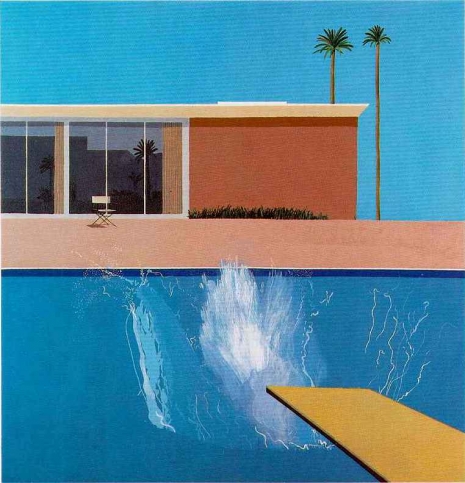
Fans of Hockney’s work will recognize in the book’s title an echo of some of the artist’s earlier works and book releases. One of Hockney’s most famous paintings is of a swimming pool, the title of which is “A Bigger Splash.”
David Hockney, “A Bigger Splash” (1967)
Similarly, the major retrospective of Hockney’s work that landed at the Tate Modern in 2013 bore the title “A Bigger Exhibition,” and there is a volume with his work called A Bigger Picture (the title has also been used for a documentary about Hockney) as well as a book containing interviews with Hockney called A Bigger Message. You can even purchase a lithograph of one of America’s most famous landmarks that is called “A Bigger Grand Canyon.”
Taschen has a tradition of bestowing upon artists of a certain caliber mega-sized volumes in a line called SUMO. Taschen’s first SUMO edition was for Helmut Newton in 1999. In 2003 Taschen released a SUMO volume dedicated to Muhammad Ali under the title GOAT, which presumably stands for “Greatest of All Time,” and the company has also released “SUMO-sized” volumes for H.R. Giger, Sebastião Salgado, and Annie Leibovitz. In 2014 Taschen published a SUMO volume about the Rolling Stones.
Pauline Boty was an artist, activist, actress and model. She was one of the leading figures of the British Pop art movement during the late 1950s and early 1960s. Her contemporaries were Peter Blake, Derek Boshier and David Hockney. But when Boty tragically died at the height of her fame in 1966, her work mysteriously disappeared. Not one of her paintings was exhibited again until 1993.
Boty was all but forgotten by the time a cache of her paintings was rediscovered on a farm in the English countryside in the early 1990s. The paintings had been stored in an old barn for safe-keeping by her brother. Their rediscovery placed Boty firmly back into the center of the Pop art boy’s club.
Throughout her life, Boty kicked against the men who tried to hold her back. Born into a Catholic family in 1938, her father (a by-the-book accountant) wanted his daughter to marry someone respectable and raise a family. Instead she chose to study art to her father’s great displeasure. In 1954, Boty won a scholarship to Wimbledon School of Art.
At college, Boty was dubbed the “Wimbledon Bridget Bardot” because of her blonde hair and film star looks. She went onto study lithography and stained glass design. However, her desire was to study painting. When she applied to the Royal College of Art in 1958, it was suggested by the male tutors that she would be more suited studying stained glass design as there were so few women painters. Though Boty enrolled in the design course she continued with her ambitions to paint.
Encouraged by the original Pop artist Eduardo Paolozzi, Boty began painting at her apartment. Her makeshift studio soon became a meeting point for her friends (Derek Marlowe, Celia Birtwell) and contemporaries (Blake, Boshier, Hockney and co) to meet, talk and work. Boty started exhibiting her collages and paintings alongside these artists and her career as a painter commenced.
In 1962, Boty was featured in a documentary about young British pop artists Pop Goes the Easel alongside Peter Blake, Derek Boshier and Peter Phillips. The film was directed by Ken Russell who created an incredibly imaginative and memorable portrait of the four artists. Each was given the opportunity to discuss their work—only Boty did not. Instead she collaborated with Russell on a very prescient dream sequence.
It opens with Boty laying out her paintings and drawings on the floor of a long circular corridor—actually the old BBC TV Center. As she examines her work a group of young women appear behind her. These women walk all over her artwork. Then from out of an office door, a nightmarish figure in a wheelchair appears and chases Boty along the seemingly endless twisting corridors. Boty eventually escapes into an elevator—only to find the ominous figure waiting inside.
Her performance in Russell’s film led to further acting roles—in Alfie with Michael Caine, with James Fox on the stage, Stanley Baxter on television and again with Russell in a small role opposite Oliver Reed in Dante’s Inferno. Boty was photographed by David Bailey, modeled for Vogue, regularly appeared as an audience dancer on Ready, Steady, Go!, and held legendary parties at her studio to which everyone who was anyone attended—from the Stones to Bob Dylan. Boty was the bright flame to whom everyone was attracted.
She was a feminist icon—living her life, doing what she wanted to do, and not letting men from hold her back. But the sixties were not always the liberated decade many Boomers would have us believe. Boty’s critics nastily dismissed her as the Pop art pin-up girl. The left-wing party girl. A dumb blonde. Of course, they were wrong—but shit unfortunately sticks.
Boty’s work became more politically nuanced. She criticised America’s foreign policy in Vietnam; dissected the unacknowledged sexism of everyday life; and celebrated female sexuality. She had a long affair with the director Philip Saville—which allegedly inspired Joseph Losey’s film Darling with Dirk Bogarde and Julie Christie. Then after a ten day “whirlwind romance” Boty married Clive Goodwin—a literary agent and activist. She claimed he was the only man who was interested in her mind.
In 1965, Boty was nearing the top of her field when she found she was pregnant. During a routine prenatal examination, doctors discovered a malignant tumor. Boty refused an abortion. She also refused chemotherapy as she did not want to damage the fetus. In February 1966, Boty gave birth to a daughter—Boty Goodwin. Five months later in July 1966, Pauline Boty died. Her last painting was a commission for Kenneth Tynan’s nude revue Oh! Calcutta! called “BUM.”
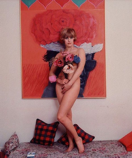
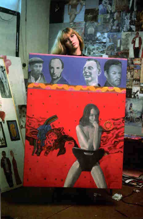
Pauline Boty in her studio holding the painting ‘Scandal’ in 1963.
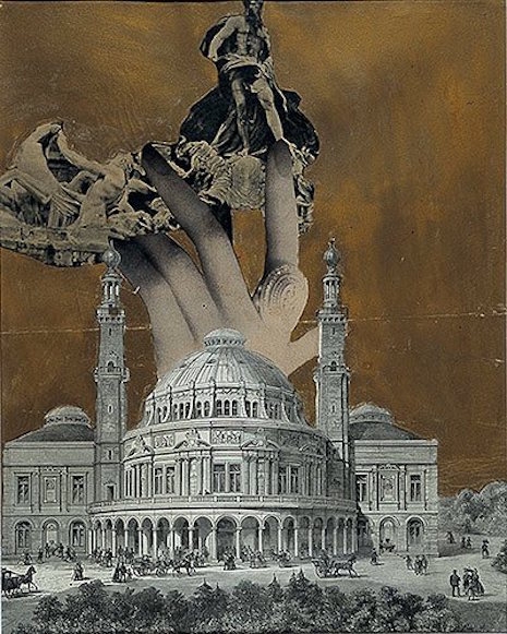
‘A Big Hand’ (1960).
More of Pauline Boty’s paintings plus Ken Russell’s ‘Pop Goes the Easel,’ after the jump…
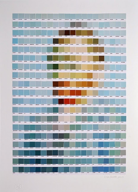
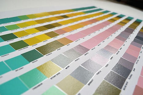
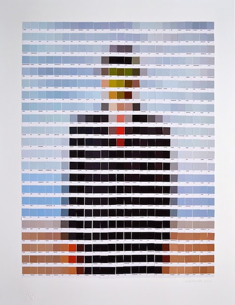
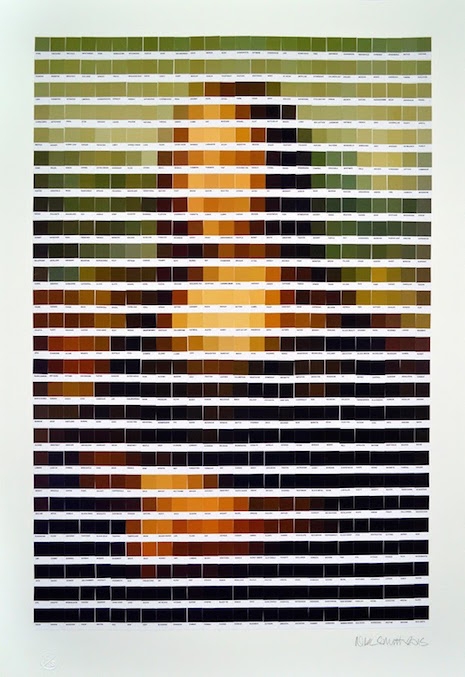
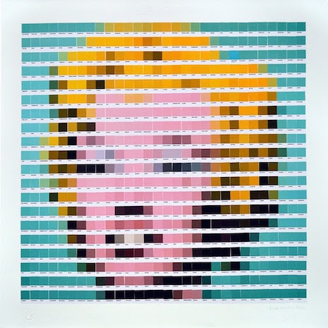
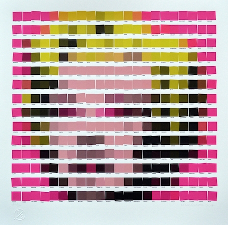
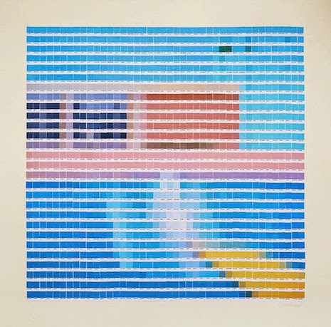
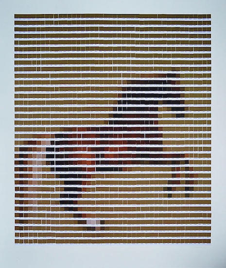
Just the other day, Pantone named Marsala the color of 2015, and the decision, er, “has critics seeing red.” The only thing that gets art and design people more worked up than Pantone swatches is the rampant overuse of Comic Sans. Art and design people LOVE Pantone. ... thus it was inevitable that someone would do what London artist Nick Smith did, and create quasi-“pixelated” versions of famous art masterpieces, only using Pantone swatches.
Smith currently has an exhibition called “Psycolourgy” at the Lawrence Alkin Gallery near Covent Garden. The show runs through February 20. Here’s the poster—you HAD to know this was coming:
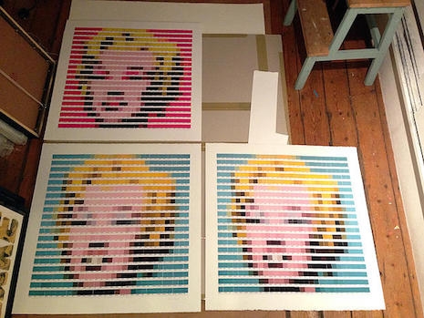
Here are the two Warhols side by side:
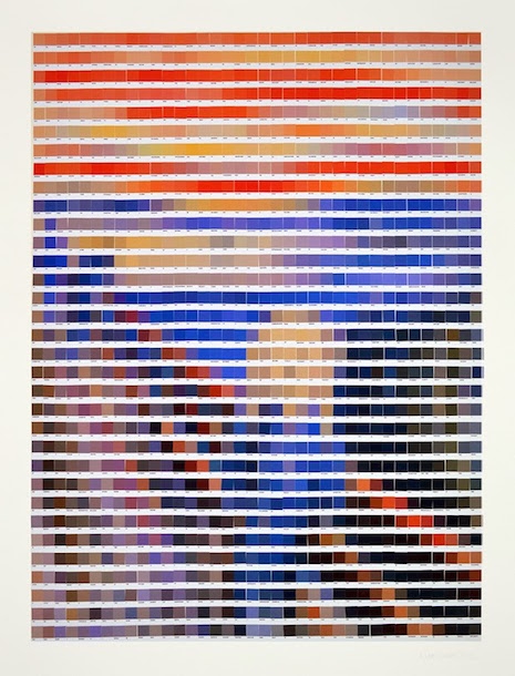
Prints of the two versions of Warhol’s Marilyn were once available at ArtRepublic, and the Van Gogh is currently available.
My favorite thing is to look at a bit up close, where you can’t even tell what the context is anymore, like this:
During discussions for an exhibition of his personal photographs, David Hockney hit upon a new way of making pictures. Alain Sayag, of the Pompidou Center in Paris, had visited Hockney at his LA home in the 1970s and was looking through the 100-odd photo albums, when Hockney realized the photographs had “cheated,” as they had not captured a true sense of the events they depicted.
“I had become very, very aware of this frozen moment that was very unreal to me. The photographs didn’t really have life in the way a drawing or painting did, and I realized it couldn’t because of what it is.
“Compared to a Rembrandt looking at himself for hours and hours of scrutinizing his face, and putting all these hours into the picture you’re going to look at, naturally there’s many more hours there than you can give it.
“A photograph is the other way round, it’s a fraction of a second, frozen. So, the moment you’ve looked at it for even four seconds, you’re looking at it far more than the camera did.
“It dawned on me this was visible, actually, it is visible, and the more you become aware of it, the more this is a terrible weakness; drawings and paintings do not have this.”
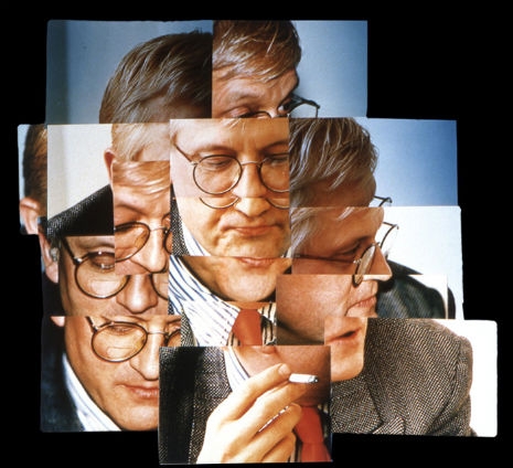
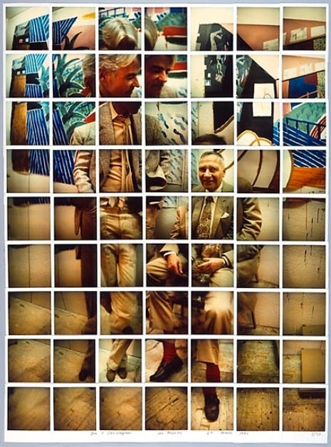
That night, after Sayag had left, Hockney started taking Polaroids of his home and studio. He took multiple pictures, concentrating on some areas and ignoring others. Hockney then selected the photos he wanted to use. He placed these onto a board, then arranged them by the same decisions of “line and form” that he used when drawing a picture. The end result Hockney called a “Joiner,” a multiple photographic portrait of a place or individual, which gives the viewer a better sense of space and time than any ordinary snapshot.
“Joiners” owed much to Cubism—an association Hockney found to be a “turn-on.”
In 1983, Melvyn Bragg’s art series The South Bank Show visited Hockney at his LA home, where the artist was filmed as he created a “Joiner” portrait especially for the documentary. Hockney used this “Joiner” to show the difference between a single snap or a filmed sequence.
Ossie Clark was a master cutter, who could run his hands over a figure and cut a dress to fit perfectly. He liked his dresses to lie next to the skin, nothing in between, capturing the wearer’s form, beauty and shape. Clark’s inspiration was dance, his idol was Nijinsky, and the movement, flow, and freedom of dance inspired his clothes to enhance the female form. At the height of his success, in the early 1970s, his clothes were worn by some of the world’s most beautiful women - Ali MacGraw, Patti Boyd, Gala Mitchell, Twiggy and Elizabeth Taylor. His leather jackets were worn by Keith Richard, while he designed a jump suit for Mick Jagger to wear during The Stones Exile in Main Street Tour. His favorite model, the beautiful Gala Mitchell said in 1971:
“Usually I lack confidence, but when I wear Ossie’s designs I know I’m beautiful and sexy. His clothes are like a play. I act to suit the mood of the dress. Fashion now is very sophisticated - as always Ossie had that feeling first.”
The magic of Clark’s fashion was the cut, the shape, the heart-tugging style, and the beautiful prints designed by wife Celia Birtwell. Together, Ossie and Celia brought a fabulous, ethereal beauty to fashion in the late 1960s, early 1970s, which has often been copied, but rarely equalled.
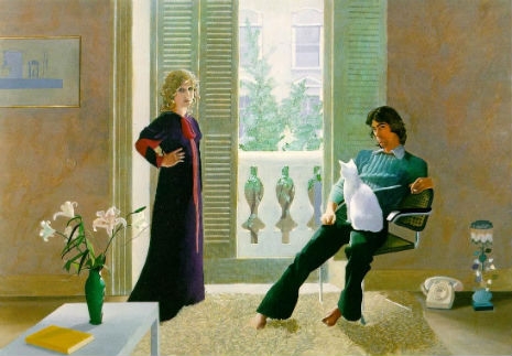
Here’s a small selection of Ossie and Celia’s fashions from German TV, circa 1969. Painting above David Hockney’s Mr. and Mrs. Clark and Percy (1971).
More of the Clark’s beautiful fashions, after the jump…
Looking like a delightfully naughty schoolboy, David Hockney explains, in this interview from Andy Warhol’s TV, why he never really wanted to be anything else but an artist, discussing his background, his early work, his heroes, his paintings, his art, his working methods, his interests, and in his involvement in designs for Ubu Roi, The Rake’s Progress and Parade. These clips usually disappear quite quickly, so watch it while you can. With subtitles in Spanish.
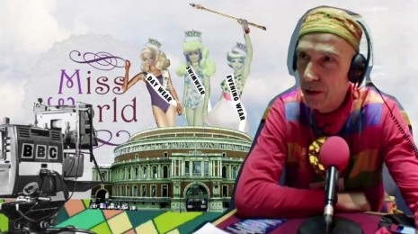
First look at the new documentary film, The British Guide to Showing Off, which celebrates Andrew Logan, artist, living legend and creator of the outrageous, anarchic and always spectacular Alternative Miss World Show.
The Alternative Miss World Show, is a pageant and fancy dress party for grown ups, launched back in 1972, it has involved the participation from the likes of Derek Jarman, Divine, Duggie Fields, Leigh Bowery, David Hockney, Richard O’Brien Zandra Rhodes, Molly Parkin, Angie Bowie and Grayson Perry over the years
“In The British Guide to Showing Off, director Jes Benstock takes us under Logan’s glittering wing to take a joyous look at this most quirky and exotic subculture event.
“Raucous, liberating and sexually charged, The British Guide to Showing Off speaks to the outsider in all of us. For anyone who has ever wanted to break out.”