


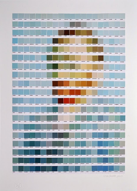
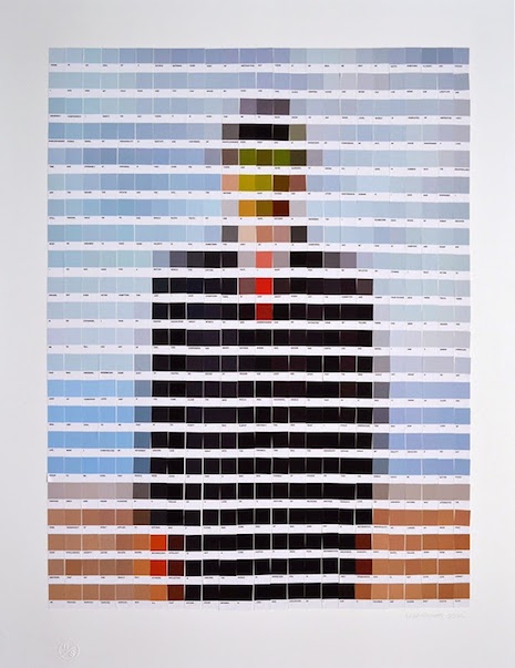
Vincent van Gogh, “Self-Portrait”
Just the other day, Pantone named Marsala the color of 2015, and the decision, er, “has critics seeing red.” The only thing that gets art and design people more worked up than Pantone swatches is the rampant overuse of Comic Sans. Art and design people LOVE Pantone. ... thus it was inevitable that someone would do what London artist Nick Smith did, and create quasi-“pixelated” versions of famous art masterpieces, only using Pantone swatches.
Smith currently has an exhibition called “Psycolourgy” at the Lawrence Alkin Gallery near Covent Garden. The show runs through February 20. Here’s the poster—you HAD to know this was coming:

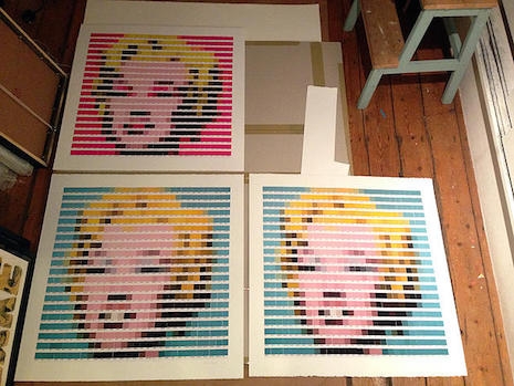
Here are the two Warhols side by side:
Prints of the two versions of Warhol’s Marilyn were once available at ArtRepublic, and the Van Gogh is currently available.
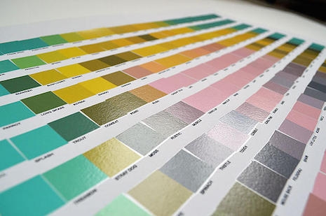
My favorite thing is to look at a bit up close, where you can’t even tell what the context is anymore, like this:
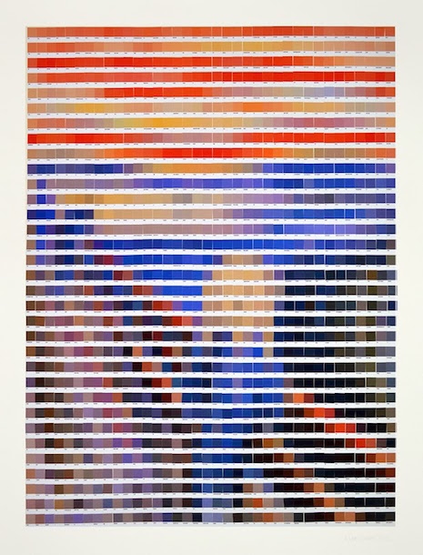
Edvard Munch, “The Scream”
René Magritte, “Son of Man”
Leonardo da Vinci, “La Gioconda”
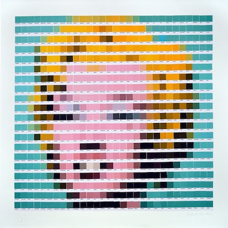
Andy Warhol, “Marilyn Monroe (Green)”
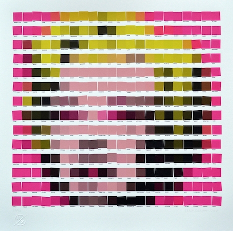
Andy Warhol, “Marilyn Monroe (Pink)”
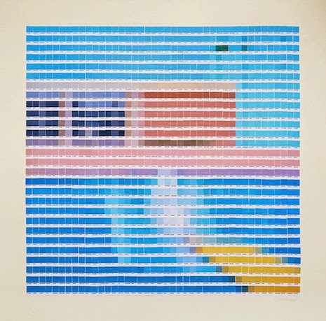
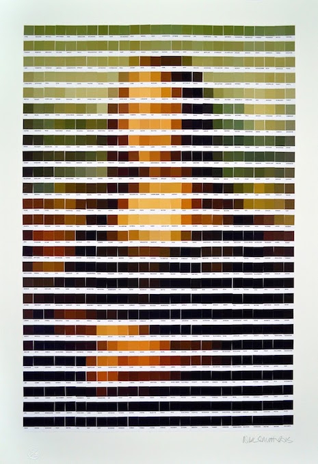
David Hockney, “A Bigger Splash”
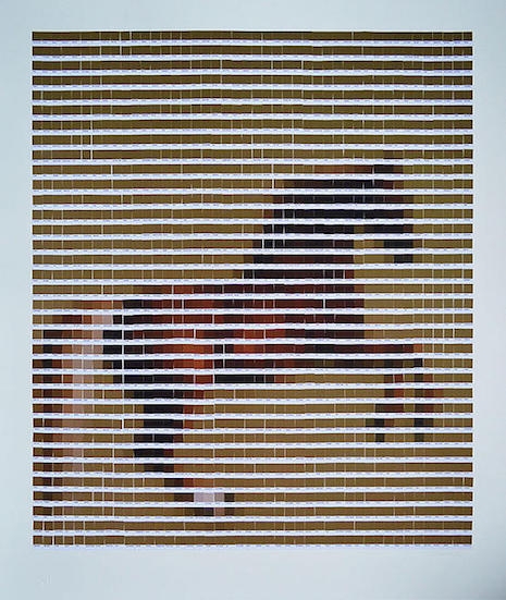
George Stubbs, “Whistlejacket”