FOLLOW US ON:
GET THE NEWSLETTER
CONTACT US
Andy Warhol interviews Frank Zappa (whom he hated) without uttering a word
04.30.2015
02:36 pm
Topics:
Tags:


In this brief clip from Andy Warhol’s public access TV show from the early 1980s, Andy Warhol’s TV, Warhol sits silently by while Richard Berlin assumes the duties of interviewing Frank Zappa. Zappa discusses the ins and outs of being a public gadfly; for a few moments we glimpse a few seconds of the video for “You Are What You Is,” which had been banned from MTV for its use of a racial slur but also, just as plausibly, because of the way it poked fun at Ronald Reagan.

The interview made a significant impression on Warhol. Here’s the entry from The Andy Warhol Diaries for June 26, 1983:
 

Frank Zappa came to be interviewed for our TV show and I think that after the interview I hated Zappa even more than when it started. I remember when he was so mean to us when the Mothers of Invention played with the Velvet Underground— I think both at the Trip, in L.A., and at the Fillmore in San Francisco. I hated him then and I still don’t like him. And he was awfully strange about Moon. I said how great she was, and he said, “Listen, I created her. I invented her.” Like, “She’s nothing, it’s all me.” And I mean, if it were my daughter I would be saying, “Gee, she’s so smart,” but he’s taking all the credit. It was peculiar.

 
Warhol’s memory was rather good—the Mothers did indeed open for the Velvets at the Trip on May 3, 1966. In late May 1966, both bands played the Fillmore in S.F. for a three-day stint.
 

Posted by Martin Schneider
|
04.30.2015
02:36 pm
|
Gloriously trippy raw food vegan Mandala cakes
04.29.2015
05:56 pm
Topics:
Tags:


A Chocolate Chai Goji
 
I love me some butter and eggs, but I’d definitely like to try one of these psychedelic-looking Mandala cakes—made with raw vegan ingredients—by Los Angeles-based raw vegan chef Stephen McCarty aka Sukhavati. (Sukhavati means “Happy” in Hindi.)

I wonder if they taste as good as they look? Since I live in Los Angeles, I just might have to give one of these a try. Honestly, though, they’re so beautiful, I’d hate to slice it up. But that’s kind of the point with these Mandela cakes, right? Sand Mandala art by Tibetan Buddhists monks is a tradition where a complex Mandala is painstakingly made over the course of several weeks with tiny grains of colored sand. (If you’ve never seen one before, they’re absolutely gorgeous. Just Google it.) When the Sand Mandala is finished, it is “ritualistically dismantled” with the attendant ceremonies to symbolize the Buddhist doctrinal belief in the transitory nature of life on this material plain.”

Netflix’s House of Cards featured in one if its episodes the construction and destruction of a Mandala. You can watch the short clip here.


A Lavender Lemon Blueberry
 

A Strawberry Rose Cacao
 

An Asian Pear Ginger


Raw vegan cheesecake
 

A Coconut Caramel Cacao

All photos via Stephen McCarty on Instagram.

Via Beautiful Decay

Posted by Tara McGinley
|
04.29.2015
05:56 pm
|
‘The Ghetto Tarot’: Haitian artists transform classic tarot deck into stunning real life scenes
04.29.2015
02:05 pm
Topics:
Tags:


Death
 
Welcome to the Ghetto Tarot, a project from award-winning documentary photographer Alice Smeets and a group of Haitian artists known as Atis Rezistans. The idea was to take the classic Rider-Waite tarot deck of 78 cards and create a photographic version of each card using settings and objects in the vibrant ghetto of Haiti.

As Smeets says, “The spirit of the Ghetto Tarot project is the inspiration to turn negative into positive while playing. The group of artists ‘Atiz Rezistans’ use trash to create art with their own visions that are a reflection of the beauty they see hidden within the waste. They are claiming the word ‘Ghetto,’ thus freeing themselves of its depreciating undertone and turning it into something beautiful.”

Smeets also related some of the memorable incidents while executing the photo shoots:
 

There have been plenty of little, funny moments. One example: when we were shooting the scene of the Death card, I asked the artists if they had real skulls to place them in the picture. Five minutes later, Claudel, one of the artists and my dearest assistant, came along holding a plastic bag filled with skulls in his hands as if it was the most normal thing in the world to carry dead peoples heads around.

It constantly surprised me how the artists almost always found immediately what I asked for. For the picture of the High Priestess, we needed horns to place them next to her feet. I hadn’t let them known beforehand that we would be in need of them. As soon as Claudel found out, he ran and came back a moment later with two horns in his hands. They never told me where they found all of the materials, they just happened to lay around somewhere in the Ghetto.


The Ghetto Tarot has been fully funded on indiegogo, and you can place an order for a full deck at the price of 32 euros (about $36).

(Clicking on any image in this post will spawn a larger image.)
 

The Nine of Cups
 

Justice
 

The Nine of Swords
 

The King of Swords
 
After the jump, more vivid pics as well as a brief video featuring interviews with some of the photo subjects…...

READ ON
Posted by Martin Schneider
|
04.29.2015
02:05 pm
|
The dark, incredibly f*cked up comics of Joan Cornellà
04.28.2015
08:52 am
Topics:
Tags:


Spanish cartoonist Joan Cornellà combines black humor and extreme discomfort, most famously in his wordless, six-panel comics. Cornellà‘s work deals in mutilation and disfigurement, sadistic or oblivious violence, the alienation of modernity and a total disregard for human life. (I know. It doesn’t sound funny, but trust me.) Cornellà‘s aesthetic runs completely counterintuitive to his themes—his colors are lovely and soothing, and his human figures are glassy-eyed and friendly, as if they walked out of a children’s cartoon.

Uncomfortable laughter aside, these beautiful little comics really bear the mark of Cornellà‘s fine arts training. His book Mox Nox is fantastic by the way, especially since the high-resolution images really let you see the texture of paper and pigment. It lets you really embrace the depth of that head-wound.


Plenty more after the jump…

READ ON
Posted by Amber Frost
|
04.28.2015
08:52 am
|
Christina in Red: Gorgeous photos of a young woman in vivid reds from 1913
04.27.2015
03:58 pm
Topics:
Tags:


I found these photos taken by Mervyn O’Gorman of his daughter Christina O’Gorman to be absolutely breathtaking. The images look modern. They look now. It’s hard to believe these were shot back in 1913.

The photographs were taken at Lulworth Cove, in the English county of Dorset. And as you can tell by the images, Christina’s color of choice was red.  The autochrome process used during that time period captured red particularly well. It’s vivid. It’s vibrant. She looks like an ethereal goddess.

Here’s a brief description of autochrome:

Autochrome is an additive color[3] “mosaic screen plate” process. The medium consists of a glass plate coated on one side with a random mosaic of microscopic grains of potato starch[4] dyed red-orange, green, and blue-violet (an unusual but functional variant of the standard red, green, and blue additive colors) which act as color filters. Lampblack fills the spaces between grains, and a black-and-white panchromatic silver halide emulsion is coated on top of the filter layer.

Mervyn was an electrical engineer and wrote the book O’Gorman’s Motoring Pocket Book in 1904. Photography was just a hobby for him. Mervyn died in 1958. Sadly, I can find no information about Christina’s life.


via Mashable and Coilhouse on Facebook

Posted by Tara McGinley
|
04.27.2015
03:58 pm
|
Crazy Hungarian posters for the original ‘Star Wars’ trilogy
04.27.2015
03:27 pm
Topics:
Tags:


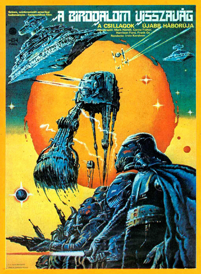
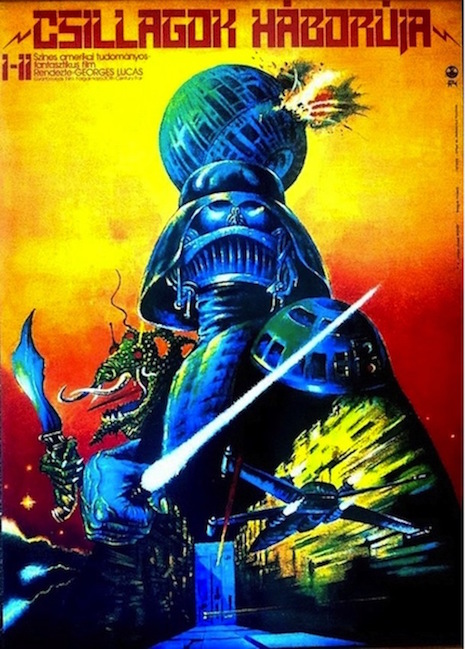
Csillagok háborúja: A Birodalom visszavág—Star Wars: The Empire Strikes Back
 
One of the differences between the first, “good” Star Wars trilogy and the second, “bad” trilogy is that the Cold War was happening when the first three movies came out. OK, it would be a stretch to argue that the Cold War with its more limited international audiences had an influence on how these movies turned out, but the fact remains that in the mid-1970s George Lucas was primarily addressing American audiences first and foremost; given the massive cult that has arisen around the franchise, when Lucas returned to telling the story of the ragtag band of space rebels in the 1990s, it was reasonable enough for him to suppose that he would be addressing all of humankind.

By the time the third movie, Return of the Jedi, came out, it was 1983, and the Cold War officially had six more years to go. The term “Soviet bloc” perhaps disguises the extent to which the various East European countries had differing levels of autonomy vis-à-vis relations with the West. After the failed Hungarian Revolution of 1956, the country came under the control of the Soviet loyalist János Kádár, but even so, willful Hungary developed its own distinctive brand of “goulash communism” and always remained considerably less repressive than the USSR or East Germany overall.

The release dates of the three movies are an indication of how different things were then. All three movies came out in May in the United States—the first and third movies actually came out on my own 7th birthday (May 25, 1977) and 13th birthday (1983), respectively—Empire was released on May 17, 1980. Star Wars: A New Hope came out in Hungary in August of 1979, fully two years and a few months after its U.S. release. The Empire Strikes Back came out in Hungary in January 1982 and Return of the Jedi in September of 1984—so by the third movie the gap had narrowed to a mere sixteen months, still far longer than it would take today, of course.

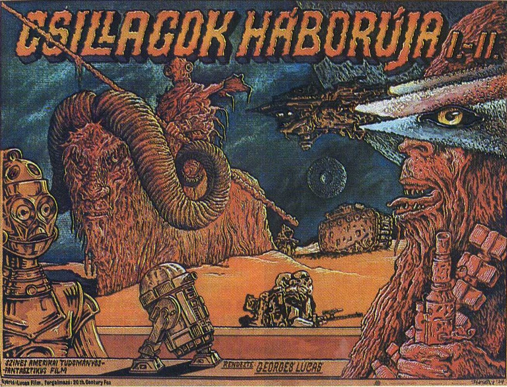
The Rembrandt, the Michelangelo—well, let’s say the Hieronymus Bosch of Hungarian Star Wars posters is clearly one Tibor Helényi, who was also a respected painter in Hungary.

My favorite aspect of Helényi’s posters are his inclination to insert big scary lizard creatures who find no correlative in the movies—plus pretty much none of the famous characters are represented, with the obvious exception of Darth Vader, who gets the most play by far (you would think that this might be true of the U.S. posters too, but it’s really not).

Also, I don’t know if Helényi borrowed or invented that nifty notched font, but I really like it. Typographers, can we get that one into regular rotation?
 

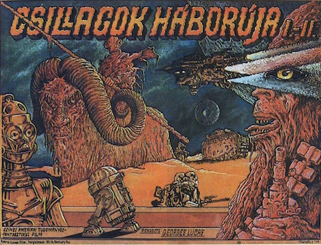
Csillagok háborúja: Új remény—Star Wars: A New Hope
 

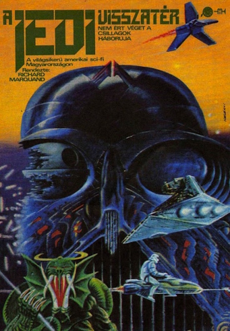
Csillagok háborúja: A jedi visszatér—Star Wars: Return of the Jedi
 
Oh yeah, here’s another Hungarian poster for Star Wars: A New Hope by an András Felvidéki, which is completely strange in a very different way.


via io9

Posted by Martin Schneider
|
04.27.2015
03:27 pm
|
Insanely detailed ‘Big Trouble in Little China’ tattoo sleeve
04.27.2015
11:56 am
Topics:
Tags:


Holy Crap! I would never do this, but I do get why someone would have their entire arm festooned with scenes and characters from John Carpenter’s 1986 film Big Trouble in Little China. I love that film. I don’t know exactly how many times I’ve seen it. More than ten. And apparently I’m not the only fan, as this arm sleeve tattoo is a flesh-etched testament to.

The Big Trouble in Little China tattoos were done by Paul Acker who owns Deep Six Tattoo in Philadelphia, Pennsylvania. It’s still a work in progress, as more tattoos and the finishing touches are being added.


More images after the jump…
 

READ ON
Posted by Tara McGinley
|
04.27.2015
11:56 am
|
Mind-blowing animatronic of Yul Brynner as the Gunslinger from ‘Westworld’
04.24.2015
04:05 pm
Topics:
Tags:


If you’re a fan of Michael Crichton‘s 1973 science fiction western-thriller WestWorld, then you’re definitely going to dig this life-like silicone robotic version of Yul Brynner as the Gunslinger. It’s truly a work of art and cool as shit to boot!

Made by sculptor Nick Marra of Nick Marra Studios, the video below goes into detail about how the Gunslinger was created. The video was shot at Monsterpalooza convention in Burbank, California.


via Tested and Laughing Squid

Posted by Tara McGinley
|
04.24.2015
04:05 pm
|
Hoarders: Photographer recreates grim scenes from his childhood
04.24.2015
09:15 am
Topics:
Tags:


The hoarders I’ve seen on reality TV tend to be isolated and lonely. Often the shame of hoarding fosters seclusion, and/or the environment their disorder has produced alienates and repels friends and loved ones. I’ve never seen a hoarder living with children, presumably because a lucid parent (most hoarders appear to have some level of self-awareness about what they’re doing), would know that a filthy home is a health hazard. Hoarder parents would have to be more secretive for fear of losing their children, though tragically this would leave them less likely to reach out for help, preserving the conditions of an afflicted family. Photographer Geoff Johnson and his sister grew up in hoarder’s house, and his series, “Behind the Door” tells the story eloquently:

Behind the Door explores the daily life of living with a parent who is a hoarder from a child’s perspective. This work is a personal reflection from Geoff and his sister’s life growing up.

Geoff recreated images displaying how stuff not only consumed his childhood home, but deteriorated conditions for daily living, ultimately shaping who he would become.

Johnson actually went back to his childhood home to stage the scenes—the first time he’d been in the house since he moved out in 1995. The photos are immediately tragic, but there is an anxiety too, as you try to imagine little feet navigating such irregular and unstable terrain.


More after the jump…

READ ON
Posted by Amber Frost
|
04.24.2015
09:15 am
|
‘The Twilight Zone’ meets M.C. Escher meets Dali in the philosophical comic strip ‘the bus’
04.23.2015
05:08 pm
Topics:
Tags:


A few weeks ago I highlighted “Dope Rider,” the trippy Wild West cartoon that appeared in High Times over a number of years in the 1970s and 1980s. The talented artist of those comic strips was Paul Kirchner, whose masterwork may well be a thoughtful and surreal strip about a municipal bus that appeared regularly in Heavy Metal over the same period, from 1979 to roughly 1985. That strip, “the bus” (always scrupulously set in lower-case), provided an ideal starting point for Kirchner’s fertile imagination, as the strip explored many variations of futility and disaster, fueled as much by The Twilight Zone and Godzilla as the paintings of Salvador Dali and M.C. Escher. As Kirchner himself writes in the afterword to a dandy collection of “the bus” published in 2012 by a French company called Éditions Tanibis,
 

The humor was inspired by the crazy logic of Warner Brothers cartoons; the paranoia of the Twilight Zone television program; and the surrealistic artwork of Bosch, Magritte, Dali, and Escher.

 
Escher, for sure—although the comic strips remind me of nothing so much as the playful, deadpan philosophy presented in the works of Jorge Luis Borges.

The book collects 73 of the strips (if my counting is accurate), which would represent almost precisely six years’ worth of output, as reflected in Kirchner’s account. According to Kirchner, he had wanted to present the strip in a horizontal format in the hopes of selling it to the Village Voice, but an editor at Heavy Metal had the shrewd idea of reducing the size:
 

Shortly after getting my foot in the door, I approached editor Julie Simmons [at Heavy Metal] with a comic strip called “the bus” (always written in lower case). I had drawn the first ten episodes in a horizontal format because I had intended to sell it to a weekly newspaper, the Village Voice. However, the Village Voice turned it down, though the art director was gracious enough to tell me it was the best thing he had ever rejected. Julie liked it and decided to run it as a half-page feature, as Heavy Metal often sold half-page ads and had to fill the remaining space.

 
Many, though not all, instances of “the bus” have precisely six panels, and most of my favorites are wordless. Tanibis to be saluted for rescuing these great strips from obscurity—even Kirchner himself admits that he never had much idea if anyone really liked the strip:
 

In those days before the internet, I rarely got feedback from readers about my work. It was published and I was paid, but what did people think of it? I didn’t know.

 
According to Tanibis, Kirchner has recently started doing “the bus” cartoons again, and Tanibis intends to publish an updated collection before the year is out. Very good news for all of Kirchner’s fans.

(For all the comics embedded in this post, clicking on the image will spawn a larger version.)


More after the jump…

READ ON
Posted by Martin Schneider
|
04.23.2015
05:08 pm
|
Page 144 of 380 ‹ First  < 142 143 144 145 146 >  Last ›