FOLLOW US ON:
GET THE NEWSLETTER
CONTACT US
Tadanori Yokoo’s awesome 1970s rock posters
12.27.2013
12:07 pm
Topics:
Tags:

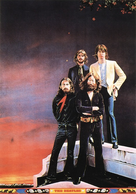
The Beatles
The Beatles, 1972
 
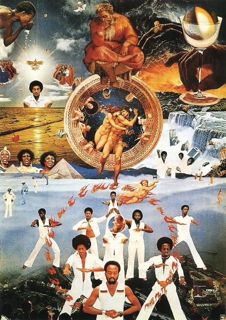
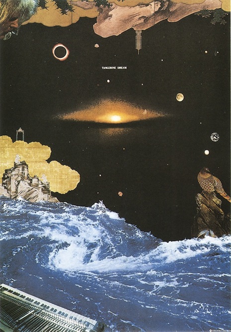
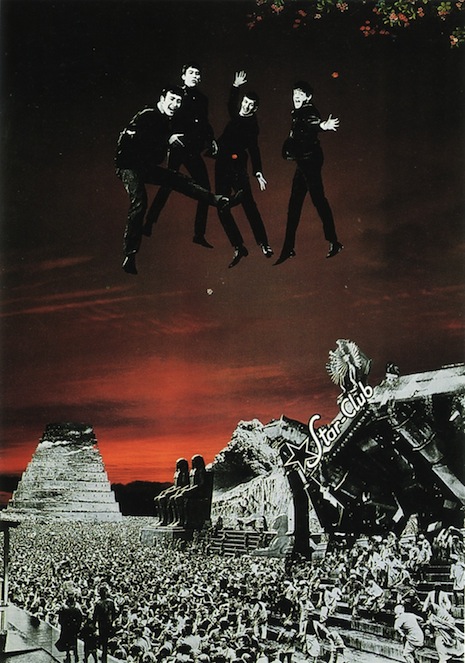
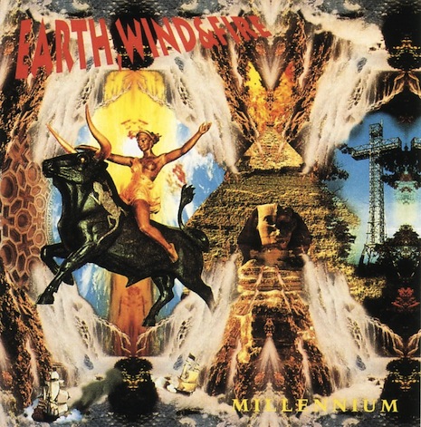
Tadanori Yokoo was one of the dominant figures, if not the dominant figure, in Japanese design starting in the Sixties. Some people liken his work to Andy Warhol but I scarcely see that, unless you’re talking about general importance and influence, in which case I can’t judge. I think Richard got it right last year when he invoked Milton Glaser, Seymour Chwast, and Peter Max, particularly Max.

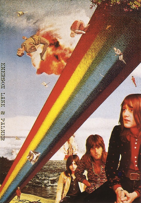
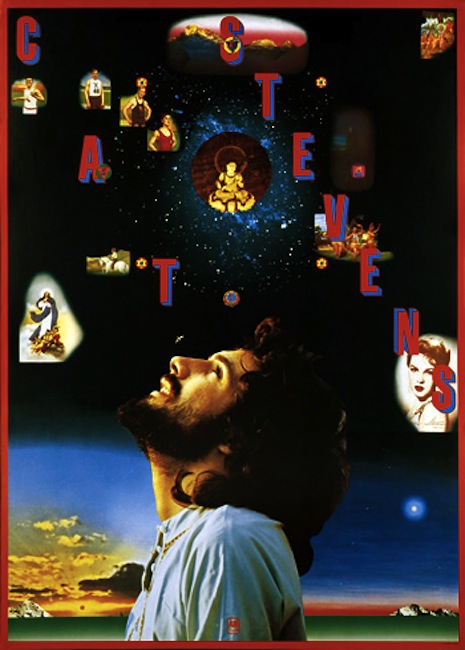
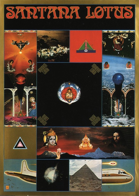
In addition to his (usually) symmetrical, DayGlo, ligne claire works, Yokoo also did a good number of rock-related graphics. The funny thing is that they’re in a completely different photocollage style—you can tell it might be by the same person but aside from that, they’re not too similar to stuff like this. I find all of these images delightful and fascinating. They’re trippy and detailed with a strong design sense, and the use of photos prevents them from flying off into the ether.

Emerson Lake and Palmer
Emerson, Lake, and Palmer, 1972
 
Cat Stevens
Cat Stevens, 1972
 
Santana
Santana, 1974
 
Earth, Wind, & Fire
Earth, Wind, & Fire, 1976
 
Tangerine Dream
Tangerine Dream, 1976
 
The Beatles
The Beatles, Star Club, 1977
 
Earth, Wind, & Fire
Earth, Wind, & Fire, 1993
 
Aa a bonus, here’s Tadanori’s cover for Miles Davis’ 1975 album Agharta.
Miles Davis, Agharta

Posted by Martin Schneider
|
12.27.2013
12:07 pm
|
John Heartfield, the original culture jammer
12.26.2013
10:09 am
Topics:
Tags:

John Heartfield
 
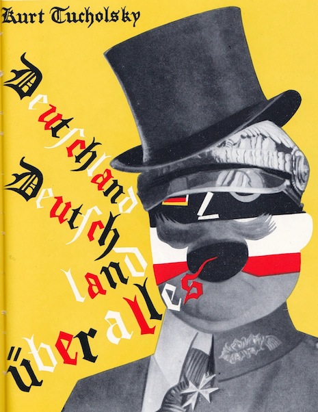
I recently stumbled upon some images by John Heartfield, and I haven’t been able to get them out of my head. I had never heard of Heartfield before, but the more I look into him, the more central and essential his work seems.

Despite the WASP-y name, Heartfield was German, and although he lived until 1968 his best-known work was during the Weimar era and also the years preceding World War II. He was born Helmut Herzfeld in 1891 and, in a detail that tells you everything you need to know about him, he adopted the English name John Heartfield (“Herzfeld”) in 1917 to protest the anti-British sentiment that was engulfing Germany at the time. His brother was born Wieland Herzfeld and for reasons I don’t fully understand decided to add an “e” to his name, making him Wieland Herzfelde. Heartfield and Herzfelde (along with the expressionist painter George Grosz) started an influential publishing company called the Malik Verlag—that also happened in 1917, the same year Helmut became Heartfield.
 
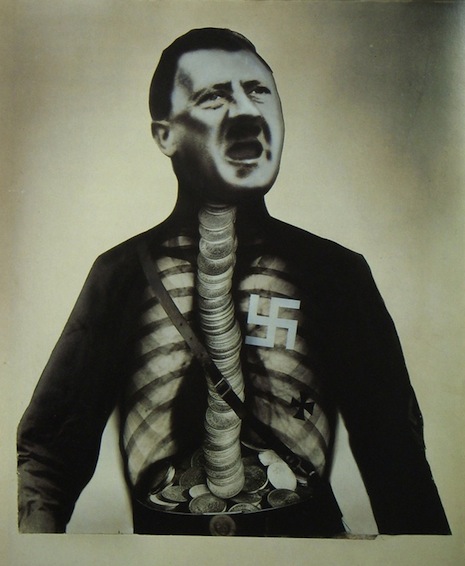
Adolf der Übermensch
“Adolf, der Übermensch: Schluckt Gold und redet Blech,” 1932 (“Adolf the Superman: Swallows Gold and Spouts Tin”)
 
Heartfield designed book covers for Upton Sinclair and many other authors and also designed stage sets for Bertolt Brecht. As with his anti-nationalist protest, Heartfield’s connection to the names “Sinclair” and “Brecht” indicates much about his artistic and political sensibility. He was part of the Dada scene as well (check out the “Soeben erschienen” cover below). One thing I didn’t realize until I began researching Heartfield was how much more politicized the German Dada scene was, as opposed to the French variety. If Heartfield’s work is anything to go by (it may not be), the German Dadaists were far more engaged with political struggle.

The man led an interesting life. As a child he and his siblings were abandoned in the woods by their parents—eventually an uncle consented to raise them. In the spring of 1933, the Nazis raided his apartment, but he escaped through the window. Eventually he emigrated to Czechoslovakia on foot—that is, he walked to Czechoslovakia in order to escape the Nazis.
 
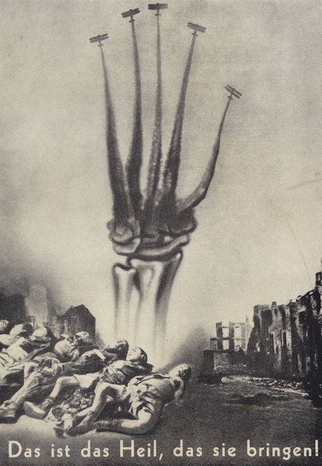
This is the cure
“Das ist das Heil, das sie bringen!” 1938 (“This is the cure that they bring!”)
 
That’s enough about Heartfield’s life—let’s talk about the work. I’m hesitant to say that Heartfield “invented” photomontage or anything like that, there were certainly people doing that sort of thing before World War I. But there is surely a case to be made that Heartfield was one of the pioneers of photomontage and arguably one of the very first to use it to such powerful effect. In many ways Heartfield might be the first photomontage artist to influence directly a lot of the counterculture movements of the Sixties and beyond. It’s pretty clear he occupies a very special position, and many of his images are decades ahead of their time. You can see Heartfield’s influence in culture jammers of all kinds, from Plunderphonics to every kind of sampleriffic noise collage and beyond.

If you look around the world today, especially on the Internet, you’re sure to see a Heartfield heir somewhere in the mix. Every time you see the head of Obama or George W. Bush pasted onto something else as a political comment, you’re seeing the Heartfield ethic in action. Adbusters has been doing Heartfield-type stuff for years now.

The question arises, Why does Heartfield’s work seem so rich and penetrating whereas (as an example) the Adbusters approach tends to pall after a while? It’s tempting to say that it’s because Heartfield was so willing to go for the jugular in his images, but I actually think it’s something like the opposite. Adbusters isn’t exactly known for pulling its punches either, you know? No, I think what makes Heartfield’s images work so well is actually a kind of delicacy, a perhaps-Continental sensibility that avoids hyperbole in favor of nuanced depth—even the crazy images of Hitler and Goering aren’t all that hyperbolic, they’re witty and they have one foot grounded in the regular world somehow. In a way there’s a lesson there. It doesn’t take artistry of craftsmanship to come up with a visual pun, the craft comes in the execution, the ability to create an image that may have blood, skeletons, misery, and suffering in it and yet not make you turn away.
 
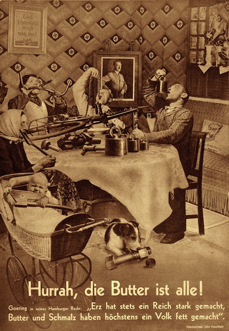
Hurrah, the Butter is Gone!
 
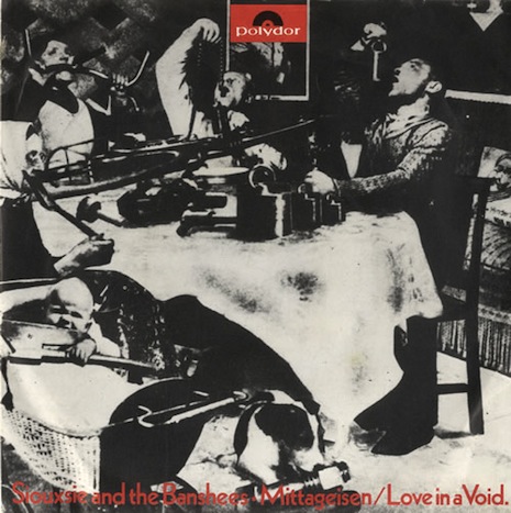
Siouxsie and the Banshees, Mittageisen
 
Siouxsie and the Banshees appropriated one of Heartfield’s most famous images when they released a German translation of their song “Metal Postcard”—you can compare the two images above. The name of the Siouxsie single is “Mittageisen,” which is a pun. The German word Mittagessen means “lunch”—Mittageisen would translate as “midday iron.” The original Heartfield print is called “Hurrah, die Butter ist alle!” which means, “Hurrah, the butter is gone!”—it’s a reference to Hermann Goering’s famous 1936 speech in which he said, “Guns will make us powerful; butter will only make us fat.” Heartfield’s ingenious answer is to make a typical Aryan household in which there is only iron on the dinner table.
 
Here’s Siouxsie and the Banshees playing “Mittageisen” in 1979:

 
Here’s a playful documentary about Heartfield’s work:

 
After the jump, several more examples of Heartfield’s searing and sarcastic imagery….

READ ON
Posted by Martin Schneider
|
12.26.2013
10:09 am
|
Salvador Dali’s Christmas cards
12.24.2013
12:35 pm
Topics:
Tags:

iladxmas000.jpg
 
Salvador Dali designed a series of nineteen Christmas cards between 1958 and 1976. These greeting cards were specially produced for the Barcelona-based company Hoechst Ibérica, and presented Dali’s take on traditional Christmas celebrations.

While popular in Spain, Dali’s greeting cards were not as successful in America, particularly with card manufacturer Hallmark, who thought his “surrealist take on Christmas proved a bit too avant garde for the average greeting card buyer.”
Rebecca M. Bender, Assistant Professor of Spanish Language and Literature has written a fascinating blog with more pictures of Dali’s festive work, which you can view here.

Happy Holidays!
 
ilad1974xmas111.jpg
Christmas 1974
 
idal1960xmas666.jpg
Christmas 1960
 
More Dalinian holiday greetings, after the jump…

READ ON
Posted by Paul Gallagher
|
12.24.2013
12:35 pm
|
Woody Allen: stand-up comedian, film director, comic strip character
12.24.2013
09:32 am
Topics:
Tags:

woodycomic
 
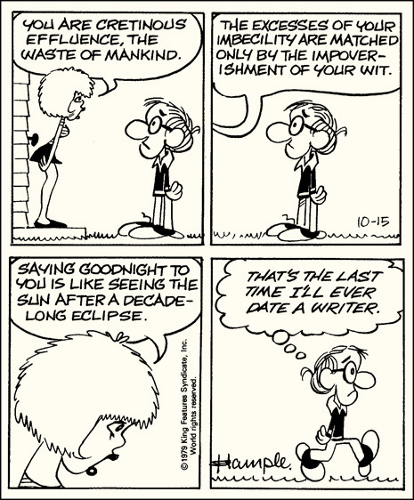
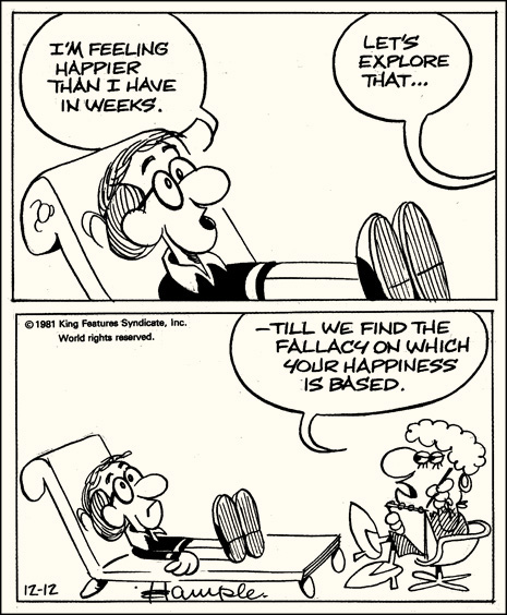
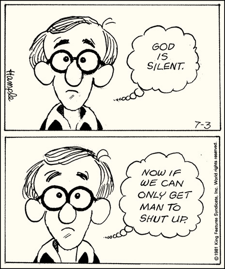
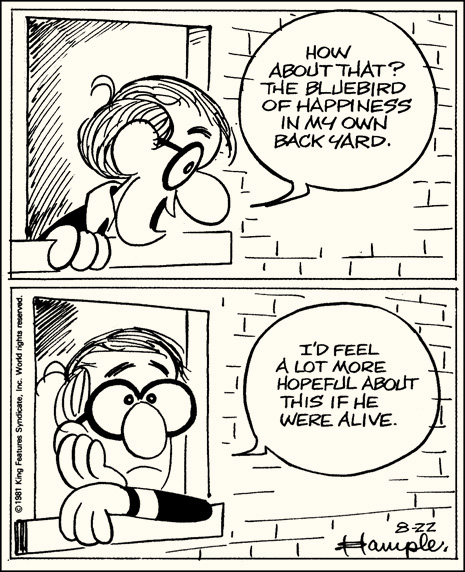
This irrational and improbable thing actually happened: a comic strip titled Inside Woody Allen - starring the man himself - was syndicated by King Features from 1976 to 1984. Created and drawn by Stuart Hample of later Children’s Letters to God fame, the strip was based on Allen’s familiar persona—the angsty, neurotic, Jewish everyman if every man was a cripplingly overanalytical disaster—and it still got printed in daily newspapers for eight years!

Hample recalled the process of working with Allen in the anthology Dread & Superficiality: Woody Allen as Comic Strip, excerpted in 2009 by The Guardian:

I had a lightbulb epiphany. It occurred to me that Woody might make a terrific comic strip. But how would he – 39 and by now wildly successful – react? I ran a test scene in my head. Me: “Woody, I have an idea for a comic strip based on you. Possible?” Woody: “Sorry. Up to my neck writing a movie, editing another movie. Writing a piece for The New Yorker. Don’t need the money. Try me next year.”

So I asked him in person. Woody was intrigued enough to say: “Show me some sketches.” I based my drawings on how he looked in his late 20s, when we’d first met. He OK’d the Woody cartoon character (he even had it animated for a sequence in Annie Hall) and said: “What about the jokes?” I brought jokes. He looked through them. “Maybe,” he said, “I could help you with the jokes.”

Assuming he was offering to write them, I wanted to shout: “My saviour!” Instead, I said: “OK.” Which was more appropriate, since his help turned out to be dozens of pages of jokes from his standup years. Some were mere shards, such as “tied me to Jewish star – uncomfortable crucifixion”. Others were even more minimal: “bull fighting”, “astrology” (Woody occasionally translated these hieroglyphs).

But there were longer notations: “Sketch – man breaking up with female ape after his evolution.” And there were little playlets: “Freud could not order blintzes. He was ashamed to say the word. He’d go into an appetiser store and say, ‘Let me have some of those crepes with cheese in the middle.’ And the grocer would say, ‘Do you mean blintzes, Herr Professor?’ And Freud would turn all red and run out through the streets of Vienna, his cape flying. Furious, he founded psychoanalysis and made sure it wouldn’t work.”

A newspaper syndicate agreed to publish the feature. They requested six weeks of sample strips. I went each Saturday to Woody’s Fifth Avenue penthouse, where he judged the material and offered suggestions on how to develop characters and pace gags, and pleaded with me to maintain high standards. On 4 October 1976, the strip was launched. Woody, the pen-and-ink protagonist, was angst-ridden, flawed, fearful, insecure, inadequate, pessimistic, urban, single, lustful, rejected by women. He was cowed by mechanical objects, and a touch misanthropic. He was also at odds with his antagonistic parents; committed his existential panic to a journal; had regular sessions with his passive-aggressive psychotherapist; was threatened by large, often armed, men; and employed his modest size to communicate physical impotence the way Chaplin, in the guise of the Little Tramp, suffered humiliation.

I often wondered why Woody gave the concept a green light. In 1977, he related the following anecdote. He had cast the actress Mary Beth Hurt in his movie Interiors. Hurt regularly phoned her mother in Iowa to reassure her that she was safe and happy. During one of those calls, she proudly announced that she was going to play Diane Keaton’s sister in a movie “by somebody you probably haven’t heard of, a director named Woody Allen”. “I know about him,” said her mother, “he’s in the funny pages.” Woody’s manager figured it was no bad thing if his image was disseminated daily out in the heartland.

 
woody1
 
woody2
 
woody3
 
woody4
 
woody5
 
Read those again, and check out this small online gallery of strips, keeping in mind that these ran in the daily funnies. Children in the late 1970s and early 1980s were seeing gags about the dead bluebird of happiness alongside Marmaduke and The Family Circus. There are plenty of reasons that Gen X turned out so messed up, but might this strip be in that mix? Could this have been a contributor to our baffling consumption of shitty angst-rock and Fruitopia?

That’s probably an overreach, sure, but still, that’s pretty damn advanced matter for the funnypapers.

Much of that angst was attributable to Allen’s participation - and was of course necessitated by obeisance to his stand-up persona - but the most notable gag writer for the strip was David Weinberger, who later went on to a career as an online marketing guru, best known for his Cluetrain Manifesto and Small Pieces Loosely Joined. Interesting how Hample and Weinberger, the auteurs behind arguably the most openly neurotic and fussily intellectual daily comic strip ever syndicated in the United States went on to greater fame for such square stuff! I suppose angst is a less reliable cash generator than cute kids and formulae for success. So it goes.

Upon the 2009 release of Dread and Superficiality (not the only anthology of the strip, by the way, just the only one widely available presently), Hample appeared with Dick Cavett to talk about Allen and the strip at the fantastic NYC bookstore The Strand. There’s video, in five parts. Part 1. Part 2. Part 3. Part 4. Part 5.

For another amusing sample of Allen in an unexpected medium, check out this footage of him appearing opposite Nancy Sinatra on the game show Password in 1965.


More Woody and Nancy after the jump…

READ ON
Posted by Ron Kretsch
|
12.24.2013
09:32 am
|
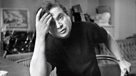
Francis Bacon: Painting and the mysterious and continuous struggle with chance
12.23.2013
06:10 pm
Topics:
Tags:

nocabsicnarfbw.jpg
 
Real painting for Francis Bacon was about a mysterious and continuous struggle with chance.

”Mysterious because the very substance of the paint can make such a direct assault on the nervous system; continuous because the medium is so fluid and subtle that every change that is made loses what is already there in the hope of making a fresh gain.”

Bacon believed when one talked about painting one said nothing of interest, it was all superficial. He believed it was best for a painter not to talk about painting. “If you could talk about it, why paint it?” he once said.

”The important thing for the painter is to paint, and nothing else.

“The most important thing is to look at the painting—to read the poetry, to listen to the music—not in order to understand it, or to know it but feel something.”

Yet, Bacon did talk at length about his paintings and his art. He claimed it was the Irish in him that made him so talkative. Much of what he said was recorded in a series of long interviews conducted with with the art critic, David Sylvester. These were later published as a book, and here in this documentary The LIfe of Francis Bacon they provide an exceptional background to understanding Bacon the artist and the man.

The documentary opens with Bacon’s idea of painting as a means to opening up areas of feeling, rather than merely illustration.

”A picture should be the recreation of an event, rather than an illustration of an object. But there is no tension in the picture unless there is a struggle with the object.

“I would like my pictures to look as if a human being had passed between them like a snail, leaving a trail of the human presence, a memory trace of past events, as the snail leave its slime.”

Bacon wanted to bring the sensation of life, what he termed “the brutality of fact,” directly to the viewer “without the boredom of conveyance.” To achieve this, he claimed he performed acts of violence on the canvas in a bid to make the pictures live. Bacon was a quick worker, turning paintings out in a few hours—compare this with the months Lucien Freud spent on a single canvas.

He took his ideas from everywhere—the colored plates in dentistry books; memories of his Nanny blurred with images of the slaughter on the Odessa Steps from Eisenstein’s Battleship Potemkin; paintings by Velázquez; his asthma, Bacon’s Popes were gasping for air, not screaming; paintings by Picasso; the sadism of his father; nudes taken by Vogue photographer John Deakin; endless photo-booth self-portraits.

Bacon painted his lovers and friends, and many self-portraits. These self-portraits became more frequent as his friends died,  many destroyed by their “gilded gutter life” of drink and excess.

”Between birth and death it’s always been the same thing, the violence of life. I always think [my paintings] are images of sensation, after all, what is life but sensation? What we feel, what happens, what happens at the moment.

“We are born and we die, and that’s it, there’s nothing else. But in between we give this purposeless existence a meaning by our drives.”

It’s rare to see as many gallery paintings by an artist in one documentary as there are contained in The Life of Francis Bacon, and it’s superbly complimented by the long extracts of Bacon’s interviews, these are read by Derek Jacobi, who memorably played Bacon in the film Love is the Devil.


Previously on Dangerous MInds
Notes towards a portrait of Francis Bacon
‘Fragments of a Portrait’: Classic documentary on Francis Bacon

Posted by Paul Gallagher
|
12.23.2013
06:10 pm
|
The Art of Parties: New York’s legendary 80s nightclub, AREA
12.20.2013
09:43 pm
Topics:
Tags:


There was, for slightly better than a decade, a “golden era” of insanely decadent, yet terribly smart and sophisticated New York City nightlife. For sake of argument, let’s say it began with Studio 54 opening in 1977 and ended in the late 80s due to several factors, including AIDS, the invasion of the “club kids” and the general financial difficulties of operating anything requiring significant amounts of space in such an expensive city. Some (arguably most) of it happened before my time, but I did get to personally experience a lot of it. When I was younger, I went out just about every single night. I felt like if I stayed in, I might miss something. At the time, this was most certainly true and I made it a point to try to cram in as many crazy experiences as I could. Quite successfully, I might add…

Although I can’t say that it was personally my favorite nightclub (the Danceteria was more what I was into, with hot girls my own age), I would have to say that AREA was probably the best or greatest New York club of the 80s, at least in my experience. Every six weeks, a team of about 30 artists and carpenters would work around the clock to ready the club for the opening of a new and quite elaborate artistic “theme” like “Red” or “Confinement” or “Suburbia.” To get across what a spectacularly mind-bending and magical place it was, here’s what I saw there, with my own eyes, coincidentally on my very, very first night as a “real” New Yorker:

I arrived in New York City in late November of 1984. After setting myself up in a (surprisingly decent) $50 a night hotel, I scanned the Village Voice for something fun to do, before deciding to go to the Danceteria. Not quite understanding what was the appropriate time to show up at a Manhattan hot spot at that age (I had just turned 19 and was in fact too young to even be there legally) I arrived too early, before practically anyone else had shown up. I sat on a couch and watched Soft Cell videos as the bar staff set up for the evening. Soon I was joined by a couple about my age—a sharp-dressed black guy and his blonde Swedish girlfriend. We struck up a friendly conversation and he revealed to me that he had cocaine—about a kilo’s worth—and did I want any? The answer to that was a resounding “Yes!” and he used a NyQuil cup to scoop out at least an eight-ball from a big ZipLoc bag and just handed it to me.

So this is New York, huh? I think I like it already!

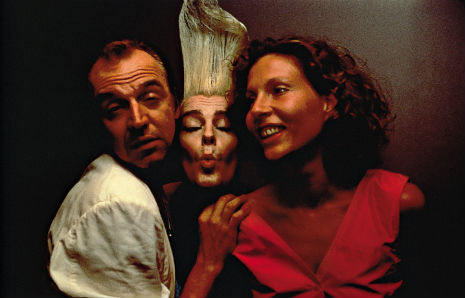
Soon we were joined by another pair of early birds, future “club kid murderer” Michael Alig—then a first year student at Fordham University in the Bronx—and a female friend. They, too, were offered some a lot of coke, accepted gladly, and Michael (who was later played by Macaulay Culkin in Party Monster) asked if we were planning to attend the opening night of AREA‘s “Faith” theme later?


I’d just gotten to town and had never even heard of the place. He insisted that he had the pull to get us all in for free, and that it was going to be amazing, so around midnight, we hopped into a cab to 157 Hudson Street, just below Canal, and disembarked into a teeming throng of people waiting to get in, waving their arms at the doormen, Day of the Locust style. True to his word, the sea of people parted and Michael got us all in for free (we were dressed weird so that helped), but as I was between the taxi and the door, I could see that there was a procession coming down the street, carrying a man on a cross with arrows—in my mind they were flaming arrows—in his stomach, like St. Sebastian. It was attention grabbing, I can assure you.
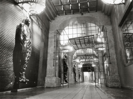


As you entered AREA, there was an impressive castle-like stone hallway, with windows on the right-hand side like you might see in a department store, but with works of art, displays, people, animals, performance art and all manner of things going on inside them. Soon the crucified guy was being carried down the hallway before he was ultimately deposited upright into a shark pool in the lounge. AREA‘s “Faith” theme saw the entire nightclub transformed into a gigantic gallery of campy religious iconography and spiritual irreverence (The bathrooms, notoriously unisex, I recall having video monitors with the Pope, Jim Jones and Jerry Falwell over the urinals at eye-level).


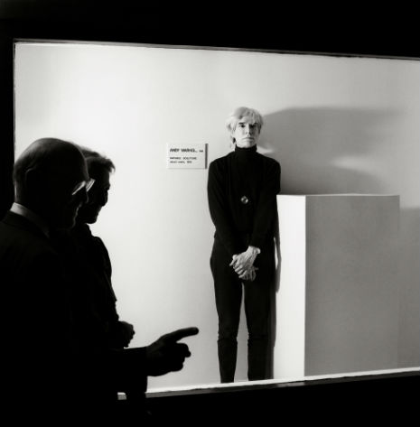
Utterly astonishing to me, Andy Warhol was there. Michael asked “Oh, do you want to meet Andy?” I said “Sure!” and he promptly pushed me at the great artist, from behind, as HARD as he could, with both arms. So hard that I nearly knocked Andy Warhol on his ass. (Luckily for me, Warhol had seen what had happened and directed his annoyance at Michael and not at me, so I was able to slink away, mortified, and move to another part of the club.)


The crowd AREA attracted was eclectic, to say the least. You had the freaks, the beautiful people, the up-and-comers, the semi-famous, the very famous, the very wealthy, fashionistas, artists, gallerists, professional liggers and hanger-oners, art students, rich Europeans, frat boy Wall Street-types (the ones who actually paid to get in and for their drinks) and just about any type of human being you can imagine, really. It was the sort of place where you could look around the room and see Joan Rivers, the B-52s, Boy George, Allen Ginsberg, Billy Idol, members of the Psychedelic Furs or Duran Duran, John Waters, John Sex, Ann Magnuson, Keith Haring, Jean-Michel Basquiat, David Byrne, Malcolm McClaren, Lauren Hutton, Matt Dillon, Federico Fellini, Barbara Walters, Peter Beard, Michael Anderson (the dwarf from Twin Peaks), Nile Rodgers, Stephen Sprouse, Steven Meisel, transsexual model Teri Toye, Calvin Klein, Sting,  etc, etc, etc, all potentially on the very same night. Their opening parties, especially, were not to be missed under any circumstances. Everyone in attendance knew there was no cooler place to be that night anywhere else in all of Manhattan, if not the entire planet.
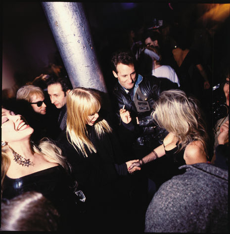


It was an extraordinary nightclub for an extraordinary time in New York’s history. The city was a wild, creative and dangerous (define that how you will) place then. AREA was a reflection of the best of what the city had to offer, a place where uptown wealth met downtown chic. It’s one of the longest-running, most brilliantly realized art projects—one pulled off by a small army of weirdos (many of AREA‘s hardworking artists were junkies), visionaries and money men—probably, I don’t know… ever. That they were able to sustain it for so long, night after night, theme after theme at such a high level creatively and then go out while they were on top makes it seem all the more remarkable.
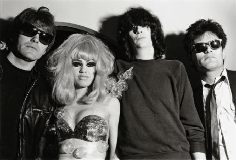


But as an art form, a party, no matter how legendary it becomes in the minds of the people who were there, is still a very ephemeral thing. Aside from memories, there are only photographs, videos and mementos left (AREA was well-known for their elaborate invitations. How I wish I’d have kept mine!). The multi-leveled social/artistic/business genius that was AREA has now been commemorated in what I’d rank as perhaps the very best art/art history book of the year. If you were there, Abrams’s AREA: 1983-1987 is a must and chances are that you already own it. If you weren’t there, it’s fascinating record of an amazing, once in a lifetime scene that will hopefully inspire some new crew to take on something this elaborate again one day. It’s a book with a cult audience, to be sure, but a cult audience that will absolutely treasure it.


Put together by AREA‘s Eric and Jennifer Goode, with an introduction by Glenn O’Brien, principal text by Stephen Saban (beyond a doubt the very best person for the job) and the photography of Volker Hinz, Ben Buchanan, Patrick McMullan, Wolfgang Wesener, Michael Halsband, Dana Buckley and others. On every level, I’d rate this publication a perfect 100/100, as a book (in literary, historical sense) and as a beautifully designed object.

More photos of AREA here.

Below, this John Sex video, “Hustle With My Muscle,” directed by the late Tom Rubnitz, is one of the few examples I can find of inside AREA on YouTube. The theme at this time would have been “American Highway” in 1986. Sadly, you really can’t get a sense of the size of the club from what you see here.
 

Posted by Richard Metzger
|
12.20.2013
09:43 pm
|
Amazing ‘sketchy’ furniture will make you look twice!
12.20.2013
08:11 am
Topics:
Tags:

fukawa 1
 
I will freely admit I got chumped. When these images of Daigo Fukawa’s Rough Sketch Products furniture started blowing up the design blogs over the last few days, I figured I was looking at photos of models digitally superimposed onto sketchbook pages, and, accordingly, I thought “meh.” But no, this is actual furniture, made of bent wire to resemble scribbles. Via Bored Panda:

Usually it takes a long way for a sketch to be turned into an actual product. Japanese designer Daigo Fukawa just might change all that, however, with his series of furniture called “Rough Sketch Products” that look like they’ve just been transferred directly from his sketchbook to reality. The project was submitted as Fukuhawa’s senior thesis exhibition at Tokyo University of the Arts.

Made from cleverly arranged wire and photographed with a perfectly blank background, his various benches and chairs trick our perception of dimensions. Suddenly, 2D meets 3D, and the people sitting on these unique scribbled creations seem to be levitating  in the air. It might not be the comfiest furniture out there, but it will definitely put a smile on your face.

It blew my mind all the more to learn that that this incredibly executed stuff is student work! I can’t imagine it’s something anyone not big into hairshirts would care to actually sit on for very long, but regardless, I now have a new and totally unrealistic dream: when I make my first million, I will hire Fukawa to remake a room in my house after a Cy Twombly painting.
 
fukawa 2
 
fukawa 3
 
fukawa 4
 
fukawa 5
 

Posted by Ron Kretsch
|
12.20.2013
08:11 am
|
Chihuahua skeleton made from old typewriter parts
12.19.2013
12:05 pm
Topics:
Tags:


I wish there were more photos of this chihuahua skeleton sculpture made entirely from typewriter parts by artist Jeremy Mayer. I wonder how big it is? Is it life-size? It must be.

According to Mayer’s Tumblr, he’ll be posting more photos of this piece in the next few days. Hold tight.

Via Boing Boing

Posted by Tara McGinley
|
12.19.2013
12:05 pm
|
Old-school Disney animator’s Christmas cards beat every cute viral card you’ve ever seen
12.19.2013
10:15 am
Topics:
Tags:

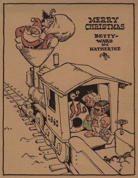
Ward Kimball Christmas card
1940
 
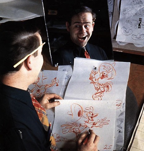
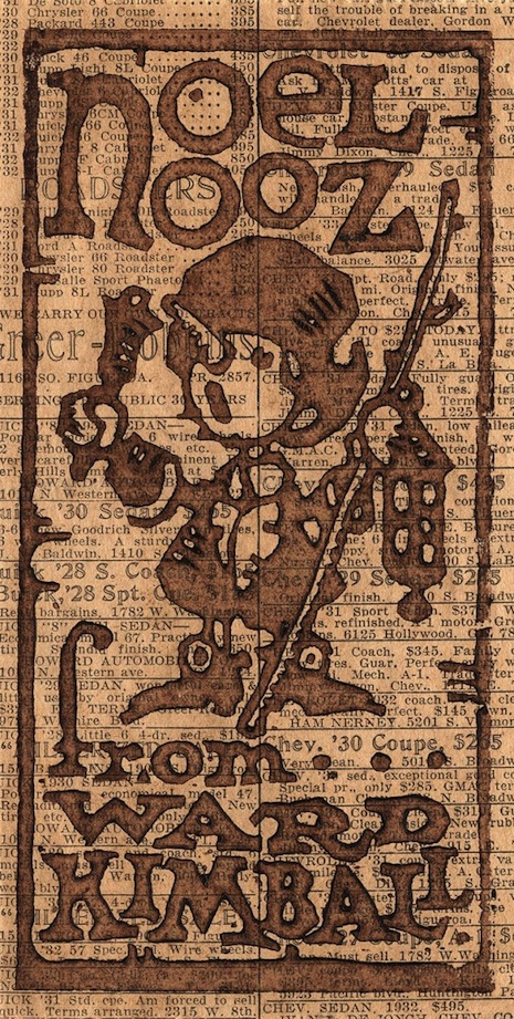
Let’s face it—if you want to see a top-notch Christmas card in action, it probably helps if you’re buddies with an old Disney hand or Chuck Jones or Tex Avery or somebody groovy like that. Ward Kimball was precisely that, one of Disney’s “Nine Old Men”, creator of Jiminy Cricket from Pinocchio and the Mad Hatter and Cheshire Cat from Alice in Wonderland as well as, surely, countless others.

Every year from the 1930s through 1966, Kimball would employ his unbeatable cartoonist’s arts to crank out a witty Christmas card. His cards were immensely popular, and his list of recipients ballooned to over 1,000 by the time he was done with it.
 
Ward Kimball
Ward Kimball
 
Imagine if you personally knew a top Disney animator, and imagine how awesome his Christmas cards would be—that’s exactly how great Kimball’s cards are. Frequent motifs include cute choo-choo trains, urchins, and trombones—in point of fact, Kimball himself played the trombone, as the Christmas video below vividly demonstrates. Most of the cards feature Kimball and his wife and children (where applicable—this changed throughout the years, of course) and starting in the 1950s the cards were more likely to include photographic montage instead of his ass-kicking draftsmanship skills. Either way his instincts for caricature and the sight gag were in fine form throughout the entire period under investigation.

Apparently (judging from the 1950 card), the Kimballs owned a cat named “Feets,” and we can only hope that they had a lion named Stanley, too, but I’m somehow less sure of that part.
 
Ward Kimball Christmas card
1936
 
More after the jump…
 

READ ON
Posted by Martin Schneider
|
12.19.2013
10:15 am
|
‘Truly’ awesome: Lionel Richie lyrics embroidered on discarded furniture
12.19.2013
10:02 am
Topics:
Tags:

Lionel Stitchie
 
The forlorn feelings elicited by unloved, unattached furniture just sitting around in some public place make them a fit canvas for the lyrics of a sublimely lofty balladeer like Lionel Richie, once of the Commodores. And it took probably the world’s biggest Lionel Richie fan—possibly ironically, although she isn’t giving the game away just yet—named Molly Evans to make the requisite connection.

This past summer, in part to amuse/annoy a Milwaukee neighbor, she started pillaging Lionel Richie classics like “Dancing on the Ceiling,” “Easy,” “All Night Long (All Night),” and “Hello” for pithy phraseology that she then embroidered on various sofas, mattresses, even a bumper pool table. Somewhat like the work of Barbara Kruger or Banksy, the massive yellow script writing—seemingly direct from the mind of Richie himself—makes for an arresting spectacle on an otherwise ordinary boulevard.

You can see more of Evans’ “Lionel Stitchie” artworks or follow her blog.
 
Lionel Stitchie
 
Lionel Stitchie
 
More after the jump…
 

READ ON
Posted by Martin Schneider
|
12.19.2013
10:02 am
|
Page 198 of 380 ‹ First  < 196 197 198 199 200 >  Last ›