FOLLOW US ON:
GET THE NEWSLETTER
CONTACT US
Punk posters from London’s legendary Roxy club
05.05.2015
01:01 pm
Topics:
Tags:


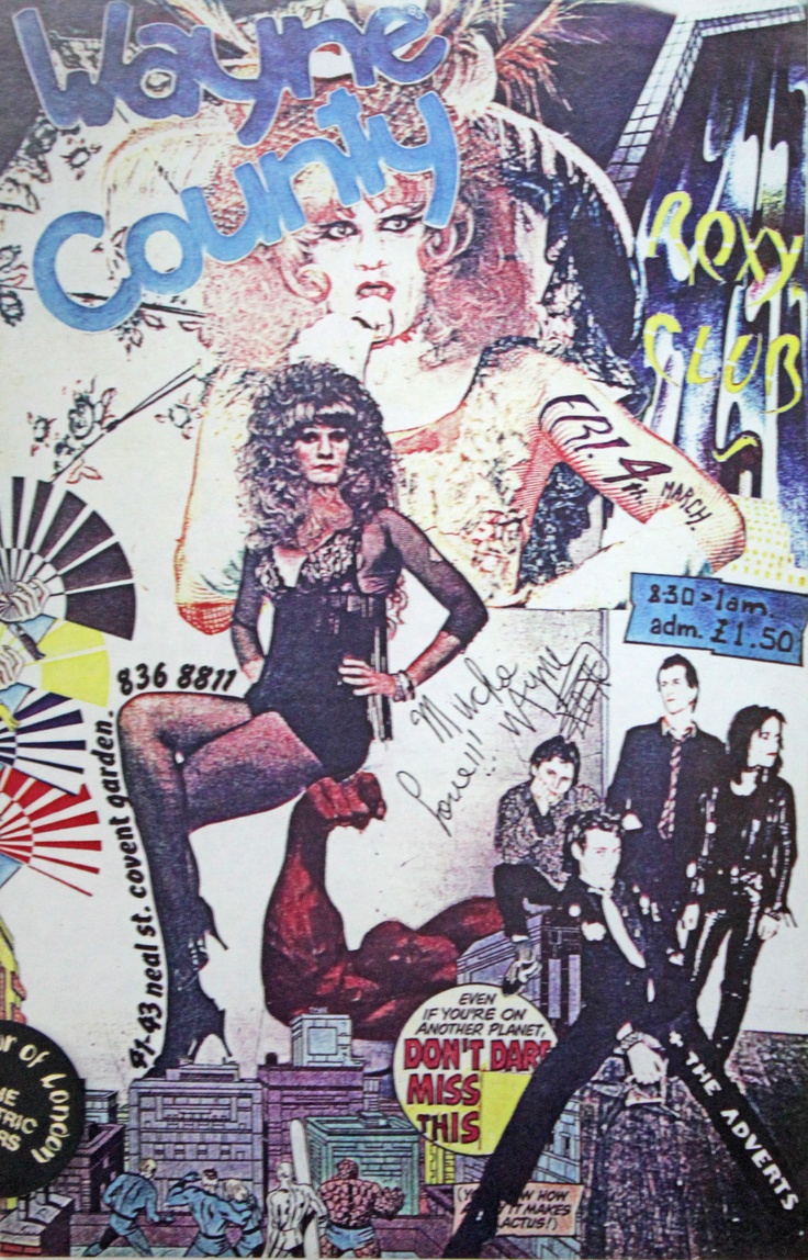
Barry Jones: “They all loved the posters. Wayne County signed his. Everybody wanted copies so I went back for a reprint.”
 
Barry Jones was one of the three founders of the Roxy in Covent Garden at the very end of 1976 and the start of 1977; the other two were Andrew Czezowski and Susan Carrington. The Roxy famously lasted less than two years and had an especially awesome start, featuring many of punk’s greatest acts in a very short time, including Wire, X-Ray Spex, XTC, the Damned, the Jam, the Police, the Adverts, Buzzcocks, Sham 69, Siouxsie & The Banshees, the Slits, and the Vibrators.

After the Roxy closed, Barry Jones joined the London Cowboys, who stayed intact through 1986.

If you do research about the 1970s with any regularity, as all DM contributors do, it becomes immediately apparent how ubiquitous black-and-white photography was and how expensive printing in color must have been. One of the aspects that makes Jones’ gig posters so marvelous is that, in addition to being totally too much and overwhelming the onlooker with visual data, they’re just full of brimming color. Not suprisingly, they were supposed to be in B&W too, as Jones revealed in the pages of The Roxy London WC2: A Punk History by Paul Marko:
 

I loved color and I loved collage. I loved Andy Warhol and I loved the mass production thing. I’d found the place on Regent Street where Bowie shot that cover of Ziggy Stardust in the telephone booth right near the Xerox copy place. There were very few copy places around at that time—colour copiers anyway. We found this place that was conveniently near us and I did some paste ups. I was in love with magazines; if you went to my flat there were stacks and stacks of colour magazines from Vogue to colour supplements. I would go through them and pull out images I loved and the typefaces I wanted to copy. I had reams of references. At that time I was also really into Spiderman comics and their graphics. I loved the depth of feel that they got. I didn’t know what I was doing but I liked that the fact there was more to read in them than my earlier posters which were flat graphic.

When I came to do the posters it was just like a natural transition to me and include things I liked. So basically I slung together these collage things. The first three were for the Yanks. I liked them and they were gonna be B&W because that was all we could afford at the time; we weren’t making that much money. I remember going down to get them printed. I ran them through the B&W copier and they were pretty disappointing and I thought just for me I’ll do a colour one and that was it. Boom! Off the page it was phenomenal. and I just made the decision on my own that these were going to be colour. It’s a special gig; it’s the Yanks, it’s the Heartbreakers. They were expensive and had to be strategically placed rather than smothering the town.

 
(If available, clicking on an image will spawn a larger version.)
 

Cherry Vanilla: “That vibrator was drawn in. It was actually a microphone in my hand, but they made it into a vibrator. I had no control over that, but I didn’t mind it. I was sexual and I didn’t mind being portrayed that way.”
 

Jones: “Leee Childers was so gracious because I’d spelt Heartbreakers wrong. I had this kind of dyslexic thing where I would do a layout and one in ten I would do a misspell. I spelt it ‘Heartbrakers’... He was so gracious saying ‘it doesn’t matter they’re beautiful.”
 
More of Barry Jones’ posters from the Roxy, after the jump…

READ ON
Posted by Martin Schneider
|
05.05.2015
01:01 pm
|
Behold, the Tittygram: ‘Our boobs. Your message.’
05.04.2015
03:13 pm
Topics:
Tags:

Tittygram
 

Thanks to Russian start-up Tittygram, you can now buy ad space on the voluptuous rack of a faceless model, because (for some reason people in Russia still think) sex sells.

Its titillating tagline is “Our boobs. Your message.”

For $10, individuals can have something deep and meaningful scribbled on the exposed nipple-free chest of an anonymous woman ($30 for businesses) within an hour. Self-described as the “Uber for Boobs” (Boober?), Tittygram sounds more like a fly-by-night “Fotomat for Jugs” to me.


Too rich for your blood? “TigerPaws” is doing the same service on Fiverr for $5/message.

via Rocketnews24

Posted by Rusty Blazenhoff
|
05.04.2015
03:13 pm
|
Bizarre ‘wrestling promo style’ TV ads for ‘80s radio stations featuring LA punkers, Fear
04.15.2015
09:15 am
Topics:
Tags:


One of the most antagonizingly offensive bands to come out of the early ‘80s US punk scene was Fear. Their legendary performances in Decline Of Western Civilization and on Saturday Night Live helped bring them up from the underground, giving them their fifteen minutes in the mainstream spotlight. Lead singer, Lee Ving, was able to parlay that fifteen minutes into a modest acting career, appearing in Get Crazy ,Streets of Fire, Dudes, Clue, and most famously in Flashdance.


Fear turned up in some strange places in the ‘80s—a time when punks on TV or in movies were generally fakey cartoon caricatures of the real thing. The crucial reference, Destroy All Movies!!! The Complete Guide to Punks on Film, is an excellent resource in studying the ridiculous “punxploitation” in ‘80s media. Fear racks up no less than fifteen entries in that tome.

Now, one could argue that Fear themselves had a bit of a cartoonish image to begin with, but it’s still rather bizarre that some ad agency thought it was a good idea to hire them to do this series of “pro-wrestling promo” style ads for a chain of radio stations. These were top 40 stations, so it’s unclear what audience the advertisers were trying to appeal to by putting Fear on TV. Especially for the time and context, these are simply weird.


More Fear after the jump…

READ ON
Posted by Christopher Bickel
|
04.15.2015
09:15 am
|
Anti-gay pizzeria bitchslapped mercilessly on Yelp
04.01.2015
02:57 pm
Topics:
Tags:


Ohhh boy. Yesterday, when Crystal O’Connor said that her family’s restaurant, Memories Pizza, in Walkerton, Indiana, would be obliged to deny a request to cater a mozzarella-themed wedding reception for a gay couple due to their religious “beliefs,” she surely didn’t anticipate the wrathful response on social media by homosexuals and/or fans of civil rights and “the American way.” Given that Memories is a local restaurant that serves pizza, the natural social media venue for a vigorous response was Yelp, the website that publishes crowd-sourced reviews of local businesses.

That response has been intense indeed—and hilarious:


The overall rating for Memories, at this writing based on 1,127 reviews, is hovering at about 1.5. Of course, not all of the people glomming onto the site are out to attack Memories; like Chick-fil-A, it has plenty of defenders too.

And lest we forget, Yelp allows reviewers to upload pics as well. Interestingly, there are currently fewer pictures than just a couple of hours ago, so Yelp or someone is seeking to remove the obvious trolls. Here, check some out:


via Salon
 

Posted by Martin Schneider
|
04.01.2015
02:57 pm
|
When The Hound from ‘Game of Thrones’ sold breakfast cereal
03.27.2015
09:29 am
Topics:
Tags:

00scotrorthronehound.jpg
 
Long before Rory McCann became internationally known as scarred, brooding hardman “The Hound” Sandor Clegane in Game of Thrones, he was the pin-up poster boy for Scotland’s traditional breakfast cereal Scott’s Porage Oats.

“Porage Oats” is a brand of porridge that takes its name from the Scottish word “poray” and the French word “potage”—hence porage. While porridge has long been a Scottish dietary staple, often providing breakfast, lunch and dinner, Scott’s Porage Oats has been household favorite since the late 1800s. A welcome winter-warmer, Scott’s Porage Oats is instantly recognizable with its distinctive packaging of a Highland laddie in kilt and vest putting a shot.
 
00123sctoats.jpg
 
This iconic image was first added to the packaging in 1924, and it has been suggested that the figure was modeled on a soldier from the King’s Own Scottish Borderers, whose barracks were not far from Scott’s oat mills in Edinburgh. According to their website:

This figure of strength, health and vitality has changed only a little over the years as fashion conscious and enthusiastic Marketing Managers have lengthened and shortened his hair, and occasionally, very controversially, his kilt.

With his Sean Conneryesque good looks and powerful build, McCann was the ideal actor to bring this trademark figure to life. In 1999 he was cast as the ever-helpful Highland laddie in a series of adverts.


What Scotsmen wear under their kilts and more top shelf entertainment, after the jump….

READ ON
Posted by Paul Gallagher
|
03.27.2015
09:29 am
|
Lose all your money to an Ellen DeGeneres-themed slot machine
03.26.2015
03:49 pm
Topics:
Tags:


Ellen DeGeneres is so very likeable that nobody is going to mind at all that she stands to make a huge wad of moolah from the what can in many cases be presumed to be the problem gambling habits of thousands of lower-income Americans.

When your face is on a device that will be used to vacuum all the spare change out of patrons’ pockets, you can’t exactly hide the fact. Ellen announced the new machines last year on her site. Her website also has a “finder” so you can make your way to the slot machines more easily. There are currently four in the San Francisco area, five in the Los Angeles area, two in the Chicago area, and so on.

“From the first spin of the reels, the famously familiar Ellen theme song emanates from each game and players are transported to the set of their favorite TV hour,” says International Game Technology, which its website identifies as “the industry’s leading manufacturer of gaming machines.” Phil O’Shaughnessy, director of Global Corporate Communications for IGT, said the following:
 

If you think about the show, there are so many icons from the show, be it the red chair, the sunglasses, even the boxer shorts. They really lend themselves nicely to a video slot environment. The other thing is, Ellen’s all about laugh dance play, and we really embrace that concept, realizing that some of the elements, such as “Know or Go” or “Wheel of Riches,” would actually make excellent bonus rounds in a slot environment as well.


There are actually three Ellen-themed games, “Ellen’s Dance Party,” “Ellen’s Know or Go” and “The Ellen DeGeneres Show 12 Days of Giveaways.”

“Casino gambling expert” Al Moe hilariously opines that “the huge Ellen photos are a bit creepy, as her eyes seem to follow you around the slot floor.” However, the San Francisco Chronicle reported yesterday that the new machines are a hit, “drawing crowds”—a representative from some casino indicated that “it’s not unusual to see a crowd standing around the machines, laughing at what transpires while people play,” according to the Chronicle.


via SFist
 

Posted by Martin Schneider
|
03.26.2015
03:49 pm
|
¡Películas muy locos, ay caramba! The awesomely lurid art of Mexican B-movie lobby cards
03.26.2015
09:34 am
Topics:
Tags:


I don’t think I’m too far out on a limb in assuming that John Cozzoli probably has a completely amazing house. Cozzoli collects 20th Century monster movie ephemera, and he’s the best kind of collector—the kind who shares. He curates the online archive Zombos’ Closet, a vast trove of endearingly cheap thrills, including movie and book reviews, and scans of his collections of cinema pressbooks, goofy paper-cutout Halloween decorations, and his amazing collection of Mexican lobby cards from B-grade films. If you have time to descend into a serious rabbit-hole of marvelous trash-culture nostalgia, visit that site just as soon as you possibly can and revel in its contents. And if that’s not enough for you, Collectors Weekly ran a terrific in-depth interview with Cozzoli in 2012. But for now, enjoy some samples from his lobby card collection. This barely even scratches the surface of what he’s got to offer on his site. I went mostly for lurid horror, but he’s got TONS of luchador movie art, as well.

Cozzoli:There’s a mistaken belief that having a big budget guarantees a good movie: It doesn’t. Many movies with modest budgets have outdone movies with bigger pockets to draw from. I love seeing how creative a director and set designer can be when faced with limited resources to work from. Horror movies were originally A-listers, drawing notable actors and production teams. Over time they switched to B and C status as the studios realized they could still make a profit on a cheap movie. Even the bad movies sometimes show a sparkle of wit or style or dramatic directness that makes them enjoyable to watch.

While many Mexican lobby cards promote American movies, they also made cards for Spanish-language movies, often illustrated with vampires, witches, and mummies; Japanese movies, like those made by Toho Studios; and other non-Spanish-language movies. Really, just about any movie that could be shown in a local theater, foreign or domestic, had cards done for it. If the lobby cards were done for American or other non-Spanish-language movies, the compositions usually derive to some degree from the movie’s poster campaign, so these cards tend to be more, let’s say, sedate, and tone down the sex and mayhem. Spanish-language lobby cards are usually more vibrant and suggestive.

Monster kid and movie historian Professor Kinema (Jim Knusch) was the person who turned me on to these wonderful examples of movie promotion for theaters. It was while perusing his collection of lobby cards and pressbooks that I fell in love with both. One reason I focus on Mexican lobby cards is because at $5 to $10 a pop, they’re a lot cheaper than American cards, making them easier to collect. Additionally, Mexican cards for native Spanish movies are usually more colorful and dynamic, and the Mexican cards come in larger sizes, which make them more interesting and displayable.


Devil Bat’s Daughter, 1946
 

She Demons, 1958
 

The Phantom From 10,000 Leagues, 1955
 
More after the jump…

READ ON
Posted by Ron Kretsch
|
03.26.2015
09:34 am
|
Taco Bell’s weird-ass Orwell ripoff, complete with totalitarian clowns (yes, you read that right)
03.24.2015
01:32 pm
Topics:
Tags:


For their new ad campaign “Routine Republic,” Taco Bell has produced a mini-movie lasting three minutes that steals from ... well, you name it.  Just off the top of my head, it cribs from The Hunger Games, Insane Clown Posse, Terry Gilliam’s Brazil, George Orwell’s Nineteen Eighty-Four and Animal Farm, Divergent, Apple’s “1984” ad campaign, and any number of David Fincher movies.

You’d have to be a semiotics Ph.D. to uncover all the layers of mendacious allusion and outright theft going on here. If nothing else, it’s a contender for the “Protesting Too Much” Hall of Fame. See, the idea is that if you are eating yummy McGriddles from McDonald’s or delectable Croissan’wiches from Burger King for breakfast, you’re a brainwashed drone who needs to be liberated by ... an A.M. Crunchwrap from Taco Bell (which admittedly also sounds yummy). Yes, you read that right: a delicious Croissan’wich and you’re a soulless drone; a delicious A.M. Crunchwrap and you’re a hipsterish free spirit with the ability to cavort in the streets of Prague, perhaps and eventually open an artisanal and/or steampunk moustache wax boutique (I have nothing against hipsters, I’m just reading into the ad). Never mind that the most powerful electron microscope on earth wouldn’t be able to detect any ideological difference between a McGriddle and an A.M. Crunchwrap.

Sticking with the Orwell tip, the commercial repurposes the “four legs good, two legs bad” formulation of Animal Farm into the totalitarian regime’s “circle = good, hexagon = bad.” I could hardly write that with a straight face, it’s so stupid. So that’s right, fealty to a round shape is bad but the one with the six equal sides is good. The ad’s Winston Smith finds his Julia as they wait on line for their Victory Gin, er, a round breakfast sandwich, lock eyes, and escape together to the land of Borat-ish un-corporate-ness. Just to make sure you don’t miss the point, the Ramones’ “Blitzkrieg Bop” kicks in at the moment of maximum individualism. Because it takes an individual to appreciate the world’s most universally beloved punk band, right?


Oh yeah, the clowns, I almost forgot. All the authority figures in “Oceania” or whatever have clown makeup on. Because McDonald’s corporate logo is a guy in a clown suit and you know, fuck that guy.

One touch I did like is that the evil kingdom is surrounded by a moat that is actually a drab ball pit, which is mostly associated with McDonald’s Playland. Of course, trying to demonize a wonderful, fun ball pit for children has to rank down there with the worst things any advertiser has ever done, but you know, all’s fair in love and breakfast war.
 
The ad itself, after the jump…

READ ON
Posted by Martin Schneider
|
03.24.2015
01:32 pm
|
‘Separate Cinema’: Unsettling and gorgeous posters from the age of segregated movies
03.20.2015
02:16 pm
Topics:
Tags:


Birthright, 1939. A black Harvard graduate confronts racism.
 
The images on this page come from a remarkable book that came out late last year, Separate Cinema: The First 100 Years of Black Poster Art, by John Duke Kisch; it’s an incredibly wide-ranging look at the posters of “black cinema” writ large, a category that includes not just the “race films” shown here but also Birth of a Nation, earnest Hollywood dramas, The Jazz Singer, Blaxploitation flicks, South African movies addressing apartheid, breakdancing movies from the 1980s, and much more. The book’s credibility couldn’t be greater, insofar as Henry Louis Gates Jr. supplies the foreword and Spike Lee the afterword.

The posters depicted here tell a tale of true segregation, a “separate but equal” industry, so to speak, that served up gripping melodramas to its chosen audience just as surely as Warner Bros. did for white audiences. The undisputed master of this period is Oscar Micheaux, who directed a couple of these movies. By Kisch’s lights “the most successful early black independent film producer and director,” Micheaux was the son of a Kentucky slave before working as a railway porter and homesteader; around World War I he started directing and producing movies, of which he directed more than 40 before he was done. Kisch describes his basic formula as follows:
 

Micheaux’s features were usually far superior to those made by other independent black studios, largely because he took a familiar Hollywood genre and gave it a distinctive African-American slant. Committed to “racial uplift,” he cast black characters in non-stereotypical roles, as farmers, oil men, explorers, professors, Broadway producers, or Secret Service agents.  … He brought to the screen diverse social issues that faced black America, and also portrayed an ideal world in which blacks were affluent, educated, and cultured. In the 1930s, his films represented a radical departure from Hollywood’s portrayal of African Americans as jesters and servants.

 
In our age, posters like this are simultaneously dazzling and upsetting, almost as taboo as the interracial drama The Exile (below) was in its day. Underlying so much of the rhetoric surrounding the racial situation in America is the understanding that all those bad things belonged to and are limited to the past; the horrors of Ferguson, Staten Island, Cleveland in 2014 showed everyone that no such assumptions are safe—even as Steve McQueen’s 12 Years a Slave (it’s included in the book too) both harks back to these unsettling movies and signals the potential for lasting change. 
 

Bosambo, 1935. British District Officer in Nigeria in the 1930’s rules his area strictly but justly, and struggles with gun-runners and slavers with the aid of a loyal native chief.
 

Black Gold, 1928. A town abandons its previous ways of life for the glamour and drama of the oil drilling trade.
 

The Flying Ace, 1926. A veteran World War I fighter pilot returns home a war hero and immediately regains his former job as a railroad company detective.
 
More after the jump…

READ ON
Posted by Martin Schneider
|
03.20.2015
02:16 pm
|
Sexist nightmares from real casting websites
03.13.2015
11:20 am
Topics:
Tags:


Two things that almost any amount of media consumption should teach even the most obtuse viewer: (1) Most everyone on TV and in movies is crazy attractive, and (2) Men get the lion’s share of the good parts. Combine those with a soupçon of ageism and you have instantly created a toxic environment in which only sexy, young women are likely to be cast in any given role.

If TV shows and movies are going to end up that way, some or most of those tendencies have to be made explicit during the creation of the product, and casting is one of the primary places that happens. In our world you can’t just say out loud that a woman’s bra measurement matters more than her acting ability, .... but sometimes casting agents do it anyway!

A new Tumblr called Casting Call Woe has smartly decided to shine a spotlight on this odious side of the entertainment industry. Sometimes the sentences are amusing, like the way they try to put a positive spin on “We’re looking for a hot bimbo to play this professor,” but a couple of them are super creepy.


More of these groanworthy examples from real casting websites after the jump…

READ ON
Posted by Martin Schneider
|
03.13.2015
11:20 am
|
Page 13 of 29 ‹ First  < 11 12 13 14 15 >  Last ›