FOLLOW US ON:
GET THE NEWSLETTER
CONTACT US
Kooky Simon & Garfunkel ad from 1967: Art is a lion, and Paul is a panda
06.06.2014
11:12 am
Topics:
Tags:

At the Zoo
 
I stumbled upon this fantastic image in an extremely thoughtful and well-written article by Richie Unterberger on “folk-rock findings” that the Rock and Roll Hall of Fame posted a few days ago. After assessing some fascinating magazine ads featuring Bob Dylan, The Byrds, Gene Clark, and Janis Ian, Unterberger ends with a real corker, a full-page magazine ad from March 1967 promoting Simon & Garfunkel’s then-new single “At the Zoo,” off of their album Bookends, complete with cute little “panda-Paul” and cute little “lion-Art” in the foreground.

Writes Unterberger:
 

Here’s guessing Paul Simon and Art Garfunkel did not see or approve this ad before it got printed in March 1967. Maybe Garfunkel wouldn’t have minded being cast as the lion, but it’s hard to see Simon being pleased to be the panda.

 
I suppose Unterberger could have a point here, but I don’t think so. First of all, the song ain’t exactly “Bridge Over Troubled Water,” it’s “At the Zoo,” one of their more whimsical, not to mention kid-friendly, ditties. Second, Simon & Garfunkel weren’t idiots: they were and are creatures of commerce as well as of art, and they probably weren’t all that opposed to whatever approach would land them the biggest hit. (For the record, it reached #16 on the U.S. charts.)

Third, and most important, that image wasn’t limited to print advertising by any means—it was the cover of the single! Did they have no control over this image, after three successful albums and the Graduate soundtrack?
 
At the Zoo
 
Well, either way you should still read Unterberger’s article. He makes a lot of good points about the evolution of the marketing of folk-rock during that period.

Here’s a wonderful clip from the UK of S&G performing “At the Zoo” for what seems like a TV audience, but it’s obviously being performed live, not lip-synced. 


Posted by Martin Schneider
|
06.06.2014
11:12 am
|
Buddy Rich for Synsonics drums
06.03.2014
09:24 am
Topics:
Tags:


As the Big Band era in Jazz fades into ever more distant memory, the great drummer and bandleader Buddy Rich may now be almost as famous for the time he was taped being a massive, massive dick to his band as he was for his playing. But his drumming WAS mindblowing—powerful and explosive yet uncannily precise, and this from a player with no formal musical training. Few, if any, other drummers have been the subject of a release devoted entirely to 70 minutes of excerpted solos.

So it was a pretty funny incongruity to see this old commercial with Rich plugging Synsonics drums, an early ‘80s synth drum pad set made by Mattel and sold in toy stores. Their “snare” sound brought to mind a box of Fruity Pebbles landing on linoleum after falling from a high shelf, and the “cymbal” sounded like ball bearings rolling around in a hubcap. The tom and bass sounds verged on Kraftwerky, in a close-but-no-cigar kinda way. Their odd sounds did nothing to diminish their charms as toys, though, and of course they have their champions. They sell for $50-100 on eBay, which is probably worth it if you know how to circuit-bend.


Thanks to Sam Harmon for this find

Posted by Ron Kretsch
|
06.03.2014
09:24 am
|
‘Ashes of Doom’: This ‘Dark Shadows’-inspired 1970s anti-smoking PSA makes me want a cigarette
06.02.2014
10:22 am
Topics:
Tags:


By the time this national Film Board of Canada anti-smoking PSA came out in 1970, Dark Shadows was already so popular it had begat a Canadian copycat, Strange Paradise. I’m not knocking it, by the way. Strange Paradise definitely retains some of the charm of its predecessor, and I’d recommend it wholeheartedly for fans of DS. I’m just saying it’s difficult to believe that “Ashes of Doom” wasn’t intentionally parodying the creepy/romantic style of those supernatural soap operas. (The short was created by Don Arioli and Grant Munro, by the way—Munro created “Toys,” the brutal stop-motion short made from GI Joes.)

While I applaud the Canadian government’s sense of humor (and their awareness of the latest trends!) there are a couple of reasons why I don’t think this film stopped anyone from smoking. First of all, the one minute and 55 second short starts with 53 seconds of credits—that’s definitely time enough light up, or at least resent the film enough to want to smoke out of spite. Second of all, while it’s a good bit of slapstick, the minute-long skit doesn’t really show any negative connotations of smoking. It ends with the protagonist’s smokey lungs mildly inconveniencing a vampire, which would actually be a really excellent incentive to smoke if you were a Gothic soap opera heroine. O Canada, what you lack in effective public health initiatives, you make up for in good-natured satirical farce.
 

Posted by Amber Frost
|
06.02.2014
10:22 am
|
HOW did McDonald’s get such a shitty new mascot? (A ‘true enough’ story)
05.27.2014
12:20 pm
Topics:
Tags:


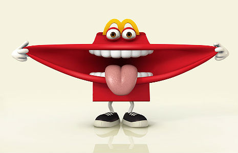
According to McDonald’s website...

McDonald’s USA is offering guests new reasons to feel good about the fun and the food at McDonald’s with the addition of a new yogurt side option for kids and a Happy Meal brand ambassador.

This terrifying new brand ambassador is called “Happy” (which, of course, is only coincidentally the same name as Pharrell’s ineluctable juggernaut). On the twitterverse people are already joking that “this is the meal that eats you!” and so on. It’s a pretty hilarious example of corporate self-hypnosis.


Perhaps you’re wondering: How on earth did they ever think that box with teeth would do anything but terrify children? Well, as a denizen of big corporate culture for a number of years now, I’ll bet I can take a pretty good guess at what happened:

1. Several years ago, an older, very high-level McDonald’s exec figured that the Ronald McDonald character was getting a little dated. A little long in the tooth. Even Ronald’s break-dancing and fist-bumping was getting old. So he called a meeting with a bunch of the young energetic MBA sub-execs and commanded them in no uncertain terms to come up with something “new” and “hip” because the public was no longer being charmed by the sight of a ginger clown selling them processed meat products.

2. Hoping the older exec would eventually forget, the MBAs commissioned a series of marketing studies that, a couple of years and a few millions of dollars later, culminated in some zany, purple, googly-eyed mascot that, while not exactly registering off-the-scales consumer-wise, was not hated or despised either.

3. The MBAs showed the senior exec images of their proposed mascot along with specially-selected customer testimonials, but the exec hated the proposed mascot and told them to come up with something completely different.

4. Of course, the MBAs were out of ideas and a veritable parade of potential new mascots all tested in the single-digits customer-approval-wise. As the weeks and months went by and the senior exec grew more irritable, the junior execs grew more and more desperate, while maneuvering into trying to lay blame on each other for the delay as well as the crappiness of the original purple googly-eyed mascot. After a night of serious drinking, however, they grabbed a guy from the graphics department to help them. After a while, one of them suggested that they simply stick arms and legs onto a happy meal and use the “golden arches” as eyebrows. An enormous gaping maw was probably considered a little too scary-looking so they gave it teeth. Since it was well past midnight the MBAs agreed to work together to sell the idea to the senior exec, even if none of them was honestly all that hot on it.

5. The next day, fighting reasonably bad hangovers, the MBAs worked hard to sell their idea, claiming that “Happy” (as the new mascot was to be called) was not terrifying at all, but had “tested strongly in the key demographics” (of course, “tested strongly” meant fear, confusion, or out-and-out hatred, but they didn’t tell the senior exec that). They argued that “Happy” would be the centerpiece of a “surround sound” strategy and that Pharrell himself was days away from selling them exclusive rights to his song.

6. Though somewhat dubious, the senior exec was reasonably placated and gave approval to “Happy” as the new mascot. None of the MBAs, of course, really like “Happy” all that much so they’ve kept his introduction pretty quiet and, after a few months, will even more quietly phase ol’ “Happy” out.


And there you have it: The birth of a shitty corporate trademark.

And in case you’re wondering: Yeah, corporate culture really works like that.

Below, the WSJ weighs in on the controversial new McDonald’s mascot…

Posted by Em
|
05.27.2014
12:20 pm
|
Daft Punk’s eerily accurate retro magazine ads
05.19.2014
09:31 am
Topics:
Tags:

Daft Punk
 
Daft Punk might be the most aggressively “retro” act since Oasis, riding canny reappropriations of the 1970s disco sound to five Grammies a few months ago. I love “Get Lucky” just as much as the next guy, and I really have to hand it to the design geniuses who cooked up these incredible faux advertisements, done up in the style of ads you might have seen forty years ago in the pages of Rolling Stone, Playboy, or Cosmopolitan.

I can’t imagine a better melding of the cool, spacey Daft Punk (already retro) vibe and the smeary, confident, sexy steez of the era of cocaine, feathered hair, and trendy jeans. 

Even better, every one of the ads is promoting a specific Daft Punk product you can buy on their website, including a poster, a record player slipmat, T-shirts, a belt buckle, and so on, all available at grotesque markups.

The ads remind me a lot of these brilliant “ALT/1977: WE ARE NOT TIME TRAVELERS” ads that popped up a couple of years ago imagining iPhone, Nokia, and Nintendo products if they had been new in the 1970s.

If you’re having trouble summoning up images of the kinds of ads the Daft Punk is referencing, here are a few examples.
 
Daft Punk
 
Daft Punk
 
Daft Punk
 
Daft Punk
 
Daft Punk
 
Daft Punk
 
Daft Punk
 
via Retromania

Posted by Martin Schneider
|
05.19.2014
09:31 am
|
Bunny in a g-string promotes ‘bestiality’ animal campaigners claim
04.22.2014
10:39 am
Topics:
Tags:

11gynnub.jpg
 
An advertisement for a Swiss shopping mall has been condemned by an animal rights’ group for promoting bestiality. The Easter poster campaign for the St. Jakob Park shopping mall has a red g-string superimposed on a rabbit. Critics claim the poster sexualizes the animal, which links to bestiality and animal abuse.

Daniel Bader from the Swiss animal protection group told Tages Anzeiger:

“From our point of view, the respect of the rabbit has been badly damaged.

“This is a clear sexualisation of an animal. As far as I’m concerned, it heads in the direction of bestiality and it stinks of promoting animal sex and the sexual abuse of animals.”

I wonder what Herr Bader would make of Brian Griffin, Disneyland, Jessica Rabbit, or those annoying dogs that always hump your leg? Clearly, Fritz the Cat would give him a heart attack,

The manager of the shopping mall told Central European News that the images of attractive women “in bunny ears and fluffy tails were clichéd,” and he wanted to create something more humorous with a real rabbit.

However, according to The Independent, Swiss PR guru Klaus J. Stoehlker said the image was far more damaging to the lingerie company.

“If I was the boss of that Italian lingerie company I would take action over this advertising,” he said.

“I mean, who wants to see their sexy underwear stuck on such a fat rabbit backside?”

No comment…
 
Via The Independent

Posted by Paul Gallagher
|
04.22.2014
10:39 am
|
Slavoj Žižek: The Pervert’s Guide to Abercrombie & Fitch Catalogs
04.02.2014
10:07 am
Topics:
Tags:


From bed or from the tub, he will pontificate!
 
I’m not up to snuff on Žižek’s entire canon, but my favorite of his contributions (besides the time he told Occupy Wall Street not to fall in love with ourselves) is his insight into cultural capitalism—here’s an awesome little animated video where he lays it all out. I highly recommend it. The long and short of the talk is a sort of natural extension of Oscar Wilde’s socialist critique of charity. As Wilde points out that charity is used to atone for the fundamentally unjust system of capitalism, Žižek points out that we now try to atone for our consumerism by “voting with our dollar”—he uses Starbuck’s fair trade coffee and Tom’s shoes as two examples.

Basically, I’ve never been much on trying to evade the horrors of capitalism with “ethical consumerism.” For one, there’s just a dearth of “ethical” products left in this world, and two, you can’t dismantle a system simply by avoiding it. I usually say that telling a socialist to fight capitalism by not buying things is like telling an environmentalist to fight pollution by not breathing smog—both impossible and impotent. And I’m sure Žižek would agree. So this 2003 Abercrombie & Fitch catalog, featuring copy written by the Slovenian Marxist philosopher himself, comes as no surprise.

The work is a snide little reflection on lust and desire, and it’s a fucking riot—totally befitting the “Karl Marx meets Groucho Marx” style they requested, and certainly an idiom in Žižek’s wheelhouse. If you’re considering the possibility that he’s not totally fucking with you, rest assured, Žižek is a fan of absurdist humor. And in case you don’t believe me, I’ve included a video where he makes the “Lynchian” case for tulips as vagina dentata. Remember folks, there are no clean hands in a dirty world, and there are no clean minds in Marxism!


Via DIS Magazine

Posted by Amber Frost
|
04.02.2014
10:07 am
|
‘The Fatal Floor’: PSA battles scourge of killer throw rugs back in the 1970s
03.31.2014
09:12 am
Topics:
Tags:

Throw rugs
 
“Polish a floor, put a rug on it – you might as well set a man trap.” That line, which appears in “The Fatal Floor,” an amazing British public service announcement from the 1970s, is so much more enticing and dangerous and complex than ... anything else in the ad. I’ve watched it five times, and I’m no closer to figuring out how in tarnation it ever made it to air. Someone wrote this ad, found a suitable location, cast it, did makeup, there may have been multiple takes. There’s editing and even a noteworthy visual effect.

All to serve the purpose of ... warning the home viewer to be careful not to put a throw rug on a slippery hardwood surface.

That’s the peril they’re worried about…. throw rugs. I’m serious.
 
The Fatal Floor
“You might as well set a man trap.”
 
I have to admit, they did a good job. I’m throwing away all my throw rugs. But I’m going to keep those greasy rags right next to the gas range until I see a commercial telling me not to.


Posted by Martin Schneider
|
03.31.2014
09:12 am
|
We Make You Us: Larry Sultan and Mike Mandel’s strange and absurd guerrilla art of the 1970s
03.31.2014
08:33 am
Topics:
Tags:


We Make You Us (1985)
 
Due to some sort of cultural amnesia, Banksy is often credited as the innovator of politically conscious “guerrilla art,” but there have always been weirdos reclaiming public space for social critique. It’s tragic that Larry Sultan and Mike Mandel don’t even get a fraction of Banksy’s name recognition. Sultan and Mandel began collaborating as grad students in 1972, and in ‘73 they began pasting their prints on billboards in the Bay area—sometimes directly over actual advertising. The pair never became very well known outside of the art world, but in 2012 (three years after Sultan’s death) their work was collected for an art book, and now the Stephen Wirtz Gallery in San Francisco is running a retrospective on their Billboards.

The series is irreverent and kind of Dada, the images ranging from strange to absurd to banal, mocking consumerism and wealth with a snide humor. In a world of such high media density, you can imagine walking right past one and not noticing the billboard’s content. It reminds me a little bit of Sean Tejaratchi’s work from Liar Town USA, where he manages to imitate the design cliches with a hilarious accuracy. Of course, Sultan and Mandel’s work isn’t direct design parody, but the subversive farce of hiding in plain sight makes for a biting denunciation. 

A collection of Larry Sultan’s work is also slated to show later this year, at The Los Angeles County Museum of Art, and Mike Mandel continues to create beautiful works of public art.
 

Oranges On Fire (1975)
 

Electric Energy Consumption (1976)
 
More billboards after the jump…

READ ON
Posted by Amber Frost
|
03.31.2014
08:33 am
|
Before ‘The Simpsons,’ Matt Groening drew cartoons for Apple computers
03.28.2014
11:10 am
Topics:
Tags:


You might remember my post from a while back on Hunter S. Thompson’s truly weird Apple computer commercial, but I think I’ve found something to top it. Apple’s branding strategy has usually been to flatter those who fancy themselves “outsiders” or “rebels”—basically everyone in the entire world. But with this 1989 attempt to woo Generation Xers, the company took a more subtle approach, with a pamphlet illustrated by Matt Groening.

At the time, Groening had plenty of underground cred with his uber-angsty comic strip, “Life in Hell.” As the name suggests, the theme of his work was much more along the lines of “surviving post-modern desperation” than “hot blonde chucking a sledgehammer at Big Brother.” But Gen Xers had a reputation (whether earned or not) for capitulating to the daily grind, and Groening’s nervous, insecure art probably felt like a perfect fit for engaging with disaffected young people preparing themselves for the job market.

The brochure was passed out in college bookstores and in between the pages selling computers as the newest college necessity, Groening’s cartoons provided a few funny, self-effacing prototypes of disoriented students. I’m sure they kept prospective customers’ attention. Groening also did a couple of posters for Apple, including one titled “Bongo’s Dream Dorm,” a fantasy of college life for his “Life in Hell” lead character. Shortly after, The Simpsons took off, and Groening’s been free to mock Apple’s “culture of innovation” ever since.


Via Vintage Zen

Posted by Amber Frost
|
03.28.2014
11:10 am
|
Page 18 of 29 ‹ First  < 16 17 18 19 20 >  Last ›