FOLLOW US ON:
GET THE NEWSLETTER
CONTACT US
Barbie Swiss Army knife
08.18.2015
11:09 am
Topics:
Tags:


American parents have become increasingly nervous about sharp objects over the generations, and I think it’s time the culture eased up a bit. I’m not saying toddlers should be wielding machetes (although that is totally a thing in quite a few cultures), but a simple pocket knife was a pretty significant part of my own childhood (even if its actual use was limited to absentmindedly whittling sticks to points). At the same time, there are aspects of more traditionally “girly” toys that I think are great too, so why not combine them in one handy-dandy multi-tool/toy? Behold, the DIY Barbie Swiss Army knife, brought to you by Instructables user Mikeasaurus, who says of his unholy union:

Empower young girls to expand their horizons beyond playing with stereotypical gender reinforcing toys by combining a everyone’s favourite pink girl-centric doll with something a little stabby.

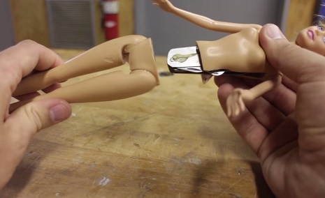
A multi-tool is hidden inside the torso of the Barbie, where the blades can be pulled out from a slit in her side. The body also separates at the waist to reveal a screwdriver hidden in the legs. The two halves of this doll are connected by magnets, so she holds together when fully assembled. Barbie never looked so good!

I doubt these are actually particularly safe for kids—a knife mounted in a doll’s abdomen is probably a bit less stable (and therefore more dangerous) than the knife alone, but it’s so darn cute and creepy, I may just have to make one to keep in my purse. You know… for protection.


Via Instructables

Posted by Amber Frost
|
08.18.2015
11:09 am
|
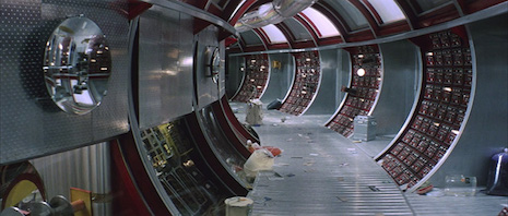
You can’t have sci-fi movies without corridors, lots and lots of corridors
08.14.2015
01:42 pm
Topics:
Tags:


Dune, 1984
 
Who hasn’t had the experience of chancing upon an unexpectedly empty passageway in a subway station or an airport and thinking, “Maaaan, they should really use this place for a sci-fi movie!”

I’ll bet you that Serafín Álvarez has experienced that feeling. He’s been running his blog Sci-Fi Corridor Archive since 2012, and in that time he has posted pictures of notable and not-so-notable corridors from a whopping 192 science fiction movies spanning the entire history of sound-enabled cinema (the earliest movie in the set is Yakov Protazanov’s Aelita, from 1924).

There really is something about corridors that seems to describe sci-fi in a way that wouldn’t be true of, say, westerns, gangster movies, gladiator movies, musicals, pirate epics, and hard-boiled crime flicks. Indeed, the image of a hermetically sealed passageway that clearly connects two other chambers floating precariously in space is very close to the heart of the sci-fi that we all know and love. 

In fact, I would argue that the witty 1999 classic Galaxy Quest was more or less commenting on this fact, seeing as how a good portion the scenes you probably remember best seem to take place in anonymous hallways.
 

Star Wars Episode IV: A New Hope, 1977
 

2001: A Space Odyssey, 1968
 

Alien, 1979
 

Flash Gordon, 1980
 

Solaris, 1972
 

Tron, 1982
 
Tons more excellent sci-fi corridors after the jump…....
 

READ ON
Posted by Martin Schneider
|
08.14.2015
01:42 pm
|
Antisocial skate decks fit for the coming apocalypse
08.12.2015
10:33 am
Topics:
Tags:

Black Metal Chicks skate deck series
“Black Metal Chicks” skate decks (art by Ben Horton)
 
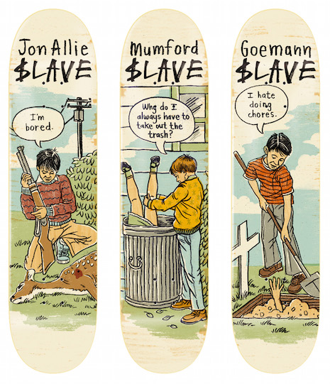
Pro skateboarders Jon Allie, Jon Goemann, Matt Mumford and Anthony Schultz are a few of the masterminds behind a series of skateboard decks decorated with in-your-face dystopian commentary and images. And I can’t get enough of them.
 
Antisocial skate decks
 
Working with Slave Skateboards (styled as $LAVE, a division of Black Box Distribution), each of the pro skaters contributed designs, to different collections over the last few years, and they are really something to behold in all their antisocial glory. In an interview with Thrasher Magazine back in 2010, Allie was asked about his widely perceived “negativity” and had this to say in response:

Yeah. I get that, but I guess I’m too straightforward. There was a time when 
I was probably a little too negative, but that was when I was younger. Fuck. I’m tough on myself, too. The negative comes out and I probably look like I’m being too negative. I have a really dry sense of humor. I laugh. All my friends know. But people who don’t know me are probably thinking, “What the fuck’s wrong with this guy?

Looking at the decks that follow, it’s not hard to conceive that a bit of negative energy was expressed during the creative process. But that is what makes them so fucking great. So strap on your helmet, it’s going to be a bumpy, slightly NSFW, ride.
 
Pet Peeve skate deck series
“Pet Peeve” skate deck series (art by Ben Horton)
 
End of the World skate deck
“End of the World” skate deck
 
Warmonger skate deck
“Warmonger” skate deck (featuring the infamous mug of Former Defense Secretary Donald Rumsfeld)
 
Sharing is Caring skate deck (From the
“Sharing is Caring” skate deck (from the “Helping Hand” series)
 
Always try to make new friends skate deck (from the
“Always try to make new friends” skate deck (from the “Helping Hand” series)
 
If you can't Beat them Join Them skate deck (From the
“If you can’t beat ‘em, join ‘em” skate deck (from the “Helping Hand” series)
 
A Good Citizen pays his debts skate deck (from the
“A Good Citizen pays his debts” skate deck (from the “Helping Hand” series)
 
Works well with others skate deck (from the
“Works well with others” skate deck (from the “Helping Hand” series)


Posted by Cherrybomb
|
08.12.2015
10:33 am
|
The Pantone Cafe, for the designer dork inside us all
08.10.2015
02:23 pm
Topics:
Tags:


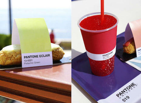
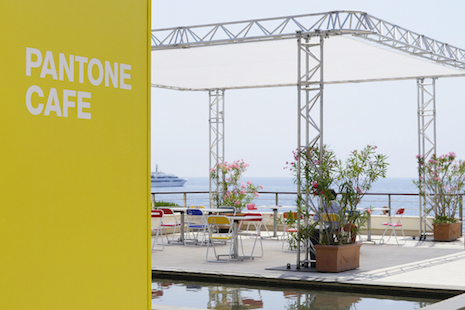
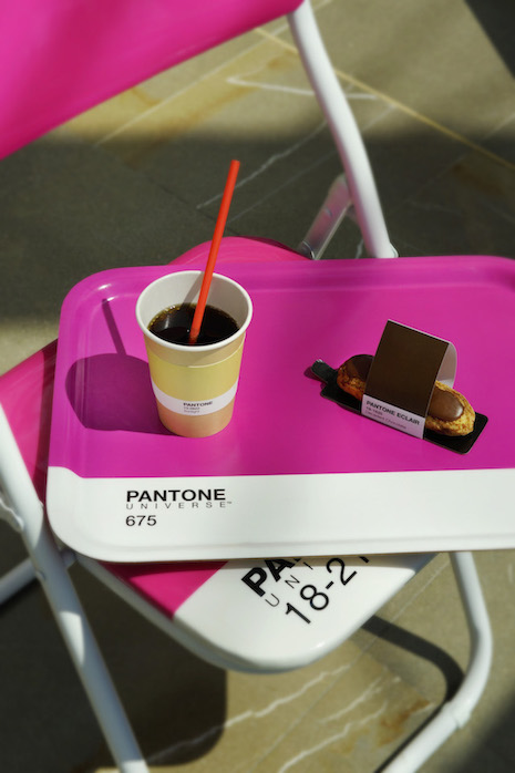
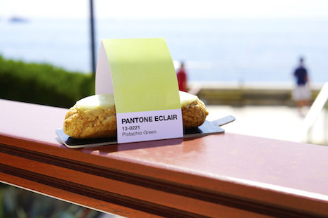
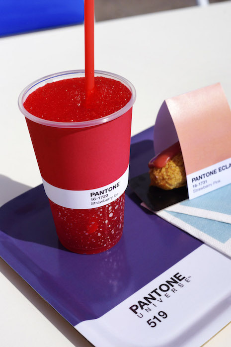
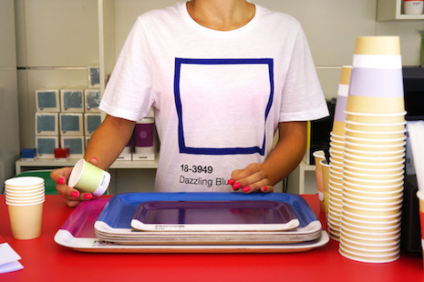
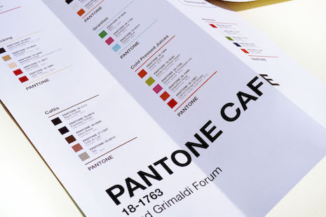
A café that organizes its offerings according to the Pantone color?  Yeah, it does seem like Monaco would be the kind of place where that could happen.

The Grimaldi Forum is a conference and congress center on Larvotto, the beach that dominates the northern section of Monaco.

On its website there is an oddly incomplete message that runs as follows: “Pantone Café, pour en voir de toutes les couleurs! C’est le bar de l’été au Grimaldi Forum… Venez vous rafraichir sous la pergola extérieure ou sous la grande verrière!”

Which more or less means: “Pantone Café, so you can see all the colors! This is the bar of the summer at the Grimaldi Forum ... Come refresh yourself in the outdoor pergola or under the glass roof!”

If you’re in Europe, hop on your #14-4809 Vespa and ride on over there for a delicious Tomato Red Mozza White #18-1660 sandwich or a Vibrant Orange #16-1364 juice!


via Internet Magic.
 

Posted by Martin Schneider
|
08.10.2015
02:23 pm
|
Wanna geek out over badass experimental color vinyl? We found the Instagram you’ve been waiting for
08.06.2015
10:48 am
Topics:
Tags:


So I have this friend, Heath Gmucs. Heath’s an extremely cool guy with an extremely cool job—since 2010, he’s run the presses at Cleveland, OH’s Gotta Groove Records, the record pressing plant near where I live. Somehow, and thank the gods for it, despite Record Store Day’s semi-annual pigpile of fake collectibles keeping pressers nationwide really damn busy all the time, he still manages to allot the time and resources to experiment, explore new techniques, play around with color, and generally just figure out what it’s possible to do with pressed vinyl as a visual medium. He often posts his successes on his Facebook page, and I always look forward to seeing his work whenever he has something new to show off. He does some utterly, brainfuckingly wonderful stuff.
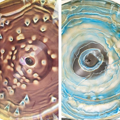


Heath, who served in the oughts as the bassist for the excellent band HotChaCha and currently plays in the also quite superb Goldmines, will tell you he’s not an artist, and with the utmost respect, I couldn’t disagree more. And indeed, in a perplexing but happy defiance of his own denial of artistry, he and his co-worker/protégé Sarah Barker have begun an Instagram called “Wax Mage,” devoted to their custom color vinyl experiments. The pair intends to soon establish Wax Mage as a boutique label dedicated to custom color pressings of curated V/A compilations, and to the sale of some of their exploratory test pressings as art objects—consider me first in line, bug-eyed, manically waving a wad of cash around when this happens. The vinyl renaissance of the last several years has been accompanied by a wider investigation into the creative use of the record press itself, and if you’ll forgive me for seeming biased in favor of a pal, Gmucs and Barker are doing some of the coolest work I’ve seen.
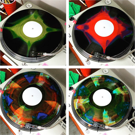


Heath was kind enough to take time out of his day to talk with DM about his work:

Dangerous Minds: You had a manufacturing background before Gotta Groove? I dimly remember at practice you mentioning factory work. (Disclosure: Heath and I played in a band together for ten weeks in 2008, which is a long story in itself.)

Gmucs: Yes. I’ve always done warehousing and manufacturing. When I found out that HotChaCha had their first record pressed in Cleveland, I just HAD to see the operation, I knew I had to work for GGR. Like I didn’t have a choice. They weren’t hiring so I lined up a “tour” of the factory and walked in with my resumé.

DM: Nice! So the record pressing industry is busy as hell lately. How do you even find the time to do so many experiments with color?

Gmucs: Vince Slusarz, the owner, is probably the coolest guy I know. He encourages it. Whenever we create a new cost effective/repeatable design he tries to sell them. The whack shit we’re doing now has been built on those early experiments, learning to do splatter and 1/2 ‘n 1/2 records in the early days. Those are like an industry standard, we want to set ourselves apart from the normal wax.

DM: Yeah, I have some splatter vinyl from the 80s, I know that pre-existed. But what you’re on about is totally different. I kind of had a light bulb moment when I got that incredible looking Unconscious Collective album and assumed you made it, and you told me you didn’t—I realized that you’re a part of something that’s happening all over your industry, now that plants are revving up again and there are younger techs doing that work, there are lots of new techniques that seem to be happening. But I wonder—since the technology of physically stamping out records one at a time hasn’t changed at all, why do you think that kind of experimenting you’re doing didn’t happen in the psych era? Seems like that would have been the natural time for all the crazy experiments to happen in vinyl! What’s different about today that it’s happening now as opposed to then?

Gmucs: Honestly, I think we’ve come from a digital era where nothing seems really tangible anymore. We are experiencing massive amounts of life from all over the world and never leaving our houses. That information and imagery is filling our brains but we still have nothing to hold. I think thats one solid reason for the comeback of the vinyl industry in general, but also a comeback for the artist, musician, and record buyer. It’s something to hold, to see, to hear. As a press technician putting out 5000 records a day I get a lot of crazy ‘what if’ thoughts—I still want to try to press a slice of Spam and eat it for lunch—what if I mix this color and that color, what if I don’t heat this material at all, what if I could make this record a different color on each side… No one at GGR has ever done anything like this before so I think that’s why Vince wants to push the limits. Record labels are asking the plants if they can do certain things with vinyl, I think that’s how it started really, with the labels wanting certain designs/colors and plants are responding to that.
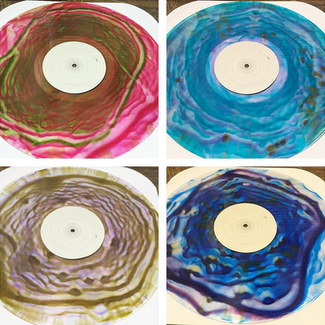


DM: Does some of it have to do with the quality of colored vinyl itself improving? I remember in the past it was always a truism that black was the high mark for sound quality, and you took your chances with color. But now color seems like half of what I can buy, it’s everywhere, and people are seeking out the most insane-looking stuff.

Gmucs: I think that back then it was more of a commodity and treated as such, like an assembly line, MAKE AS MANY WIDGETS AS YOU CAN AS FAST AS YOU CAN! I do think though that, chemically, the color formulas are better, allowing for better flow in the plates which equals better sound quality in the end product. The materials are still quite different from one another though, and it requires a lot of know-how to make them sound good together.

DM: I see, thus the need to make time for all the experimenting.

Gmucs: Yes, and what’s been happening lately is that people are requesting me to press for them and requesting a handful of whatever I come up with. That’s what really is allowing the experiments.

DM: Do you have a single favorite experimental color record you’ve ever pressed?

Gmucs: Yes, I have a fave. I can’t recreate it either, I’ve been trying for over a year. I made it for the band Mr. Gnome. I know exactly how I did it, but can’t make that design happen again like that.
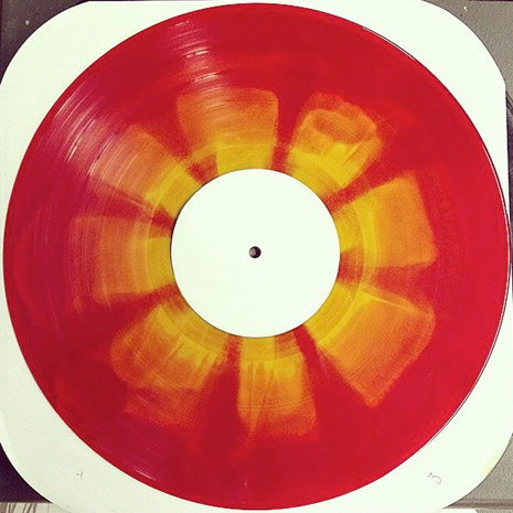


Um, hell yeah, if that was reproducible I’d probably request that, myself.

If you should happen to be getting records pressed at Gotta Groove, it’s possible to request that Heath or Sarah press your run and see what you get. It could very well be something like the following:
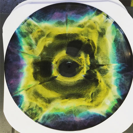


More wild-ass colorful vinyl after the jump…...
 

READ ON
Posted by Ron Kretsch
|
08.06.2015
10:48 am
|
The classiest bong ever will get you high as f*ck AND look fabulous with your Swedish furniture
08.05.2015
09:55 am
Topics:
Tags:


The slow process of mainstreaming cannabis in the USA is an ongoing source of fascination to me as a former, um, enthusiast. I’m aware of a minor reefer civil war going on between bong-ripping hippies who feel that as long-time champions of the green they’re the soul and standard-bearers of pot-dom, versus hash oil vaping professional types who, with some justification, see themselves as the mainstream face of cannabis that’s going to help win the acceptance of legalization that’s eluded the whites-with-dreads brigades, but whom the hippies see as usurpers of weed culture.

But I’ll score the new-school a point on this one: pipe and bong design has long been associated with juvenile eyesore bullshit for addled heads who evidently can’t function without seeing ALL THE COLORS AT ONCE. And while I’m glad such wares are keeping glass-blowers’ books in the black (my soft spot for the independent artisan transcends my perpetual irritation with both hippie culture and so-called “upscale” dicks), the Aura Water Pipe is an overdue injection of refinement into a marketplace that has long catered mostly to people who think rainbow-hued glass skulls are like, the ultimate, bruh. The reality is that to a great many pot users, pot isn’t the lynchpin of an all-consuming, indentity-defining lifestyle of psychedelic art, jam bands, and 420 culture, it’s just pot.


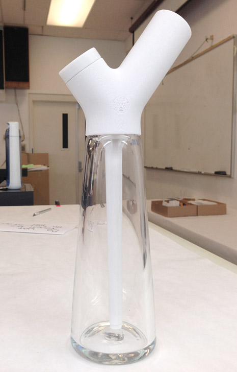
Aura is designed to provide a cleanable, durable, and user friendly water pipe smoking experience in a form that moves beyond the adverse reaction and stigma associated with traditional bongs. As progressive attitudes toward marijuana use continue to grow in the United States and abroad, water pipes have remained a reminder of the drug’s marginalized and subversive past. A look into existing cannabis products reveals the absence of a brand that connects with the mature, style conscious, and forward thinking market that has emerged in the recent wave of legalization in the United States. Designed to appeal to both existing and new users, Aura evolves the water pipe into a contemporary object that is comfortable in plain sight.

The Aura is a project of Western Washington University’s Mauricio Romano, and it was recently honored as a runner-up in the Consumer Products category of the 2015 Core 77 design awards, cited not just for its appearance—my wisecracking about skull bongs aside, there have of course always been subtler smoking devices—but for its mechanics. (If that stuff interests you, seriously, that link contains more info on bong engineering than I ever expected to read in my life.)

Aura’s form is driven by a simplified user experience created by grouping the touchpoints of smoking (the handle, bowl piece, and mouthpiece) at the top of the device. First time use of a traditional water pipe can be a confusing and intimidating experience given the lack of an intuitive grip and the poor ergonomics of a vertical cylindrical mouthpiece. A holding place for the hand is created by the branches of Aura’s mouthpiece, providing intuitive control and comfort. In addition, the wrist and neck of the user are in a neutral position when smoking thanks to the angle of the mouthpiece. Lost lighters are no longer a problem, as space within the mouthpiece is provided to store one when not in use.

The glass components of traditional water pipes are easily broken, requiring replacement of the entire water pipe when an accident happens because they are fused together. Aura is designed for manufacturing from stainless steel, PCABS plastic, and brass components, ensuring minimal breakability. The cost of manufacturing in these materials is also much less at a large scale than traditionally handworked glass pieces. The resin and particulate matter that accumulate during smoking are difficult to access and clean in traditional water pipes, resulting in a perpetually dirty product. Aura’s main components disassemble to allow access to unclean areas for hand cleaning. The entire system is dishwashable as well, thanks to these durable materials.


Click the image to spawn a readable enlargement
 
Kinda had to giggle at the informercial-ineptness attributed to smokers in that—using a bong can be “a confusing and intimidating experience”? Come ON. On the other hand, it’s a sign of progress that they can so openly talk about cannabis in their hype. I remember head shop guys—and I assume this is still true where weed remains illegal—constantly and pointedly referring to tobacco and only tobacco when discussing pot accessories with customers, and terminating the conversation and the sale if the customer kept mentioning illegal drugs after a warning or two.

Though its designer claims a patent pending, the Aura doesn’t appear to be available for sale yet. Presumably their Facebook presence and website will spread the word if and when these are actually released to the consumer. In the meantime, here’s more of the bong-porn for which you presumably clicked on this post in the first place.


Via If It’s Hip It’s Here

Posted by Ron Kretsch
|
08.05.2015
09:55 am
|
Eat a bag of fun with this ‘gold at the end of the rainbow’ cookie cutter!
08.05.2015
09:50 am
Topics:
Tags:


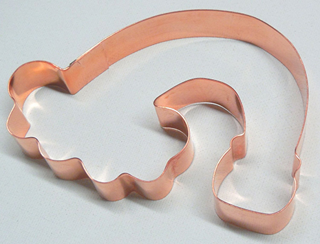
It’s not often that we at Dangerous Minds stoop to flaccid shilling for online products, but when we saw this “Somewhere Over the Rainbow Pot O’ Gold St. Patricks Day Cookie Cutter,” we thought, “That really looks like something we’d like to get our hands on.”

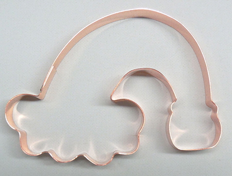
This cookie cutter is, ostensibly, used to make cookies that look like a rainbow bursting forth from a cloud and landing in a pot o’ gold. We guess.


If you were thinking “it looks more like a huge limp cock,” you weren’t the only one. 

The folks at fastcompany.com went to the trouble of emailing the manufacturer of the cookie-cutter, TheFussyPup, to ask if anyone had ever suggested the cutter might resemble anything other than a cloud, rainbow, and pot o’ gold—had anyone ever suggested it bared a passing resemblance to a huge dangling dick and furry balls?

A spokesperson for the company responded that she didn’t realize the cutter resembled anything else when her sister designed it—until they showed it to some friends.


According to Kimberly Wolfe, one of the proprietors of TheFussyPup:

One pointed out its resemblance to the male organ. We had a little giggle and dismissed the thought. While making adult theme cookie cutters isn’t our main goal, we are happy to provide cookie cutters for any occasion—and we love to see the creativity of our customers! Now if only someone would send me a picture of the results!

That sounds like a challenge.

Some may already be up to that challenge, as one five-star review on Amazon suggests: “I used this to bake a whole bunch of cookies, put them in a bag, gave them to somebody, and said, ‘Eat a bag of these!’”

Via: Fastcompany.com

Posted by Christopher Bickel
|
08.05.2015
09:50 am
|
Minor Threat’s iconic ‘Out of Step’ LP cover
07.13.2015
11:55 am
Topics:
Tags:


“I can’t keep up! I can’t keep up! Out of step with the world!”
 
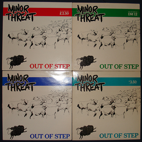
Minor Threat’s 1983 LP Out of Step is arguably one of the ten most important American hardcore albums, both in terms of its musical power and overall lasting influence. For ‘80s punk kids it was one of those “gateway” records, much like Black Flag’s Damaged or Dead Kennedys’ Fresh Fruit For Rotting Vegetables—ubiquitous, readily available at any mall in any podunk town, anywhere across the USA. Camelot Records might only have had twenty titles in their “punk” section, but Out of Step was one of ‘em.

The producers of the excellent documentary on the DC hardcore scene, Salad Days: A Decade Of Punk In Washington, DC (which is currently available for pre-order)  maintain a Facebook page which routinely shares articles and factoids about Minor Threat and their contemporaries. This page recently reported that the band’s original intention was to have the Out of Step cover art illustrated by famed punk artist Brian “Pushead” Schroeder, but at the last minute the band decided to go in a different direction, enlisting the help of friend and art school student Cynthia Connolly


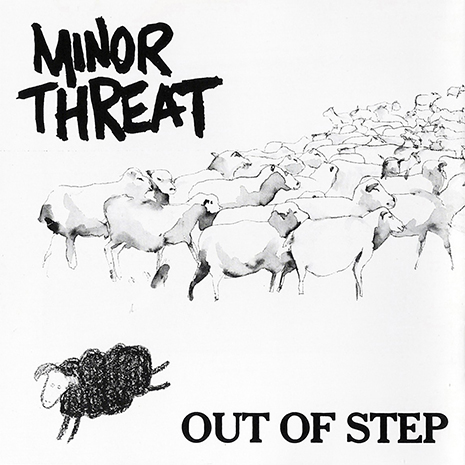
Connolly’s iconic design of the crude black sheep leaping away from a pack of finely watercolor-rendered white sheep, besides being a spot-on symbol for youthful rebellion, is as masterful a work of “branding” as the instantly recognizable DK logo or Black Flag bars. The meaning instantly connects, while being tonally subtle—in stark contrast to the majority of early ‘80s “brutal” punk sleeve art. The child-like rendering of that libertine lamb says more than a thousand radioactive skulls ever could.
 

DC artist and photographer, Cynthia Connolly—taken from her book, Banned in DC.
 
Connolly, who also faithfully documented the ‘80s DC scene, is responsible for the essential book Banned in DC, which is available through Dischord Records. Dangerous Minds had the opportunity to speak with Connolly about the sheep, “Mr. Sheepy” as she calls him, and what it symbolizes.

Dangerous Minds: What can you tell us about the design of the Out of Step cover?

Cynthia Connolly: Minor Threat had asked me to make a drawing for the Out of Step cover. Ian Mackaye and I discussed something to do with a black sheep. The obvious idea was a black sheep that was leaping away from all the white sheep. The black sheep symbolized all of us, the kids that were doing something different, going against the grain of what was going on at the time.  I thought of us as young and energetic. I was just 19 when I drew the sheep, I think. I was young and energetic! It was 1983. 

Anyway, the white sheep were illustrated in water color with fine lines. They were elegant and sophisticated, but looked like they were bored, and perhaps even happy about being bored. The black sheep, on the other hand, had his eyes open—an important detail some people miss when getting it as a tattoo!—and is leaping from the drab sophisticated crowd. He’s making a choice on being different and is happy about it. The crayon, of course, is a symbol of youth and innocence. One thing I didn’t do is that I colored the sheep in like an adult… not as like a child (in circles… adults would fill in the shape from left to right).

The funny thing is, that drawing was a one shot deal. I just did one drawing. Showed it to them and was done. I did practice the black sheep a couple times on another paper, but once I got it down, just drew it on the watercolor of the white sheep and I was done! So punk! I call him “Mr. Sheepy” now, when people ask about him.
 

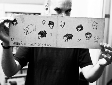
Ian MacKaye displays sheep sketches. Photo by Peter Beste.
 
It’s noteworthy how “gentle” the image is—in contrast to typically dark or aggressive “punk art” of the time.

Exactly. He’s NOT angry—as so much punk depicts—he’s merely making a choice to be different and has no qualms about it. He is intentionally jumping away. I love what he symbolizes and is still a guiding light in ways for myself. In the end, it’s about not having the fear of following your passion, being creative, and stepping out to support your ideas and the ideas of your friends.
 

Connolly, pictured here with a dress made from the same silk screen that was used to create the “Out of Step” test press covers. “We threw the dress into the mix. It’s like a punk poodle skirt!” Photo by Jim Saah.
 
Continues after the jump…

READ ON
Posted by Christopher Bickel
|
07.13.2015
11:55 am
|
Let houseguests know where you’re coming from with an octopus chandelier
07.08.2015
09:00 am
Topics:
Tags:


Pink Paris 2
 
What if, just by pointing towards the ceiling, you could remind your guests that you’re on a first-name basis with dread Cthulhu? You never know—it might come in handy the next time one of your relatives praises Bill O’Reilly, wonders when you’ll get “a real job,” or tells you to turn down the Sleaford Mods. Until you can put in that trap door that opens on an alligator pit, why not see what you can do with one of these apotropaic ceiling decorations, a shrug, and a slight roll of the eyes?

Philadelphia-based artist Adam Wallacavage started making these octopus-shaped chandeliers in 2001, “‘cause I had no money, and plaster was cheap.” Speaking as your personal stylist, don’t you think one of these might really tie the room together?
 

Martin Denny
 

Small Gold Chandelier
 
More after the jump, plus a tour of the artist’s home…

READ ON
Posted by Oliver Hall
|
07.08.2015
09:00 am
|
The Electric Kool-Aid Architects: Astounding, lysergic Iranian temple photography
07.07.2015
09:42 am
Topics:
Tags:


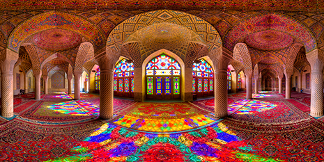
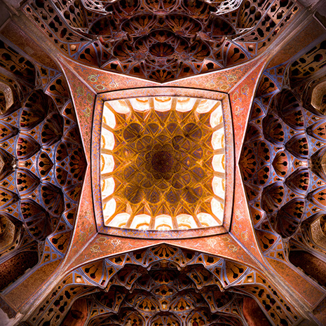
Nasir al-mulk Mosque. All images © Mohammad Domiri
 
When one thinks of the home of psychedelic architecture, Iran probably isn’t the first place that springs to mind. But here it is. It’s undeniable. Northern Iranian student Mohammad Reza Domiri Ganji has recently documented the existence of these intricate structures in Iran with gorgeous HDR photographs, so incredible that the Western mind can barely grasp them.

Although these buildings seem to be tailor-made for the likes of Ken Kesey
or Timothy Leary, it’s probably best to keep in mind that any Western traveler who might suddenly decide to become one with the Universe while visiting these sites on LSD, will probably be executed immediately after it’s discovered that they’re using drugs in Iran.

So, just sit back and enjoy these rich hallucinogenic mandalas from the psychedelic Summer of Jihad in the comfort of your own home—and know that they’re out there…in Iran.

It’s hard to imagine what the intricate blueprints might have looked like for these buildings, but it’s fairly clear that the architects knew what to do with the windowpane.
 

Aligholi agha bath—Isfahan
 

Ceiling of Alighapu
 
More after the jump…

READ ON
Posted by Christopher Bickel
|
07.07.2015
09:42 am
|
Page 16 of 37 ‹ First  < 14 15 16 17 18 >  Last ›