FOLLOW US ON:
GET THE NEWSLETTER
CONTACT US
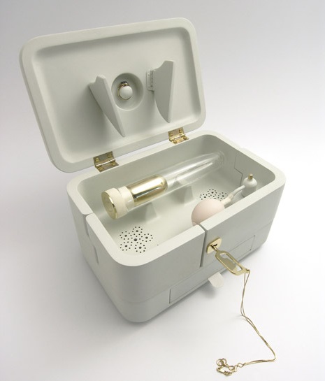
Because love never dies: Put your loved one’s ashes in a glass dildo
04.27.2015
09:45 am
Topics:
Tags:


In 1901 Dr. Duncan “Om” MacDougall began a series of experiments wherein he placed elderly, terminal tuberculosis patients on massive industrial scales, hospital bed and all. MacDougall weighed six subjects before and after death, and concluded from the postmortem weight loss that the human soul weighs 21 grams—hence the name of designer Mark Sturkenboom‘s “memory-box.”

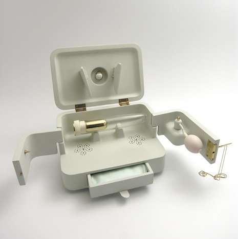
With 21 Grams Sturkenboom has managed to create an opportunity for a truly libidinal mourning experience. The “kit” comes in a sleek, Jobsian case, openable only with a key that doubles as a lovely pendant necklace. Inside you find an atomizer bulb (to spritz your beloved’s perfume), a set of internal speakers to amplify music from the iPhone dock in the back, and a blown-glass dildo containing a tiny urn of ashes—21 grams of ashes, to be precise. Sturkenboom describes the project thusly:

21 Grams is a memory-box that allows a widow to go back to the intimate memories of a lost beloved one. After a passing, the missing of intimacy with that person is only one aspect of the pain and grieve. This forms the base for 21 Grams. The urn offers the possibility to conserve 21 grams of ashes of the diseased and displays an immortal desire. By bringing different nostalgic moments together like the scent of his perfume, ‘their’ music and reviving the moment he gave her her first ring, it opens a window to go back to moments of love and intimacy.She is able to have an intimate night with her sweetheart again.

Before you go all Social Justice Warrior on Sturkenboom for the heteronormativity of “widow,” (for who wouldn’t want to be penetrated by a loved one’s earthly remains, regardless of gender or marital status?!?), the inspiration for 21 Grams ” is actually an elderly widow—he sometimes helps her carry her groceries. Sturkenboom noticed the urn containing her husband’s ashes, remarking, “she always speaks with so much love about him but the jar he was in didn’t reflect that at all.”

Sturkenboom has not said whether or not his muse is flattered by his tribute.


Continues after the jump…

READ ON
Posted by Amber Frost
|
04.27.2015
09:45 am
|
‘White Glove Test’: The ‘teenage folk art’ of the Louisville, Kentucky punk scene, 1978-1994
04.20.2015
09:55 am
Topics:
Tags:

White Glove Test
 
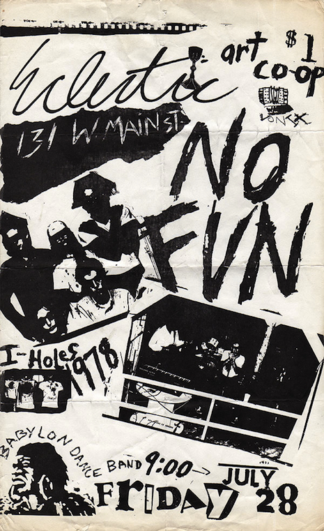
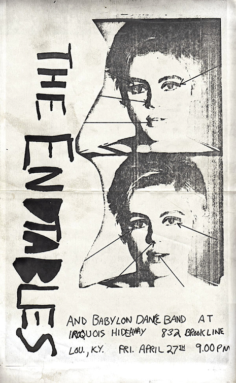
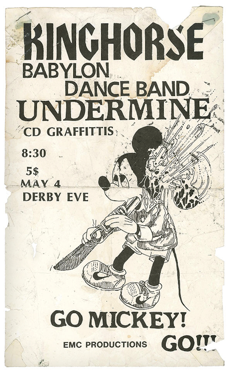
This week, Drag City is releasing a rad book of American punk rock ephemera entitled, White Glove Test: Louisville Punk Flyers, 1978-1994. This 288-page hardback is jam-packed with what David Grubbs (Squirrel Bait, Bastro, Gastr del Sol) calls “teenage folk art.” The book documents a bygone era—pre-Photoshop and before the rise of the Web—when flyers were hand-assembled and often the only means bands had to promote their shows.

“Ephemera—the most beautiful kind of refuse. Created in a moment without thought of legacy, but standing as a pure record of time, place, and without any Rashomon spin or Zapruder eye. When we were stenciling, chopping, and recombining days before a show, I barely had a thought about anyone not standing on Bardstown Road or near Iroquois Park ever giving these broadsheets another glance. There was a need to leave a breadcrumb trail for the freaks. The newspaper of record saw us as a fringe element not worthy of bulletins. It was the only way to broadcast—to cast broadly. Now they have gained an emotional sheen. The punk rock mayfly (genus Ephemera) is gone, but any of these posters is a microchip bursting with memories.” (Tara Key, a member of a number of Louisville outfits, including No Fun, now considered the scene’s first punk band)

There are over 700 flyers in White Glove Test; here are some of our favorites:
 
No Fun
1978
 
The Endtables
1979
 
Kinghorse
1990
 
Many more amazing punk flyers, after the jump…

READ ON
Posted by Bart Bealmear
|
04.20.2015
09:55 am
|
Siouxsie Sioux dolls
04.13.2015
01:59 pm
Topics:
Tags:


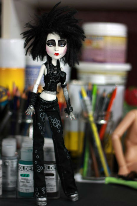
Siouxsie Sioux doll by Refabrications
 
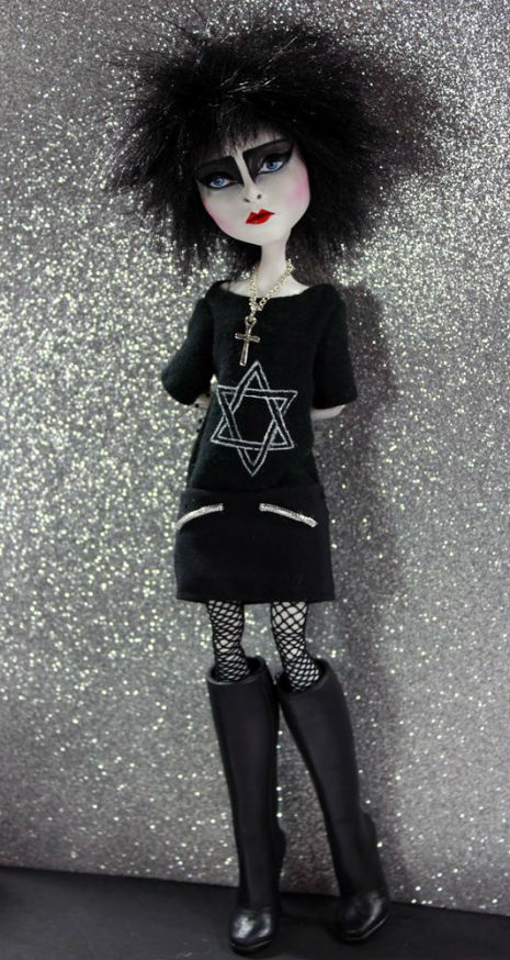
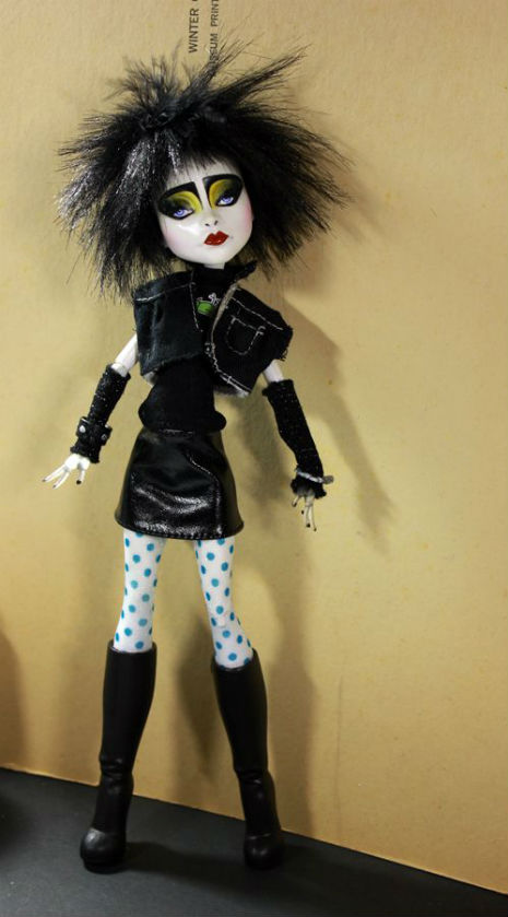
Somehow I found myself googling “Siouxsie Sioux dolls.” The best ones, IMO, are done by Alyissa Brown AKA Refabrications. I *think* you can purchase the dolls on her website.

I tried to find other Siouxsie dolls by different artists, but sadly the majority of them just ended up looking like Edward Scissorhands.

I couldn’t find the artist’s name for the amigurumi Siouxsie Sioux. So if anyone out there knows, tell me in the comments and I’ll update the post with proper credit and a link.


Siouxsie Sioux doll by Refabrications
 

Siouxsie Sioux doll by Refabrications
 

Siouxsie Sioux doll by Refabrications
 
More after the jump…
 

READ ON
Posted by Tara McGinley
|
04.13.2015
01:59 pm
|
Ridiculous plateware shaped like specific foods
03.23.2015
11:45 am
Topics:
Tags:


Breaded fish and rice
 
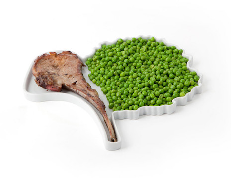
Here’s a whimsical and marvelously impractical plateware idea from Kahla at 5.5 Design Studio: plates designed to fit specific meals. The idea is that you can plan out your week this way, with “Daily Menu Plates” for breaded fish, a chicken leg, a single sausage, and so on.

The drawback of the plan becomes apparent when you try to consider what happens in week 2, of course. Equally obviously, flat plates designed to hold a hamburger will hold a lobster roll equally well.

Here is the explanatory text from Kahla:
 

Au quotidien, les plats qui composent et définissent notre alimentation de base sont souvent un peu archétypaux : jambon / coquillettes, Poulet / frites, côtelette / petits pois, poisson pané / riz.

«Daily Menu» est une collection d’assiettes biomorphiques qui joue de ces clichés et qui nous accompagne tout au long de la semaine. Ces assiettes fonctionnent comme des fiches recettes pour nous suggérer des idées de repas quand le manque d’inspiration nous envahit. A chaque jour son plat et à chaque plat son assiette!

In everyday life, the dishes that make up and define our basic food are often a little archetypal: ham / macaroni, chicken / fries, chop / peas, breaded fish / rice.

“Daily Menu” is a collection of biomorphic plates that plays with these clichés and accompanies us throughout the week. These plates function as recipe cards to suggest meal ideas when lack of inspiration strikes. Each day has its plate and each dish his plate!

 
Shit, I could really go for some bangers and mash right now….
 

Chicken and fries
 

Chop and peas
 
More of these things after the jump…

READ ON
Posted by Martin Schneider
|
03.23.2015
11:45 am
|
Saul Bass: Great cinema title sequences from Otto Preminger to Martin Scorsese
03.16.2015
02:47 pm
Topics:
Tags:

00sbposters11.jpg
 
Over five decades Saul Bass designed opening title sequences that were sometimes better than the movies they introduced. His ambition he once said was to “make beautiful things even if nobody cares.”


Bass started out as a graphic designer and was asked by film director Otto Preminger to put together a poster for his movie Carmen Jones. Preminger was so impressed by the result that he asked Bass to design the opening titles. So began his 40-year career in movies. Bass went on to work with Preminger again on The Man with the Golden Arm and Anatomy of a Murder, he also designed titles for Alfred Hitchcock (Vertigo, Psycho), and Martin Scorsese (Cape Fear, The Age of Innocence and Casino).


Additionally, Bass designed the logos for a whole range of corporations and products and even had time to direct the cult science fiction movie Phase IV. As a designer he set a standard for other to follow, which is evident from this hour-long selection of his title work from 1955-1995.
 

Posted by Paul Gallagher
|
03.16.2015
02:47 pm
|
Artist creates beautiful jewelry from the hair of cancer patients
03.11.2015
10:08 am
Topics:
Tags:


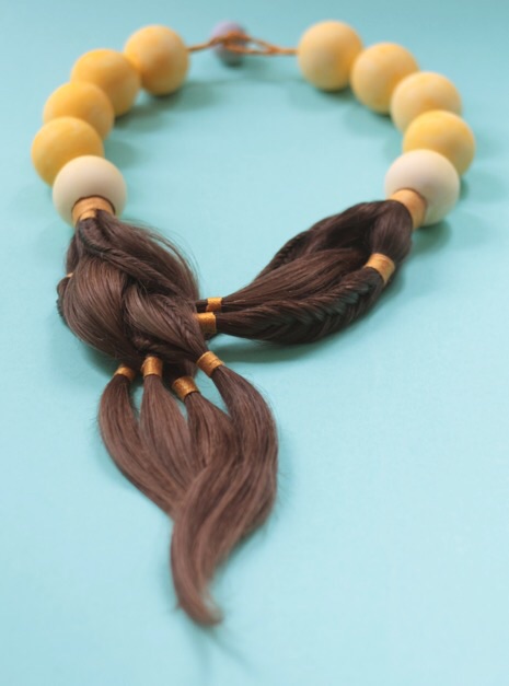
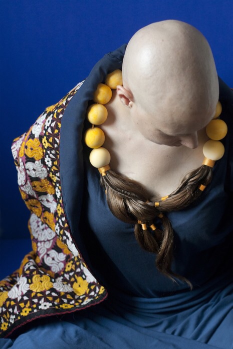
Designer Sybille Paulsen uses unconventional materials for all of her work, but her series “Tangible Truths” is created with one of the rarest and most unique mediums—the hair of women undergoing chemotherapy. These beautiful, elaborate pieces allow women to keep their hair and wear it in a meaningful way. Paulsen customizes each necklace to the personality of the client, taking special care to get to know each woman over the course of the construction process. Her work is produced catharsis for both patients and families.

In the words of one of her clients:

What Sybille created touched me really deeply. The free flow design of the project meant that my hair had not been transformed simply into a piece of art that was separate from me, the flow of the necklace she created somehow seemed to still hold pieces of me within it. The waves of the hair ... still looked so alive and so full of life. ... Her work touched not only me, but also those close to me here in Berlin who have seen it or seen the pictures. One person close to me even teared up because the necklace still looked like my hair and was a reminder of what it had been. ... I was impressed by what she had produced and very proud to have been a part of her project. ... I love the idea of helping create beauty out of what for many of us is a ugly process: chemotherapy.

If you’d like to help Paulsen expand her services to low income women, you can donate to “Tangible Truths” here.


More after the jump…

READ ON
Posted by Amber Frost
|
03.11.2015
10:08 am
|
Check out ‘Boo-boos,’ gory band-aids for grosser healing
03.03.2015
06:21 pm
Topics:
Tags:


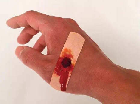
Minor injuries like paper cuts can be very dispiriting—despite whatever pain (or at least inconvenience) they may cause, they never quite garner the horrified reaction you feel you deserve. Enter “Boo-boos,” the gruesome Band-Aids from designer Sherwood Forlee. These little nasties display a variety of trompe-l’œil wounds, so you can heal while simultaneously terrorizing your friends, loved ones and the complete strangers that are forced to share public transportation with you!

The only thing to do now is expand the line—I’m holding out for scabies or leprosy!


small caliber gunshot
 

decubitus ulcer with maggot infestation
 

skin ulcer with skin slip
 

chemical burn
 

slashing sharp force trauma
 
Via designboom

Posted by Amber Frost
|
03.03.2015
06:21 pm
|
Kooky Kindle cover disasters
02.24.2015
01:09 pm
Topics:
Tags:

002gaughost.jpg
 
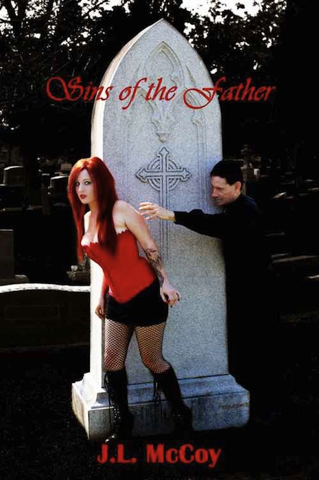
You certainly can’t judge a Kindle by its cover as some of these badly illustrated titles are certified Amazon bestsellers—which either means they’re good reads or the author comes from a very large family.

The best thing about Kindle is the opportunity it gives wannabe writers to publish their work, but conversely, the worst thing about Kindle is the opportunity it gives to wannabe writers who want to publish their work… because some of them will.

Then of course there are the Kindle covers which vary from the tacky to the plain bizarre to the truly fucking ugly. So popular are these bad covers there is even a Tumblr site celebrating their awfulness, from which this small selection of abominations is culled.
 
003sinsfa.jpg
 
001abbynormal.jpg
 
005hammer3.jpg
 
030scoots.jpg
 
006overlors.jpg
 
More kooky Kindle covers after the jump…

READ ON
Posted by Paul Gallagher
|
02.24.2015
01:09 pm
|
Sexy pony girls, for all your BDSM rocking horse needs
02.23.2015
02:14 pm
Topics:
Tags:


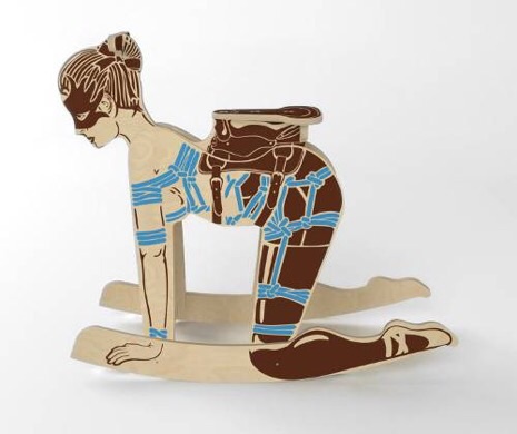
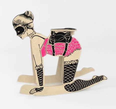
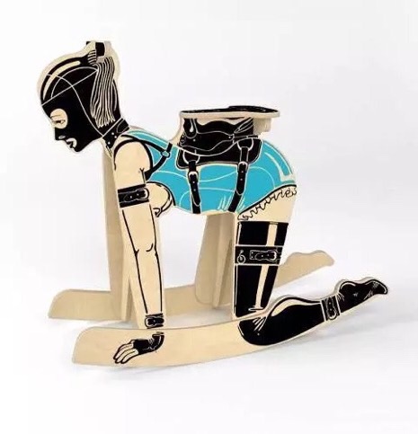
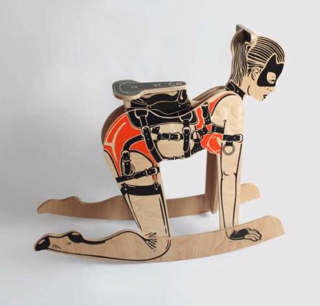
In one of the more disturbing yet hilarious feats of crafty design I’ve seen, Peter Jakubik has redefined the term “pony play” with these bondage-inspired rocking horses. You have the option of making your own by downloading a DIY template from Etsy ($22.09), or purchasing one of many completed and painted models($1699.37), each with their own names, unique accessories and backstories. Yes, whether you prefer lace and ruffles, elaborate rope-play or a vinyl facemask, there is a pony girl for you.

Take for example the lovely Gisele, above:

The flexible body of Gisele the Balerina [sic] is firmly tied by a rope maze forming an improvised body harness. She combines her delight in rope tying with a passion for scenic dance. You can transform a classic performance by your bizarre game to a “bondage” Swan Lake.

I’m actually a bit partial to the unfinished wood grain, below. It has a certain… rustic ambiguity.

See more below for an idea of the “variety” that’s offered. Obviously this is all well and good, but I think he’s really limiting himself by sticking to the female form—a pony boy would sell much better, in my opinion. Maybe the purchaser is attracted to men or perhaps they like the idea of sadomasochistic kitsch, but don’t want the antifeminist stigma that might be associated with such a surreal knick-knack?

I say get on it, Jakubik! You’ll have them chomping at the bit!


“Fille de joie Jacqueline has penchant for burlesque. Her panties, stockings, long gloves and a corset must miss ruffles in any event. At first glance she coquettishly invites you to sit in the saddle and be gently lulled.”
 

“Despite the donkey ears on the harness, Vanda is not as adamant as you would expect from the way she looks. In its wavy-trimmed negligee and eared harness she keeps standing in her place, obediently waiting for the regular evening ride.”
 

“Xenia illustrates real girl next door without any sexual inhibitions. She hides her innocent little face under the hood joining her hair into a thick tail. Cuffs on hands and feet bond up her momentary daftness. It’s just up to you to unleash, and turn a canter to a rodeo.”
 

“Helga gives a clear indication that her haggard appearance of a little beast is really not for a romantic nature. Her semi-transparent lingerie and latex stockings are held in place by a similarly toned garter belt and tightly tied by a body harness. She will definitely stand out from your collection of toys.”

Posted by Amber Frost
|
02.23.2015
02:14 pm
|
John Waters favorite website critiques gay ‘interior design’ as seen on Grindr
02.20.2015
01:40 pm
Topics:
Tags:


Oh come on dude! At least tidy up a little bit first!
 
John Waters calls it “hilarious.” David Sedaris says it’s “just perfect.” Lurid Digs is quite possibly the greatest design resource on the entire Internet. This brilliant blog doesn’t deconstruct posh flats or stately mansions—my guess is that they dig through Grindr looking for the worst interiors of the erotic selfie genre. You would be shocked at the settings some of these men find appropriate for their boudoir photography, but Lurid Digs is on a mission to educate the masses—you know, in the name of good taste. Queer eye for the gay guy. Somebody had to do it.

From the website:

Interior design began with the first cave dwellers. Most likely it was a gay caveman who decided to paint pictures of running bison and other frolicking animals on the rough walls and low ceilings of his abode. Not only were these flourishes artistic and decorative, they also served as a way to feel more comfortable while living in a hole in the earth.

But, my how times have changed. Gone is the stereotypical association of gay men with good interior design. The Internet has shattered the gay style myth forever with its slew of nude amateur self-portraits that clog bandwidth from New York to Sydney and back again. These Feng Shui-challenged souls have proven over and over again that male homosexuals can be just as color uncoordinated, sloppy and nasty as their straight brethren. Yes, the gap between what defines gay and straight is slowly beginning to zipper shut.

Below I have carefully curated a few safe-for-work excerpts, cropping or censoring the associated photos for modesty, but whatever you do,do not visit the actual site if you aren’t in a gay-sex-friendly and penis-positive employment environment!


Do you know what drives me crazy about rooms like this? (Warning: this will reveal just how anal I am.)

It’s not the artwork. I mean, yes, the juxtaposition of the vaguely primitivist nude on the right with the large, Thomas Kinkade-y woodland scene (probably entitled “King of the Valley” or “The Forest’s Royal Family” or “Prince Staggerton and His Freaky, Funky Fawns”) is jarring. But at least there’s a theme going on, which is mostly “nature”. Or “naturism”.

It’s not the wallpaper, which is so aggressively neutral, it’s like being mugged in a wheat field by a Sandy Duncan impersonator, wielding a fistful of Triscuits. Plus, my mother had this exact same wallpaper put up in the house that we lived in between my 4th and 9th grade years, so, you know: memories, like the unnecessarily moulded corners of my hallway.

No, it’s the fact that in hanging said artwork upon said papered walls, the decorator didn’t use picture moulding and wire. Instead, s/he punched right through the wallpaper with a couple of lousy nails — possibly several, if there wasn’t a studfinder handy — meaning that s/he is now stuck with this particular arrangement until s/he decides to repaper the place, because patching holes in wallpaper is not for the faint of heart.

And goddess forbid s/he should move out before selling the place. Take down these paintings, and the house will look like the set of The Golden Girls: Sarajevo, 1993. Don’t people think of resale value anymore?

 
PHOTO REMOVED FROM WEBSITE
 

I like lesbianish minimalism. In theory. I like neutral backgrounds. In theory. I like semi-Spartan spaces. In theory.

Then I look at this room. Are they freakin’ kidding me?
This isn’t understated. It’s unfinished.

Do something, already! Hang a painting. Wainscott the tub surround. Put a Scarlett O’Hara toiletpaper cozy on top of the toilet. Optimally place a themed wastebasket. Pick a color, any color, and disperse it anywhere, anywhere.
For the love of Christopher Lowell, just start. And then continue. And then continue some more.

I don’t care how butch you (think you) are, a trashbag is not a design statement. And your panties are not accessories.

And as for those who have the ego to paper the interwebs with naked self-portraits but not the pride to clean the mirror or tidy up the two things in the reflected room?


The Shining ruined a lot of things.

It ruined the idea of winter retreats, proving that anyone dumb enough to lock himself away at a snowbound lodge will eventually start talking to ghost bartenders, taking blood elevators, and slaughtering everyone in sight. It ruined the archetype of the heroic “scream queen”, because for the first time in cinematic history, audiences rooted for the axe-wielding maniac, praying that he would slit Shelley Duvall’s throat so she would JUST CALM THE FUCK DOWN. And The Shining ruined Danny Lloyd’s career. Or rather, it prevented Danny Lloyd’s career from ever happening.

The Shining also ruined hallways. Before the movie came out in 1980, many of us had never given hallways much thought. In our 1960s and 1970s ranch homes, hallways were functional, forgettable architectural elements that connected our sunken dens to our rumpus rooms. But The Shining made them something sinister and deadly and full of twins.

So, if you must take a sexpic for Grindr or Growlr or some other app that holds a deep-seated grudge against the letter “e”, please (a) don’t take the photo in a hallway, and (b) if you must do it in a hallway because every other corner of your house is filled with bloodstained corpses, make sure that the hall is wide and attractive and finished and uncluttered. Because seeing vile-colored walls (that merge abruptly into differently hued vile-colored walls), unfinished doorjambs, unpainted plaster, naked lightbulbs, and piles of junk on the floor of a hallway makes viewers feel claustrophobic. Which is fine if you’re looking to pick up spelunkers or Harry Houdini, but otherwise, your axe-wielding right hand may have to do.

The whole site is ridiculously funny, and I strongly suggest you check it out, lest you commit a sexy snapshot Cardinal sin yourself. If you’re already featured on Lurid Digs, you have my deepest sympathy, but maybe consider sending them a revision shot showing what you’ve learned? I’m sure they’d love to know they’re making a difference in the world, one amateur at a time.

Posted by Amber Frost
|
02.20.2015
01:40 pm
|
Page 18 of 37 ‹ First  < 16 17 18 19 20 >  Last ›