FOLLOW US ON:
GET THE NEWSLETTER
CONTACT US
Back cat-a-log: Classic album covers ‘purrfectly’ re-imagined with kittens
12.12.2017
09:39 am
Topics:
Tags:

01cpurrdivisionunknownwhiskers.jpg
Purr Division—‘Unknown Whiskers.’
 
Cats on the covers of your favorite music—what’s not to like?

On those odd occasions when I finish reading the funnies and have nothing more practical to do, I like to ponder those big meaningful questions of life like what happens to all those sites and pages that grab their fifteen minutes and then disappear just as quickly (or are lost in the mix) as the next distraction claims its time?

Way back in 2011, musician, designer, record label CEO, and seller of vintage posters Alfra Martini seemed to be everywhere when her blog The Kitten Covers made (literally) international headlines.

Martini’s blog was a simple idea that came to her in a “fever dream.” It was also, apparently, inspired by that famous painting of dogs playing poker around a green baize table. Her idea was to recreate classic album covers with cute little furry felines. Martini’s first attempt was the cover of a David Bowie album which (understandably) impressed her boyfriend and everyone else who saw it. A meme was born, shall we say, and those first album covers were shared far and wide. Then there came the media coverage and even an interview or two.

But then what?

Martini continued making her covers with cats but all that fame and frenzy (and maybe I’m wrong here) seemed to slowly ebb away—or maybe I stopped paying attention. Which is a shame, as some of Martini’s best Kitten Covers came after the big-fifteen minute fame bubble of 2011. Maybe a lack of interest or a lack of time led Martini to stop making her kitty covers in 2016—or maybe she’s having a sabbatical away from such creative fun, I dunno. Whichever, here are some of the choice Kitten Covers you may have missed.
 
02cthek52s.jpg
The K-52s.
 
08cMeowerheadAceofSpayeds.jpg
Meowerhead—‘Ace of Spayeds.’
 
03cjesusnmeowchainpsychocatty.jpg
The Jesus and Meowy Chain—‘Psycho Catty.’
 
04ckwastaughtoutta.jpg
KWA—‘Straight Outta Cat Town.’
 
More cat covers, after the jump…
 

READ ON
Posted by Paul Gallagher
|
12.12.2017
09:39 am
|
Monsters: ‘The Outer Limits’ trading cards
12.07.2017
09:50 am
Topics:
Tags:

00OLwrapper.jpg
 
This morning, while taking a browse of some favorite sites, I found myself watching a short compliation video of various monsters, creatures, and nefarious extraterrestrials from that old cult classic sci-fi series The Outer Limits. Though I never saw the show until my teens, I was given an Outer Limits annual, one snowy Christmas, when I was around pre-school age. This book was filled with comic strips about ravenous alien gloop and stories about crash-landed flying saucers. It started a passion for this kind of stuff that has lasted right through. But there’s nothing new in that.

The compilation clip was by Wah Ming Chang for a project called Monsters. Chang was a cinematographer, designer, and sculptor who is probably better known to Star Trek fans as Wah Ming—the mega-talent responsible for designing the tricorder and communicator on the original series, as well as a whole host of martians, monsters, and what-have-you. (Indeed, there’s a good blog to be done on Chang.) Anyhow, Chang also designed many of the monsters and special effects for The Outer Limits—hence the fine little compilation clip (see below) of various happy memories of scary things from outer space like the “Man from Galaxy ‘X’” or “The Zanti Misfits.”

All this, eventually, made me seek out a whole set of the Monsters From Outer Limits trading cards that were issued to coincide with the original TV series by Bubbles Inc. (Topps) in 1964. Back then, a packet of these cards (with a stick of chewing gum) cost 5¢. I was way too young to have ever bought or even thought about these magnificent works of pop culture, but know now I would have tried my hardest to collect a whole set if I had been. Nowadays, a single card from this set can fetch up to $50—which is fair return on an original investment all those years ago.

Having never actually seen a full set (I don’t get out much, I live in a trailer park, I like Wheetos), I thought it would be a fun diversion to gather all these past riches together for our delight and delectation. ‘Nuff said?
 
020OLthetelevisionterror.jpg
#1 The Television Terror.
 
04OLtheradioactiveman.jpg
#2 The Radio-Active Man.
 
More ‘Monsters from Outer Limits’ plus video, after the jump….
 

READ ON
Posted by Paul Gallagher
|
12.07.2017
09:50 am
|
Dainty insult teacups and saucers ‘For the lady who speaks her mind…’
12.04.2017
01:59 pm
Topics:
Tags:


“An injury is much sooner forgotten than an insult.” -Lord Chesterfield

Rusty Blazenhoff over at Boing Boing turned me on to these lovely insult teacup and saucer sets by Miss Havisham. The teacups and saucers start at around $60. I’m digging these big time!

According to Miss Havisham’s site:

We are still accepting orders but due to overwhelming demand, please note that any order placed after 1pm Pacific time 11/29 cannot be guaranteed to arrive in time for Christmas. Those placed prior will be shipped in time for the holiday. Our evil cat army is packing as quickly as they can.

Even if I were to get this after the holidays, I’d still be super stoked. The “Witch!” set is by far my favorite.


More after the jump…

READ ON
Posted by Tara McGinley
|
12.04.2017
01:59 pm
|
Bad, weird and just downright pervy album covers (NSFW)
11.24.2017
06:34 am
Topics:
Tags:

01badlp.jpg
 
Out there, somewhere, there’s bound to be an apology floating around the Internet from a near-retirement-age record designer fessin’ up to all the bad album covers he was responsible for back in the day when lines were a little more blurred. Now, this guy would tell you (if he could) that he has a lot of respect and admiration for all the hardworking people who design album covers and he’s truly horrified to find some of his worst work that he had honest-to-God deliberately forgotten about is now doing the rounds on the Internet.

Honestly, he really can’t remember ever doing any of these album covers and well, if he did, it must have been down to a tight deadline or a shitload of drugs or maybe perhaps both. However, he sincerely hopes these allegedly inappropriate album covers won’t be viewed as something representative of the kind of stuff he does now. He was much younger then.

Thankfully, due to all the sons of bitches who think it’s funny to share this guy’s shit, he has been encouraged to review his past history with some candor and examine his back catalog just in case there’s any more of this embarrassing shit out there.

Fortunately, for us, it looks like there is indeed plenty of creepy, weird, and downright inappropriate stuff still floating around out there.
 
016badlp.jpg
 
018badlp.jpg
 
More strange and saucy album covers, after the jump…
 

READ ON
Posted by Paul Gallagher
|
11.24.2017
06:34 am
|
Check out this Medieval Wonder Woman battledress
10.25.2017
01:25 pm
Topics:
Tags:

01wonderwoms.jpg
 
This armor battledress for Princess Diana of Themyscira, Daughter of Hippolyta, aka Wonder Woman, is certainly something to behold. Made from intricate, handcrafted leather by Samuel Lee at Prince Armory, this superhero outfit is “truly one of a kind.”

I recently saw the new Wonder Woman movie with a girlfriend who thought the most impressive thing about it was the way Princess Diana’s hair and makeup stayed immaculate throughout. To be honest, I never noticed, being too busy contemplating why this Amazonian superhero needed the irritating Captain Kirk and his gaggle of geeks along for the ride. As any fule no, Wonder Woman don’t need nobody to beat-up the bad guys—though this leather battledress would definitely add to her coolness.
 
02wonderwom.jpg
 
03wonderwom.jpg
 
More after the jump…

READ ON
Posted by Paul Gallagher
|
10.25.2017
01:25 pm
|
The never before told story of the man in the infamous ‘FUCK THE DRAFT’ posters
10.20.2017
09:58 am
Topics:
Tags:


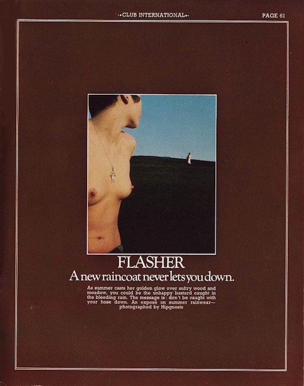
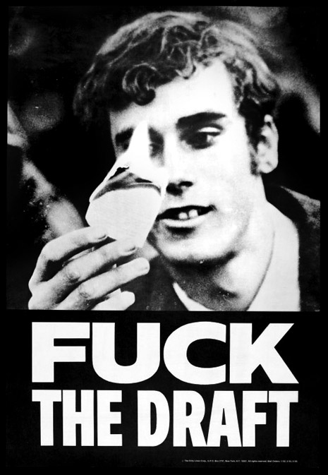
Of the many stories of official government suppression that came out of the Vietnam War era protest movements, one of the most compelling is the saga of Kiyoshi Kuromiya’s indelible “Fuck the Draft” poster. Kuromiya procured—how is unclear—a photo of a hippie burning his draft card, looking almost religiously captivated by the flame, and set his slogan in the plainest possible type. It was a hit, but his mail order sales gave feds seeking to suppress its message a strong angle of attack—using the mails to send obscene materials over state lines. The designer spent three years fighting those obscenity charges, and my Dangerous Minds colleague Jason Schafer crafted a fascinating deep-dive of that story about two and a half years ago. I unconditionally recommend reading it before proceeding here.

A crucial part of that story has gone untold until now—the perspective of Bill Greenshields, the man in the photograph. He’s only ever been publicly identified as the face of “Fuck the Draft” once before, practically in passing in a 1968 issue of an underground magazine. He’s agreed to tell his story for the first time to Dangerous Minds, to mark the 50th anniversary of his immortal rebellious action—the photo was taken on October 21, 1967, at the notorious war protest at the Pentagon, the one during which Abbie Hoffman famously attempted to levitate the building.

Dangerous Minds was put in contact with Greenshields by longtime Detroit art/punk provocateur Tim Caldwell (we’ve told you about him before.) Caldwell has known Greenshields for decades, but only just found out about his friend’s connection to the poster. It’s a story best told in Caldwell’s words:

Tim Caldwell: I was at the Museum of Contemporary Art Detroit for this exhibit called “Sonic Rebellion,” for the 50th anniversary of the Detroit riots in July of 1967. There are all these artifacts, like magazines, protest posters, books, and photographs, and people’s interpretations of all that in their artwork. And also there’s this idea of music as a force of expressive resistance. And there was this poster of my friend Bill. It was really weird, because he’d always told me he’d had a very different life before we met, and I didn’t really know what he looked like as a teenager—he’s almost 70 and I met him about 30 years ago, doing films and things like that. But so I saw this poster, in a case, and I was like “WOW, that’s him!” He looks kind of goofy and crazed in it, because that’s just the moment they caught him, he wasn’t posing or anything. I hadn’t seen him in about five or seven years, so I called a mutual friend who’s a musician who he knew Bill from film societies going back to the ‘80s. And he confirmed that it was Bill in the poster, and I asked if he was OK with talking about it, since he’d never mentioned it. So finally I called Bill and, yeah, it’s him! And every time we talked after that he’d have more and more crazy stories about stuff he did in the protest era that I’d never heard about before, he had this whole secret life before I met him—I started to wonder how well I’d really known him for those 30 years!
 

Bill Greenshields reliving a key moment from his past

Greenshields broke his decades-long silence on his experience in a phone conversation last weekend.

DM: So let’s start at the beginning—the protest itself. What were the circumstances, and do you know who shot the picture?

Bill Greenshield: I have no idea who took the picture or how I was selected to be on a poster. There were some people around with cameras, some of whom I thought were probably government spooks.

DM: Some of them probably were!

BG: There were friendlies too, with cameras, though. This occurred at the Pentagon on October 21, 1967, and it was part of the march on the Pentagon.

DM: This was the day that Yippies tried to levitate the Pentagon?

BG: Yeah, that occurred at the same time, you might say, around sundown. The march started at the Lincoln Memorial. People were bussed in from all over the country, and it was kind of a virgin thing, the first really big national march. If you’ve been to the Lincoln Memorial, you know there’s a giant long reflecting pool between that and the Washington Monument obelisk. At that particular time, I was part of a group of draft resistors in the Detroit area, and one of us had made a mock-up of a sign, a really large draft card. The name on it was “Loony Bird Johnson,” since LBJ was president at the time. Another fellow and I took off our shoes and sock and walked into the reflecting pool, which was slippery as hell. So we’re slipping and sliding, trying to be really careful, taking this gigantic draft card out into the middle of it, and suddenly everyone looked a lot smaller, except Lincoln, who was still very imposing. We got out a butane lighter and tried to light it, and it took a while, because there was a breeze and it was poster board. But we got it lit and immolated the whole thing. Then slid all the way back and put our shoes on to go hear all the speeches.

Then there was a march across the Potomac to the Pentagon. I don’t know how many miles it was, but it was slow going. I don’t know how many people were there but it was a long line of them, and the first people there went to where the public entrance was, that large staircase, and they went up there and got stuck up there, surrounded by Federal Marshals, who were not very nice [laughs], with billy clubs and whatnot, and Federal troops, who were our age, and were very nice. They were armed, but you could talk with them. It was starting to get dark, and like I said, they were stuck up there. Then some of the Yippies were doing like an invocation to levitate the Pentagon…

DM: So did it go up?

BG: Well, WE levitated! [laughs] Anyway, what happened was someone threw a rope up to the next level, because the stairs were blocked, and nobody was grabbing it to climb it, and I thought “what the hell,” and I started to go up. And as I’m going up I’m thinking various things, like “I hope someone up there keeps holding the other end of this,” and “A sniper could pick me off pretty good right now.” And when I got all the way up some people saw me and helped me over the ledge. People were pretty crammed together, and about 50 of them had put their draft cards in a soldier’s helmet and burned them all, and I had just missed it. So I took mine out and lit it up individually, and it lit a lot better than the big cardboard one. That was when someone took my picture. And that picture somehow got to Kiyoshi Kuromiya who made the poster.

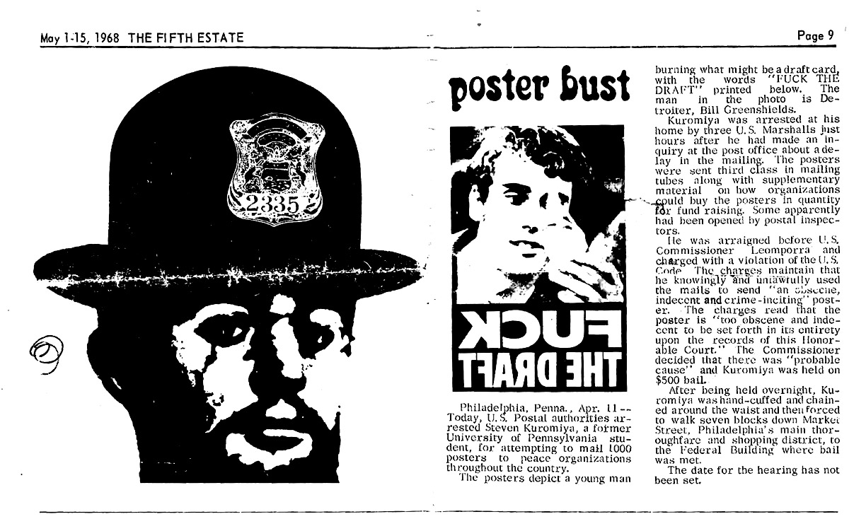
I had no knowledge of the poster until an article in May of 1968, in The Fifth Estate, an underground paper that still exists, by the way, Harvey Ovshinsky was the editor. I was a childhood friend of his, all the way through junior high school, and he recognized me on the poster right away, and even named me in the article.
 

click to spawn a more readable enlargement

DM: The look on your face in that poster is a little demented, like you’re some kind of twisted fire-worshipper.

BG: Yeah, like there’s this GLEE of some kind! That’s probably why it was selected, but you gotta remember, I had just climbed this rope after walking from the Lincoln Monument to the Pentagon, and so I probably WAS really enjoying burning that card at the time. [laughs]

DM: So after the poster came out, the Federal obscenity charges came up against Kuromiya. Did the feds try finding you, too?

BG: Yes, they did.

Continues after the jump…

READ ON
Posted by Ron Kretsch
|
10.20.2017
09:58 am
|
Powerful anti-racist miniature dioramas created inside jewelry boxes
09.27.2017
09:37 am
Topics:
Tags:

01Deluge2015.jpg
‘Deluge’ (2015).
 
Maybe it was the miniature world of The Sims or the illustrations in Where’s Waldo? with its crammed panoramic scenes filled with chaos and action that first suggested the possibility to Canadian artist Curtis “Talwst” Santiago of producing tiny dioramas inside jewelry boxes. Or, maybe it was the Parisian dude living in Vancouver, from whom Talwst bought old magazines and posters to make his collages, who one day tossed him an engagement ring box and said, “I want to see what you can do with this.”

It didn’t take long. Talwst’s turned the box into a diorama of a beach scene with his girlfriend coming out of the water like Botticelli’s Venus. It was the start of a process with which Talwst creates astonishing works of power and beauty.

Talwst—pronounced “Tall Waist” a reference to his Caribbean grandfather’s and his father’s nickname—was born and raised in Sherwood Park, Alberta, Canada. His father emigrated from Trinidad to Fort McMurray in 1969. The experience of growing up in Canada was different to the life Talwst discovered when he moved to New York. As a Black man then living in Brooklyn, he found himself stopped and frisked by cops for no other reason than the color of his skin.

When I came to the States, there was some difference between me and the young man here that I see. But the minute I put on that big black hoodie, my black sweatpants, and I’m standing outside having a smoke outside of my studio, I’m immediately viewed as ‘nobody,’ and they know nothing about me. I realized that could happen to anyone, at any time. How many young men, that are loved by their families and are good people, were being killed? That resonated with me. It was the start of looking at Black identity in America because it’s significantly different than Canada.

The state-sanctioned racism and violence against the Black community made Talwst understand that Black lives have less value in America, and that at any moment his own “life could be taken or seen as having no value.”

Watching news reports of Black men being murdered on the streets for no reason led Talwst to produce dioramas on the shooting by police of Michael Brown in Ferguson, Missouri, in 2014, and the strangulation by police of Eric Garner on Staten Island in 2014.

[W]ith Michael Brown, it’s almost like a Goya painting [The Third of May]. Where we have images of this person beforehand and then we have images of him dead.

It’s a plethora of feelings. It’s frustration, it’s feeling thankful that I’m standing in a position where I’m able to observe and look at it, and not feel lost, locked in it, trapped by it. With the Eric Garner tape, you watch the whole thing happen in front of you. Working on that piece was so sad for me. I felt so much sorrow for his family. You hear him beg for his life.

Just before Garner’s murder, Talwst had seen Goya’s Disasters of War etching Por Qué? of “this guy being choked against a tree by three soldiers.”

A few days later, it’s 4 AM in the morning and I’m watching the YouTube video [of Garner being choked by police officers], and it draws to mind the etchings. I started crying, working and crying and feeling so sad and hurt. But I learned so much from that. I learned that I had the ability to channel my emotions into the work, if it’s honest work. But I held in the back of mind, this is not a monument to death. This is the spark to thinking and looking differently for a lot of people that are going to view this and see the video. It had to be a catalyst, mainly for his family. They’ve seen the moment of his death so much, but they never saw a moment of his ascension, his soul moving. And that’s what I wanted to create.

Talwst has also produced dioramas on the plight of Syrian refugees (Deluge) and the rape of indigenous people (The Rape). He also has produced work on environmentalism, gender and identity. His dioramas have been featured in art galleries and museums across America and Canada, and in Paris, Johannesburg, South Africa, and Geneva, Switzerland. And you can see more of Curtis Talwst Santiago’s work here. Click images to see larger picture.
 
07Execution_Of_Unarmed_Black_Men14.jpg
‘Execution of Unarmed Black Men’ aka ’ Execution of Michael Brown’ (2014).
 
013porque15.jpg
‘Por qué?’ (2014).
 
More of Talwst’s astonishing dioramas, after the jump…
 

READ ON
Posted by Paul Gallagher
|
09.27.2017
09:37 am
|
When the legendary Hipgnosis did fashion shoots for ‘classy’ porn mag Club International (NSFW)
09.20.2017
12:55 pm
Topics:
Tags:

020hipclub.JPG
 
It’s a fair bet that a large part of many (most?) record collections includes a good percentage of covers by the legendary London-based graphic designers Hipgnosis.

Storm Thorgerson and Aubrey Powell who were the original founders of Hipgnosis turned out a massive array of iconic designs for bands as varied as Pink Floyd (who had been the first band to commission the duo), T.Rex, Hawkwind, Led Zeppelin, Elton John, 10CC, Wings, AC/DC, Black Sabbath, Genesis, Jon Anderson, Depeche Mode, XTC, ABC, Megadeth, and even England’s former poet laureate John Betjeman.

Apart from album covers, Hipgnosis also designed a series of fashion spreads for the softcore porn mag Club International and its more hardcore American edition Club.

Club International was founded by porn supremo Paul Raymond, who ran the legendary strip club the Raymond Revuebar in London’s seedy Soho district and a series of best-selling porn mags. Under its first editor Tony Power, Club International was intended as a high-quality adult entertainment magazine mixing the best of writers with the finest photographers and designers.

Hipgnosis was hired to add a classy touch to the magazine’s fashion spreads. The gig allowed Thorgerson and Powell to try-out a few ideas which they would later re-use on album covers—the flasher who would reappear on Pink Floyd’s A Nice Pair, for instance, while the water-in-the-face shots would feature on Peter Frampton’s Something’s Happened. See more Hipgnosis glorious work here.
 
01hipclub.JPG
 
02hipclub.JPG
 
See more of Hipgnosis’ fashion work for Club International, after the jump…
 

READ ON
Posted by Paul Gallagher
|
09.20.2017
12:55 pm
|
Your worst nightmares: The macabre and disturbing sculptures of Emil Melmoth (NSFW)
09.05.2017
09:37 am
Topics:
Tags:

01melmoth.jpg
 
Imagine someone sneaked into your bedroom when you were asleep, peeled back your eyelids and scooped out your very worst nightmares then turned them all into sculptures.

Well, that’s kinda like what Mexican artist Emil Melmoth has achieved with his gruesome, morbid, yet strangely compelling sculptures of deformed creatures and unnamed things that dwell in the night—he has made the terrors of darkness visible.

Melmoth takes his inspiration from religious iconography, medical anatomy, death culture, the circus, the freak show, and the downright macabre. His sculptures may look like expensive props for a deeply disturbing horror movie but they are intended to engage the viewer in some serious thinking. Fusing wax, ceramics, resin, nails, and bone, Melmoth creates meditations on the human condition that juxtapose “ideas of religious immortality and paradise with the reality of bodily imperfection, dissection, and truths of scientific knowledge.”

[His] wax, anatomical models revel in a dark and surreal environment, and where his depraved sculptures live in affliction: fragile beings in an eternally harrowing state of mind. Melmoth projects the sublime and ethereal concepts of death onto his creations, portraying pessimism, nihilism, existentialism, the question of transcendence beyond death, mental instability, and self-destruction, all ideas represented in his invigorating constructs.

An exhibition of his work is currently on show at the Last Rites Gallery (until September 9th) but if you can’t make that then you can follow Emil Melmoth on Instagram and Facebook.
 
02melmoth.jpg
 
03melmoth.jpg
 
010melmoth.jpg
 
See more of Emil Melmoth’s nightmarish sculptures, after the jump…
 

READ ON
Posted by Paul Gallagher
|
09.05.2017
09:37 am
|
Objects of Desire: Vintage erotic pocket watches (NSFW)
08.15.2017
09:43 am
Topics:
Tags:

01objtdsr.jpg
 
From what I can gather, the earliest erotic pocket watches date back to the 17th-century when they were intended as prized erotica for a small but wealthy market. Some of these early designs were made as saucy keepsakes for loved ones, while others were specifically manufactured for the Chinese market, in particular the Emperor and his entourage, where many of these naughty timepieces were given as gifts to cement trade and diplomatic agreements.

By the 18th-century, erotic automaton pocket watches—that is timepieces with painted dials and movable parts depicting explicit scenes of sexual congress—were popular with royalty and the upper class. These watches usually featured a brightly painted erect penis that swayed back and forth in time with the second hand. One such watch, the Henry Capt, Musique d’Amour sold for $216,880 in 2011. Of course, back in the day, being caught with a porny timepiece could lead to its confiscation and public censure. Today we’ve got the Internet…

These pocket watches weren’t just cheap knock-offs, they made by some of the finest and most famous clockmakers in the world like Cortébert, Breguet et Fils, and Doxa. In the 20th-century, companies like Omega and Smiths-Ingersoll continued the tradition producing a limited but highly collectible selection of erotic watches—including one in which Snow White entertained the Seven Dwarves.

The following selection ranges from Breguet et Fils “Cavalcade” (1820), which depicts a couple on on horseback, to the mid-20th-century Swiss designs of randy gentlefolk enjoying some outdoor sports.
 
02ojbjtdsr.jpg
 
04objtdsr.JPG
 
More titillating timepieces, after the jump…
 

READ ON
Posted by Paul Gallagher
|
08.15.2017
09:43 am
|
Page 3 of 37  < 1 2 3 4 5 >  Last ›