FOLLOW US ON:
GET THE NEWSLETTER
CONTACT US
‘Game of Thrones’ intro redone retro 60s-style
09.03.2014
11:28 am
Topics:
Tags:


Milan Vuckovic reimagined the Game of Thrones title sequence and theme song as a 60s-era homage to famed movie title designer Saul Bass.

Someone in the YouTube comments asked Vuckovic if the static you hear during the song was done purposefully. Vuckovic said indeed, that it was done on purpose.

 
via World’s Best Ever

Posted by Tara McGinley
|
09.03.2014
11:28 am
|
ChávezPro: Hugo Chávez’s handwriting is now a revolutionary, anti-imperialist font
08.19.2014
10:47 am
Topics:
Tags:


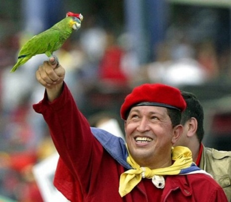
Hugo Chávez’s regime was a mixed bag, but though the Bolivarian bureaucracy has its issues, the advances he made have seen him canonized among poor and working class Venezuelans. He’s responsible for massive developments in infrastructure like rural schools, free university and excellent, free hospitals. He democratized natural resources and largely dismantled the oligarchy that previously ran the country—these are the sorts of accomplishments that predictably produced a palpable cult of personality around Chávez as a leader. 

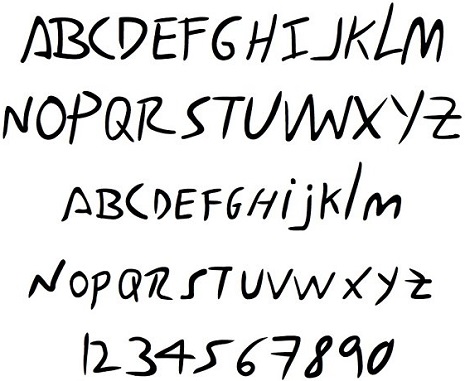
Still, it’s a little odd to see his handwriting commemorated in an “anti-imperialist” font. A group called Creative Trench actually reproduced his penmanship from his prison letters, and are giving it away for free (naturally), on their website.


For the full effect, try picturing the scrawl over this letter to his daughter, written from prison in February of 1992 after the failed coup. By the way, “Maisantera” is the name of their home, “the boy” is probably Chávez’s son, and the cuatro is a Venezuelan instrument.

My love: Hello, my heart!

I want you to know that day and night I carry you in my heart and in my mind.

I’m so happy that you are well.  As always, I am proud to have a daughter like you, pretty, intelligent and brave.

Maria, I’m in good physical health and above all have a tranquil conscience. I did what I had to do, with the hope that things would change, with the Bolivarian hope that there will be a better world for you in the future, a world where there is not so much injustice and such corruption, were children have food, shelter, medicine, toys, schools.  All of Venezuela’s children.

You are already a young lady so I’m sure you understand me.

The only thing, my baby girl, is that now I will not be very close to you [...] as before.  But my heart and my spirit are always there in the “Maisantera” and wherever they [the family] go.

Remember to apply yourself to your studies and to your reading, as well as to art and music. It will cultivate a noble and libertarian spirit that you will carry within.

Likewise with sport, to have “a healthy mind in a healthy body”. Keep going to the pool (be very careful).

I entrust the boy to you.  Encourage him to learn to play the cuatro, to write stories and to draw, and to keep going to swimming and to baseball. But please take care of him.

I must go now, my Maria, with the hope of seeing you soon and with the greatest love from,

Papa

ChávezPro (yes, that’s what it’s actually called) isn’t completely unprecedented. In Venezuela, Chávez’s handwriting is on all kinds of swag, from buildings to clothing. Still, the best use of ChávezPro has to be for covert trolling, no? I know exactly what font I’m using for my Republican relatives’ birthday cards, anyway.

Below, Oliver Stone’s Hugo Chávez documentary South of the Border:

 
Via Fast Company

Posted by Amber Frost
|
08.19.2014
10:47 am
|
Raise a glass to Cthulhu at the Lovecraft Bar
08.08.2014
09:24 am
Topics:
Tags:

lovbarcraft11.jpg
 
The Lovecraft Bar in New York looks like the perfect place to eat, drink and discuss all things Cthulhu. The eldritch interior design and artwork was created by artist Benjamin Enzfelder, and he has certainly given the bar a great Lovecraftian atmosphere. Certainly on my places to visit next time I’m in NY.

The Lovecraft Bar will officially open in September, details here.
 
lovebarcraft22.jpg
 
lovebarcraft33.jpg
 
lovebarcraft44.jpg
 
lovebarcraft55.jpg
 
lovebarcraft77.jpg
 
lovebarcraft88.jpg
 
lovebarcraft99.jpg
 
H/T Steal This Singularity, via Dark Corner Books

Posted by Paul Gallagher
|
08.08.2014
09:24 am
|
Meet the Kuba Komet, the most ass-kicking retro home entertainment system ever made
08.07.2014
11:58 am
Topics:
Tags:


This remarkable piece of equipment is called the Kuba Komet. It was manufactured by the KUBA Corporation in Wolfenbüttel, West Germany, from 1957 to 1962. The recommended retail price for the Komet was 2,798 Deutschmarks, or roughly $1250, which correlates to about $10,500 in today’s dollars. (According to this Census Bureau report of 1960, the average income for a family in 1958 was $5,100.) It was a hefty item, weighing 289 pounds and is a little more than seven feet wide. It featured a television, a record player, a radio, eight speakers and a “TV tuner” in the bottom cabinet—if you were willing to pay a little extra you could get a “magneto-phone wire recorder” (a forerunner to the reel-to-reel and cassette audio recorders) as well as a remote control.

One of the Komet’s best features was that the big “sail” section of the unit could swivel. The blonde-colored wood is solid maple; the darker wood is wenge, a rare form of timber found only in sub-Saharan Africa.

Here’s a picture of the Kuba Komet with its bottom drawer open:


There are only about ten of them in existence, about half of them in North America. The Early Television Museum in Hilliard, Ohio, has one on display—since I live in Ohio, I should probably make a pilgrimage to check it out.


On this videokarma.org forum, the users complain about the unnecessary internal complexity of German electronics products from that era, as in, “Why use one part when we can use 15?” In 2011 a nonfunctioning Kuba Komet unit was auctioned for $3250, which isn’t such a bad price for the most awesome fixer-upper in the world. Although according to this thread, they’ve also been auctioned for about $8,000.


via Atompunk

Posted by Martin Schneider
|
08.07.2014
11:58 am
|
You knew this would happen: The inevitable Worf-Joy Division mash-up T-shirt
08.05.2014
09:48 am
Topics:
Tags:

001unkoklingont11.jpg
 
One of the most iconic album covers in pop history meets one of the most iconic foreheads in television history in this T-shirt mashup of Joy Division’s Unknown Pleasures with Klingon Worf from Star Trek: The Next Generation.

The T-shirt is called “Klingon Pleasures” and the mix of album’s original image of radio waves from pulsar CP 1919 seems a perfect fit with Worf’s brow. “Klingon Pleasures” is one of NickOG‘s (Nick O’Gorman) designs on Threadless.
 
01jdklingpleasure.jpg
 
Via Nerdcore

Posted by Paul Gallagher
|
08.05.2014
09:48 am
|
‘The 10th Victim’: Violent, campy 1965 battle of the sexes satirizes reality TV decades in advance
07.28.2014
08:12 pm
Topics:
Tags:


For reasons I cannot fully articulate, even to myself, one of my favorite things ever in life is the (relatively) little-known 1965 French-Italian film, The 10th Victim (La decima vittima) starring Ursula Andress and Marcello Mastroianni and directed by Elio Petri. I have movie posters, lobby cards and various pulp paperback books with different great covers (Part of my fascination with the film, obviously, has to do with Ursula Andress—at the absolute height of her considerable beauty here—that much I do know…)


The plot (clearly the “inspiration” for The Running Man) revolves around the reality show assassins of “The Big Hunt,” a wildly popular futuristic TV spectacle sponsored by the Ming Tea Company of Japan. For five hunts you are the killer, for five hunts the victim.


To win the tournament, the assassins must complete ten kills, but they never know if they are the hunter or the victim. The Andress character’s kills are elaborate—one of them was even ripped-off for an Austin Powers movie—and she becomes the most popular of the contestants. Her kills are used as TV advertisements for the Ming Tea Company and she wants her tenth killer to be a spectacular one.


Next up is Mastroianni’s character, Polletti… or is he? You can’t kill the wrong victim, you see, or else you lose.


You can’t kill the wrong killer in preemptive self-defense, either, or else you lose. What if she is to be his victim? Neither of them know for sure, so of course they have an affair!


The SpyVibe blog calls The 10th Victim a “cocktail of groovy music, op art, pop art, space-age fashion, and modern design.” It’s not even that The 10th Victim is all that good of a film (say, a “six” out of a possible “ten”) but man does it LOOK GREAT. If you’re into things like Danger Diabolik, Fathom, Modesty Blaise or the “Matt Helm” or “Flint” movies, this might be for you. Although not an over the top “funny ha ha” kind of comedy, The 10th Victim is a fun, campy feast for the eyes that was a decades-before-its-time satire of reality TV and our violence-obsessed mass media.

You could also see it was an elaborate metaphor for male-female relationships and the battle of the sexes. I’m pretty sure that part was intentional, especially when Marcello’s mistress helps Ursula’s character—who is fucking him—to stalk her philandering lover. How dare he three-time her!


The soundtrack to The 10th Victim was one of my “Holy Grail” records for many years before I was generously gifted with a copy by Pizzicato 5‘s Yasuharu Konishi when I was visiting Tokyo back in 1994. The score by Piero Piccioni is one of my favorite film scores of all time, consisting as it does of an incessantly repeated loopy organ motif and “la la la la” scat singing by the great Italian singer Mina. Piccioni thought this would sound like jazz in the future. I think the maestro was right:


Below, the original trailer for The 10th Victim.


The entire film is online at Daily Motion. Blue Underground have released The 10th Victim on Blu-ray which is the way you really want to want this puppy…
 

Posted by Richard Metzger
|
07.28.2014
08:12 pm
|
Gorgeous psychedelic handbills and posters from Detroit’s Grande Ballroom, circa 1967-68
07.22.2014
02:49 pm
Topics:
Tags:


Simply stunning vintage handbills for Detroit’s historic live music venue The Grande Ballroom. The majority of these trippy handbills and postcards were designed by Gary Grimshaw (who died in January of this year) and Carl Lundgren. Historically significant, yes, but from a design perspective, these are just jaw-droppingly, face-melting goodness, aren’t they?


More after the jump…
 

READ ON
Posted by Tara McGinley
|
07.22.2014
02:49 pm
|
Cardiac Wallpaper
07.21.2014
01:49 pm
Topics:
Tags:


From the same people who brought you the fantastic Day of the Dead Sugar Skull wallpaper a few years back, comes a new design titled “Cardiac Wallpaper” which features intertwining anatomical human hearts. I dig this. Each roll is “screen printed by hand, reinforcing the exceptional quality.”

I honestly wish this came in more colors, but sadly it appears the only color option so far is red (I guess that does make sense, tho).

Each roll will set you back around $300. I’d advise hiring a professional to hang and paste this if you’re going to spend that kind of money on wallpaper. I mean, you really couldn’t afford any fuck-ups with this…

You can order it at the Street Anatomy Store.

Technical Information:

  • Roll size: 10m x 52cm (32.8 ft x 1.7 ft)
  • Pattern repeat: 53 cm
  • Hand screen printed in the UK


Posted by Tara McGinley
|
07.21.2014
01:49 pm
|
Communism in textiles: Soviet fabrics from the 20’s and 30’s
07.18.2014
11:31 am
Topics:
Tags:


If you walked by a set of curtains made from one of these fabrics, you might not pick up on a communist star or the CCCP acronym. Many of the designs below are thematic of classical Russian art; you see lush color, dense scapes and even the odd Orientalist trope (note the pattern with the camels).

Anything more than a quick glance however, might reveal romantic depictions of farmers and factory workers, often rendered in the angular, geometric lines of Soviet Constructivism. Even more explicit are the references to Soviet ambitions of modernization. We see tractors, cars, airplanes, trains and smoke stacks—all the promise of an industrialized workers state.


More Soviet textiles after the jump…

READ ON
Posted by Amber Frost
|
07.18.2014
11:31 am
|
Ultra cool design for a portable standing desk
07.16.2014
10:32 am
Topics:
Tags:


Okay, so this isn’t a “dangerous” topic or post per se, but I wanted to blog about the StorkStand anyway because not everyone has the dough to spend on an automatic sit-to-stand desk. The StorkStand is a portable standing desk that can be used on the back of any chair. The desk can hold up to 50 lbs. of weight and weighs slightly over 4 lbs. so you can carry this puppy around with ease. Maybe there are other versions of this portable desk—I don’t know—but I think it’s a brilliant idea.

You can pre-order the desk for $199.00 here.


via Like Cool

Posted by Tara McGinley
|
07.16.2014
10:32 am
|
Page 21 of 37 ‹ First  < 19 20 21 22 23 >  Last ›