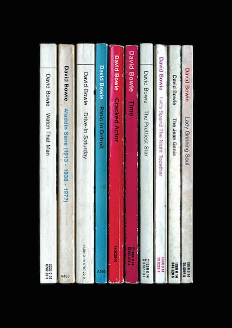
David Bowie, Aladdin Sane. Those red and blue spines seem artfully placed, hm?.......
I’ve collected Penguin paperbacks for years; I’ve always been drawn to the groovy mid-century aesthetic of the covers from the pre-1980 era (actually pre-1970 for the really good stuff), with the stately and ineffably British typesetting and the promise of erudite treasures within.
So something in me totally lit up when I saw the StandardDesigns shop at Etsy. Clearly whoever is doing this store is a kindred spirit. You see, their main stock in trade is making posters where each of the songs of certain classic albums (there’s an emphasis on Bowie and British postpunk and Britpop, but not to worry, it’s not like VU and Springsteen and the Pixies and Tom Waits aren’t also in the mix) are represented by a single book from the midcentury Penguins. Once you do all of the songs of Doolittle or OK Computer or Substance, say, you’ve got a tidy little shelf of dog-eared paperbacks, each with a title in the often-teeny Penguin spine lettering.
Appreciating these posters is assisted by knowing some of the basics of the Penguin paperback world. One great thing about midcentury Penguins was the wonderful rules they set down in order to communicate things. For instance, the Pelican imprint specialized in nonfiction subjects and used blue as the indicating color, while murder mysteries almost always used green.
The early (and quite famous) phase of Penguin paperbacks were dominated by Jan Tschichold’s 1940s-era design with author and title information set in Gill Sans, flanked by huge orange stripes on the top and bottom. In 1962 Romek Marber came up with a standardized layout for Penguin titles that came to be known as the Marber Grid, which did a great deal to clarify what a Penguin cover was supposed to look like. Opinions may differ but most of my favorite covers use the Marber Grid.
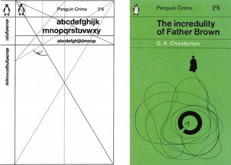
The Marber Grid
The posters go in for a lot of little in-jokes or otherwise apt use of the Penguin spines. The “shelves” for Nebraska, Velvet Underground and Nico, Aladdin Sane, Velvet Underground and Nico, Unknown Pleasures and a couple others strongly mimic the album covers they’re recapitulating, while in most of the other cases there’s just a vague color resemblance. For Velvet Underground and Nico they’ve worked in the name “Andy Warhol” as the “editor” of the volume Heroin. The one for Led Zeppelin’s “Zoso” album doesn’t mention the band’s name anywhere—just like the real cover—and also uses exclusively titles from the Penguin Poets series from the late 1950s, while OK Computer, quite aptly, is made up entirely of those blue nonfiction Pelicans. My favorite detail actually comes from the poster for The Queen Is Dead, where “Bigmouth Strikes Again” is the only spine that’s one of those green mystery covers, which is somehow totally appropriate.
Each poster costs $26.54 but there are bundle deals if you want more than one. If you want to learn more about the history of Penguin design, I can’t recommend Phil Baines’ book Penguin By Design strongly enough, and Seven Hundred Penguins is also a fantastic treat.
Click on any of the posters for a larger view.
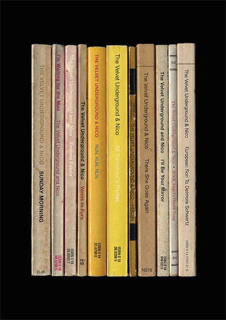
Velvet Underground and Nico
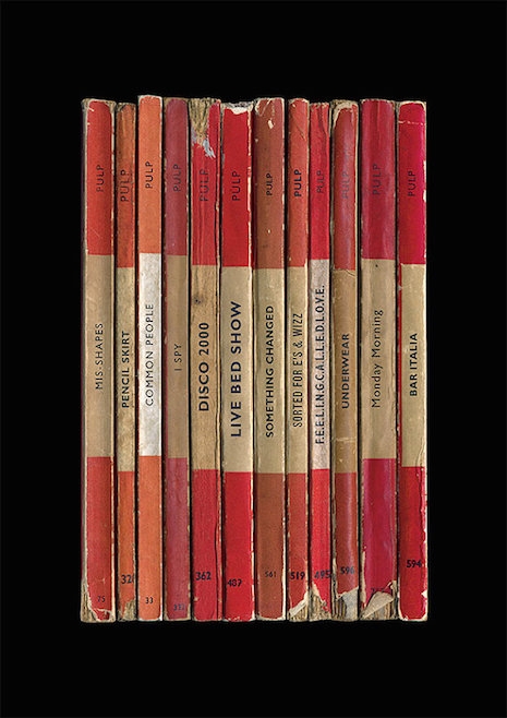
Pulp, Different Class

Tom Waits, Rain Dogs
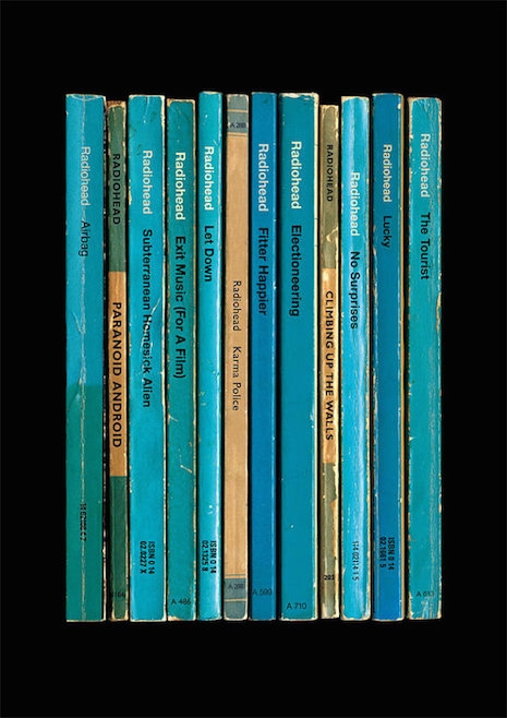
Radiohead, OK Computer
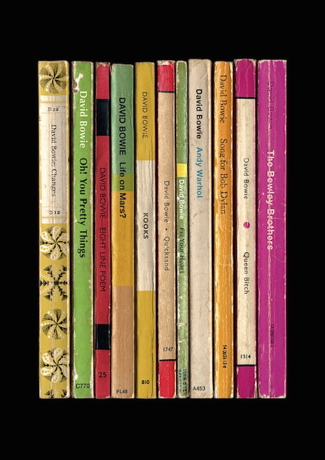
David Bowie, Hunky Dory

The Smiths, The Queen Is Dead
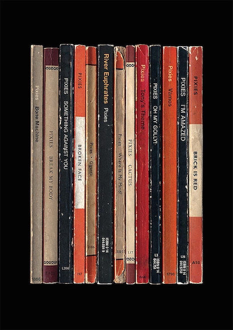
Pixies, Surfer Rosa

Joy Division, Unknown Pleasures
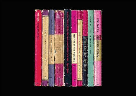
Bob Dylan, Blood on the Tracks
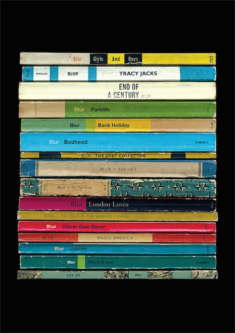
Blur, Parklife

Led Zeppelin, “Zoso”
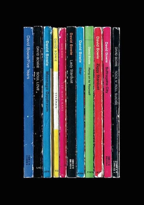
David Bowie, Ziggy Stardust and the Spiders From Mars
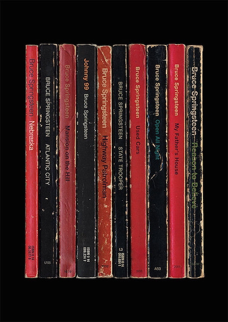
Bruce Springsteen, Nebraska
Previously on Dangerous Minds:
Quentin Tarantino’s Screenplays: Re-imagined as Penguin books