


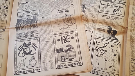
It all started a few weeks ago with a nice lady dropping by the record store with two cardboard moving boxes full of old newspapers. “I thought I’d see if anyone here wanted these before I threw them out.”
I looked into the first box and on top was an issue of The Village Voice from April of 1969. Without even hesitating I said “Yep, I’ll be happy to take these in.” Digging further, I saw that I was looking at two boxes full of old Voice issues from the late ‘60s—mega score. All I had in my pocket was ten dollars, but I offered it to the nice lady. “These are cool, please take my ten bucks. And THANK YOU!”
I started plowing through the contents of the two boxes when I got home that evening. All told, there were forty-five issues of the Voice dating between 1967 and 1969—one of the most interesting periods in U.S. history for art and radical politics. The Voice, at that time, was one of the major mediums carrying the anti-war message, not to mention reporting on the explosion of art, psychedelic thought, and counterculture. Every issue in those two boxes was a treasure trove of Vietnam era cool: Andy Warhol shot. Abbie Hoffman arrested. Eldridge Cleaver lecturing. Burroughs and Ginsberg hit up Timothy Leary’s LSD Center. Jimi Hendrix is playing this weekend. Janis Joplin is playing another. Hair is on Broadway. I Am Curious (Yellow) is at the cinema. EVERYONE is protesting. Cops are busting heads. I’m completely enthralled and lost in these stacks.
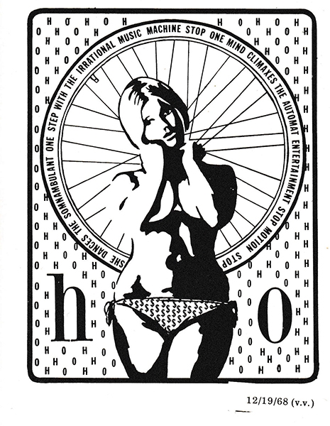
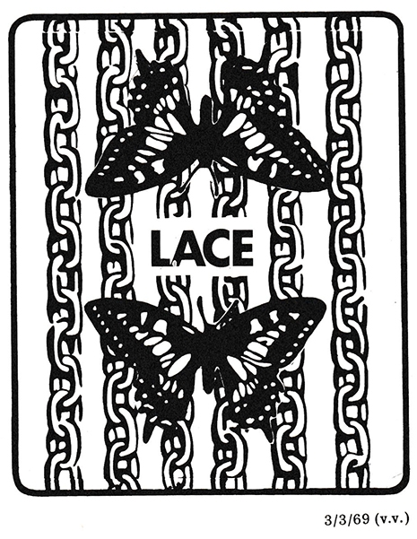
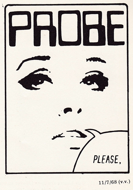
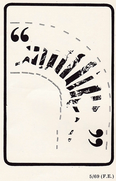
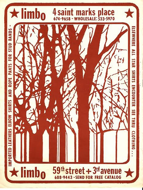
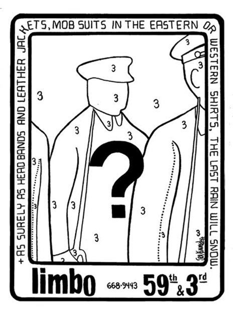
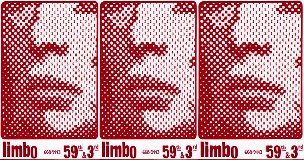
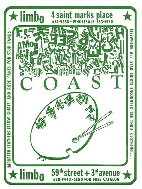
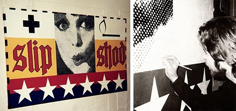
As I’m meticulously poring over the issues, I begin to notice the ads for one particular shop: Limbo. To say there was something special about these mystifying “anti-ads” is an understatement. My eye was drawn magnetically to the Limbo graphics. There was at least one in every issue. The designs were sort of a Dada/Pop Art hybrid, but actually quite unlike anything else—definitely unlike anything else in the Voice at that time. Sure, there were lots of era-typical psychedelic graphics advertising everything from fur coats to futons… but the Limbo ads weren’t exactly psychedelic… and they weren’t exactly advertising anything other than their own unique form. They seemed completely and beautifully out of place and time, something a step beyond the pop iconography of Warhol’s work from a few years prior. Familiar, yet obscure. Every image stopped me in my tracks and had me guessing at its mysteries.
Ads for Limbo as they appeared in the Village Voice.
I became obsessed. I went through every issue, specifically hunting each Limbo ad. They were all different. They didn’t repeat. All arresting and confounding.
Mesmerized, curious, needing to know more, I went to the Internet for information and with very little effort found that this long-defunct shop had both a handy Wikipedia entry and Facebook presence.
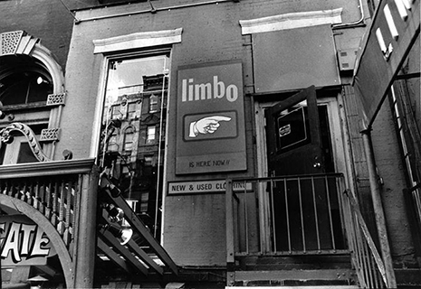
From what I discovered, I was surprised I hadn’t already known about Limbo. It was apparently the IT shop in the East Village. Writing in eye Magazine, Norman Steinberg described Limbo as “much more than just a clothing store. It is a social, intellectual, and entertainment experience that appeals to people of all ages, races, creeds, colors and political persuasions.”
Beyond being simply a retail shop, Limbo was a countercultural HUB for disaffected New Yorkers. The store, through a wholesale sales agreement with Fillmore East, dressed rock stars from Janis Joplin, Jimi Hendrix and Jim Morrison, to the New York Dolls and Velvet Underground. John Lennon, Yoko Ono, Andy Warhol and his “superstars” Baby Jane Holzer, Nico, Viva and Edie Sedgwick were all frequenters.
“Dress as decoration. Dress as defiance. Dress as decorum, or its opposite. That was at the heart of Limbo.”
Limbo sold not only typical “peacenik” clothes like Indian cottons and silks, but also military surplus for the Yippie warriors of the day. Limbo was one of the first sellers to make “vintage” clothing “hip,” calling the inventory on their flyers: “Dead Man’s Clothing.” Limbo is also often credited with starting the trend of “distressing” blue jeans before sale. As a retail shop, it served as a cultural focal point in the East Village—much in the same way that its successor served the early punk scene. Many of our readers may be familiar with the store which Limbo became after being sold in 1975: Trash & Vaudeville.
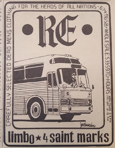
“Carefully Selected Dead Men’s Clothing For The Heads of All Nations”
As I thought about the notion of a shop like Limbo being a community axis, I was reminded of my own recent experience with the nice lady dropping off the two boxes of Village Voices at the record shop and felt connected to that tradition of storefronts being places that can exist beyond their capitalist function of exchanging goods and services for money—places that offer a space for like-minded individuals to meet and share ideas or pass things along simply because that’s a “cool thing to do.”
Scouring the photo galleries on Limbo’s Facebook page, I found many of the same striking ads I had seen in those Village Voice issues. Scanning through those, I located the name of the artist who had designed them: Ira Kennedy.
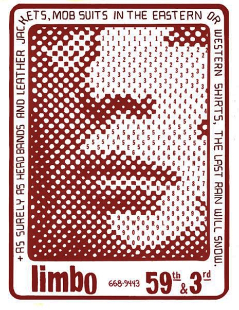
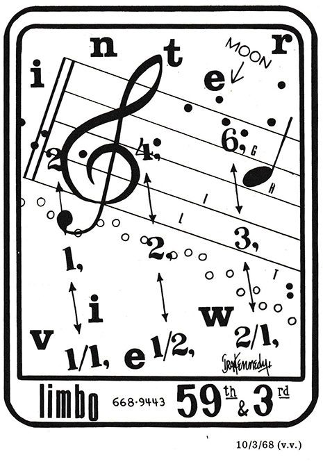
“Fanfare for the face in a number world”—Copy of this ran in Village Voice 12/5/1968. The border around the art is the actual “ad.”
With a bit of further sleuthing, I discovered Kennedy’s personal website and was pleased to learn that he’s still producing challenging work as an artist today.
Contacting Limbo to learn more about these designs. I was thrilled to hear back from both Marty Freedman, original owner of Limbo, and Ira Kennedy himself. I was particularly curious to ask about Kennedy’s working relationship with the shop, as it seemed he had a remarkably free-reign as far as what would be considered acceptable content (for a retailer trying to sling bell bottoms and fringe vests).
According to Limbo owner, Marty Freedman:
Ira came see me at Limbo in 1967. He showed me and one of my “partners,” Fabulous Freddy Billingsley, some examples of his work. We got it, loved it and thought it reflected what we were doing at Limbo. From that point, we started a beautiful three-year relationship. As I remember it, Ira was “up & coming,” and was soon being shown in group shows with local artists, including Andy Warhol.
Limbo was blessed by this relationship. As Limbo’s business began to take off, so did the quality and complexity of Ira’s ads. As our store reflected ‘60s ethos and style and subversion, so did Ira’s work. We all had strong anti-war views and were basically anti-establishment. During this time, Ira’s ads were among the brightest and most original beacons sending out anti-war messages.
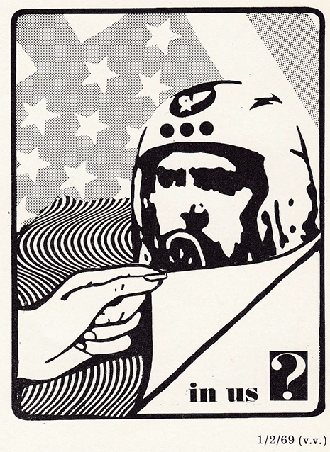
In us ?
Visually, Kennedy’s ads predict the type of design we’d more commonly associate with the visual art of the Punk movement with its melding of Dada, Pop, and Situationist forms. Indeed, détourned clip-art style graphics were to become a staple of punk design nearly a decade later. And that may be why those ads leap off the page of the Voice—though drawing from influences already in place, the presentation was ahead of its time.
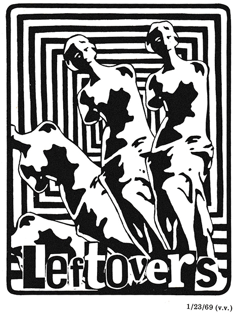
Kennedy was producing Limbo ads for the Voice between 1967 and 1969—fortuitously the exact years represented in those 2 boxes of newspapers brought to me by the nice lady. During this period he was also producing ads and illustrations for Circus magazine, the Fillmore East Program, and The East Village Other .
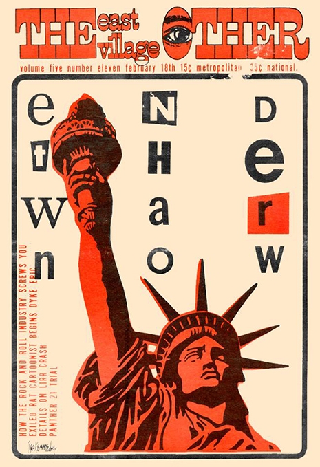
East Village Other cover by Ira Kennedy. “Ransom note”-styled graphics would become a staple of Punk art ten years later.
In 1969 Totem Editions published a book, simply entitled Limbo, otherwise affectionately referred to as The Little Blue Book, which compiled most of Kennedy’s ad work as well as poetry. Kennedy claims they were given away to customers at the shop. Never reprinted, you can still run across copies here-and-there online.

Ira Kennedy’s “blue book” which compiles most of his late ‘60s ad work
During this time Kennedy had begun to get some recognition for his art. According to a bio on his website, he had two one man shows at Parente Gallery, and a group show titled “The Art of Money” at the Chelsea Gallery alongside Andy Warhol, Larry Rivers and other “really famous artists.”
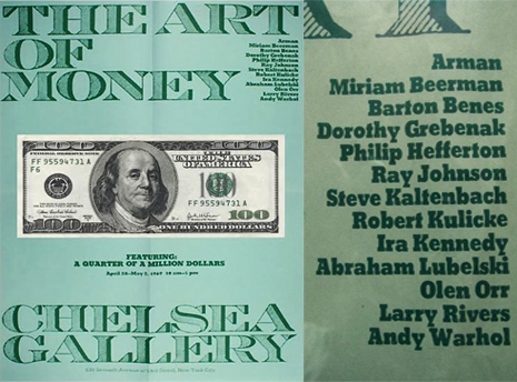
Flyer for show at Chelsea Gallery featuring Kennedy and Warhol.
Things were starting to happen for Kennedy when he became ultimately disillusioned with the New York Art Scene, stating in his bio:
I realized that unless I promoted myself, at expense of my work, by attending the right parties and showing up in the right places, I would never climb any further up that ladder. Also, if I did and was successful, the best I could hope for would be less than a decade of acceptance before the new trend for the next decade swept everything else aside.
At the time of this disenchantment, he had started a family and decided it was time to pack up and move to Texas, leaving the New York art world behind him.
One can’t help but wonder, though, where Kennedy would sit in the historical record had he been willing to play the art-schmooze game. Kennedy relays that one critical gallery curator told him that his work wasn’t “threatening enough.” Perhaps the threat wasn’t obvious enough? It seems there’s something to be said for getting bold, unusual, meaningful imagery out to the masses under the guise of “advertising.” It may be that the “game” is harder to win when biases exist against “commercial artists” in the world of metropolitan fine (“real”) art. Of course several famous artists have made that crossover (indeed, Warhol), but New York is well-known for chewing up and spitting out ambitious young artists—you could hardly blame one with a new wife and child for ultimately saying “fuck this shit.”
Still, the fact that he was producing weekly work as his job means that the brief stint in the New York art world was a prolific one. And with the wonder of this magical series of tubes we’re all connected to today, we can review and reappraise the importance of these pieces.
Ira Kennedy kindly indulged my fawning over his work, and answered a few questions, painting an image of what it was like to be a young, struggling artist in New York in 1967:
Dangerous Minds: A couple of weeks ago I was gifted a large stack of old Village Voices dated between 1967 and 1969. Those old issues give an insight into what was going on culturally in New York City in the late ‘60s, particularly in regard to radical politics and the art scene. In retrospect, that period seems like an historical anomaly with so many radical ideas bursting forth in a relatively brief span of time. In what ways did this environment inform your work?
Ira Kennedy: In 1965 the Beatnik era was fading away and the Hippie movement was in its infancy. Having recently moved from San Francisco, I arrived on St. Mark’s Place in 1965 and started working as a dishwasher for Gregory’s restaurant. At the time the art and music scene—in fact it seemed the social order— was being radically challenged and I was fortunate enough to be on the ground floor. I was 25 years old and eager to become an artist. My earliest paintings during that period were strongly influenced by the work of Van Gogh but that began to shift away and moved toward pieces similar to Robert Rauschenberg, Roy Lichtenstein, Jasper Johns and other Pop artists. I loved the psychedelic posters coming out of San Francisco but I was intent on becoming a “gallery artist.”
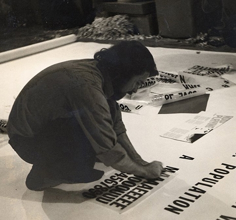
Ira Kennedy creating in New York.
DM: How did working with Limbo come about? And what were the terms of your relationship with Limbo?
IK: Back around 1966 I had just hired on at Limbo, working in the warehouse when Limbo announced they were relocating their business from 24 St. Mark’s Place to a much larger building at 4 St. Mark’s Place. Being all of 26 years and professing to be an artist I somehow managed to impress the owners Marty Freedman and Fred Billingsley to let me do the Grand Opening ad to appear inThe Village Voice.
I’m not sure why they agreed. I had no experience in advertising and no portfolio. Nothing. Just enough audacity to convince the owners I was up to the task. Maybe it was because I was willing to create the ad for free. The first ad was a photo montage, but since the store was advertising in the Voice every week I had to come up with a plan. I didn’t really have a plan, so I made one up.
In short order, the ads became sketches for the paintings I was working on at the time. Marty and Freddy never told me what to do. I don’t know why. I really didn’t know what I was doing but apparently they were okay with that.
After several weeks I found the courage to ask if I could get paid for the ads. My rent was $65 a month so that seemed like the perfect weekly rate.
That exposure lead to work designing covers for The East Village Other, plus illustrations in various publications including The Fillmore East Program Guide, Circus Magazine, WBAI’s program guide, a set for the Film Advertisers Association and other sets for underground films. And eventually two solo exhibitions and a group show, “The Art of Money,” which included several notable artists including Andy Warhol.
Kennedy (right) working on painting (left).
DM: So the ads were “sketches” for paintings you were working on? I’m assuming those paintings went into your gallery exhibitions? How were these works, as well as the “sketches,” received—by the Art community, your bosses, and your peers? Did you ever receive any negative criticism?
IK: My paintings, along with limited edition prints (based on the ads) sold well enough to allow me to take cabs to the Museum of Modern Art for lunch, buy some books, etc. and have it all written off as a tax deduction.
As far as criticism, I remember on one occasion while a couple was looking at one of my pieces, one of them said, “This is too precious.” Also, when I took my work to Castelli Gallery which represented many of the Pop artists—and I’m not sure this was a criticism or advice—Ivan Karp who was the curator at the time, said, “The work is good, it’s just not threatening enough.”

DM: Aside from the weekly stipend, what were the other perks of working for Limbo? I’m talking access to clothes, gigs, etc? Was there any status afforded to someone associated with such a hip clothier?
IK: Apart from meeting the occasional celebrity or rock star I, along with other employees of Limbo, were able to purchase clothes at wholesale prices thus we were some of the best dressed hippies in the city. The other perk, which was really cool, was free tickets to the Fillmore East. Consequently, I had the great good fortune to see Jimi Hendrix, The Doors, Jefferson Airplane, Country Joe and the Fish, Richie Havens, Santana and Ravi Shankar— just to name a few.

DM: The reason I wanted to track you down in the first place, was because going through those Voice back issues, I became obsessed with the Limbo ads. For me, they leapt off the page, even among all the other wild psychedelic period graphics. Artists are often very critical of their own work, but can you give a personal insight into why you think these designs were (are) so visually commanding?
IK: Well, at the time I remember reading something Claude Levi-Strauss wrote, “Ambiguous relationships are the most compelling.” In my work I tried to exercise that notion graphically by combining words and images in a seemingly arbitrary manner—kinda like abstract expressionism, but with the graphic power of Pop art. I seldom had a clear idea of what was intended until I was finished. I’m sometimes amazed that Marty and Freddie went along with my artistic antics. But, I must have been doing something right. In September 1972 The Art Directors Club awarded Limbo a special “Certificate of Merit” for its contribution to Advertising, Editorial and Television Art and Design.

DM: In those designs, were you drawing from any specific influences? Dada and Pop Art come to mind for me as an outside viewer, but I’m curious about what you were pulling from. The images seem so different from anything else that was going on in advertising at the time. As a visual style, many of them seem to predict the graphics that would later be associated with the Punk movement (which was also birthed from the East Village).
IK: The Dada artists such as Kurt Schwitters were a major influence, and the later work of Stuart Davis were also informing my work. Being an artist and writer I was trying to find a way to combine those talents. Later on, the work of the Concrete Poets were becoming another source of inspiration.
DM: How large were the original pieces the ads were shot from? Do any of the originals still exist?
IK: They were 8.5” x 11” and some still exist in various states of disintegration. I still have a few of the original flyers that were the current ads reproduced in color and distributed at the uptown store on 59th Street and 3rd Avenue.
DM: In your Internet bio you noted that success lead to “disenchantment with the ‘Art’ world,” and go on to say “I realized that unless I promoted myself at the expense of my work by attending the right parties and showing up in the right places I would never climb any further up that ladder. Also, if I did and was successful the best I could hope for would be less than a decade of acceptance before the new trend for the next decade swept everything else aside.”
Would you call this “keeping it real” or did it just seem time for the next chapter?
IK: Simply put, I saw the avant garde as a game of esthetic one upsmanship which was inspired more by the intellect than the soul. After Pop art, the trends toward conceptualism then minimalism seemed to be leading to a dead end. I actually found myself headed that way. My last painting in New York was a 4’x 6’ “event”—I can hardly call it a painting. It was created on brown raw canvas on which I stenciled COVER in clear gloss acrylic. The notion was simply to “cover” a canvas with that word. Much like the abstract expressionists I would toss the stencil on the canvas and apply the acrylic until I thought I had done enough. That is when I realized there was nowhere else to go with my art, so I returned to my roots in Texas. That painting was never exhibited and eventually abandoned during one of my many moves.

DM: The visual style you work in today is quite a bit different than your work from the late ‘60s. Can you describe the evolution from one style to the other? Your newer works remind me a bit of South American shamanic Ayahuasca-inspired art. What inspirations do you draw from in the work you do today?
IK: Artists of the past have had sudden shifts in their artistic style. Picasso’s revelation came once he saw African art, and Van Gogh’s discovery of Japanese art was equally life-changing. Likewise, my exposure to the native arts of Mexico and the ancient rock art of the Southwest Indians culminated in a trip to Australia where I was introduced to Australian Aboriginal art. Ultimately this exposure evoked an artistic epiphany and after decades of exploration I finally realized my unique artistic vision.
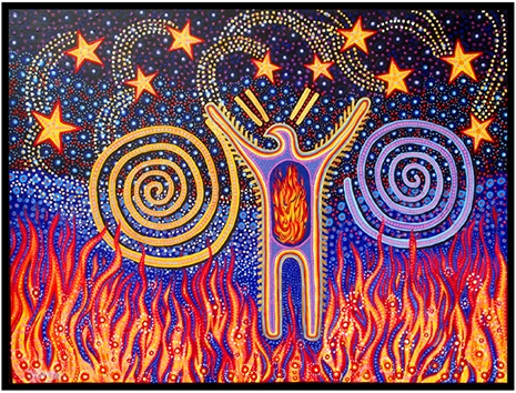
“Between Two Fires”—an example of Kennedy’s more current work.
DM: Finally, what’s going on with Ira Kennedy today?
IK: I was one of 116 artists chosen for North Light Books’ Best of Acrylic competition: Acrylicworks 2: Radical Breakthroughs This led to my appearance in the Acrylic Artist Magazine Summer Edition where I am featured as one of “Eleven innovative artists who share how they wield color to evoke emotion and tell their stories”. My work has also appeared in Southwest Art Magazine, May 2015 issue. In addition, I was one of 12 artists chosen to exhibit my photomontage, “Earth Mother” in the Linus Galleries online exhibition “Myths, Legends & Folklore”.
More of Mr. Kennedy’s story and work can be found on his website and Facebook page. His “blue book” contains more images from his late ‘60s work with Limbo.
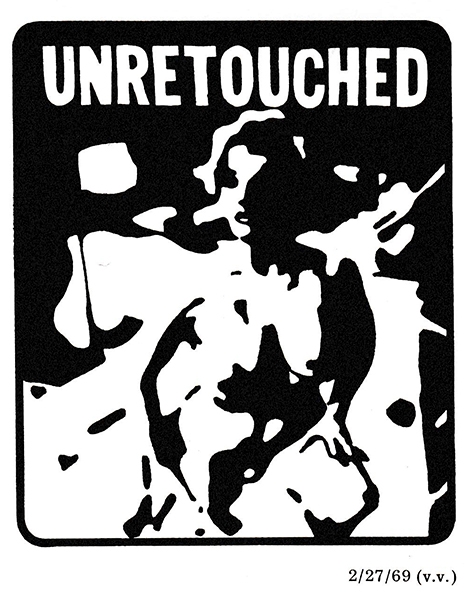
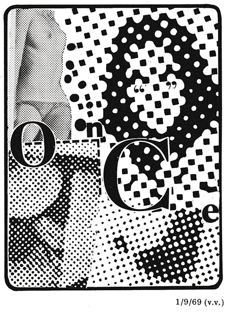
A sampling of that “too precious” work is presented here: