
Someone colorized the opening credits to ‘The Munsters’
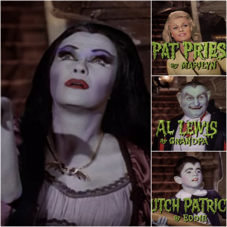
Most people dislike the colorization of old B&W films and photographs. I’m one of those people. The colors never look real enough to me and they add a certain “fakey” modernization to the film or photograph. That’s just my opinion. However, this is not the case with the colorization of the opening to the 1964 TV sitcom The Munsters. This one totally works. Perhaps it’s because it’s extremely well done or maybe it’s because the Munsters were such a colorful, cartoony family that it’s not offensive to see them in color. I don’t know.
Pop Colorture explains the painstaking process of getting The Munsters opening right:
I spent a day or two thinking of how I was going to approach colorizing hundreds upon hundreds of individual images and I finally streamlined a process. After importing all 1,317 frames of the 44-second opening, I broke them down into scenes. Each scene consists of an establishing shot of the character, followed by a quick zoom into a closeup. The establishing shots and close ups would be easy enough, but the zooms seemed like a challenge when coloring frame by frame. Using the same color palette for both parts of the shot did not work well, so I had to color each section (establishing and close-up) separately and find a way to transition the colors during the zoom.
~snip~
I fully colorized several images, almost as key frames, throughout the entire segment, then adjusted for the small movements in between. I knew I would be working frame by frame, but I was not prepared for the sheer amount of time required for this adventure. In the end, I colorized every single frame by hand and even re-colorized the portions of Eddie and Marilyn when I decided on better color choices. In all, I colorized nearly 2,000 images over the course of 80 hours in one very, very full week.
That’s dedication. But like I said in the previous paragraph, it’s really well done. I don’t think you’ll hate it. I think you’ll dig it.
via reddit