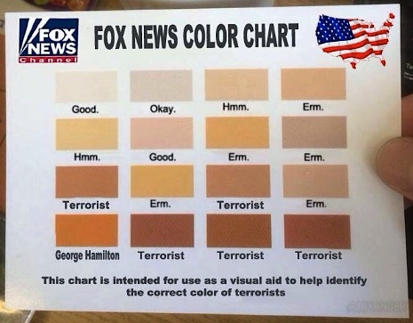
This Fox News Color Chart helps elderly viewers and Fox News “journalists” alike calibrate who’s a terrorist and who is George Hamilton.
Odd that there’s no indicator for John Boehner… Via Bipartisan Report.
<< Back to main
We use ads to keep our content free for you.
Please allow ads and let sponsors fund your surfing. You can find instructions here as to how.
Thank you!