Wonderful ‘Twin Peaks’ mid-century style matchbook covers

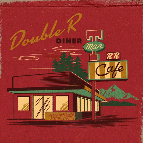
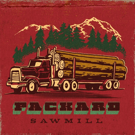
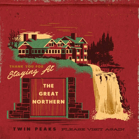
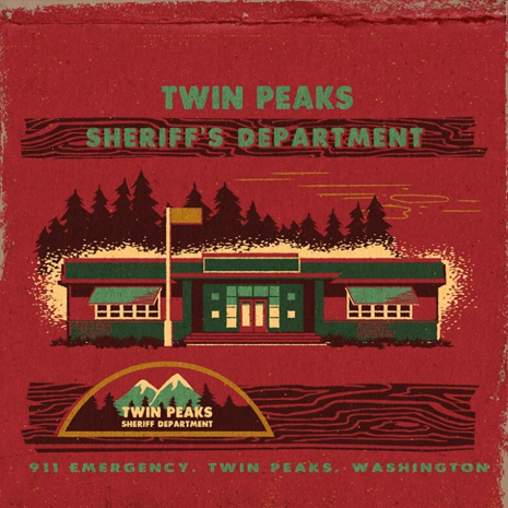
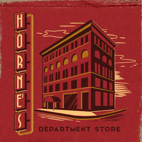
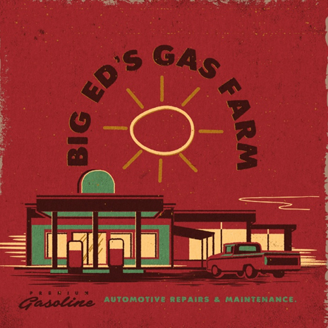
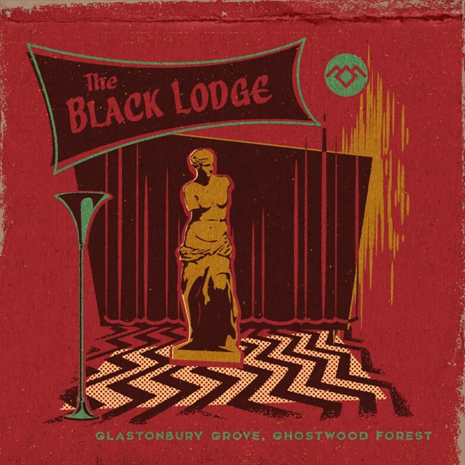
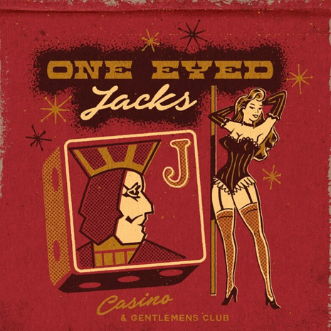
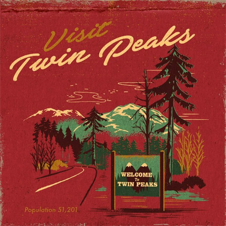
Brisbane-based illustrator/designer Steven Rhodes can handle an impressive diversity of styles, but as I perused his portfolio, the quirk in his oeuvre that struck my fancy the most was his truly impressive gift for recreating the distinctive look of cheap mid-century print graphics. He used that talent to wonderful effect in a new set of prints, available from Society 6, in which he imagines matchbook covers for locations in David Lynch’s cult TV series Twin Peaks. I wish he’d actually have matchbooks made—I’d definitely get a set! That said, while the diner, gas station, casino et al all seem like businesses that might have custom matchbooks, I question whether the sheriff’s department and the mill would have them. But it’s hard to quibble too much when it’s all in fun, and the sawmill cover is actually pretty great.
Welcome to Twin Peaks debuted them earlier this summer, and Rhodes explained what attracted him to the project:
“Twin Peaks has always evoked a sense of nostalgia. There’s an innocent 1950’s aesthetic to the town that contrasts so well with the darkness beneath. It was important that the artwork felt as authentic as possible to the mid-century era.”