


This is the second installation of posts from the influential graphic artist Art Chantry’s forthcoming book Art Chantry Speaks: A Heretic’s History of 20th Century Graphic Design. The first is here. Chantry’s clear reverence for and deep knowledge of the history of his discipline, particularly in championing its seediest manifestations and its obsolete processes, informs a body of work which as much as anyone’s has been THE look of garage punk and grunge, and we’re grateful to Chantry and Feral House for letting us use his work in this form.—Ron Kretsch
Above is the cover of Harper’s Bazaar, September 15th, 1939. The cover is by A.M. Cassandre (1901-1968). I was lucky enough to stumble across a stash of these in a thrift store. I have the entire year bracketing from December 1938 all the way through January 1940. With the exception of three covers, they were all designed and illustrated by A.M. Cassandre.
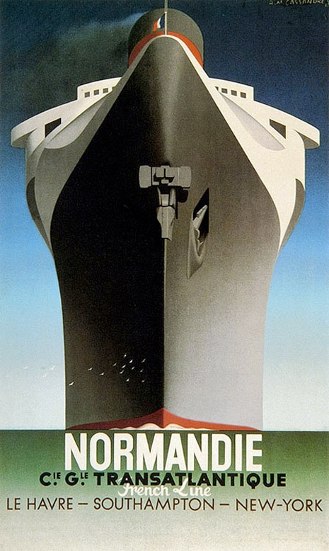
Cassandre is considered maybe the high point of “high” Art Deco graphic design. His most famous poster is of a luxury liner barreling down on you, imaged from the bow of the ship. It’s a stunner. Virtually all of his posters—and he did many—are perfect. Each one is a highly prized collector’s item, a high mark in the history of poster design and graphic design. At his peak, the guy could do no wrong.
This is not to confuse A.M. Cassandre’s work with Art Deco exclusively. I doubt he considered his work “Art Deco” at all. He was one of a huge number—a legion—of graphic designers simply working in the hip style of the moment. Cassandre was not working in a vacuum; there were hundreds of competitors making similarly stunning posters while he was at work. Cassandre’s output was just a hair more astonishing, just a little “better” than the pack. Now, he’s virtually the only guy whose name we recognize from that era of poster design.
One of the big differences was that Cassandre was a Surrealist. The late 1930s was a period when Surrealism invaded American advertising. Surrealism leaked over from Europe initially through the art scene. But the real transfer of surreal dream imagery didn’t really cross the Atlantic until it hitchhiked on the back of the fashion industry. Euro-trash fashionistas of the ‘30s were avid hipsters, too. So they aped their ideas in a shallow copycat way into their fashionista thinking.
The ads in these magazines are a mind-blowing trip. Instead of real models, there was a proliferation of mannequins. And if that wasn’t disturbing enough, they are set in graphic dreamscapes, often with disturbing defacing elements like vegetables for heads and bananas for hands floating in swirling clouds and watch faces. All very cool, très chic!
Cassandre’s illustration style was part Dali, part Magritte and a little Max Ernst tossed in for shits and giggles. Cassandre’s imagery was so strange that his work looks psychedelic today (the chemical Surrealism of a later time). For an American magazine of this era, his work must have stood out like a big strange thumb.

Cassandre’s cover work for this period of Harper’s Bazaar was strange, to say the least. Instead of depicting actual fashions, he depicted the fantasy behind the fashion. He concentrated on the “dream of the idea” of what was being said and what the implication may be. It appealed to an emotional level of otherness and spin. The world on the verge of the second world war must have seemed like a bad nightmare unfolding. So Cassandre depicted floating eyeballs over an outline of France to imagine Paris fashion on the brink of catastrophe. Disturbing stuff—especially weird to see on the cover of a fashion magazine.
More after the jump…