FOLLOW US ON:
GET THE NEWSLETTER
CONTACT US
‘New’ Warhol works discovered on old Amiga floppy disks
04.24.2014
10:00 am
Topics:
Tags:

Andy2
 
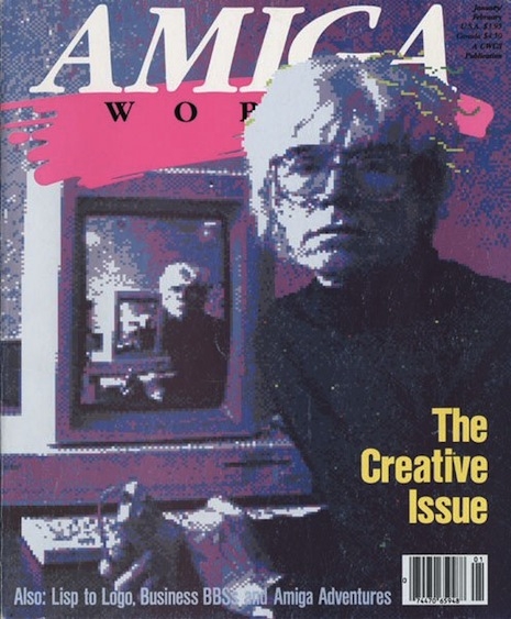
Last year we posted about Andy Warhol’s interest in the Amiga computing platform, including his participation in an Amiga product launch event in 1985, at which a pixelated image ostensibly created by Warhol of Debbie Harry was shown. At the event Warhol, in a desultory manner, executed the fill function a few times; it’s unclear to what extent that work qualifies as a Warhol original—and yet, lots of Warhol artworks were executed by underlings, so really what’s the diff? In that post we also presented a remarkable cover story/interview on Warhol that appeared in Amiga World magazine early the next year.

Yesterday the Frank-Ratchye STUDIO for Creative Inquiry at Carnegie Mellon University issued a press release with the title “Previously Unknown Warhol Works Discovered on Floppy Disks from 1985” and the subtitle “Collaborative Team Rescues Early Digital Art through ‘Forensic Retrocomputing.’” The substance of the press release is that “a multi-institutional team of new-media artists, computer experts, and museum professionals have discovered a dozen previously unknown experiments by Andy Warhol ... on aging floppy disks from 1985.” The discovery was in part a result of efforts by “post-conceptual” artist Cory Arcangel:
 

The impetus for the investigation came when Arcangel, a self-described “Warhol fanatic and lifelong computer nerd,” learned about Warhol’s Amiga experiments from the YouTube video of the 1985 Commodore Amiga product launch [the product launch referenced above]. Acting on a hunch, and with the support of CMOA curator Tina Kukielski, Arcangel approached the AWM in December 2011 regarding the possibility of restoring the Amiga hardware in the museum’s possession, and cataloging any files on its associated diskettes.

-snip-

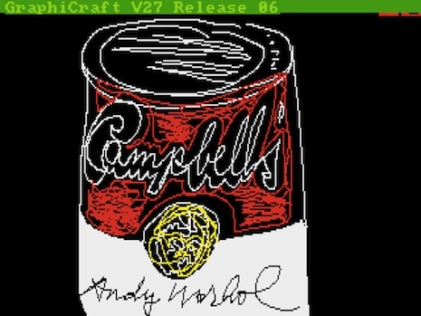
It was not known in advance whether any of Warhol’s imagery existed on the floppy disks—nearly all of which were system and application diskettes onto which, the team later discovered, Warhol had saved his own data. Reviewing the disks’ directory listings, the team’s initial excitement on seeing promising filenames like “campbells.pic” and “marilyn1.pic” quickly turned to dismay, when it emerged that the files were stored in a completely unknown file format, unrecognized by any utility. Soon afterwards, however, the Club’s forensics experts had reverse-engineered the unfamiliar format, unveiling 28 never-before-seen digital images that were judged to be in Warhol’s style by the AWM’s experts. At least eleven of these images featured Warhol’s signature.

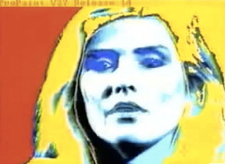
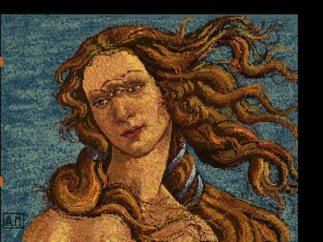
The images depict some of Warhol’s best-known subjects—Campbell’s® soup cans, Botticelli’s Venus, and self-portraiture, for example—articulated through uniquely digital processes such as pattern flood fills, palletized color, and copy-paste collage. “What’s amazing is that by looking at these images, we can see how quickly Warhol seemed to intuit the essence of what it meant to express oneself, in what then was a brand-new medium: the digital,” says Arcangel.

 
On Saturday, May 10, at Carnegie Library Lecture Hall in Pittsburgh, a short film called “Trapped: Andy Warhol’s Amiga Experiments” documenting the team’s efforts will be shown.

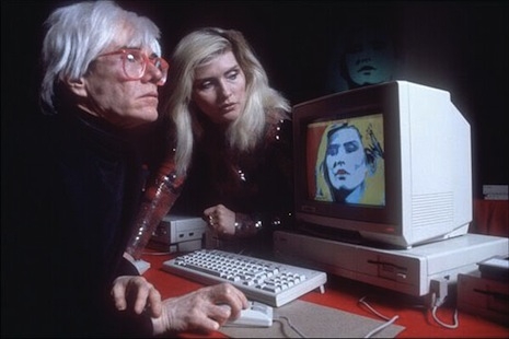
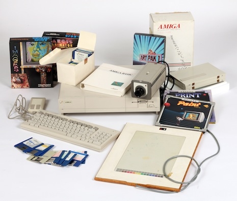
The press release did not divulge information as to when the other 9 or 25 (depending on what figure you go by) digital artworks will be made public. At the top of this page is one of the images released to the public, called Andy2; the other two, Campbell’s and Venus, are below, as well as a picture of Warhol’s Amiga setup.

I’m not an art historian or art critic, but I will say this. I like Campbell’s the best of the three. It engages the most signature work of Warhol’s career, and it’s nice to look at. To call Venus a fully fledged work of art may be a stretch….. it doesn’t seem out of the realm of possibility that Venus was hardly much more than a trial effort to see if he could master the cut and paste function. I’m not saying it was that, I’m saying it could be that. Given the minimal manipulations involved and the cheeky (and let’s not forget, not terribly Warholian) subject matter, to argue for its status as a mature Warhol work might well be to indulge in some kind of aesthetic-categorization hair-splitting…. It’s not like art critics have ever, ever argued that a ridiculous or trifling work of art merited major world-historical status…... Maybe not, maybe I’m being narrow: I’ll leave it for others to decide.
 
Campbell's
 
Venus
 
Amiga equipment
 
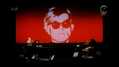
Here’s a video of Warhol and Debbie Harry at that Amiga product launch in July 1985:


via Internet Magic

Posted by Martin Schneider
|
04.24.2014
10:00 am
|
The early jazz album covers of Andy Warhol
02.26.2014
11:30 am
Topics:
Tags:

Monk
Thelonious Monk, Monk, 1954
 
Before he became just about the most important person in the world in the 1960s, Andy Warhol made a living as a graphic designer. He did a whole slew of album covers and, as is well known, a good many book jackets as well. Often he enlisted his mom to write the scrawled text, as we saw in this delightful mock cookbook from 1959, her handwriting was his secret weapon until he made the silk screen his signature medium of choice.

For most of these albums, he was responsible for the drawing if not necessarily the layout. In the case of the Monk album above, we know it’s his mother’s handwriting and he may not have done the layout, so it’s unclear exactly how much credit he should get, but then again, that was more or less his method at The Factory!
 
Count Basie
Count Basie, s/t, 1955
 
Kenny Burrell
Kenny Burrell, Volume 2, 1956
 
Kenny Burrell
Kenny Burrell, Blue Lights, 1958
 
Artie Shaw
Artie Shaw and His Orchestra, Both Feet in the Groove, 1956
 
More work from Warhol’s “Blue Note period” after the jump…

READ ON
Posted by Martin Schneider
|
02.26.2014
11:30 am
|
Talking sex with Andy and Bill: William S. Burroughs and Andy Warhol discuss ‘the first time’
01.21.2014
08:53 am
Topics:
Tags:


Two cultural icons of the twentieth century, William S. Burroughs and Andy Warhol, enjoying dinner and amiably discussing the first time they had sex with another man—whatever could be more salubrious? Horses are part of the conversation, too. Read on in the excerpt from Victor Bockris’ classic book, With William Burroughs, A Report from the Bunker
 

Burroughs: Cocteau had this party trick that he would pull. He would lie down, take off his clothes, and come spontaneously. Could do that even in his fifties. He’d lie down there and his cock would start throbbing and he’d go off. It was some film trick that he had.

Bockris: How’d he pull that off? Have you ever been able to come through total mental—

Burroughs: Oh, I have indeed. I’ve done it many times. It’s just a matter of getting the sexual image so vivid that you come.

Warhol: How old were you when you first had sex?

Burroughs: Sixteen. Just boarding school at Los Alamos Ranch School where they later made the atom bomb.

Warhol: With who?

Burroughs: With this boy in the next bunk.

Warhol: What did he do?

Burroughs: Mutual masturbation. But during the war this school, which was up on the mesa there thirty-seven miles north of Santa Fe, was taken over by the army. That’s where they made the atom bomb. Oppenheimer [the scientist who invented the bomb] had gone out there for his health and he was staying at a dude ranch near this place and said, “Well, this is the ideal place.” It seems so right and appropriate somehow that I should have gone to school there. Los Alamos Ranch School was one of those boarding schools where everyone rode a horse. Fucking horses, I hate ‘em. I had sinus trouble and I’d been going to New Mexico for my health during the summer vacations and then my family contacted the director, A. J. Connell, who was a Unitarian and believed very much in positive thinking, and I went there for two years. This took place on a sleeping porch, 1929.

Warhol: How great! Was the sex really like an explosion?

Burroughs: No no … I don’t remember it was so long ago.

Warhol: I think I was twenty-five when I first had sex, but the first time I knew about sex was under the stairs in Northside, Pittsburgh, and they made this funny kid suck this boy off. I never understood what it meant…

Burroughs: Made him do what?

Warhol: Suck this boy off, but I didn’t know what it meant, I was just sitting there watching when I was five years old. How did you get this kid to do it, or did he do it to you?

Burroughs: Oh I don’t know, sort of a lot of talking back and forth…

Here’s a remarkable clip of the pair, this time chatting about, er, chicken fried steak—in the very room in which Arthur Clarke wrote 2001: A Space Odyssey! Phew, so much history! The footage is from an episode of the BBC documentary program Arena about the Hotel Chelsea and there are a couple of odd narrative elements to it, but the clip mercifully ends with Nico singing a haunting rendition of “Chelsea Girls”—in the Chelsea Hotel itself, one wonders if it was in Room 506…..
 

Previously on Dangerous Minds:
In her vagabond shoes: Nico sings ‘New York, New York’
1981 documentary on the Chelsea Hotel: The vortex where it all came together

Posted by Martin Schneider
|
01.21.2014
08:53 am
|
‘Songs for Drella’: Lou Reed and John Cale pay tribute to Andy Warhol, live 1989
01.10.2014
03:18 pm
Topics:
Tags:


When Lou Reed and John Cale’s collaborative tribute to Andy Warhol, Songs for Drella, came out in 1990, I didn’t love it. I didn’t even like it. It felt really forced. Over time it came to grow on me, but seeing the suite performed onstage, in the form of Oscar-nominated cinematographer Ed Lachman’s video documentation of the piece, really brought it alive.

Songs for Drella was part of 1989’s “Next Wave” festival at BAM and if you’ve ever been lucky enough to see something staged there, well, the lighting design and the general production values are usually more on a level of a Broadway show than a typical rock concert. Songs for Drella is essentially a theater piece and the visuals provide much of the enjoyment as well as a vague narrative. The songs are roughly in chronological order as they tell the story of Warhol’s life, from Pittsburgh, his early days in NYC, getting shot and his worldwide fame. The narrator changes from first person (Warhol’s POV), third person descriptions and Reed and Cale’s own commentary, as both longtime friends and collaborators with the artist.

According to a photographer I knew who shot the two of them around this time, Reed and Cale seemed to absolutely loathe each other. He described them as the two biggest bastards he’s ever been hired to shoot, in fact. Hissing snakes. The pair apparently vowed never to work together again, but they did anyway, for the ill-fated Velvet Underground reunion of 1993.

Shot on December 4–5, 1989 without an audience at the Brooklyn Academy of Music, Songs for Drella came out on VHS and Laserdisc, but as yet, has still not come out on DVD. The album itself was recorded in the weeks after this was taped.
 

Posted by Richard Metzger
|
01.10.2014
03:18 pm
|
Art & Commerce: Andy Warhol and Salvador Dalí‘s commercials for Braniff Airways, 1967
01.02.2014
09:53 am
Topics:
Tags:

Andy Warhol and Sonny Liston
 
In 1967 legendary adman and designer George Lois conceived a hip new ad campaign for Braniff International Airways, in a style that was remarkably similar to his undying Esquire covers from around the same time. (If you’re at all interested in design, you’ve definitely seen a bunch of those covers, just Google it.)

In two TV spots, Andy Warhol tries to convince a not-buying-it Sonny Liston, then the world heavyweight champ, as to the artistic validity of his Campbell’s soup cans, and Yankee hurler Whitey Ford quizzes Salvador Dalí about the differences between the screwball and the knuckleball.

Lois, in his egotistical and yet charmingly frank (“out-bullshit” etc.) style, explains on his website what he was getting at with the Braniff ads. He mentions a bunch of other pairings that were presumably filmed, but, well, they ain’t on YouTube, anyway.
 

WHEN YOU GOT IT—FLAUNT IT!

A JUXTAPOSITION OF CELEBRITY ODD COUPLES, PORTRAYED AS LOVABLE SPOTLIGHT HUSTLERS, TRYING TO OUT-BULLSHIT EACH OTHER AS THEY FLY BRANIFF.

In 1967, When you got it—flaunt it! became an American colloquialism as well as a standard entry in the anthologies of American sayings, almost instantly. It was my slogan for Braniff—a zany, outrageous campaign that featured a smorgasbord of the world’s oddest couples, exchanging the screwiest and most sophisticated chatter heard on television. Our juxtaposition of unlikely couples was unprecedented, creating the perception that when you flew Braniff International, you never knew who might be in the seat next to you. Pop guru Andy Warhol tried (but failed) to engage the sullen heavyweight champ Sonny Liston…Salvador Dali (Wen yo godet—flawndet!) talked baseball with Whitey Ford…black baseball legend Satchel Paige talked about youth and fame with neophyte Dean Martin Jr….poet Marianne Moore discussed writing with crime novelist Mickey Spillane…Rex Reed dueled with Mickey Rooney…British comedienne Hermione Gingold trumped film legend George Raft at his own game, whilst inundating him with pretentious palaver.

Sounds wacky on the face of it, but as we eavesdrop on these odd couples trying to outflaunt each other, we hear everything that has to be said about Braniff. We also imply that you might bump into a celebrity or two on a Braniff flight. (Yet another spot was produced with a Braniff stewardess welcoming an eclectic procession of business travelers: Joe Namath, Emilio Pucci, the Italian fashion designer to the Jet Set, thespians Gina Lollobrigida, Tab Hunter and Sandra Locke, jockey Diane Crump and the Rock group Vanilla Fudge.) They are not idealized celebrities—they are famous people who are portrayed as lovable extroverts, combined to radiate a surreal kind of believability. A commercial has little credibility if we think its spokespersons are hustling a buck. Celebrities must not look like mercenaries. I make them believable by showing them in a human way, downplaying their celebrity.


Previously on Dangerous Minds:
Andy Warhol shills for VIdal Sassoon
Salvador Dali vs. acid indigestion: Zany Alka Seltzer commercial from 1974

Posted by Martin Schneider
|
01.02.2014
09:53 am
|
When the Velvet Underground sued the Andy Warhol Foundation
12.12.2013
01:05 pm
Topics:
Tags:

Velvet Underground-Warhol lawsuit
 
On his 1989 album New York, Lou Reed sang, “No one here dreams of being a doctor or a lawyer or anything / They dream of dealing on the dirty boulevard….” And yet shortly before he died, Reed (along with John Cale) did employ the services of an attorney in order to sue their old chum Andy Warhol (well, sort of). To be precise, in 2012 the Velvet Underground sued the Andy Warhol Foundation for improper use of that famous banana logo that Warhol designed for the Velvets’ first album, The Velvet Underground & Nico.

It’s all kind of a sad coda to the uneasy partnership that Warhol and the Velvets struck way back in 1966.
 
The VU banana iPhone case
The offending iPhone case
 
So in 2012 the Andy Warhol Foundation approved the manufacture of a bunch of iPhone and iPod accessories using the famous banana image, and John Cale and Lou Reed really didn’t like that the organization had sought to, ahem, “deceive the public” into thinking the Velvet Underground offered “sponsorship or approval” of the items, which included “a $149.95 shoulder bag and a $59.95 protective sleeve.” As stated in the lawsuit The Velvet Underground v. The Andy Warhol Foundation for the Visual Arts, Inc.,
 

VU’s use and application of the design to symbolize the group and its whole body of work has been exclusive, continuous and uninterrupted for more than 25 years. . . . Members of the public, and particularly those who listen to rock music, immediately recognize the banana design as the symbol of the Velvet Underground. . . . It is not merely the graphic reproduction by Andy Warhol of a piece of fruit: it is the ‘iconic’ VU banana.”

 
That was in January of 2012. But don’t get the idea that the Andy Warhol Foundation took the legal challenge lying down over the next few months. For instance, in September 2012 it was reported that in court papers filed in U.S. District Court in New York, the Foundation claimed that the band’s use of the famous image in licensing deals “constitutes unclean hands and illegal trademark use.” The Warhol Foundation claimed that it “enjoys priority of trademark use in the Warhol Banana Design” because the group “never made a bona-fide source-indicating trademark use” of the graphic.
 
Andy Warhol and VU
 
Somewhat sensibly, the Foundation claimed that it owns the rights to Warhol’s name and signature, although given that the signature in question is a stylized font-representation of Warhol’s name, I’d be curious how the exact wording of the legal filing ran. In their counter-filing, the Warhol Foundation made the mirror image of VU’s original claim, stating that the group’s use of Warhol’s name “is likely to confuse consumers into believing that the Warhol Foundation or other authorized representative of Andy Warhol has sponsored, approved or authorized the good or service in question.” Exactly: there’s no lower blow than implying that the Andy Warhol Foundation would ever, ever authorize some cheesy Warhol “shoulder bag” or “protective sleeve”—which, let’s recall, was exactly what they did.

In May of this year, the two parties reached a settlement.

So thorny! Call me crazy (or Solomon), but it sounds like a situation where both parties have some claim over the copyright, so maybe a shared copyright is appropriate, if that’s even a thing. The details of the settlement, as is usually the case in such matters, have not been disclosed.

Here’s a brief clip about the origins of the Warhol/VU partnership from Andy Warhol: A Documentary Film from the PBS American Masters series:
 

Previously on Dangerous Minds:
Andy Warhol: The Velvet Underground and Nico 1966
Velvet Underground documentary from 1986 puts it all together in a nice package

Posted by Martin Schneider
|
12.12.2013
01:05 pm
|
In the studio with Andy Warhol and Roy Lichtenstein, 1966
12.02.2013
02:24 pm
Topics:
Tags:

lichtwarhcolorsix.jpg
 
Pop Artists Roy Lichtenstein and Andy Warhol divulge some of the influences and techniques to their work in this documentary by Lane Slate from 1966.

Artists are not always the best expositors on their art. There are the exceptions like David Hockney, who inclusively shares his knowledge through television documentaries, or Francis Bacon, who spent hours in conversation with David Sylvester discussing the influences and sources for his work. Here, we find Lichtenstein enthusiastic though slightly inconclusive, and Warhol being just Andy.


Roy Lichtenstein’s bold, bright, iconic paintings of comic book panels and advertisements offered an ironic commentary on sixties’ consumer society, while at the same time showed an artist attempting to make art viable in such a world. When Lichtenstein explains the ideas and intentions behind his work, his answers come spilling out like the contents of a shaken can of cola, the bubbles of information frothing over into long stream of consciousness answers, which never really come to a formal resolution.

Lichtenstein begins with a description of the modern landscape that inspired his work and influenced his style:

”I think we’re living in a society that is to a large extent is Pop, I think it’s one of the facets of our society, and it’s one of the facets of present society which is new, and is one of the facets which hasn’t existed before.

“It’s made in a way, partially, a new landscape for us. In the way of billboards, and neon signs, and all the stuff we’re familiar with, and also literature, and television, radio, almost all of the landscape, all of our environment seems to be made, partially, of a desire to sell products.

“This is the landscape that I am interested in portraying. I’m also not only portraying it, but I am working in the style of it, or a style which at least parodies the style of everyday art, everyday society. 

“I am interested in portraying a sort of anti-sensibility that pervades the society and a maybe gross over-simplification. I use that more as style rather than actuality. I really don’t think art can be gross and over-simplified and remain art—it must have subtleties, and it must sort of yield to an aesthetic unity, otherwise it’s not in the realm of art, it’s something else probably. But I think using it as a style gives it a kind of brutality, and maybe hostility that is useful to me in an aesthetic way.”

Okay, Roy.

Andy Warhol starts his interview with a renunciation of the reverence with which art and paintings are given.

”Why I don’t paint anything? Because I hate objects. I hate to go to museums to see pictures on walls that look so important because they don’t mean anything, I think.”

It’s a good start, as Warhol could give a masterclass in being inarticulate. Of course, it’s all deliberately elusive, and just watch how quickly he loses interest once the questions become about the personal rather than his work.

“You should just tell me the words and I’ll repeat them. I’m so empty today, I can’t think of anything.”

The interview ends with Warhol talking about The Velvet Underground, before he is seen inflating silver balloons as the band rehearse in the background.
 

Posted by Paul Gallagher
|
12.02.2013
02:24 pm
|
Fanciful recipes illustrated by a young Andy Warhol
11.21.2013
03:50 pm
Topics:
Tags:

Andy Warhol
 
In 1959—three years before his breakout solo exhibition at Eleanor Ward’s Stable Gallery in New York—Andy Warhol teamed up with a well-known socialite named Suzie Frankfurt to produce a slim satirical cookbook mocking the trendy French cuisine recipe books that were all the rage at the time. It was called Wild Raspberries, named in jest after the Ingmar Bergman movie, Wild Strawberries, that landed on U.S. shores the same year. Frankfurt took care of the text, Warhol did the illustrations, and none other than Julia Warhola—Warhol’s mother—did the lettering. Warhol hired several young men to help with the illustration—some have argued that this cookbook was the genesis of Warhol’s later assembly line method of art production. 
 
Andy Warhol and Suzie Frankfurt, Wild Raspberries
 
Frankfurt appears to have been a pretty interesting woman. She was an interior designer and worked at Young + Rubicam in the 1950s, the same time that Warhol was working as a commercial artist. As her New York Times obituary put it in 2005, “A bohemian hostess, the flame-haired Ms. Frankfurt was known as a creative catalyst as well as a celebrity decorator. The designer Gianni Versace, for example, credited her with introducing him to America when he was largely unknown, not to mention also introducing him to Studio 54.”
 
Andy Warhol
 
Andy Warhol
 
More recipes after the jump…..

READ ON
Posted by Martin Schneider
|
11.21.2013
03:50 pm
|
Colorful sports uniforms for hip artists like Warhol and Basquiat
11.11.2013
10:27 am
Topics:
Tags:

Andy Warhol, number 28
 
I know perfectly well that these shirts are little more than a quick grab at fashion trendiness, but I like ‘em anyway. The whole idea of a French firm assigning American sports jerseys to various iconic creative people (none of whom would probably be able to tell apart a catcher’s mitt from a hockey stick) seems pretty witty to me.

These come from a French fashion outfit called LES (ART)ISTS, who say that these designs were inspired by “American football jerseys,” which seems fair enough.

The regular T-shirts are €45 ($60), and the flannel versions are €99 ($133). Actually, they seem to have only the b/w version (such as the KAWS one) on their site. I prefer the more playful and colorful ones, they strike me as much more clever and engaging.

The odds are that the numbers were chosen more or less at random, but I can’t help reading meanings in (busted, I’m a sports fan). WARHOL 23 makes sense for anyone who knows who Michael Jordan is [Update: DM reader “ThatGuy” points out that Warhol is 28 on all three shirts], and beyond that, I admire the use of rather high numbers. In baseball high numbers are generally used for scrubs who don’t play, the types who make it to spring training and then don’t make the squad. If we’re talking football, the numbers have specific meanings—for instance, a number in the 80s means you’re a wide receiver, anywhere from 50 to 79 means you’re either a lineman or a linebacker, and so on.
 
Keith Haring, number 58
 
Haruki Murakami, number 62
Takashi Murakami, number 62
 
Damien Hirst, number 75
 
Jean-Michel Basquiat, number 60
 
See the rest of the jerseys after the jump…...
 

READ ON
Posted by Martin Schneider
|
11.11.2013
10:27 am
|
Andy Warhol paints Debbie Harry on an Amiga computer, 1985
10.22.2013
09:10 am
Topics:
Tags:


When Commodore released the Amiga (which was the highest-quality desktop computer out there for a little while), they got a really good get for the product launch press conference in late July of 1985: none other than Andy Warhol. Rather remarkably, according to Technologizer, the launch event was “a black-tie, celebrity-studded gala at the Vivian Beaumont Theater in New York’s Lincoln Center.”

The Amiga always was a funny duck, but at the time, it offered better graphics than Apple or PCs, and it also offered a fantastic thing called multitasking. People who owned Amigas were known to be evangelical about the subject. As New York Magazine told it, Warhol murmured into a microphone, “It’s such a great thing. I’ve always wanted to be Walt Disney. I’m gonna tell everyone to get one.” (The bulk of that article is a rave review of the newly unveiled Amiga.) It’s apparent that the pixelated version of the Blondie lead singer qualifies as a “Warhol” “original” on the strength of Warhol executing the fill function a couple of times, but still.
 
Andy Warhol and Debbie Harry
 
Warhol isn’t exactly synonymous with forward-thinking technophilia, but in a lot of ways, computer-generated art fits in perfectly well with his sunny, democratic, and somewhat automated take on the world. After all, this is the guy who in The Philosophy of Andy Warhol, penned, in what is one of my absolute favorite quotations of the twentieth century, “What’s great about this country is that America started the tradition where the richest consumers buy essentially the same things as the poorest. You can be watching TV and see Coca-Cola, and you know that the President drinks Coke, Liz Taylor drinks Coke, and just think, you can drink Coke, too. A Coke is a Coke and no amount of money can get you a better Coke than the one the bum on the corner is drinking. All the Cokes are the same and all the Cokes are good. Liz Taylor knows it, the President knows it, the bum knows it, and you know it.”
 
Amiga World
 
Warhol also made the cover of the third-ever issue of Amiga World (blurry PDF), which also scored an interview with the pop art master. In the introduction to the interview, it is made painfully clear how entirely crazy it was that the magazine got Warhol to agree to it. The interview is predictably amusing, and Warhol is epigrammatic and opaque and inscrutable in his oddly accessible way, but what does shine through is his genuine enthusiasm for the Amiga and computers in general. Also, out of nowhere Warhol uncorks this pithy gem: “Mass art is high art.”  It’s definitely worth a read.
 

Previously on Dangerous Minds:
John Waters and Divine on a rarely seen episode of Andy Warhol’s TV show
Warhol Polaroids of Sports Legends

Posted by Martin Schneider
|
10.22.2013
09:10 am
|
Elizabeth Taylor’s craziest role: ‘The Driver’s Seat’ AKA ‘Identikit’
10.09.2013
11:23 am
Topics:
Tags:

image
 
The Driver’s Seat AKA Identikit stars Elizabeth Taylor in one of her single most berserk performances and since no one can bring the crazy like La Liz, that is really saying something. This 1974 Italian film is based on a novella by Muriel Spark about a disturbed woman in a foreign country who seeks a man who will tie her up and stab her to death. There is ridiculous (mostly shouted, even screamed) dialogue like: “I sense a lack of absence” and “I feel homesick for my own loneliness.” How about “You look like Red Riding Hood’s grandmother. Do you want to eat me?” She holds up her purse in an airport security check and exclaims “This may look like a purse but it is actually a bomb!?” The best line is this, however: “When I diet, I diet and when I orgasm, I orgasm! I don’t believe in mixing the two cultures!”

The director, Giuseppe Patroni Griffi, seems to have had no control over Taylor whatsoever and it appearss like she is making up her own Dada dialogue on the spot much of the time. Andy Warhol has a cameo in the film playing a British “your Lordship” who has a cryptic encounter with Liz in an airport and they meet again later in the film. His voice is overdubbed with an English voice, which is disconcerting but kind of interesting, too. Why isn’t this cuckoo-pops crazy film better known?

 
image
 
Here is what the AllMovie Guide has to say about The Driver’s Seat:

A beautiful but mysterious woman goes on a journey that has dangerous consequences for her and those around her in this offbeat, arty drama from Italian filmmaker Giuseppe Patroni Griffi. Lise (Elizabeth Taylor) is a woman edging into middle age who is nearing the end of her emotional rope. Needing some time away from her job and responsibilities, Lise flies to Rome, and on the flight she meets Bill (Ian Bannen), an eccentric health food enthusiast who makes it clear he wishes to seduce her, and Pierre (Maxence Mailfort), a curious man who is wary of Lise and goes out of his way to avoid her. Lise informs anyone she speaks with that she’s come to Rome to meet her boyfriend, but it soon becomes clear she has no specific plans nor anyone to see. Lise whiles away the afternoon shopping with Mrs. Fiedke (Mona Washbourne), a chatty older woman from Nova Scotia, and in time crosses paths with Bill again, but it’s not until she meets up with Pierre that her real reason for coming to Italy, as well as the depth of her madness, becomes clear. As Lise wanders through Rome, a team of police detectives is seen investigating a crime that seems to involve her. Also released as Identikit and Psychotic, The Driver’s Seat features a brief appearance from Andy Warhol as a British nobleman.

The film premiered at the Cannes Film Festival to stunned silence and it has been suggested that Liz at one point tried to buy up the rights and all prints of the movie. The filming began one day after she filed for divorce from Richard Burton and she reportedly said to director, Griffi, “It takes one day to die, another to be reborn.”
 
The Driver’s Seat is not out on a proper DVD release, but you can often find bootlegs at a “99 Cents Only” store.


Posted by Richard Metzger
|
10.09.2013
11:23 am
|
Mick Jagger to Andy Warhol, 1969: ‘Do what ever you want’
09.04.2013
05:06 pm
Topics:
Tags:

Rolling Stones, Sticky Fingers promo shoot
 
Sticky Fingers: The Stones at the peak of their powers, the catastrophe of Altamont right in their rear-view mirror, “Sister Morphine,” “Wild Horses,” “Brown Sugar,” an attention-getting album cover with a shot of a man’s crotch and an actual zipper—all of that courtesy of Andy Warhol, of course. In its own way Sticky Fingers is as 60s as anything that ever happened, even if it was released in April 1971.

That zipper would bring its own share of headaches—it made the album impossible to stack easily, leading to lots of scratched returns. Oh, and by the way, the album also featured the first-ever use of the Stones’ tongue logo, designed by John Pasche.
 
Sticky Fingers
 
If you want to see a megastar with a relaxed sangfroid that even Kanye West would envy, check out this suave letter to Andy Warhol getting him started on the Sticky Fingers project: “Here’s 2 boxes of material you can use, and the record.” Hilariously, Jagger warns him that extra elements in the cover design may lead to problems down the line, but then emphasizes, “I leave it in your capable hands to do what ever you want” before asking him, in so many words, where the truck should deposit the huge heaping mounds of cash. “A Mr.Al Steckler ... will probably look nervous and say ‘Hurry up’ but take little notice.”

In short, everything any designer would want from a client. World fame, money, creative freedom, and heedless to all consequences.
 
Mick Jagger to Andy Warhol
 
(via Letters of Note)

Previously on Dangerous Minds:
Mick Jagger goes to the beach in astro-pervert hot pants, 1973
Mick Jagger just oozes sincerity!
Andy Warhol: The Velvet Underground and Nico 1966
Dennis Hopper’s screen test for Andy Warhol

Posted by Martin Schneider
|
09.04.2013
05:06 pm
|
Keith Haring discusses the mass marketing of his art
09.03.2013
10:22 am
Topics:
Tags:

Keith Haring
Haring risking arrest to wish New Yorker’s a happy Valentine’s Day
 
Aired on January 20th, 1990, this French interview was recorded soon before Keith Haring’s death at age 31 from AIDS-related complications. Haring is warm and charismatic throughout, graciously venerating his peers and responding earnestly to questions about his decision to mass market his work.

While Haring’s art has certainly proved lucrative (some of his sweeter images even grace baby bibs nowadays, much of the income going to The Keith Haring Foundation for pediatric AIDS), he was an artist of the people, and originally opened his “Pop Shop” boutique to make his work available to “not only collectors, but kids from the Bronx.” Many critics thought this actually hurt his reputation with “serious” collectors (i.e. big money), since many were less interested in art so easily accessible to the hoi polloi.

In an awkward/endearing moment, the interviewer asks Haring how much his paintings actually sell for, to which Haring replies, “Now it’s ridiculous.” Upon further pressing, Haring says incredulously that some small drawings had recently sold for, ahem, $25,000, each. Apparently all those graffiti fines were actually a sound investment. And so would an investment be in a small Keith Haring original…
 

Posted by Amber Frost
|
09.03.2013
10:22 am
|
Happy Birthday Andy Warhol!
08.06.2013
12:37 pm
Topics:
Tags:


The Pop Art genius was born on August 6, 1928 and died, prematurely, probably due to hospital incompetence after a routine gall bladder operation, on February 22, 1987 at the age of 58.

Here’s what Andy Warhol had to say about death:

I never understood why when you died, you didn’t just vanish, and everything could just keep going on the way it was only you just wouldn’t be there. I always thought I’d like my own tombstone to be blank. No epitaph and no name.

Well, actually, I’d like it to say “figment.”

I remember vividly when Andy Warhol died. As a New Yorker myself, it truly felt like it was the end of an era. After Warhol died, New York’s fabled nightlife took a nosedive (there were other important factors, too, like AIDS, of course). It wasn’t like you’d be able to see Warhol at a party, a fashion show, a nightclub or a restaurant ever again and think to yourself “Oh, Andy Warhol’s here. I must be in the very best party in Manhattan tonight.”

That was kind of what Warhol’s stamp of approval meant to New Yorkers. His presence alone made you feel cool. I met Warhol several times—as fate would have it, the first time was on the very day I moved to New York, at the Area nightclub. The infamous homicidal club kid king, Michael Alig, then a 18-year-old college student, asked me if I’d like to meet Andy Warhol. “Sure!” I replied and then Michael (who I had just met) proceeded to shove me—HARD, using both arms—into the artist, nearly knocking him down. Warhol just shrugged it off and blamed Michael anyway as he’d seen the whole thing go down. After that incident, I’d see Warhol around every few weeks for the next couple of years.

When he died so suddenly, I cannot stress this enough, it was like a pall had come over the city. New York would just never be quite the same ever again.

The first sign that there was something wrong with Andy Warhol, that he might be a mortal being after all, came three weeks ago. It was a Friday night, and after dinner with friends at Nippon, he was planning to see Outrageous Fortune, eat exactly three bites of a hot-fudge sundae at Serendipity, buy the newspapers, and go to bed. At dinner, though, he felt a pain. It was a sharp, bad pain, and rather than let anyone see him suffer, he excused himself. And as soon as he got home, the pain went away.

“I’m sorry I said I had to go home,” Warhol told Pat Hackett a few days later as he narrated his daily diary entry to her over the phone. “I should have gone to the movie, and no one would ever have known.”

In fact, no one remembered. And if anyone suspected trouble, it was dispelled the next week by Warhol’s ebullient spirits at the Valentine’s dinner for 30 friends that he held at Texarkana with Paige Powell, the young woman who was advertising director of Interview magazine by day and Warhol’s favorite date by night. Calvin Klein had sent him a dozen or so bottles of Obsession, and before Warhol set them out as party favors for the women, he drew hearts on them and signed his name. On one for ballerina Heather Watts he went further, inscribing the word the public never associates with Andy Warhol: “Love.”

Excerpt from “The World of Warhol” by Jesse Kornbluth, from the March 9, 1987 issue of New York Magazine.

The Figment Project, sponsored by the Andy Warhol Museum and EarthCam has a live look at the artist’s actual grave site in Pittsburgh today.

Below, art critic “Brian Badonde” (BAFTA-winner comedic genius Kyvan Novak) visits Bandy’s childhood home in Pittsburgh on Facejacker:
 

Posted by Richard Metzger
|
08.06.2013
12:37 pm
|
Tally Brown: Warhol associate & LGBT cult figure does best Bowie cover EVER
05.22.2013
03:47 pm
Topics:
Tags:


At the time of her greatest notoriety in the 1960s and 70s, Julliard-trained blues singer Tally Brown was a zaftig bohemian cabaret artist associated with NY’s underground art scene, Warhol’s Factory and a performer at Reno Sweeny’s and the Continental Baths. Brown’s social circle included the Living Theatre, Holly Woodlawn, Taylor Mead, Grace Jones and Diane Arbus.

Her obituary in the New York Times described her as:

“A short, stout singer with wild black hair, Ms. Brown was known for her intense, dramatic renditions of songs by Kurt Weill, the Rolling Stones and David Bowie.”

Intense and dramatic she certainly was! Tally Brown was also good friends with Divine and often mistaken for the infamous drag queen/actor.


If it wasn’t for her appearances in a few of Warhol’s films, the 1974 cult classic schlockfest, Silent Night, Bloody Night and German director Rosa von Praunheim’s 1979 documentary Tally Brown, New York she would probably be long forgotten, but in fact, since her death in 1989 (mostly due to the von Praunheim film) she’s become a bit of an LGBT cult figure. (Another obscure film that Brown was in, Wynn Chamberlain’s Brand X has been getting a second life in recent years)
 

Above, Mick Ronson behind Tally Brown as David Bowie looks on from left.

Here’s a link to Tally Brown’s rendition of Bowie’s “Lady Grinning Soul” with the lyrics changed to the first person.

In the clip below, from the opening of Tally Brown, New York, the aging diva sings Bowie’s “Heroes” as the camera very, very slowly creeps up close enough to see her face. This gets pretty amazing, so stay with it. Are these not the very best Bowie covers you have ever heard???


Thank you very kindly Spencer Kansa!

Posted by Richard Metzger
|
05.22.2013
03:47 pm
|
Page 5 of 10 ‹ First  < 3 4 5 6 7 >  Last ›