FOLLOW US ON:
GET THE NEWSLETTER
CONTACT US
The weird world of cheesecake stock photography
06.12.2015
07:58 am
Topics:
Tags:


This is the third and final installation of posts from the influential graphic artist Art Chantry’s forthcoming book Art Chantry Speaks: A Heretic’s History of 20th Century Graphic Design. The first is here, the second here. Chantry’s clear reverence for and deep knowledge of the history of his discipline, particularly in championing its seediest manifestations and its obsolete processes, informs a body of work which as much as anyone’s has been THE look of garage punk and grunge, and we’re grateful to Chantry and Feral House for letting us use his work in this form. —Ron Kretsch

We’re all familiar with stock photos. Nowadays, most professional photographers I know no longer take photos, but make stock images. These photos are sold through websites for download and reproduction. Designers grab these photos, sometimes actually paying for them, and then “re-work” them in Photoshop to create the desired image. Basically they take stock photos and make new photos out of them. Strange days.

Maybe not so strange. This system existed back in the earlier days of advertising and design as well. The images were often seconds, outtakes and highly adaptable images that could be used in any of a number of settings and advertising situations. The user would order it through the stock photo house (often out of a printed catalog). Then the stock house would send them either a slide or a print of whatever was needed for their use. The user would pay a “usage fee” depending on how the photo would be used. If it was to be used in a dummy or comp, the fee would be much smaller than if it were to be used in a brochure printed in the millions of copies and distributed worldwide. Very practical, and everybody made money. It would still cost much less than hiring a “live” photographer and working with them to obtain the custom photo image you might need.

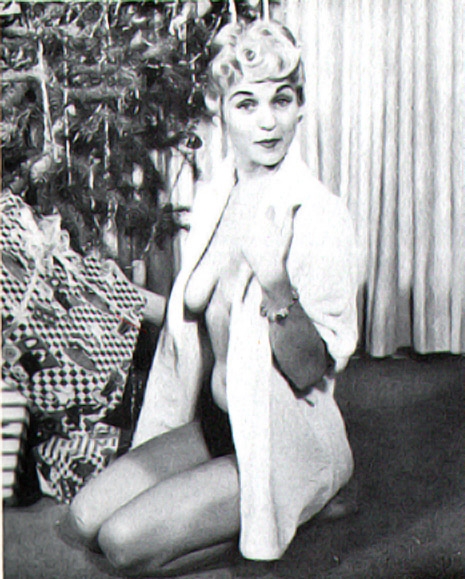
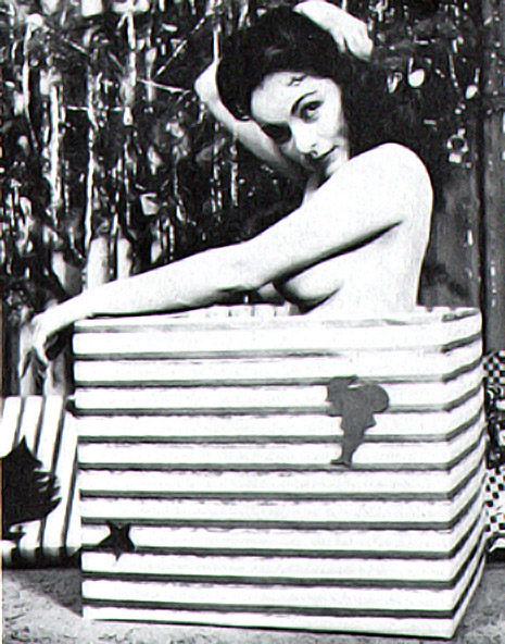
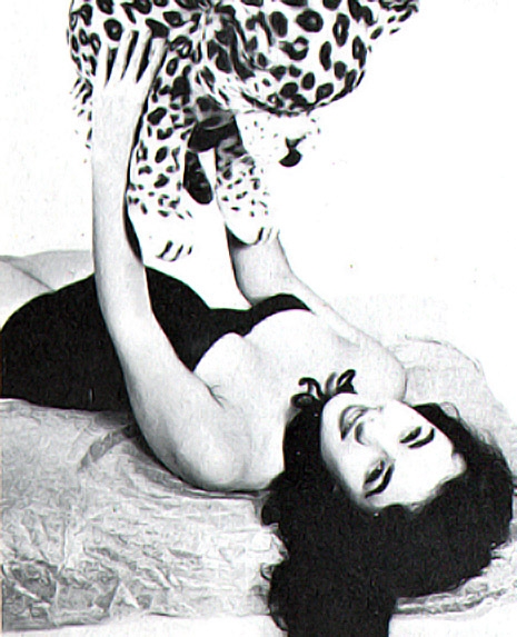
In the postwar period—the glory years of “Mad Men”-style advertising—one of the most popular forms of stock photography was the “glamour” shot. This was an offshoot of model photography that would have a buxom, beautiful young woman posing in a variety of peculiar environments (and varying states of dress) that could be used for adverts or calendars or even be picked up by “men’s magazines” and used to entice America’s hormone-soaked males.


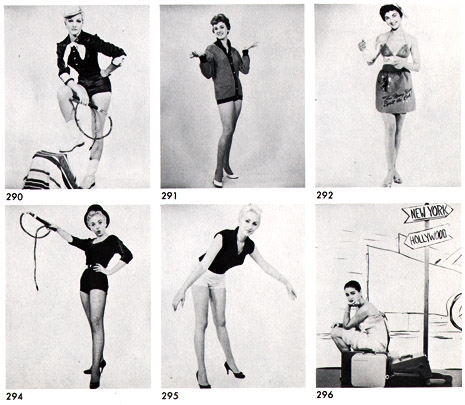
A lot of these glamour stock photo companies were little more than a single somewhat slippery fella with a studio, camera equipment and a lot of props. I think of this territory as classic “bachelor pad” photography—that weird fetishistic territory where the hot-shot handsome young man with a camera used the existing system to meet hot chicks and maybe get lucky. Then they would make some money on the side. It’s one small step above pornography. Indeed, back in the days of our fathers, this was viewed as “R-rated” pornography. Those old “morality code” systems disappeared in the late ‘60s and are almost forgotten.


Once in a while I’ll get lucky and find an old catalog of glamour photography stock photos. Some of the glamour photographers became quite famous, like Russ Meyer and Peter Gowland and even Bunny Yeager. Exactly what kind of advertising could this stuff be used for? Dunno. They all have terms and conditions of use on the cover and the rest of the catalog is only photos of buxom scantily clad babes in silly poses. I swear I’ve seen some of these images in old “men’s magazines” of the ‘50s and ‘60s with names like Cocktail and Duke.


Art Chantry is a graphic designer with more awards and accolades than he can shake a stick at, including a Golden Lionne from Cannes. Over his 40-year career, he worked on the dark side of the marketing world, concentrating on popular culture and broken clients.  during that time he managed to brand a cultural moment in time - grunge. His works hangs in the Smithsonian, MoMA, the Library of Congress, the Louvre, and the Rock and Roll Hall of Fame. More recently, he’s been getting old and writing down his heretical notions about the work he immersed himself in. The results weren’t pretty. Art Chantry Speaks: A Heretic’s History of 20th Century Graphic Design is due out on July 14th.

Posted by Ron Kretsch
|
06.12.2015
07:58 am
|
The strange and lovely Surrealism of ‘Harper’s Bazaar’ in the ‘30s
06.10.2015
09:22 am
Topics:
Tags:


This is the second installation of posts from the influential graphic artist Art Chantry’s forthcoming book Art Chantry Speaks: A Heretic’s History of 20th Century Graphic Design. The first is here. Chantry’s clear reverence for and deep knowledge of the history of his discipline, particularly in championing its seediest manifestations and its obsolete processes, informs a body of work which as much as anyone’s has been THE look of garage punk and grunge, and we’re grateful to Chantry and Feral House for letting us use his work in this form.—Ron Kretsch

Above is the cover of Harper’s Bazaar, September 15th, 1939. The cover is by A.M. Cassandre (1901-1968). I was lucky enough to stumble across a stash of these in a thrift store. I have the entire year bracketing from December 1938 all the way through January 1940. With the exception of three covers, they were all designed and illustrated by A.M. Cassandre.

Cassandre is considered maybe the high point of “high” Art Deco graphic design. His most famous poster is of a luxury liner barreling down on you, imaged from the bow of the ship. It’s a stunner. Virtually all of his posters—and he did many—are perfect. Each one is a highly prized collector’s item, a high mark in the history of poster design and graphic design. At his peak, the guy could do no wrong.


This is not to confuse A.M. Cassandre’s work with Art Deco exclusively. I doubt he considered his work “Art Deco” at all. He was one of a huge number—a legion—of graphic designers simply working in the hip style of the moment. Cassandre was not working in a vacuum; there were hundreds of competitors making similarly stunning posters while he was at work. Cassandre’s output was just a hair more astonishing, just a little “better” than the pack. Now, he’s virtually the only guy whose name we recognize from that era of poster design.

One of the big differences was that Cassandre was a Surrealist. The late 1930s was a period when Surrealism invaded American advertising. Surrealism leaked over from Europe initially through the art scene. But the real transfer of surreal dream imagery didn’t really cross the Atlantic until it hitchhiked on the back of the fashion industry. Euro-trash fashionistas of the ‘30s were avid hipsters, too. So they aped their ideas in a shallow copycat way into their fashionista thinking.

The ads in these magazines are a mind-blowing trip. Instead of real models, there was a proliferation of mannequins. And if that wasn’t disturbing enough, they are set in graphic dreamscapes, often with disturbing defacing elements like vegetables for heads and bananas for hands floating in swirling clouds and watch faces. All very cool, très chic!

Cassandre’s illustration style was part Dali, part Magritte and a little Max Ernst tossed in for shits and giggles. Cassandre’s imagery was so strange that his work looks psychedelic today (the chemical Surrealism of a later time). For an American magazine of this era, his work must have stood out like a big strange thumb.


Cassandre’s cover work for this period of Harper’s Bazaar was strange, to say the least. Instead of depicting actual fashions, he depicted the fantasy behind the fashion. He concentrated on the “dream of the idea” of what was being said and what the implication may be. It appealed to an emotional level of otherness and spin. The world on the verge of the second world war must have seemed like a bad nightmare unfolding. So Cassandre depicted floating eyeballs over an outline of France to imagine Paris fashion on the brink of catastrophe. Disturbing stuff—especially weird to see on the cover of a fashion magazine.

More after the jump…

READ ON
Posted by Ron Kretsch
|
06.10.2015
09:22 am
|
Art Nouveau, ‘Laugh-In,’ and Hallmark Psychedelia—Art Chantry speaks
06.08.2015
11:25 am
Topics:
Tags:


When I got my review copy of Art Chantry Speaks: A Heretic’s History of 20th Century Graphic Design in the mail from Feral House, I was mighty thrilled, as I’ve long admired Chantry’s work as a graphic artist. His clear reverence for and deep knowledge of the history of his discipline, particularly in championing its seediest manifestations and its obsolete processes, informs not just his own body of work, which as much as anyone’s was THE look of garage punk and grunge, but the work of the countless artists whom he’s inspired. In my past life as an Art Director in alt-weeklies, Chantry’s posters, record covers, and his work for the Seattle music magazine The Rocket, reproduced in the must-have Some People Can’t Surf, were frequent go-tos for inspiration when Photoshop just couldn’t do the job. Art Chantry Speaks is a collection of opinionated musings on a variety of design topics, and I was struck by a significant overlap between Chantry’s essays and DM’s coverage, so we decided that rather than simply review the book, we’d draft Chantry into service as a sort of guest blogger, republishing a few of his essays as DM posts. This is the first, and we’re grateful to Chantry and Feral House for letting us use his work in this form.—Ron Kretsch

In the mid- to late 1960s, the psychedelic underground revolution had already started to wane. It was a literal flash in the pan. All of the original pioneers had morphed into varying sorts of hacks and quacks, pushing new agendas as far-fetched as Buddhism, meditation, world domination, the Internet and flying saucers. Basically, the acid world was as unstable as the drug itself. Old doses of blotter have short half-lives and lose their potency fast. Vintage blotter acid collectors (yes, there is a huge market) probably couldn’t get high if they ate their entire collections. So goes the culture as well.

Whenever an underground counterculture (a rebellion against some established norm) erupts, there is usually a pushback from the mainstream. The first is “attack” (“Them dirty stinkin’ hippies should all be shot”) and then there is “assimilation” (“Gee, that paisley looks so cool on you!”).

Back in the Romantic rebellion of the late 1800s there emerged a back-to-nature movement that resulted in the Arts and Crafts revival and a rejection of established artistic norms. This rejection of the status quo happens with such periodic intensity, you could probably set a clock by it. During this phase, the reaction was heavily against the industrial revolution.

The initial process of saying “no” in this case was simply to return to handmade objects. This included an embrace of nature forms that was intellectually and emotionally antithetical to the Victorian stye. The immediate result was a rebirth of organic design and the Arts and Crafts movement. Some people literally returned to the woods to live like wild men (at least “wild” from their stilted perspective). Think Emerson, Thoreau or Gibbons.

Of course, industry—powered by the fast buck—saw opportunity and attempted to copycat the new romantic look. The result was Art Nouveau—a homespun manufactured style applied as decoration (just like Victorian motifs). The big difference was the curve. The Art Nouveau manufactured style almost appeared to have been grown on a machine like some kind of vining plant made of iron.

Soon, new archeological discoveries in Egypt and Mesoamerica resulted in another semi-rejection of the current design culture. The ancient “primitive man” geometric stylings as seen in King Tut’s tomb and the newly “discovered” cultures of the Mayans and the Aztecs resulted in quick adaptations to the Art Nouveau style (and so much easier to make with a machine). The result was Art Deco.

Art Nouveau started to look old-fashioned and Art Deco became the new rage of the machine society. Thoreau’s Walden Pond gave way to Fritz Lang’s Metropolis. The resulting mechanized World Wars did more to end that dream than any artistic rejection ever could.

Flash forward to the early post-WWII period in America. Displaced vets couldn’t fit into the new peacetime America. Uniformity was valued and loose cannons were depicted in popular media as Communist threats to the social order. The beatniks, biker culture, surfers, hot-rodders, truckers, abstract expressionist painters, gay underground, poets and bop musicians were the new Bohemia and they were derided as decadent trash. But the seeds of rejection they sowed took fruit in the early/mid ‘60s, just as the international modern stylings of the new space age and the “big idea” advertising culture combined with industrial ingenuity to create a new golden era of conformity and high style. “007, meet Helvetica Bold…”

The outsider subcultures were still there, developing their own aesthetic systems, not too dissimilar to the Romantics of the previous century. A new “back to nature” dream and a rebirth of the “community of man” emerged, albeit in scattered pockets. When the psychedelic culture emerged a real alternative to the exiting dominant culture became a possibility. It’s been said that with the hippies, “many puddles became a pond,” and soon many ponds became a lake, then an ocean. Then a tidal wave…


The high art style of this new “psychedelic” look was so heavily borrowed from early Art Nouveau that it was almost an embarrassment. Wes Wilson discovered typography by a famous Arts & Crafts typographer, Alfred Roller, and placed it on a waving baseline—and invented “psychedelic lettering”! Stanley Mouse began to ape Beardsley. Other artists copycatted Alphonse Mucha posters to a T. Rick Griffin followed the hand-drawn like work of scores of Blake imitators and shoved it through surfing and acid to arrive at his incredibly “organic” style.

The psychedelic style was an LSD-washed version of Art Nouveau. Even the communal movement owed its origins to Walden dreams. It was history repeating itself all over again, but this time in mind-blowing colors.

Industry was still there too, cranking out their version of what they thought they could sell. Whenever a new “culture” emerges and finds popular appeal to the young, the marketing monsters are right there ready to go with their mass-produced version of the same thing. But they never get it quite right. The very industrial design process removes the “natural” content and replaces it with uniform mediocrity. In this case, the fake psych look literally replaces the larger mainstream culture’s very idea of what Psychedelia was.

Along came “industrial psychedelia” or, as I prefer, “Hallmark psychedelia” (because Hallmark greeting cards tried so hard for so long to co-opt the style). It was all bright colors, swirling everything, cartoon characters, goofy humor and totally innocent fun. Basically, the exact opposite of the earnestness of the Hippie movement and its goals.


Continues after the jump…

READ ON
Posted by Ron Kretsch
|
06.08.2015
11:25 am
|