As a kid I spent roughly two hours a day getting bussed back and forth to middle school and when I wasn’t dodging apples, I had plenty of time to immerse myself in the then still-slim oeuvre of Stephen King. Carrie, Salem’s Lot and The Shining all made somewhat more tolerable the stupidity of my fellow riders, and gave my own outsider-ish existence if not heroic contours, then something just as good: the potential for them.
I mean, I knew I wouldn’t be bumping into migrating vampires or telekinetic prom queens. But say I did, and needed to save not just my ass, but the asses of everyone I loved, and even, what the hell, the asses of those apple-chuckers. In terms of how to make that happen, King’s books offered up a pretty persuasive set of blueprints.
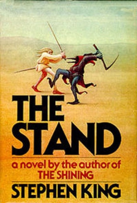
Maybe more than King’s novels themselves, though, I remember being absolutely mesmerized by their covers, and spending many long moments at the local library (a frequent King setting) simply gazing at them. The artwork of those early hardcovers did a fantastic job of whittling core themes down into imagery that was as simple as it was evocative (see above).
If you’d already read the book, with just a glance at its cover, you could relive it all over again. And say you hadn’t read the book, the covers made you want to, like, immediately.
Well, fans of that early artwork can now skip the library and gaze at the more than 2,000 King covers gathered over at StephenKingShop. They’re arranged by title, and I find it particularly interesting (and saddening) that, with the advancement of years—and books—the elegance of the cover art grows less and less striking. And that’s especially true for the paperbacks. Don’t get me started on those “Signet” ‘90s!
Via Cabinet: All The Stephen King Covers In The World
Posted by Bradley Novicoff
|
09.22.2009
10:44 pm
|