


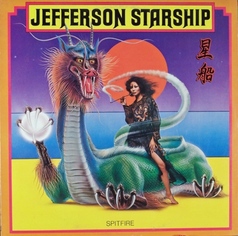
The cover of Jefferson Starship’s 1976 album ‘Spitfire’ by Shusei Nagaoka.
You may not know Japanese artist Shusei Nagaoka by name, but there is no doubt that you have seen his colorful sci-fi art that has graced the covers of albums by Jefferson Starship, ELO, electronic pioneer Giorgio Moroder and Earth, Wind & Fire, just to name a scant few. Nagaoka’s artwork has also appeared in countless publications from Hustler to National Geographic. Nagaoka is probably best known for his album art—one of his most impactful being the cover of the 1977 album by Electric Light Orchestra, Out of the Blue which unless you were living under a rock back in the 1970s you’ve seen. The art for Out of the Blue is highly representative of Nagaoka’s style, artistic vision and use of arresting color schemes.
Born in Nagasaki in 1936, Nagaoka moved from the city to the island of Iki, thankfully escaping the devastation caused by the atomic bomb that was dropped by the U.S. on his birthplace in 1945. Though he did pursue a formal education for a time at Musashino Art University in Tokyo, the artist would eventually drop out choosing to follow his artistic passion on his own. Nagaoka relocated to Hollywood in 1970 where he quickly established himself as a popular, in-demand artist. In 1976 Nagaoka would be praised for his collaboration with Jefferson Starship designing a strikingly erotic image of a sultry Japanese woman smoking an opium pipe straddling a dragon on the cover of Spitfire. Fans of the graphic designer place his contributions alongside other notable artists that share his sci-fi/psychedelic vibe such as the insanely talented Pedro Bell or the great Neon Park (aka Martin Muller).
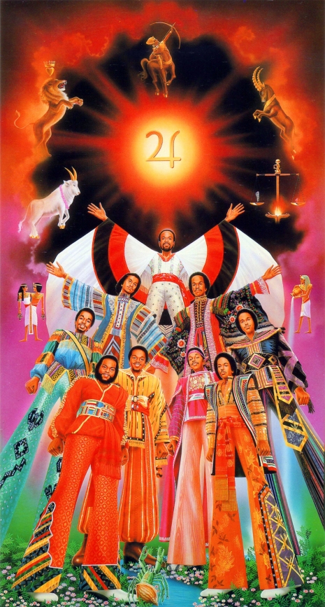
Artwork for Earth, Wind & Fire’s 1979 album ‘I Am.’
A compelling story concerning Nagaoka and his connection to the world of music was his long relationship with Earth, Wind & Fire that produced the profound cover art for the 1977 album All ‘N All; 1979’s I Am; and 1983’s Powerlight. When it came to the concept for the artwork for All ‘N All, the band’s founder Maurice White, who was a deeply spiritual man, had a very specific vision for the cover and inside the gatefold. Tapping into White’s knowledge and love of Egyptology and theology Nagaoka incorporated imagery synonymous with Egypt such as a sphinx, an all-seeing eye, and futuristic pyramids. Inside the gatefold are a series of ten white columns each with a different symbol such as a caduceus, the Star of David and the ancient Egyptian symbol of the Eye of Horus poised peacefully on top. Here’s more from White himself on working with Nagaoka:
“It was a great pleasure working on my album covers with Shusei. Even though we spoke different languages, we shared a vision. His talent and creativity helped make each of our collaborations memorable and helped extend the message in our music into the visual plane of color harmony and symbolic expression.”
There are also a few books about the artist worth picking up such as The Works of Shusei Nagaoka from 1981 and the gorgeously published Androla in Labyrinth published in 1984. Some of the images that follow are NSFW.

The cover of “Pleasure Prinicipal’ the 1978 album by George Clinton protégés, Parlet.

Giorgio Moroder’s 1979 album ‘E=MC².’

ELO’s ‘Out of the Blue’ 1977.
More of Shusei Nagaoka’s work after the jump…
