FOLLOW US ON:
GET THE NEWSLETTER
CONTACT US
Thrill to the covers of Boris Karloff’s ‘Tales of Mystery’ comic
11.17.2015
11:43 am
Topics:
Tags:

001borisk001.jpg
 
E.C.‘s Tales from the Crypt was long dead and buried by the time I’d picked up my first Spider-Man comic and attempted web-slinging off the garage roof. If I’d known about Tales from the Crypt then, I would have abandoned Peter Parker to life as a useful flyswatter and hung my star to the Crypt Keeper. All things horror were a childhood obsession—and though with hindsight some graduate of Psychology 101 might give my predilection for nasty thrills an asshat theory about using horror movies as a means to control personal fears—the truth is—I just fucking loved ‘em.

Of course, the possibility that out there—somewhere—was a happy marriage of comic book and horror story was a pre-pubescent fantasy as remote as the coupling between Cinderella and Prince Charming. Then one day I discovered Boris Karloff’s Tales of Mystery at the back of a rack of comics and knew the Prince’s luck was looking up.

Ye gods, the covers alone were enough to put my imagination into overdrive—like a hyperactive kid popping bubble wrap—the images of prehistoric beasts devouring fishermen on storm-tossed seas, gruesome subterranean creatures clambering out of crypts, devils torturing unrepentant souls, and a viscous ooze devouring all. The fact that each cover had a passport photo of the debonair Mr. Karloff—a man who looked like he worked at a bank or sold life insurance to the over 50s—only made the thrills more enjoyably fun, as I knew this kindly old man would never, ever, go overboard with the horror. Or would he?

Boris Karloff’s Tales of Mystery was originally a spin-off from his TV series Thriller. When the series was canceled, publisher Gold Star re-titled the comic as Boris Karloff’s Tales of Mystery. It continued to be published after Karloff’s death in 1969, and ran into the seventies—around about the time when I picked-up on it. If you want to have a swatch of the whole set of covers available have a look here or here.

This little bundle of goodies culled from everywhere and beyond brings back fine memories of the pure joy to be had imagining the possible terrors that were about to unfold—and appreciating the best thrills are all in the mind.
 
02borisk02a1.jpg
 
A003borisk3.jpg
 
004borisk4.jpg
 
05borisk005.jpg
 
More fabulous Karloff kovers, after the jump…

READ ON
Posted by Paul Gallagher
|
11.17.2015
11:43 am
|
Vintage comic book ads that were too good to be true!
11.05.2015
12:20 pm
Topics:
Tags:

16seamads161.jpg
 
I was never going to be Spider-Man—no matter how I tried to swing from washing lines or scale neighborhood walls or tumble out of trees. My enthusiasm for imitating Peter Parker always ended in disaster and bruised limbs. Obviously being a superhero was not all it was cracked-up to be. And when I thought about it further it seemed a rather silly career option—there was no pay, no pension plan, and the insurance premiums, well, they had to massive. Before hitting double-figures in years I’d given up on joining the the Avengers or the Justice League and was happy just to read of their incredible adventures in the pages of comics.

Being born and raised in Scotland meant an intermittent supply of such comic books capers. Most of these magazines way back then were brought over to Glasgow as ballast on cargo ships delivering goods and produce from America and beyond. This premium ballast would later be sold in the likes of a wee crammed kiosk near Queen Street Station, or the local newsagent and grocer (McGregor’s) in Blairdardie. Yet, the pleasure of the action-packed panels in every Spider-Man or Batman, was equalled (and often bettered) by the thrill of the adverts for toys, goods and services posted in every issue.

America was known as “the land of plenty,” and going by the vast range of toys and goods advertised, this seemed to be true. Toys were not only plentiful over there but cheap, bewitching and utterly exotic. Coins to hypnotize your friends. Sea monkeys that could live in a goldfish bowl and be trained to perform tricks! X-ray specs guaranteed to make everything see-thru. A Polaris submarine—more than seven feet long—which I dreamt of traveling in along the Forth-Clyde Canal, avoiding the ghostly weeds, the garbage, discarded shopping trolleys, and the imaginary gangsters—pale, bloated and tethered to weighty blocks of concrete. But of course I knew—just like my failed attempt to imitate the web-slinger—that these adverts of youthful dreams were equally illusory and would always seem far, far better in print than ever in real life.

These are the ads I salivated over most—and to be frank a part of me still does hanker after them.
 
07franads07
This was top of my list as must have.
 
08monsads08.jpg
Kinda looks like that monster from ‘Night of the Demon.’
 
11dinoads11.jpg
 
14skuads14.jpg
I eventually bought a rubber skull mask from a joke shop—it gave me… er… minutes of fun.
 
More comic book ads, after the jump…

READ ON
Posted by Paul Gallagher
|
11.05.2015
12:20 pm
|
Meet Connie Rodd, Will Eisner’s porny pin-up who taught preventative maintenance to the U.S. Army
08.04.2015
11:26 am
Topics:
Tags:


As one of the first major artists in American comics, cartoonist Will Eisner had immeasurable influence on the genre, particularly with his early masked crimefighter series The Spirit. His art actually proved so popular that he was charged with the daunting task of making compelling materials for the U.S. Army. His military comics were incredibly popular, but the most memorable of his creations has to be Connie Rodd, the brilliant (and professional!) bombshell who graced the pages of PS: The Preventive Maintenance Monthly—a publication that must have really been challenging to sex up!

As a pinup, Connie was actually a little more transgressive than she appears at first glance; since her first appearance in 1951, she was the most capable voice of reason in Preventive Maintenance Monthly. Connie knew her shit. For 123 issues, you had a woman explaining the procedures and standards of military machinery to a bunch of male soldiers—most notably the boneheaded “Joe Dope” character. To be fair to the men serving under Connie, it appears her slammin’ bod proved to be a little bit of a distraction—even the machinery salivated over her! 


Lots more Connie Rodd classics after the jump…..
 

READ ON
Posted by Amber Frost
|
08.04.2015
11:26 am
|
‘The Filth & the Fury’: Sex Pistols comic from 1984
06.03.2015
10:12 am
Topics:
Tags:


Milestones on the road from terrifying societal scourge to mass-market-friendly cultural icons…. In 1984 Smash Hits put out a “yearbook” that contained this wonderful 4-page comic about the entire career of the Sex Pistols, from their origins in 1975 Chelsea to their final show in San Francisco in 1979. [Update: This was in 1978, of course; the comic had it wrong as well.] Flickr user Jon Hicks posted these a few years back—as he points out, the strip has no profanity at all.

The comic is signed by Arthur Ranson, whose art graced countless publications from the early 1970s up through as recently as 2013. The writer is Angus Allan, whose image (according to the above link) appears bottom left of third page, but I haven’t been able to figure out what that’s supposed to mean. (Maybe they mean the fellow who pops up in the “EMI” panel of the second page?)

Click on the images for a larger view:


Posted by Martin Schneider
|
06.03.2015
10:12 am
|
Your favorite comic book superheroes caught in compromising, mundane and very HUMAN positions
05.26.2015
10:11 am
Topics:
Tags:


Superheroes capture our imagination because, for the most part, they are ordinary people who have been granted some particular power and must reconcile the responsibility of that power with the fact that, at heart, they are human beings with regular human faults and complexities.

Indonesian photographer Edy Hardjo has made it his mission to demonstrate this reconcilliation between superpower and ordinary human behavior. Hardjo’s work uses humor to show us that, in spite of their given better-than-human abilities, superheroes are just regular schmucks like the rest of us. Hardjo’s photographs give us an insight into the mundane worlds of The Avengers, Wolverine, Spiderman, Batman and other characters from the Marvel and DC universes.

Hardjo utilizes 1/6-scale figures and Photoshop to produce hilarious and sometimes risque insights into the the everyday life of a superhero.

These are some of our favorites:


More after the jump…

READ ON
Posted by Christopher Bickel
|
05.26.2015
10:11 am
|
That time all those Avengers appeared on ‘Late Night with David Letterman’
05.20.2015
12:51 pm
Topics:
Tags:


It’ll be hard for me to imagine life without David Letterman on the tube. He’s been on late night TV since 1982, and as someone who was a tween during that era I’ve been watching him since probably 1984 or so. In high school he was one of my main heroes, and a lot of what I think I know or appreciate about comedy can be traced back to obsessive late night viewings of Brother Theodore, Pee-wee Herman, Marv Albert, Chris Elliott, Harvey Pekar, Biff Henderson, et al. on the kooky public/secret clubhouse he had going on NBC for quite a while there. At the risk of editorializing, I have found Dave’s CBS show far less essential, to the point that I don’t even really care that much that he’s retiring; the turning point in that process may actually have been the institutionalization of the top ten list, which started out as just another random segment, just like viewer mail. The problem besetting his show post-1988, say, is the same syndrome that has happened to the rest of the late night talk spectrum, which is that watching ultra-prepped actors winkingly play beer pong with Jimmy Fallon (or whomever) has basically no relation to the truly unscripted, fairly snide, and attitudinally aggressive antics that used to occur around 1 a.m. most weeknights during the 1980s.

After Late Night with David Letterman had been around a year or two, a lot of savvier people began referencing it. It felt during this time like renegade entertainment, an unusual commodity that was obscurely about the entertainment industry if not quite of it, and therefore it became a kind of a trope, if you could work “David Letterman” into your story you added a slight buzz of disposable knowingness, much like referencing some of the guests he had on (Pee-wee etc.). In effect, Letterman became a kind of punchline for the smarter set. The idea of John McEnroe or Charlie Brown or Tootsie or Hulk Hogan visiting Letterman’s NBC was a joke in and of itself.

Case in point, issue 239 of the Avengers from Marvel, the January 1984 issue, which trumpeted on its cover, “THE AVENGERS ON LATE NIGHT WITH DAVID LETTERMAN!” See? It was mildly ridiculous, as everything that appeared on Late Night was mildly ridiculous.

In the issue, aspiring actor Simon Williams (a.k.a. Wonder Man) gets booked on Late Night, whose producers request a larger cast of Avengers to appear. A few of the reserve Avengers join Wonder Man on the show, not knowing that serial pest Fabian Stankowicz seeks to sabotage their appearance by planting various booby-traps around the set. Eventually Letterman konks Stankowicz on the head with a giant doorknob.

Here are a few images from the issue—if you click on them, you’ll get to see a slightly larger version.


More after the jump…

READ ON
Posted by Martin Schneider
|
05.20.2015
12:51 pm
|
Marvel’s ‘Generic Comic Book’: The only superhero comic you’ll ever need!
05.06.2015
08:31 am
Topics:
Tags:


In the spring of 1984, Marvel Comics published a very strange one-off called Generic Comic Book, which was exactly as advertised: an all white cover to mimic ‘80s generic food labeling, an all white and nameless hero to the same end, completely one-dimensional characters and situations and a heavy reliance on tired tropes… so basically it was any old B-grade comic, only pointedly worse. I discovered it in the bargain comics box of my favorite toy shop, marked below its 60¢ cover price. You would have bought it, too.

The story begins with several pages of expository dialogue and internal monologue. We see right out of the gate that our hero has a girlfriend, but that’s about all that’s right with his crapsack life, and the girlfriend doesn’t even last past the first page. She’s literally put on a bus, never to be seen again. Our hero is broke. He wants to buy a house for himself and his girl, but he lives with his parents and also needs money to—I shit you not—“get little Bobby the operation he so desperately needs.” A professional writer got paid to write that line. I’m not bitter.


Could someone tell the letterist about “to” and “too?”
 
On his way home, our hero’s problems are compounded when he gets mugged by some generic goons. Acting out in frustration, he smashes the Three Mile Island snow-globe (RELEVANT SOCIAL ISSUE YOU GUYS) from his prized collection of glow-in-the-dark crap, setting in motion one of the most admirably preposterous superhero origin stories I’ve ever read: breaking the Three Mile Island snow globe atomically activated all the other iridescent stuff in the room (SEE? SEE? TOTALLY RELEVANT!), giving our hero super strength, super vision, super hearing—and bleaching his hair bright white.
 

If you can’t read whitey’s pin, it says “HEAVY MEAT.” I want to hear that band.
 
This is only the beginning… much, much more after the jump…

READ ON
Posted by Ron Kretsch
|
05.06.2015
08:31 am
|
The dark, incredibly f*cked up comics of Joan Cornellà
04.28.2015
08:52 am
Topics:
Tags:


Spanish cartoonist Joan Cornellà combines black humor and extreme discomfort, most famously in his wordless, six-panel comics. Cornellà‘s work deals in mutilation and disfigurement, sadistic or oblivious violence, the alienation of modernity and a total disregard for human life. (I know. It doesn’t sound funny, but trust me.) Cornellà‘s aesthetic runs completely counterintuitive to his themes—his colors are lovely and soothing, and his human figures are glassy-eyed and friendly, as if they walked out of a children’s cartoon.

Uncomfortable laughter aside, these beautiful little comics really bear the mark of Cornellà‘s fine arts training. His book Mox Nox is fantastic by the way, especially since the high-resolution images really let you see the texture of paper and pigment. It lets you really embrace the depth of that head-wound.


Plenty more after the jump…

READ ON
Posted by Amber Frost
|
04.28.2015
08:52 am
|
Awesome Ramones T-shirts, drawn by the author of ‘My Friend Dahmer’
03.27.2015
09:13 am
Topics:
Tags:


If you read alt-weeklies in the ‘90s and ‘oughts, John “Derf” Backderf’s comic The City may well have been on your radar. Over its 24-year lifespan, it ran in 140 papers in all, peaking at 75 at once in the late ‘90s, including the late, lamented Cleveland Free Times, at which he and I were co-workers. Of course that publishing sector is gasping for air now, and Derf has moved on from it to an edifying afterlife: he’s retired the weekly strip, and like many cartoonists, he’s moved into web-comics, and he’s had great success creating graphic novels.

In 2008, Derf released the acclaimed Punk Rock and Trailer Parks, an account of being a young punk in Akron during the halcyon days of weirdomusic in Northeast Ohio. But his magnum opus so far is 2012’s My Friend Dahmer. You see, future cartoonist Derf was high school pals with future cannibalistic serial killer Jeffrey Dahmer, and his portrait of his onetime friend’s teen years is affecting, disturbing, compelling, deeply human, and just bottomlessly sad. Derf depicts behaviors in the teenaged Dahmer that we’d all recognize today as HUGE RED FLAGS that he was going to turn out seriously broken, but in the early ‘70s could be and were hand-waved as mere weirdness. It was nominated for basically all of the awards, and was named one of Time‘s top five non-fiction books of the year.


Both Punk Rock and Trailer Parks and My Friend Dahmer have been translated into French, which has given Derf a chance to travel to France for promo appearances and exhibits. For one of those exhibits, he drew some wonderful tributes to Joey and Johnny Ramone, and they’ve been made into t-shirts which are available through Birdcage Bottom Books. Also available to the discerning Derf aficionado is this shirt, which may or may not bear a (totally unintentional) resemblance to Lester Bangs (or not), available from publisher SLG Comics.
 

Posted by Ron Kretsch
|
03.27.2015
09:13 am
|
‘Will the real Stan Lee please stand up?’: Comics icon appears on ‘To Tell the Truth,’ 1971
01.19.2015
02:13 pm
Topics:
Tags:


If you skip past the first fourteen minutes of this edition of To Tell the Truth from 1971, you can bypass some desultory business with a palmistry expert and get to the good stuff—one of the founding figures of modern comic books, Stan Lee! This episode was shot in color, which made it much easier to savor the grooooovy, Laugh-In-inspired decor.

Of course, Stan Lee had an enormous impact on the development of comic books as well as their current dominance in Hollywood. Along with Steve Ditko and Jack Kirby, Lee created most of the iconic characters whose names adorn the top-grossing movies of the last several years—Spider-Man, the Hulk, the Fantastic Four, Iron Man, Thor, the X-Men, and so on.

I won’t say which one of the three fellows it is, but I will say that two of the four panelists (Peggy Cass and Bill Cullen)* were able to suss out who the real Stan Lee is.


via The Untold Story
 
* Blew this detail the first time around. Thanks to herschel for pointing out my mistake.

Posted by Martin Schneider
|
01.19.2015
02:13 pm
|
‘World Wide Weirdies’: Wild UK comic art from the mid ‘70s
12.23.2014
09:53 am
Topics:
Tags:


From 1974-1978, the English kids’ humor comic Whoopee! ran a wonderfully bonkers series of whimsical horror panels called “World Wide Weirdies,” by Ken Reid, an illustrator from Manchester. They were usually on the back covers and featured grotesque, Basil Wolverton-esque monsters in bizarre situations, adorned with punning captions. According to the British Comics Wiki, they were based on readers’ ideas and winning submissions would win their authors an easy two pounds. While the central images are great on their own, Reid’s marginalia is quite fun, too. There are tons of these, at generous resolution, at this Flickr page.


More after the jump…

READ ON
Posted by Ron Kretsch
|
12.23.2014
09:53 am
|
Indian comic book heroine is a rape survivor who fights violence against women and rides a tiger
12.17.2014
03:21 pm
Topics:
Tags:


Two years ago, a fatal New Delhi gang rape inspired mass protests all over in India, but the the legal reforms (which include things like the banning of acid sales) have done very little to protect women, and most of the more programmatic promises (tracking public transportation, more women cops, better lighting in urban areas, etc) have gone largely unimplemented. Feeling discouraged by the purely legalistic approach to rape, New York-based filmmaker Ram Devineni decided to fight violence against women on the cultural front—starting from childhood education.

Devineni has produced Priya’s Shakti, a graphic novel available online and in print, featuring a rape survivor protagonist who is aided by a goddess and her faithful tiger steed. The book is currently available in Hindi, English and Marathi, but will be translated into other languages to better serve India’s diverse population. The concept is a masterful utility of traditional values to further humane ends, and I’d argue something aimed at younger readers is going to have the greatest long term effect on culture at-large. 


The storyline focuses on Priya, a human woman and ardent devotee of the Goddess Parvati who has experienced a brutal rape and the social stigma and isolation resulting from it. The Goddess Parvati is horrified to learn about the sexual violence that women on Earth face on a daily basis and is determined to change this disturbing reality. Inspired by the Goddess, Priya breaks her silence. She sings a message of women’s empowerment that enraptures thousands and moves them to take action against [gender-based violence] around the world. This project highlights the threat of sexual harassment and violence that women face on a daily basis unless deeply rooted patriarchal norms are challenged.

 
The discussion of sexual assault in far-away lands often results in a lot of projection and avoidance of more home-grown violence, but I think we in the US could learn a lot from this project. The anti-rape movement here has only just begun to move beyond telling women “how to not get raped,” but I’ve yet to see a childhood sex education project that instills ideas of bodily autonomy and consent. Then again, I suppose our growing commitment to Abstinence-Only Education kind of precludes talking to kids about how to have mutually agreed upon sex.


Via NPR

Posted by Amber Frost
|
12.17.2014
03:21 pm
|
The astonishingly incompetent superhero art of Fletcher Hanks
12.11.2014
01:48 pm
Topics:
Tags:


The other day I was trying to describe the work of Fletcher Hanks to a comics collector friend of mine, a fan of Spider-Man and the X-Men and Daredevil, and I made the following analogy: Fletcher Hanks is the Shaggs of superhero comics…. they have the same combination of fascinating (ahem) “excellence” and off-putting weirdness, the same feeling of a direction very much not taken, the same outsider status, the same fervent adoption by devotees.

Hanks drew superhero comics for a terribly short time—1939 to 1941—before dropping off the map altogether. It’s a bit of a miracle that we have so many of his comics in print, and much of that is due to the heroic labors of Paul Karasik, a former RAW employee of Art Spiegelman’s who also collaborated with David Mazzucchelli to create a graphic novel version of Paul Auster’s novel City of Glass in 1994. Hanks first became known to contemporary readers in Art Out of Time: Unknown Comics Visionaries, 1900-1969 edited by Dan Nadel, a fascinating delight for comics lovers, experts, dorks from 2006. In 2007 Karasik published I Shall Destroy All The Civilized Planets! and in 2009 You Shall Die By Your Own Evil Creation!, both of which are highly recommended if you like what you see here. The first volume contains a 16-page comic by Karasik about discovering Hanks’ work and meeting with his (it turns out) estranged son.

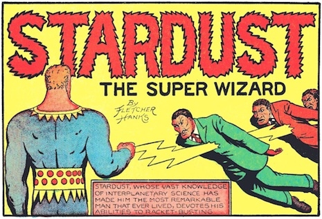
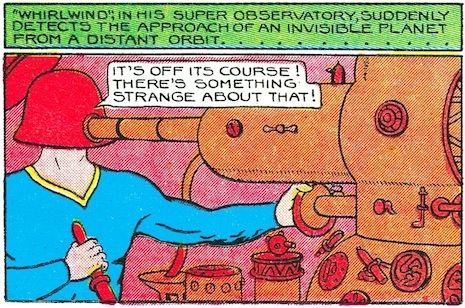
Hanks was born in 1887. We know he was married and had a son but then packed up and left around 1930. According to his son, who is named Fletcher Hanks Jr., he was an alcoholic and physically abused his wife and son. We know that he was found, frozen to death on a park bench in Manhattan in January 1976, at the age of 88. Hanks’ work had two primary characters, “Stardust the Super Wizard” and “Fantomah the Mystery Woman of the Jungle,” and a host of less interesting characters like Space Smith, Big Red McLane, and Whirlwind Carter. Hanks used pseudonyms like Hank Christy, Barclay Flagg, Bob Jordan, and Charles Netcher. As Karasik points out in the video below, part of the fascination Hanks exerts is that he is a rare early case of a true auteur, a comics artist who “wrote, penciled, inked, lettered, and, I think, colored his work.”

Stardust is a well-nigh omnipotent space traveler who has prodigious strength, can read people’s thoughts, can control objects with his mind, produce all manner of anti-gravity rays from his body, and generally do whatever he wants. On the page he seems a lot like Magneto of the X-Men but in truth he has a whole lot in common with Dr. Manhattan from Watchmen. Fantomah was similarly prodigiously powered and whenever she used her powers, her face would transform from that of a normal human woman to a blue-skinned skull-like visage with a blond locks of hair, an arresting voodoo-like image.

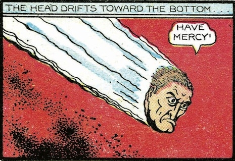
Stardust bears some resemblance to Superman but in fact ends up being an unwitting critique of Superman, in that a creature who has so many powers ends up being less than interesting. Stardust never faces the slightest resistance in any of his plots. A typical Stardust story features Stardust becoming aware of some nefarious scheme by some gangsters or “fifth columnists” and then zeroing in on the malefactors and stopping them and then either depositing them with the federal authorities (who have done nothing to assist Stardust) or else consigning them to some horrible fate that somehow, poetically, serves as a just comeuppance. The best-known example of that comes in “De Structo & the Headhunter,” in which he punishes the ringleader by reducing him to nothing but a head, while stating “I’ll punish you according to your crime, De Structo. ... You tried to destroy the heads of a great nation, so your own head shall be destroyed.” In another story he turns the head honcho into a rat with a human head.

Here’s Nadel on Hanks, as quoted in Tom Spurgeon’s Comics Reporter blog:
 

Fletcher Hanks I like graphically. Some people might call him a primitive, but what’s so great about him is that he took this idea of superheroes as gods literally, even before anyone articulated the idea. He made these moving statues. You have characters carved out of granite, moving around the page, and then maybe he got lucky with whomever was coloring the Fiction House stuff. There are these clunky outlines of bodies and this gorgeous flat color laid over it. Icons moving across the page. Granite statues. It’s really intriguing. Every single Fletcher Hanks comic I’ve seen is like that. They’re just these incredible visions of statues in motion. The writing is just bizarre, so intense and vicious—maybe one of the more visceral comics in there.

 
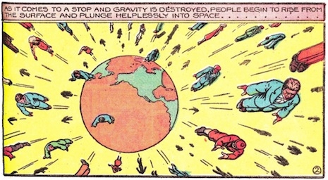
Hanks’ stories are full of un-nuanced plots and schemes with bad guys who are constantly trying to “enslave” or “destroy” something. Even adjusting for the pre-WW2 atmosphere of fear, these stories are just silly most of the time. What sets Hanks’ works apart are his remarkable compositions and use of color—Karasik is quite right in observing that these strips are so fascinating because they so CLEARLY emanate from one mind. All the compositions are defiantly 2-D, and as Karasik establishes in his second Hanks volume You Shall Die By Your Own Evil Creation!, he frequently reused entire pages in different stories. Hanks’ comics are wildly inert, improbable, at times ugly, yet always bountifully colorful and arresting and distinctive. Hanks showed great imagination in his tropes, which frequently involve Stardust or somebody suspending a phalanx of tanks suspended in mid-air, or rocketing every human being in existence away from planet Earth simultaneously before Stardust can set it right. The vitality of Hanks’ expression isn’t on a par with Winsor McCay and George Herriman but does have something of that flavor of strange distant fever dreams from long ago…...


More amazing Fletcher Hanks frames and a Q&A with author Paul Karasik, after the jump…...

READ ON
Posted by Martin Schneider
|
12.11.2014
01:48 pm
|
The marvelous cover art of the early ‘Star Trek’ comic books
12.09.2014
10:19 am
Topics:
Tags:


Poor Gold Key Comics. Despite their stewardship of tons of familiar titles, they always ranked a tier (or three) below the A-list. While Marvel and DC had all the high-octane superhero star power, Gold Key largely got by on licensing properties from other media. They did comic book tie-ins with Hanna-Barbera, Warner Brothers, and Disney cartoons, and brought TV shows like The Man from U.N.C.L.E., The Twilight Zone, H.R. Pufnstuf (!!!), Dark Shadows and Star Trek to the comics racks. Amusingly, some of their tie-in comics outlived by years the original TV series’ upon which they were based, but the company’s fortunes waned throughout the 1970s, and after they lost the lucrative Trek license to Marvel in 1979—just months before that franchise’s cinema revival—their days were numbered. Gold Key was done for by the mid 1980s.

But though they were never the heaviest hitters, Gold Key weren’t wanting for talent. A young Frank Miller’s first pro gig was illustrating a story in The Twilight Zone, and ‘60s-‘80s sitcom deity Garry Marshall wrote scripts for some of their titles. And they had cover painter George Wilson. It’s is beyond frustrating how difficult biographical data on Wilson is to come by. Despite being as prolific as he was accomplished, he has no Wikipedia entry, and searches for his work are complicated by the existence of a pulp novel cover illustrator by the same extremely common name. But his obscurity—and I get that he was basically a jobber, but still—does nothing to diminish his gifts, and it’s just all kindsa wrong that as yet there’s been no big, lavish, coffee-table book collecting his work. He produced incredible numbers of vivid, exciting, superbly designed, impeccably rendered, ridiculously fun cover paintings for Gold Key’s sci-fi, adventure, and horror titles, including many for Star Trek. A lot of the covers that weren’t by Wilson were thrown-together photo illustrations. We suspect you’ll agree that these are far preferable.


More after the jump…

READ ON
Posted by Ron Kretsch
|
12.09.2014
10:19 am
|
Art Spiegelman: The Playboy Years
11.26.2014
06:23 pm
Topics:
Tags:


January 1982
 
Art Spiegelman is about as close as you can come to an eminence grise in the comix game. As the co-editor of Raw in the 1980s (his wife Françoise Mouly was the other co-editor), Spiegelman injected the U.S. underground comix scene with a healthy dose of intellectual experimentation, introducing such talents to the country as Chris Ware, Joost Swarte, Mark Newgarden, and Charles Burns. In 1991 Spiegelman completed his autobiographical years-long project Maus—if you haven’t read it you really should. Not for nothing did it become the first “graphic novel,” as the terminology had it and fitfully still has it, to win the Pulitzer Prize. Since that time Spiegelman spent several years as art director for the New Yorker and published several high-quality works like In the Shadow of No Towers, Co-Mix: A Retrospective of Comics, Graphics, and Scraps, and Breakdowns: Portrait of the Artist as a Young %@&*! He has the credibility that only roots in the underground scene can give you, he’s blended high art and low art (he was also involved with the creation of Garbage Pail Kids, for instance), and he’s generally a walking encyclopedia of comix history and lore. In 2008 I saw Spiegelman give a presentation on “Comics 101” as part of the New Yorker Festival, and it was a delight.


Raw existed from 1980 through 1991, and it must have been quite a challenge for Spiegelman and Mouly to pull off the publication of such an ambitious and infamously large-format book in Soho, one that surely had a host of printing issues most magazines don’t have to worry about (having their own dedicated printing press surely helped with that). Fortunately, to help pay the bills, Spiegelman was doing freelance work for Playboy from 1978 to 1982. I’ll bet those checks with the little rabbit in the corner (??) sure came in handy. 

His first cartoon for Playboy was a wordless 12-panel item called “Shaggy Dog Story” in the January 1979 issue about a woman having sex with a dog. Maybe not content-wise, but visually at least it wouldn’t look out of place in Raw, which isn’t necessarily true of his other work for Playboy—it has a jagged look that evokes ... something earlier and continental, not art nouveau but something similar. Most of Spiegelman’s cartoons for Playboy came in the form of a running series called “Edhead,” which depicted the adventures of a poor fellow who consists of a head but no body—that ran through most of 1979, then stopped until two further strips in 1981. In the January 1982 issue Spiegelman and Lou Brooks did a large panel of “Teasers” full of sophomoric jokes. My favorite thing he did for Playboy was a one-off four- (or eight-)panel strip called “Jack ‘n’ Jane/Rod ‘n’ Randy,” which is so elegantly complex that you can practically see the germ for Chris Ware’s entire future career in it. The idea is that every frame is divided into two; in the top frame a man and a woman converse, and in the bottom frame you get a parallel dialogue between the man’s penis and the woman’s vagina. OK, so maybe it isn’t exactly Binky Brown Meets the Holy Virgin Mary—it’s still pretty impressive for a few square inches of real estate in the back of a nudie magazine…..

(Click on the images for a larger version.)
 

October 1979
 

December 1978
 

February 1979
 

March 1979
 

April 1979
 
Several more “Edheads” and a rejected Playboy parody for Wacky Packages, after the jump…...

READ ON
Posted by Martin Schneider
|
11.26.2014
06:23 pm
|
Page 2 of 3  < 1 2 3 >