FOLLOW US ON:
GET THE NEWSLETTER
CONTACT US
Starring William S. Burroughs as Dr. Benway
04.01.2015
01:24 pm
Topics:
Tags:


This remarkable footage comes from Howard Brookner’s Burroughs: The Movie from 1983. In this scene, two modes of address are skillfully intercut, Burroughs himself reading the hospital passage from early in Naked Lunch, which becomes the voiceover for an actual filmed enactment of the same scene, starting Burroughs as his memorable creation Dr. Benway, described by one observer as “the high priest of manic irrationality.”

Warhol superstar Jackie Curtis is tasked with embodying the nurse, a task she does admirably—the mind practically invents a cigarette for her to puff on between lines, so world-weary and seen-it-all is her nurse. I couldn’t figure out the name of the fellow playing Dr. Limpf. Of course, Roy Scheider played Dr. Benway in David Cronenberg’s 1991 adaptation of the book.

Jim Jarmusch and Tom DiCillo, who together did so much to define American independent film in the 1980s, both worked on Burroughs: The Movie. Jarmusch’s masterpiece Stranger Than Paradise came out a year later, of course.

Continues after the jump…

READ ON
Posted by Martin Schneider
|
04.01.2015
01:24 pm
|
The Andy Warhol New York City Diet (or give your dinner to the homeless)
03.31.2015
12:56 pm
Topics:
Tags:


Shane Parrish at Farnam Street reminded me of an amusing passage from The Philosophy of Andy Warhol (From A to B and Back Again) in which he explains how to keep the pounds off.
 

But if you do watch your weight, try the Andy Warhol New York City Diet: when I order in a restaurant, I order everything that I don’t want, so I have a lot to play around with while everyone else eats. Then, no matter how chic the restaurant is, I insist that the waiter wrap the entire plate up like a to-go order, and after we leave the restaurant I find a little corner outside in the street to leave the plate in, because there are so many people in New York who live in the streets, with everything they own in shopping bags.

So I lose weight and stay trim, and I think that maybe one of those people will find a Grenouille dinner on the window ledge. But then, you never know, maybe they wouldn’t like what I ordered as much as I didn’t like it, and maybe they’d turn up their noses and look through the garbage for some half-eaten rye bread. You just never know with people. You just never know what they’ll like, what you should do for them.

So that’s the Andy Warhol New York City Diet.

 
La Grenouille was and is a fancy eatery in Midtown, by the way. If the above passage teaches you anything, it might be “Don’t take diet advice from thin people.” Having said that, however, the intersection of Warhol and food yields some interesting nuggets.

Not terribly surprisingly, Andy Warhol claimed that his only weakness for nostalgia had to do with the old-style automats like Schrafft’s, for which, remarkably, Warhol did a 60-second commercial in 1968 that consisted of a single voluptuous pan over one of Schrafft’s scrumptious chocolate sundaes. That commercial, alas, appears to be lost to the sands of time, but you can watch a 2014 “re-creation” of the commercial here.

Anyway, here’s Warhol on Schrafft’s and Chock Full O’ Nuts:
 

My favorite restaurant atmosphere has always been the atmosphere of the good, plain, America lunchroom or even the good plain American lunchcounter. The old-style Schrafft’s and the old-style Chock Full O’ Nuts are absolutely the only things in the world that I’m truly nostalgic for. The days were carefree in the 1940s and 1950s when I could go into a Chocks for my cream cheese sandwich with nuts on date-nut bread and not worry about a thing.

 
A few lines later, Warhol writes, “Progress is very important and exciting in everything except food.” But that didn’t prevent him from proposing an eccentric dining solution for lonesome foodies:
 

I really like to eat alone. I want to start a chain of restaurants for other people who are like me called ANDY-MATS—“The Restaurant for the Lonely Person.” You get your food and then you take your tray into a booth and watch television.

 
Incredibly, as the blog Restaurant-ing Through History explains, that ridiculous Andy-Mat idea nearly happened in real life. Below is a picture of Warhol with three associates, architect Araldo Cossutta, developer Geoffrey Leeds, and financier C. Cheever Hardwick III; it appears that the picture was taken at some sort of announcement event for the Andy-Mat, which was to be “an unpretentious neighborhood restaurant serving homely comfort food at reasonable prices which was slated to open in fall of 1977 on Madison Avenue at 74th Street in NYC.”


For anyone who knows New York, Madison and 74th Street is a terrible place to place an “unpretentious neighborhood restaurant” serving food at “reasonable prices.” The plan was to include “pneumatic tubes through which customers’ orders would be whooshed into the kitchen. The meals served in Andy-Mats, in keeping with the times, were to be frozen dinners requiring only reheating.” Hooray, frozen dinners! Unsurprisingly, the restaurants never happened.

Continues after the jump…

READ ON
Posted by Martin Schneider
|
03.31.2015
12:56 pm
|
Mind-bogglingly awesome sketches for Jodorowsky’s ‘Dune’—done in his own hand?
03.30.2015
02:16 pm
Topics:
Tags:


John Coulthart at his blog {feuilleton} has discovered an absolutely marvelous find that is currently on eBay. There is an auction that ends in a few days with the intriguing title “Alejandro Jodorowsky’s DUNE Script EARLY DRAFT? Giger ILLUSTRATED Original Art.”

Yes, that’s right. It appears to be a full script for Alejandro Jodorowsky‘s Dune, however, “It is NOT the ‘phone book size’ script as seen in the documentary ‘Jodorowsky’s Dune,’ but appears to be an earlier/shorter version. There are about 300 pages in total, including illustrations.” At present there have been 15 bids on the script, and the price is at $710.

For those who don’t know, in the 1970s there was a concerted effort to bring to the screen an adaptation of Frank Herbert’s sci-fi mega-bestseller Dune. In 1984, of course, an adaptation by David Lynch was released; while it’s a remarkable piece of work, that version is widely seen as a failure. In 2013 Frank Pavich’s movie Jodorowsky’s Dune documented the abortive first attempt to make the movie.

Here’s the cover of the script, as well as the title page:


Despite the title of the auction, the description indicates that the images “do NOT appear to be by Jean Giraud/Moebius, or Giger, but by an unknown artist.” Certainly at a glance they seem completely dissimilar from all of Giger‘s known output; I am a little less certain in the case of Moebius, but probably more dissimilar than similar. Coulthart convincingly suggests that the drawings are by Jodorowsky himself (interestingly, the eBay seller does not venture a guess), pointing to his 1967 comic Fabulas Panicas. Here’s Coulthart:
 

No artist is credited but the naive style rules out both Moebius and HR Giger (who arrived late to the project in any case). Best bet is either Jodorowsky himself—in 1967 he was writing and illustrating a comic strip, Fabulas Panicas—or Jodorowsky’s colleague from the Panic Movement days, Roland Topor. In the early 70s Topor was working with René Laloux on the animated SF film Fantastic Planet.

Many of the conceptions differ radically from the more graceful designs that Moebius produced later on. Also of note are details such as the anal entrance to the Emperor’s throne room, a Harkonnen orgy and an insemination scene viewed from inside Jessica’s vagina. By the time Giger joined the production team the instruction was not to create anything too erotic or adult since the film needed to reach a large audience.

 
Keep reading after the jump…

READ ON
Posted by Martin Schneider
|
03.30.2015
02:16 pm
|
Weegee’s whimsical snapshots of people watching movies
03.28.2015
12:28 pm
Topics:
Tags:


The American photographer Arthur Fellig, who took the name Weegee as a reference to his seemingly clairvoyant ability to arrive at the scenes of grisly crimes, often in advance of the authorities (the name “Weegee” derives from the board game “Ouija”). No other photographer combines the worlds of news reporting and high art as seamlessly as he does—many of his photos were taken for immediate publication in newspapers, but the originality of his compositions have ensured that his work is routinely discussed in the same breath as masters of photography like Henri Cartier-Bresson, Diane Arbus, Berenice Abbott, and Garry Winogrand. The prime of Weegee’s career was in the 1940s and he died in 1968, but the vitality of his pictures and the lurid subject matter (many of his subjects are murder victims) led to a certain vogue in the 1980s and 1990s. His first book was called Naked City, a phrase that was adopted by avant-garde jazz musician John Zorn for one of his combos in the 1980s—I first discovered Weegee’s work through the cover of their first album. In 1992 Joe Pesci starred in a fictionalized version of Weegee’s life called The Public Eye, directed by Howard Franklin (in the movie, Pesci plays “Bernzy,” who is embroiled in an actual murder plot).

In 1943, with the use of an infrared flash and special film, Weegee captured audience members in New York City movie theaters, unaware that their images were being recorded. The results are predictably marvelous….


Many more after the jump…....

READ ON
Posted by Martin Schneider
|
03.28.2015
12:28 pm
|
Awesome Ramones T-shirts, drawn by the author of ‘My Friend Dahmer’
03.27.2015
09:13 am
Topics:
Tags:


If you read alt-weeklies in the ‘90s and ‘oughts, John “Derf” Backderf’s comic The City may well have been on your radar. Over its 24-year lifespan, it ran in 140 papers in all, peaking at 75 at once in the late ‘90s, including the late, lamented Cleveland Free Times, at which he and I were co-workers. Of course that publishing sector is gasping for air now, and Derf has moved on from it to an edifying afterlife: he’s retired the weekly strip, and like many cartoonists, he’s moved into web-comics, and he’s had great success creating graphic novels.

In 2008, Derf released the acclaimed Punk Rock and Trailer Parks, an account of being a young punk in Akron during the halcyon days of weirdomusic in Northeast Ohio. But his magnum opus so far is 2012’s My Friend Dahmer. You see, future cartoonist Derf was high school pals with future cannibalistic serial killer Jeffrey Dahmer, and his portrait of his onetime friend’s teen years is affecting, disturbing, compelling, deeply human, and just bottomlessly sad. Derf depicts behaviors in the teenaged Dahmer that we’d all recognize today as HUGE RED FLAGS that he was going to turn out seriously broken, but in the early ‘70s could be and were hand-waved as mere weirdness. It was nominated for basically all of the awards, and was named one of Time‘s top five non-fiction books of the year.


Both Punk Rock and Trailer Parks and My Friend Dahmer have been translated into French, which has given Derf a chance to travel to France for promo appearances and exhibits. For one of those exhibits, he drew some wonderful tributes to Joey and Johnny Ramone, and they’ve been made into t-shirts which are available through Birdcage Bottom Books. Also available to the discerning Derf aficionado is this shirt, which may or may not bear a (totally unintentional) resemblance to Lester Bangs (or not), available from publisher SLG Comics.
 

Posted by Ron Kretsch
|
03.27.2015
09:13 am
|
¡Películas muy locos, ay caramba! The awesomely lurid art of Mexican B-movie lobby cards
03.26.2015
09:34 am
Topics:
Tags:


I don’t think I’m too far out on a limb in assuming that John Cozzoli probably has a completely amazing house. Cozzoli collects 20th Century monster movie ephemera, and he’s the best kind of collector—the kind who shares. He curates the online archive Zombos’ Closet, a vast trove of endearingly cheap thrills, including movie and book reviews, and scans of his collections of cinema pressbooks, goofy paper-cutout Halloween decorations, and his amazing collection of Mexican lobby cards from B-grade films. If you have time to descend into a serious rabbit-hole of marvelous trash-culture nostalgia, visit that site just as soon as you possibly can and revel in its contents. And if that’s not enough for you, Collectors Weekly ran a terrific in-depth interview with Cozzoli in 2012. But for now, enjoy some samples from his lobby card collection. This barely even scratches the surface of what he’s got to offer on his site. I went mostly for lurid horror, but he’s got TONS of luchador movie art, as well.

Cozzoli:There’s a mistaken belief that having a big budget guarantees a good movie: It doesn’t. Many movies with modest budgets have outdone movies with bigger pockets to draw from. I love seeing how creative a director and set designer can be when faced with limited resources to work from. Horror movies were originally A-listers, drawing notable actors and production teams. Over time they switched to B and C status as the studios realized they could still make a profit on a cheap movie. Even the bad movies sometimes show a sparkle of wit or style or dramatic directness that makes them enjoyable to watch.

While many Mexican lobby cards promote American movies, they also made cards for Spanish-language movies, often illustrated with vampires, witches, and mummies; Japanese movies, like those made by Toho Studios; and other non-Spanish-language movies. Really, just about any movie that could be shown in a local theater, foreign or domestic, had cards done for it. If the lobby cards were done for American or other non-Spanish-language movies, the compositions usually derive to some degree from the movie’s poster campaign, so these cards tend to be more, let’s say, sedate, and tone down the sex and mayhem. Spanish-language lobby cards are usually more vibrant and suggestive.

Monster kid and movie historian Professor Kinema (Jim Knusch) was the person who turned me on to these wonderful examples of movie promotion for theaters. It was while perusing his collection of lobby cards and pressbooks that I fell in love with both. One reason I focus on Mexican lobby cards is because at $5 to $10 a pop, they’re a lot cheaper than American cards, making them easier to collect. Additionally, Mexican cards for native Spanish movies are usually more colorful and dynamic, and the Mexican cards come in larger sizes, which make them more interesting and displayable.


Devil Bat’s Daughter, 1946
 

She Demons, 1958
 

The Phantom From 10,000 Leagues, 1955
 
More after the jump…

READ ON
Posted by Ron Kretsch
|
03.26.2015
09:34 am
|
Dainty teacups filled with Cthulhu and other eldritch creatures
03.25.2015
03:40 pm
Topics:
Tags:


Brisbane-based artist Michael Palmer creates these fierce looking sea-dwelling creatures that sit within a dainty teacup full of “tea.” The “tea” is actually resin, so you can’t drink out of these. Bummer.

More than anything, they’re just awesome to look at and would make a cool gift for someone.

Even though an Ood from Doctor Who doesn’t technically live in water, I’d like to see one of those within a teacup.

You can purchase these cups from Voodoo Delicious on Etsy. Each (nonfunctional) teacup will run you about $45.


via Bored Panda

Posted by Tara McGinley
|
03.25.2015
03:40 pm
|
Astonishing matte paintings from ‘Ghostbusters’
03.25.2015
12:37 pm
Topics:
Tags:


Ghostbusters is one of the most iconic movies of all time—it was the most successful comedy of the 1980s, by far, and that’s an objectively true statement—it was the #6 grossing movie in that decade, behind (in order) E.T.: The Extra-Terrestrial, Return of the Jedi, The Empire Strikes Back, Batman, and Raiders of the Lost Ark (box office figures from Box Office Mojo).

The question arises, Why was it so successful? Strictly considered as comedy, it doesn’t hold a candle to other movies of the era, such as Night Shift, Better Off Dead, Vacation, Airplane!, just to name a few. Aside from the obvious charm of its lead actors, Ghostbusters succeeds because of its scale, its status as a movie that’s both scary and funny (like Abbott & Costello Meet Frankenstein) in which all of Manhattan Island takes a righteous beating.

As it happens, Ghostbusters employed the talents of two of the nation’s leading matte artists, being Matthew Yuricich, a veteran of the trade who had worked on Close Encounters of the Third Kind, Logan’s Run, Point Blank, Blade Runner, and North by Northwest, and Michelle Moen, called by Richard Edlund, the movie’s visual effects supervisor, “one of the best, if not the top, matte painters in the business.” A movie as successful as Ghostbusters benefits from key contributions from every corner, but if you wanted to argue that the movie’s matte artists were as responsible for its success as its actors, I wouldn’t argue.

Film is obviously a 2-D medium most of the time, which is what allows for the possibility for jaw-dropping visual trickery such as this. Taking in scenes like this, or scenes from Star Wars and Blade Runner, the mind knows that the images aren’t actually possible but it never occurs to the viewer that maybe somebody could paint a landscape that detailed and specific. But people can do that very thing—they’re visionaries who are responsible for some of the most indelible images of cinema history.

Many of these photos come from the indispensable blog Matte Shot.


Here we see how the shot is a combination of three different elements.


Here’s Yuricich working on the painting directly above.


via Tombolare
 

Posted by Martin Schneider
|
03.25.2015
12:37 pm
|
The DEA has trippy looking patches that make you kinda WANT to do drugs
03.24.2015
11:13 am
Topics:
Tags:


I had no clue the DEA’s Dangerous Drugs Intelligence Unit had such cool looking patches. I just always assumed they were boring, I guess. Looking at these, they’re quite the opposite of what I expected. They’re like trippy biker gang badges or some glow-in-the-dark black light poster from the ‘70s. The top one looks like something you’d have seen for sale at a Dead show…


DEA Ecstasy and Club Drugs patch
 

DEA Operation Green Air patch
 

DEA Heroin Intelligence Unit patch
 
More after the jump…
 

READ ON
Posted by Tara McGinley
|
03.24.2015
11:13 am
|
In bed with Andy: David Bailey’s banned ‘Warhol’ documentary
03.23.2015
06:06 pm
Topics:
Tags:

002warbailbed.jpg
 
Among the reasons given for the banning of David Bailey’s documentary on Andy Warhol were: its possibly breach of the Vagrancy Act and a suggested sex act that was not “conducive to road safety.” These were the stated opinions of lawyer and judge Lord Justice Lawton and the sports journalist and broadcaster Ross McWhirter.

McWhirter was one-half of the famous twin brothers Ross and Norris McWhirter who compiled, wrote and edited the Guinness Book of Records. It was McWhirter who initiated the bizarre events that led to Bailey’s film being pulled from broadcast in January 1973, and temporarily banned until March of the same year. McWhirter was responding to the press previews for Bailey’s film that appeared in the Sunday papers on January 14th that described the film as “shocking,” “revolting,” and “offensive,” with the worst scene (erroneously) described by the Daily Mail as showing:

...a fat female artist [who] dyes her breasts and then rolls about on canvas ‘painting’...

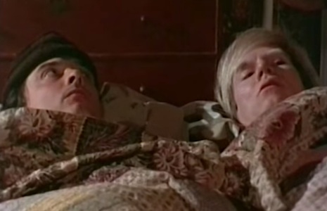
This was Brigid Berlin making one of her famous “Tit Prints,” which was cited by Lord Lawton as a possible source of offense.
 
004bailwarx.jpg
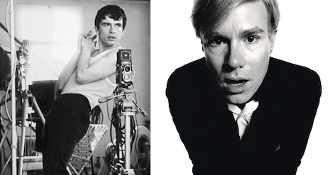
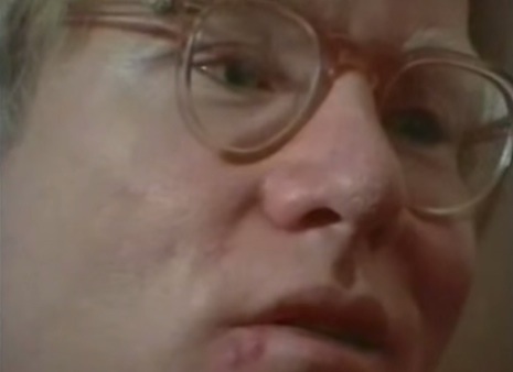
Director and subject.
 
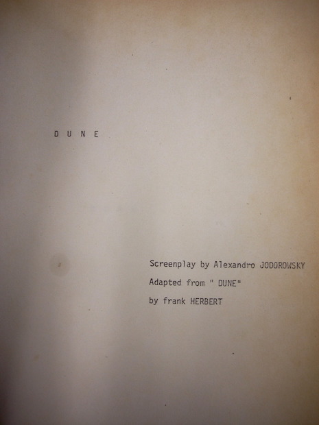
David Bailey had spent about a year working on his documentary about Andy Warhol—it was the last of three films Bailey made for Lew Grade’s television company ATV, the other two were profiles of photographer Cecil Beaton and director Luchino Visconti—and he had spent considerable time with the often monosyllabic and elusive artist, and had interviewed many of Warhol’s Factory entourage including Candy Darling, Paul Morrissey, Fred Hughes, Jane Holzer and art dealer Leo Castelli. Bailey had given over directing duties to William Verity, while he spent his time asking questions and getting close to the film’s subject.

When ATV gave a press screening for Bailey’s Warhol, little did they consider that the negative response of the press would lead to the film being banned. When Ross McWhirter read the press previews, he was sufficiently disgusted that he saw an opportunity to strike a blow for the silent majority—for whom he believed himself to be the obvious spokesman. In fact, he was over-reacting to some hearsay about a film he had not seen.
 
0000war0000.jpg
 
On Monday 15th, McWhirter prepared to take out an injunction against the Independent Broadcasting Authority—the TV watchdog—for allowing Bailey’s film to be screened. On Tuesday January 16th, he issued a writ against the documentary to stop it being broadcast. However, McWhirter’s writ was dismissed during a one-minute High Court hearing. Like all zealots, McWhirter was not one to have the law stop him, and he appealed the High Court’s decision.

McWhirter’s actions gained support from an unlikely quarter: one of the ITV broadcast regions Anglia decided, after is chairman Lord Townshend and two members of the channel’s planning committee had watched the documentary, not to screen the documentary as Bailey’s film was:

...not of sufficient interest or quality.

McWhirter’s appeal was heard at 17:00hours on Tuesday January 16th, the day Warhol was set for broadcast. The Appeal Court consisted of Lord Justice Cairns, Lord Justice Lawton, and was presided over by Lord Denning. Although he had not seen the programme, McWhirter claimed in his writ that the press previews were sufficient to suggest the show would cause considerable offense. Any programme that was considered to be offensive to “good taste and decency” was to be banned under the guidelines of the Television Act of 1964.

Causing offense to the viewing public was not McWhirter’s only concern over Bailey’s film as his writ went on to describe some of its possible dangers:

At one point there is a conversation between a man dressed as a Hell’s Angel and a girl. In that piece, the girl discusses sex with the man and says she would like to have sex with him on the back of a motorcycle doing 60 miles an hour. Apart from anything else, that does not sound as though it is conducive to road safety.

Like McWhirter, none of the Lords had seen Bailey’s film, however this didn’t stop them pontificating about its possible criminal intent. According to the Guardian newspaper, Lord Justice Lawton was deeply concerned over Brigid Berlin’s breast painting:

...the viewers of Britain were to be shown pictures of a fat lady doing something that sounded to him very much like a breach of the Vagrancy act, apart from anything else…

 
003bridtitpaint.jpg
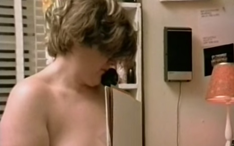
The offending “tit printing” scene.
 
However, it was the IBA who received the greatest criticism from Lord Denning for their perceived failure to view the documentary before transmission. This, as it later turned out, was a major oversight by Denning and co. as they had failed to ascertain whether anyone from the IBA had actually watched the film—which in fact they had. IBA General Director Brian Young, Head of Programmes Joe Wellman, together with their deputies, had all watched Bailey’s film and suggested cuts and had even insisted on the addition of an introductory voice-over.

Still this did not stop the appeal judges voting 2-1 in favor of an interim injunction that temporarily banned the film from being screened on television—a documentary on craftwork was broadcast instead.

Watch David Bailey’s ‘Warhol’ after the jump…

READ ON
Posted by Paul Gallagher
|
03.23.2015
06:06 pm
|
Page 147 of 380 ‹ First  < 145 146 147 148 149 >  Last ›