FOLLOW US ON:
GET THE NEWSLETTER
CONTACT US
Jazz great Charles Mingus takes on the bootleggers in this amazing self-produced comic strip
03.13.2017
11:32 am
Topics:
Tags:


Around the time that he became an authentic jazz superstar in the mid-1960s, Charles Mingus became obsessed about avoiding exploitation at the hands of “distributors and retailers.” Mingus was unusually DIY for his era, and he made concerted efforts to secure an unusual amount of control over the production and distribution of his music, a process that included setting up an organization called Charles Mingus Enterprises with a Charles Mingus Record Club. Mingus tried to self-distribute his albums via mail order, and to that end hired artists and layout people to make newspaper ads touting his albums.

As Gene Santoro writes in Myself When I Am Real: The Life and Music of Charles Mingus:
 

Janet Coleman and Susan [Mingus’ fourth and final wife] and assorted others helped with Charles Mingus Enterprises. Some, in the Beat tradition, drew cartoons for ads and the album cover. But Charles and Susan ran it. Mingus wanted to sell only by mail order, so he couldn’t be ripped off by distributors or retailers. He wouldn’t lug stock and collect checks. It would be straightforward. It was his.

He planned to put ads in the burgeoning counterculture papers, many, like the Village Voice, started by Beats. He wanted the ads to look homemade.

 
However authentic Mingus’ annoyance on this subject, it seems that this phase didn’t last all that long. In this online forum you can read the musings of several Mingus fans reminiscing about the Mingus’ mail-order album Mingus at Monterey, which came out in 1964—it’s noteworthy that they don’t talk about any other mail-order albums, just that one. In commenting on that album, Wikipedia even mentions that it was released on Mingus’s “short-lived mail-order Jazz Workshop label.” And the Internet is not teeming with images of the ads Mingus put out—far from it.

Mingus had a full comic strip put together in a vaguely Dick Tracy-ish style; it appeared in the Village Voice in December of 1966. Its title was “Charles Mingus Fingers the Record Hi-Jackers”—in the strip, a female beatnik named “Chris” goes into a record shop to inquire about getting ahold of some LPs by “Charlie Mingus.” Sure enough, the shop owner does have some, and sells six of them to Chris. In the final two panels (one doubling as a kind of mail-in coupon), Chris meets Mingus on the street and reports to him on the store’s nefarious bootleg trade. Chris says to the jazz great, “That cat dropped six of your albums on me! Do I get to collect that $1000 reward when you turn him in Ming?”

As one can see from the signature at the bottom left, the strip was executed by Gene Bilbrew, an African-American cartoonist whom some credit with creating the first black superhero, the Bronze Bomber. Bilbrew had once been an assistant to comics legend Will Eisner. Later on Bilbrew worked as a fetish artist at Irving Klaw’s bondage-oriented Movie Star News/Nutrix company; Klaw also discovered Bettie Page. 

At the bottom of the strip is a cut-out coupon to enable the reader to order Mingus at Monterey, “the latest Mingus Town Hall 1964 album,” and/or Music Written for Monterey.

Santoro describes it thus:
 

The plot: a beautiful woman helped him ferret out bootleg record dealers by going into shops and asking for his records, which were going out of print. He appeared with her, to urge readers to buy his stuff only through the mail. He was drawn wearing his khaki army shirt with many pockets and a snapbrim fedora.

 
In the strip, Chris mentions a $1,000 reward that Mingus is willing to pay. According to Santoro, Mingus included a similar mention in a different advertisement in the Village Voice, which took the form of a “Legal Notice” indicating a “$500.00 Reward for evidence which secures conviction of any person selling these records.”

Read the strip after the jump…

READ ON
Posted by Martin Schneider
|
03.13.2017
11:32 am
|
Love and Rockets: Punk flyers by Los Bros Hernandez
03.13.2017
10:31 am
Topics:
Tags:


Jaime
 
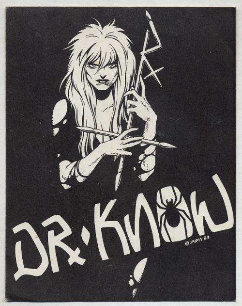
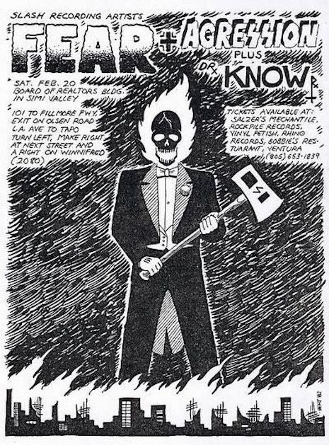
Los Bros Hernandez (Gilbert, Jaime, and Mario) have been a force in the world of comix ever since they began publishing Love and Rockets, their seemingly endless trove of stories inspired by the Chicano punk scene in and around Oxnard, California (or “Huerta”) in 1981. Love and Rockets has long been a key touchstone for the SoCal punk scene, even inspiring the Bauhaus offshoot way off in England to appropriate the comic’s name.

Gilbert and Jaime were the most prolific of the siblings. Both of them were into the punk scene, but Jaime was more into it, and he also stuck with the scene longer. In an interview with Chris Knowles, Jaime credited the DIY ethos of punk with inspiring their own decision to self-publish:
 

In the beginning, we didn’t know what kind of audience we would have, or if we would have an audience. At the same time, we were like, “Well, fuck it, we’re going to do it anyway. We knew this was good. We know these stories are worth telling. So, we’ll get there without your help.” I was cocky enough to pull it off! You know, the whole punk do-it-yourself thing was also because it helped me grow up a lot. I mean, it wasn’t just the music scene, it was just… I just saw the world in a big scope for the first time, and I was 18 to 21, those years, so it was just very eye-opening, and I’m glad it happened at that point.

 
However, Jaime eventually got disillusioned by the inevitable conformity that hit the punk scene: “I’d be watching a band, and all of a sudden, I’d be pushed from behind, and I’d look, and there’d be this wall of guys, just because I wasn’t wearing the same boots they were wearing. That’s when it just wasn’t fun anymore, you had to watch your back!”

Jaime and Beto’s enthusiasm for local punk bands led the two of them to design the occasional flyer for acts like Fear, Dr. Know, Youth Brigade, and Angelic Upstarts.
 

Beto
 

Jaime
 
More after the jump…

READ ON
Posted by Martin Schneider
|
03.13.2017
10:31 am
|
Groovy 1968 Frank Zappa advertisement from Marvel Comics’ Daredevil #38
03.02.2017
03:12 pm
Topics:
Tags:


One of the primary reasons that the quite mind-blowing, entertaining, and enjoyable Monkees movie Head did so poorly at the box office in 1968 was that it represented such a sharp break from the family-friendly sitcom on which the group had built its following. The movie featured lots of utterly confusing footage, at times on an antiwar theme, that was mostly the kind of thing college-aged pot smokers like to see, but it amazingly garnered a G rating, at least initially. As Joseph Brannigan Lynch wrote on the occasion of the Blu-Ray release of Head:
 

Partly to blame was the marketing campaign that was almost as avant-garde as the film itself, but even worse was the fact that many theaters (successfully) demanded the film’s G-rating be turned into a Mature rating, simply because the film structure allegedly resembled an acid trip.


One of the many fascinating people involved with Head was, of course, Frank Zappa, who wanders through the movie with a Hereford Bull in tow and chides Davy about how “white” his music is not to forget the youth of America. One wonders if Columbia Pictures’ famously miscalculated ad campaign was in any way influenced by a similarly odd campaign for one of Zappa’s albums a few months earlier.

In March 1968, the Mothers of Invention unleashed their third mind-bending cultural intervention, known to all and sundry as We’re Only in It for the Money. In a curious move, Verve Records, no doubt directed by Zappa himself, apparently selected the pre-teen comic book audience to be one of the target demographics to promote the album to. Specifically, Daredevil #38, which came out the same month as the album, and featured a remarkable full-page ad promoting the record.

More after the jump…
READ ON
Posted by Martin Schneider
|
03.02.2017
03:12 pm
|
Vintage guitar ads featuring hot chicks with big hair
02.14.2017
11:26 am
Topics:
Tags:


Vintage ad for B.C. Rich guitars 1989.
 
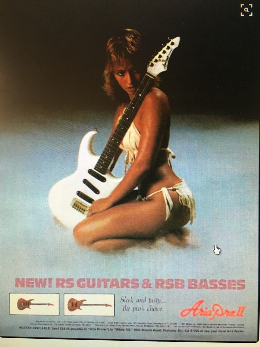
Today’s post from yours truly is going to take you on a trip down memory lane to a time when magazines were the main communication device for rock and roll. Though some great rock oriented print magazines do still exist, for at least four decades from the 60s through the 90s magazines were what you spent your money on so you could be sure to get the recommended daily amount of rock and roll information, get fan club info, and pull out centerfolds of a young David Lee Roth to hang on your wall—right next to whatever else covered up the ugly wallpaper in the room you spent your teenage years in.

If you’re a guitar loving gearhead and also a fan of girls, then you’re going to get an especially good kick out of the images in this post that feature the famous “Dean Girls” who helped sell guitars for Dean in a series of ads in the late 70s and 80s, as well as some racy images used by B.C. Rich. All of the images in the post have pretty consistent themes that include bikinis, big 80s hair and lots of skin. Oh, and there’s guitars too. Though there’s really nothing particularly risqué about a girl in a bikini holding a guitar, some of the images are probably NSFW. YAY!
 

Aria Pro II ad.
 

One of the girls from guitar maker Dean and their series of ads featuring scantily clad ladies. This one is known as the Dean “Rip Girl.”

More after the jump…

READ ON
Posted by Cherrybomb
|
02.14.2017
11:26 am
|
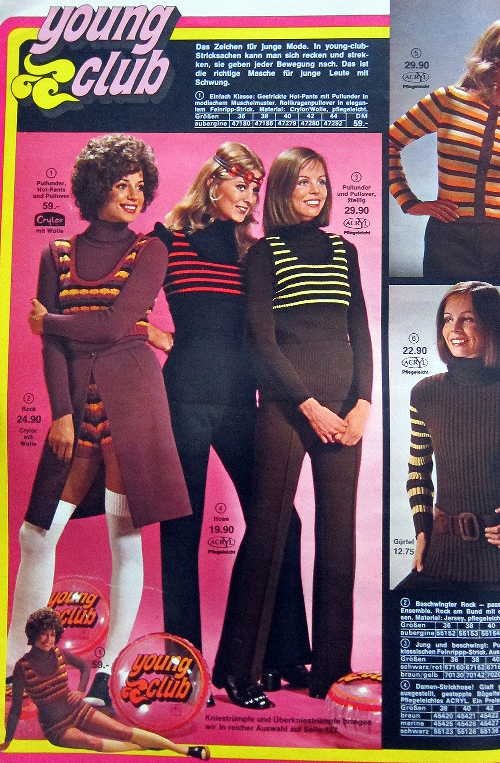
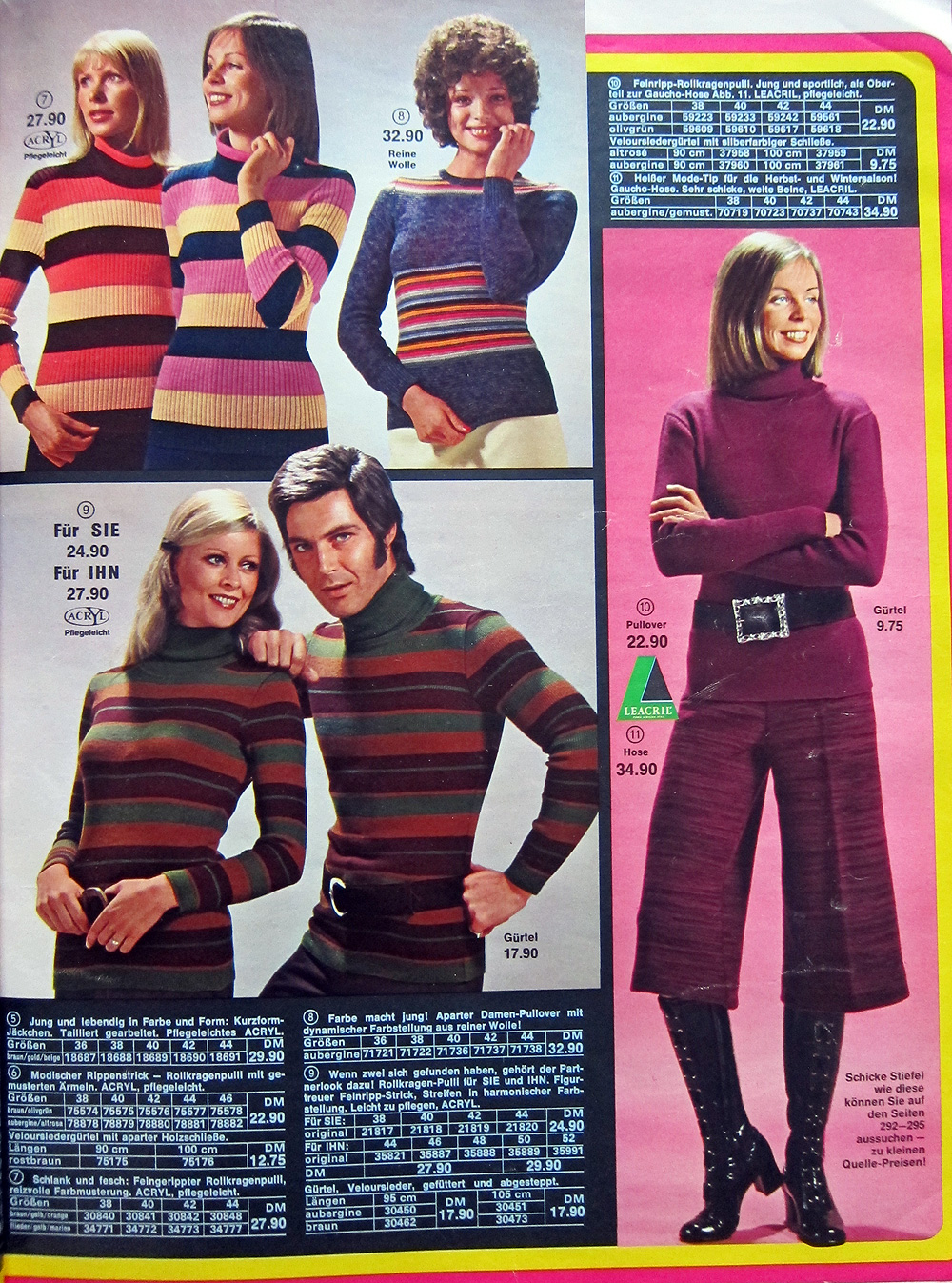
‘Young Club’ winter 1972: 21 pages from this incredibly retro German mail-order catalogue
02.02.2017
08:58 am
Topics:
Tags:


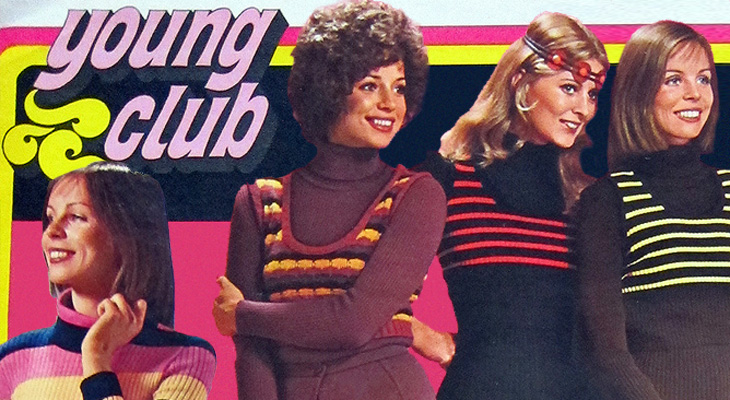
Karstadt is the largest department store chain in Europe. Go retro shopping there in 1972 using your imagination and pages from this 700+ page Winter catalogue which somehow turned up at the Rose Bowl Flea Market. Did most European women wear wigs in the early 70s? That certainly seemed to be the case going by the evidence here.

This long-standing mail-order service run by Quelle was in operation until October 2009 before going out of business.

Jetzt kaufen, solange der Vorrat reicht! (Buy now, while supplies last!)


More pages after the jump…

READ ON
Posted by Doug Jones
|
02.02.2017
08:58 am
|
Debbie Harry in 1980 TV ads for Gloria Vanderbilt jeans
01.26.2017
01:19 pm
Topics:
Tags:


Until the mid-70s, the only kinds of blue jeans anyone really wore were Levis, Lee or Wrangler. Then came designer jeans like Calvin Klein and Gloria Vanderbilt.

To take on the big three jeans companies, these upscale upstarts needed cutting-edge celebrities to flog their togs: Calvin Klein famously used Brooke Shields and Natasha Kinski in his memorable advertising campaigns. Gloria Vanderbilt’s teen line, “GV Jr.” by Murjani had style icon Debbie Harry of Blondie for the spokesmodel.

In the first one, you’ll notice Lounge Lizard John Lurie on sax and Harry saunters past some SAMO wall tagging (SAMO was the graffiti name used by a young Jean-Michel Basquiat). Eagle-eyed No Wave trainspotters will also notice Mudd Club co-founder Anya Phillips and James Chance as they watch this over and over again…


Another Gloria Vanderbilt jeans commercial with Debbie Harry after the jump…
READ ON
Posted by Richard Metzger
|
01.26.2017
01:19 pm
|
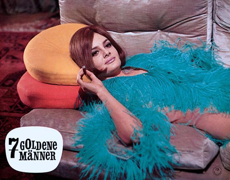
Ultra stylish German lobby cards from the world of 1960s European cinema
01.25.2017
09:56 am
Topics:
Tags:


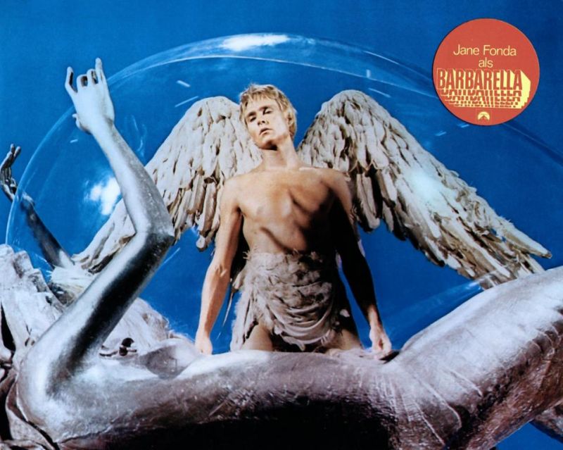
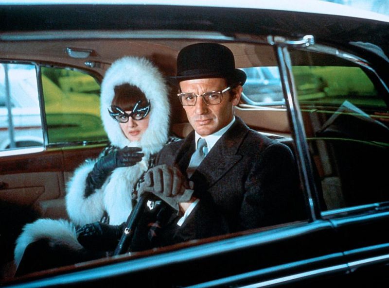
Millennial recap: Lobby cards were issued by the motion picture studios and typically depicted eight scenes from the film it was advertising. While they are no longer used by theaters they have become a popular collector’s item amongst film fanatics around the world. Here’s a gallery of 37 German lobby cards promoting the Italian heist-comedy Seven Golden Men (1965); A Degree of Murder (1967) starring Anita Pallenberg; the Eurospy cult favorite Kill Me Gently (1967); German sex-romp Angel Baby (1968); Fräulein Doktor (1969) starring Suzy Kendall, the sci-fi classic Barbarella (1968) starring Jane Fonda; Eurospy underground hit Island of Lost Girls (1969); Claude Lelouch’s romantic drama Love Is a Funny Thing (1969); the German hitchhiking comedy That Guy Loves Me, Am I Supposed to Believe That? (1969) starring Uschi Glas, and Lucio Fulci’s brilliant Hitchcock inspired giallo One on Top of the Other (AKA Perversion Story) (1969) starring Marissa Mell.
 

Seven Golden Men (1965)
 

Seven Golden Men (1965)
 

Seven Golden Men (1965)
 
More after the jump…

READ ON
Posted by Doug Jones
|
01.25.2017
09:56 am
|
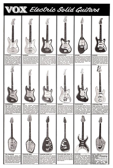
Groovy vintage ads for classic guitars
01.12.2017
09:02 am
Topics:
Tags:


Inspired by a recent post on reverb.com, I jumped down an Internet rabbit hole of vintage guitar ads. Naturally, there’s a ton of wonderful stuff to be found, and I was surprised, despite how niche a market these ads were trying to reach, at how little they differ in look and tone from any other ads of their times. ‘50s ads tended to be bland product shots surrounded by expository text, by the mid-‘60s ads started getting more creative, and ‘70s ads were often rainbow-hued blowouts executed by illustrators who owed their livelihoods to Milton Glaser. Which is basically to say that a lot of them could just as easily have been ads for cars or small appliances. Why this surprised me, I don’t know—they were crafted by the same agencies, using the same broad theories as to what worked, as all other ads. (And if those cultural transitions interest you, I cannot recommend Thomas Frank’s The Conquest of Cool

What follows is culled from countless online sources. I’ve tried to keep them roughly in chronological order, but not all of them were possible to date. Of particular interest—the Vox and Domino ads below boast the most out-there instrument designs, but due to their vintage they’re the most conservative ad designs, and Fender ads from the ‘70s were especially lysergic, in a study-hall kinda way.
 

Domino, early ‘60s
 

Vox, 1964
 
More vintage guitar ads after the jump…
READ ON
Posted by Ron Kretsch
|
01.12.2017
09:02 am
|
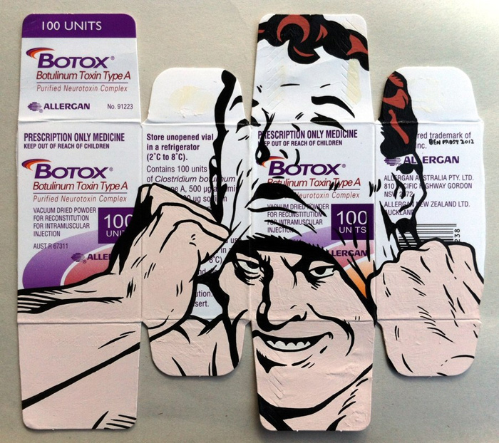
Porny, provocative pop-art mashed up with pharmaceutical packages
01.11.2017
08:38 am
Topics:
Tags:


A painting by Ben Frost.

Birds shit wherever they want ‘cause they all know it’s crap down here.

Words by artist Ben Frost inscribed on his 2005 piece “Birds and Bad Things”

Artist Ben Frost hails from Australia and has spent time living in Japan. His subversive pop-art contains references to Japanese Manga as well as a myriad of well-know commercial images such as a box of McDonald’s famous french fries that has been layered with a erotic image of a Lichtenstein-esque looking woman being whipped by a proper female Victorian-era librarian during her off time. And that’s one of Frost’s more demure works of art.

Frost himself is as risky as his boundary-pushing paintings. In 2000 the artist faked his own death as a publicity stunt to promote his solo-show of the same name and invitations to the event consisted of Frost’s “faux funeral” notice. Later that same year a painting at the show “Colussus”—a collaboration with fellow artist Rod Bunter—was slashed apart by an attendee.

It’s not hard to understand how Frost’s work might stir some intense emotions with his confrontational art, because the concept of mixing propaganda with pornographic images, Dracula or Ren and Stimpy on a box of Epinephrine is perhaps a little out there for some people. However if everything about that statement makes perfect sense to you, then you’re going to really enjoy looking over the images of Frost’s work included in this post. From time to time Frost sells his artwork on his website Ben Frost IS DEAD.

A few of the paintings are NSFW.


READ ON
Posted by Cherrybomb
|
01.11.2017
08:38 am
|
Super-sexy-mini-flower-pop: The surreal & futuristic Afri-Cola ads of the late ‘60s
12.20.2016
10:09 am
Topics:
Tags:


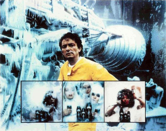
In the 1960s, German soft drink Afri-Cola (which first hit the shelves in 1931) was quickly losing to its competitors Coca-Cola and Pepsi. In 1968, the brand started searching for a new marketing campaign in an attempt to regain their image. They hired prolific commercial designer and photographer Charles Wilp from Düsseldorf. The wildly eccentric 36-year-old was rarely seen not wearing his trademark canary yellow jumpsuit and his provocative ideas that knew no creative limits would soon elevate him to a pop star level. 
 
While visiting the Marshall Space Center in Huntsville, Alabama, Wilp looked into the “Cryo Chamber,” (a tent where rockets are inspected at below zero temperatures), and through various iced plastic films saw a folding door with the image of a pin-up girl. He began envisioning the playmate floating around the room as if she were a ghost, and this gave birth to his groundbreaking ad concept.


Approximately 20 deliberately taboo TV spots and print ads with surreal-futuristic images began running all over Germany. These bizarre visuals included attractive nuns wearing makeup and eyeliner, lascivious stewardesses administering transfusions with cola instead of blood, an American soldier with a dove of peace, and a nude mustachioed male (the very first nudity in advertising history) weightlifting a soft drink bottle. Wilp’s risque ads, aimed to make viewers feel intoxicated without the use of drugs, were met with furious protest from ecclesiastical moralists who unintentionally helped the brand achieve exactly what they wanted: Afri-Cola became the cult drink of the flower power generation overnight and sales increased by a remarkable 30 percent.
 
Charles Wilp achieved this success by rejecting ad agency tools such as market research and media planning. Instead, he moved forward with his own strategy based on reversing visual perception. “If, for example, the market researchers say Afri-Cola is for young people, smiling young people should appear on the display. And if the media planners say Afri-Cola is a drink for hot days, then the ad should be in the magazines in the summer. I do the opposite: I photograph Afri-Cola with nuns and connect that with intoxication. I do not take a man with two girls, which would be common, but a girl with two men.” The breakthrough ads featured representatives of all different races, sexes, and levels of social strata.


Originally, Charles Wilp hired German-based American garage rock band The Monks to record a jingle, he thought their experimental sound and blasphemous image that mimicked the Catholic church would be a perfect fit for the controversial advertising campaign. Unfortunately, his plan didn’t work out. “The musicologists and the CEO couldn’t agree with me and the whole thing failed.” Charles Wilp explained in the 2008 Monks documentary The Transatlanic Feedback. “I performed my Afri-Cola music with 48 strings, 2 oboes, 2 harps, 4 timpani, classical instruments. And I created this ‘unreal’ sound which I always wanted to do and which I could have achieved faster with The Monks. Then I didn’t have to deal with the burden of conventions.” Wilp’s orchestrated Afri-Cola score was released on vinyl as a “super single.”
 
More after the jump…

READ ON
Posted by Doug Jones
|
12.20.2016
10:09 am
|
Page 5 of 29 ‹ First  < 3 4 5 6 7 >  Last ›