FOLLOW US ON:
GET THE NEWSLETTER
CONTACT US
The far out work of Frank R. Paul, the ‘Father of Science Fiction Art’
08.29.2017
07:36 am
Topics:
Tags:


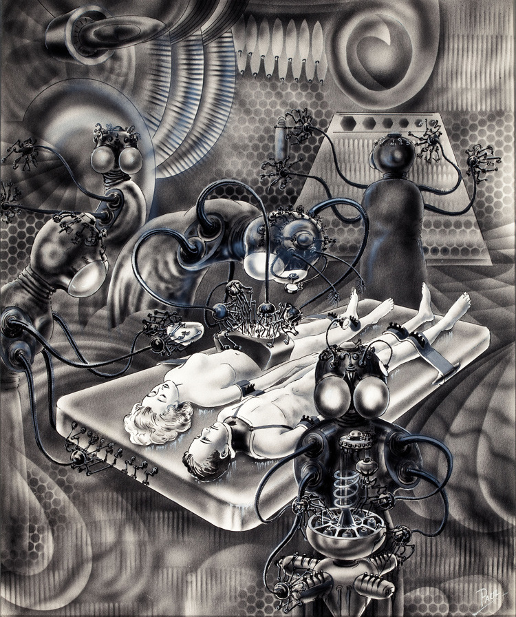
A remarkable black and white illustration by Frank R. Paul.
 
Hailing from Austria, pulp novel and comic book artist Frank R. Paul (born Rudolf Franz Paul in 1884), only attended school until the eighth-grade. At the time, affluent members of Austria received formal education beyond that, but Paul’s family were not a part of that world. So, when Paul turned fourteen, he got his first job working in a paper mill which he kept until the age of seventeen when he left Austria to avoid being drafted into the military. Paul ended up in Paris where he studied art which then led him to pursue studies in architecture in London. Finally, Paul would find himself and his first success as an artist in New York (after a short pit stop in San Francisco) where he was hired by Hugo Gernsback, the editor of The Electrical Experimenter, to create artwork for the monthly magazine in 1914.

Known today as the “Father of Science Fiction Art” Paul’s vivid work has appeared in and on the covers of a wide variety of magazines and pulp novels, most notably Amazing Stories who published a painting done by Paul on their very first issue in 1926. Other influential covers by Paul include the unique illustration of the “Human Torch” (the robot superhero created by Carl Burgos, not Johnny Storm of the Fantastic Four) on Marvel Comics #1 in 1939, as well as his terrifying depiction of H. G. Wells’ vision of The War of the Worlds for Amazing Stories in 1927.

Publications containing Paul’s wild illustrations have sold for more than 20,000 dollars in the past, and his work is highly sought after by collectors. I highly recommend picking up the impeccable 2009 book, FROM THE PEN OF PAUL: The Fantastic Images of Frank R. Paul if you are at all a fan of the science fiction genre. I’ve posted some of Paul’s super spacey paintings, illustrations and magazine/pulp novel covers below.
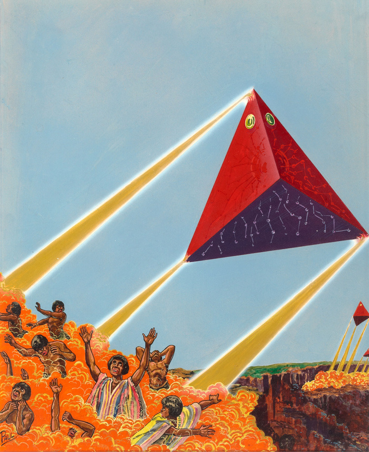
 

1940.


More after the jump…

READ ON
Posted by Cherrybomb
|
08.29.2017
07:36 am
|
Trip out to the wild work of ‘Karaska’ the psychedelic surrealist from Kiev
08.29.2017
07:04 am
Topics:
Tags:


I recently came across the mind-expanding, surrealist collage artwork of Kiev, Ukraine’s Vadim Karasev. Having worked freelance under the pseudonym Karaska since 2013, Karasev’s postmodern vision is the product of several difficult years of personal self-realization and creative discovery. “Generally, I’m an engineer by education,” Karasev explained via email exchange. “I had to study and develop art on my own, which for me is the most amazing journey. The journey into the depths of oneself.”
 
This path toward innovation saw stylistic influences by the likes of Giorgio De Chirico, René Magritte, Jeff Jordan, and other modern artists, such as Maurizio Cattelan. Additionally, many narratives witnessed within Karaska’s work are inspired by classical literature from novelists Jorge Luis Borges, Franz Kafka, poets such as Arthur Rimbaud and André Breton, and many others. “I’m interested in the theme of the mystery of dreams and reality, mixing them, moving from one to another,” Karasev highlights. “These two worlds are interrelated and equally important, they exist, complementing each other and forming our reality.”
 
Take a look at some of Karaska’s reality-shifting examples of psychoactive new surrealism below.


More after the jump…

READ ON
Posted by Bennett Kogon
|
08.29.2017
07:04 am
|
The weird fantasy menageries of Hannes Bok
08.29.2017
06:58 am
Topics:
Tags:


Hannes Bok was one of a thousand illustrators who eked out a career making illustrations for magazines, particularly scf-fi magazines, in the middle part of the last century. Born Wayne Francis Woodard in Kansas City in 1914, he grew up in Duluth, Minnesota, and lived in Los Angeles and Seattle as a young man.

His selected pseudonym, which lent his work an air of European sophistication, was a jumbled reference to the greatest of all Baroque composers, Johann Sebastian Bach. (“Hannes” relates to “Johannes,” a variant of Bach’s first name.) Early in his career Bok befriended an unknown writer named Ray Bradbury who would later become an advocate for Bok among sci-fi publishers. After Bok established himself in the late 1940s, he moved to New York City.


Bok’s work cannily melds the stately art of the pre-Raphaelites and the more cartoonish, fantastical motifs of the sci-fi stories he was illustrating. A good many of Bok’s images resemble those of his exact contemporary Virgil Finlay, but Finlay’s utterly unique output was far more delicate and “three-dimensional,” for lack of a better descriptor. Where Finlay’s work might depict a damsel in thrall to a demon, Bok would be more likely to juxtapose a stolid explorer flanked by two bizarre creatures.

Bok was also a noted astrologer as well as a creative writer. He published two novels, The Sorcerer’s Ship and The Blue Flamingo, which was later retitled Beyond the Golden Stair. First editions of the book Hannes Bok: A Life in Illustration are much prized by fans of midcentury illustration, running as high as $150


Much more after the jump….....

READ ON
Posted by Martin Schneider
|
08.29.2017
06:58 am
|
Contemplating death & turning heads: The strange and disturbing sculptures of Yoshitoshi Kanemaki
08.28.2017
09:34 am
Topics:
Tags:

01yoshi.jpg
 
Yoshitoshi Kanemaki sketches out his sculptures on paper before taking a large chunk of tree trunk and carving out his pencil-drawn designs. He uses camphor wood which is an evergreen tree that can grow up to one hundred feet in height. As he carves and chisels, he draws onto the wood to highlight the details he wants to bring out in each sculpture. He then paints the finished work in soft pastel colors.

And what do the resulting works look like?

Well, Kanemaki’s sculptures include large intricate skeletal momento mori which achieve just what their titles describe—figures gripped by the bones beneath the skin. He also carves strange figures with multiple heads which depict human indecision, ambiguity, the swinging change of mood daily wrought by life like a unmoored boat upon torturous seas. And then we have the split personalities or “glitches,” the two-head figures that capture “the hesitations or inconsistencies” that we can never answer.

“I think that such ‘ambivalent’ emotions can be embodied regardless of whether they are ‘surface’ or ‘deep’ layer by giving the effect of an irregular shape deviating from [the] human figure. The sculpture series created with these feelings is the projection of my own emotions — it may be your figure.”

Kanemaki was born in the Chiba Prefecture of Japan in 1972. He graduated from the Department of Sculpture, Tama Art University, Tokyo, in 1999. Since then he has exhibited his work in group and solo shows across the country, won several awards, and has work in various public collection. See more of Kanemaki’s work here or follow him on here.
 
02yoshi1
 
03yoshi.jpg
 
010yoshi.jpg
 
More of Kanemaki’s scupltures, after the jump…
 

READ ON
Posted by Paul Gallagher
|
08.28.2017
09:34 am
|
Jewelry based on Alejandro Jodorowsky’s cult classic ‘The Holy Mountain’
08.28.2017
09:27 am
Topics:
Tags:


A photo from AMBUSH’s ad campaign for their ‘Holy Mountain’ line of jewelry and accessories, 2012.
 

“You are excrement. You can change yourself into gold.”

—a quote from “The Alchemist” (played by Alejandro Jodorowsky) in The Holy Mountain

Back in 2012 Tokyo company AMBUSH created a line of jewelry and accessories based on the messed up imagery from Alejandro Jodorowsky’s 1973 film, The Holy Mountain. AMBUSH’s ad campaign for the line was ambitious, to say the least, and, as you might imagine, the line sold out quicker than you can say “The grave receives you with love.” It is possible to track some of the unique pieces down out there on the Internet such as Wrong Weather, Grailed, Big Cartel and sometimes eBay. I can’t lie, I want nearly everything from AMBUSH’s wearable homage to one of my favorite films of all time.

I’ve posted images from the ad campaign as well as several photos of items in the collection that are just too fucking cool. Some are NSFW, much like Mr. Jodorowsky himself.
 

“Eye Ring.”
 

Pin set. Available here.
 

Clutch with design inspired by ‘The Holy Mountain.’
 
More after the jump…

READ ON
Posted by Cherrybomb
|
08.28.2017
09:27 am
|
‘Eaten Alive’: Tobe Hooper’s 1976 horror film about a man-eating crocodile was banned in the UK
08.28.2017
09:22 am
Topics:
Tags:

Eaten Alive
 
Dangerous Minds was saddened to learn that director Tobe Hooper died on Saturday. Hooper is best known for The Texas Chain Saw Massacre, his 1974 low-budget horror masterpiece concerning a group of young people terrorized by a family of cannibalistic nutjobs. The movie was an artistic, critical and financial success, grossing more than $30 million in the U.S. Hopper’s anticipated follow-up was initially given a limited release in 1976.

Eaten Alive is a horror/exploitation film about a deranged hotel owner who kills his guests and feeds them to his pet crocodile. It has solid B-movie cast, including Marilyn Burns, who memorably screamed her head off in Chain Saw, and a heavily made-up Carolyn Jones, who was “Morticia” on the The Addams Family, playing brothel owner Miss Hattie. A young Robert Englund (a/k/a “Freddy Kruger”) is great as the lowlife “Buck.” Englund utters the unforgettable first words in the picture: “Name’s Buck. I’m rarin’ to fuck.’” The dialogue was later adapted by Quentin Tarantino and used in Kill Bill: Volume One.

Eaten Alive was given a wide release in the states in 1977, and in 1978, a slightly edited cut was approved by the BBFC, the British ratings board. Released in the UK as Death Trap, it gained notoriety a few years later, after it appeared on home video.
 
Death Trap VHS
 
In Britain during the early 1980s, there was a moral panic regarding the availability of certain movies on VHS. At first, motion pictures that came out on video didn’t have to be rated, meaning anyone of any age could rent them. Especially violent and gory pictures like Driller Killer and I Spit on Your Grave were singled out as being inappropriate for young people; the films identified as such came to be known as “Video Nasties.” In 1982, Death Trap was one of those successfully prosecuted under Britain’s Obscene Publications Act, and the distributor had to surrender all VHS copies to the court. If you’re wondering the fate of The Texas Chain Saw Massacre, well, it was denied certification by the BBFC in 1975 and didn’t come out in Britain until 1999—! The following year, Death Trap was once again made available on home video in the country.
 
Hooper and Brand
Hooper and actor Neville Brand on set.

After repeated disputes with producers, Hooper quit before filming of Eaten Alive was complete, leaving it to be finished by others. While the final product certainly doesn’t match the quality of Chain Saw, the picture isn’t without its merits. Many scenes are effectively unsettling, especially those involving the terrorized child staying at the hotel, which are particularly unnerving. Hooper’s use of color is notable, and the atmospheric outside shots look really cool.
 
Judd
 
I tend to agree with this IMDb user’s assessment of the film and of Neville Brand, who plays the hotel owner:

‘Death Trap’ reminds me of Dario Argento’s movies. Not in the subject matter, or directorial style, but in the sense that what you’re seeing is a filmed nightmare, devoid of logic, but full of memorable over the top images. The sets are cheap and nasty, the acting varies from quite good to plain silly, the “plot” can basically be summed up as: people check into a seedy motel and get fed to a pet crocodile by its nutty owner, but you know what? It’s still a hell of an entertaining trashy horror movie.

Neville Brand (‘The Ninth Configuration’) gives a gonzo, almost vintage Timothy Carey-like performance as psycho scythe wielding “Judd,” owner of the one place in town you really don’t want to check in to.

 
More after the jump…

READ ON
Posted by Bart Bealmear
|
08.28.2017
09:22 am
|
The hilariously f*cked-up art of defacing kids’ coloring books (NSFW)
08.25.2017
09:09 am
Topics:
Tags:

05colorcorr.jpg
 
Looking for a scintillating opening paragraph to begin this piece on hilariously defaced kids’ coloring books, I thought it’d be fun to share a few of the images with a psychoanalyst friend to get his take. Oh boy, was that a bad idea. His eventual response after a few hours of email silence was:

I’d really like to ask the question “Where did the bad man touch you?”

Note to self: Humor and analysis don’t mix.

Second note to self: Never go to an analyst.

But at least I got my opener, well, other than saying:

You’ll never be able to look your favorite childhood cartoon characters in the eye again after a swatch of these Coloring Book Corruptions. Just take a moment to look at what they’ve done to poor Eeyore or innocent little Bambi and darn-it! even Bert ‘n’ Ernie and you’ll see what I mean. (Though to be fair, the Bert ‘n’ Ernie picture does seem somehow kinda likely, though why I’m not quite sure.)

Since the dawn of cave paintings and other cliched tropes, people have been drawing dicks and tits and generally fucking up other people’s artwork with occasional gut-busting results. Admit it. What was more fun in high school? Listening to the calculus teacher drone on about whatever the fuck calculus is or drawing dicks on the pictures in some text book?

The doodling talent behind Coloring Book Corruptions explains how it all started out of “boredom.”

Boredom will produce a wide variety of things. One fine day whilst visiting my cousin, we decided to color. If not for her enjoyment of this hobby, this past time would have never been born. We sat down to begin and I casually flipped through a rather large coloring book. Perhaps it was fated that this particular coloring book was full of slightly deranged looking animals. I could not help but imagine them plotting and feuding with one another. Inspired, I began to turn a seemingly innocent children’s coloring book into something both awful and hilarious (at least to me). I feel this concept should be shared with the world based on the twisted amusement it has brought me.

Coloring Book Corruptions seemed to disappear for a couple of years (or maybe that was just me not paying attention), but now you too can enhance some treasured childhood memory with some pencils or crayons right here.
 
022colcorr.jpg
 
012colcorr.jpg
 
More comic coloring book chortles, after the jump…

READ ON
Posted by Paul Gallagher
|
08.25.2017
09:09 am
|
Janis Joplin’s band play a wild, psychedelic version of ‘In the Hall of the Mountain King’
08.25.2017
08:47 am
Topics:
Tags:

Ball & Chain
 
In April 1967, a then little-known San Francisco group, Big Brother & the Holding Company, appeared on their local public television station, KQED. This was a few months before their legendary performance at the Monterey Pop Festival—which would make singer Janis Joplin a star—and the release of their first album, which came out later in the year. Their live set for the KQED cameras is now appreciated for its documentation of Joplin pre-fame, but the highlight of the footage doesn’t involve her at all. It’s her band’s untamed interpretation of a nearly 100-year-old piece of music that made for unusually great TV. Still does!

“In the Hall of the Mountain King” was written by Norwegian composer, Edvard Grieg. It was commissioned for Peer Gynt, an 1876 play concerning the vagabond life of the title character. The Grieg piece is played during a fantasy sequence in which Grynt sneaks into the castle of the Mountain King.

The Charlotte Symphony Orchestra sets the scene:

The music begins with the tiptoeing theme in B minor, played slowly by the cellos and bassoons, indicating Peer Gynt’s careful footsteps as he creeps into the castle. A second statement of the theme, played at another pitch and on different instruments, represents the king’s trolls, who eventually give chase to Peer. The tempo gradually escalates, and the music gets faster and faster and louder and louder. A series of crashing cymbals and thunderous timpani rolls silence all the other instruments, as the mountain tumbles to the ground and destroys the trolls who have been chasing after the fleeing Peer.

Even non-classical music fans will probably recognize the piece.
 

Much more after the jump…

READ ON
Posted by Bart Bealmear
|
08.25.2017
08:47 am
|
Unintentionally hilarious horror movie-themed anti-smoking PSA
08.25.2017
08:45 am
Topics:
Tags:


This short anti-smoking PSA produced by Enniscorthy Youthreach in conjunction with the Irish Cancer Society has its heart in the right place even if the results are unintentionally hilarious.

The two-minute spot on the terrors of peer-pressure features homages to famous horror villains, including Jack Torrence (“I’ll huff and I’ll puff… MAINLY PUFF”), a Freddy Krueger with cigarette fingers instead of knives, Jason Voorhees, Michael Myers, Ghostface, Chucky, Hannibal Lecter, and a Reagan McNeil who, in the best scene of the video, vomits a whole carton’s worth of cigs at the protagonist. 

In the end, we find that this was all the hospital-bed nightmare of someone ostensibly dying of lung cancer.

The storyline, acting, makeup, and special effects are all gloriously no-budget and awesomely terrible, making this, perhaps, the most entertaining anti-smoking PSA of all recorded time.

Watch it after the jump…

READ ON
Posted by Christopher Bickel
|
08.25.2017
08:45 am
|
Pharaoh’s Den, the Sun Ra-themed grocery store in Philadelphia
08.25.2017
07:50 am
Topics:
Tags:


The Pharaoh’s Den sign in ‘Sun Ra: A Joyful Noise
 
“PHARAOH FED THE NATIONS OF THE WORLD FOR 7 YEARS,” the sign in Germantown proclaimed. “THE FIRST SUPERMARKET.” This was the entrance to Pharaoh’s Den, a grocery store run by Sun Ra’s saxophonist and manager Danny Thompson during the Arkestra’s Philadelphia period. When I finally get that time machine, I will do all of my shopping here and at Leonard Nimoy’s Pet Pad.

Just thinking about a day in Danny Thompson’s life during those years makes my feet hurt. Ra biographer John F. Szwed writes that running the store, which was financed by Thompson’s mother, was only one of the saxophonist’s responsibilities as the person tasked with keeping the Arkestra in funds. When he wasn’t busy in all-day rehearsals or running Pharaoh’s Den, Thompson wore a salesman’s hat, dealing stacks of El Saturn’s unlovely vinyl.

Danny Thompson’s approach to the sale of records was what he called improvisation, and what others might call shtick: a mixture of messianic zeal, hustle, and moxie. When he entered Third Street Jazz & Blues with handfuls of 45s, some of which looked warped, handmade, maybe not even recorded on, he launched into a pitch that assured the sales staff that no other store would be getting these records, that they were a unique product, collectors’ items, that they would immediately sell out…then, more ominously, that they were dangerous. After such a spiel, who could say to him only, “We’ll take a couple”? When asked what the returns policy was for defective records, Thompson would answer, “The Creator works in mysterious ways.”

Thompson described the grind of working for “the Creator” in a recent onstage discussion with his colleague, Marshall Allen. “It was like you going to a construction job,” he said.

I became Sun Ra’s manager for like 10 years. It will burn you out. Really, I’m not going to lie. If everything went wrong, it was on you. If everything went right, it was on, “Sun Ra did it.” It was just so much. It was so much that I left for a while, but you never really leave. I took a vacation like 10 years.

See film footage of the Pharaoh’s Den after the jump…

READ ON
Posted by Oliver Hall
|
08.25.2017
07:50 am
|
Page 149 of 2346 ‹ First  < 147 148 149 150 151 >  Last ›