Art Nouveau, ‘Laugh-In,’ and Hallmark Psychedelia—Art Chantry speaks

When I got my review copy of Art Chantry Speaks: A Heretic’s History of 20th Century Graphic Design in the mail from Feral House, I was mighty thrilled, as I’ve long admired Chantry’s work as a graphic artist. His clear reverence for and deep knowledge of the history of his discipline, particularly in championing its seediest manifestations and its obsolete processes, informs not just his own body of work, which as much as anyone’s was THE look of garage punk and grunge, but the work of the countless artists whom he’s inspired. In my past life as an Art Director in alt-weeklies, Chantry’s posters, record covers, and his work for the Seattle music magazine The Rocket, reproduced in the must-have Some People Can’t Surf
, were frequent go-tos for inspiration when Photoshop just couldn’t do the job. Art Chantry Speaks is a collection of opinionated musings on a variety of design topics, and I was struck by a significant overlap between Chantry’s essays and DM’s coverage, so we decided that rather than simply review the book, we’d draft Chantry into service as a sort of guest blogger, republishing a few of his essays as DM posts. This is the first, and we’re grateful to Chantry and Feral House for letting us use his work in this form.—Ron Kretsch
In the mid- to late 1960s, the psychedelic underground revolution had already started to wane. It was a literal flash in the pan. All of the original pioneers had morphed into varying sorts of hacks and quacks, pushing new agendas as far-fetched as Buddhism, meditation, world domination, the Internet and flying saucers. Basically, the acid world was as unstable as the drug itself. Old doses of blotter have short half-lives and lose their potency fast. Vintage blotter acid collectors (yes, there is a huge market) probably couldn’t get high if they ate their entire collections. So goes the culture as well.
Whenever an underground counterculture (a rebellion against some established norm) erupts, there is usually a pushback from the mainstream. The first is “attack” (“Them dirty stinkin’ hippies should all be shot”) and then there is “assimilation” (“Gee, that paisley looks so cool on you!”).
Back in the Romantic rebellion of the late 1800s there emerged a back-to-nature movement that resulted in the Arts and Crafts revival and a rejection of established artistic norms. This rejection of the status quo happens with such periodic intensity, you could probably set a clock by it. During this phase, the reaction was heavily against the industrial revolution.
The initial process of saying “no” in this case was simply to return to handmade objects. This included an embrace of nature forms that was intellectually and emotionally antithetical to the Victorian stye. The immediate result was a rebirth of organic design and the Arts and Crafts movement. Some people literally returned to the woods to live like wild men (at least “wild” from their stilted perspective). Think Emerson, Thoreau or Gibbons.
Of course, industry—powered by the fast buck—saw opportunity and attempted to copycat the new romantic look. The result was Art Nouveau—a homespun manufactured style applied as decoration (just like Victorian motifs). The big difference was the curve. The Art Nouveau manufactured style almost appeared to have been grown on a machine like some kind of vining plant made of iron.
Soon, new archeological discoveries in Egypt and Mesoamerica resulted in another semi-rejection of the current design culture. The ancient “primitive man” geometric stylings as seen in King Tut’s tomb and the newly “discovered” cultures of the Mayans and the Aztecs resulted in quick adaptations to the Art Nouveau style (and so much easier to make with a machine). The result was Art Deco.
Art Nouveau started to look old-fashioned and Art Deco became the new rage of the machine society. Thoreau’s Walden Pond gave way to Fritz Lang’s Metropolis. The resulting mechanized World Wars did more to end that dream than any artistic rejection ever could.
Flash forward to the early post-WWII period in America. Displaced vets couldn’t fit into the new peacetime America. Uniformity was valued and loose cannons were depicted in popular media as Communist threats to the social order. The beatniks, biker culture, surfers, hot-rodders, truckers, abstract expressionist painters, gay underground, poets and bop musicians were the new Bohemia and they were derided as decadent trash. But the seeds of rejection they sowed took fruit in the early/mid ’60s, just as the international modern stylings of the new space age and the “big idea” advertising culture combined with industrial ingenuity to create a new golden era of conformity and high style. “007, meet Helvetica Bold…”
The outsider subcultures were still there, developing their own aesthetic systems, not too dissimilar to the Romantics of the previous century. A new “back to nature” dream and a rebirth of the “community of man” emerged, albeit in scattered pockets. When the psychedelic culture emerged a real alternative to the exiting dominant culture became a possibility. It’s been said that with the hippies, “many puddles became a pond,” and soon many ponds became a lake, then an ocean. Then a tidal wave…
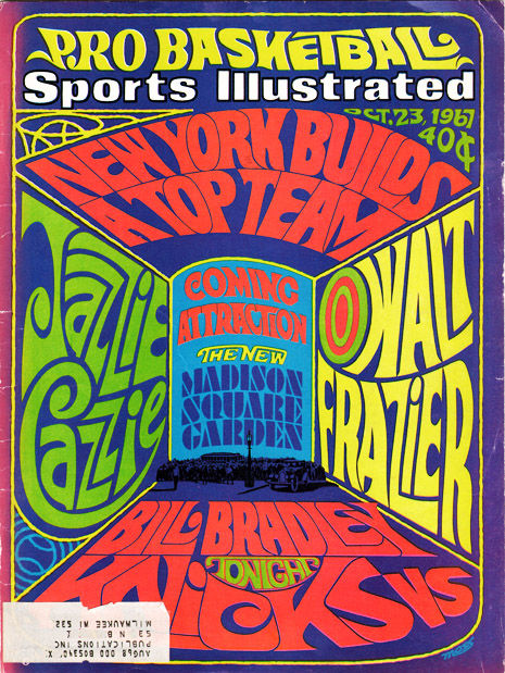
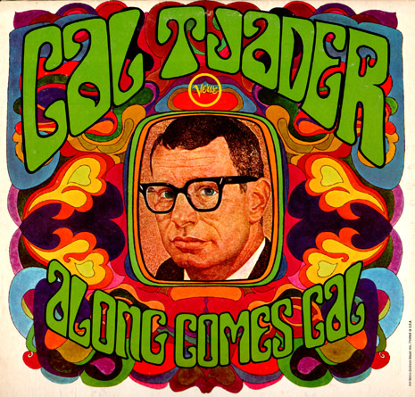
The high art style of this new “psychedelic” look was so heavily borrowed from early Art Nouveau that it was almost an embarrassment. Wes Wilson discovered typography by a famous Arts & Crafts typographer, Alfred Roller, and placed it on a waving baseline—and invented “psychedelic lettering”! Stanley Mouse began to ape Beardsley. Other artists copycatted Alphonse Mucha posters to a T. Rick Griffin followed the hand-drawn like work of scores of Blake imitators and shoved it through surfing and acid to arrive at his incredibly “organic” style.
The psychedelic style was an LSD-washed version of Art Nouveau. Even the communal movement owed its origins to Walden dreams. It was history repeating itself all over again, but this time in mind-blowing colors.
Industry was still there too, cranking out their version of what they thought they could sell. Whenever a new “culture” emerges and finds popular appeal to the young, the marketing monsters are right there ready to go with their mass-produced version of the same thing. But they never get it quite right. The very industrial design process removes the “natural” content and replaces it with uniform mediocrity. In this case, the fake psych look literally replaces the larger mainstream culture’s very idea of what Psychedelia was.
Along came “industrial psychedelia” or, as I prefer, “Hallmark psychedelia” (because Hallmark greeting cards tried so hard for so long to co-opt the style). It was all bright colors, swirling everything, cartoon characters, goofy humor and totally innocent fun. Basically, the exact opposite of the earnestness of the Hippie movement and its goals.
The new Hallmark psych look became so prevalent that it eventually replaced REAL psychedelia in the popular consciousness. When the average person thinks “psychedelic” they are usually bringing to mind the fake look, not the real style. It’s like Peter Max on one end of the spectrum and Rick Griffin on that other end. One was totally faked and the other utterly heartfelt.
One of the foremost promoters of the “hip new young look” of psychedelia was the short-lived but extraordinarily popular comedy television show called Laugh-In (actually hosted by two old-school Borscht Belt comics named Dan Rowan and Dick Martin). It was on the air for six seasons (1969-73) and its mark was revolutionary. Its impact changed our popular sensibility as much as Saturday Night Live did in the late ’70s and ’80s.
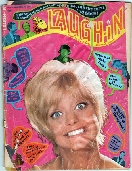
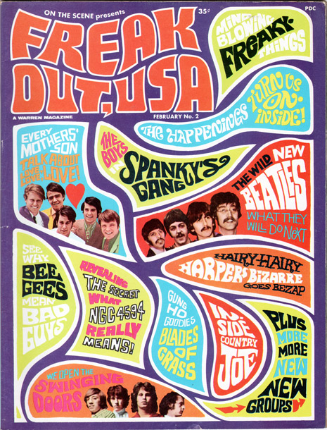
This little magazine cover (terribly beat up) is one of my favorite examples of “Hallmark psychedelia.” It’s totally contrived by mainstream thinking. Professional trained “graphic designers” created this homage to psychedelia they saw the young folks sporting in the streets. It is a completely false remake, a “bootleg” of the popular underground psych stylings. As perfect in its new interpretation as the Peter Max posters or those Hallmark greeting cards—beautiful glorious krap kulture. The heart blood of American style.
However, faux-psychedelia (like all art styles) was defined by its lack of permanence, even though it worked—and worked in spades. When we think of the hippie era, we think of this Laugh-In look, but on the inside of the magazine, you can see it already starting to change. The cartoon work feels like MAD magazine (because that’s what they knew). It still attempts to ape the first retro-monster stylings of Push Pin studios and its illustrators like Milton Glaser, Seymour Chwast and John ALcorn (especially). But the artist buried in every graphic designer keeps trying to push the envelope.
Click image to enlarge
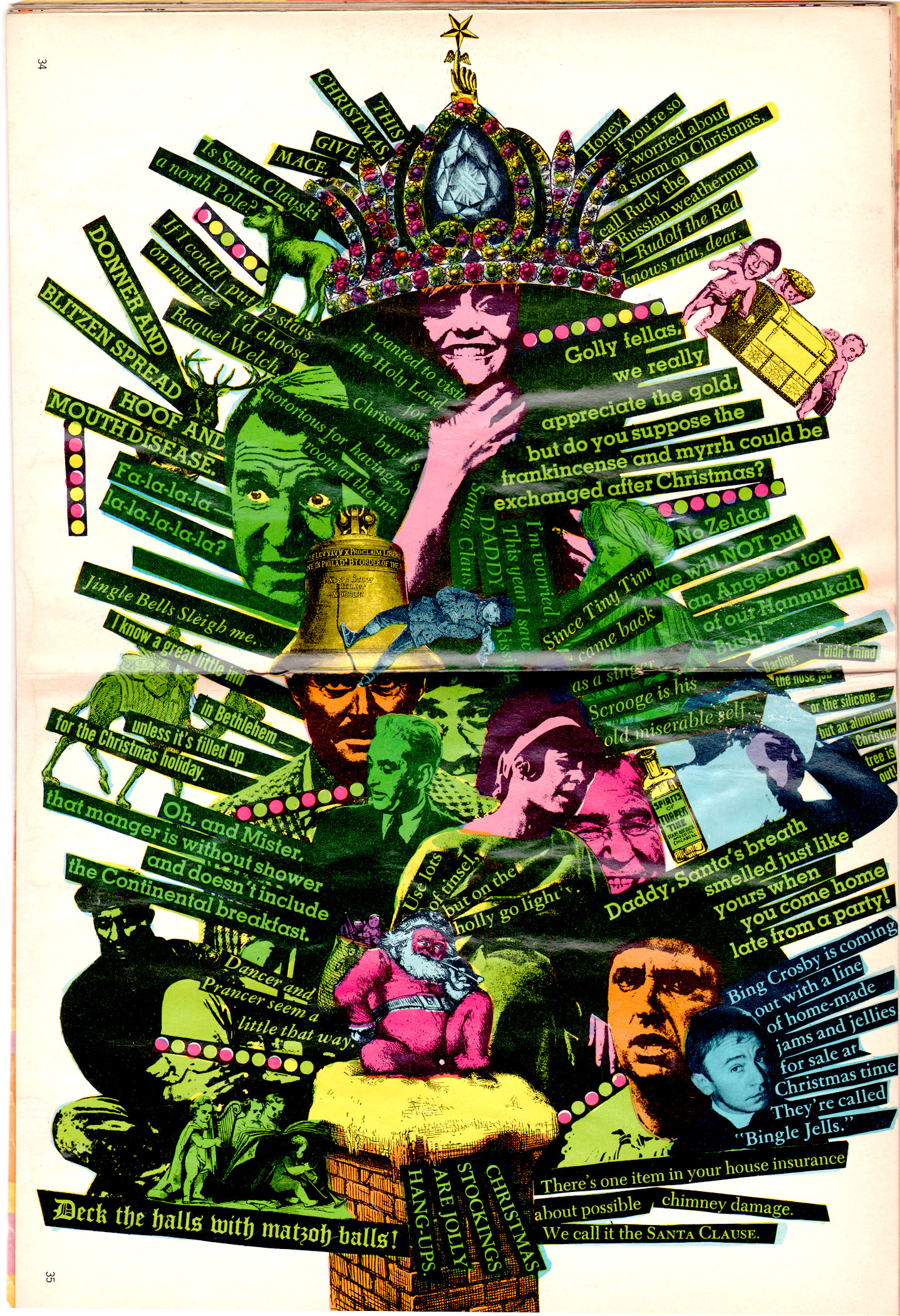
The color centerspread of this Laugh-In mag is a shock. When I first saw it I stopped dead in my tracks. This was “Hallmark psychedelia?” It was so out of place in this magazine that it stood out like a giant Day-Glo thumb. Some designer/cartoonist/art director or whatever was having some fun here. They were screwing around and definitely pushing a few envelopes.
The high-contrast photos (thanks to stat cameras and early Xerox) are peppered throughout. But the strips of typography plastered in fans containing dumb jokes are meant to echo the spastic delivery style of the TV show itself. The clip art is Victorian in style—a direct contrast to everything Hippie. It winds up echoing typographers like Robert Massin and other European modernists. This person also knew a thing or two about Surrealism and Dada as well.
This is early, early punk. A real nasty FU to the reader and the management and the current mainstream style. It’s a rejection of the rejection. It’s an attempt to crank against the tide and go somewhere new. It uses bold, ugly, harsh and offensive color as a big in-your-face joke. It distills the essence of what made Laugh-In and even the Hippie culture appealing in the first place. First you must tear it down before you can build. Charming, eh?
The new rebellion of art is still lurking, waiting, stewing. It’s ready to strike anywhere, anytime. We may all be laughing in our discontent, but we’d better watch out. I think it’s coming again…
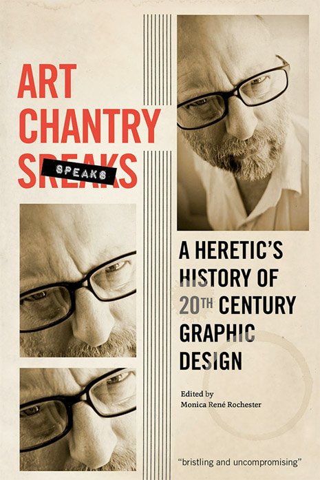
Art Chantry is a graphic designer with more awards and accolades than he can shake a stick at, including a Golden Lionne from Cannes. Over his 40-year career, he worked on the dark side of the marketing world, concentrating on popular culture and broken clients. during that time he managed to brand a cultural moment in time – grunge. His works hangs in the Smithsonian, MoMA, the Library of Congress, the Louvre, and the Rock and Roll Hall of Fame. More recently, he’s been getting old and writing down his heretical notions about the work he immersed himself in. The results weren’t pretty. Art Chantry Speaks: A Heretic’s History of 20th Century Graphic Design is due out on July 14th.