


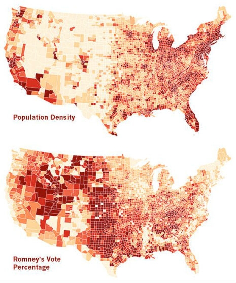
One of the single most revealing infographics to emerge post election was this one, displaying US population density vs. Republican votes for the top of the ticket.
So, if your nearest neighbor lives about 30 miles “down the road” (not that there is anything wrong with that) you were probably more likely to vote for Mitt Romney.
City dwellers? Well… not so much.
No wonder the GOP’s get out the vote effort sucked so badly… And it’s only going to get more difficult next time!
Via the map’s maker, Tim De Chant, at his Per Square Mile blog:
There are lots of reasons why the 2012 presidential election broke the way it did, but one that’s not often reported—but particularly germane to Per Square Mile—is the divide between cities and the country. I’ve been thinking for a while now about this split as a driving force behind the polarization of U.S. politics, and I know I’m not alone.
But I was curious. Can we actually see the divide between cities and the country in the electoral map? In short, yes, but I’ll let the maps to the rest of the talking.
Click through to Tim’s website for an interactive version of this map to see how population density relates to each candidates’ electoral vote tally.