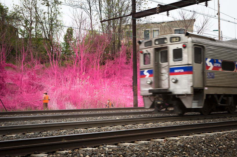


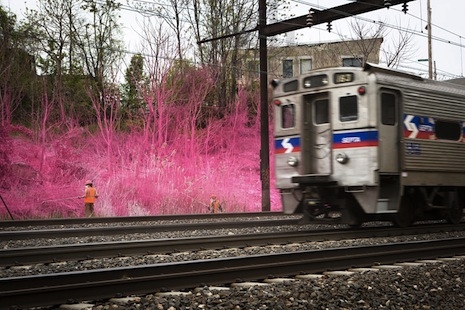
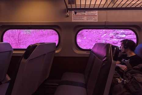
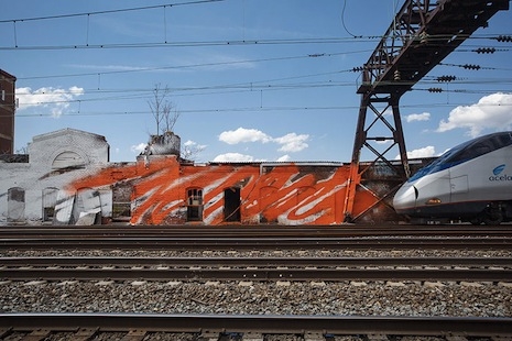
For the past two weeks, rail commuters in the greater Philadelphia area have been speeding past brief bursts of startling day-Glo color, standing out in the otherwise typical greys and browns of a major Eastern metropolis. The project, underwritten by the City of Philadelphia’s Mural Arts Program, is the handiwork of noted German artist Katharina Grosse, and it’s intended to give a little aesthetic jolt to the doubtless sleepy train ride passengers take every morning.
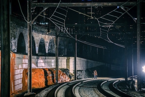
The work exists on seven sites between the North Philadelphia Station and the 30th Street Station downtown, which conveniently serves trains from the Amtrak, SEPTA and NJ Transit rail networks—so plenty of people will see the installation. As the artist says, “I need the brilliance of color to get close to people, to stir up a sense of life experience and heighten their sense of presence.”
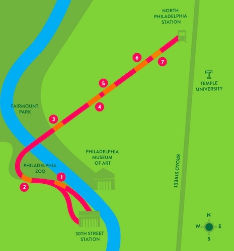
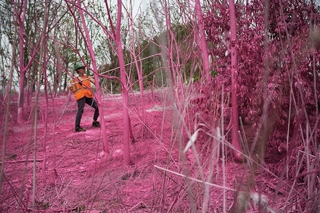
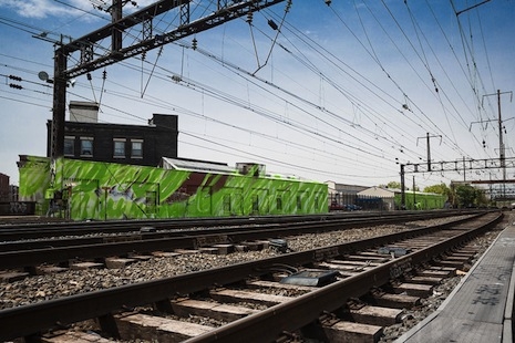
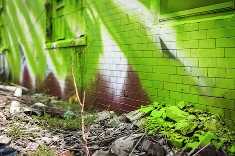
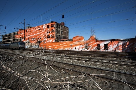
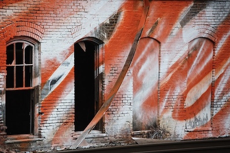
Vaguely (but not derivatively) reminiscent of Christo’s massive interventions, the work bears the somewhat trying-too-hard name psychylustro, and seems more than anything else a temporal version of those nifty anamorphic 3D sidewalk paintings you’ve seen—the angles of the lime green paint splatters on the sprawling building at “site 7” near the North Philadelphia Station seem specifically tailored to be more arresting when viewed from the moving train.
Grosse has specialized in ambitious large-scale works that fall somewhere between site-specific installation art and architecture; it’s not too much of a stretch to call her an abstract architect. Based on my perusal of the small selection of artworks shown at the bottom of this page, psychylustro seems to be a more successful work than the others shown because of its utilitarian pop and also the requirement to use bold colors—in my estimation, anyway.
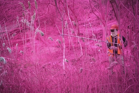
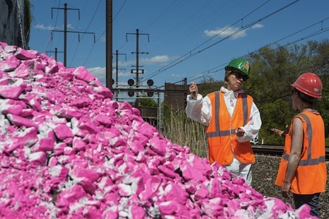
The sites represent a cross-section of urban decay, including an old railroad trestle and an abandoned warehouse with trees today popping through its collapsed roof, and the colors—bright orange, lime green, hot pink—were surely chosen to stand out. Curator Liz Thomas observes that the work’s purpose is to inject “a beautiful disruption into a daily routine” and to provoke “an experience that asks people to think about this space that they hurtle through every day.”
Grosse intentionally declined to protect the exposed paint with sealant, so the inevitable months-long process of decay has, well, already begun. Eventually the lime-green warehouse will fade and become besmirched by some form of urban grime. Honestly, I hope it doesn’t end up being an eyesore, because in its current form it’s quite something.
Here’s a playful time-lapse video documenting the creation of a hot-pink site. I’d love to see video from the train! But so far there isn’t anything like that on YouTube.
via Designboom