


A doff of the feathered hat to medieval book historian Erik Kwakkel working at Leiden University in the Netherlands. Last week he posted images on his blog pertaining to a most unusual book he had recently stumbled upon. It dates from 1692 and is credited to one “A. Boogert,” and it has to count among one of the most exhaustive explorations of color ever produced by the human mind. The book’s title is Klaer lightende Spiegel der Verfkonst…Tot Delft, gedaen en beschreeven dour A. Boogert or Traité des couleurs servant à la peinture à l’eau [Treatise of colors used in watercolor painting].
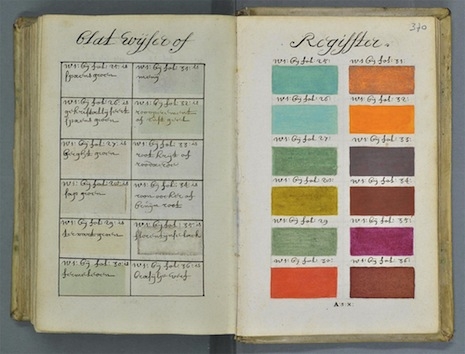
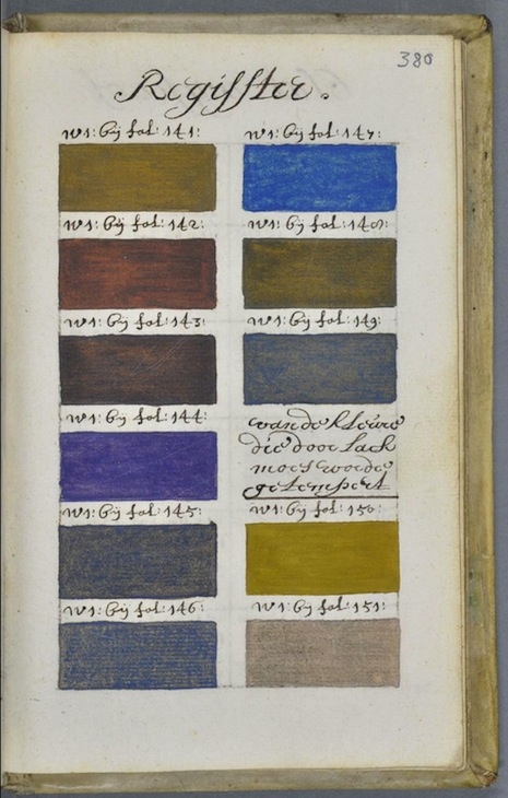
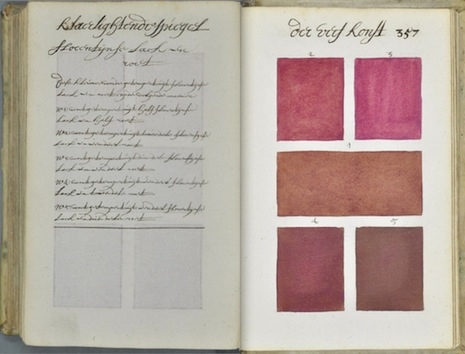
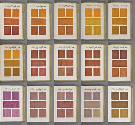
In the book, which has more than 700 pages, Boogert executed a staggeringly impressive series of color samples; there must be several thousand different colors elucidated here. In the bulk of the book, Boogert used the left-hand side of each spread to explain the ratios of pigment and “one, two or three portions of water” to achieve the colors depicted on the right-hand page, usually five colors that are closely related (see picture at bottom for a typical example). The entire book was written entirely by hand, and only one copy of the book is known to be in existence. It’s likely that Klaer lightende Spiegel der Verfkonst, even if relatively few painters ever saw it, represented the most comprehensive account of colors ever achieved up to that juncture.
The natural reference point here, for contemporary graphic designers, is the Pantone Color Guide, which first saw print in 1963. I find myself wondering to what hell Glidden would have consigned this author, had they only had the chance.