


One of the favored forms of Beat author William S. Burroughs was that of the “cut-up,” basically fancy talk for “collage.” After the Dadaists pioneered the technique in the 1920s, the midcentury artist who had done the most with it was Brion Gysin, a close friend of Burroughs, who once called Gysin “the only man I ever respected.” Gysin stumbled on the technique on his own around 1954 when he slashed a newspaper page and noticed that the page underneath created interesting juxtapositions. Gysin showed Burroughs the cut-up concept in the late 1950s, as he related in Cut-Ups: A Project for Disastrous Success:
William Burroughs and I first went into techniques of writing, together, back in room No. 15 of the Beat Hotel during the cold Paris spring of 1958. ... Burroughs was more intent on Scotch-taping his photos together into one great continuum on the wall, where scenes faded and slipped into one another, than occupied with editing the monster manuscript. ... Naked Lunch appeared and Burroughs disappeared. He kicked his habit with apomorphine and flew off to London to see Dr Dent, who had first turned him on to the cure. While cutting a mount for a drawing in room No. 15, I sliced through a pile of newspapers with my Stanley blade and thought of what I had said to Burroughs some six months earlier about the necessity for turning painters’ techniques directly into writing. I picked up the raw words and began to piece together texts that later appeared as “First Cut-Ups” in Minutes to Go (Two Cities, Paris 1960).

William S. Burroughs, photograph by Brion Gysin
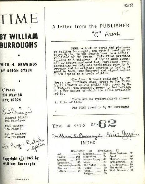
In 1965 Gysin and Burroughs collaborated on a cut-up version of Time Magazine that would end up being 27 pages long. According to Jed Birmingham, “Time was published in 1965 in 1000 copies. 886 copies comprised the trade edition. These copies were unnumbered and unsigned. 100 copies were signed by Burroughs and Gysin. 10 copies numbered A-J were hard bound and contained a manuscript page of Burroughs and an original colored drawing by Gysin. 4 more were hors commerce. ... An hors commerce print was used as the color key and printing guide that the printer would use to insure consistency of the print run.”
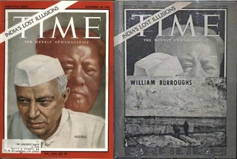
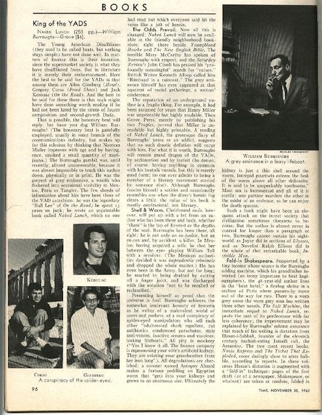
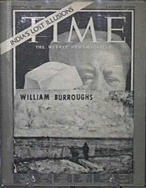
Apparently, Burroughs and Gysin chose the November 30, 1962, cover of Time to mess with because that issue contained a dismissive review of Naked Lunch under the title “King of the YADs,” where “YAD” stood for “Young American Disaffiliates.” Burroughs was greatly irritated by the review.
The Time cut-up was described as follows in Robert A. Sobieszek’s Ports of Entry: William S. Burroughs and the Arts:
Burroughs created his own version of Time magazine, including a Time cover of November 30, 1962, collaged over by Burroughs with a reproduction of a drawing, four drawings by Gysin, and twenty-six pages of typescript comprised of cut up texts and various photographs serving as news items. One of the pages is from an article on Red China from Time of September 13, 1963, and is collaged with a columnal typescript and an irrelevant illustration from the ‘Modern Living’ section of the magazine. A full-page advertisement for Johns-Manville products is casually inserted amid all these text; its title: Filtering.
Here we can see what the cover originally looked like in color. Photograph: Stephen J. Gertz
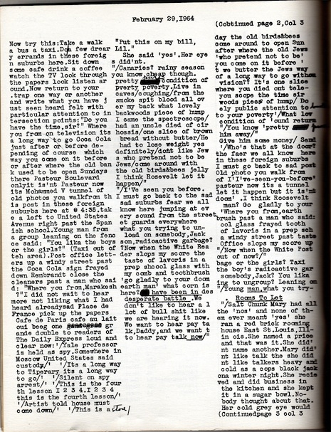
The first few pages (after the “copyright page”) are pretty much pure typewritten text—the metaphor of this being a version of Time doesn’t really obtain until you get to page 5, which has the word “REPUBLICANS” across the top as well as the words “Democratic Governor John Swainson,” who was the Governor of Michigan when the original issue came out (but not in 1965). After that you spot the familiar non-serif typeface here and there. Page 6 is titled “THE WORLD” and is about Red China. Page 8 is simply an unmolested full-page ad for Johns-Manville. Page 10 has a picture of a bunch of dignitaries at Peking Airport and another one with “John and William Faulkner.” Pages 13-16 are a series of ideogrammatic doodles by Gysin, after which the text reverts almost entirely to typewritten text by Burroughs.
Page 22 may be the most interesting page, as it features several short paragraphs of true automatic writing, as for example: “moo moo. .Tally Tillie Valspar Vent flu flu..doo do do. .Ding Dong Bell. .Sell sell sell. .Knee Wall fell. .sell sell sell. .Tele tell yell. .Sell sell sell. .Pell Pow Mell. .Sell Sell Sell. .Pel Tex Mell.”
Here is Burroughs and Gysin’s Time cut-up in its entirety:
The rest after the jump…