FOLLOW US ON:
GET THE NEWSLETTER
CONTACT US
Occultism, cinema and architecture: How a ouija board built the Bradbury Building
02.21.2018
12:33 pm
Topics:
Tags:


As a native Angeleno, I love my city and its architecture. Mostly I love the insane stories that lie within each building’s walls, especially if they somehow involve strange occult groups or bizarre happenings. Luckily for me, LA has plenty of these around. My favorite structure (for many reasons) has a deep history with occultism and is quite well known in the film and television industry. Along with luminaries like classic film actor Edmond O’Brien and action star Rutger Hauer to pop music icon Janet Jackson, the Bradbury Building in downtown Los Angeles has played a co-starring role in many media events over the last 75 years. The building made famous by Blade Runner and the set of Rhythm Nation 1814, MGM’s White Cliffs of Dover (Clarence Brown, 1944) and more, now houses offices of Marvel Comics and other businesses. But that was not always the intent. The design of the Bradbury was quite different and far more “spiritually” engaging. 

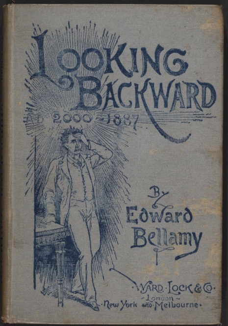
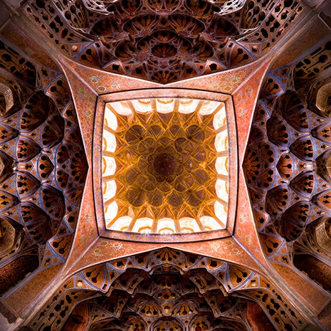
Millionaire Louis Bradbury selected George Herbert Wyman to prepare the design for the building and commissioned it in the 1890s. Wyman, working under well-established architect Sumner P. Hunt at the time, was not known but he had what Bradbury was looking for: less conventionality, more creativity, and an interest in more radical architectural design. Influenced by a novel published in 1888 by journalist Edward Bellamy called Looking Backward: 2000-1887, the men conspired to make the Bradbury Building a physical incarnation of utopianism and futurist thought. Within the book, Bellamy spoke of buildings “full of light” designed with windows that allowed this luminosity to flow in from the sides of the building as well as from the roof. This aspect of Bellamy-ism described a construction centered on the virtue of building to and for the very notion of natural lighting, something that ended up being very useful to future filmmakers!

George Wyman and Louis Bradbury were not alone in their attraction to futuristic thinkers like Bellamy. During this time, Los Angeles was home to many clubs, social gatherings and meetings of utopian societies centered on such aesthetic ideals spoke of in books like Looking Backward. But George Wyman was still unsure about taking the contract due to his underling status with Sumner P. Hunt. He felt it would be a betrayal of sorts. So he decided, like any good early 20th century man, to let the decision be influenced by the occult. While this was not singular to LA, as much as any Angeleno loved a good futurist ideal, they adored spiritualism even more. George Wyman decided to contact his dead brother via what we know now as a Ouija board.

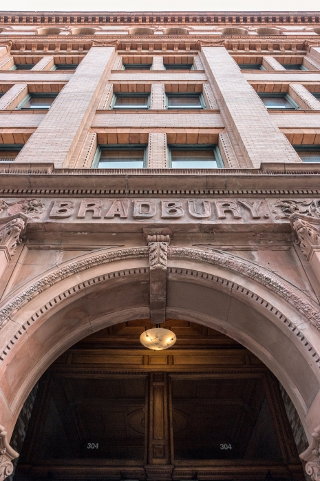
Young Mark Wyman had died a few years earlier and George felt it would be best to get Mark’s feelings on the Bradbury contract. According to sources as close to the family as Wyman’s own daughter, the message received via the planchette was: “Take the Bradbury Building. It will make you famous.” George Wyman took the contract. The beautiful Bradbury Building opened in 1893, located at 304 South Broadway in downtown Los Angeles. It was just about as full of art nouveau glory, wrought iron strength and light-expansive splendor as a building could possibly be. Sadly, Mr. Bradbury had passed away a few months earlier so he never got to see his creation at its fullest. 

One of my favorite films to be shot here is Rudolph Maté’s D.O.A. (1950) starring Edmond O’Brien. D.O.A. opens with the conclusion of the film and is one of the darkest, most engaging B-noirs ever made. The famous opening scene offers Frank Bigelow (O’Brien) entering the Homicide Division office located in the Los Angeles City Hall building. He sits down, and states: “I want to report a murder.” The commanding officer asks him who was murdered and the camera finally shows us O’Brien’s face. “I was,” he breathes. The rest of the film is a non-stop roller coaster; documenting Bigelow’s action-packed last 24 hours of existence searching for his killer.

The grand finale made great use of the elegant Bradbury Building walkways located outside the offices. The dramatic staircases and wrought-iron elevators add to the film’s drama and visual set-up. The design and openness of the building allow for the full noir vision to be captured in a low-light setting. D.O.A. was a low-budget film, made in under a month. Headed up by Rudolph Maté and shot by Ernest Laszlo, the dystopian visuals affected by their lighting and narrative worked perfectly with the Bradbury’s design.

As Thom Anderson details in his film essay, Los Angeles Plays Itself, director Ridley Scott and his screenwriter did not initially agree on shooting locations for what many consider to be one of the greatest science-fiction and neo-noir films of all time: Blade Runner (1982). Writer Hampton Fancher knew that the building was in regular usage for filming at this moment in time and felt that its idiosyncratic aesthetic made it far too recognizable of a structure. Ridley Scott felt differently. “It hasn’t been done the way I’m going to do it,” he stated. Scott knew that the visual landscape planned for Blade Runner matched the architecture of the Bradbury Building perfectly. It even allowed for the fact that, by the 1980s, the building was a little worse for wear (the building was renovated in the early ‘90s, but in 1982 it was pretty run down).

The beautiful multi-paneled skylight stretching over the atrium on the Bradbury, influenced by early 20th Century futurism, now became a whole new science fiction: Scott exploited that with style, shining searchlights and blinking neon through the ceiling, calling attention to the anxious and claustrophobic feel of the film.

Today’s Bradbury Building may not look exactly like it did when these works were shot, but it still maintains the architectural schema that Wyman and Bradbury originally planned. It is an extraordinary place to behold: light flowing in from the windowed ceiling, breathtakingly beautiful latticed ironwork on the elevators. Filmic works that are shot there now are typically less nihilistic than the ones of the past but since the renovation, the building is in better shape. As part of our treasured Los Angeles history, the 125-year-old building is the oldest structure to be named as a Los Angeles Historic-Cultural Monument (LAHCM). It has also been nationally recognized, garnering a place in the US National Register of Historic Places and a US National Historic Landmark. Not too shabby for a building whose contractor took the job from an Ouija board response.


More after the jump…

READ ON
Posted by Ariel Schudson
|
02.21.2018
12:33 pm
|
Porn-optical illusion: Suggestive collages of sex and architecture (probably NSFW)
10.04.2017
09:24 am
Topics:
Tags:

01scientwehst.jpg
 
The question is often asked by our dear readers as to why some images are pixelated on social media? “We all got nipples,” they might comment on a post or “I’ve seen nudies before” they might add. Well, yes, of course. But social media is not really that open or user-friendly and never has been. We all might be grown-up about things that may shock or trigger others, but it only takes one turd in the pool for swimming to be canceled or one Mrs. Carmody for an account to get shut down.

Artist provocateur Giulia aka @scientwehst knows this only too well as she has had her artworks pulled and her accounts shut down after some busybody was offended by her erotic collage. I believe being offended is good for the soul. If you are offended then you’re learning something new and increasing your intellectual scope rather than narrowing it down to a rather grotty clogged artery that is on the verge of causing fatal cardiac arrest.

Giulia thinks “Social-media society is not a public, democratic space,” and we should stop treating it as such.

These white-tech bros dictate in their swivel chairs what we can share and how we can manage our platforms. They create a facade of openness, while exploiting us and profiting from our data and content. We are not protected because social-media has been privatized. Social media companies serve as an arm to our government’s agendas… Our government is also inherently sexist… Sexism still thrives in social media society… Let’s all connect the dots.

Giulia is a 27-year-old artist from Florida, who currently resides in Brooklyn. Growing up she felt uncomfortable about her body image. She wanted to be tall and skinny coz that’s what magazines and TV and movies and adverts sold as the perfect female form. This anxiety carried on into her twenties until one day, “about 2–3 years ago, [..] I started to say, ‘fuck this shit! I will never have this type of body, and I’m going to embrace the softness that is me’.” Her view now is “fuck a beauty standard: just be you.”

Out of this rethinking, Giulia started making collages in which she placed architectural pictures of various buildings, churches, and interiors over images lifted from porn and glamour mags. The results were provocative, some might say shocking yet certainly powerful and erotically charged. Sex it seems is everywhere but especially in our minds.

Follow Giulia on @scientwehst.
 
03scientwehst.jpg
 
02scientwehst.jpg
 
More of artist provocateur Giulia’s pin-ups, after the jump…
 

READ ON
Posted by Paul Gallagher
|
10.04.2017
09:24 am
|
A musical tour of Osaka’s Expo ‘70: Beautiful time capsule of futuristic design
04.05.2017
09:39 am
Topics:
Tags:


Osaka Show 1970 was a hour-long musical produced by Valerio Lazarov for TVE (the national television station in Spain). It featured its countries biggest pop stars at the time: Massiel, Karina, Julio Iglesias and Miguel Ríos singing, strolling and galavanting through the amazing, colorful, awe-inspiring grounds of Expo ‘70 in Suita, Osaka, Japan. The TV special serves as a beautiful time capsule of the Metabolist movement. With a groundbreaking masterplan by Kenzo Tange and his team of a dozen Japanese architects, they successfully turned the expo park into a modern city with radical, urban design concepts which envisioned sea, sky, and space as future sites for human habitats.

The theme of Expo 70 was “Progress and Harmony for Mankind” and over 78 countries participated. As these Spanish pop stars take you on a utopian tour through the various pavilions you’ll see no shortage of incredible architecture, design, sculptures, waterfalls, skyways, modern furniture, roller coasters, monorails, animatronics, mirrored glass, domes, and people movers. Kenzo’s Tower of the Sun building which also served as the symbol of Expo ‘70 stands larger than life, Willy Walter’s Switzerland Pavilion illuminates with over 32,000 glass bulbs, while amazing details inside the pavilions are seemingly endless: The “Fuji Symphoni Toron” for example demonstrates a robot operated organ that could have served as the centerpiece of your living room today.

More after the jump…

READ ON
Posted by Doug Jones
|
04.05.2017
09:39 am
|
Beautiful panoramic Cubist drawings of China’s urbanized landscape
02.20.2017
08:53 am
Topics:
Tags:

0033_1.jpg
Panorama of Tuan Jie Hu.
 
I spent twenty minutes looking for Waldo but was too overawed by the sheer magnificence of these panoramic drawings that I gave up looking for the stripy little fucker.

Not that I would have ever found him in these stunning, breathtaking, incredible, ___ [fill in the blank with your own adjective] architectural drawings of Beijing’s downtown districts. These massive, painstakingly created drawings are the work of artists/architects at the Drawing Architecture Studio, China. The images form part of their Urbanized Landscape Series.

Awesome, aren’t they?

Just take a look at the panorama drawing above (and its details below) of Tuan Jie Hu—“old residential area located by the East 3rd Ring Road in Beijing”—which “vividly depicts the views from the daily life in this busy local community.”

At the same time, the piece also shows some new exploration in architectural drawing techniques. Some 45-degree axis from different directions allow the viewers to constantly change their viewpoints, which is like a Cubism painting.

The Drawing Architecture Studio was founded by architect Li Han and designer Hu Yan in Beijing. Their intention is to offer a “creative platform integrating architecture, art, design, urban study, pop culture, and aiming to explore the new models for the creation of contemporary urban culture.”

Sounds good to me. They also sell a variety of products which you check out here. Click on the images below for a closer look.
 
c0033_2.jpg
Detail of Tuan Jie Hu panorama.
 
c0033_4.jpg
 
c0033_5.jpg
 
More gorgeous panoramic maps of downtown Beijing, after the jump…

READ ON
Posted by Paul Gallagher
|
02.20.2017
08:53 am
|
Stark war memorials of Yugoslavia
02.17.2017
11:04 am
Topics:
Tags:


The Stone Flower, a structure known as a “spomenik” located in Jasenovac, Croatia. Built in 1966, it commemorates the thousands of victims who were executed during World War II at the Jasenovac forced labor and extermination camp which operated on this very location by the river Sava.

To be honest, there is about a zero percent chance that I will ever travel to any of the countries of the former Soviet Union. Which is a shame since I really, really love vodka. However, if I did ever venture to that part of the world I would make it a point to attempt to see at least a few of the haunting sculptures or “spomeniks” that were erected all over what was formerly called Yugoslavia. These stone architectural marvels are meant to serve as grim reminders of those who fought and died in various military events that took place during significant battles, involving among other things resistance operations meant to repel the Ottoman Empire in the 1800s.

Most of the structures were built in the late 60s. One of the most striking is the Monument to the Revolution which is located in Podgarić, Berek. The futuristic-looking sculpture was built by Croatian sculptor Dušan Džamonja and still stands as a memorial to the citizens of Moslavina who died while resisting the German forces during WWII. Others appear to be channeling the architectural design directly from 1976 and the film Logan’s Run—which is perhaps yet another reason I find them so compelling to look at. 

While they are quite beautiful to behold, it’s critical to understand the meaning behind the monuments that serve as a reminder of time much more daunting than what we are being faced with right now. As well as the fact that those who do not remember the past—specifically the numerous historical examples in Yugoslavia that saw the people adapt to authoritarian regimes—will likely allow such events to repeat themselves. Many of the images of notable spomeniks in this post were taken by famed Antwerp-based photographer Jan Kempenaers and are the featured in his 2005 book, Spomenik. If you’re interested in learning more about the history behind the spomeniks, I would recommend spending some time at the extensively detailed online resource, the Spomenik Database.
 

A set of sculptures that stand in Bubanj Memorial Park built by Petar Kristic. Located on a hill in Niš, it marks the location where more than ten thousand Serbian people were systematically executed by German forces.
 

“Bulgaria’s UFO,” the Buzludzha monument. Designed by Georgi Stoilov, the monument officially opened in 1981 on the top of Mount Buzludzha which was also the infamous site of the last stand between Bulgarian rebels and the Ottoman Empire in 1868.
 
More after the jump…

READ ON
Posted by Cherrybomb
|
02.17.2017
11:04 am
|
University building sure looks a lot like a toilet
07.06.2016
02:41 pm
Topics:
Tags:


In February the State Council of the Chinese central government released an “urban blueprint” calling for buildings that are “suitable, economic, green and pleasing to the eye,” and putting the kibosh on those that are “oversized, xenocentric, weird.”

One wonders how the officials behind that directive reacted when they saw the building recently unveiled by an educational facility in Hainan, China. It bears a striking resemblance to a certain plumbing object that most of us use every day.


Here’s the kicker: the school in question is actually the North China University of Water Conservancy and Electric Power, leading some to suppose that the commode-ish design of the structure is a tongue-in-cheek reference to the purpose of the university. That it was deliberate!

This new toilet-building arrives in a year when many people are saying that Zaha Hadid’s design for the airport in Beijing, scheduled to be completed in 2019, looks suspiciously like a vagina.


via Mashable

Posted by Martin Schneider
|
07.06.2016
02:41 pm
|
Stark images of the decaying & (maybe) haunted ‘UFO’ resort in Taiwan that never was
06.08.2016
09:15 am
Topics:
Tags:


Clusters of the pod-shaped ‘Sanzhi UFO Houses’ in New Taipei City in Taiwan.
 
There are lots of mythical, Scooby-Doo style storylines associated with the construction of what was to be a posh, futuristic resort destination that became known as the Sanzhi UFO Houses (also known as the “Sanzhi Pod Houses” or “Sanzhi Pod City”). Located in the Sanzhi District of New Taipei City in Taiwan and reminiscent of the short-lived Disneyland attraction the Monsanto House of the Future , one of the rumors conjured up about Sanzhi was that it was built on the same site as a burial ground for Dutch soldiers back in the early 1600s. There was also some talk that the construction site was cursed due to the removal and subsequent disassembly of a Chinese dragon sculpture from the property. Where are those meddling kids when you need them?
 

A water slide to nowhere.
 
All stoner-jokes aside, there were actually numerous fatal accidents (and a suicide) that occurred while the UFO-style resort was being built. Ultimately, anyone involved with construction and development of the Sanzhi UFO Houses called it a day and work on what was to become a large-scale vacation destination, ceased. Despite the fact that it never took off the Sanzhi UFO Houses became a very desirable tourist destination just based on their unusual architecture and folklore. Sadly, if you were just about to book a couple of tickets to Taiwan to see them, don’t, as the strange futuristic village of pods were reduced to rubble sometime in 2008 despite an attempt to preserve a few and convert them into a musuem.

Shots of the Sanzhi UFO Houses that are no more, after the jump…

READ ON
Posted by Cherrybomb
|
06.08.2016
09:15 am
|
The Mind Expander Chair & other inventions from the far-out world of 60s architects Haus-Rucker-Co.
01.21.2016
12:10 pm
Topics:
Tags:

Haus-Rucker-Co. Environment Transformer
Haus-Rucker-Co. “Environment Transformer” the “Flyhead,” 1968
 
In the late 1960s, a group of architects in Vienna decided to see what would happen if they created architectural designs that had the ability to alter a person’s state of perception or consciousness, using sensory enhancement or deprivation. 
 
Haus-Rucker-Co.
Haus-Rucker-Co. “Environment Transformers” left to right - the “Flyhead,” “Viewatomizer,” and the “Drizzler,” 1968
 
Comprised of Laurids Ortner, Günther Zamp Kelp and Klaus Pinter (and later joined by Manfred Ortner in 1971) the group called themselves Haus-Rucker-Co. In 1967 the group formed around something they called the “Mind Expanding Program” which produced a number of sensory enhancement machines like the “Mind Expander Chair,” futuristic helmets known as “Environment Transformers” with names like “Flyhead,” “Viewatomizer,” and the “Drizzler,” (pictured above), as well as the groovy-sounding, “Yellow Heart” (pictured below).
 
Haus-Rucker-Co.
Haus-Rucker-Co. “Yellow Heart” 1968
 
Haus-Rucker-Co.
 
The psychedelic architects described the experience of being inside the “Yellow Heart” as follows:

The idea that a concentrated experience of space could offer a direct approach to changes in consciousness led to the construction of a pneumatic space capsule, called the ‘Yellow Heart.’ Through a lock made of three air rings, one arrived at a transparent plastic mattress. Offering just enough space for two people, it projected into the centre of a spherical space that was made up of soft, air-filled chambers. Lying there one could perceive that the air-filled “pillows,” whose swelling sides almost touched one, slowly withdrew, that is to say the surrounding space appeared to expand, finally forming a translucent sphere and then, in a reverse motion, flowed out again. Large dots arranged in a grid on the outer and inner surfaces of the air-shells changed in rhythmic waves from milky patches to a clear pattern. The space pulsated at extended intervals.

 
Haus-Rucker-Co.
Haus-Rucker-Co. “Mind Expander” chair, 1968
 

“Mind Expander Chair” II by Haus-Rucker-Co. 1969
 
The idea for Haus-Rucker’s “Mind Expander Chair” was born from their “Balloon for Two” installation, which was a large balloon hung from a window outside a small apartment in Vienna with structures and trees inside of it. The Mind Expander Chair on the other hand was not as precarious, and was created for two people to use at the same time. The idea was that a woman would sit on her male companion’s lap and once everyone was too close for comfort, the large cover of the Mind Expander Chair would be pulled down and something called a “rhythm machine” would be (ahem), turned on.

Haus-Rucker’s CV is rich with sci-fi daydreams, and to feature them all here would be much like their creations, seemingly impossible. There have been a few books published on the history of Haus-Rucker-Co. worth looking into like Haus-Rucker-Co: Architectural Utopia Reloaded that features a large sampling of the group’s space-aged creations. Images from Haus-Rucker’s “Mind Expansion” series, as well as their interactive piece from 1970, “Giant Billiard” follow.

You could grab your bong to enhance your own personal experience, but trust me, you’re not going to need it.
 
Haus-Rucker-Co.
An early version of the “Mind Expander” chair, 1967
 
Oase Number 7, an installation by Haus-Rucker-Co. in progress Kassel, Germany, 1972
“Oase Number 7,” an installation in progress by Haus-Rucker-Co., Kassel, Germany, 1972
 
Continues after the jump…

READ ON
Posted by Cherrybomb
|
01.21.2016
12:10 pm
|
Top this, Burning Man! Amusing new ‘Domestikator’ building is semi-NSFW
08.21.2015
11:28 am
Topics:
Tags:


The theme of this year’s Ruhr Triennale in northwestern Germany is “Seid umschlungen,” a phrase from Friedrich Schiller‘s “Ode to Joy” that translates as “be embraced”—a directive that may have been willfully, and amusingly, misunderstood by one of the festival’s contributors.

The Dutch design company Atelier Van Lieshout has created a massive edifice in Bochum, Germany, called “Domestikator” that includes two linked structures that look distinctly like two human beings in the throes of sexual passion. The fuller installation of which it is a part is called “The Good, the Bad and the Ugly.”


The centerpiece of the installation is the “Refectorium,” and it also includes the “BarRectum,” which “takes its shape from the human digestive system,” according to designboom

According to Lost at E Minor’s Inigo del Castillo, the building is intended “to symbolise humanity’s abuse of power, domesticating anything and everything it can get its hands on, including taboos and ethical dilemmas like bestiality.”

Yeah, right.


via Lost at E Minor

Posted by Martin Schneider
|
08.21.2015
11:28 am
|
The Electric Kool-Aid Architects: Astounding, lysergic Iranian temple photography
07.07.2015
09:42 am
Topics:
Tags:


Nasir al-mulk Mosque. All images © Mohammad Domiri
 
When one thinks of the home of psychedelic architecture, Iran probably isn’t the first place that springs to mind. But here it is. It’s undeniable. Northern Iranian student Mohammad Reza Domiri Ganji has recently documented the existence of these intricate structures in Iran with gorgeous HDR photographs, so incredible that the Western mind can barely grasp them.

Although these buildings seem to be tailor-made for the likes of Ken Kesey
or Timothy Leary, it’s probably best to keep in mind that any Western traveler who might suddenly decide to become one with the Universe while visiting these sites on LSD, will probably be executed immediately after it’s discovered that they’re using drugs in Iran.

So, just sit back and enjoy these rich hallucinogenic mandalas from the psychedelic Summer of Jihad in the comfort of your own home—and know that they’re out there…in Iran.

It’s hard to imagine what the intricate blueprints might have looked like for these buildings, but it’s fairly clear that the architects knew what to do with the windowpane.
 

Aligholi agha bath—Isfahan
 

Ceiling of Alighapu
 
More after the jump…

READ ON
Posted by Christopher Bickel
|
07.07.2015
09:42 am
|
Punk is for the ‘burbs: The oppressive banality of Hardcore Architecture
05.19.2015
12:26 pm
Topics:
Tags:


Women in Drag: The address given for their untitled cassette, in Albuquerque, NM 87123. Source: MAXIMUM ROCKNROLL, issue no. 29, October, 1985. Street view date: June, 2014. Sample quote from the review: “Sun-baked punk, thrash, Egypto-crypto-weirdness.”-Tim Yohannan
 
I have always had a bit of a love-hate relationship with Maximum Rocknroll. On the one hand, they were an indispensable and formative resource for awesome writing and great comics (and I may or may not have submitted an EP in desperate hopes of being reviewed by them). On the other hand, their editorial tone could come off a bit snobby, and I kind of agree with Jello Biafra when he said, “If ‘Holiday in Cambodia’ were released today, it would be banned from Maximum Rocknroll for not sounding punk.” Still, my feelings are ultimately fond, and I love that Marc Fischer and alternative archivists Public Collectors have created Hardcore Architecture, a sort of punk rock home tour. From the site:

Hardcore Architecture explores the relationship between the architecture of living spaces and the history of underground American hardcore bands in the 1980s. Band addresses are discovered using contact listings found in demo tape and record reviews published from 1982-89 in the fanzine MAXIMUM ROCKNROLL (MRR). Google Street View is used to capture photos of the homes. Street names and numbers are removed to respect the privacy of people currently living at these addresses.

Two things immediately jumped out at me. First, I am reminded that most of inhabited America is fuck-ugly. Like, suburbia from an Alexander Payne movie kind of ugly. Second, more than centrally located big cities or towns, it appears a lot—if not most—of the rage necessary for the mosh-pit comes out of the suburbs. It makes sense: they have the room and the money for instruments, I can’t say I blame them for their disaffection—that shit is bleak.
 

Honeymoon Killers: The address given for their “Uncut! Uncensored!” cassette in New York, NY 10009. Source: MAXIMUM ROCKNROLL, issue no. 15, July, 1984. Street view date: Oct., 2014. Sample quote from the review: “A screeching pet rock cousin to New York’s current school of avant-noise bands. The difference here is their fondness for trashing 50′s standards. “Who Do You Love” and “Ubangi Stomp” have never been abused quite like this before.”-Jello Biafra
 

Civil Defense: The address given for their “Gun Control” EP, in St. Paul, MN 55119. Address source: MAXIMUM ROCKNROLL, issue no. 16, August, 1984. Street view date: Aug., 2014. Sample quote from the review: “An uneven debut but C.D. have potential.”-Jeff Bale
 
More Hardcore Architecture after the jump…

READ ON
Posted by Amber Frost
|
05.19.2015
12:26 pm
|
Frank Gehry gives 98% of architecture the finger
10.26.2014
11:49 am
Topics:
Tags:


Frank Gehry has been the number-one superstar of architecture for a generation now, going roughly as far back to the unveiling of the Guggenheim Museum in Bilbao in 1997. His shimmering buildings often resemble curved paper, and as top dog in the architecture world, his buildings have come in for some criticism for being not entirely practical in every respect. 

Gehry was in Oviedo, Spain, last week at a press conference related to the country’s Prince of Asturias Awards program for the arts. A journalist asked Gehry, according to De Zeen magazine, “what his response was to people who accused him of creating architecture for show.” Here was his answer, as tweeted by Inés Martín Rodrigo on Thursday:


Translation (thank you Google): “Answer by Frank Gehry to the first question of journalists in Oviedo.”

Gehry then said, “Let me tell you one thing. In the world we live in, 98 percent of what gets built and designed today is pure shit. ... There’s no sense of design nor respect for humanity or anything. They’re bad buildings and that’s it.”


Gehry continued, “Every now and then, however, a small number of people do something special. They’re very few. But—my God!—leave us in peace! We dedicate ourselves to our work. I don’t beg for work. I don’t have publicists. I’m not waiting for people to call me. I work with clients who have respect for the art of architecture. At the very least, don’t ask stupid questions like this.” Observers on the scene report that this answer was met with an uncomfortable silence. Gehry then apologized, pointing to fatigue from his travels from France that day to attend the press conference. “Please, you have to understand that I’m tired and a little dazed by the trip. ... I’ll mumble an apology.” It’s worth keeping in mind that Gehry is currently 85 years old.

Just for fun I Googled the terms “gehry badass” and, wouldn’t you know it, came up with this hit: “Frank Gehry, Architectural Badass.” Which confirms what we already knew, Frank Gehry is a badass.


via Hyperallergic

Posted by Martin Schneider
|
10.26.2014
11:49 am
|
England’s eccentric ‘New Brutalist’ architects, The Smithsons
06.30.2014
01:52 pm
Topics:
Tags:

01snoshtims.jpg
 
Though they only designed a handful of buildings during their four decades career, British architects Alison and Peter Smithson were amongst the most influential and controversial pioneers of the New Brutalist movement. The husband and wife partnership achieved early success by winning a competition to design Hunstanton Secondary Modern School in Norfolk, England in May 1950, but due to post-war steel shortages, the school was not constructed until 1954.

Their design of a “single oblong with three internal courtyards—the middle of which is roofed to provide the school with a hall” was made from steel, concrete and glass and owed much to Mies van der Rohe for its style and structure. The construction was highly praised by fellow architects, including Philip Johnson who wrote in the Architectural Review in 1954:

...the plan is not only radical but good Mies van der Rohe, yet the architects have never seen Mies’s work. And though the Smithsons may not agree, much of the excellence of their work is a tribute not only to themselves but also to the genius of Mies van der Rohe.

Johnson was wrong on one point, the Smithsons had seen the work of van der Rohe. However the building also had its detractors in particular the children and teachers who used the building claimed it was too hot in summer and unbearably cold in winter.
 
snoshtimshunt.jpg
 
When the completed school was photographed for architectural journals Peter had every piece of furniture removed from the interior to best show the building in its pristine glory. There of course is the problem, for what makes architecture seem good on paper, is often foiled the moment humans inhabit the space.

The Smithsons moved away from van der Rohe and embraced Le Corbusier and his ideas for urban planning as propagated through the Congrès International d’Architecture Moderne (CIAM). They described themselves as the “New Brutalists,” and their early success was followed by almost a decade without commissions. This may have been in part due to the institutionalized sexism of the day—in a world where a woman architect was almost unheard of—and also to the couple’s didactic and over-bearing personalities. As Rachel Cooke put it in her essay on Alison Smithson in her excellent book Her Brilliant Career:

[Alison] and Peter were increasingly convinced that, at bottom, the drought was personal—that competition judges and planning officers had only to see their names on a drawing to lose interest. It had been a political statement, of sorts, to call their partnership ‘Alison and Peter Smithson’, and Alison now suggested, only half-jokingly, that they should start using only Peter’s name, or even a pseudonym.

The dry spell would continue for the rest of the Fifties. But it wasn’t only their designs that caused people to baulk. Somewhere along the way the Smithsons gained a reputation for being difficult. Specifically, Alison gained a reputation for being difficult. ‘The problem was that she could upset clients,’ says a former assistant. ‘It wasn’t just the case that she thought she was right; the client should do what she said too. That didn’t go down well.’ Another architect: ‘Alison whined. She was relentless. Her voice was relentless. She had a chip on her shoulder.’ And another: ‘I found her difficult. She had a beastly temper, and she could be horrid to people.’ And here is Jane Drew: ‘I thought her voice always had a moan in it somewhere.’ I take all of these comments with a pinch of salt; visible women in male-dominated professions are often characterised as shrill, bossy, chippy, stubborn and complaining, even by other visible women. On the other hand, Alison could be exasperating. Even those who loved her will tell you so.

 
101snosthims.jpg
 
The Smithsons next major project was “The Economist Building” (1959-62) in London, which proved to be successful with both commissioner (chairman of The Economist, Sir Geoffrey Crowther) and the magazine’s staff. The Smithsons wrote of the project:

[The Economist] had the nerve to commission and to build their own building, without any previous experience of how to do such a thing; allowing their architects to shape their work space with its presence in St. James’s Street, Piccadilly, to its filling systems and taps in the lavatories.

Some consider “The Economist Building” to be the Smithson’s masterpiece that has “withstood the flow of time.” But yet again, the success of a concrete and glass building did not last long and the couple were faced with another spell without commissions.
 
03snoshtims.jpg
 
This changed at the end of the decade, when Alison and Peter bagged their biggest public commission from the London County Council to build a modern housing estate, consisting of two long concrete tower blocks.

The scheme had a pretty name: Robin Hood Gardens. But though it looked fabulously arresting in photographs, as such egg boxes always do, it was not at all pretty in the flesh. It consisted of two non-identical slab blocks of pre-cast concrete, ‘split like a kipper’ as Peter put it, and bent around a green mound made with the spoil of the buildings it replaced. There were 213 [apartments] in all, access to which was provided by [elevators] at the end of every block and continuous decks that ran the full length.

Robin Hood Gardens was occupied in 1971, and completed in 1972, at a cost of £1,845,585. Vandals began their angry work soon after the first residents moved in. The facilities at the base of the building—the social centre and the laundrette among them—closed just weeks later.

 
07snoshtims.jpg
 
In 1970, novelist B. S. Johnson was commissioned by the BBC to make a documentary on Alison and Peter Smithson and the building of Robin Hood Gardens. Called The Smithsons on Housing, the documentary was damningly criticized on its screening by both BBC management (who thought it disappointing and amateurish) and by critics. Johnson was a fan of the Smithsons but one would never guess it from his documentary, the main fault of which is the manner in which he collaborated with the couple in presenting them in horrendous mid-close-up, talking directly and endlessly to camera. They come across as unsympathetic and unlikable and it perhaps explains why they were often unsuccessful in their careers. Or, as Jonathan Coe described the film in his biography on Johnson Like a Fiery Elephant:

Watching it today is a positively eerie experience. This is not just a question of hindsight—of knowing that the brave new housing project which these two theorists discuss with such daunting intellectual fervour would come to be regarded, by many, as a social and architectural disaster—but of the whole atmosphere of the film, an atmosphere dictated by the screen presence of Peter and Alison Smithson themselves. Never can late ‘60s fashions have looked so eccentric, for one thing. Sitting upright at what appears to be a kitchen table in extreme close-up, reading cue cards with all the expressive variety of a dalek with a PhD, Alison Smithson appears to be wearing a child’s spacesuit improvised out of tin foil for much of the film. The effect is frankly terrifying, and it’s frequently hard to concentrate on what either of them is saying.

Over-earnestness can undermine the most well intentioned speaker and here the Smithson’s veer between Monty Python’s “most boring man” and one of Eleanor Bron’s satirical characters, which is unfortunate, as in amongst the suggestion of making London a future Venice or admitting that they “maybe asking people to live in a way that is stupid,” there are some interesting ideas. However, Johnson’s film is a powerful presentation of why the Smithsons were perceived so unsympathetically by their critics, as they come across as zealots, who cared more for the theory of architecture than the practice of living.


More of The Smithsons after the jump…

READ ON
Posted by Paul Gallagher
|
06.30.2014
01:52 pm
|
N.W.A. alumnus Ice Cube waxes philosophical on modern architecture
04.01.2014
09:56 am
Topics:
Tags:


Ice Cube reenacting this famous photo of Charles Eames
 
A few days ago, a friend and I were discussing the bourgeois assumption that the “lower classes” do not enjoy “high art.” Part and parcel to this snobbery, there’s the idea that the wealthy are automatically “cultured,” a myth easily dispelled by a quick glance at the nouveau riche so often paraded on reality TV. Anyone can be tacky, but rich people have the means to really take tacky to its highest heights—and I say this as a long-standing fan of “tacky!”

Still, it’s always nice to learn that a former hardscrabble member of the hoi polloi has staked their claim to the artistic traditions of the monied, so I was pleased as punch to learn that Ice Cube has a penchant for modern architecture, specifically for modernist husband and wife duo, Charles and Ray Eames. Apparently Ice left El Lay to study architectural drafting at the Phoenix Institute of Technology before his career with N.W.A took off. The video below is a promotion for “Pacific Standard Time: Art in L.A. 1945-1980,” an exhibit that ran from 2011 to 2012 at the Getty Institute. As Ice opines the beauty and dynamism of Los Angeles, the parallels between the prefab design of the Eames and rap are made obvious, when he declares, “They was doing mash-ups before mash-ups even existed.”

Nowadays the name “Ice Cube” can illicit a little bit of disdain in a certain crowd—his acting in family-friendly movies apparently cost him some kind of mythical “credibility.” But from the looks of the man in this video, he’s clearly still just a guy who likes what he likes, and he doesn’t really give a fuck what anyone else thinks.
 

Posted by Amber Frost
|
04.01.2014
09:56 am
|
Mussolini’s Fascist Party’s headquarters… less than subtle
03.13.2013
08:59 am
Topics:
Tags:

image
1934, eight years into Mussolini’s dictatorship
 
While I understand he was in no way obligated to gussy up Italian Fascism for public consumption, a giant ominous Cubist interpretation of your own face doesn’t exactly gift-wrap it, does it?

Come on, romance me a little!

Posted by Amber Frost
|
03.13.2013
08:59 am
|
Page 1 of 2  1 2 >