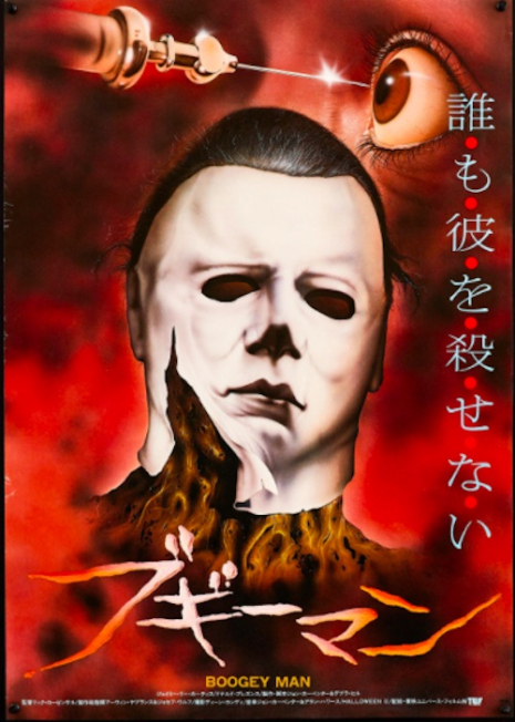
A Japanese movie poster for ‘Halloween II’ (1981).
It’s that time of year again! The time when we massacre innocent pumpkins, gorge on candy to the point of regret and worship all things bloody and disgusting. Ah, Halloween, how I’ve missed you.
Before we take a look at the large array of movie posters created for the various films (twelve in all) in director John Carpenter’s Halloween series, let’s talk a little about the film that introduced “The Shape,” aka unstoppable murderer, Michael Myers. If you recall, Halloween was an indie movie, made for a modest $300K. However, John Carpenter spent half of the film’s budget on Panavision cameras, with 100K going to actor Donald Pleasance for his five days on the set. Despite the fact that I and the maths do not play well together, that would leave $50K to actually shoot Halloween. Poor Jamie Lee Curtis was forced to shop at *gasp*, JC Penney for her wardrobe, upon which she dropped less than $100 bucks. The nerve! All of Carpenter’s penny-pinching would pay off when, at the close of Halloween‘s opening week, the film grossed over one million dollars – $1,270,000, to be precise. It has remained as one of the highest-grossing independent films of all time, garnering praise and fans from around the world. Halloween‘s popularity would continue as the series progressed and, over the last four decades, the series has continued to captivate horror fans. This includes the twelfth film in the series, Halloween Kills, which made 50 million dollars at the box office over its opening weekend. The original 1978 film that started it all continues to make money at the box office. Over the weekend of October 13th in 2018, 40 years after its release, Halloween grossed nearly $10K. Sure, that didn’t break any box office records, but it’s a reminder of how revered Carpenter’s first Halloween film is.
Originally, Carpenter titled his film The Babysitter Murders, but thanks to executive producer Irwin Yablans’ suggestion of changing the name (and moving the setting to Halloween night), the world of Halloween would begin its global takeover. The posters in this post were created over the decades to market Carpenter’s Halloween film series not only in the U.S., but in France, Yugoslavia, the UK, Japan, and beyond. Some of which, even if you’re a super-fan, may be new to you. The vast majority are for the OG film, so let’s start chronologically. The evil has RETURNED!
A movie poster for ‘Halloween’ (1978) from Argentina.

Germany
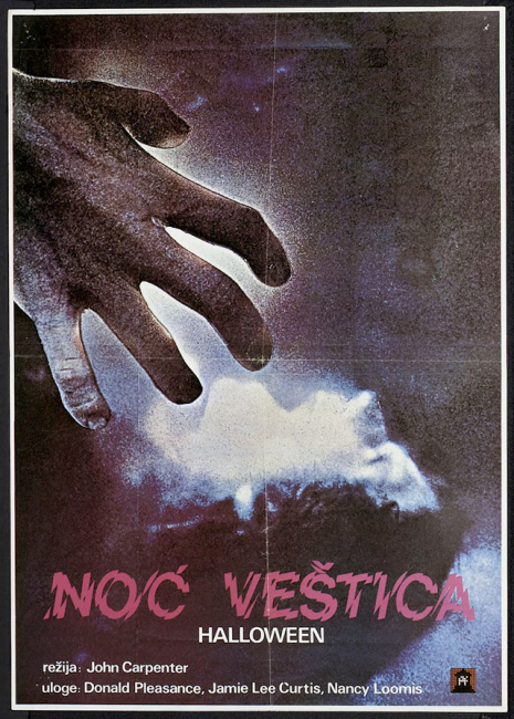
Yugoslavia

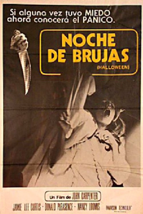
Italy
Many more after the jump…