FOLLOW US ON:
GET THE NEWSLETTER
CONTACT US
Sex, drugs and terrible things: Lurid and decadent poster art from the bad old days
06.07.2016
03:16 pm
Topics:
Tags:


A Socialist “Murder of Crows” poster uses the horrors of war for its political agenda.

Thomas Negovan, the gallerist behind the quirky Los Angeles-based Century Guild specializes in Art Nouveau and the Symbolist movement. He’s an expert at tracking down weird and wonderful things and now he’s offering new “Patronage Prints” struck from rare images from his archives. The prints are produced in small editions and prices start under $50. The idea is to support the research and also make it so that affordable versions of what would otherwise be ungodly expensive can be appreciated without spending your life savings. (And if you want to do that, no problem, he can sell you the originals.)

The originals of these posters are excruciatingly rare works on paper; in some cases, the ones Century Guild have exist in quantities fewer than five and they’re primarily in museums.  They’re true “underground” modern art. When they were created, they were meant to be destroyed, not kept, but their designs and sensibilities permeated the underground art culture and informed works that blossomed decades—or a century—later. Their common thread is that they were once trash, but we recognize them today as incredibly modern treasures—and the reason is because of that underground influence.

They’re printed on 11” x 14” archival paper. Order from Century Guild.


Decadent Weimar-era icon Anita Berber seductively reveals her heroin injection marks in a 1919 film titled ‘Prostitution,’ its racy subject matter disguised under the auspices of being a “social hygiene film.”
 

A giant poster celebrating a 1907 novel studying the life—and death—of Nostradamus.
 

White Slavery was a hot button in popular culture, capitalized upon in this 1927 “grand adventure” film by legendary political illustrator Mihaly Biró.
 
More mayhem after the jump…

READ ON
Posted by Richard Metzger
|
06.07.2016
03:16 pm
|
Socialist artist Vladimir Mayakovsky’s agitprop posters for revolutionary Russia
03.16.2016
12:21 pm
Topics:
Tags:

00maya00.jpg
 
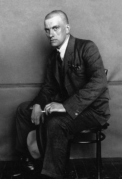
Vladimir Vladimirovich Mayakovsky (1893-1930) was a poet, playwright, artist and actor. He cut a rather dashing, nay swashbuckling figure—with his shaved head and Crowleyan features—during the height of the Russian Revolution. He dressed like a dandy. He was hailed as the “artistic genius of the Revolution.” Performed poetry exhorting workers to rally to the cause. Produced plays that were considered the greatest of their day. And he created a series of agitprop posters—promoting news and political ideas—that became an art form launching a whole new approach to Soviet propaganda and graphic design.

In the 1980s, I was fortunate enough to see an exhibition of Mayakovsky’s artwork at the the Fruitmarket Gallery in Edinburgh. The exhibition was dominated by his bright, colorful posters with their (often simplistic) political messages. These fragile yellowed sheets of paper had once been displayed in shop windows or distributed to the countryside to inspire the largely illiterate Russian populace.

When he was a student in 1907, Mayakovsky claimed that he’d:

Never cared for fiction. For me it was philosophy, Hegel, natural sciences, but first and foremost, Marxism. There’d be no higher art for me than “The Foreword” by Marx.

He was expelled from college for non-payment of fees the following year. He then involved himself with the Bolsheviks—distributing leaflets, organizing meetings, and on one occasion he helped a female prisoner escape from jail. Such activities led to his eventual sentence of eleven months in prison. Here he started writing poetry and the fusion of “Revolution and poetry got entangled in [his] head and became one.”

On his release, Mayakovsky dedicated himself to the socialist cause. Not as a revolutionary leader but as an artist producing “Socialist Art.” He performed poetry, wrote plays, disseminated political pamphlets and produced agitprop posters. His work as a playwright and poet brought him considerable success and fame. He became the leading figure among the young revolutionary writers and artists of the day.

Come the Russian Revolution, Mayakovsky saw no question on what had to be done. He embraced the revolution wholeheartedly.  In 1919, he joined the Russian State Telegraph Agency (ROSTA). Here he was responsible for designing and writing many of the now legendary political posters. Unlike many of contemporaries, Mayakovsky kept to the tradition of hand-made posters—using linocut and stencils, rather than the more clean cut graphic design of Alexander Rodchenko—though the two did later collaborate on several designs.

Mayakovsky also embraced the artistic Futurist and Constructivist movements, which caused him to lose favor with some Party members including the new soviet leader Josef Stalin, who had replaced Lenin after his death in 1924.

During the 1920s, Mayakovsky became involved with the Left Art Front. In their manifesto the poet controversially stated the group’s policy as:

..[a] re-examining [of] the ideology and practices of the so-called leftist art, rejecting individualism and increasing Art’s value for the developing Communism…

As the decade progressed, Stalin implemented radical and oppressive changes which caused Mayakovsky to question the direction the Communist Party and the country were heading. He was deeply concerned by the oppression of the arts and the silencing of any dissenting voices. Mayakovsky raised some of his hopes and fears in a poem “Conversation with Comrade Lenin” in 1929, where he imagined himself giving a progress report to the dead soviet leader:

Without you,
        there’s many
              have got out of hand,

all the sparring
        and squabbling
                      does one in.
There’s scum
        in plenty
              hounding our land,

outside the borders
            and also
                  within.

Try to
    count ’em
          and
            tab ’em -
                  it’s no go,

there’s all kinds,
          and they’re
                  thick as nettles:
kulaks,
    red tapists,
          and,
              down the row,
drunkards,
      sectarians,
            lickspittles.
They strut around
            proudly
                as peacocks,
badges and fountain pens
                studding their chests.
We’ll lick the lot of ’em-
                but
                  to lick ’em
is no easy job
        at the very best.

Stalin and his cronies branded Mayakovsky as a “fellow traveler”—which damned the poet as untrustworthy. A smear campaign was orchestrated against him. He was denounced in the press and loyal party members barracked him during poetry readings. It seemed his fate had been sealed.

On April 12th, 1930, Mayakovsky committed suicide by shooting himself through the heart. His suicide note read:

To all of you. I die, but don’t blame anyone for it, and please do not gossip. The deceased terribly disliked this sort of thing. Mother, sisters, comrades, forgive me—this is not a good method (I do not recommend it to others), but there is no other way out for me.

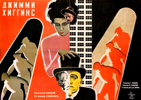
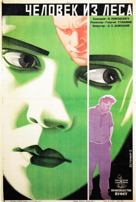
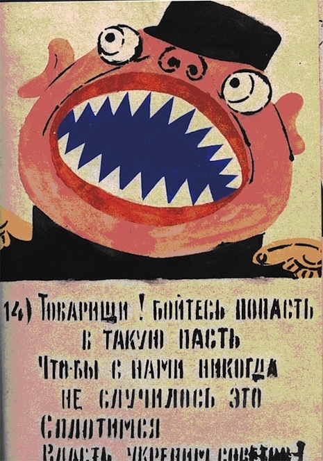
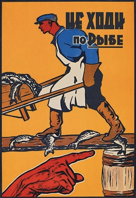
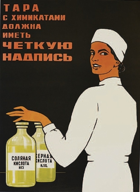
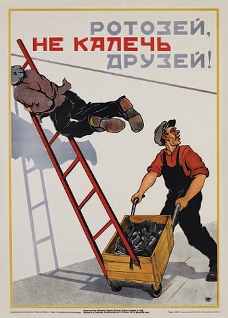
Mayakovsky’s agitprop posters were never intended to be exhibited in galleries or museums. They were propaganda used to spread revolutionary ideas, to satirize and expose injustices, and inspire the mass of the Russian public to take control of their lives. Ironically, the message was lost and it was the museums and galleries that have kept Mayakovsky’s art and ideas alive.
 
01maya1.jpg
 
02maya2.jpg
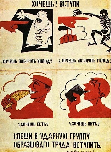
Do you want to join? (circa 1920).
 
More of Comrade Mayakovsky’s posters, after the jump…

READ ON
Posted by Paul Gallagher
|
03.16.2016
12:21 pm
|
Beyond the Valley of the Lurid Exploitation Film Posters of the 50s, 60s & 70s
02.05.2016
04:16 pm
Topics:
Tags:


Night Tide

A Lovecraftian poster for an odd 1960s mermaid thriller starring Dennis Hopper with a freaky cameo appearance by Marjorie Cameron, the bohemian witch of Los Angeles.

This is a sampling from a private collection of rare, massive 40” x 60” posters that were printed on cardstock for drive-In movie theaters.  More posters and related merchandise are online at hautecampe.com (“Archeaologists of the Strange”).  All are for sale at auction until February 8, when the bidding closes.

Haute Campe offers a collection of original rare, vintage film posters from the 1940s-1970s originating mostly from drive-ins and grindhouse theaters. Most of the posters went through a single distributor called National Screen Service, hence the “property of N.S.S.” at the bottom of 99% of the movie posters printed in the 20th century!  While many posters were destroyed by the elements and others were pulled off the wall by collectors, a great many returned to the distributor’s archives and piled up for many many years. 

We were fortunate enough to be able to acquire a large part of the archives and the treasures were fantastic, including rarely-seen posters that were for small run promotions and exceedingly impossible to find sizes like the gorgeous and massive 40” x 60” silkscreens created for drive-in movie theaters.

This is a selection from the latter part of the alphabet. You can see A to N at an earlier post here.
 

Ordered to Love

An American distributor purchased a historical film and repackaged it as a Nazisploitation thrill; the fact that the movie was years old at this point was sold to the audience as the film having been “censored until now!”
 

Please, Not Now!

A towel-clad Brigitte Bardot stuns in this incredible 1961 Pop Art poster.
 

Rasputin the Mad Monk/The Reptile

A giant poster advertising a 1966 Hammer double-feature where theatergoers would get their own Rasputin beard!
 

Runaway Daughters
 
More after the jump…
 

READ ON
Posted by Richard Metzger
|
02.05.2016
04:16 pm
|
Particularly lurid exploitation film posters of the 50s, 60s and 70s
01.30.2016
12:44 pm
Topics:
Tags:


The Black Klansman

Forty years before Chappelle’s Show made the joke, a black man spends his nights in a most curious manner…

This is a sampling from a private collection of rare, massive 40” x 60” posters that were printed on cardstock for drive-In movie theaters.  More posters and related merchandise are online at hautecampe.com (“Archeaologists of the Strange”).  All are for sale at auction until February 8, when the bidding closes.

Haute Campe offers a collection of original rare, vintage film posters from the 1940s-1970s originating mostly from drive-ins and grindhouse theaters. Most of the posters went through a single distributor called National Screen Service, hence the “property of N.S.S.” at the bottom of 99% of the movie posters printed in the 20th century!  While many posters were destroyed by the elements and others were pulled off the wall by collectors, a great many returned to the distributor’s archives and piled up for many many years. 

We were fortunate enough to be able to acquire a large part of the archives and the treasures were fantastic, including rarely-seen posters that were for small run promotions and exceedingly impossible to find sizes like the gorgeous and massive 40” x 60” silkscreens created for drive-in movie theaters.

This is just a selection from the first part of the alphabet…
 

Blood and Black Lace

Mario Bava directed this 1964 film that created the template for the “body count” slasher films of the 1980s.
 

Blood Bath

A 1966 stinker that started out in Yugoslavia as a spy film and—being judged unreleasable—had extra sequences filmed in Venice, California and was re-edited as a horror movie.
 
Many, many more movie posters, after the jump…

READ ON
Posted by Richard Metzger
|
01.30.2016
12:44 pm
|
These horrifying posters make great gifts for all of the freaks (and dope fiends) on your Xmas list
12.09.2015
07:18 pm
Topics:
Tags:


‘Syphilis: L’Hecatombe’ (“The Mass Slaughter of Syphilis”) by Louis Raemaekers, 1922.  Dutch soldiers returning home from the front with “The French Pox” caused a massive spike in STD-related deaths in the years following the war.

My pal Thomas Negovan owns the Century Guild gallery. Originally founded in Chicago in 1999, in December 2012 he opened a location in the Culver City Arts District of Los Angeles. Tom specializes in Art Nouveau and Symbolist works from Germany, Austria, France, and Italy done between 1880-1920, and includes the lithography of significant artists such as Gustav Klimt, Egon Schiele, Alphonse Mucha, and Henri de Toulouse-Lautrec; important Symbolist Artworks; and artifacts from the silent film era and German cabaret. Works from his collection are on permanent display in The Art Institute of Chicago, The Detroit Institute of Art, and The Metropolitan Museum of Art. 

This Christmas season, the gallery has selected some of their most macabre and fantastic posters to be printed as limited edition Patronage Prints. Priced under $50, they’ll certainly make… unusual presents for all the weirdos (and drug addicts) on your shopping list…


‘Shadows and Light’ by Walter Schnackenberg is a 1919 Munich cabaret performance depicting a ‘Beauty and the Beast’ theme.


Fritz Lang wrote the silent film script of a woman leading men to their demise in ‘The Dance of Death’ (1919).


A poster advertising the The Grand-Guignol theater, a legendary landmark of terror.  Performances there ran the gamut from horror to comedy, stimulating both extremes of human response.

More after the jump…

READ ON
Posted by Richard Metzger
|
12.09.2015
07:18 pm
|
Be careful with that hammer & sickle, Eugene: Soviet accident prevention posters
06.05.2015
09:48 am
Topics:
Tags:

001sovietacciden98765refg001.jpg
 
During the 19th century posters were primarily used as a means of advertising and publicity. It would take the events of the First World War and the Russian Revolution to change their use from commercial to a means of propaganda and education. Posters became a means to educate or re-educate a nation according to the beliefs of their leaders—whether as a rallying point in war or to inspire revolution.

For Soviet Russia the poster was a means of spreading state information targeting the population across a vast and diverse country. Literacy had been a problem in Russia—according to 1897 national census, under Tsarist rule just 28.4% of the populace were literate. After the revolution, Lenin promised to “liquidate illiteracy” and by 1926, 56.6% of Russians were registered as literate.

However, knowing that at least half of your workforce was illiterate was a hinderance to the planned Soviet industrialization of the country.The workforce had to be educated as quickly and successfully as possible. To solve the problem accident prevention posters were produced disseminating clear and succinct warnings to all possible hazards faced by the Soviet workforce in industry and agriculture. “Be careful with a fork,” “Hey Scatterbrain! Don’t cripple your Friends!” or “Don’t Walk on Fish!” reinforced the need for the individual to take responsibility of their own actions for the benefit of the greater good. Though many of the messages may strike us now as bizarre or strange (“A fan is a friend of labor. Let it work forever.”), they all reflect a revolutionary change to the quality of health and safety at work.
 
002sovietposacc987654ef002.jpg
‘Hide the Hair.’
 
003sovietposstacc98765003.jpg
‘Don’t Walk on Fish!’
 
004sovietaccipost87654004.jpg
‘Chemical containers should have accurate inscriptions!’
 
006sovietjhgfdsdfgpost006.jpg
‘Hey Scatterbrain! Don’t cripple your Friends!’
 
More health and safety notices from Soviet era Russia, after the jump…

READ ON
Posted by Paul Gallagher
|
06.05.2015
09:48 am
|
Rude, nude and lewd: Lurid 1970s Sexploitation posters
05.20.2015
10:29 am
Topics:
Tags:

008sexploitapostoiuytrefg8.jpg
 
When I was a kid growing up in Edinburgh during the 1970s, I became aware of a cinema called the Jacey on the city’s main thoroughfare Princes Street. It was difficult not to be aware of the Jacey—with its brightly lit foyer, white-painted exterior and beautiful French-styled windows—it looked like some kind of respectable brothel or a dodgy gentleman’s club—which wasn’t too far away from the truth, as the Jacey was an adult cinema showing imported Scandinavian porn and American sexploitation movies.

Outside, directly visible to all passing trade, were small framed windows where customers could view the promotional photographs, lobby cards and posters for the forthcoming attractions. Like many inquisitive schoolboys, I stopped here on the way home from school (for purely educational purposes, of course…) to view the photos of scantily clad men and women in black & white or garish colors frolicking as nature intended. This display became like a kind of barometer for me as it reflected the “atmospheric” changes in public taste for adult entertainment. At first, there was the innocent healthy lifestyle documentaries on nudist camps with fit youngsters playing games, stretching muscles and touching their toes. Then the more specialized films from Sweden with young blondes quieting their existential angst with spontaneous sexual adventures with strangers. Then American movies that mixed bad sex with bad acting and bad dialog. On occasion, there were screenings of arthouse films by Pasolini (Canterbury Tales) and Fellini (Satyricon)—perhaps the titles had suggested more than these films delivered? The Jacey closed around May 1973, its last double-bill was I Am Sexy and Do You Want To Remain a Virgin Forever?

As this “golden age” of seventies blue movies waned there arrived the awful British sex comedies that regularly starred Anthony Booth (father-in-law of former British Prime Minister Tony Blair) and a host of respected character actors (including Beryl Reid, Roy Kinnear and Richard Briers), and even employed the writing skills of Monty Python’s John Cleese and Graham Chapman.

The audiences seemed to change too—from old men to liberated and progressive young couples to teenage boys their first flush of lust. This was a time when virginity was still considered “sacred” and sex before marriage was generally discouraged—which made having a porn cinema on Edinburgh’s most famous and busiest street an odd comment on what was deemed acceptable. Edinburgh was then a very genteel city, and “sex” for most of its middle class citizens was what the coal was delivered in.

Then again, apart form their saucy taglines, most of these films rarely had anything as explicit than can be found on the pages of Tumblr today. This collection of 1970’s sexploitation posters covers all the bases—from nasty stag films, to smut movies starring Batman‘s Adam West, to the saucy comic Brit flicks.
 
004sexploitatonpostzxcvbjiufd4.jpg
 
013sexploitapostsdfghju13.jpg
 
016sexplotaposteoijhxzcvbni16.jpg
 
More after the jump…
 

READ ON
Posted by Paul Gallagher
|
05.20.2015
10:29 am
|
‘Separate Cinema’: Unsettling and gorgeous posters from the age of segregated movies
03.20.2015
02:16 pm
Topics:
Tags:


Birthright, 1939. A black Harvard graduate confronts racism.
 
The images on this page come from a remarkable book that came out late last year, Separate Cinema: The First 100 Years of Black Poster Art, by John Duke Kisch; it’s an incredibly wide-ranging look at the posters of “black cinema” writ large, a category that includes not just the “race films” shown here but also Birth of a Nation, earnest Hollywood dramas, The Jazz Singer, Blaxploitation flicks, South African movies addressing apartheid, breakdancing movies from the 1980s, and much more. The book’s credibility couldn’t be greater, insofar as Henry Louis Gates Jr. supplies the foreword and Spike Lee the afterword.

The posters depicted here tell a tale of true segregation, a “separate but equal” industry, so to speak, that served up gripping melodramas to its chosen audience just as surely as Warner Bros. did for white audiences. The undisputed master of this period is Oscar Micheaux, who directed a couple of these movies. By Kisch’s lights “the most successful early black independent film producer and director,” Micheaux was the son of a Kentucky slave before working as a railway porter and homesteader; around World War I he started directing and producing movies, of which he directed more than 40 before he was done. Kisch describes his basic formula as follows:
 

Micheaux’s features were usually far superior to those made by other independent black studios, largely because he took a familiar Hollywood genre and gave it a distinctive African-American slant. Committed to “racial uplift,” he cast black characters in non-stereotypical roles, as farmers, oil men, explorers, professors, Broadway producers, or Secret Service agents.  … He brought to the screen diverse social issues that faced black America, and also portrayed an ideal world in which blacks were affluent, educated, and cultured. In the 1930s, his films represented a radical departure from Hollywood’s portrayal of African Americans as jesters and servants.

 
In our age, posters like this are simultaneously dazzling and upsetting, almost as taboo as the interracial drama The Exile (below) was in its day. Underlying so much of the rhetoric surrounding the racial situation in America is the understanding that all those bad things belonged to and are limited to the past; the horrors of Ferguson, Staten Island, Cleveland in 2014 showed everyone that no such assumptions are safe—even as Steve McQueen’s 12 Years a Slave (it’s included in the book too) both harks back to these unsettling movies and signals the potential for lasting change. 
 

Bosambo, 1935. British District Officer in Nigeria in the 1930’s rules his area strictly but justly, and struggles with gun-runners and slavers with the aid of a loyal native chief.
 

Black Gold, 1928. A town abandons its previous ways of life for the glamour and drama of the oil drilling trade.
 

The Flying Ace, 1926. A veteran World War I fighter pilot returns home a war hero and immediately regains his former job as a railroad company detective.
 
More after the jump…

READ ON
Posted by Martin Schneider
|
03.20.2015
02:16 pm
|
Trippy Czechoslovakian movie posters of classic American films
03.19.2015
03:28 pm
Topics:
Tags:


Hello Dolly, poster created 1970
 
Man, I really got lost in the massive archive of Czechoslovakian posters of American films on the Terry Posters website. I cherry-picked the ones I really dug, but there are a ton more that might strike your fancy. A lot of these are for sale too. If you see something you just gotta have, it just might be available for purchase.

As a side note: The poster for Ghostbusters below really has me scratching my head….


Ghostbusters, poster created 1988
 

Mary Poppins, poster created 1969
 

My Fair Lady, poster created 1967
 

Planet of the Apes, poster created 1970
 

Cinderella, poster created 1970
 

Rebel Without A Cause, poster created 1969
 
More after the jump…
 

READ ON
Posted by Tara McGinley
|
03.19.2015
03:28 pm
|
‘Please applaud with hands only’: Movie theater audience etiquette posters from 1912
03.13.2015
01:41 pm
Topics:
Tags:


I’m sure you’re annoyed at that asshole who was talking on his cellphone while you were trying to enjoy Taken 3, but inconsiderate behavior at the movie theater isn’t a recent phenomenon. Far from it! Movie theaters have been gently trying to modify the behavior of uncooperating audience members almost as far back as there have been movies.

These wonderful posters date from circa 1912, you can find them on the Library of Congress website, in the “Prints & Photographs Online Catalog.” The Library of Congress description of these cards runs, “Positive paper print from lantern slide used in motion picture theaters as announcement. Each text superimposed on humorous photograph, and the whole shown in a fancy carved frame.”

The one about applauding with your hands must have been trying to get people not to shout at the screen? Right? Right?


More after the jump…

READ ON
Posted by Martin Schneider
|
03.13.2015
01:41 pm
|
Polish movie posters make every movie a scary movie
03.07.2014
12:45 pm
Topics:
Tags:

Rosemary's Baby
 
OK, so the first few posters shown below are for actual scary movies—Rosemary’s Baby, Poltergeist, Alien, and The Birds all get grotesque posters, and completely appropriately so. But while I’m not denying the utter coolness of all these designs, most feel, if not misleading, totally out of left field.

First of all, Planet of the Apes has a spoiler right there in the damn poster—enraging? Yes. Allusive to the tone of the film? Not so much. It could also be argued that the Star Wars poster has a spoiler as well—if this is for Return of The Jedi, it’s definitely alluding to the Death Star’s explosion. Not cool, Poland! So not cool! (Though I do appreciate the decidedly Hebraic font on the use of the word “Jedi.”)

But the Cabaret poster looks like a fucking Cronenberg film, and can you guess what the next one is? Young Frankenstein. That is a poster for the Mel Brooks comedy classic Young Frankenstein. After that we have the 1980s pseudo-feminist love letter to Wall Street finance, Working Girl, which again, looks more than a little Cronenberg if not Kafka. And Tootsie has shades of Buffalo Bill from Silence of the Lambs. But in my opinion, it’s the final poster, for a Charlie Brown movie, that really takes the cake. I know Charles Schulz’s brand of kiddie entertainment wasn’t candy-coated, but—based on the poster alone—I get the distinct impression that this movie is about a bunch of children who drown.
 
Poltergeist
 
Alien
 
The Birds
 
Planet of the Apes
 
Star Wars
 
Cabaret
 
Lots more hilariously inapt Polish posters after the jump…...

READ ON
Posted by Amber Frost
|
03.07.2014
12:45 pm
|
Alternate universe movie posters
02.20.2014
12:48 pm
Topics:
Tags:


Sean Hartter’s “Alternate Universe Movie Posters” website boasts some bust-a-gut funny twists on classic films. I selected a few pieces I found highly amusing, but I suggest moseying on over to Sean’s website yourself to… “take it all in.”


More after the jump…

Posted by Tara McGinley
|
02.20.2014
12:48 pm
|
Ichiban Bond: Gorgeous Japanese James Bond posters
02.12.2014
03:27 pm
Topics:
Tags:

image
 
Lovely vintage Japanese James Bond posters.
 

image


image


image


More posters after the jump…

READ ON
Posted by Richard Metzger
|
02.12.2014
03:27 pm
|
Vintage adult film posters are campy, clever, sleaze-tastic and sometimes even quite lovely
02.03.2014
10:34 am
Topics:
Tags:

poster
Consenting Adults (1982)
 
The New York Times recently profiled Vinegar Syndrome, a company that collects, catalogs, restores, and distributes antique skin flicks. And while not a vintage X aficionado myself, I was struck by the posters I found from both Vinegar Syndrome and Distribpix (another company that does re-releases); there is some truly cool and campy poster art to be found in the adult section, folks!

And as the Internet continues to cut out the middle man of the adult film industry, I’m a little sad to know that these kinds of posters have gone the way of the dinosaur, probably never to return. From corny, to clever, to downright pretty, a once dynamic medium is now no more. A moment of silence, please.
 
poster
I Wish I Were in Dixie (1969)
 
poster
Marilyn and the Senator (1975)
 
poster
Open Air Bedroom (1971)
 
poster
People (1978)
 
poster
Spread Eagles (1968)
 
poster
The Telephone Book (1971)
 
poster
Tigresses (1979)
 
poster
Wanda Whips Wall Street (1982)

Previously on Dangerous Minds:
‘The Telephone Book’: A girl falls in love with the world’s greatest obscene phone caller
Kill the Pigs or How I Stopped Worrying and Took a Punk Vacation
Russ Meyer’s ‘Fanny Hill’: Bosomania Gets Fancy
 
Via The New York Times

Posted by Amber Frost
|
02.03.2014
10:34 am
|
The revolutionary Soviet silent-era film posters of the Sternberg Brothers
01.23.2014
12:29 pm
Topics:
Tags:


“Of all arts, for us cinema is the most important.”—Lenin, 1919

An exhibition of Soviet silent-era film posters now underway at London’s Gallery for Russian Arts and Design features, among many treasures, a fair few of the important works of the design team of brothers Vladimir and Georgii Stenberg. Far from household names, it’s true, but their place in art history is difficult to deny. Their success was somewhat serendipitous—it happened that their Dada-inspired method of found image manipulation dovetailed perfectly with the conceits and priorities of the Constructivist movement that was dominating Soviet graphics of their time. They enjoyed a nearly decade-long run of superb work that ended only with Georgii’s untimely death in a 1933 traffic accident. I quote at length here from curator Christopher Mount’s essay in the exhibition catalog of their 1997 MoMA retrospective:

The 1920s and early 1930s were a revolutionary period for the graphic arts throughout Europe. A drastic change took place in the way graphic designers worked that was a direct consequence of experimentation in both the fine and the applied arts. Not only did the formal vocabulary of graphic design change, but also the designer’s perception of self. The concept of the designer as “constructor”—or, as the Dadaist Raoul Hausmann preferred, “monteur” (mechanic or engineer)—marked a paradigmatic shift within the field, from an essentially illustrative approach to one of assemblage and nonlinear narrativity. This new idea of assembling preexisting images, primarily photographs, into something new freed design from its previous dependence on realism. The subsequent use of collage—a defining element of modern graphic design—enabled the graphic arts to become increasingly nonobjective in character.

In Russia, these new artist-engineers were attracted to the functional arts by political ideology. The avant-gardists’ rejection of the fine arts, deemed useless in a new Communist society, in favor of “art for use” in the service of the state, was key in the evolution of the poster. Advertising was now a morally superior occupation with ramifications for the new society; as such, it began to attract those outside the usual illustrative or painterly backgrounds—sculptors, architects, photographers—who brought new ideas and techniques to the field.

Vladimir and Georgii Stenberg were prominent members of this group, which was centered in Moscow and active throughout the 1920s and early 1930s. The Stenberg brothers produced a large body of work in a multiplicity of mediums, initially achieving renown as Constructivist sculptors and later working as successful theatrical designers, architects, and draftsmen; in addition, they completed design commissions that ranged from railway cars to women’s shoes. Their most significant accomplishment, however, was in the field of graphic design, specifically, the advertising posters they created for the newly burgeoning cinema in Soviet Russia.

These works merged two of the most important agitational tools available to the new Communist regime: cinema and the graphic arts. Both were endorsed by the state, and flourished in the first fifteen years of Bolshevik rule. In a country where illiteracy was endemic, film played a critical role in the conversion of the masses to the new social order. Graphic design, particularly as applied in the political placard, was a highly useful instrument for agitation, as it was both direct and economical. The symbiotic relationship of the cinema and the graphic arts would result in a revolutionary new art form: the film poster.


More after the jump…

READ ON
Posted by Ron Kretsch
|
01.23.2014
12:29 pm
|
Page 2 of 3  < 1 2 3 >