FOLLOW US ON:
GET THE NEWSLETTER
CONTACT US
There’s a restroom in Lithuania decorated with tiles featuring a Soviet high rise
03.27.2018
09:53 am
Topics:
Tags:

01sovti.jpg
 
Comrade, fed up with those white capitalist tiles in the restroom of your favorite people’s bar or local workers’ canteen? Then why not tell the capitalist pig owner to change them to more pleasing images of the glorious socialist high rises of former Soviet countries.

This is what you will find in the Galeria Urbana restaurant in Kaunas, Lithuania, where the walls of the comfort station have been decorated with tiles featuring photographic images of Soviet-era high rises or “небоскреб.” The tiles are the work of Lithuanian design studio Gyva Grafika, who wanted to bring the “outside inside” and re-examine the country’s “dark Soviet occupation history” and the “culture that was introduced to [Lithuania] by force.” Many of these Soviet-era high rises are now being demolished or modernized under EU-sponsored renovation projects as Lithuania hopes to move “forward to a better and more optimistic tomorrow” as “a strong north European country.” It certainly provides a talking point over dinner and a distracting way to spend a penny.
 
02sovti.jpg
 
03sovti.jpg
 
More after the jump…
 

READ ON
Posted by Paul Gallagher
|
03.27.2018
09:53 am
|
Exquisite pages from the vintage design bible ‘The Inland Printer’
03.14.2018
11:54 am
Topics:
Tags:

01inlpri.jpeg
 
The Inland Printer was a trade magazine that showcased the best printing techniques and technology between 1883 until 2011. It has been described as a designer’s Bible and “the single greatest resource for the study of the American printing industry.”

The magazine kicked-off as a response to the booming Mid-Western printing industry which was supplying an insatiable demand for books, magazines, newspapers, advertisements, and other printed materials—from labels and wrapping paper to business cards and serviettes. The first issue of the Inland Printer was a mere “twenty-four pages, thirteen of copy and eleven of advertisements.” This quickly grew in size month-by-month until the magazine maxed at a hefty 200-pages for one of its editions.

It was popular because it highlighted new techniques, offered a forum for discussion of ideas, and heralded the changes in design from Art Nouveau to Bauhaus and beyond. The magazine featured many of the big name artists and designers of the day like William Henry Bradley and Frank B. Nuderscher. The magazine was also the first American publication to change its cover every month which is now the standard for every periodical. A selection of these earlier covers can be viewed here. Below, a selection of pages from the magazine that feature many fo the cutting edge printing techniques of the day (like intricate and overly elaborate engraving) to use of color and photographic image.
 
02inlpri.jpeg
 
03inlpri.jpeg
 
More design classics, after the jump…

READ ON
Posted by Paul Gallagher
|
03.14.2018
11:54 am
|
‘Addams Family’ fan creates 3,000-piece LEGO Addams’ Mansion
02.23.2018
07:14 am
Topics:
Tags:


Addams Family fan and LEGO enthusiast Hugh Scandrett has created a nearly-3,000 piece modular recreation of the creepy/kooky Addams Family mansion which he has submitted to LEGO Ideas. If 10,000 people support his build idea, LEGO will review it to possibly make it an actual set. So far, as of this writing, the project has nearly 3,000 supporters.

Scandrett had previously submitted a larger build of the Addams’ mansion in 2016—in honor of the show’s 50 anniversary—but the original build had 7,000 parts, exceeding the 3,000 piece limit imposed by LEGO Ideas.


Scandrett’s earlier 7,000 piece build.

Details of the new construction:

Three floor Mansion, each floor is a removable segment, like standard LEGO modular construction.
The Mansion measures 23” (57cm) high, 10” (25cm) wide and 15” (38cm) deep.
A full glass greenhouse.
Includes 8 minifigs: Morticia, Gomez, Wednesday, Pugsley, Uncle Fester, Grandmama, Cousin It and Lurch.
The build includes 2,975 original LEGO pieces, no modifications.

You can vote to support Scandrett’s set idea HERE. We give it TWO SNAPS.


Much more after the jump…

READ ON
Posted by Christopher Bickel
|
02.23.2018
07:14 am
|
Strange Illustrations of Robots, Devils, Fire-Breathing Witches, and Weapons of War from 1420
01.25.2018
10:00 am
Topics:
Tags:

01defontana.jpg
The Devil and all his internal works.
 
There’s an episode of South Park where Stan, Kyle, Cartman, and Kenny try out different routines only to find “The Simpson’s Already Did It.” Looking at the illustrations of technological inventions by fifteenth-century Venetian physician, engineer, and alleged “magus,” Johannes de Fontana, (ca. 1395-1455), aka Giovanni Fontana, it’s more than apparent that whatever invention we think is new someone (probably not The Simpsons...) has already imagined it.

In his technological or mechanical treatise, Bellicorum instrumentorum liber cum figuris (ca. 1420), Fontana imagined or rather devised a whole series of machines for use in war, traveling, entertaining children, flying, robots, rocket-powered craft, timepieces, fountains, and even a means of projecting images like a magic lantern. Unlike most other inventors at this time, Fontana showed the workings of his inventions—the pulleys and weights (sand, water) by which his mechanical devices worked. Most inventors illustrated their proposals “in action” as if functioning in real time, therefore, keeping internal mechanisms of cogs and wheels and what-have-yous hidden, thus to ensure they might be paid for developing such contraptions. Fontana presented his work with see-thru interiors, allowing the viewer to witness or rather imagine just exactly how this devil could fly or that vehicle move. This all well-and-good until one realizes many of these wonderful designs are utterly unworkable as they “do not conform to the principles of mechanics.”

Many of the ideas contained in Bellicorum instrumentorum liber cum figuris focus on weapons of war like exploding missiles, mechanical battering rams and alike. However, Fontana did also include a number of designs for children’s toys and several drawings that scorched myths about the supernatural and the occult by explaining how devils and witches were most probably just robotic automata used to terrorize his fellow citizens.

A copy of Johannes de Fontana’s Bellicorum instrumentorum liber cum figuris can be viewed here.
 
02defontana.jpg
A mechanical toy.
 
012defontana.jpg
More toy/entertainment for kids.
 
03defontana.jpg
A robot witch showing how it would move on rails, have wings that flapped and arms that moved, and an ability to blow fire or air.
 
More mechanical illustrations, after the jump…
 

READ ON
Posted by Paul Gallagher
|
01.25.2018
10:00 am
|
How they brought ‘The Elephant Man’ back to life
01.24.2018
10:39 am
Topics:
Tags:

0ephelumppost2.jpg
 
It started with making false noses. Christopher Tucker was studying opera at drama school when he was asked to appear in a production of Rigoletto. He decided to give his character a noticeably larger hooter. He began fashioning different designs and discovered he liked making noses. That was when Tucker gave up Verdi and opera for a career as a makeup artist.

You may know the name, but if you don’t you will certainly know Tucker’s handiwork. He designed Mr. Creosote for Monty Python’s The Meaning of Life—“And finally, a wafer thin mint.” He came up with the designs for the lycanthropes in Neil Jordan’s werewolf fantasy The Company of Wolves. He also worked on Dune and even made an unfeasibly large prosthetic penis for porn star Long Dong Silver. Somewhere in among that lot you’re bound to have seen Tucker’s incredible craftsmanship.

He is best known, however, for his prosthetic makeup designs for David Lynch’s The Elephant Man, in which he recreated the severe deformities of Joseph Merrick, a man whose head was grossly enlarged and his body disfigured by an unknown disease—it is still a matter of debate as to the cause of Merrick’s illness. Because of his deformities, Merrick was exhibited as a freak in Victorian sideshows. The main problem for Tucker was not to make his designs look like “a cheap horror” but as “something approximating but not an exact clone of the ‘Elephant Man’.”

Lynch had originally planned to design the makeup for Merrick himself but the enormity of the task and his inexperience almost left the film without its “Elephant Man.” Eventually, Tucker was called in to rescue the movie and create its unforgettable makeup designs.
 
0ephelumpjh.jpg
Hurt as Joseph Merrick, or rather John Merrick as he is called in the film.
 
The late, great John Hurt was tasked with bringing Merrick to life on the screen. Hurt was one of those rare and subtle actors who brought tremendous sensitivity and humanity to each of his performances. He was one of those actors the press often “rediscovered” every so often—as they did after his performance as Quentin Crisp in The Naked Civil Servant, or when he appeared as the deranged emperor Caligula in I, Claudius, or the broken, drug-addled Max in Midnight Express, or the vulnerability he brought to the doomed Stephen Ward in Michael Caton Jones’s film Scandal. But Hurt never really went away. He was consistently good in all of his roles, so good that the press took his quality of acting for granted, and only commented on his work when he was truly exceptional.
 
04ephelumptuck.jpg
Tucker’s photograph of Hurt as Merrick.
 
It took seven to eight hours in makeup for Hurt to become Merrick. It then took up to two hours to remove the fifteen layers of prosthetics Hurt wore. The designs for the “Elephant Man’s” head and limbs were taken directly from original casts of Merrick’s body kept at the Royal London Hospital. The long, laborious procedure of becoming Merrick led Hurt to quip: “I think they finally managed to make me hate acting.”

The BFI has a fascinating interview with Tucker about his designs for The Elephant Man which you can find here, while below, Tucker and Hurt discuss the process of bringing Merrick to life on the screen.


Posted by Paul Gallagher
|
01.24.2018
10:39 am
|
Like Tinder for desperate people: Unsettlingly bad Europop record covers
01.23.2018
10:06 am
Topics:
Tags:

01dutchlp.jpg
 
I have a pet theory (I call him Malcolm, he likes having his tummy rubbed) that posits the suggestion that maybe vinyl declined all those years ago because there were so many shit covers around. It is possible. Too many shit covers meant people didn’t want their lack of taste in music to be seen by their cool friends, so sales dropped until downloads arrived when nobody knows what shit you’re listening to on your iPod.

I mean, we all have guilty secrets about music, you know, bands we’re not supposed to like but we always seem to find there’s just that one track that awful band did way back when that always hits the spot when we’re feeling all mushy inside or very, very drunk or just loved up on way too many eccies or even possibly having no fucking taste in music whatsoever. You know the kind of thing. If you don’t, well you haven’t been paying attention.

Having a sneaky little taste for something outré or déclassé or just fucking shit meant, back then at least, having to buy the goddam vinyl (there were no downloads then, kids, see above). This meant you would always have the unfortunate evidence of your guilty little pleasure on display for every fuckwit who browsed through your record collection and never let you live it down.

Which, by long way of a preamble, brings me to this fucking collection of shit covers from the 1970s and 1980s that were (somehow) available in Europe, well, primarily Holland, to be fair. Some of these covers look like the profile pics for would-be serial killers on Tinder. These are obviously the kind of covers made by foolhardy record execs who say things like “Who needs a designer, my son’s gotta camera, he can do it….” And you know what, he did.
 
015dutchlp.jpg
 
06dutchlp.jpg
 
02dutchlp.jpg
 
More tasteless record art, after the jump…

READ ON
Posted by Paul Gallagher
|
01.23.2018
10:06 am
|
Two-Fisted Sentences and Hard-Boiled Covers: Mickey Spillane’s pulp fiction
01.15.2018
12:44 pm
Topics:
Tags:

05aspillaneitjury.jpg
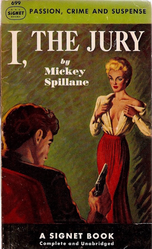
‘I, the Jury’ (1947).
 
Mickey Spillane said he was a writer, not an author. “Authors want their name down in history; I want to keep the smoke coming out of the chimney.” During his lifetime, Spillane sold over 200 million books, most featuring his hard-nosed, two-fisted hero Mike Hammer. These books were loved by the public but loathed by the critics. Spillane didn’t care. He wrote for himself and he knew there were plenty of people who wanted to read his stories.

Spillane was at his peak in the 1950s when he would often have six books in the top ten best-seller list. At a party, Spillane met an East-coast critic who decried the writer for polluting the list. Without missing a beat, Spillane replied, “You’re lucky I didn’t write another four.”

Mike Hammer was originally intended as a comic strip hero called Mike Danger. Spillane had written stories for comic books like Captain America, Batman, and Superman before, working alongside a young Stan Lee, who could work on three different stories on three different typewriters all at the same time.

Spillane was also fast. He wrote his first Mike Hammer novel I, the Jury in nineteen days. He wanted the money to buy a house. I, the Jury set the sex and violence template for the rest of the Hammer series which usually featured a dame in trouble and bad men doing bad things. A total of fourteen Mike Hammer books were published during Spillane’s life. Mike Hammer is a brutal, violent hero who lives by his own austere moral code exacting bloody vengeance on those he thinks deserve it. First, it was killers and G-men, then after the dawn of the “Red Scare,” it was the commies. In his third book, One Lonely Night, Hammer ends up killing around forty reds with a machine-gun. It was originally nearer eighty, but the publishers thought that was a bit too much. Throughout his adventures, Hammer was ably supported by his girlfriend Velma. Critics denounced Mike Hammer as “a sadist” and “a homicidal paranoiac.” Spillane said he didn’t give a hoot for what the critics thought, the only thing he cared about was the royalty check. His writing brought strange fans like Ayn Rand, though he didn’t agree with her politics, and some famous detractors like Ernest Hemingway, who famously denounced Spillane in print. Spillane was nonplussed. He quipped “Hemingway, who?” when asked about the Nobel prize winner’s comments on TV.

And then there were all the movies made from his books, most notably Robert Aldrich’s version of Kiss Me Deadly in 1953, which Spillane wasn’t too keen on—he’d rather people read his book. However, Spillane himself played Hammer in an film adaptation of The Girl Hunters in 1963.

Times changed, Mike Hammer and Mickey Spillane fell out of fashion—though Spillane’s star never really dimmed in Europe. It was as if the words spoken by Hammer in One Lonely Night had come true for Spillane:

Isn’t that the way life is? You fight and struggle to get something and suddenly you’re there at the end and there’s nothing left to fight for any longer.

This year marks the centenary of Spillane’s birth and although he wrote many other equally good novels, including two different series (Tiger Mann and Morgan the Raider), and a whole slate of new Spillanes (finished by friend and writer Max Allan Collins) are due for release this year, it will always be for his tough guy Mike Hammer that Mickey Spillane will always be remembered.
 
03aspillanemygunisquick.jpg
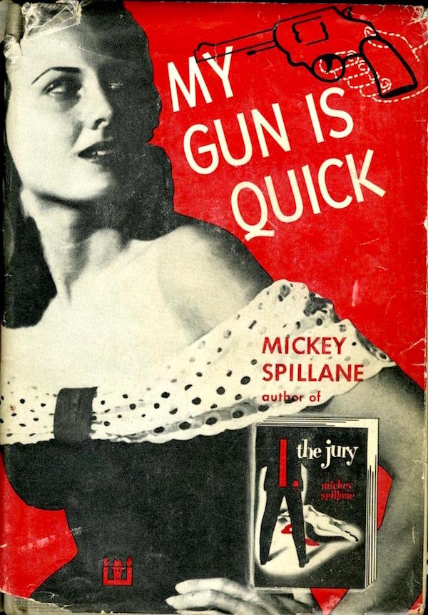
‘My Gun is Quick’ (1950).
 
06aspillanevengeanceismine.jpg
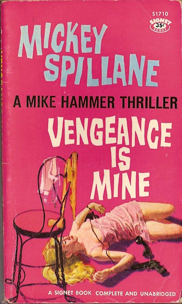
‘Vengeance is Mine’ (1950).
 
More Spillane covers, after the jump…
 

READ ON
Posted by Paul Gallagher
|
01.15.2018
12:44 pm
|
Goodnight, sweet prince: There are ‘Big Lebowski’ cremation urns
01.05.2018
10:35 am
Topics:
Tags:


It’s one of the most indelible scenes from one of the most memorable and quotable cult films in cinema history: John Goodman as the unhinged blowhard Walter Sobchak in The Big Lebowski, scattering the ashes of his newly-deceased bowling teammate Donny, eulogizes his friend after spending countless years of his life constantly telling him to shut the fuck up. The ashes are in a Folgers coffee can because the cost of an urn was too dear, and Sobchak utterly ruins the simple, two-person funeral with a pointless detour into his own Vietnam war shell-shock and by scattering the ashes all over the funeral’s other guest, Jeffrey “The Dude” Lebowski.

It’s easy to imagine that at least some among the film’s fanatical devotees—self-identified as “Achievers” after a throwaway detail early in the film—have envisioned using a Folgers can as a final resting place in homage to that scene, and if you’ve ever gone to a bowling alley in a bathrobe and ordered a White Russian, I might be talking about YOU. Well, you’re in luck. Purveyors of gorgeous handmade cremation urns Memento Memorials have tracked down the period-correct cans and mismatched lids (Folgers has never used blue lids, the one in the film is almost certainly from a Maxwell House can) and paired them with pedestals made of bowling balls to create replica Big Lebowski urns.


While there are plenty of Folgers coffee cans to be had on the internet, the exact version of the coffee can used in the movie was made in the mid 90s and not in the kind of quantities that make it easy to come by.  The style itself can be found with some effort but nailing down the “For All Coffee Makers” version is even rarer. There are size variations and condition factors as well. As an extra kicker, the blue lid is from a Maxwell House tin from the same decade that is just as difficult to source.

There are times when we have to buy a group of unrelated coffee cans in order to get the one sweet prize within in order to say goodnight to one sweet prince. We will accept cans that are “Automatic Drip” (or other grind styles as we find them), cans that are unopened and still have what might be coffee in them. Sometimes a seller is wise to the rarity and possible end use as a Big Lebowski Urn and jacks up the price.

 
This is apparently a key detail.

Because Memento Memorials can only sporadically procure the extremely specific cans and lids required, these urns haven’t been available very often, so instead of selling them outright, they’ve taken to auctioning them to benefit the Prevent Cancer Foundation. This month, they’re auctioning three of them. The individual auctions run from January 9-13, 16-20, and 23-27.


More after the jump…

READ ON
Posted by Ron Kretsch
|
01.05.2018
10:35 am
|
Cute miniature models of Fauns, Jackalopes, Dragons, Daenerys Targaryen, and Unicorns
01.04.2018
10:09 am
Topics:
Tags:

01mijbilspringjackalope.jpg
Spring Jackolope.
 
Warning: Cuteness overload ahead.

Silvia Minucelli is an engineer and freelance artisan who creates itsy-bitsy, ickle figurines using polymer clay and a toothpick—can you imagine how painstaking and difficult that must be? Minucelli produces and sells her delightful models under the name Mijbil Creatures—named after the famous otter in Gavin Maxwell’s book Ring of Bright Water.

Based in Sweden, Minucelli works at her engineering job by day and then at night, spends hour-upon-hour fashioning her intricate designs of jackalopes, dragons, fauns, and even Daenerys Targaryen from Game of Thrones. She sculpts her designs with a toothpick as normal modeling tools are way too big to sculpt something that is sometimes smaller than a pinky nail. Municelli then bakes the finished sculpture, paints it and sells it via her Etsy page. For those with a high cuteness tolerance, you can also follow Mijbil creatures on Facebook or via Minicelli’s blog.
 
02mijbiljackaolope2.JPG
Spring Jackolope.
 
03mijbilblackfaun.JPG
Black Faun.
 
012mijbilfuan.jpg
‘White Faun.’
 
More delightful Mijbil Creatures, after the jump…
 

READ ON
Posted by Paul Gallagher
|
01.04.2018
10:09 am
|
The ‘thread of life’: Anatomized textile sculptures
12.12.2017
10:17 am
Topics:
Tags:

01dissctf.jpg
 
I never dug dissecting critters in biology class at school. I understood its relevance but always thought there must be some better way of discovering how a frog, or a rat, or a mouse worked—hadn’t millions of these little fuckers been sliced and diced by more knowledgeable people before me? I wasn’t being wimpy, I just knew too many weirdos who, inspired by their gory handwork in class, bragged about clipping the fins off fish from the local pond for the jollies.

Artist Sabine Feliciano may have had similar thoughts about dissection class. She makes textile sculptures of dissected animals with their beautiful guts displayed for all to see. Feliciano transforms materials, or what she describes as the “thread of life,” into woven, crocheted, and stitched colorful representations of anatomized animals. Her intention is to “transcribe a sensation,” causing a visceral response in the viewer, which I’m sure it does. (“It’s life, Jim, but not as we know it.”) She also adds pearls and stones to her work. The finished result is an oddly disturbing mix of disemboweled toy and a strange and beautiful memento mori—which invites our touch.

Feliciano has been exhibiting her textile work or Wild Textile World since 2006. A graduate of the Ecole d’art Graphique et de Communication Visuelle, in Paris, Feliciano worked as a graphic designer and as an artistic director at Publicis & Nous and at the AirParisAgency before starting her career as a freelance graphic designer. She certainly has a unique and unusual sense of macabre fun. See more of this talented artist’s work here.
 
03dissctf.jpg
 
02dissctf.jpg
 
More dissected critters, after the jump…
 

READ ON
Posted by Paul Gallagher
|
12.12.2017
10:17 am
|
Page 2 of 37  < 1 2 3 4 >  Last ›