FOLLOW US ON:
GET THE NEWSLETTER
CONTACT US
Anatomical artist figure boasts unprecedented realism, and is weirdly cute, too
10.11.2013
10:43 am
Topics:
Tags:

art doll 1
 
I hereby confess: I’m a recovering art school grad. I’ve spent more hours and tuition than I’d care to recount in life drawing and portrait classes, trying to hone my ability to render a figure or a likeness. More recently, I’ve even hopped the Dr. Sketchy and Drink & Draw trains, and yet, to this day, I still can’t draw hands for shit. Before, and even many times since the advent of reference models online, I’ve used the classic wooden articulated figures that artists have used since approximately the invention of pencils. If a picture isn’t forming in your mind, Dada/Surrealism leading light Man Ray featured them in a series of photos in the 1940s.
 
man ray fuckdolls
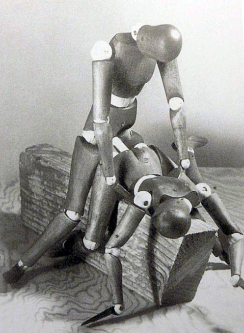
Real mature, there, Manny.

But as you can see, they have plenty of limitations. You can get the basics of a pose from them, but come on, nobody looks like that. Nobody has a honeydew melon for a shoulder or a Magneto helmet for a head. But necessity being the mother of invention, someone has at long last addressed this glaring deficiency in this most basic artist’s tool. Via RocketNews24, meet S.F.B.T.-3 (Special Full-action Body Type v.3).
 
art doll 2
 
art doll 3
 
art doll 4
 

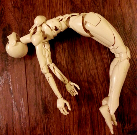
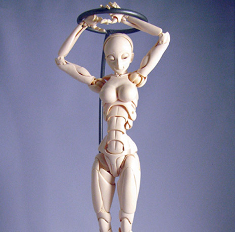
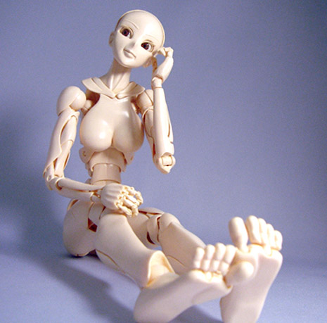
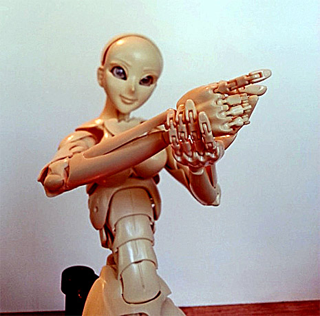
Ten years in the making, this girl has 80 moveable parts in her body, allowing for an unprecedented number of poses and anatomical designs. We take a look at the doll’s amazing details and see how it performs in some popular anime poses for the illustrator’s eye.

Manufactured in Japan by Dolk Station (the site’s in Japanese, sorry), it has articulated eyeballs and toes, for God’s sake.  Hans Bellmer may be bonering in his grave. There’s a write-up at CrabFu Artworks, and it’s a very favorable review. Understandably so. The attention to realism in the musculature is astonishing. The big downsides are that the slender female that looks like a much friendlier and somewhat more human version of the creature from Splice is the only body type available, and it’s priced at an ouch-worthy $300, and that’s before international shipping. But still, its mere existence is a start - there may be hope for my hand-eye coordination, yet.
 

Posted by Ron Kretsch
|
10.11.2013
10:43 am
|
DIY Ouija Board Coffee Table
10.02.2013
02:21 pm
Topics:
Tags:


When I first saw this DIY Ouija Board coffee table on Instructables, I wasn’t sure if I liked it or not. But the longer I looked, the more my Native American spirit guide, White Feather, convinced me that it was pretty rad…

Purpletheory writes:

I was inspired by old Ouija Board designs, which had wonderful curved typefaces and intricate illustrations. This was a fun project and cost me around $120 to complete, and requires only basic tools.

There are 11 steps involved if you wanna try making this on your own. All the instructions are here.


I noticed someone in the comments section followed Purpletheory’s step-by-step instructions and posted photos of the finished table. I think it turned out rather nicely.


Photo by insilvermoonlight.
 
With thanks to Michelle Ma Belle!

Posted by Tara McGinley
|
10.02.2013
02:21 pm
|
Slip slidin’ away: Derelict house transformed into an unusual work of public art
10.02.2013
01:17 pm
Topics:
Tags:

etagramxelakcinnehc.jpg
 
Artist Alex Chinneck has transformed a derelict house in Margate, England, to make it appear as if the frontage is slowly sliding down into the street.

The mid-19th-century town house was bought under compulsory purchase by Thanet District Council, who allowed artist Chinneck to create a public artwork.

Ten different companies donated materials to create the sloping facade at Godwin Road, Margate, which Chinneck has called “From the knees of my nose to the belly of my toes.”

London-based Chinneck said the idea was “self-initiated”:

“Initially I wanted to do it in London and I wrote to various people to try to get it off the ground. I was offered a huge number of properties, including a multi-storey car park, but I then decided I wanted to do it in Margate because I was excited by the arrival of the Turner Contemporary art gallery.

“I was aware of this idea that people have a choice whether or not they go through the doors of an art gallery, and often they don’t because they feel intimidated, so I think public art is important.

“I wanted to create something that captured humour, illusion and would be accessible to people from all types of different backgrounds. The response has been very positive.”

The building will be on display for a year, before it will be brought back into residential use. See more of artist Alex Chinneck’s work here.
 
kcennihcxela.jpg


H/T Rebecca Thompson!
 

Posted by Paul Gallagher
|
10.02.2013
01:17 pm
|
Pulp fiction: Classic works of literature with hard-boiled covers
09.30.2013
12:07 pm
Topics:
Tags:

xdhjgtessdub.jpg
 
Pulp! The Classics publishes classic works of literature with retro-pulp fiction covers. The books are redesigned and reset with the original texts, while the covers mash-up images of such Hollywood stars as Marilyn Monroe as Tess of the D’Ubervilles, and Humphrey Bogart as Heathcliffe on the cover of Wuthering Heights. Others include Colin Firth as D’Arcy in Pride and Prejudice, Alistair Sim as Scrooge, Ryan Gosling as Dorian Gray, and Alan Ladd/Robert Redford in The Great Gatsby.

The covers were painted by David Mann, who explains the story behind the covers on the Waterstone’s Blog. Here he explains his cover for Thomas Hardy’sTess of the D’Ubervilles:

This version is a second attempt. Watch what you say about the body because that’s my wife! No seriously, that’s my wife. The head is that of a famous Hollywood sex object from the olden days. There was going to be a rustic pipe dangling from her mouth in keeping with Tess’s agrarian credentials. However somebody at the New York Times (fancy!) made the suggestion of a bottle of whisky and a smattering of pain killers. No pain killers (leaning too much towards MM reference), but here’s the whiskey…. with a comedy straw. My personal favourite of the covers.

Follow Pulp! The Classics on Twitter
 
xdgdxpulppride.jpg
 

This cover was originally painted only as a sample for the publisher, but ended up being published on the first Pulp! The Classics. I used a photo of Colin Firth to paint from, as I felt that he’s still the definitive Mr Darcy for most people, the aim was to produce a Colin Firth-esque visage, not necessarily a bang-on portrait. I’ve subsequently been told it looks just like him/ nothing like him / a bit like him / just like myself!

 
xghfgatgrt.jpg
 

The cover is a pastiche of the old Alan Ladd movie poster (but you knew that right?). I’ve made the cross-reference to Robert Redford in the head area.

 
xlkxmasca
 

Another mash up, featuring Alistair Sim’s mug, but the body is courtesy of Googling ‘scrooge’ . My rendering features the threat of a possible ultra-violent outcome, for increased comic effect.

 
More pulp classic covers, after the jump…
 
Via Waterstone’s Blog
 

READ ON
Posted by Paul Gallagher
|
09.30.2013
12:07 pm
|
J. G. Ballard: A gallery of 1980s book covers
09.27.2013
11:51 am
Topics:
Tags:

0011jgbrisecrash.jpg
 
James Marsh designed these iconic covers for J. G. Ballard’s novels in 1985. His style, a mix of Surrealism/Futurism/Art Deco and Allen Jones-ish fetishism, certainly captured something of the themes contained in Ballard’s beautifully constructed fictions.

I had quite a few of these (and most of the David Pelham’s Penguins), as they were eminently collectible. Marsh also supplied memorable covers for Kurt Vonnegut, Doris Lessing, Ray Bradbury, Angela Carter and Lewis Carroll.

Amongst my favorites here are the instantly recognizable covers for Crash, Hello America and the beautiful one he did for The Crystal World. If you look closely, you will also note a small portrait of Ballard contained within the rear-view mirror for Concrete Island.

These images were uploaded by Wire-Frame, and there is a fabulous collection of other covers on his or her Flickr page. There is also a good article over at Ballardian on the artwork for Ballard’s novels.

More on James Marsh can be found here.
 
0022jgblowcraftameri.jpg
 
0033jgbconcislatroexhi.jpg
 
More images of the near future, after the jump…

READ ON
Posted by Paul Gallagher
|
09.27.2013
11:51 am
|
Ginormous Vincent Price ring
09.04.2013
04:46 pm
Topics:
Tags:


Just your average (ENORMOUS) sterling silver Vincent Price ring by artist Paul Komoda! Apparently only three of these rings were made. You can get more info about ‘em here

Previously on Dangerous Minds:

Vincent Price: A thrilling selection of his movie trailers

Vincent Price talks Art and Acting: A scintillating interview from 1974

Vincent Price & Peter Cushing: On location filming ‘Madhouse’ in 1974

Posted by Tara McGinley
|
09.04.2013
04:46 pm
|
Hell yeah: Amazingly detailed ‘Blade Runner’ action figures
08.29.2013
02:24 pm
Topics:
Tags:


Lord have mercy! These incredible 12” Blade Runner action figures are something else, aren’t they? Sculptor Scott Pettersen made these gorgeous pieces. Apparently each one takes take two to three months to make. I believe it, too! Just look at the detail in the clothes alone! My mind is simply blown!

“I work in wax when I sculpt and you can get a lot of detail in wax,” Pettersen says of the figures’ faces. “The finished heads are made out of resin — the kind I use is a clear, translucent color, so I cast it in a light color and then build onto that with different flesh tones. With all of them I use airbrush and there’s a lot of blending, a lot of thin, thin layers — I think on mass-produced figures all the paint is opaque and nothing is done with layers so it’s not as realistic.”

Read more about Pettersen’s Blade Runner action figures at Geek Exchange.


Posted by Tara McGinley
|
08.29.2013
02:24 pm
|
Berlin’s Ampelmännchen, symbol of ‘Ostalgie,’ is objectively superior to the competition
08.21.2013
11:52 am
Topics:
Tags:

Ampelmännchen
 
In Berlin, the little illuminated red and green fellows who signal the all-clear for pedestrians are a beloved and fiercely protected symbol of the city. The Ampelmännchen (little traffic light man) and his iconic two-dimensional graphic pantomime is one of the few remnants of the former German Democratic Republic that has not only been tolerated since 1989 but has risen to near-universal acceptance—even love.

Perhaps the closest American analogue is “Rich Uncle Pennybags,” otherwise known as the Monopoly Man. From a political perspective, it’s difficult to argue that East Berlin’s more humble everyman, with his stocky gait and functional fedora, isn’t a preferable symbol than the moustachio’d plutocrat—who after all has been known to commit transgressions serious enough to land himself in the clink.

The Ampelmännchen was invented by Karl Peglau, a “traffic psychologist” who sought to create a visual icon that would be appealing and comprehensible to young and elderly Germans alike. For many years East Germany had its Ampelmännchen, while West Germany made do with a sleeker, more generic homunculus. After the fall of the Berlin Wall in 1989, a lot of West German practices in signage and so forth, many of them endorsed by the EU, began to replace the old East German ways—and even the Ampelmännchen was threatened. The East Germans responded with a fierce public outcry to save the little dude, the force of which in 2005 even led to the adoption of the Ampelmännchen in West Berlin as well.

The widepsread impulse to save the Ampelmännchen became a primary exemplar of Ostalgie, a German portmanteau word combining the words for “nostalgia” and “East.” Another prominent example of Ostalgie is Wolfgang Becker’s engaging and internationally successful 2003 movie Good Bye Lenin!, which focused on the herculean efforts of a young man to create a kind of Potemkin GDR within the confines of the bedroom of his mother, recently awoken from a coma and therefore entirely unaware of the transformations of 1989.

As we move inexorably further from 1989, the Ampelmännchen’s political edge tends to dissipate, as his inherent distinctiveness and cuteness move to the foreground. Commenting on the “comeback” of the Ampelmännchen in 1997, its creator Peglau rather high-mindedly noted, “It is presumably their special, almost indescribable aura of human snugness and warmth, when humans are comfortably touched by this traffic symbol figure and find a piece of honest historical identification, giving the Ampelmännchen the right to represent a positive aspect of a failed social order.”

The latest news is that the Ampelmännchen offers not only cozy feelings of nostalgia—it also boasts superior design, in a purely objective sense. Psychologist Claudia Peschke and her team at Jacobs University in the German city of Bremen recently conducted tests involving both the Ampelmännchen and the traditional, more anodyne figure seen in the rest of Europe, including versions with the “wrong” color imposed. It turns out that people respond more to the shape, or function, of the symbol than they do to the color, and it also emerged that the Ampelmännchen outperformed the regular, svelte figure in terms of identifying whether it’s time to walk or stand still.

As noted, the Ampelmännchen’s status as a beloved totem of nostalgia has also (paradoxically) meant big business, as this nearly wordless video featuring some of the industrial production shows:


As with any good icon, there are few contexts in which it looks truly out of place. As proof, we offer this reworking of Psy’s “Gangnam Style” in which the Ampelmännchen and his politically correct counterpart, “Ampelfrau” (introduced in 2004), both do that galloping thing that swept the globe last year.
 
“Berlin Ampel Style”:

Posted by Martin Schneider
|
08.21.2013
11:52 am
|
Eccentric millionaire professor builds ‘country villa’ on top of 26-story apartment block
08.12.2013
01:42 pm
Topics:
Tags:

anihcesuoh.jpg
 
At first glance the compound is reminiscent of ThunderbirdsTracy Island or, the hideaway for a James Bond villain. The villa is situated 26-floors up, atop an apartment block in Beijing’s Haidian district, and was built by a man, known to his neighbors as “Professor Zhang.”

Professor Zhang originally purchased the penthouse apartment, before deciding to extend his property upwards onto the roof. His roof-top country villa includes rockeries, sculptures, trees and gardens, and has taken six-years to build. Its development has caused structural damage, water leakage to the building and considerable inconvenience to its tenants… gives a whole new meaning to the trickle down effect…
 
anihcesuoh2
 
The Beijing Morning News contacted Prof. Zhang, who claimed he was unconcerned what his neighbors thought.

“Since I dare to live here, I am not worried about complaints.”

When questioned about the noise, the eccentric home-owner replied:

“Famous people come to my place and sing. How can you stop them?”

In China, the rich can do as they please, and Professor Zhang is rich enough that he can openly flout any planning regulations. The other residents have asked the building’s management, local urban management officials and even the police to enforce planning regulation against Professor Zhang, but all have refused.


Via The Independent
 

Posted by Paul Gallagher
|
08.12.2013
01:42 pm
|
The Indefinable Leigh Bowery: Vintage documentary presented by Hugh Laurie
07.16.2013
04:57 pm
Topics:
Tags:

hgielyrewoblalala.jpg
 

“Fashion is a bit of a problem with me, because you have to appeal to too many people, and I like appealing to maybe one-or-two. Then, I like them to be interested in me, but never dare copy me.”

Leigh Bowery admitted he couldn’t tell the difference between a stage and a street. They were both platforms on which to present himself. But if asked he was asked to explain himself, that presented problem that Leigh thought best solved by being thankful he existed.

Well, of course, as Leigh gave much to be thankful for.

Though Leigh Bowery defied facile definition, he is best remembered as a fantastical character whose talent, energy and discipline gave others the chance to be themselves, and thus to be free.

In this episode of the London-centric TV show South of Watford, Hugh Laurie (yes, him off House) trails around with Leigh, and takes a close-up look at all of his different creations: from fashion and dance, to clubs and films. It includes interviews with dancer Michael Clark, director John Maybury and gender illusionist Alana Pellay.


The rest of Hugh Laurie in search of Leigh Bowery, after the jump…

READ ON
Posted by Paul Gallagher
|
07.16.2013
04:57 pm
|
Page 25 of 37 ‹ First  < 23 24 25 26 27 >  Last ›