FOLLOW US ON:
GET THE NEWSLETTER
CONTACT US
Dog sculptures made out of used bicycle parts
01.27.2014
02:41 pm
Topics:
Tags:


Israeli artist Nirit Levav makes these rather peculiar life-size dog sculptures from recycled bicycle parts. Her series is called “Unchained.” The canines are mostly made from old bike chains, gear parts, saddles and pedals. 

You can view more of “Unchained” at her Etsy shop. If you’re curious how much these puppies (see what I did there?) cost… they’re a pretty penny to say the least.


With thanks to Gail Potocki!

Posted by Tara McGinley
|
01.27.2014
02:41 pm
|
Terrifying, vivid portents of doom from 16th-century Germany
01.24.2014
04:05 pm
Topics:
Tags:

Book of Miracles
 
Wow! Apparently, someone in Bavaria a very, very long time ago wanted to scare the living daylights out of a bunch of people. These astonishing gouache and watercolor paintings, commissioned by an unknown patron around 1552 in Augsburg, Germany, depict flying dragons, two-headed beasts, armored cupids (!), fire and brimstone, the whole kit and caboodle of the End of Days. They were discovered quite recently and sold at auction a mere six years ago.

I wish I could read these; I can understand German, but centuries-old portentous religious texts expose the limits of my paltry fluency. Fortunately, we have Joshua P. Waterman, who helped compile 169 (!) of these phantasmagorical images for the recently published Book of Miracles, to guide us:
 

The unidentified patron who commissioned this manuscript wanted to create a stunning visual experience…. The Protestant viewer would have reflected on the greater significance of these wonders: Why are there dragons in the sky? Why does it rain blood? Why are there three suns overhead? We know from contemporary sources that the answer was general: Things are wrong in the world. Repent and prepare for the end times, which are possibly now.

They implied moral improvement could mark a path not only to a better existence on earth, but also eternal life. Unfortunately, the catastrophes in the book—earthquakes, floods, storms, fires, and volcanic eruptions—are still all too relevant. Let’s hope instead that 2014 brings harmless wonders such as battles of celestial armies, which was the 16th-century interpretation of northern lights, and maybe some sword-wielding comets.


The Taschen book must be quite an impressive volume: the list price is $150, but at Amazon it’s a veritable steal at $101.12. Me, I’ll wait for the inevitable HBO series.
 
Book of Miracles
 
Book of Miracles
 
Book of Miracles
 
Book of Miracles
 
More after the jump…

READ ON
Posted by Martin Schneider
|
01.24.2014
04:05 pm
|
The revolutionary Soviet silent-era film posters of the Sternberg Brothers
01.23.2014
12:29 pm
Topics:
Tags:


“Of all arts, for us cinema is the most important.”—Lenin, 1919

An exhibition of Soviet silent-era film posters now underway at London’s Gallery for Russian Arts and Design features, among many treasures, a fair few of the important works of the design team of brothers Vladimir and Georgii Stenberg. Far from household names, it’s true, but their place in art history is difficult to deny. Their success was somewhat serendipitous—it happened that their Dada-inspired method of found image manipulation dovetailed perfectly with the conceits and priorities of the Constructivist movement that was dominating Soviet graphics of their time. They enjoyed a nearly decade-long run of superb work that ended only with Georgii’s untimely death in a 1933 traffic accident. I quote at length here from curator Christopher Mount’s essay in the exhibition catalog of their 1997 MoMA retrospective:

The 1920s and early 1930s were a revolutionary period for the graphic arts throughout Europe. A drastic change took place in the way graphic designers worked that was a direct consequence of experimentation in both the fine and the applied arts. Not only did the formal vocabulary of graphic design change, but also the designer’s perception of self. The concept of the designer as “constructor”—or, as the Dadaist Raoul Hausmann preferred, “monteur” (mechanic or engineer)—marked a paradigmatic shift within the field, from an essentially illustrative approach to one of assemblage and nonlinear narrativity. This new idea of assembling preexisting images, primarily photographs, into something new freed design from its previous dependence on realism. The subsequent use of collage—a defining element of modern graphic design—enabled the graphic arts to become increasingly nonobjective in character.

In Russia, these new artist-engineers were attracted to the functional arts by political ideology. The avant-gardists’ rejection of the fine arts, deemed useless in a new Communist society, in favor of “art for use” in the service of the state, was key in the evolution of the poster. Advertising was now a morally superior occupation with ramifications for the new society; as such, it began to attract those outside the usual illustrative or painterly backgrounds—sculptors, architects, photographers—who brought new ideas and techniques to the field.

Vladimir and Georgii Stenberg were prominent members of this group, which was centered in Moscow and active throughout the 1920s and early 1930s. The Stenberg brothers produced a large body of work in a multiplicity of mediums, initially achieving renown as Constructivist sculptors and later working as successful theatrical designers, architects, and draftsmen; in addition, they completed design commissions that ranged from railway cars to women’s shoes. Their most significant accomplishment, however, was in the field of graphic design, specifically, the advertising posters they created for the newly burgeoning cinema in Soviet Russia.

These works merged two of the most important agitational tools available to the new Communist regime: cinema and the graphic arts. Both were endorsed by the state, and flourished in the first fifteen years of Bolshevik rule. In a country where illiteracy was endemic, film played a critical role in the conversion of the masses to the new social order. Graphic design, particularly as applied in the political placard, was a highly useful instrument for agitation, as it was both direct and economical. The symbiotic relationship of the cinema and the graphic arts would result in a revolutionary new art form: the film poster.


More after the jump…

READ ON
Posted by Ron Kretsch
|
01.23.2014
12:29 pm
|
Psychedelic blizzard (Too much of that snow white?)
01.22.2014
01:30 pm
Topics:
Tags:


Bmaffitt on Imgur posted these triptastic images of falling snow in NYC. Bmaffitt says he/she “pointed a video projector out the window” onto falling snow then snapped some gorgeous pictures.


More images after the jump…
 

READ ON
Posted by Tara McGinley
|
01.22.2014
01:30 pm
|
What if ‘Game of Thrones’ were set in feudal Japan?
01.22.2014
08:21 am
Topics:
Tags:

Feudal Japan
“Battle of the Trident”—Seiji writes: “This is the iconic duel between Robert Baratheon and Rhaegar Targaryen that preceded the series by seventeen years. Instead of a war hammer, Robert wields a Kanabō, a club-like samurai bludgeoning weapon. His antlered helmet is inspired by the famous helmet of the warlord Honda Tadakatsu.”


What would “Westeros” be in Japanese? “Wesatarosu”? (Apologies if that’s way off.) At any rate, That’s the question prompted by these marvelous artworks by imgur user seiji, who is clearly a fan of the HBO series/endless series of novels by George R. R. Martin as well as of the distinctive visual steez of 18th-century Japanese woodblock prints.

As Seiji commented on his imgur page:

“I thought it would be interesting to draw a retelling of the [A Song of Ice and Fire] universe as if it took place in feudal-era Japan. These drawings are inspired by the Ukiyo-e style.”

Now I’m imagining Toshiro Mifune occupying the diminutive shoes of Peter Dinklage as Tyrion Lannister. Nah, can’t see it without Dinklage….
 
Feudal Japan
“Tyrion at the Eyrie”—“Catelyn Stark, her uncle Brynden Tully, and a dispatch of the Knights of the Vale journey to the Eyrie while transporting their captive, Tyrion Lannister. Tyrion is dressed in the robes of a nobleman.”
 
Feudal Japan
“Bran Stark and Hodor Journey North”—“Weirwood lore shares some interesting similarities to Shinto practices, so I drew a shimenawa (prayer rope) around the tree trunk.”
 
Feudal Japan
“Jon Snow Duels Qhorin Halfhand as Wildlings Look On”—“The wildlings are dressed like the Ainu, who are the indigenous people of northern Japan. The Ainu are thought to be the descendants of the first inhabitants of the islands, and throughout history they have lived independently in the cold far north, beyond the grasp of the Emperor.”
 
Feudal Japan
“The Execution of Eddard Stark”—“Instead of having Ilyn Payne simply execute Ned Stark, an amused Joffrey orders Ned to commit seppuku. Ilyn is on hand to perform the kaishaku, or ritual decapitation to quicken the death. The paper in front of Ned is a death poem, which a samurai would traditionally write before ending his life.”
 
Feudal Japan
“Mother of Dragons”—“Danaerys wears traditional Heian-period royal clothing and is seated on the Mongolian Steppes, a fitting analogy for the Dothraki Sea, far from Westeros.”
 
via RocketNews24

Posted by Martin Schneider
|
01.22.2014
08:21 am
|
3-D printing, T-shirts and cufflinks: The surreal world of sonogram mementos
01.21.2014
10:52 am
Topics:
Tags:

3-D fetus
 
For the record, I like babies. I think self-proclaimed baby-haters are usually just acting out bogus irritation so they can feel important by taking umbrage with someone who can’t fight back. And I’m not one of those self-righteous people who constantly feels the need to declare (a little too forcefully, and generally apropos of nothing), that new parents can be weird. Of course they can be weird—they’re sleep-deprived and incredibly emotional and their lives suddenly revolve around a tiny living creature totally dependant on them. It’s a weird situation, and I think we can all stand to give parental weirdness a little break now and then.

However, I will always find the obsession with sonograms completely weird. That shit is notably, exceptionally, particularly weird. It’s not the sonogram itself, nor the idea that a parent might get excited about it—it’s the conflation of sonogram “photography” with actual baby pictures.  Sonogram pictures are “photography” only in the most literal way, and a sonogram print-out is no more a “baby picture” than a colonoscopy photo is erotica, and yet there is this reverence for that blurry little photo, which almost never presents anything even halfway resembling an actual baby. And then there’s that 3-D ultrasound imaging—more identifiable, I suppose, but far grosser-looking.

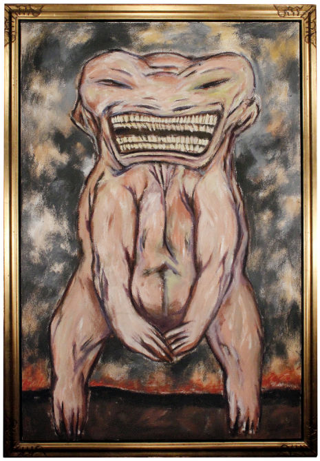
But in the spirit of embracing all things that creep me out, I have decided to grace you, dear readers, with a short list of some of my favorite ways people memorialize their ultrasounds, starting with the delightful little hellspawn you see at the top of the screen.

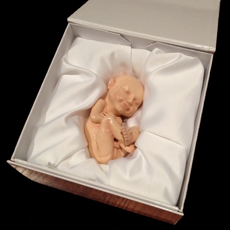
Sonograms themselves are a product of fairly recent technology, meaning we are at the dawn of a new baby-era. But forget 3-D imaging, for $600, you can 3-D print a life-size model your fetus! Their tagline is “Imagine holding your baby before he or she is born,” (No thank you! Before they are born, they belong on the inside!) and they come in a satin-lined box. You know what other kind of box is usually satin-lined? A coffin. Coffins are lined with satin.

I’m not a Luddite by any means, but one does have to wonder if this micro-observational tendency will escalate further as the technology becomes available. Will we someday regularly witness fertilization, perhaps watching sperm swim across a high-definition screen? Will we root for the little guys like they’re pro athletes? Radical feminist Shulamith Firestone envisioned the escalation of “test-tube” babies to the advent of robotic wombs—perhaps we’ll view fetal formation entirely outside the body! Honestly, I’d find that all preferable to dead fetus doll in a coffin, but let’s move on to the lower-tech options.
 
sonogram portrait
 
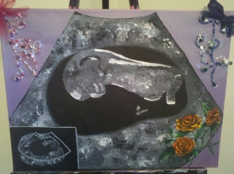
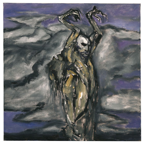
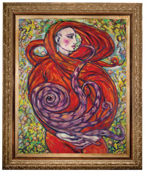
Custom sonogram portraiture posed sort of an aesthetic quandary for me. Which feels more uncanny—the chintzy, sentimental folk art sonogram painting, or the stylistically mature product of obvious training?
 
sonogram portrait
 
I’m going with the second one, if only because the store-front’s pitch leads with death:

Every life is a miracle to be celebrated and remembered. My Miracle Ultrasound Paintings were inspired by the memory of our niece who’s [sic] life ended just three short days after her birth. We were left with her ultrasound picture, one of our first and most precious memories.

While I make a point to avoid criticizing anyone’s mourning rituals, I would say, of the women I know, very few would be inclined to make a baby-related purchase from a vendor who begins their sales pitch with an anecdote about the death of a baby. Then again, very few of the women I know would invest $100 in custom sonogram portraiture. I’d wager the artist is addressing a very niche target audience.
 
sonogram t-shirt
 
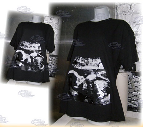
This is simply too literal for my tastes. Much like those leggings that simulate the appearance of human muscles, I’ve just never been a fan of any clothing that brings to mind the removal of skin. I once had a friend who had her fallopian tubes tattooed over their location and it was a semi-distracting reminder of her guts. The difference is, of course, that she got the tattoo specifically to embrace the discomfort surrounding reproduction and our fundamental existence as, to quote Vonnegut, “meat machines.” This T-shirt, on the other hand, is supposed to be “cute.” Ah the subjectivity of beauty!
 
cake topper
 
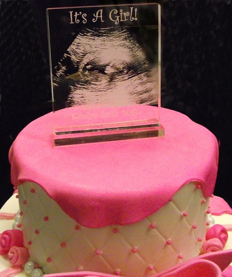
I would not eat a cake with a sonogram cake topper. The visceral reminder of a fetus generally kills my appetite, and frankly, I question the motives of anyone who gets too hungry around fetal imagery. There’s also a store that prints your sonogram on water bottle labels. Drinking the fluid from a container with a fetus printed on it has got to be some kind of Freudian cannibalism thing, right?
 
cufflinks
 
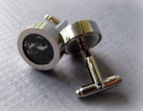
I saved this one for last, mainly because totally I dig it. I totally dig sonogram cufflinks. They’re functional. They’re subtle and discreet—they don’t scream to the unwilling world, “hey, look at my fetus.” The idea is morbid, but quietly so, and can therefore be executed with some degree of self-awareness. Plus, I can imagine totally going through a Patti Smith-style post-baby menswear phase that would necessitate the use of germane cufflinks. Most importantly though, it’s a disarming object of subversive style, and it can be used to creep out and embarrass your children someday—I mean, why else would you even have kids?

Posted by Amber Frost
|
01.21.2014
10:52 am
|
Talking sex with Andy and Bill: William S. Burroughs and Andy Warhol discuss ‘the first time’
01.21.2014
08:53 am
Topics:
Tags:


Two cultural icons of the twentieth century, William S. Burroughs and Andy Warhol, enjoying dinner and amiably discussing the first time they had sex with another man—whatever could be more salubrious? Horses are part of the conversation, too. Read on in the excerpt from Victor Bockris’ classic book, With William Burroughs, A Report from the Bunker
 

Burroughs: Cocteau had this party trick that he would pull. He would lie down, take off his clothes, and come spontaneously. Could do that even in his fifties. He’d lie down there and his cock would start throbbing and he’d go off. It was some film trick that he had.

Bockris: How’d he pull that off? Have you ever been able to come through total mental—

Burroughs: Oh, I have indeed. I’ve done it many times. It’s just a matter of getting the sexual image so vivid that you come.

Warhol: How old were you when you first had sex?

Burroughs: Sixteen. Just boarding school at Los Alamos Ranch School where they later made the atom bomb.

Warhol: With who?

Burroughs: With this boy in the next bunk.

Warhol: What did he do?

Burroughs: Mutual masturbation. But during the war this school, which was up on the mesa there thirty-seven miles north of Santa Fe, was taken over by the army. That’s where they made the atom bomb. Oppenheimer [the scientist who invented the bomb] had gone out there for his health and he was staying at a dude ranch near this place and said, “Well, this is the ideal place.” It seems so right and appropriate somehow that I should have gone to school there. Los Alamos Ranch School was one of those boarding schools where everyone rode a horse. Fucking horses, I hate ‘em. I had sinus trouble and I’d been going to New Mexico for my health during the summer vacations and then my family contacted the director, A. J. Connell, who was a Unitarian and believed very much in positive thinking, and I went there for two years. This took place on a sleeping porch, 1929.

Warhol: How great! Was the sex really like an explosion?

Burroughs: No no … I don’t remember it was so long ago.

Warhol: I think I was twenty-five when I first had sex, but the first time I knew about sex was under the stairs in Northside, Pittsburgh, and they made this funny kid suck this boy off. I never understood what it meant…

Burroughs: Made him do what?

Warhol: Suck this boy off, but I didn’t know what it meant, I was just sitting there watching when I was five years old. How did you get this kid to do it, or did he do it to you?

Burroughs: Oh I don’t know, sort of a lot of talking back and forth…

Here’s a remarkable clip of the pair, this time chatting about, er, chicken fried steak—in the very room in which Arthur Clarke wrote 2001: A Space Odyssey! Phew, so much history! The footage is from an episode of the BBC documentary program Arena about the Hotel Chelsea and there are a couple of odd narrative elements to it, but the clip mercifully ends with Nico singing a haunting rendition of “Chelsea Girls”—in the Chelsea Hotel itself, one wonders if it was in Room 506…..
 

Posted by Martin Schneider
|
01.21.2014
08:53 am
|
The hilariously deadpan TV commercials of Chris Burden
01.20.2014
02:47 pm
Topics:
Tags:

Chris Burden, artist
Chris Burden, “Full Financial Disclosure”
 
If you were flipping through the TV channels (using your hand to adjust the dial on the set, most likely) in Los Angeles or New York in the mid-1970s, it’s possible that you caught some unusual commercials by an artist of the caliber of Michelangelo or Rembrandt. I refer to Chris Burden, and I know he belongs in the class of Michelangelo and Rembrandt because one of the commercials told me so—and commercials always tell the truth.

The New Museum in New York recently mounted “Extreme Measures,” an expansive retrospective of Burden’s work; it ended a week ago, but the exhibition is “partially on view through 1/26/14.” Burden is most famous for two artistic stunts: 1971’s “Shoot,” in which he enlisted a friend to shoot him in the arm, and 1974’s “Trans-Fixed,” in which he had himself nailed to a Volkswagen, Jesus-style. “Trans-Fixed” inspired a lyric in David Bowie’s “Joe the Lion” from his 1977 album Heroes: “Joe the lion / Went to the bar / A couple of drinks on the house an’ he said / ‘Tell you who you are if you nail me to my car.’”

A good deal of Burden’s work is conceptual and yet completely sticky: it’s not just dumb luck that he ended up inspiring a line in a Bowie song. In that way he reminds me a bit of Komar and Melamid. In the mid-1970s Burden got interested in television, specifically “the omnipotent stranglehold of the airwaves that broadcast television held.”
 
Paid for by Chris Burden artist
 
In “Poem for L.A.,” which aired in June 1975, Burden intones to the camera “Science has failed. Heat is Life. Time kills,” as the words appear on the screen. To fill the required 30 seconds, you just see the identical footage three times. My favorite is probably “Chris Burden Promo,” in which the six names “Leonardo Da Vinci / Michelangelo / Rembrandt / Vincent Van Gogh / Pablo Picasso / Chris Burden” blandly rocket towards the viewer in the manner of an aggressive movie title or a “Pow!!!” sound effect from the TV series Batman with Adam West. That one was shown during the first season of Saturday Night Live, in fact. According to the dates furnished by Burden (May 1976), the only shows it could have appeared on (should you be scraping your memory banks) were hosted by Madeline Kahn and Dyan Cannon. The other five names were chosen as the result of a nationwide survey establishing the most well-known artists to the American public.

Equally witty/conceptual was “Full Financial Disclosure,” which ran in the Los Angeles area in 1977; in this one Burden sits at a desk in front of the American flag and presents a summary of his 1976 earnings. The concept here wasn’t quite as random as the others; indeed, it could be seen as a legitimate commercial intended to promote a show he had at the Baum Silverman Gallery in which his own cancelled bank checks were part of the artworks.

Amusingly, in this YouTube clip, presumably generated by Burden, the content runs about three and a half minutes and then repeats a couple more times, similar to the commercials in which he was obliged to repeat the content to fill the time of a standard commercial.
 

Posted by Martin Schneider
|
01.20.2014
02:47 pm
|
Hellraiser: The Macabre Art of Horror Master Clive Barker
01.17.2014
09:40 pm
Topics:
Tags:


“I think of myself as somebody who is reporting from a world of dreams.”
-Clive Barker

Although primarily known as an author of dark fantasy, and as the creator of the “Hellraiser” and “Candyman” horror movie franchises, Clive Barker is also a prolific visual artist. Barker will often paint a character into existence before fleshing it out on the page:

“I’m painting these pictures in the expectation that… interesting, strange characters and landscapes will come into my mind and into my mind’s eye and appear on the canvas through the brush. There is something willfully strange about this process—that you stand back at the end of a night’s work and you look at something and you say, ‘Where did that come from?’ I mean, I’m not the only artist who does that - lots of artists do that, I know. And it’s been wonderful because if I had created Abarat from words—if I’d written Abarat and then illustrated it… it would not be anything like as rich or as complex or as contradictory a world as it is. Because this is a world which has been created from dream visions…  What I’m doing is finding stories that match the shape of my dreams.”

This weekend you can see the art of Clive Barker at LA Art at the Century Guild booth #1216 . You can pre-order the upcoming hardcover Clive Barker art book here.


Posted by Tara McGinley
|
01.17.2014
09:40 pm
|
‘Beauty’: Classical art animated in stunning short film
01.17.2014
10:58 am
Topics:
Tags:


The paintings of the Old Masters come to life in this wonderfully animated video by Rino Stefano Tagliafierro. Imagine a virtual reality version of this in 3-D. (They’re getting there, I tested some pretty amazing VR goggles recently)

I can’t get enough of this jaw-dropping gorgeousness. That seems to be the point.


Via Nerdcore

Posted by Tara McGinley
|
01.17.2014
10:58 am
|
Page 195 of 380 ‹ First  < 193 194 195 196 197 >  Last ›