FOLLOW US ON:
GET THE NEWSLETTER
CONTACT US
Born To Be Posthumous: The Eccentric Life and Mysterious Genius of Edward Gorey
01.10.2019
08:15 am
Topics:
Tags:


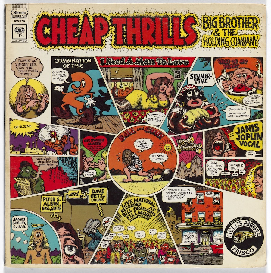
Cultural critic Mark Dery, whose erudite essays have appeared in the pages of the Atlantic Monthly, Washington Post, Village Voice and his own collections, The Pyrotechnic Insanitarium: American Culture on the Brink and Escape Velocity: Cyberculture at the End of the Century, returns with his remarkable biography of the comically sinister author and illustrator Edward Gorey. This delightful combination of biographer and subject has been praised in the New York Times, the New Yorker, at NPR Vogue and other prestige outlets. We’re pleased to present a short excerpt from Born To Be Posthumous: The Eccentric Life and Mysterious Genius of Edward Gorey (Little, Brown) at Dangerous Minds.

In the following excerpt from my just-published biography, Born To Be Posthumous: The Eccentric Life and Mysterious Genius of Edward Gorey (Little, Brown), I explore Gorey’s role, alongside Seuss and Sendak, in the postwar revolution in children’s books, a gleeful insurrection that killed off those insufferable, simpering Goody-Goodies, Dick and Jane, for good. In so doing, Gorey and other writer-illustrators reshaped American notions of kids lit and even childhood itself, making way for a more honest acceptance of the facts of life: divorce, death, racial tensions, queer desire. As well, the new wave slyly satirized not only the mainstream culture of the ‘50s and ‘60s but the conventions of children’s literature itself, many of which dated back to the cautionary tales and nursery-rhyme sermonizing of the Victorian era, when the children’s book as we know it was born. Whether Gorey’s work really was kiddie fare or arsenical treats for adults ironically disguised as picture books is still up for debate. Regardless, his influence is stronger than ever, identifiable at a glance in the YA novels of Lemony Snicket (A Series of Unfortunate Events) and Ransom Riggs (Miss Peregrine’s Home for Peculiar Children), the twee-goth movies of Tim Burton, and somber memoirs of “the miseries of childhood,” as Gorey put it, such as Alison Bechdel’s graphic novel Fun Home.

— Mark Dery

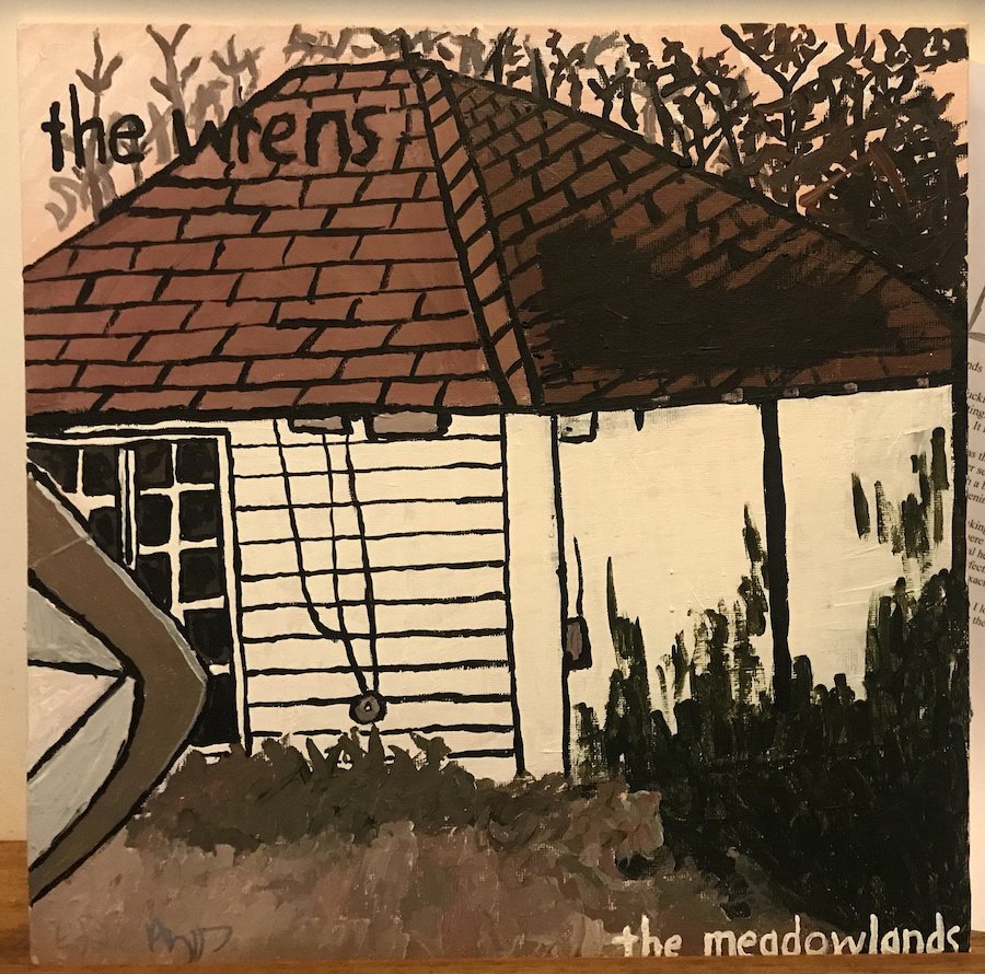
Nineteen-sixty saw the publication of Edward Gorey’s sixth book, The Fatal Lozenge, by the New York publisher Ivan Obolensky. Subtitled An Alphabet, The Fatal Lozenge was his first foray into the ABC genre. He would go on to perform variations on the abecedarium theme in six books, one of which, The Gashlycrumb Tinies, would become his best-known title. [They are, in chronological order, The Fatal Lozenge, The Gashlycrumb Tinies, The Utter Zoo, The Chinese Obelisks, The Glorious Nosebleed, and The Eclectic Abecedarium.]

The alphabet book is one of the oldest forms of children’s literature. Rhyming couplets, illustrated by woodcuts, aided memorization. Early examples wedded ABCs and Calvinist catechism. The New England Primer, ubiquitous in late-seventeenth-century America, is typical of the genre:

A In Adam’s Fall We sinnèd all.
B Heaven to find; The Bible Mind.
C Christ crucify’d For sinners dy’d.
D The Deluge drown’d The Earth around.

Gorey’s interest in the alphabet book was undoubtedly a byproduct of his interest in Edward Lear, well known for loopy abecedaria like “Nonsense Alphabet” (1845) (“P was a pig, / Who was not very big; / But his tail was too curly, / And that made him surly”). His library reveals a longstanding fascination with the form, with a predictable focus on the nineteenth century. On Gorey’s bookshelves, we find A Moral Alphabet (1899) by Hilaire Belloc, A Comic Alphabet (1836) by George Cruikshank, a Dover facsimile of The Adventures of A, Apple Pie, Who Was Cut to Pieces and Eaten by Twenty Six Young Ladies and Gentlemen with Whom All Little People Ought to Be Acquainted (circa 1835), and of course Lear in abundance. 

At the same time, he couldn’t have been oblivious, as an illustrator working in commercial book publishing, to the waves Dr. Seuss was making in kid lit. Alphabet books were playing an important part in reshaping American ideas about childhood. Consider Seuss’s On Beyond Zebra! (1955), whose boy narrator dreams up a new alphabet for kids who think outside the Little Golden box (“In the places I go there are things that I see / That I never could spell if I stopped with the Z”). Or Maurice Sendak’s Alligators All Around (1962), in which “shockingly spoiled” reptilian protagonists throw tantrums and juggle jelly beans with abandon. These and other unconventional abecedaria celebrate Romper Room radicals who flout the rules. Seen in their cultural and historical context, they look like premonitions of the hippie era, with its worship of nonconformity and its elevation of the child to a cultural icon, not to mention its stoner humor and acid-soaked song lyrics.

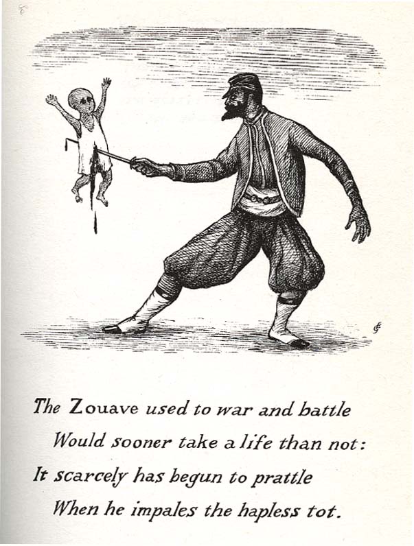
Though he seemed barely to notice the counterculture of the ’60s, beyond the Beatles, Gorey was in his own quietly perverse way more iconoclastic than Seuss or Sendak. In The Fatal Lozenge, as in The Listing Attic, his earlier book of macabre limericks, his combination of a children’s genre (in this case, the ABC book) with dark subject matter and black comedy is both mordantly funny and unsettling, especially when he crosses the line, as he occasionally does, into the “sick humor” of contemporaries such as the cartoonist Gahan Wilson. When an interviewer mentioned to Sendak that the grisly drawing of an infant skewered on the point of a Zouave’s sword in The Fatal Lozenge was the moment when Gorey went “down the road of no return as far as publishers were concerned,” Sendak quipped, “That’s why he was so loved. There’s never enough dead babies for us.”


The literary theorist George R. Bodmer places Gorey’s ironic, sardonic ABCs in the context of a postwar pushback, among children’s authors such as Seuss and Sendak, “against the limits of imagination, or the limits the outside world would impose on imagination . . .” In his essay “The Post-Modern Alphabet: Extending the Limits of the Contemporary Alphabet Book, from Seuss to Gorey,” Bodmer calls Gorey’s “anti-alphabets” a “sarcastic rebellion against a view of childhood that is sunny, idyllic, and instructive.” Gorey’s mock-moralistic tone satirizes received wisdom about the benignity of parents and other authority figures: a magnate waiting for his limousine “ponders further child-enslavement / And other projects still more mean”; two little children quail in terror at the sight of their towering, bearded uncle, for they “know that at his leisure / He plans to have them come to harm.” Yet Gorey also punctures the myth that children are little angels: a baby, “lying meek and quiet” on a bearskin rug, “Has dreams about rampage and riot / And will grow up to be a thug.” (The rug’s enormous, snarling head, with its bared fangs, is an omen of mayhem to come.)

Talking about The Fatal Lozenge in 1977, Gorey said, “This was a very early book and at that date I was not above trying to shock everyone a bit.” In that sense, his sixth book is so similar to his second that it might as well be called Son of Listing Attic. A good part of the book consists of the usual droll riffing on stock characters and situations borrowed from gothic novels, penny dreadfuls, Conan Doyle, and Dickens.

But just as clearly, there’s more going on in The Fatal Lozenge than enfant terrible-ism (“trying to shock everyone a bit”) or the larger trends identified by Bodmer: the bohemian backlash against the suffocating normalcy of the Eisenhower era and the growing resistance, led by Drs. Spock and Seuss, to outdated, repressive ideas about childhood and parenting. The recurrence of themes closer to home—the beastliness of babies, the depravity of the clergy (a nun is “fearfully bedevilled”), the furtiveness and shamefulness of homosexual desire, here associated with child molestation and even more monstrous perversions (“The Proctor buys a pupil ices, / And hopes the boy will not resist / When he attempts to practice vices / Few people even know exist”)—makes us feel, at times, as if we’re eavesdropping on a psychotherapy session. That these disconcerting images come to us in the reassuring wrappings of a children’s book makes The Fatal Lozenge even more disquieting.

It’s precisely that insinuating knowingness that Sendak loved about Gorey’s little books. “They all had what appealed to me so much—aside from the graphics and the writing—[which] was the wicked sexual ambiguity that ran through all of it.” Even Gorey’s artlessly brilliant covers for Anchor Books, Doubleday’s tasteful paperback line, exhibited an arch wit, Sendal thought. “I remember a jacket he did for…a novel by Melville, Redburn. And the jacket summed up completely the kind of confused homosexuality of that novel….So erotic and yet so simple. You can look at it any way you like. . . . [H]e buried a lot of information about himself in the art.”
 
More after the jump…

READ ON
Posted by Richard Metzger
|
01.10.2019
08:15 am
|
‘You didn’t want to support that guy!’ R. Crumb turns down Mick Jagger
01.08.2019
10:07 am
Topics:
Tags:


Born in 1943, Robert Dennis Crumb is likely the most renowned underground comics artist and arguably the most adept comix practitioner of all time. As hyperbolic a figure as the Boomer generation ever produced, Crumb famously emerged out of a family full of nut cases to become a figure out of time, clinging to his beloved jazz records from the World War I era while loudly disdaining much of modern life and spontaneously projecting his wiry frame onto the lap of whatever healthy-buttocked woman is in the vicinity.

Crumb’s singular cover for Big Brother and the Holding Company represents something of an exception to Crumb’s distaste for the most beloved artifacts of his own generation. It was inarguably Crumb’s most successful foray into the rock milieu, but what is rather less known as that the Rolling Stones also wanted Crumb to do a cover for them, but he turned them down flat. 


In an amusing interview conducted by Larry Jaffee sometime during the George W. Bush administration, Crumb amusingly discourses on the commission to do the artwork for Cheap Thrills. He didn’t dig the music, but he did the cover because he liked Janis Joplin as a person, and she asked him to do it. He earned a cool six hundred bucks for the art.

When Mick Jagger came a-callin’, though, Crumb said no way. In the Jaffee interview, he says that he didn’t want to “endorse” the music of the Stones, because he found all of the guys in the band “irritating.” Crumb even candidly cops to a little jealousy with respect to Jagger’s sexual appeal. “All the girls liked it, girls didn’t like cartoonists, they liked Mick Jagger.... You didn’t want to support that guy!”

And then, of course, comes Crumb’s trademark chuckle.


Posted by Martin Schneider
|
01.08.2019
10:07 am
|
‘Qaeda, Quality, Question, Quickly, Quickly, Quiet’: Learning the alphabet with George W. Bush
01.03.2019
08:33 am
Topics:
Tags:


I remember watching George W. Bush deliver the State of the Union address on January 29, 2002, on the TV of a tiny barroom in the East Bay. No cocktail was strong enough. This was the speech that denounced the “axis of evil,” a coinage of Bush speechwriter David Frum, who has lately been rehabilitated as a true friend of democracy and stalwart defender of the realm. Perhaps when the professional eulogists are finished carving the likenesses of Poppy and W. into Mount Rushmore, they can squeeze in this august son of Canada, who believes the problem with the Iraq War was the people of Iraq.

With every patriot face now awash in tears for these old-fashioned Republicans, the kind who could, when the occasion demanded it, speak in complete sentences, let us remember “Qaeda, Quality, Question, Quickly, Quickly, Quiet,” the artist Lenka Clayton‘s alphabetized cut of the address, which blasted those sentences to rubble and sifted the bits. Marc Campbell posted this vid on DM many moons ago, but it’s worth revisiting now. On one hand, it is a cognition-destroying mindhammer that smashes illusions about the stimulus-response theory of government. On the other, even alphabetically reordered and condensed to 18 minutes, W.‘s oratory sounds like Pericles next to the barnyard squawks and grunts that will comprise the phonemic index of the 2019 State of the Union address, which I understand will be subtitled “A Case Study in Lycanthropy.”
 

Detail from the soundtrack LP cover

If you like the movie, you’ll love the soundtrack LP (side one: “A - My,” side two: “Nation - Zero”) and accompanying flip-book.
 

via Reddit

Posted by Oliver Hall
|
01.03.2019
08:33 am
|
Gods and Monsters: The haunting artwork of Shiki Taira
01.02.2019
07:16 am
Topics:
Tags:

01taira.jpg
 
Room #3110 of the Park Hotel, Tokyo, has a large plate glass window with an impressive view of Mount Fuji. The view is one of the reasons for booking the room. The other, more important reason, is room #3110 has been designed and painted by artist Shiki Taira. It is room #30 in the hotel’s series of apartments designed by different Japanese artists. The hotel management’s intent is to offer guests a “fresh look at art”

To touch the beauty of the soul, surely a hotel which refreshes mind and body, and where more time is available for relaxation than in art museums, is an ideal venue for such an experience.

Taira’s room #3110 features a variety of Japanese gods flying across the walls, which when night falls, their reflection makes it appear as if these gods are flying over Mount Fuji. Taira adds:

I wanted to create a room where guests will be surrounded by auspicious Japanese motifs…They are lucky Japanese motifs such as the Fujin (Wind God), Raijin (Thunder God), Shichifukujin (Seven Lucky Gods) and Ichimoku-sama (One-Eyed God)...

 
08taira.jpg
Part of room #3110 designed and painted by Shiki Taira.
 
Born in Tokyo in 1990, Taira studied at the Department of Design, Tokyo University of Arts, where she graduated in Fine Art from the Department of Drawing and Decorative Art in 2013. Taira first exhibited her work at the 0+Ten Gallery, Tokyo, with further shows quickly following at the Sato Museum of Art, the ShinPA 10th, Gallery Art Morimoto, and the Seizan Gallery. She has been described as “a cutting edge artist” who is known for “her unique yōkai world that unfolds on silk with excellent brush works.”

Taira’s paintings incorporate traditional yōkai—the gods, ghosts, shape-shifters, and monsters from Japanese mythology who live in the half-light, the twilight area between between known and unknown, who prey on the unwitting and the lost—and reimagines them in a contemporary setting. Taira has said of her work that she likes to deform an individual’s distinctive features which then allows her to bring out images of the phantoms underneath. In Japan, she says:

We have an idea the gods dwell in various creatures and nature traditionally in Japan. Phantom is a part of these ideas and painted and printed in subject of Ukiyo-e in Edo-period by Hokusai Katsushika and others.

Her work suggests our lives are haunted by strange obsessions and superstitions which can sometimes shape our actions.
 
02taira.jpg
 
04taira.jpg
 
06taira.jpg
 
More beautiful, ghostly artworks after the jump…
 

READ ON
Posted by Paul Gallagher
|
01.02.2019
07:16 am
|
Eric Stanton & The Bizarre Underground (plus the fetish culture origins of Spider-Man!)
12.24.2018
02:26 pm
Topics:
Tags:

kvhghduc
 
In Eric Stanton & the History of the Bizarre Underground the sordid tale of the fetish world, this so-called “bizarre underground,” is revealed to be less steeped in the creepy/sleazy milieu it is normally portrayed as coming from. Author Richard Perez Seves details how the fetish subculture had many allies and partners in the supposedly more innocent OVERground world of the happy Fifties and Sixties. This long awaited book tells this story as it should be told, with LOADS of black and white and color art reproductions, histories, collectors’ checklists with detailed descriptions and more. It’s a very “modern” book in the sense that it’s perfect for the short attention span world and can be read in, or out, of order as info is needed.

But I’m not saying there’s not much to read, because there is! And it’s written in an appropriate timeline, with copious notes and a great index. It doesn’t come off like an encyclopedia, nor does it speak down to its audience, and best of all it’s a big hardcover book that is really affordable. It’s actually way cheaper than it should be! Eric Stanton & the History of the Bizarre Underground can be found on sale as you read this for around twenty dollars on Amazon! Which is insane! Even the queen of burlesque Dita Von Teese has put her stamp of approval on the book.
 
gsfcsa
 
Everything I love and collect culturally seems to lead to the same time period, that fuzzy period around 1954 when things started bubbling into what we now know as rock n’ roll, teenage and monster cinema, the Beats, MAD Magazine, and the “bizarre fetish underground.” All of these things were initially seen as a threat to society the minute they became a “thing” that had an identity. This identity represented rebellion and freedom. All of these things had been brewing for varying periods of time, some for very long periods of time, by single-minded freethinkers experimenting with obsession, be it art, literature, music, or sex. But there’s a moment when a rebellious idea becomes a thing, meaning something that other people realize is happening and so they join in and start doing it as well. Then it becomes… a threat! And when kids get involved it makes it easier for the “critics” and politicians with agendas to start the finger pointing, blaming, set-ups and knock downs, political committees and so on.

These “things” were such a threat to the powers that be that they were portrayed as causing Communism, crime, drugs, pregnancies and worse. The premiere form of presentation in print of the fetish underground was, in fact, comics. Of course there were “dirty” photos as well—notably the classic Bettie Page shoots that informed male libidos of several generations—but it’s worth noting that—at the very least—50% of all published fetish materials were comics, which is quite odd and interesting. These were comics that were not read by children. It doesn’t seem like many women read them either, of course.
 
khd
 
ligm;kopi
The price is from 1958, which is pretty remarkable!
 
Unlike most artists, who simply drew what guys like Irving Klaw paid them (very little) to draw, Eric Stanton was very interested in the sexy subject matter he was working with, which is what injected his art with that extra shiny, whip-cracking “something.” He was also instrumental in bringing Gene Bilbrew (aka “Eneg” and other pseudonyms) into that world. Bilbrew was the yang to Stanton’s ying in a sense in that Stanton was a healthy, very fit, white suburban (at that time) family man, and Bilbrew was, as they say, living the life. Gene was an African-American heroin-addicted jazz musician living in, and at the end, dying in (of an overdose) in a porno bookshop on “The Deuce” (42nd Street between 7th and 8th Avenue). Their styles were very similar at first (Bilbrew worked for Will Eisner and Jules Feiffer early on and he and Stanton met at the Cartoonists and Illustrators School, where they also met Steve Ditko and struck up a fast friendship). Bilbrew’s art got consistently weirder and weirder as time and his drug addiction went on, becoming so weird that it seemed to be intentional. And maybe it was, but I’m talking weird on two levels, one in subject matter with everyone, including the “pretty girls” used to sell the books he was illustrating becoming monstrous and bizarre (in the traditional sense) and downright ugly! On the other hand he seemed to lose his sense of perspective with arms and legs getting rendered too short, people looking like midgets, really big, almost square, wall-eyed heads, etc. (If all this was , er… on purpose, then Bilbrew has become my all-time favorite artist! Taking a concept as simple as using sexy women to sell hard up guys horny reading material and taking this idea and turning it on its head into a truly bizarre version of itself.)
 
kfutes
 
xvbdfcdt
 
vbnskjcru
Three paperback covers, all with Gene Bilbrew art.
 
The big revelation in Eric Stanton & the History of the Bizarre Underground is the direct connection between the world of the adults-only sex underground publications and the burgeoning creation of Marvel Comics. In this book all the guessing, rumors and wondering that has been whispered about for decades is spelled out in words and in pictures!

Eric Stanton was married to a religious extremist who was massively opposed to what he started to do for a living. Stanton realized more and more how much he was turned on by this world he happened to step into and things went very wrong at home. In classic style Odd Couple-style, Stanton moved his studio into his art school buddy’s space. This friend happened to be one Steve Ditko, who would later go on to co-create Spider-Man with Stan Lee.

Keep reading after the jump…

READ ON
Posted by Howie Pyro
|
12.24.2018
02:26 pm
|
Meet the makeup artists who transformed David Bowie, Divine, Tim Curry & more into pretty things
12.17.2018
08:36 am
Topics:
Tags:


A stunning image of David Bowie as Pierrot with makeup by Australian artist Richard Sharah.
 
There are few images in rock and roll as recognizable as David Bowie’s Aladdin Sane look. With his hair quaffed in a red mullet and a lightning bolt slashed across his face, it is hard to conceive how anyone would not be at least somewhat aware of Bowie in this context. Bowie’s constantly changing personae are, of course, some of his crowning achievements but as we all know, even the greatest artists didn’t become great without a little help from their friends. David Bowie had many incredible collaborators. Here are two which had the great honor of using his face as a canvas.

Bowie’s secret weapons in the makeup department during the 70s were Algerian-born Pierre La Roche, and legendary Australian makeup artist Richard Sharah. La Roche is the man responsible for creating Bowie’s iconic lightning bolt, and the far-out gold sphere Bowie sported on his forehead as Ziggy. Sharah gets the credit for bringing the Pierrot look used for the cover of Scary Monsters and the “Ashes to Ashes” video to life. However, both men have made other impactful contributions to the world of makeup. Let’s start with the late Richard Sharah.

Richard Sharah’s unique makeup style helped inspire the looks of the New Romantic movement. Sharah’s working relationship with designer Zandra Rhodes (who dressed Freddie Mercury and Queen during the 1970s) lasted for decades. Sharah was slightly color blind—something his fans and students believed only enhanced his artistic ability. Taking things a step further, Sharah also made his own products, therefore, creating truly singular work for his clients which in addition to Bowie included Visage’s Steve Strange and a makeup icon in his own right, Divine (pictured below).
 

Divine (Harris Glenn Milstead) in makeup done by Richard Sharah.
 
Pierre La Roche left his native Algiers and made his way to France while still in his teens, though he wouldn’t stay long. His next move was to England, where he worked for cosmetics giant Elizabeth Arden. While with EA, David Bowie would hire La Roche to do his makeup for his 1972 album The Rise and Fall of Ziggy Stardust and The Spiders From Mars, keeping him around to take care of business for the 1973 live concert film where Bowie retired Ziggy. Here’s more from LaRoche on Bowie’s “perfect” face:

He had the perfect face for makeup, even features, high cheekbones, and a very good mouth.

And boy, the man should know, as he spent the better part of the 1970s working on Bowie’s beloved mug. In 1971, he painted Bowie’s eyelids blue to compliment the famous turquoise suit worn in the “Life on Mars” video. In 1973 for the album Pin Ups, La Roche made both Bowie and supermodel Twiggy look gorgeously futuristic. In 1975 La Roche would work on the influential cult film, The Rocky Horror Picture Show, where he was given the opportunity to create Dr. Frank N. Furter’s diabolical, sweet transvestite face, famous tattoos, as well as other characters for the film. As history has proven, this and the other images he concocted for RHPS are indelible, as are his other contributions, which strongly influenced the look of glam rock.
 
Much more make-up, after the jump…

READ ON
Posted by Cherrybomb
|
12.17.2018
08:36 am
|
Revisiting Pete Shelley’s groundbreaking multimedia album project ‘XL1’
12.11.2018
10:11 am
Topics:
Tags:


Pete Shelley died late last week, a very sad day for all of us at Dangerous Minds. He will be missed.

Everyone reading this knows that Shelley played an important role in the UK punk scene as the lead vocalist and songwriter for Buzzcocks and was an important new wave innovator as a solo artist. Over the weekend John Coulthart called attention to an aspect of Shelley’s career I hadn’t known about, his innovative use of computer technology to create alternative means of enjoying music in the televisual age.

On the cover of Shelley’s first proper solo album, 1981’s Homosapien, a dandified version of the artist perches awkwardly in an extremely 1980s sort of “office” that featured (among other objects) a pyramid, a phrenologist’s skull, and, significantly, a Commodore Pet, which was one of the first personal computers sold directly to consumers, in the late 1970s. Wittingly or no, that Pet would signal a bold direction Shelley would take on his 1983 follow-up, XL•1, which featured a suite of “videos” to accompany each of the album’s songs that consisted entirely of computer graphics. The program was programmed by Joey Headen for the ZX Spectrum, a home computer of that moment that served as the approximate British equivalent to the Commodore 64 in the United States. (Remember: If you’re not pronouncing it “Zeddex Spectrum,” you’re not saying it right.)

According to Headen, Shelley, an early adopter of the ZX Spectrum, wrote a simple program in BASIC that would display the words to one of his songs in response to a series of key presses. Eventually, with the help of some computer-savvy friends, Shelley put together a test of a program that would run without requiring human intervention—using Wire’s “A Question of Degree” as the guinea pig. Shelley liked the results so much that for a time he would enthusiastically show the program off to houseguests.


Shelley’s producer Martin Rushent was (like Shelley) quite technophilic and thus instrumental in making the ZX Spectrum version of XL•1 come into being. Rushent’s home studio was technologically forward-looking enough that in 1983 the magazine MicroComputer Printout would quip that his mixing desk “looks like something out of Star Wars.” Rushent invited Headen and another programmer named Francis Cookson up to his home studio to work on the program while Shelley cut the tracks for the album. Headen later reminisced:
 

We decided the program was going to be divided into 10 different sections, one for each song. Each song was going to have a different graphical look.

The lower third of the screen, 8 lines of text, would contain the lyrics. I had devised different methods for the text appearing: instantly, slowly, from the side and from the top. These could be used depending on the song. The top part of the screen would be used for graphics. The graphics were kept simple—pixels, lines, circles, color blocks, scrolling horizontally and vertically.

With three weeks until the album was to be finished, I moved down to the hotel to work on the program full time. This was crunch time, and Francis and I spent most of the time working in the hotel room. In fact it took us three days before we realized that there was only one bed in the room and we had to change rooms.

 
Here’s one of the pages Headen saved from that month of work—a lyrics sheet in Shelley’s handwriting for XL•1‘s first track “Telephone Operator.” I’m not sure but the numbers on the right might have been some kind of notation for Headen to keep track of the program’s cues.


The program was crude but anyone who remembers 1983 at all will testify that such oddities didn’t seem crude whatsoever at the time.
 
After the jump, experience the full multimedia experience of XL•1….......
 

READ ON
Posted by Martin Schneider
|
12.11.2018
10:11 am
|
Black Xmas: Half off classic cult movie posters sale (for the weirdo on your Xmas shopping list)
12.05.2018
10:38 am
Topics:
Tags:


Torture Garden’ (UK, 1967)
 
Every year around this time, Westgate Gallery‘s poster concierge extraordinaire Christian McLaughlin drastically cuts prices for his annual Black Xmas 50% Off Sale. Why it’s almost half off, even…

Anyway, my pal McLaughlin, a novelist and TV/movie writer and producer based in Los Angeles, is the maven of mavens when it comes to this sort of thing. You couldn’t even begin to stock a store like his if you didn’t know exactly what you were looking for in the first place, and if you want a quick (not to mention rather visceral) idea of his level of deep expertise—and what a great eye he’s got—then take a gander at his world-beating selection of Italian giallo posters. Christian is what I call a “sophisticate.”

He’s got a carefully curated cult poster collection on offer that is second to none. His home is a shrine to lurid giallo, 70s XXX and any and every midnight movie classic you can shake a stick at. But why would you want to shake a stick at a bunch of movie posters to begin with? That would be pointless. And stupid.

The Westgate Gallery’s Black Christmas 50% off sale sees every item in stock at—you guessed it—50% off the (already reasonable) normal price. All you have to do is enter the discount code “BlackXmas2018” at checkout and your tab will be magically cut in half.

The selection below is only a very tiny sliver of what’s for sale at Westgategallery.com.
 

‘Multiple Maniacs’ poster on sale at Westgate Gallery
 

Grave of the Vampire’ aka ‘Seed of Terror’  (USA, 1972)
 

The Pit’ aka ‘Teddy’ (Canada, 1981)
 

‘Andy Warhol’s Dracula’ poster for sale at Westgate Gallery
 

Rare Japanese ‘Sisters’ poster for sale at Westgate Gallery
 
Many, many, more marvellous movie posters, after the jump…

READ ON
Posted by Richard Metzger
|
12.05.2018
10:38 am
|
Art, Bro: For a hundred bucks, Eddie Argos of Art Brut will paint the cover of your favorite album
12.04.2018
10:05 am
Topics:
Tags:


The calendar says December, so that means that somewhere within a thirty-mile radius of where I am right now, “Wonderful Christmastime” is ruining someone’s day. On the bright side, it’s also seasonally appropriate to insert Bad Santa references into your repartee (especially if you work in an office).

It’s also a fine moment to pass along an unusual gift idea—an amusing painting about rock music painted by an actual rock star!

For a few years now, you see, the highly amusing Eddie Argos, frontman of the British rock combo known as Art Brut, has been offering actual painted creations for sale on his website Lo-Fi Punk Motherfucker. Most of the paintings Argos does are of album covers. He does Art Brut album covers, of course—you can buy a painting of Art Brut’s third album Art Brut Vs. Satan or It’s a Bit Complicated if you want one. He also has a series of Pulp album covers (Different Class, Intro: The Gift Recordings, Separations, and His ‘n’ Hers).

He also has a few typically unpretentious canvases dedicated to coffee and tea and ones about mix tapes.


The most intriguing category, for my money, is the “submit your own” one, which invites you to name your favorite album. Eddie will paint the album cover while listening to the album and then submit a hard-copy review of the same album along with the finished painting. The whole deal costs £70 for the small (15 cm) and £100 for the large (30 cm)—shipping included! He will perform this service for any album you name—even the Stone Roses. (It says that, “even the Stone Roses.”)

Last year I sent Eddie the requisite cash and title (The Meadowlands, by the Wrens) and he duly reciprocated by sending me the artwork pictured above. I’m very happy with it, and it now occupies a special section of my bathroom wall (this is true).

Eddie’s love affair with the painterly life stretches back at least as far as Art Brut’s first album, which featured a song in which Argos crooned about David Hockney and Henri Matisse.

Eddie’s Instagram page consists mostly of his album cover paintings, and they’re worth a look. Often he will append a brief comment about the album, in which you learn that he had not listened to Minutemen before (??!) and also, apparently, the Beatles, much. His comment on Soul Mining by The The is an absolute must-read.

At some point a few months ago Eddie made it known that he was no longer doing the favorite album series but a mysterious confrontation involving a spectre and a tombstone has apparently softened his heart and he has made it known via Twitter that he is “still making album paintings ... if you are looking for a Christmas present for someone.”

Much like Eddie and accepting album cover requests, Art Brut has similarly resumed an activity, namely that of releasing record albums. Earlier this year they put out a stimulating exercise in punky Sprechgesang called Wham! Bang! Pow! Let’s Rock Out! and you should certainly buy it.


More after the jump…

READ ON
Posted by Martin Schneider
|
12.04.2018
10:05 am
|
Jimi Hendrix REALLY HATED his album covers
11.21.2018
04:00 pm
Topics:
Tags:


Linda McCartney’s image of the Jimi Hendrix Experience with some kids in Central Park was Jimi’s prefered image for the cover of ‘Electric Ladyland’

Although he was, during his brief and meteoric career, the highest paid live performer in the world, when it came to his album covers, Jimi Hendrix got no respect from his record labels.

First there was the dull UK cover for Are You Experienced designed by Chris Stamp, with a photo by Bruce Fleming and psychedelic lettering by Alan Aldridge. You’d think with a trio like that, and with a trio of such wild-looking subjects, for a stellar result, but no, the original UK album cover of Are You Experienced was a dud. Jimi didn’t like it at all, and for the US release, hired fashion photographer Karl Ferris (a close associate of The Fool) to shoot the band with a fisheye lens and infrared film for the iconic psychedelic cover most associated with the album.
 

UK vs. US art

And then there was the cover for Axis: Bold As Love. Roger Law made a painting of the band based on a photo-portrait from Karl Ferris and that image was superimposed over a mass-produced religious poster. Hendrix and the Experience were depicted as incarnations of Vishnu something many Hindus found insulting. Hendrix hated it, feeling that its appropriation of Hindu symbolism was “disrespectful” and questioning why his own Native American heritage did not supply the motif. An exasperated Jimi told the press that “the three of us have nothing to do with what’s on the Axis cover.” (It’s worth noting that this cover art is still banned in Malaysia.)
 

The ‘Axis’ cover Hendrix felt was “disrespectful.”

But the worst was yet to come. Around the time of his final masterpiece Electric Ladyland, Hendrix sent a very specific handwritten letter, with several drawings, to his American label Reprise Records describing EXACTLY what he wanted for its album cover. He requested a shot by his friend photographer Linda Eastman, who would marry Paul McCartney the following year. Eastman’s portrait was of the band with some children on José de Creeft’s famous Alice in Wonderland sculpture in New York’s Central Park.

Dear Sirs,

Here are the pictures we would like for you to use anywhere on the L.P. cover - preferably inside and back, without the white frames around some of the B/W ones, and with most of them next to each other in different sizes and mixing the color prints at different points, for instance.

[Sketch]

Please use cover picture with us and the kids on the statue for front or BACK COVER (OUTSIDE COVER) and the other back or front side, (outside cover) Please use three good pictures of us in B/W or color.

We would like to make an apology for taking so very long to send this but we have been working very hard indeed, doing shows AND recording.

And please send the pictures back to

Jimi Hendrix Personal & Private
c/o Jeffrey & Chandler
27 EAST 37th ST. N.Y. N.Y.

After you finish with them.

Please, if you can, find a nice place and lettering for the few words I wrote named… “Letter of the room full of mirrors.” on the L.P. cover.

The sketch on the other page is a rough idea of course…But please use ALL the pictures and the words - Any other drastic change from these directions would not be appropriate according to the music and our group’s present stage - And the music is most important. And we have enough personal problems without having to worry about this simple yet effective layout.

Thank you.

Jimi Hendrix


Reprise simply ignored these direct requests from the artist and used instead a solarized Karl Ferris photo taken in 1967. Track Records, Hendrix’s U.K. label, did even worse, using a David Montgomery photo depicting nineteen naked ladies!
 

The scandalous naked ladies UK cover image for ‘Electric Ladyland’ by David Montgomery

After expressing initial disgruntlement, Hendrix told Melody Maker in November 1968 that he hadn’t been informed about Track’s plans for the UK album cover:

“I didn’t know a thing about the English sleeve. Still, you know me, I dug it anyway. Except I think it’s sad the way the photographer made the girls look ugly. Some of them are nice looking chicks, but the photographer distorted the photograph with a fish-eye lens or something. That’s mean. It made the girls look bad. But it’s not my fault.”

Considering how very specific he had been, and the number of time that he’d seen his wishes brushed aside, that’s a pretty magnanimus reaction.

Which brings me to the brand new INSANE 5.1 remix of Electric Ladyland, which has Jimi’s preferred cover image restored to the cover. But first a slight digression…

Keep reading, after the jump…

READ ON
Posted by Richard Metzger
|
11.21.2018
04:00 pm
|
Page 11 of 380 ‹ First  < 9 10 11 12 13 >  Last ›