If you’re like me, either you do this or you have friends who do this, dismiss any athletics-related topic by—eyeroll optional—relegating it to the category of sportball or sportsball, I’ve seen both used. Artist Don Celender was touching on something vaguely similar when he produced his endlessly amusing Artball Trading Cards project in 1971.
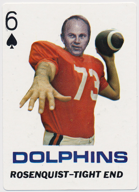
James Rosenquist, Tight End
The more I hear about Celender, of whom I had never heard before a few days ago, the more I like him. He unfortunately died in 2005 at the age of 73. He was a native of Pittsburgh and received art-related degrees from two esteemed local schools, Carnegie Mellon University and the University of Pittsburgh; he taught at Macalester College in St. Paul, Minnesota. Here’s a section of his NY Times obit—I like absolutely everything about this:
In 1969, with Conceptual Art gaining steam, Mr. Celender began a series of letter-writing campaigns that spoofed the movement while spreading its ideas and gathering interesting information. With his Cultural Art Movement he sent outlandish proposals to 25 museum directors, suggesting for example that Sherman Lee, director of the Cleveland Museum of Art, drop by parachute 1,000 works of Asian art from the museum’s collection, one at a time, onto the state of Alabama. Mr. Lee replied that since art was in the mind of the beholder, he had “mentally performed” Mr. Celender’s idea.
In subsequent works, Mr. Celender surveyed film directors, prison wardens, labor leaders, religious figures, travel agents, celebrities and famous chefs about their art preferences. He also produced a series of baseball cards using artists’ faces.
He was kind of the thinking person’s Ted L. Nancy of his day, if that reference means anything to anyone. But far from the nut that that description implies, he appears to have been a gentle satirist of the art world while playing fully within the art world’s rules.
On those “surveys” of various types of people on their art preferences, you can look at an example here, namely an “ART PREFERENCE SURVEY OF SOAP OPERA ACTORS/ACTRESSES” (in the example, Guiding Light actor Jerry ver Dorn says he favors M.C. Escher).
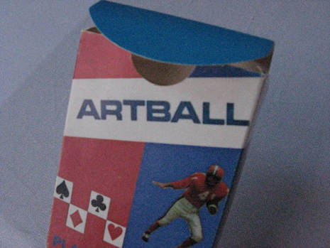
The playing cards constitute irresistible eye candy for baseball fans of a certain type—I am certainly one of the clan. I badly want to hold and touch these little scraps of silly cardboard. There isn’t that much information out there on the cards, it seems; it was difficult scraping together the visual evidence I was able to gather for this post (if anyone has or finds more images of the cards, please let us know). If you’re lucky you can find a set on eBay for about $50.
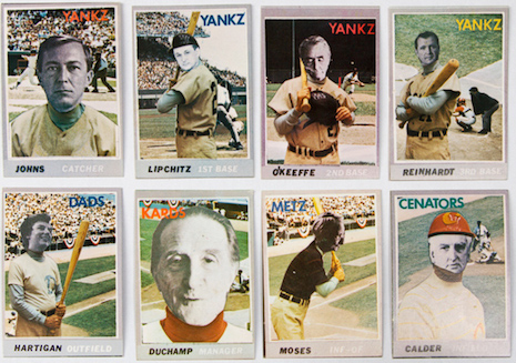
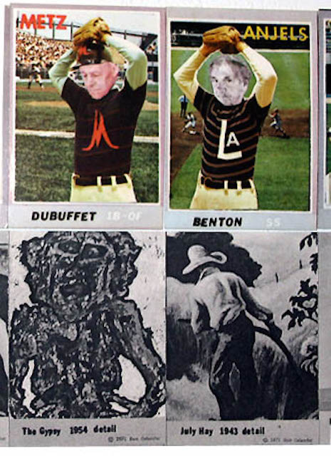
The cards seem to vary significantly, to the point that any sentence written about them risks being inaccurate. For some of the cards, Celender seems to have been used the metaphor of regular playing card, as in the “James Rosenquist, Tight End” card pictured above, whereas others seem entirely made from scratch—rather than deface actual baseball cards, Celender appears to have made mini-collages of baseball players and superimposed the black-and-white face of an artist over the player’s face, and then added a fakey baseball team name like “METZ” or “CENATORS” (for those who disdain sportsball, the Washington Senators were a baseball franchise from 1901 to 1960 before becoming the Minnesota Twins, and then, weirdly, from 1961 to 1972 before becoming the Texas Rangers; the Mets currently play in New York City). On the back would be a “highlight” from that artist’s career. You can see the method here, using Jean Dubuffet‘s “The Gypsy” and Thomas Hart Benson‘s “July Hay.”
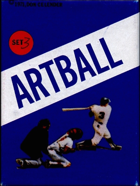
I believe there were five sets of cards. For completeness’ sake, here are the artists represented in each set, culled from the listings at specific object:
Set 1: Josef Albers, Marcel Duchamp, Max Ernst, Alberto Giacometti, Robert Morris, Richard Pousette-Dart, Franz Kline, Jean Dubuffet, Georges Roualt, Leo Castelli, Isamu Noguchi, Anthony Caro, Vincent van Gogh, Marisol, Gerald Clarke, Bernhard Berenson, Albert P. Ryder, Fernand Leger, Horace Pippin, Paul Jenkins
Set 2: Helen Frankenthaler, George Luks, Hans Hofmann, Georges Braque, Victor Vasarely, Marc Chagall, Martha Jackson, Henry Moore, Richard Lippold, Raoul Dufy, Alfred H. Barr Jr., David Smith, Bradley Walker Tomlin, Georgia O’Keeffe, Pavel Tchelitchew, Grandma Moses, Arthur B. Davies, Albert Alexander Smith, Tony Smith, Allan Appel, J. Carter Brown
Set 3: Robert Rauschenberg, William Glackens, Tom Wesselmann, Henri Toulouse-Lautrec, Thomas Hart Benton, Édouard Manet, Henri Matisse, Adolph Gottlieb, Wassily Kandinsky, Yves Tanguy, Ivan Karp, Donald Judd, Larry Rivers, Thomas Eakins, Willem de Kooning, George Segal, Grace Hartigan, Jackson Pollock, Robert Henri, John Marin
Set 4: John Chamberlain, Henri Rousseau, Hans Hartung, Ibram Lassaw, Ozenfant, John Goodrich, Hilton Kramer, Ray Johnson, Roy Lichtenstein, Jacques Lipchitz, Barnett Newman, Ad Reinhardt, Peggy Guggenheim, Bridget Riley, Matta, Rufino Tamayo, Piet Mondrian, Andrew Wyeth, Everett Shinn, Richard Lindner
Set 5: Jasper Johns, Piet Mondrian, Dan Flavin, Thomas B. Hess, Mark Rothko, Pablo Picasso, Patrick Caulfield, Claes Oldenburg, Alexander Liberman, Alexander Calder, Andy Warhol, Ossip Zadkine, Pierre Soulages, Charles Burchfield, Clyfford Still, Allan Kaprow, Sidney Janis, Dorothy C. Miller, Sam Francis
Here are a couple more images (if you are diligent in your searches you can find more out there; this isn’t a bad starting point) and a stimulating Vine:
More after the jump…
Posted by Martin Schneider
|
02.18.2015
01:32 pm
|