FOLLOW US ON:
GET THE NEWSLETTER
CONTACT US
Vintage ‘Op art’ book covers from the 50s, 60s and 70s animated with psychedelic results
10.16.2015
11:10 am
Topics:
Tags:


German motion designer Henning M. Lederer animated 55 retro “Op art” book covers from the ‘50s, ‘60s and ‘70s. The results are beautifully psychedelic and quite hypnotic.


The animation, after the jump…

READ ON
Posted by Tara McGinley
|
10.16.2015
11:10 am
|
Killer 70s horror-themed motorcycle toys: Scare Cycles!
10.12.2015
11:45 am
Topics:
Tags:


The Ideal toy company produced a line of Evel Knievel themed “gyro powered” motorcycle toys from 1973 until 1977, the year Knievel attempted to beat Shelly Saltman to death with a baseball bat. Needing a quick replacement for their motorcycle toys, Ideal rolled out a line of “Scare Cycles” in 1978. These were the coolest toys ever in 1978. There were three characters in the series of monster-themed bike riders: Frankenstein, Dracula, and the Grim Reaper. Somehow the horror of monsters on cycles was deemed more palatable to children than the real-life horror of a baseball bat-wielding stunt-monster on a bike.


Dracula rode a “Dracucycle”—a coffin on wheels. Frankenstein’s monster rode a “Frankencycle” with skull handlebars and a tombstone backrest. The Grim Reaper rode “Boneshaker,” a three-wheeled hearse.

Continues after the jump…

READ ON
Posted by Christopher Bickel
|
10.12.2015
11:45 am
|
Sesame Street ‘original 69 monster’ T-shirt fail
10.02.2015
11:44 am
Topics:
Tags:


This T-shirt featuring Cookie Monster is commemorating the birth of Sesame Street in 1969.

But something is a little bit off about this.

This had to have been intentional, right? Right?

I know none of our readers need this fail explained. Quite simply, your humble Dangerous Minds correspondent is a giggling 12-year-old boy.

The shirt is available as part of a package of Sesame Street commemorative shirts being sold through Amazon.

H/T: Marc Masters

Posted by Christopher Bickel
|
10.02.2015
11:44 am
|
Your favorite movie villains are now IKEA instruction manuals
09.28.2015
09:26 am
Topics:
Tags:


Artist Ed Harrington has scores of horror and pop-culture-themed illustrations on his website, Instagram, and Tumblr pages, most displaying his keenly sick sense of humor.

I really love the guy’s work, but my favorite pieces come from a series of IKEA instruction manual-style renderings of infamous movie villains.

I’m not totally sure what IKEA instruction graphics have to do with horror icons, but if you’ve ever have to cobble together a piece of furniture using one of their assembly diagrams, you know there is definitely a sense of dread attached. A bag full of hex bolts is as real-world horror as it gets.

Each of the pictographs assigns a bullshit Ikea product-esque faux-Swedish name to its subject: Jason Voorhees becomes “Vörhees” and Freddy Krueger becomes “Krugr.” The “Krugr” piece is a gem: the step-by-step icons illustrate the famous jump-rope chant from the A Nightmare on Elm Street movies (“One, two, Freddy’s comin’ for you. Three, four, better lock your door…”) Brilliant.


Anyway, these illustrations are the bomb dot com. Check Harrington’s website for more fun stuff.


More after the jump…

READ ON
Posted by Christopher Bickel
|
09.28.2015
09:26 am
|
Crash: Apocalyptic J.G. Ballard quotes about cars on traffic signs
09.16.2015
12:59 pm
Topics:
Tags:


In 1965 the British Road Sign project was launched, introducing Great Britain to a multitude of new road signs as well as two ubiquitous two new typefaces (Transport and Motorway), all of which were designed by Jock Kinneir and Margaret Calvert, who basically invented modern road signage in the same act. It doesn’t matter if you live in the U.K. or the U.S. or the European continent—if you’ve been in a car, you’ve seen their two-dimensional pantomimes (example).


2015 being the 50th anniversary of the British Road Sign, this summer the MADE NORTH Gallery celebrated the design landmarks with a project in which they invited “leading British artists and designers to transform the familiar circle, triangle and square signs.” The participants were encouraged to “create their own content for the signs developing concepts that evolve from current signs function of instructing people of speed limits and directions to poetically disrupting our everyday with designs that makes us stop, look and think about design and our environment in a slightly different way; less instructions and more pauses for thought.”
 

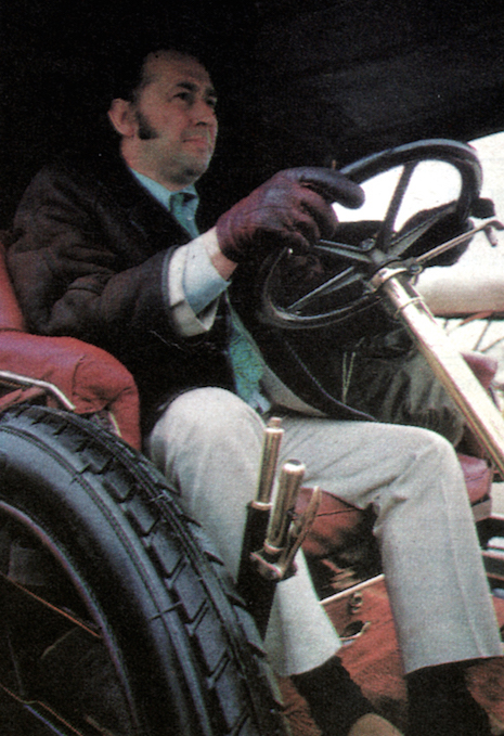
J.G. Ballard behind the wheel of a 1904 Renault Park Phaeton, 1971
 
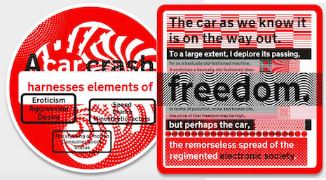
Possibly the most intriguing entry came from the well-known British designer Jonathan Barnbrook, whose past projects include the album art for David Bowie’s 2002 album Heathen as well as his 2013 release The Next Day; he also collaborated with Damien Hirst on his restaurant Pharmacy. Barnbrook crated two “anti-signs,” if you will, signs that could never serve any proper public service but whose very inutility prompts the viewer to engage with them in a more conceptual, artistic way. More interestingly, Barnbrook’s two signs incorporate lengthy quotations from the patron saint of automobile crashes, J.G. Ballard, the one man on earth who might fairly be said to disagree with the need for traffic signs to prevent fatal accidents.

Both signs are essentially illegible in the usual sense, and simply offer up a perverse Ballard sentiment about cars in forbidding combinations of red, white, and black. The first features a sentence from Ballard’s interview in Penthouse, which appeared in the magazine in the September 1970 issue (incidentally, three years before the publication of Ballard’s magnum opus on automobile accidents, Crash, but the same year as Ballard’s thematically similar multi-media work The Atrocity Exhibition).


For the record, the full line is “A car crash harnesses elements of eroticism, aggression, desire, speed, drama, kinesthetic factors, the stylizing of motion, consumer goods, status—all in one event.” You can read Ballard’s full Penthouse interview here.

Barnbrook’s second sign appropriates a comment about the eventual demise of cars (one that has proven to be not very prophetic at all) that comes from an essay Ballard wrote for the Autumn 1971 issue of Drive called “The Car, the Future”:


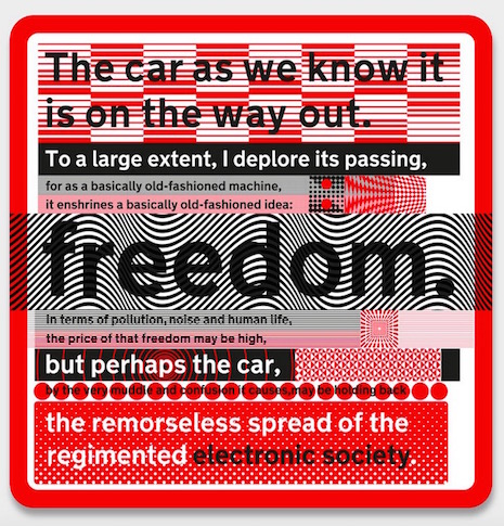
This sign is far more cluttered, with too much text really. The quotation reads as follows: “The car as we know it is on the way out. To a large extent, I deplore its passing, for as a basically old-fashioned machine, it enshrines a basically old-fashioned machine, it enshrines a basically old-fashioned idea: freedom. In terms of pollution, noise and human life, the price of that freedom may be high, but perhaps the car, by the very muddle and confusion it causes, may be holding back the remorseless spread of the regimented, electronic society.” You can read the full essay “The Car, the Future” here.

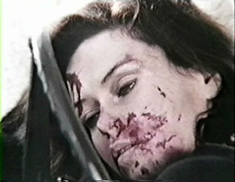
After the jump, director Harley Cokeliss’ 17-minute meditation on Ballard’s “Crash” thematic, featuring an appearance by Ballard himself…

READ ON
Posted by Martin Schneider
|
09.16.2015
12:59 pm
|
1957’s ‘House of the Future’—according to Monsanto and Disney
09.04.2015
02:16 pm
Topics:
Tags:


Photo: Ralph Crane, LIFE Magazine
 
From 1957 to 1967, in Anaheim’s Disneyland, there existed the “House of the Future,” a creation of the plastics division of Monsanto, in order to demonstrate the wondrous uses to which plastic would be put in the decades to come. Today the house seems like a relic, a path not taken, much like Moshe Safdie’s Habitat 67 concept that was unveiled at the Montreal Expo in 1967.

Monsanto’s house was also called the “Plastic Mushroom,”  owing to its design, it seems, which required that four wings flare out from a concrete stump in the center. (As with The Jetsons or Star Wars, gee-whiz futurism apparently resides in buildings being perched on top of other things.)


The Monsanto domicile was featured in a November 11, 1957 story in LIFE about “New Shapes for Shelter” in which the following description appeared.

“Plastic Mushroom,” Monsanto Chemical Co.‘s experimental house, consists of only 20 molded pieces. Whole house rests on a 16-foot-square block of concrete. The four wings are cantilevered from utility core in center. Floors and ceilings are foot thick, of rigid urethane foam set between reinforced plastic panels. The 1,300-square-foot house has two bedrooms, living room, family room, kitchen and two baths. All fixtures, like bathtub and sinks, are molded plastic.

After the “House of the Future” was torn down in 1967, Disneyland visitors were deprived of the chance to tour it for themselves—until now! The Disney History Institute (not affiliated with Disney) recently posted a “Virtual 360° Flythrough” on YouTube that will allow you to take a tour of the premises. After you hit play, you have the option of grabbing the frame and swiveling your point of view around so you can see everything in the home. It’s best if you keep the point of view directed at the direction you’re moving, most of the time.


Continues after the jump…

READ ON
Posted by Martin Schneider
|
09.04.2015
02:16 pm
|
Artist carves pearls into teeny-tiny skull jewelry
08.27.2015
12:52 pm
Topics:
Tags:


Normally I’m not a fan of skull jewelry designs, but these intricately carved pearl skulls are really, really well done. Tokyo-based jewelry designer, Shinji Nakaba, creates these delicate-looking skull rings and skull brooches.

I’d love to see an entire skull pearl necklace by Nakaba, but sadly I didn’t see one on his website. Hopefully he sees this and considers making one. Now that would be a statement necklace! Exquisite stuff, but since no prices are listed, I’m assuming the prices must be astronomical.


More after the jump…
 

READ ON
Posted by Tara McGinley
|
08.27.2015
12:52 pm
|
Are you cucumber or a carrot? Wrap your meat in fruit and veg for the optimum fitting condom!
08.27.2015
11:43 am
Topics:
Tags:


In a triumph of design, Guan-Hao Pan, a student at the National Taipei University of Technology has created this adorable (and functional!) condom series using fruits and vegetables for sizing models. Love Guide Condoms gives you five options, from biggest to smallest you have cucumber, carrot, banana, turnip and zucchini. Obviously fruits and vegetables aren’t standardized, but it’s not a bad system to measure your meat. The nutritious theme of these rubbers is based off the Chinese proverb, “hunger and lust are only natural,” and yes they’re as “green” (yuk yuk) as possible, with biodegradable packaging, as opposed to the non-biodegradable foil that’s used most commonly.

The array of sizes is intended to help men choose a correctly-fitted condom, as incorrect sizing can actually result in breakage or slippage (no word on how you will prevent men from vanity sizing). Also, the condoms are placed over a tiny nub in the package, so that the user will be less likely to put it on inside out (big no-no, can also cause breakage), and so that removing them requires the pinching on the reservoir tip (something you should always do)!


More after the jump…

READ ON
Posted by Amber Frost
|
08.27.2015
11:43 am
|
Cradle yourself in retro-futurist comfort: Eero Aarnio’s Ball Chair
08.26.2015
09:15 am
Topics:
Tags:


It’s what the 2060s looked like in the 1960s.

Ever since the Ball Chair (sometimes called the Globe Chair)  was first created in 1963 by Finnish designer Eero Aarnio, it’s been a standard set-design to indicate “high-tech” or “the future.”. It’s been used in such iconic works as The Prisoner television show and the 1996 Tim Burton film Mars Attacks!

Somehow, the spherical shape suggests a futuristic quality that can’t be matched by more conventional, angular furnishings. But according to Aarnio, he actually designed the chair for his own home:

The idea of the chair was very obvious. We had moved to our first home and I had started my free-lance career in 1962.

We had a home but no proper big chair, so I decided to make one, but some way a really new one. After some drawing I noticed that the shape of the chair had become so simple that it was merely a ball. I pinned the full scale drawing on the wall and sat in the chair to see how my head would move when sitting inside it. Being the taller one of us I sat in the chair and my wife drew the course of my head on the wall. This is how I determined the height of the chair. Since I aimed at a ball shape, the other lines were easy to draw, just remembering that the chair would have to fit through a doorway.

After this I made the first prototype myself using an inside mould, which has been made using the same principle as a glider fuselage or wing. I covered the plywood body mould with wet paper and laminated the surface with fiberglass, rubbed down the outside, removed the mould from inside, had it upholstered and added the leg. In the end I installed the red telephone on the inside wall of the chair. The naming part of the chair was easy, the BALL CHAIR was born.

Of course, anyone who knows the truth about this spherical, hollowed-out chair understands that it exists primarily as a backdrop for photographing models. Someone figured out long ago that a beautiful model sitting in a Ball Chair is a thing of future-mod perfection. Somehow, it just always seems to work. Here are a few examples of that retro-futurist perfection captured by the lens:


More after the jump…

READ ON
Posted by Christopher Bickel
|
08.26.2015
09:15 am
|
Male ‘manikins’ so realistic you might not need a ‘real’ man again
08.25.2015
09:59 am
Topics:
Tags:

Sinthetics
Male “manikin” (hat and cheap vodka not included)
 
So-Cal company Sinthetics are the folks responsible for these fully articulated, anatomically correct sculpted “manikins” (a word the company coined themselves) that are so lifelike, that they may make you may swear off the boring, old real thing.
 
Mr. William manikin with guitar
“Mr. William manikin” in a sensitive moment
 
Prices start at $5,900 for Sinthetics’ male dolls which includes a complimentary “gel buttocks upgrade.” And it is the upgrades that Sinthetics offers that make their individually hand-made manikins truly one-of-a-kind. Here’s a price list of some of my favorites:

Freckles: start at $50 and go up depending on placement, density and amount

Tan Lines: $250 for bottoms-only and $500 for the top. Any style you would like!

Custom teeth (!), labia or nipples all start at $150

Custom Eyes: start at $300 and are done by Sinthetics own “professional” eye maker. Animal and monster eyes are also available (Squeee!)

Extra penises (for the male dolls) are $99 and up depending on the upgrade

Thigh Modifications: $150 - $350 depending on which option is selected

Sinthetics also makes female manikins with customizable “honey pots” (which Sinthetics will happily replace for FREE every 13 months, yipee!) as well as a synthetic penis (which according to Sinthetics’ site are mostly cast from actual penises) that is so REAL looking, you might want to replace your own saggy, worn out one with Sinthetics six-incher. More slightly NSFW photos of Sinthetics lifelike manikins follow.
 

“Gabriel” manikin with blonde wig and 80s party attire


“Gabriel” manikin with dark hair and a “friend”
 
Sinthetics
 
More ‘manikins’ after the jump…

READ ON
Posted by Cherrybomb
|
08.25.2015
09:59 am
|
Page 15 of 37 ‹ First  < 13 14 15 16 17 >  Last ›