FOLLOW US ON:
GET THE NEWSLETTER
CONTACT US
For your feminine anatomical jewelry fix, order the Clitoring now!
02.03.2015
09:10 pm
Topics:
Tags:


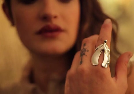
Ever have one of those days where you wake up and think, “Sure, I’d like to embody female sexuality with my ensemble today, but that big business meeting I have at noon might not be the most appropriate setting for my full-body vulva costume. How can I go subtle?” Well, now the discerning gynocentric fashionista has an option for the office—the Clitoring, presumably by artist Penelopi Jones (though one could never know because “she” spells it “PenelopiJones,” and does not refer to herself in the first person, so “PenelopiJones” could very well be the name of an LLC belonging to some 75-year-old male jeweler obsessed with female anatomy).

From “her” website:

This provocative little anatomical form, mysterious yet oddly familiar, is a subtly stylized representation of a thing we all know, yet may know surprisingly little about. Until very recently both science and culture have misunderstood and often ignored all but the very tip of it. Our ring, like the anatomical renderings in the header, illustrate the newly rediscovered internal structure of the clitoris. The sensitive little button at the top of a woman’s vagina is apparently just the tip of the iceberg. What lies beneath the surface is vastly more complex and fascinating. It contains eight thousand nerve endings at the tip that permeate through this greater internal structure, then connect to an even greater network of fifteen thousand more that map the entire pelvic region, suggesting that even vaginal orgasms are technically “clitoral.” Over a lifetime the clitoris will increase in sensitivity and in size by seven times. The “wings” that hug the vaginal opening are called the bulbs of the vestibule and are composed of erectile tissue that become swollen during arousal.  The “arms” are the two crura that form a wishbone-like shape. We like to think of them as a sort of tuning fork, a device for sending and receiving vibrational energy, possibly for exploring the resonant structure of the universe.

If you’re sensing a little New Age woo in that description, just know that it’s nothing compared to affiliated project, The PenelopiJones Experiment, which purports to be, “a record of our pursuit of a greater understanding of the resonant structure of the universe through orgasm.”

Look, it’s kind of pretty, and it comes in both a ring and a pendant for a necklace (the sterling silver for $122 to 14 karat gold for $535), but I make it a point to steer clear of any jewelry that might accidentally misidentify me as the member of a cult. So on the off-chance The PenelopiJones Experiment is some sort of clitoral Scientology, I’ll be sticking with the classic vulva-suit.
 
Via Bustle

Posted by Amber Frost
|
02.03.2015
09:10 pm
|
‘Most of My Heroes Still Don’t Appear on No Stamp’: Kings and queens of hip-hop
12.15.2014
04:24 pm
Topics:
Tags:

3madinahiphopst.jpg
 
Artist and designer Mark “Madina” Culmer produces lyrically inspired work from “The Golden Era Hip-Hop 1980s-1990s.” Taking The Public Enemy album/track “Most of My Heroes Still Don’t Appear on No Stamp” as his cue, Mark has created a print consisting of 42 postage stamps honoring the kings and queens of hip hop who:

...propelled the genre from humble beginnings in the block parties in New York to the global phenomenon we see today. So if you thought ‘most of my heroes don’t appear on no stamps’ a few words of advice ‘Don’t believe the hype’.

Based in Brighton, England, Madina’s designs are also available as T-shirts and hoodies, and the whole range of his work can be found here.
 
03chuckdstamp.jpg
Chuck D.
 
009jdilla.jpg
J Dilla.
 

The Notorious B.I.G.
 
More after the jump…
 

READ ON
Posted by Paul Gallagher
|
12.15.2014
04:24 pm
|
Flower power: Guns replaced with flowers in vintage war photos
12.15.2014
10:48 am
Topics:
Tags:

01flowerpowergun.jpg
 
It was poet Allen Ginsberg who came up with the term “Flower Power” in his essay “How to Make a March/Spectacle” when he suggested anti-Vietnam war protesters should hand out thousands of flowers to policemen, soldiers and politicians as a symbol of their passive resistance to conflict.

French artist and designer Mister Blick makes a similar anti-war statement with his collages of historic war photographs in which weapons are replaced with giant flowers, and bullets with colorful petals.
 
02flowepowergun.jpg
 
03flowerpowergun.jpg
 
04flowerpowergun.jpg
 
05flowerpowergun.jpg
 
H/T Vintage Everyday.
 

Posted by Paul Gallagher
|
12.15.2014
10:48 am
|
Real estate cosplay: NYC developers trying to make ‘Steampunk Luxury Condos’ happen
12.11.2014
05:49 pm
Topics:
Tags:


They say that “money don’t buy taste,” but if you can afford to live at N°15 RENWICK, one would assume you’ve at least got the cash for a “style consultant” to tell you how fucking corny you are. The luxury development (whose logo is an obvious homage to CHANEL N°5) is trying what may be the lamest of all marketing angles to attract a wealthy and “creative” clientele—they’re making it steampunk. Their advertising is an utterly confusing photo-spread of classically influenced modern architecture inhabited by Victorian-ish “characters”—it can only be described as real estate cosplay…

From the website:

The Characters of 15 Renwick pay homage to the Victorian era in which the street’s namesake, James Renwick and his son, lived (1790-1895). Renwick was a pioneering author, engineer and professor at Columbia University while his son, James Jr., was one of the most celebrated architects of his generation. The Characters also embody the creative persona of today’s Hudson Square resident and the insider nature of the single-block Renwick Street.

Look, pining for “Olde New York” is a rite of passage no matter what year you moved here, but these people are paying an insane amount of money for a New York that never even existed! One of the developers, Eldad Blaustein joked that the ideal tenant might be a “Wall Street trader, but he’s writing songs, he’s writing poems at night.”

Sounds about right. Who else would be so dead inside that they’d want to come home to LARP?


More real estate steampunk cosplay after the jump…

READ ON
Posted by Amber Frost
|
12.11.2014
05:49 pm
|
Idiotic hipsters complain about the font of ‘I Can’t Breathe’ protest shirts
12.10.2014
02:04 pm
Topics:
Tags:


A new entry of the annals of monumentally missing the point…

“I Can’t Breathe” may be the sentence of 2014. They are, of course, the last words, uttered many times, of Eric Garner, the 43-year-old NYC Department of Parks horticulturist and occasional loose cigarette salesman whose inexplicable death by police chokehold in the Tompkinsville neighborhood (where I lived until quite recently) last July has led to a great deal of outcry.

The sentence has achieved the ultimate that can happen in our society—it has become a free-floating signifier in social media, just like Paula Deen’s supposedly homophobic fried chicken recipes or something. This past week several prominent athletes in the predominantly African-American NBA, including the Bulls’ Derrick Rose, the Cavaliers’ LeBron James, the Lakers’ Kobe Bryant, and the Nets’ Deron Williams, have warmed up wearing T-shirts heartbreakingly emblazoned with that simple message of solidarity with a blameless victim of police brutality: “I CAN’T BREATHE.”

All across America, a small minority of observers reacted in the expected way: they tut-tutted the shirts’ choice of font. The shirts, while admittedly embodying a courageous stand against the combined forces of intolerance, had committed the unpardonable sin of violating a bit of design etiquette.

Among people who take design very seriously, the Comic Sans typeface has been a bête noire for at least a decade, because it is often used by “design-blind” “normals” outside of its optimal range of uses, frequently lending an unserious air to messages of stern import. Designed by Vincent Connare, Comic Sans was released by Microsoft in 1994, which surely contributed to its popularity.

For instance, Tony Seddon named a book after it (Thou Shall Not Use Comic Sans: 365 Graphic Design Sins and Virtues: A Designer’s Almanac of Dos and Don’ts) in which he calls it “arguably the most inappropriately used typeface in history” (although a page later he sort of takes it back).

Eventually, on the McSweeney’s website, Mike Lacher defended the honor of the typeface with “I’m Comic Sans, Asshole,” which contained the immortal line “I’m the best thing to happen to typography since Johannes fucking Gutenberg.” The piece simultaneously seemed to agree with the design critics’ peeve while putting them in their place.

On the T-shirts, for instance, Caroline Fredericks, of “California/Alabama,” tweeted, “how many people will be able to look past the choice of comic sans?” Ryan Hubbard, of Kansas City, tweeted, “Who’s giving all of these NBA players “I can’t breathe” shirts set in Comic Sans? I love that they’re wearing them, but come on, man.”

The New York Times report on the shirts emphasizes the outsize efforts of Jay-Z and others to replicate the gesture made by Derrick Rose of the Bulls and makes no mention of Comic Sans or any other aspect of the shirts’ design, except to note that “Rameen Aminzadeh, a member of Justice League NYC, drafted a simple design for the text of the T-shirt, which other members of the group approved sometime after 1 a.m. [referring to late Sunday night/early Monday morning].”

Here are a few of the tweets—there’s plenty more where these came from.


via Vocativ

Posted by Martin Schneider
|
12.10.2014
02:04 pm
|
Turntablism: So there’s a Spirograph record player hack
12.06.2014
12:54 pm
Topics:
Tags:


As if having a turntable didn’t already cause me and my savings account enough trouble, after seeing these videos, now I really want another one. There are some crafty people out there who’ve figured out how to make record players function as visual art tools. Specifically, drawing roulette curves, not entirely unlike Christian Marclay weilding a Spirograph. (If someone with better math-fu wants to correct me on what kind of curves these are exactly, PLEASE go for it, I’m all ears.)


I’d love to do something like this, but actually play the records, credit each drawing to the two musical artists whose albums “made” the art, and show them in such a way as to allow the viewer to hear the mashed-up musical works. Maybe go ultra-meta and use concrète artists? Spyro Gyra vs ... well, any musician named “Graff?” It could get quite ridiculous!
 
More after the jump…

READ ON
Posted by Ron Kretsch
|
12.06.2014
12:54 pm
|
Let’s play Revolution: Gorgeous but violent Soviet board games, 1920-1938
11.11.2014
02:50 pm
Topics:
Tags:


“Chemical War,” 1925
 
The phrase “war toys” usually evokes images of little plastic guns, gritty action figures with kung-fu grips and more recently the first-person shooter video game. In Soviet Russia however, bloodthirsty board games were incredibly popular. I’d imagine this was partially due to a national penchant for games of strategy (like chess), but also probably owing (at least somewhat, if not to a great extent) to manufacturing considerations. Russia was still attempting a massive industrialization project throughout the 1930s, and board games were pretty quick and easy to produce without much in the way of materials or tools.

Obviously not every Russian board game had the hawkish tenor of most of the games below (“Electrification”), but there’s certainly enough of them to see palpable themes of nationalism and war. You’ll notice the game “Battle” looks pretty wholesome at first glance… until you realize that the players are engaging in a leisurely game on a battlefield, seemingly unaware of the carnage taking place directly behind them. Despite the intriguing cover art, I can’t find much on the rules or premises of these games, except they they were educational tools and often contained a military trivia component. Still, as far as insidiously nationalist, war-mongering propaganda goes, don’t they look kind of… fun?
 

“Revolution,” 1925
 

“Air War,” 1925
 

“Battle,” 1938
 
More Soviet games after the jump…

READ ON
Posted by Amber Frost
|
11.11.2014
02:50 pm
|
Furry furniture that looks like taxidermied Dr. Seuss creatures
11.06.2014
10:19 am
Topics:
Tags:


Golden Corral and Beast Guests, 2014
 
Texas twins Nikolai and Simon Haas desperately wanted to see the Ralph Bakshi flop, Cool World as kids, but their parents wouldn’t let them. Mom and dad were right. Not only was the the film a little seedy for 8-year-olds, it was a half animated, half live-action mess, high on concept and low on plot. The movie came out in 1992, four years after Who Framed Roger Rabbit?, but it lacked that film’s imagination (and writing) and the animation felt cheap and gimmicky. The Hass Brothers haven’t seen the movie to this day, but their fantasy idea of it serves as the inspiration for their new show, “The Haas Brothers: Cool World,” at R & Company in New York.

The furniture and furnishings they created in the name of Bakshi’s box office bomb are actually far less louche than their inexplicable source material. I’d argue the work is downright Seussian—comic and surreal, but with the added element of a playful sexuality (including an actual “Sex Room Entrance”). The ceramics could be the work of Whoville artisans, and the furniture resembles the animals from If I Ran the Zoo. The use of leather and fur (real), alongside horns and feet (metal), leave the viewer with the distinct impression that a few Fizza-ma-Wizza-ma-Dills were harmed in the making of that chaise lounge.
 

Mini Beasts, 2014
 

Beast Bench, 2013
 

Accretion Vases and Zoidberg Lamp Series, 2014
 

Beast Club Chairs, 2014
 

Beast Setee, 2013
 

California Raisin, 2014

Candelabras, Accretion Vases, Hematite Vases, 2014
 

Anna Nicole, 2014
 
“Hairy Belafonte” and more after the jump…

READ ON
Posted by Amber Frost
|
11.06.2014
10:19 am
|
Ghost Rider: The perfect motorcycle for All Hallows’ Eve
10.31.2014
10:09 am
Topics:
Tags:

2hallomotoween.jpg
 
Now this is the kind of motorcycle you want to be seen riding when you turn up late to that Halloween party. This customized skeleton bike is a definite head turner—the bike Ghost Rider really should have had.

Take a look at the craftsmanship going on here: a hammer forged bike frame made from a skeleton rib cage and spine, with arm bones as front forks, bony hands as wheel hubs, and a skull with 32 teeth and a headlight in each eye socket. This beauty was almost entirely handmade by self-taught metal worker John Holt in his basement workshop in Boone County, Illinois, in 2004 and 2005. The bike has a 2.3-liter Ford engine with a variable flow hydraulic drive. The bike weighs 850 pounds; if made to stand up straight, the skeleton would be over nine feet tall.

This was the first bike Holt ever built—though he previously made a suit of armor in 1995—and he “fashioned the design” from a plastic model of a skeleton. Holt calls his bike “Iron Death.” Yep, that sounds right.
 
1hallomotoween.jpg
 
3hallomotoween.jpg
 
5hallomotoween.jpg
 
6hallmotoween.jpg
 
4hallomotoween.jpg
 
7hallomotoween.jpg
Thanks to Duke Sandefur, via Vince Lewis
 

Posted by Paul Gallagher
|
10.31.2014
10:09 am
|
Frank Gehry gives 98% of architecture the finger
10.26.2014
11:49 am
Topics:
Tags:


Frank Gehry has been the number-one superstar of architecture for a generation now, going roughly as far back to the unveiling of the Guggenheim Museum in Bilbao in 1997. His shimmering buildings often resemble curved paper, and as top dog in the architecture world, his buildings have come in for some criticism for being not entirely practical in every respect. 

Gehry was in Oviedo, Spain, last week at a press conference related to the country’s Prince of Asturias Awards program for the arts. A journalist asked Gehry, according to De Zeen magazine, “what his response was to people who accused him of creating architecture for show.” Here was his answer, as tweeted by Inés Martín Rodrigo on Thursday:


Translation (thank you Google): “Answer by Frank Gehry to the first question of journalists in Oviedo.”

Gehry then said, “Let me tell you one thing. In the world we live in, 98 percent of what gets built and designed today is pure shit. ... There’s no sense of design nor respect for humanity or anything. They’re bad buildings and that’s it.”


Gehry continued, “Every now and then, however, a small number of people do something special. They’re very few. But—my God!—leave us in peace! We dedicate ourselves to our work. I don’t beg for work. I don’t have publicists. I’m not waiting for people to call me. I work with clients who have respect for the art of architecture. At the very least, don’t ask stupid questions like this.” Observers on the scene report that this answer was met with an uncomfortable silence. Gehry then apologized, pointing to fatigue from his travels from France that day to attend the press conference. “Please, you have to understand that I’m tired and a little dazed by the trip. ... I’ll mumble an apology.” It’s worth keeping in mind that Gehry is currently 85 years old.

Just for fun I Googled the terms “gehry badass” and, wouldn’t you know it, came up with this hit: “Frank Gehry, Architectural Badass.” Which confirms what we already knew, Frank Gehry is a badass.


via Hyperallergic

Posted by Martin Schneider
|
10.26.2014
11:49 am
|
Page 19 of 37 ‹ First  < 17 18 19 20 21 >  Last ›