One of the primary accomplishments of Montage of Heck documentary on Kurt Cobain that aired on HBO earlier this week was to remind me how much I fuckin’ love Bleach. Nirvana’s three studio albums are very distinctive, of course—all three albums are excellent, but in my mind I classify them as “raw (low budget),” “polished (medium budget),” and “raw (high budget).” I really like Nirvana in its “raw (low budget)” state. The whole first half of Montage of Heck consists largely of quasi-animated sequences with Nirvana music churning underneath, and damned if I don’t find “School,” “Negative Creep,” and “Blew” just as galvanizing and toe-tapping as I did when the album became lodged in my CD player back in 1990.
When Bleach was released, a big portion of the mystique of the album derived from its doomy, mysterious album cover. What the hell is a “Kurdt Kobain”? This really cost $606.17? What is happening in the picture on the cover? Why is “Bleach” in quotation marks? And so on. The front cover is a classic, and the tall, serif letters of “NIRVANA” would shortly adorn ten thousand T-shirts as well as all of the band’s official releases, from Nevermind all the way to From the Muddy Banks of the Wishkah (but not the B-sides comp Incesticide).
Remarkably, one of the most important decisions of the band’s career—what the logo would look like—was decided by chance, indeed, as Jacob McMurray has written, “mostly by accident.”
Quoting from the indispensable volume edited by McMurray, Nirvana: Taking Punk to the Masses, which documented the 2011 exhibition of the same name,
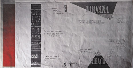
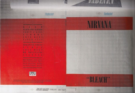
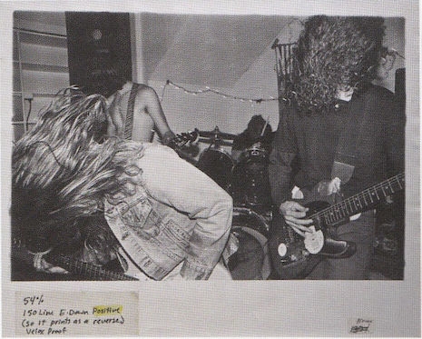
The layout for the Bleach cover was created by graphic designer and musician Lisa Orth at the offices of The Rocket, where she also worked. The cover comformed to Sub Pop’s design aesthetic: a stark field of color with bold type and a striking photograph. The photo, by Kurt Cobain’s girlfriend Tracy Marander, was reversed-out as if it were a film negative. It featured the band (including [Jason] Everman, though he didn’t perform on the album) playing at the Reko/Muse Gallery in Olympia, WA, on April 1, 1989. Orth asked The Rocket’s typesetter, Grant Alden, to set the band’s name in whatever was already installed in their typesetting machine. And thus Nirvana’s logo was born, mostly by accident.
That typeface, based on Bodoni Extra Bold Condensed, was called Onyx, and it looks like this:

The differences between Bodoni Extra Bold Condensed and Onyx aren’t 100% clear to me, but as Caitlin Richards helpfully explains, “The difference between Onyx and Bodoni is that Onyx’s letters are tracked closer to each other.”
Art Chantry gets into the jargon in the book Nirvana: Taking Punk to the Masses,
It was a typeface called Onyx which is a Compugraphic bad design of Bodoni Condensed—really hunky, ugly, and those Compugraphics, if you didn’t use the right kerning programs you had really bad letterspacing. And so Grant Alden basically just sat down, slammed it out, charged Lisa Orth 15 bucks, which she paid out of pocket, and that is where Nirvana’s logo came from.
While we’re on the subject of the Bleach cover, here are three fascinating images of the design elements that went into it. I had never seen these before like two days ago (clicking spawns a larger version).


And finally—my favorite of them all—here’s the cover image in its un-inverted state, which I’ve been dying to see for 25 years:

Again, if you find this even a fraction as interesting as I do, you really have to pick up Nirvana: Taking Punk to the Masses.
Photos: Lance Mercer