FOLLOW US ON:
GET THE NEWSLETTER
CONTACT US
Sex signals: Trashy illustrations from vintage ‘Frederick’s of Hollywood’ catalogs
06.21.2017
09:16 am
Topics:
Tags:


A page from one of Frederick Mellinger’s famous ‘Frederick’s of Hollywood’ catalogs. Mellinger is pictured, with what I imagine was a permament grin, just below the word ‘SEX.’
 

“I never listen to Paris designers . . . they don’t dress women for men.”

—Frederick’s of Hollywood founder Frederick Mellinger on what made him successful.

 
You have to give Frederick’s of Hollywood founder, Frederick Mellinger a lot of credit. After lying about his age, Mellinger scored a gig at a women’s “intimate apparel” company when he was only fourteen. The veritable dream job quickly helped acquaint Mellinger with the ins-and-outs of the mail-order business though he would later be fired from his job for suggesting that the company add *gasp* black undergarments to its catalog. During a stint in the army Mellinger became hip to the existence of the “pinup girl.” His new awareness would end up being a tipping point for the young entrepreneur who headed to New York City to open the first Frederick’s headquarters in 1946 right on Fifth Avenue which he dubbed “Frederick’s of Fifth Avenue.” Within a year’s time, Mellinger moved his base of operations to Hollywood Boulevard.

I’m sure most of you out there are at least somewhat acquainted with what Mellinger would end up calling Frederick’s of Hollywood. Those three words are undeniably synonymous with girlie garments like push-up bras, crotchless panties, and other skin-tight delights, many of which were black. While he was still doing business in New York, Mellinger couldn’t get a magazine or newspaper to run illustrated ads for his racy garment because they considered them to be “pornographic.” Once he relocated his headquarters to Los Angeles and opened the first of what would eventually become 160 retail locations in 1947, everyone from exotic dancers to bored housewives started snapping up his enticing designs. Then, while on a business trip to France that same year, he bore witness to his first bikini-clad woman. Mellinger brought back as many French bikinis as he could which he promptly sold without effort back in Hollywood. Then something happened that would prove to be a linchpin to Frederick’s future success that involved the cops and one of their bikini-loving fans.

A lucky girl who happened to score one Mellinger’s French bikinis was arrested on Venice Beach while wearing it and was charged with “indecent exposure.” The papers went wild and widely published stories accompanied with scandalous images of the poor girl being cuffed and stuffed into a police car. Orders for anything and everything from the Frederick’s of Hollywood catalog went through the roof, and it would be almost 40 years until the company would post their first ever loss in 1984. Through it all, it was Mellinger’s determination to continue to push the boundaries of lingerie design that led to, among other things, the invention of the thong panty and edible panties. Well done, Mr. Mellinger, well done.

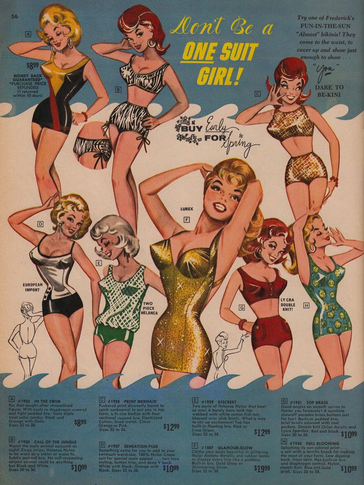
When I came across the illustrations used during the early days of Frederick’s, I had not seen them before. Most likely since I mostly associated the catalog with the real-life model sleaze of the 80s. The discovery has led me to pursue the acquisition of one of their vintage catalogs that pre-date the mid-70s, which are sadly hard to come by these days. So, for the time being, we will all have to live vicariously through the images below, some of which are NSFW.
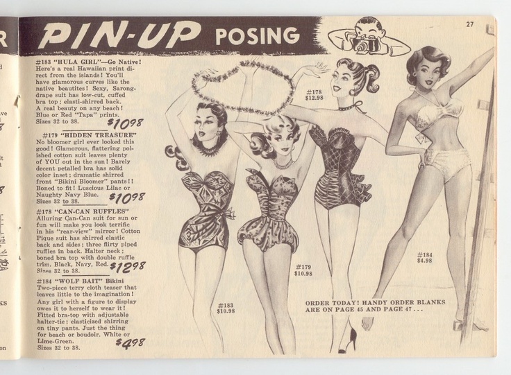
 

1954.


More sexy stuff after the jump…

READ ON
Posted by Cherrybomb
|
06.21.2017
09:16 am
|
‘Shocked’ Trump face, Nicolas Cage, luchador and many more WEIRD one-piece swimsuits
06.21.2017
08:15 am
Topics:
Tags:


Donald Trump
 
Today is the first day of summer—even if every day tends to feel like summer anymore—so it seems appropriate to blog about these interesting one-piece bathing suits for women. Beloved Wear makes these suits and and believe it or not… they’re on sale! Each one will cost you just $49.95!

I can’t vouch for the quality as I’ve never shopped from this website before, but you’re probably 100% sure to turn a lot of heads if you sport one by the pool or at the beach. I can pretty much guarantee it.


Nicolas Cage
 

Luchador
 
More after the jump…

READ ON
Posted by Tara McGinley
|
06.21.2017
08:15 am
|
Is this 40-year-old footage of the Cure the oldest known footage of the band?
06.20.2017
12:50 pm
Topics:
Tags:


The Easy Cure in 1977: Peter O’Toole, Robert Smith, Porl Thompson, Michael Dempsey, and Lol Tolhurst (in front).

Here is what might be the earliest footage that exists of the Cure, or as they were then known—as of July 3, 1977 when this performance took place—the Easy Cure. If there is anything earlier than this—which at one point appeared on a VHS home video release in 1986 called Staring at the Sea—I’m unaware of it.

The place was the Queens Square Bandstand in Crawley, and the Easy Cure consisted of Robert Smith (guitar), Lol Tolhurst (drums), Porl Thompson (guitar), Michael Dempsey (bass), and Peter O’Toole (vocals). Previously, Smith, Thompson, Dempsey and Tolhurst had played together in a band called Malice that went through a few lead singers before O’Toole joined in April of 1977. Soon afterward the band recorded a demo in the dining room at Smith’s parents’ house and won a talent contest that saw them signed to a recording contract with the German record label Ariola-Hansa. The Easy Cure name came from the title of a song written by Tolhurst.
 

Michael Dempsey, Porl Thompson, Robert Smith, Peter O’Toole & Lol Tolhurst.

This footage was shot on July 3, which was one of the single hottest days of 1977 in the UK. The highest temperature recorded on that day was 28°C at Heathrow Airport, only 30 miles from Crawley. Seen in the film, a young woman waves a fan to cool herself down, and some of the men watching have removed their shirts due to the brutal heat. The youthful group is apparently performing a song here called “I Wish I Was Your Mother.” Soon after this was shot O’Toole left the band for a kibbutz in Israel and Smith became the lead vocalist.

Take a look, after the jump…

READ ON
Posted by Richard Metzger
|
06.20.2017
12:50 pm
|
‘Aliens are never eliminated’: Amazing 1979 ‘Alien’ board game
06.20.2017
11:27 am
Topics:
Tags:


We’ve noted before that the merchandising arm connected with Ridley Scott’s original Alien movie of 1979 didn’t seem to know anything about the movie. (For example here are a bunch of trading cards Topps put out, with bland text that seems pretty clueless about what’s actually in the movie.) 

Apparently nobody had gotten the memo that Alien was an R-rated thrillfest in which an alien creature gorily bursts through the chest of one of the characters—this movie was clearly not intended for nine-year-olds, which made the attempts to market the movie to nine-year-olds all the weirder. (Actually, I myself was nine years old when Alien came out—I didn’t see it, but I vividly remember a classmate of mine telling me all about it. Obviously the chestburster scene was the main thing he talked about.) 

So here’s another kid-targeted mindfuck…. an actual Alien board game, put out by Kenner!


On BoardGameGeek, the world’s greatest resource for board game enthusiasts, the user reviews for this game are all over the map, and it’s easy to see why. A glance at the board reveals that the game is probably a pretty lazy rehash of Parcheesi, which is basically true. (If you were given a single day to design a board game as a tie-in for, say, Kong: Skull Island, you’d probably end up with something along the lines of Parcheesi, too.) But at the same time, there are some clever touches.

The object of the game is to make your way through the Nostromo to reach the Narcissus space station. Each player has three Astronaut tokens and one Alien token. You roll dice and move players around, and a player can use his or her Alien to take out the opposing Astronauts. Now right there you have an instant contradiction: The whole point of the Xenomorph is that nobody “controls” the fucking thing. It is inherently uncontrollable. The dictates of symmetrical gameplay that would have reigned in the 1970s meant that you couldn’t have one player as the alien and other players representing the Nostromo crew members, which is how the game probably should have been designed. 

Anyway, I mentioned clever game design. The main feature I wanted to point out was the introduction of “air shaft” pathways that are only available for the Alien to use. I like that idea quite a bit. Parcheesi doesn’t have that feature, right?

Also, in the game instructions there appears what is maybe the greatest sentence ever to appear in an instructions manual for a game designed for kids. The sentence is: “Aliens are never eliminated.” Eek!


It’s interesting that the understanding of Ripley as a movie character for the ages had not solidified yet. Sigourney Weaver’s image doesn’t appear anywhere on the box. Here’s an interesting custom logo that Kenner must have cooked up for the game:


If you paid the original price for this game in 1979, you lucked out by obtaining what would eventually become a collector’s dream acquisition.

Continues after the jump…

READ ON
Posted by Martin Schneider
|
06.20.2017
11:27 am
|
Dream of Venus: Inside Salvador Dalí‘s spectacular & perverse Surrealist funhouse from 1939
06.20.2017
10:44 am
Topics:
Tags:


The fabled entrance to the “Dream of Venus” pavilion created by Salvador Dalí for the World’s Fair in 1939.
 
Salvador Dalí was asked to create a pavilion for the World’s Fair to be held in Summer of 1939 in Flushing Meadow, Queens, NY. Given a canvas this big, as you might imagine, Dalí‘s concept for what was called “Dream of Venus” was just as over-the-top as the wildly eccentric Surrealist himself. In a letter written to his friend, Spanish filmmaker Luis Buñuel, Dalí reported that the pavilion would include “genuine explosive giraffes.” That never happened during the eight weeks it took to set up and construct what has been referred to as Dalí‘s “funhouse.”

The creation of the pavilion was the idea of noted architect, artist, and art collector, Ian Woodner. Woodner approached New York art dealer Julien Levy and together they quickly decided to give the gig to Dalí. As you entered the pavilion you had to pass between twin pillars that were fashioned in the image of female legs that were protruding from a skirt that had been pulled up above the knees. In various windows at the entrance, Dali placed a sculpture of a nude torso of a woman with another naked body of a woman in a window above who had a mermaid-like tail. There was also a large-scale image of Botticelli’s “Birth of Venus.” Dalí had intended to remove the head of the goddess and replace it with a fish head. This was one of many conceptual ideas the artist had intended to incorporate into the pavilion that was soundly rejected by the Fair’s organizers and sponsors. Dalí was so incensed by the Fair’s requests for alterations to his fever-dream funhouse that he wrote a pamphlet called “Declaration of the Independence of the Imagination and the Rights of Man to His Own Madness.” The pamphlet condemned the Fair’s censorship of his work and with the help of a pilot and an airplane, he had copies of it dropped from the sky all over New York City.

Here’s a bit from Dalí‘s “fuck you squares” manifesto which you can read in its entirety here:

“Only the violence and duration of your hardened dream can resist the hideous mechanical civilization that is your enemy, that is also the enemy of the ‘..pleasure-principle’ of all men. It is man’s right to love women with the ecstatic heads of fish.”

 
Once visitors got inside “Dream of Venus” things got fantastically freaky. Two huge swimming pools featured partially nude models floating around in the water. In one of the pools, a woman dressed in a head-to-toe rubber suit that had been painted with piano keys cavorted around with other “mermaids” who “played” her imaginary piano. In fact, the place was filled with scantly-clad women lying in beds or perched on top of a taxi being driven by a female looking S&M batwoman. There were functional telephones made of rubber as well as an offputting life-size version of a cow’s udder that you could touch—if you wanted to, that is. Dalí had originally intended for all of his female models (his “living liquid ladies”) to have fish heads, but this was yet another one of the artist’s visions for the pavilion that was spit on by Fair’s sponsors. What a drag. Despite all the push back, “Dream of Venus” is nothing short of a stunning display of touristy fun gone off the rails. I’ve posted images of the funhouse-style pavilion below, many of which were taken by German-born photographer Eric Schaal. The 2002 book, Salvador Dalí‘s Dream of Venus: The Surrealist Funhouse from the 1939 World’s Fair chronicled the entire process down to the very last detail in photos including behind-the-scenes snapshots of some of Dalí‘s models getting ready to give the performance of their lives. Most of the images that follow are NSFW.
 

Dalí and his wife and muse, Gala.


More Dalinian madness at the 1939 World Fair, after the jump…

READ ON
Posted by Cherrybomb
|
06.20.2017
10:44 am
|
Welcome to My Nightmare: The strange and disturbing ‘hyperrealist absurdism’ of Beau White
06.20.2017
09:42 am
Topics:
Tags:

01SavourTheFlavour.jpg
‘Savor the Flavor.’
 
A snail sits on a popsicle within kissing distance of a man’s mouth as he willfully sucks out the confection’s chilly orange flavor. It’s an utterly disturbing yet grotesquely humorous image—a fragment of a nightmare, a half-remembered fear that causes a shudder of unease in the viewer. This is just one of the many strange and darkly fantastic canvases painted by Australian artist Beau White.

Since childhood, White has drawn or painted similarly absurd and uncanny images. He describes his art as “hyperrealist absurdism.” He claims no “grand vision or statement’ for his work, but rather wants to “paint silliness and weirdness in various forms for my own gratification and anyone else with similar inclinations.”

There is nothing particularly philosophical about my art in the conceptual sense. There are themes and narratives that are relatively simple and obvious, with the main focus being on the ridiculous.

~snip!~

Although I steer away from taking the subject matter in my work too seriously, I do spend a serious amount of time, consideration and mental exertion on my creative process. That’s where I derive the most meaning in my art; In the doing, not the discussion that follows.

One of his flagship pieces, “Thirst” from 2015, depicts a woman (his partner Isabel Peppard) covered in drying clay emerging from some dank undergrowth presenting a hideously huge shiny leech cradled in her arms. Artists like writers tend to betray their own emotions in their work. When White was a child he used to swim in the local creek that was infested with bloodthirsty leeches. It was a start of a phobia that has remained all his life. However, White prefers his audience to derive their own meanings and interpretations from his work rather than be told how they should or shouldn’t think or feel about it.

See more of Beau White’s work here.
 
013Bloodthirsty.jpg
‘Bloodthirsty.’
 
03Feast16.jpg
‘Feast.’
 
More of Beau White’s beautiful and dark art, after the jump…

READ ON
Posted by Paul Gallagher
|
06.20.2017
09:42 am
|
Insane footage of The Clash, Joy Division, The Jam & The Specials on UK TV
06.19.2017
03:32 pm
Topics:
Tags:


An early shot of “the only band that matters,” The Clash.
 
According to what I was able to dig up about the footage you are about to see from UK television show Something Else, the performance by The Clash that was filmed in 1978 was allegedly their one and only live contribution to be televised by the BBC. Strummer and his bandmates never appeared on Top of the Pops because they refused to lip-synch their songs. In addition to that cool piece of punk history, Joy Division’s appearance on the show, during which they played “Transmission” and “She’s Lost Control” would be the last videotaped-for-TV footage of the band when it was shot in the studio for the show in 1979.

It’s important to clear up the possible misconception that all of the bands in the footage below appeared at the same time on Something Else, though The Jam and Joy Division performances were aired on the same show. It’s also safe to assume that appearances by all four of these bands on one singular TV show might have caused viewers to spontaneously combust into flames after witnessing the adrenalin charged performances by four of the greatest bands to ever come out of the UK. The program itself was a precursor to other notable shows like The Tube and Oxford Road Show which integrated the format used by Something Else. The show’s “vibe” was also famously parodied by the strangely ribald BBC comedy/music series The Young Ones. The dig was also said to be directed at the Oxford Road Show which as I mentioned borrowed heavily from Something Else.

The episode in question, Demolition, was the first show of season one which aired on November 9th, 1982. During the episode we see Rick, played by the late Rik Mayall, frantically “shushing” his roomies so he can watch the faux television show “Nosin’ Around” which later causes him to kick in the TV screen in frustration because someone purporting to “speak for the youth” was wearing “flared trousers.” I can’t say that I blame him for his reaction either as I feel the much the same way anytime I see someone wearing white shoes. While I’m sure the footage I’ve posted won’t make you want to stick your foot up your television’s “ass” so it shits size eights, it will make you want to smash something. So perhaps have an easily breakable item close by that you won’t miss just to be safe. Posers get LOST!
 
Watch after the jump…

READ ON
Posted by Cherrybomb
|
06.19.2017
03:32 pm
|
‘The Lonely Lady’: Worst film of all time or filthy masterpiece of trash cinema? You decide!
06.19.2017
01:04 pm
Topics:
Tags:


US movie poster for ‘The Lonely Ladyfor sale at Westgate Gallery

We’ve waited almost 34 years to see The Lonely Lady as it played on cinema screens during its cruelly brief Universal theatrical release.  Only 1983’s most depraved trash-film degenerate whose sense of camp was so finely tuned that the combo of Pia Zadora plus Harold Robbins set off an alarm-bell that sent them flitting, without hesitation, to the nearest multiplex, earned the privilege of experiencing on the big screen a motion picture that’s been called “a baby Valley of the Dolls”, “the funniest trainwreck ever lensed,” “Pia Zadora’s most shocking role,” and “the Showgirls of the Eighties.” 

An even smaller segment of the initial LL audience stumbled upon their life-changing movie ticket through magical good fortune.  In my case, it was a doubly mystical milestone.  My grandmother’s selection of The Lonely Lady for her precocious, film-crazed tween grandson not only left an indelible impression as the filthiest, most lurid motion picture I’d ever seen, it opened up a literary world of riveting, highly educational, frequently pornographic sagas euphemistically known as “beach books” which ensured I was completely corrupted before puberty.  She had, you see, chosen this film because she’d read the Robbins novel, as she told me on the taxi-ride home, sending me straight to a collection of paperbacks which my saintly, beloved, closet-freak meemaw had been quietly enjoying in plain sight for as long as I could remember:  In addition to the brilliant Mr. Robbins (The Adventurers, The Betsy, 79 Park Avenue), during my early teen years I discovered the best of Jackie Collins (Hollywood Wives, The Stud, The Bitch, Lovers & Gamblers), Judith Gould (Sins), Sidney Sheldon (The Other Side of Midnight, Bloodline), Sally Beauman (Destiny, possibly THE filthiest) and of course Jackie Susann (Valley of the Dolls).
 

British quad movie poster for ‘The Lonely Lady’ for sale at Westgate Gallery
 
As much as I cherish all of the above masterworks, only one of them spawned a movie in which Pia Zadora loses her virginity to a garden-hose wielded by Ray Liotta.  And now, thanks to Shout Factory’s gorgeous Blu-ray release, the first time this cult essential has been available on home video since the days of VHS, a whole new generation of thrill-seeking tweens can start learning everything their parents won’t tell them and be better prepared for the Hollywood careers that so many of them have already chosen.

Top 10 things about The Lonely Lady:

10.  The soundtrack includes Pia’s cover of “The Clapping Song.” 

9.  The bizarre and inappropriate Eurotrash accents of so many bit players in a story set entirely in the San Fernando Valley, Hollywood & Beverly Hills. 

8. Pia’s brilliant writer character is named “Jerilee Randall.”  Jerilee Randall!

7. Jerilee’s attempt to get her indecently too-old, impotent and obscenely hairy-backed husband hard by cooing “Gently, gently”. 

6.  Instead of the luscious bi-sexy babes of Cinemax, the lesbos here are all repulsive predatory gargoyles, like the long-breasted bikini-clad matron in the hot tub who purrs the horrendously looped pick-up line “It’s wonderfully relaxing!” 

5.  The lesbian Italian movie star (who tricks Jerilee into a threesome with her toad of a husband) is cross-eyed, but her nipples point in different directions, too.

4.  Post-threesome, Jerilee is so disgusted with herself she showers with her clothes on and promptly suffers a nervous breakdown. 

3.  The best nervous breakdown scene EVER, in which the keys of Jerilee’s typewriter become the faces of her tormentors, before rising from the keyboard into a swirl of mocking sound-bytes and cheesy shattering optical effects. 

2.  The Blu-ray’s bonus “Network TV version” of the film features an extended typewriter-mad-scene and other unique bits to make up for the absence of the eight nude sex scenes Pia dutifully performed. 

1.  Finally, a cautionary tale that dares to expose Hollywood’s most sordid secret:  Everybody wants to fuck the writer! 
 
The bonkers nervous breakdown scene from ‘The Lonely Lady,’ after the jump…

READ ON
Posted by Christian McLaughlin
|
06.19.2017
01:04 pm
|
Ralph Steadman’s grotesquely brilliant illustrations for Orwell’s ‘Animal Farm’
06.19.2017
12:04 pm
Topics:
Tags:

01anifargeo.jpg
 
George Orwell had difficulty in getting Animal Farm published in the 1940s. His satirical fable about a farm being taken over by a cowardly, power-mad pig was seen as an undisguised and rather offensive attack on Soviet Russia and its leader Joseph Stalin. As Orwell later explained in his introduction to the book, it was not considered the done thing in 1940s Britain to criticize their war ally Russia and especially its leader Stalin in any way. (Sidebar: Orwell’s introduction was not included in the book on its first publication and is still missing from most editions today.)

Due to the war, any criticism of Uncle Joe was not tolerated—even if there was ample evidence that things might not be as jolly as the Russians liked to pretend. The media (including the BBC) and its allies in left-wing intelligentsia swallowed wholeheartedly every piece of propaganda issued by the U.S.S.R. which was then spewed out as fact.  But Orwell was never one to be swayed by the heady eau de cologne of fashionable politics. Orwell actually believed in a practical socialism—not one that resulted in the oppression of the majority by a tiny minority as was the case with Stalin, whose dictatorship had murdered up to 60 million.

Eventually, after a series of surprising knockbacks from British and American publishers (including one from T. S. Eliot at Faber & Faber), Orwell’s tale was successfully published by Secker & Warburg in August 1945 and has never been out of print since. However, its release was not well received. Certain critics tried to damn the book with faint praise or dismiss it as “clumsy” and “dull.” Now, clumsy and dull are not the kind of words I would ever associate with Orwell’s fastidious writing or with this allegorical masterpiece.

Orwell first had the idea for Animal Farm after seeing a small boy whipping a horse:

“...I saw a little boy, perhaps ten years old, driving a huge carthorse along a narrow path, whipping it whenever it tried to turn. It struck me that if only such animals became aware of their strength we should have no power over them, and that men exploit animals in much the same way as the rich exploit the proletariat.”

Orwell wrote Animal Farm between 1943 and 1944, during the height of the Second World War. He also added in some of his own personal experience of having witnessed firsthand the Communist purges during the Spanish Civil War which revealed to him “how easily totalitarian propaganda can control the opinion of enlightened people in democratic countries.” Orwell intended his novella as a warning and a condemnation of Stalin’s vicious dictatorship and his corruption of socialist ideals.

Political cartoonist David Low was the man who first illustrated Orwell’s political parable. While Low’s work was satirical and well-matched to Orwell’s prose, his illustrations pale when compared to the scabrous beauty of Ralph Steadman’s grotesque scratchings. Steadman provided illustrations for the 50th anniversary edition of Animal Farm in 1995.

I’d be hard put to think of any other artist who so effectively depicts the grim satire at the heart of Orwell’s tale. Steadman’s drawings seem to be on the verge of exploding with fury at the raw injustice of life or, in this case, the political allegory of the endless brutal horror of Animal Farm.
 
01anifar.jpg
 
02anifar.jpg
 
03anifar.jpg
 
See more of Ralph Steadman’s gonzo illustrations, after the jump…
 

READ ON
Posted by Paul Gallagher
|
06.19.2017
12:04 pm
|
Laser-cut jewelry based on ‘A Clockwork Orange,’ Siouxsie Sioux’s ‘eyes’ & other pop culture icons
06.19.2017
09:36 am
Topics:
Tags:


A laser-cut image of actor Malcolm McDowell from ‘A Clockwork Orange.’ A triangular cameo and necklace by Fable & Fury.
 
Based in Seattle, Fable & Fury’s often gonzo wearable offerings run the gamut from necklaces with cameos of David Lynch and Vampirella to devilishly stylish takes on famous verbiage from Stanley Kubrick’s violent mindfuck, A Clockwork Orange. One such homage—derived from Anthony Burgess’ 1971 novel on which the film was based—includes the word “Devotchka” attached to a chain. The word, which means “young woman” is a part of the colorful fictional slang “Nadsat” created by Burgess himself which Kubrick incorporated into the film. Another great homage to the film by Fable & Fury designer Jennifer is her grim nod to “Alex DeLarge” (memorably played by actor Malcolm McDowell) and his prison number “655321” done in gleaming stainless steel. Nice.

Fable & Fury has been cranking out their bad-ass statement pieces for almost a decade and many of Jennifer’s pieces sell out quickly. The vast majority of the necklaces I’ve posted below run from $21 bucks to $32 or so depending on the style and material, and most are currently in stock at Fable & Fury’s online store.


Another clever reference to ‘A Clockwork Orange.’
 
More after the jump…

READ ON
Posted by Cherrybomb
|
06.19.2017
09:36 am
|
Page 174 of 2346 ‹ First  < 172 173 174 175 176 >  Last ›