FOLLOW US ON:
GET THE NEWSLETTER
CONTACT US
Hyper-realistic life-size sculpture of special effects pioneer, Ray Harryhausen
05.06.2015
08:53 am
Topics:
Tags:

Ray Harryhausen sculpture
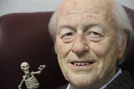
Ray Harryhausen sculpture. Or the real thing?

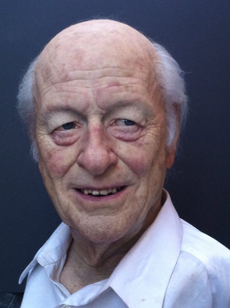
This life-size sculpture of special effects master, the late Ray Harryhausen, has unsurprisingly been mistaken for a photograph of the man himself. Sculptor and LA-based artist Mike Hill said that his tribute to Harryhausen took about six weeks to complete, but the background work of studying and perfecting every aspect of Harryhausen ‘s image from his teeth to the liver spots on his head, took many more months. At first I thought that Hill had perhaps based the vision for his remarkable sculpture on an existing photograph of Harryhausen. When I asked Hill for some background on the concept, he said that the idea for the sculpture was something he had conceptualized on his own, and that his only goal was to “portray Ray in his element, like a proud father. Which is exactly how he (Harryhausen) looked at his creations.”

And to that I say mission accomplished, Mr. Hill.
 
Ray Harryhausen sculpture with skeletons
 
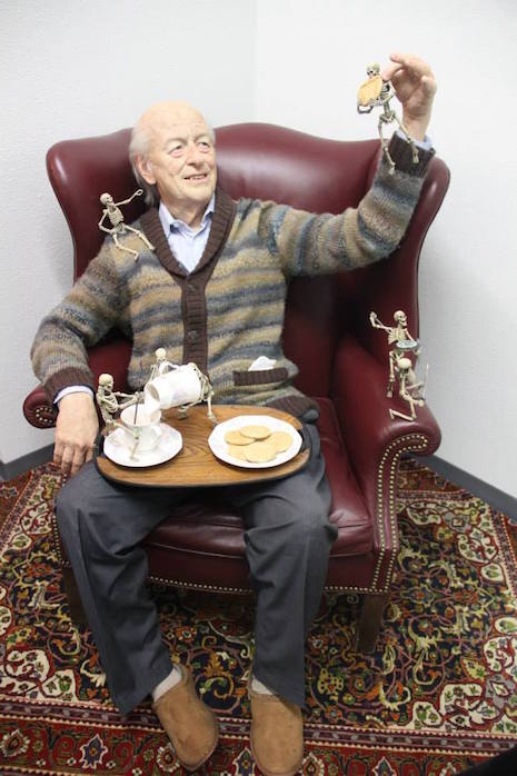
Joining Harryhausen in this stunning homage are members of the skeleton warriors from two of Harryhausen’s most loved films, Jason and the Argonauts and The Seventh Voyage of Sinbad. Honestly, the image of seeing Harryhausen enjoying milk and cookies while admiring his skeletal minions made my eyes a little leaky. I should probably get that checked out. Many more images that will make you do a double-take follow.
 
Ray Harryhausen sculpture
 
Get a better look at ‘Ray’ after the jump…

READ ON
Posted by Cherrybomb
|
05.06.2015
08:53 am
|
‘Big Lebowski’ Russian nesting dolls
05.05.2015
05:15 pm
Topics:
Tags:


San Francisco-based designer Andy Stattmiller has certainly won my heart over with these excellent matryoshka dolls that pay homage to everyone’s favorite late-‘90s bowling-themed stoner movie, The Big Lebowski by Joel and Ethan Coen.

Die-hard fans of the movie won’t need to be told that the dolls represent, in descending order, Walter Sobchak, The Dude, Jesus, Maude Lebowski, The Big Lebowski, The Stranger, and the innocent marmot that gets tossed into the Dude’s bathtub.

Wait: No Donny? No Donny??

Actually, Stattmiller accurately points out that Donny is represented by the Folger’s can Walter is clutching.  Walter is also carrying ex-wife’s pomeranian, sans bowling shoes (I assume anyway, it’s in a carrier).


More after the jump…

READ ON
Posted by Martin Schneider
|
05.05.2015
05:15 pm
|
Shit Museum opens in Italy
05.05.2015
04:09 pm
Topics:
Tags:

The Museum of Shit
 

A milk farm in Northern Italy, located in Castelbosco, is now home to the Museum of Shit, or in its native language, Museo della Merda.

The farm’s owner and the museum’s curator, Gianantonio Locatelli, created the museum to educate people on the the good uses of poop. His farm’s cows alone produce over 100,000 kilos of dung a year, some of which is reused as art in the museum.

Looking to visit this shitty place? Well, don’t delay. It’s only open weekends from May through August 2015, and by appointment only.

 
via Boing Boing, artnet News

Posted by Rusty Blazenhoff
|
05.05.2015
04:09 pm
|
Punk posters from London’s legendary Roxy club
05.05.2015
01:01 pm
Topics:
Tags:


Barry Jones: “They all loved the posters. Wayne County signed his. Everybody wanted copies so I went back for a reprint.”
 
Barry Jones was one of the three founders of the Roxy in Covent Garden at the very end of 1976 and the start of 1977; the other two were Andrew Czezowski and Susan Carrington. The Roxy famously lasted less than two years and had an especially awesome start, featuring many of punk’s greatest acts in a very short time, including Wire, X-Ray Spex, XTC, the Damned, the Jam, the Police, the Adverts, Buzzcocks, Sham 69, Siouxsie & The Banshees, the Slits, and the Vibrators.

After the Roxy closed, Barry Jones joined the London Cowboys, who stayed intact through 1986.

If you do research about the 1970s with any regularity, as all DM contributors do, it becomes immediately apparent how ubiquitous black-and-white photography was and how expensive printing in color must have been. One of the aspects that makes Jones’ gig posters so marvelous is that, in addition to being totally too much and overwhelming the onlooker with visual data, they’re just full of brimming color. Not suprisingly, they were supposed to be in B&W too, as Jones revealed in the pages of The Roxy London WC2: A Punk History by Paul Marko:
 

I loved color and I loved collage. I loved Andy Warhol and I loved the mass production thing. I’d found the place on Regent Street where Bowie shot that cover of Ziggy Stardust in the telephone booth right near the Xerox copy place. There were very few copy places around at that time—colour copiers anyway. We found this place that was conveniently near us and I did some paste ups. I was in love with magazines; if you went to my flat there were stacks and stacks of colour magazines from Vogue to colour supplements. I would go through them and pull out images I loved and the typefaces I wanted to copy. I had reams of references. At that time I was also really into Spiderman comics and their graphics. I loved the depth of feel that they got. I didn’t know what I was doing but I liked that the fact there was more to read in them than my earlier posters which were flat graphic.

When I came to do the posters it was just like a natural transition to me and include things I liked. So basically I slung together these collage things. The first three were for the Yanks. I liked them and they were gonna be B&W because that was all we could afford at the time; we weren’t making that much money. I remember going down to get them printed. I ran them through the B&W copier and they were pretty disappointing and I thought just for me I’ll do a colour one and that was it. Boom! Off the page it was phenomenal. and I just made the decision on my own that these were going to be colour. It’s a special gig; it’s the Yanks, it’s the Heartbreakers. They were expensive and had to be strategically placed rather than smothering the town.

 
(If available, clicking on an image will spawn a larger version.)
 

Cherry Vanilla: “That vibrator was drawn in. It was actually a microphone in my hand, but they made it into a vibrator. I had no control over that, but I didn’t mind it. I was sexual and I didn’t mind being portrayed that way.”
 

Jones: “Leee Childers was so gracious because I’d spelt Heartbreakers wrong. I had this kind of dyslexic thing where I would do a layout and one in ten I would do a misspell. I spelt it ‘Heartbrakers’... He was so gracious saying ‘it doesn’t matter they’re beautiful.”
 
More of Barry Jones’ posters from the Roxy, after the jump…

READ ON
Posted by Martin Schneider
|
05.05.2015
01:01 pm
|
The communist art of René Mederos, Cuban propagandist for Vietnamese revolution
05.05.2015
08:27 am
Topics:
Tags:


“Como en Viet Nam,” ca. 1970
 
Retrospectives on communist art and design are often dominated by some pretty inaccessible (and sometimes downright godawful) aesthetics. For example, many people find the grey boxes of GDR architecture a bit alienating, and while I personally adore it for kitsch value, most folks don’t dig on Socialist Realism paintings, as all that beatific portraiture of Stalin can get overwhelmingly corny. Dictators and stark buildings are not however, the whole and sum of communist aesthetics. There has been a lot of exoteric art produced in the name of the workers state, and with his unmistakable saturated colors and revolutionary tableaux, René Mederos was one such propagandist of the people.

Born in 1933, self-taught Cuban artist Felix René Mederos Pazos began his career at a Havana print shop when he was only 11 years old. By his mid-twenties he was Chief Designer for the big Cuban television station, and in 1964 he started making propaganda posters as head of a design team. In 1969 Mederos was sent to Vietnam to paint the war alongside the Vietnamese communists that were fighting it. Despite the brutality and violence he witnessed, Mederos often produced alluring, joyful images, a direction that some Cubans felt wasn’t dark and/or anti-American enough.

Mederos actually returned to Vietnam in 1972, and though he also did series on Che Guevara and the Cuban Revolution, Vietnam remains his most famous subject, and a major touchstone in Cuban graphic design.
 

1969
 

“Como en Viet Nam, Mes de la Mujer Vietnamita” (Month of the Vietnamese Woman), ca. 1970
 

More Mederos after the jump…

READ ON
Posted by Amber Frost
|
05.05.2015
08:27 am
|
Norway’s monument to 91 ‘witches’ killed nearly 400 years ago
05.04.2015
04:18 pm
Topics:
Tags:


Just like New England in 1692-1693, the little town of Vardø, located far north of the Arctic circle, in the extreme northeastern part of Norway—it’s actually much closer to Russia than it is to Sweden, which is unusual for a Norwegian town—experienced a witch crisis all its own in the 17th century. The witch trials ended up affecting an unusually high percentage of the local townspeople—the entire county of Finnmark had a population of 3,000 people, but 135 people were accused of practicing witchcraft, 91 of whom were executed. As in Salem, the method of “pond dunking” was used:
 

it was often part of the process to include “trial by water”—the result being seen as “God’s will”. Those accused were bound hand and foot and thrown into the water. If the person floated, it was sign of their guilt. If they sank, they were innocent. During the Vardø witch trials, all those that were subjected to “trial by water” floated—thus guilty in the eyes of God.

 
In 2011 a memorial for the victims of the witch trials was erected and unveiled by the Queen of Norway. The designers of the memorial were two highly esteemed artists, Peter Zumthor of Switzerland and Louise Bourgeois, born in France but active in the United States. The memorial, known as the Steilneset Memorial, is located next to what is believed to be the execution site of many of the 91 victims.

The memorial consists of two parts, a long hallway suspended near the beach, Zumthor’s “Memory Hall,” a long cross-hatched frame containing a corridor with 91 lamps, each one illuminates a window and a plaque that tells the story of the men and women killed with testimony from their trials. That is connected to the Bourgeois contribution, a black box made of glass with a constantly burning chair in the middle, with mirrors suspended above it. This part is called, “The Damned, The Possessed, and The Beloved.”

Of the artists’ process, Zumthor has said, “I had my idea, I sent it to her, she liked it, and she came up with her idea, reacted to my idea, then I offered to abandon my idea and to do only hers, and she said, ‘No, please stay.’ So, the result is really about two things—there is a line, which is mine, and a dot, which is hers…. Louise’s installation is more about the burning and the aggression, and my installation is more about the life and the emotions [of the victims].”


More after the jump…

READ ON
Posted by Martin Schneider
|
05.04.2015
04:18 pm
|
Technology’s lost art: The ancient magic of the record label
05.04.2015
02:44 pm
Topics:
Tags:


In our race to embrace new technologies much has been lost. During the 50s and 60s General Electric spokesman Ronald Reagan appeared regularly on American television declaring with godlike certainty “that progress is our most important product.” And we bought it. And we’re buying it still.

Until their recent resurgence, vinyl records were a thing of the past. Now it’s compact discs that are being phased out. DVDs and Blu-rays are next. The powers that be want us streaming data through the ether without the hassle or production costs of actually making something you can hold in your hand and own, not just store in a cloud somewhere. In our embrace of the new, faster, most convenient thing, we’ve lost a substantial amount of what we love about the things we love, the things that make our lives more beautiful. My Sonos streaming device is an ugly block of white plastic. My turntable, a Thorens with a beautiful wooden plinth, is a masterpiece of design and function, gorgeous to look at, soulful, unique. My record collection is not just, to my ears, a superior way to listen to music, it is a wonderland of marvelous sleeve art, label design and picture discs. All of which I can hold in my hands, all responding to gravity and easily handed off to a friend to appreciate as much as I do. No one ever comes into my home and asks to see my set lists on Deezer or flips through my Amazon cloud collection.

The phasing out of vinyl, CD, DVD, celluloid, happened so fast that a lot of people were caught by surprise. I own a vintage audio store and people are coming in on a regular basis to buy CD players because the local big box stores don’t sell them anymore. You might be able to find a shitty player that will shuffle dozens of CDs or some crappy all-in-one system. But a good single tray player with a decent digital audio chip is getting harder to find unless you move into expensive audiophile gear territory. If you told me even five years ago that CD players and CDs themselves would become collectible I would have laughed and said you were nuts. Guess what? Anyone want to buy a Suicide Commandos’ CD for $400. I got one.

The return of vinyl is wonderful for many of us. But the big three music corporations hate it. They’ve had to shift back to making stuff. And they have to pay a lot of people to make it. The new records sold in my store put scores of people to work, from the guys who make my record bins, to workers pressing the vinyl to the artists designing record jackets again. Add to that the truckers who move the vinyl, the folks in my store who sell it and homegrown turntable manufacturers like U-Turn who can’t keep up with production demands. All those people making livings thanks to vinyl. Not to mention, the musicians who now have more control over their product and profit when they produce their own records. Yes, a record costs much more than a CD to make or an MP3 to stream. But a record is something special to a bands’ fans. It is an artifact, a totem, something you hold close to your heart knowing that not everyone owns one of these slabs of black magic. With demand so high and current production so limited, every record made today is almost instantly collectible. You may be fine listening to iTunes or Amazon cloud, but vinyl is something you want to own. It is precious. It is art.

So that’s my vinyl rant. It was all leading up to sharing these beautiful 78rpm record labels produced in Britain between the years of 1898 and 1926. Enjoy them. And be happy that we may be seeing their like again, if not already.


More after the jump…

READ ON
Posted by Marc Campbell
|
05.04.2015
02:44 pm
|
Super sexy, futuristic couture cosplay
05.04.2015
02:25 pm
Topics:
Tags:

Divamp Mohawk Helmet
 
Designer Boyd Baton has been crafting his dystopian designs for over 20 years in Barcelona, Spain. While attending school in his native Holland in the early 90’s, Baton found himself smack in the midst of the emerging Acid House dance scene and started making hand-painted T-shirts and costumes for his friends and the club kids. One of Baton’s first creations was a bra made from mirrored PVC, a fab fabric that he still incorporates into the futuristic looks that are a part of his label Divamp Couture which Baton launched in 2013.
 
Divamp Alien Helmet
 
While Baton says he admires the work of designers like Thierry Mugler and Jean-Paul Gaultier, he credits Mother Nature as his true muse. Since I’m pretty sure Barcelona is located on planet Earth, I find Baton’s nod to nature a bit confusing. Sadly, the truth is that I’ve never been to Barcelona. So I must suspend my disbelief that some areas of the city are inhabited by extras from Mad Max. But I digress.
 
Divamp Mohawk Helmet and Armor
 
Baton’s extreme duds are made from flexible mirrored PVC sewn onto a fabric lining. So they only look like they would repel bullets or protect you from a surprise roadside attack by The Acolytes. Also, if while looking through some of the images that follow of Baton’s sci-fi handy work you think that you’ve just found the perfect get up for Halloween this year, forget it. Baton’s more involved designs cost over a grand, and smaller pieces like this spiny armor for your arm will run you a few hundred dollars. Let’s face it, if you want to look like the alternate universe version of the Plasmatics (and who doesn’t?), it isn’t going to come cheap. If you’re currently in Barcelona, Baton’s work can be seen and purchased in at his brick and mortar store located on the popular shopping street, Carrer Petritxol.
 
Divamp Mask and Armor
 
Divamp Mirrored Hair
 
More after the jump…
 

READ ON
Posted by Cherrybomb
|
05.04.2015
02:25 pm
|
Demented clown portraits by Elo Perfido
05.04.2015
12:38 pm
Topics:
Tags:


God, I wish whoever was behind Jared Leto’s laughable “look” as The Joker (some suspect the make-up was a “troll”) took some pointers from French-born photographer Eolo Perfido‘s photo series “Clownville.” The portraits are a perfect mixture of demented and grotesque.

Make-up by Valeria Orlando.


More after the jump…
 

READ ON
Posted by Tara McGinley
|
05.04.2015
12:38 pm
|
Famous Monsters: The eerie movie-monster portraits of Basil Gogos
05.01.2015
09:04 am
Topics:
Tags:


In it’s late ‘50 to early ‘70s heyday, Famous Monsters of Filmland became legendary. Though it thoroughly covered the horror film scene, it did its job with a surfeit of cheek that made it accessible to younger readers, making it a semi-serious film rag that appealed to the MAD magazine demographic. (Its publisher, Warren Publishing, was also home to MAD visionary Harvey Kurtzman’s Help!.) It spawned imitations, and soldiered on for over a decade past its useful life, to fold in 1983. The mag was revived in 1993, and after some legal contention, it continues today as a web site and a bimonthly print publication.

Between MAD magazine and Playboy, there was Famous Monsters of Filmland. For kids growing up in the late 1950s and early 1960s, it was one of the landmarks of adolescence; something that was frowned upon or simply beyond the comprehension of their parents; something that was uniquely their own. It was Forrest J. Ackerman’s genius to recognize that kids would love exploring the worlds of horror and science fiction and it was Jim Warren’s genius to grasp that by making the magazine scholarly but humorous, it would diffuse the subject matter’s dark side and make that younger readership feel welcome. In fact one of the striking elements of FM’s early years is how much interaction there was with its readership, through its lengthy letter column (which regularly printed reader photos) to the “You Axed for It” request pages and the fan club/“Graveyard Examiner” sections. The magazine had a curious innocence (engineered by Ackerman’s persona of a friendly, endlessly punning uncle), mixed with a sense of transgrescence. For all the jokes an light-heartedness, this was still a publication filled with images of monsters, the undead, vampires, and corpses which carried with it a frisson of danger and the forbidden.

The Warren Companion

One of the factors that distinguished Famous Monsters in its prime was stunning cover art, most notably the expressionistic character portraits of Basil Gogos. Gogos was a Greek national born in Egypt, whose family moved to the US when he was in his teens. He studied illustration under the Art Student’s League’s Frank J. Reilly, and began illustrating pulp westerns at the end of the ‘50s. His leap to the horror genre came quickly—his first FM cover was a 1960 portrait of Vincent Price, and he went on to do more than 50 utterly distinctive works for the publication.


Plenty more, plus a TV documentary about Basil Gogos, hosted by Elvira, Mistress of the Dark, after the jump…

READ ON
Posted by Ron Kretsch
|
05.01.2015
09:04 am
|
Page 143 of 380 ‹ First  < 141 142 143 144 145 >  Last ›