FOLLOW US ON:
GET THE NEWSLETTER
CONTACT US
For the discerning Satanist: Demonic sculptures made from bones
05.14.2015
09:49 am
Topics:
Tags:


Untitled No. 2
 
Sculptor John Paul Azzopardi creates these lovely, elaborate skeletal structures from actual bones to a sort of “Refined Satanist” effect. The works invoke a kind of “pop pagan” iconography—ram’s heads, bats, a mysterious structure that looks like it belongs on an altar etc.—but the articulated detail of each sculpture prevents them from being perceived as too… “serial killer?” Azzopardi does not say where he gets his bones, but they appear to be small animal bones, or possibly small children’s bones, humanely sourced from crooked orphanages and Marilyn Manson’s trash cans.

From his site:

Bone is a collection of fossilized structures that explores the gentle temperance located within the constitution of sound, i.e. its very silent centre.  The architectural relationship that oscillates back and forth from the simple and the complex to the living and the dead connects space and form, creating existential structures of interwoven silence. The death embedded in its form, its life. This might confront the spectator with a spectre, the simulacrum of itself that stalls, halts being something in its tracks.


Untitled No. 2
 

Untitled No. 6
 
Continues after the jump…

READ ON
Posted by Amber Frost
|
05.14.2015
09:49 am
|
Ten years before Disney, Lotte Reiniger made breathtaking animated features before fleeing the Nazis
05.12.2015
07:09 pm
Topics:
Tags:


The popular history of animation starts with Walt Disney—a tragic oversight and a considerably US-centric misconception. In addition to the pre-Disney animation in America, the Soviets were making cartoons early on (starting with cautionary propaganda, of course) and the Japanese produced amazing early animation referencing folklore. However, the most beautiful and ambitious of early cartoons have to be from Charlotte “Lotte” Reiniger, a German filmmaker who produced lush, elaborate scenes using stop-motion with excruciatingly detailed silhouette cut-outs. Even more impressive was the duration of her films—which qualify as features—made ten years before Disney’s Snow White, which is generally recognized as the first animated feature film.


Below you can watch Reiniger’s most famous work, 1935’s Papageno, which was set to music from Mozart’s opera “The Magic Flute.” While it lacked the production values of some of her later features, Papageno is the most fantastical, following Papageno the birdcatcher’s quest to find his true love. The silhouettes themselves are a perfect example of Reiniger’s cut-out style, which was inspired by Chinese silhouette puppetry. The cut-outs were generally set against brightly monochromatic backgrounds, but the painstakingly cut scenery and subjects really pop against white as well. The piece is a perfect fairy tale—richly evoked with drama, romance and humor.


Despite her success (she was particularly popular in the avant-garde scene alongside artists like Bertolt Brecht and Kurt Weill), Reiniger’s career was sporadic. As known leftists during the rise of the Third Reich, she left the country with her husband and collaborator Carl Koch. Unable to get permanent Visas, the couple hopped around Europe for over ten years and still managed to create twelve films, including Däumelinchen (better known as “Thumbelina”), Cinderella, Hansel and Gretel, and 1955’s beautifully colored Hansel and Gretel


Via Network Awesome

Posted by Amber Frost
|
05.12.2015
07:09 pm
|
Handsewn images of Patti Smith, Marianne Faithfull, Nico, Syd Barrett and more
05.12.2015
02:24 pm
Topics:
Tags:

Nico hand embroidery
Nico, Nude and Deaf in One Ear (recto and verso) - 2013 - 2014, 84” x 40”, hand embroidery on muslin
 
Masterful embroiderer Jenny Hart said she was really unhappy while away art school in France, so she dropped out of the program she had enrolled in and got a degree in French instead. Lucky for all of us, Hart continued to draw and thanks to inspiration from her beloved comic books and the legendary line drawings of R. Crumb, found her muse. Embroidery.

Since forming her company, Sublime Stitching, Hart’s work has been featured in publications likeVogue and The New York Times. Her work is privately owned by many collectors, including the estate of the late Elizabeth Taylor, as well as a piece that is part of a permanent display at the Smithsonian American Art Museum in Washington, D.C.

Hart has even experimented sewing with human hair, an artistic dream that she wanted to make a reality for as long as she can remember. After an exhaustive search through the wig stores of LA (a great story on its own I’m sure), Hart found a wig made exclusively from human hair extensions. Despite this discovery, she ended up stringing her own hair through a piece of leather that would go on to become a piece called “Oh Unicorn”.
 
Patti Smith embroidery
Patti Smith Transfigured (detail) - 2014, hand embroidery on cotton
 
Marianne Faithful embroidery
Marianne Faithfull - 2005
 
In addition to the intoxicating images of Smith, Faithfull and Nico, Hart has also created embroidered versions of French cabaret singer Edith Piaf; La Chingona from SF-based Incredibly Strange Wrestling; Marianne Faithfull, The head of John the Baptist; Iggy Pop; Pink Floyd’s founder Syd Barrett, and many others. If you are handy with a needle and thread, take a look at some of the patterns you can make on your own that Hart created in collaboration with cartoonist, Jim Woordring. Many images of Hart’s work that your eyeballs will dig follow!
 
Edith Piaf embroidery
Edith Piaf: Piaf - 2002
 

Syd Barrett - 2003, hand embroidery on satin
 
More after the jump…
 

READ ON
Posted by Cherrybomb
|
05.12.2015
02:24 pm
|
Stunning occult posters of magicians from many decades ago
05.12.2015
12:35 pm
Topics:
Tags:


Kellar. Thurston. Carter. These names are forgotten to us, but once they motivated throngs of people to attend their mystical performances of occult hoodoo and magic. Their posters are models of the seductive appeal, with their bold names and strange images of impossible creatures. The prominence of the name in these posters is far from accidental—only after years of painstaking labor rising up through the ranks might a magician become one of the select handful whose name alone could draw crowds.

Harry Kellar was called the “Dean of American Magicians” and one of his main illusions was the “Levitation of Princess Karnack,” which trick he pilfered from a rival magician by bribing a member of the other guy’s theater staff. He also had a trick that involved decapitating his own head, which would then levitate over the stage.

Howard Thurston (it does sound more alluring without the “Howard,” doesn’t it?) was a partner of Kellar’s, a master of tricks involving playing cards. You can see that one of the posters says “THURSTON: KELLAR’S SUCCESSOR.” Thurston eventually did become the best-known magician in America.

Charles Joseph Carter perfected the classic “sawing a woman in half” illusion and also had an especially macabre trick in which his shrouded body would vanish just as it dropped from the end of a hangman’s noose.

Some of you might remember a diverting 2001 novel called Carter Beats the Devil by Glen David Gold, a thriller, somewhat like Caleb Carr’s The Alienist, about a fictionalized version of Carter.


More magicians, after the jump…

READ ON
Posted by Martin Schneider
|
05.12.2015
12:35 pm
|
‘Poorly Drawn Album Covers’: Your Facebook time waster for the day
05.12.2015
10:23 am
Topics:
Tags:


I have a big weakness for injudiciously liking and joining extremely narrow-purpose Facebook pages and groups, and as such I’m a proud member of “Staring At This Picture Of Dave Navarro Until It Gives Me An Acid Flashback,” at least a dozen groups that consist of nothing but vinyl enthusiasts posting the covers of whatever they’re listening to at the moment, and OF COURSE “The Same Photo of Glenn Danzig Every Day,” which DM told you about last week. But the thing that’s been tickling me this week is “Poorly Drawn Album Covers,” which is exactly what you think. The page’s unnamed admin draws (presumably by him or herself, no artist credits are given), shoddily, in what must be MS Paint or worse, album covers ranging from iconic, instantly recognizable classics (amusingly, their Screamadelica and Songs About Fucking don’t actually look super different from the originals at first glance) to recent indie stuff—and they have quite good taste in indie, IMO. But even if you can’t name the record (they’re not identified for the reader, which I like), it’s still always a giggle. Here are a few samples. There’s plenty more where this came from, and if that’s still not enough for you, these folks have competition on Tumblr.
 

Bjork, Homogenic
 

Kendrick Lamar, To Pimp A Butterfly (which by the way is as good as everyone says)
 

Ride, Nowhere
 
More poorly drawn album covers after the jump…

READ ON
Posted by Ron Kretsch
|
05.12.2015
10:23 am
|
‘Song portraits’: What does music by Radiohead, Stevie Wonder & David Bowie LOOK like?
05.11.2015
04:00 pm
Topics:
Tags:


Led Zeppelin, “Since I’ve Been Loving You,” Led Zeppelin III
 
Synesthesia is a fascinating condition experienced by 2% to 4% of the population, wherein a stimulus of one sense (taste, say) is processed and perceived within the framework of another sense (hearing, say). A person with the condition might say “That spaghetti tastes loud,” or “That song is purple.” Some minor crossing of wires that leads to a harmless yet stimulating state of affairs for those who have it. Notable synesthetes include Nikola Tesla, David Hockney, Vladimir Nabokov, Duke Ellington, and Wassily Kandinsky. Nabokov famously felt that each letter had a very specific color, which is a relatively common manifestation of synesthesia. 

Erin Kelly at All That Is Interesting has posted the, well, interesting “song portraits” of a Missouri artist named Melissa McCracken. As Kelly writes,
 

Each of McCracken’s paintings is based on a certain song, and incorporates the song’s notes, tempo, and chord progression through textures, hues and shapes. It is not imperative that one understands the condition’s neurological underpinnings to appreciate the work being done here, but those with a taste for abstract art will perhaps extract the most enjoyment from these pieces.

 
Check them out, they’re quite wonderful. I woulda said the Prince song would have a lot more purple to it, but I suppose McCracken knows best.

(Clicking on a song title will bring you to a YouTube version of that song. Highly recommended to refresh your memory! Hearing the music makes the pictures pop a lot more.)
 

Stevie Wonder, “Seems So Long,” Music of My Mind
 

Etta James, “At Last,” At Last!
 

Radiohead, “Karma Police,” OK Computer
 
More synesthesia after the jump…

READ ON
Posted by Martin Schneider
|
05.11.2015
04:00 pm
|
The cover for Nirvana’s iconic album ‘Bleach’ was based on an accident
05.07.2015
11:20 am
Topics:
Tags:


One of the primary accomplishments of Montage of Heck documentary on Kurt Cobain that aired on HBO earlier this week was to remind me how much I fuckin’ love Bleach. Nirvana’s three studio albums are very distinctive, of course—all three albums are excellent, but in my mind I classify them as “raw (low budget),” “polished (medium budget),” and “raw (high budget).” I really like Nirvana in its “raw (low budget)” state. The whole first half of Montage of Heck consists largely of quasi-animated sequences with Nirvana music churning underneath, and damned if I don’t find “School,” “Negative Creep,” and “Blew” just as galvanizing and toe-tapping as I did when the album became lodged in my CD player back in 1990.

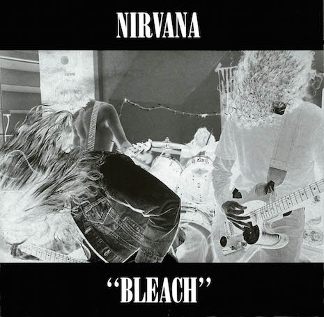
When Bleach was released, a big portion of the mystique of the album derived from its doomy, mysterious album cover. What the hell is a “Kurdt Kobain”? This really cost $606.17? What is happening in the picture on the cover? Why is “Bleach” in quotation marks? And so on. The front cover is a classic, and the tall, serif letters of “NIRVANA” would shortly adorn ten thousand T-shirts as well as all of the band’s official releases, from Nevermind all the way to From the Muddy Banks of the Wishkah (but not the B-sides comp Incesticide).

Remarkably, one of the most important decisions of the band’s career—what the logo would look like—was decided by chance, indeed, as Jacob McMurray has written, “mostly by accident.”

Quoting from the indispensable volume edited by McMurray, Nirvana: Taking Punk to the Masses, which documented the 2011 exhibition of the same name,

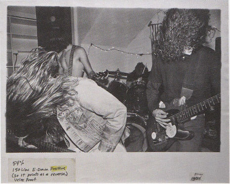
The layout for the Bleach cover was created by graphic designer and musician Lisa Orth at the offices of The Rocket, where she also worked. The cover comformed to Sub Pop’s design aesthetic: a stark field of color with bold type and a striking photograph. The photo, by Kurt Cobain’s girlfriend Tracy Marander, was reversed-out as if it were a film negative. It featured the band (including [Jason] Everman, though he didn’t perform on the album) playing at the Reko/Muse Gallery in Olympia, WA, on April 1, 1989. Orth asked The Rocket’s typesetter, Grant Alden, to set the band’s name in whatever was already installed in their typesetting machine. And thus Nirvana’s logo was born, mostly by accident.

That typeface, based on Bodoni Extra Bold Condensed, was called Onyx, and it looks like this:


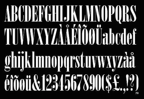
The differences between Bodoni Extra Bold Condensed and Onyx aren’t 100% clear to me, but as Caitlin Richards helpfully explains, “The difference between Onyx and Bodoni is that Onyx’s letters are tracked closer to each other.”

Art Chantry gets into the jargon in the book Nirvana: Taking Punk to the Masses,
 

It was a typeface called Onyx which is a Compugraphic bad design of Bodoni Condensed—really hunky, ugly, and those Compugraphics, if you didn’t use the right kerning programs you had really bad letterspacing. And so Grant Alden basically just sat down, slammed it out, charged Lisa Orth 15 bucks, which she paid out of pocket, and that is where Nirvana’s logo came from.

 
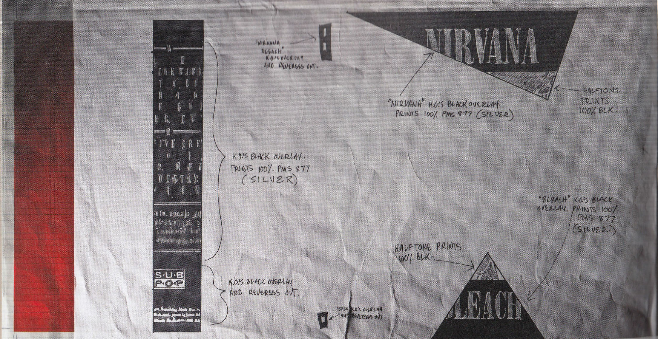
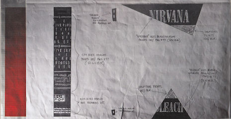
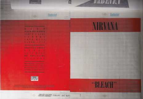
While we’re on the subject of the Bleach cover, here are three fascinating images of the design elements that went into it. I had never seen these before like two days ago (clicking spawns a larger version).


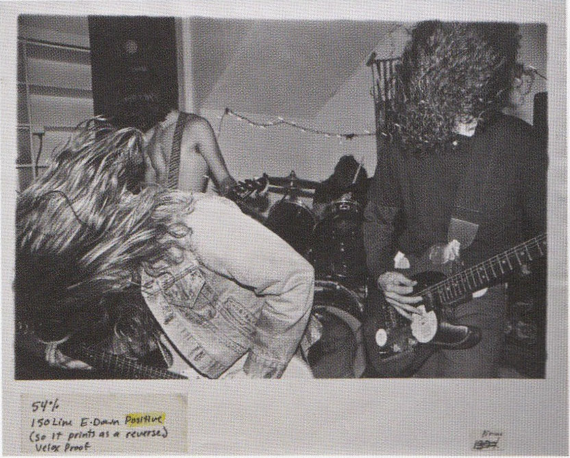
And finally—my favorite of them all—here’s the cover image in its un-inverted state, which I’ve been dying to see for 25 years:


Again, if you find this even a fraction as interesting as I do, you really have to pick up Nirvana: Taking Punk to the Masses.

Photos: Lance Mercer

Posted by Martin Schneider
|
05.07.2015
11:20 am
|
See Frida Kahlo’s wardrobe, locked away for 50 years
05.06.2015
02:43 pm
Topics:
Tags:


Traditional Tehuana dress
 
Anyone with the remotest familiarity with the paintings of Frida Kahlo will have noticed that one of her primary subjects is her own physical pain and the fragility of her own body, especially after a life-altering accident with a bus that occurred in 1925. In that accident, the bus she was riding on collided with a trolley car, and the list of the ailments that resulted would give even the staunchest stoic pause: a broken spinal column, a broken collarbone, several broken ribs, a broken pelvis, eleven fractures in her right leg, a crushed and dislocated right foot, a dislocated shoulder; an iron handrail pierced her abdomen and her uterus as well.

It wasn’t just her paintings that referenced her broken body (Tree of Hope, 1946, is a good example); her wardrobe inevitably did as well. Her clothes were an expression of her indomitable will as much as anything else—she was determined to live a fulfilled, independent, and creative life, and thus created for herself ad hoc clothes that fused skirts and corset or prosthetic leg and boot, and accommodated her misshapen, asymmetrical legs (as a result of which, she wore long, traditional Tehuana dresses to conceal her lower body). She painted on her body casts (one of them has the Communist hammer and sickle on it).

After Kahlo’s death in 1954, her husband Diego Rivera shut her belongings in a bathroom at their Mexico City home, the Blue House, the marvelous house they shared—and then insisted that it be locked up until 15 years after his death (which, in the event, happened in 1957). In fact, the room wasn’t opened until 2004, when Ishiuchi Miyako was given permission to photograph its intimate contents. The photographs will be on display at the Michael Hoppen Gallery in London from May 14 through July 12.

The best thing that could happen to the Internet right now would be for Etsy to become infected with Kahlo’s distinctive clothing aesthetic. This is a style icon!
 

Cats-eye glasses
 

Full body cast/skirt
 
More of Frida’s fashion, after the jump…

READ ON
Posted by Martin Schneider
|
05.06.2015
02:43 pm
|
Nick Cave meets Dr. Seuss
05.06.2015
12:42 pm
Topics:
Tags:


Dr. Seuss and Nick Cave? Two great tastes that taste great together? Sure. Why not?

Nick Cave’s “Red Right Hand,” a single from his 1994 album Let Love in is one of his best-loved tunes and long an in-concert staple of his live shows. It can be heard opening and closing series one of Peaky Blinders, the soundtrack to all three of the Scream movies, The X-Files and many other things (including, curiously, a Snoop Dogg documentary.). The “red right hand” referred to in the lyrics is an allusion to a stanza in Milton’s Paradise Lost (not the first time Cave has drawn inspiration from Milton’s epic verse):

“What if the breath that kindled those grim fires, / Awaked, should blow them into sevenfold rage, / And plunge us in the flames; or from above / Should intermitted vengeance arm again / His red right hand to plague us?” (Book II, 170-174)

And now the song’s sinister narrative has been Seussified by Deviant Art user DrFaustusAU... Cave’s lyrical wordplay is suitably Seussian, and it works brilliantly:
 

Take a little walk to the edge of town. Go across the tracks…
 

Where the viaduct looms, like a bird of doom, as it shifts and cracks…
 

Where secrets lie in the border fires, in the humming wires. Hey man, you know you’re never coming back…
 
More after the jump…
 

READ ON
Posted by Richard Metzger
|
05.06.2015
12:42 pm
|
Lydia Lunch’s sexy ‘Fashion Calendar,’ 1978
05.06.2015
11:19 am
Topics:
Tags:


This “fashion calendar” featuring Lydia Lunch, queen of New York’s no wave movement of the late 1970s, was executed by Julia Gorton for a class at Parsons School of Design in 1978. This was the same year that the seminal No New York compilation was released, including key contributions from Teenage Jesus and the Jerks, of which Lunch was the frontperson.

Gorton, who today is a professor at Parsons, also designed flyers for Teenage Jesus and the Jerks, such the following:


This calendar appears in No Wave: Post-Punk. Underground. New York. 1976-1980.  by Thurston Moore and Byron Coley. The caption refers to it as “a 1978 Lydia Lunch fashion calendar, assembled by Julia Gorton for a design class at Parsons.” No other information is given.

March and June and October aren’t present—either they were never made or they have been lost to the sands of time; I suspect the former. In any case, the 9 months that are there do not include the days of the week, so you can print them out and use them in any year. If it’s a leap year, hold your nose and stay at home all day on February 29th.

Here’s the calendar in its original layout, followed by the individual months. The first two images, you can click on them to see a larger view.


Continues after the jump…

READ ON
Posted by Martin Schneider
|
05.06.2015
11:19 am
|
Page 142 of 380 ‹ First  < 140 141 142 143 144 >  Last ›