FOLLOW US ON:
GET THE NEWSLETTER
CONTACT US
Disorientation of the senses: William Burroughs makes a ‘sick’ and ‘disgusting’ movie, 1966
06.16.2016
04:26 pm
Topics:
Tags:

0_1wsbcb.jpg
WSB by Charles Burns.
 
William Burroughs’ work has always been controversial. When Naked Lunch was first published it was denounced by critics as “obscene,” “repugnant” and “not unlike wading through the drains of a big city.” The poet and arbiter of highbrow taste, Edith Sitwell decried the book stating she did not want “to spend the rest of my life with my nose nailed to other people’s lavatories.” Its publication led to an infamous obscenity trial where Norman Mailer was called as a witness to defend the book and its writer. Mailer famously declared Burroughs as:

....the only American novelist living today who may conceivably be possessed by genius.

However, Burroughs was generally unfazed by his detractors—after all he wasn’t writing for them.

When Burroughs decided to make a short film The Cut-Ups with B-movie smut-peddler Antony Balch it was perhaps inevitable that their collaboration caused similar outrage.

When The Cut-Ups was first screened at the Cinephone, Oxford Street, London in 1966:

Members of the audience rushed out saying, ‘It’s disgusting,’ to which the staff would reply, ‘It’s got a U certificate, nothing disgusting about it, nothing the censor objected to.’

According to Burroughs biographer Barry Miles the Cinephone’s manager, Mr. Provisor:

...had never had so many people praise a film, or so many hate it.

 
More after the jump…

READ ON
Posted by Paul Gallagher
|
06.16.2016
04:26 pm
|
OMG, you can actually commission your own ‘Sweet Valley High’ portrait!
06.15.2016
12:00 pm
Topics:
Tags:


Image via Twitter

I’m sure you guys remember the Sweet Valley High book series from the 80s and 90s, right? Even if you were too old to read them, those SVH books were everywhere and the cover art was recognizable. They’re “totally 80s” iconic at this point, kind of like Patrick Nagel. Artist and illustrator, James L. Mathewuse—who’s also illustrated book covers for Nancy Drew, The Hardy Boys and Judy Blume novels—was behind the Sweet Valley High series cover art.

As one of the New York publishing houses’ popular illustrators, Mathewuse also became the sole artist who created over 250 covers for the “Sweet Valley High” and “Sweet Valley Twins” young adult romance series. Another young adult book, “Tiger Eyes” by Judy Blume, won the prestigious honors for “Best Young Adult Book of the Year.” The young adult series that Jimmy painted have been recognized as the largest selling, not only in America, but in the world.

If you’ve ever dreamt of having your mug immortalized as a Sweet Valley High character… now is your chance. James L. Mathewuse takes commissions! OMG.

According to his website, portraits start at $200 and you can contact him for a consultation. I just might take him up on this!

Click here to visit his page.

Below, examples of Mathewuse’s work:


via Boing Boing and Your Tango

Posted by Tara McGinley
|
06.15.2016
12:00 pm
|
Concept art for David Cronenberg’s ‘Total Recall’ that never was
06.14.2016
02:38 pm
Topics:
Tags:


I’ve heard some great stories about the David Cronenberg movies that almost were. Indeed, I once heard Cronenberg himself tell the tale of taking a phone call from the office of George Lucas, who wanted to feel the Toronto-born director out on the subject of directing Return of the Jedi. Cronenberg sniffed that he didn’t really direct material written by other people, and that was the end of that. (The conversation is all the more ironic if you consider that since that moment, Cronenberg has directed material originated by William S. Burroughs, J.G. Ballard, and Don DeLillo, among others. Maybe he just didn’t think of Lucas as a writer on that level?)

Cronenberg also turned down a chance to direct Top Gun, finding it too jingoistic (plus, as a Canadian, Cronenberg doubly wasn’t into it).

What I didn’t know until recently is that Cronenberg was the first director to be considered to direct Total Recall, which was eventually directed (rather well) by Dutch director Paul Verhoeven, previously responsible for Robocop.

Interestingly, Ronald Shusett and Dan O’Bannon had tried to develop Philp K. Dick’s story “We Can Remember It For You Wholesale” as a script in the 1970s before concluding that the special effects would be too costly—their next project would become Alien, the commercial success of which kick-started the orignal PKD project again. 

Cronenberg worked on pre-production for the PKD project for about a year, a process that generated the fascinating concept art seen below. His choice for the lead role was to have been William Hurt, a far cry from Arnold Schwarzenegger’s, er, likely less thoughtful approach to the movie. After Cronenberg’s labors, the producers told him that they admired his treatment but were hoping for something a little bit closer to “Raiders of the Lost Ark Go to Mars,” so Cronenberg returned to a project that would have a tone that interested him much more, that being a remake of the 1958 sci-fi classic The Fly.

Purportedly, Cronenberg’s take on the material would have been lot closer to Dick’s original story than the Verhoeven movie.

The artworks here were created by Ron Miller and his wife Judith Miller, who was responsible for the 3-D models, as well as production designer Pierluigi Basile.


Much more after the jump…....
 

READ ON
Posted by Martin Schneider
|
06.14.2016
02:38 pm
|
Jeepers Creepers: Surreal illustrations of witchcraft-caused eye diseases from the 16th century
06.08.2016
10:03 am
Topics:
Tags:

0_1opthal5.jpg
 
Georg Bartisch dedicated his life to the study and treatment of the eye and its diseases.

Born in Königsbrück, Saxony in 1535, Bartisch was apprenticed to a barber surgeon at the age of thirteen. After three years training, he set off to ply his trade as an itinerant surgeon—carrying out operations, amputations, and diagnosing illness amongst the populace of Saxony, Silesia, and Bohemia.

Medicine at this time was still prone to a belief in the superstitious. Bartisch believed a patient could be diagnosed through their astrological chart or horoscope and that magic, astrology and indeed witchcraft itself played an important role in the diagnosis and treatment of disease.

His main interest was ophthalmology. Though never academically trained, Bartisch excelled in his study of eye diseases and their cures, and was recognized as a leading expert in ocular medicine and surgery. One can imagine how brutal and painful such procedures would have been at this time when there was very poor hygiene and no anaesthetics.

Bartisch also believed myopia, hyperopia, astigmatism could be corrected by the wearing of masks rather than by the use of eyeglasses (see illustrations below). He believed a glass held in front of the eyes would only further damage the patient’s sight.

Though many of his ideas may seem strange to us now, Bartisch was a pioneer and his major contribution to ocular medicine was his compendium or “atlas” Ophthalmodouleia Das ist Augendienst published in 1583. It was the first book that detailed eye diseases and was responsible in establishing ophthalmology as a separate and distinct medical discipline.

Ophthalmodouleia Das ist Augendienst included sections on head and eye anatomy; strabismus; cataracts (which he classified by color—white, blue, gray, green, yellow, and black); external disease; trauma; and even witchcraft.

By 1588, Bartisch was oculist to the court of Duke Augustus I of Saxony. He died in 1607.

If you have an interest in the history of medicine, or are just a bibliophile, then you may be interested in viewing the whole of Georg Bartisch’s Ophthalmodouleia which has been digitized here.
 
0_1opthal9.jpg
 
0_1opthal8.jpg
 
More after the jump…

READ ON
Posted by Paul Gallagher
|
06.08.2016
10:03 am
|
What if Quentin Tarantino’s movies actually were pulp fiction?
06.06.2016
10:56 am
Topics:
Tags:


It’s not news that Quentin Tarantino is a lover of hard-boiled crime fiction. His most successful movie is, of course, even called Pulp Fiction, which memorably featured a character (John Travolta’s Vincent Vega) who liked to read the first installment of Peter O’Donnell’s Modesty Blaise series while using the toilet.

Tarantino’s follow-up to Pulp Fiction, 1997’s excellent Jackie Brown, was based on Elmore Leonard’s 1992 novel Rum Punch. Tarantino threw in a shot of Robert Forster’s Max Cherry reading Len Deighton’s spy thriller Berlin Game while waiting for Jackie to be released from prison.

And Tarantino’s interest in Leonard doesn’t stop there: it’s been rumored that Tarantino has shown an interest in adapting the crime fiction master’s 1972 western 40 Lashes Less One—but considering that Tarantino’s last two movies were westerns, that didn’t seem too likely, but Tarantino brought it up again as recently as last December—it seems he might want to do it as a TV series.

Tarantino’s strengths as a filmmaker track those of the dime-store fiction category, so a French art director named David Redon had the bright idea to concoct a bunch of paperback covers for each of Tarantino’s movies. The quality is a bit variable (the Pulp Fiction one isn’t good, and come on, you have to misspell INGLOURIOUS the right way!), but I like most of ‘em just fine.

The iconic poster for Pulp Fiction actually is a dog-eared paperback cover, so this makes sense on a number of fronts.


More after the jump…....
 

READ ON
Posted by Martin Schneider
|
06.06.2016
10:56 am
|
Disturbingly beautiful (almost dirty) images of human anatomy from the 1700s (NSFW)
06.03.2016
10:02 am
Topics:
Tags:

0_01platesanat.jpg
 
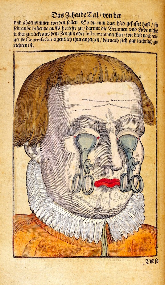
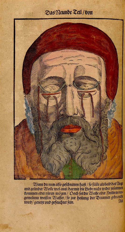
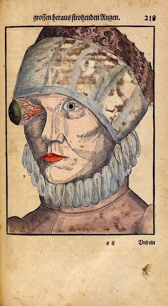
Jacques Fabien Gautier was a printmaker, painter, anatomist and philosopher who is now best remembered for his often lurid anatomical illustrations.

Born in Marseilles in 1716, Gautier began his career as a painter before moving onto printmaking where he developed an interest in the techniques of color printmaking which were then being pioneered by Jacob Christoph Le Blon (1667-1741). Gautier posited the theory colored prints could be created in much the same way as colored patterns were woven into cloth.

In 1736, Gautier moved to Paris—as he believed only great ideas came from great cities. Here he met Louis-Bertrand Castel, a mathematician and scientist who encouraged Gautier to investigate his theories into color printing. However, many of Gautier’s proposals for three and four color printing had been already developed by Le Blon. In 1738, Gautier joined Le Blon’s color-printing workshop but left after only six weeks. He then adopted Le Blon’s ideas and established a printmaking business as a four color printmaker.

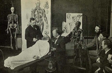
Gautier had one good idea—he decided to produce all of the color anatomical illustrations for medical studies. He collaborated with Jacques Francois Duverney, a lecturer in anatomy at the Jardin du Roy. Together they produced l’Essai d’anatomie or Myologie complete en couleur et grandeur naturelle, composée de l’Essai et de la Suite de l’Essai d’anatomie en tableaux imprimés (1746) and Anatomie de la tête, en tableaux imprimés qui représentent au naturel le cerveau sous différentes coupes, la distribution des vaisseaux dans toutes les parties de la tête, les organes des sens et une partie de la névrologie, d’après les pièces disséquées et préparées par M. Duverney, en 8 grandes planches dessinées, peintes, gravées et imprimées en couleur et grandeur naturelle, par le sieur Gautier or Anatomie de la tête (1748).

The collaboration earned Gautier respect. He became known as a philosopher and anatomist became and was made a member of the Dijon Academy of Sciences.  In 1752, he published a baffling critique on Sir Isaac Newton’s theory of color—Chroa-génésie—in which amongst other things he claimed:

...the sun as the universal agent and motive force. According to Gautier’s theory, the force of its rays generates planetary motion, and it is the source of light and fire, substances with broad significance and many uses according to his system. Modified, they create thunder, lightening, and such geologic phenomena as volcanoes and earthquakes…

Gautier’s theories showed his “understanding of geometry is even less exact than his understanding of Newtonian optics.” His writing was described as “convoluted” and “unintelligible.” Surprisingly, this did not stop Gautier from being taken seriously (if only briefly) as a philosopher—enough to have the great writer Goethe suggest his treatise on color deserved an answer. Goethe also described Gautier as “an active, quick, rather impulsive man, certainly gifted but more than befittingly aggressive and sensational.”

Some critics considered Gautier veered more towards the sensationalist than the scientific:

[Gautier’s] anatomical illustrations while they may perhaps be fascinating to the layman…impress the critical observer with their arrogance and charlatanery and do not recommend themselves to the student of anatomy either for their faithfulness or their technique.

His later work in particular—when Gautier was acting as both anatomist and illustrator—has been dismissed as:

“....probably aimed at more prurient-minded lay persons than at anatomists.”

In a pre-Bettie Page world, I suppose that you took what you were offered?

Now largely forgotten as a natural philosopher and anatomist, Gautier (or Gautier d’Agoty as he later called himself) is now best known for his illustrative work for Jacques Francois Duverney’s three volumes on anatomy.

A copy of Essai d’Anatomie can be viewed and downloaded here.
 
From ‘l’Essai d’anatomie’.
 
0_02platesanat.jpg
 
0_03platesanat.jpg
 
0_02platesanat.jpg
 
More after the jump…

READ ON
Posted by Paul Gallagher
|
06.03.2016
10:02 am
|
The delightfully sleazy sex paperbacks of the 1960s
06.03.2016
09:39 am
Topics:
Tags:


Last week I hipped a book dealer friend of mine to a decent estate sale score. As his “tip” to me for the heads-up he gifted me a nice-sized box full of old pulp fiction titles with an emphasis on lurid covers.
 

A few of the titles in my gift box.
 
The very same day, synchronicity dropped the new expanded edition of Feral House’s exhaustive study of Sixties sleazy sex paperbacks, Sin-A-Rama onto my doorstep.
 

Now available via Amazon.
 
If you have an interest in vintage erotic paperbacks, either from a literary standpoint or as a connoisseur of the tacky cover artwork, this book is an absolute must-own.

The bulk of Sin-A-Rama consists of hundreds of cover reproductions with date, publisher, author and artist credits. The photos alone make this worth the price of admission—so much delicious eye-candy. But what makes Sin-A-Rama an important work is the twenty-two essays on various aspects of the filthy book business, covering publishers, writers, artists, and themes. The majority of these essays are written by dirty novel experts Earl Kemp and B. Astrid Daley who clearly display an affinity for their subject through their comprehensive research. Sin-A-Rama also contains an index of publishers and authors (with their pseudonyms). The new “expanded edition” contains profiles on “Occult Sleaze,” “Swinging Sleaze,” and the “tawdry taboo stuff that sleaze literature fell into during the 1970s”  that were not included in the original edition.

There are so many titillating, shocking, and hilarious titles on display in Sin-A-Rama—so many I’d love to have in my own collection. Until I find that mother lode of sticky originals at some dirty old man’s garage sale, I’m satisfied to have the cover reproductions included herein.

Dig these kinky covers with their vivid depictions of lusty, busty sexpots:


Many, many more lurid pulp paperback book covers, after the jump…

READ ON
Posted by Christopher Bickel
|
06.03.2016
09:39 am
|
Boyd Rice and Douglas P. get busy in the new fan-fiction comic book ‘Love Holocaust’
06.03.2016
09:03 am
Topics:
Tags:


Now there’s a Henry & Glenn Forever for the neofolk set.

The latest catalog from Soleilmoon Recordings (home of the affordable Dreamachine and much of the Legendary Pink Dots’ oeuvre) offers Love Holocaust, a new comic book about “an imaginary romantic encounter” between former collaborators Boyd Rice of NON and Douglas P. of Death in June:

The story, written by J. Guignol, draws inspiration from Death In June’s legendary songbook. Illustrator Tenebrous Kate turned the story into a comic book, and has lovingly hand-made each copy. The covers are hand-printed linocuts with gold ink on black paper. Limited numbered editions of 27 hard-bound and 50 soft-bound copies.


The glimpses of the book’s contents on the Soleilmoon website disclose runes, Gothic script, tiki mugs, and other totems of these men’s mythologies. I see that J. Guignol describes their assignation in the kind of prose Terry Southern used to call “brutally frank” and “frankly explicit”:

Boyd wanted to feel the tightness of Dougie’s anal swastika, he wanted to open the “brown book” of his love. Boyd began to pull Dougie’s pants down; his hot breath send [sic] shivers down Dougie’s spine as he whispered in his ear, “Put the mask on. You know I like it with the mask on.”

More fun after the jump…

READ ON
Posted by Oliver Hall
|
06.03.2016
09:03 am
|
‘Where’s Warhol?’: See if you can find the elusive white-haired pop art master
06.02.2016
10:02 am
Topics:
Tags:


Little could cement Andy Warhol’s status as the world’s number-one free-floating, all-purpose signifier of “the art world” more convincingly than the recent publication of Where’s Warhol? by Catharine Ingram and Andrew Rae just a couple of weeks ago by Laurence King.

The playful, dense book is an obvious homage to the Where’s Waldo? series of books by Martin Handford that were an enormous sensation in the 1980s and 1990s. (In the U.K., where the books originated, the books were called Where’s Wally?)

A fact that was most likely not as easily apprehended as Waldo’s red-and-white winter hat was that Handford’s books represented a culmination of an artistic tradition known as the “Wimmelbilderbuch,” a German term that is roughly translated as “teeming picture book.” Richard Scarry was probably the most popular practitioner of the Wimmelbilderbuch, but the tradition has surprisingly deep roots, encompassing such visionary geniuses as Hieronymus Bosch and Pieter Brueghel the Elder.

The creators of Where’s Warhol? appear to be acutely aware of the Wimmelbilderbuch tradition, as one of their most enchanting spreads is a riff on Bosch’s Garden of Earthly Delights, retitled simply “The Garden of Artistic Delights”:


The tableau is simply overflowing with references to the art world. Just in a few seconds I can spot references to Basquiat, Haring, Dalí, Koons, Michelangelo, Botticelli, and Gilbert & George. I’d love to know what I’m missing!

In each panel, the task is to pore over the image and detect the acknowledged master of pop art, always wearing a white-and-blue striped shirt and always wearing sunglasses (you can usually tell the decoys because they aren’t wearing the sunglasses).

Here’s a marvelous panel with Warhol and some pals at Studio 54:


As Carey Dunne of Hyperallergic points out, the fun of detecting the well-known personages in the panels actually is a pretty decent analogue for Warhol’s own celebrity-drenched life.
 
Several more panels to look at, after the jump….....
 

READ ON
Posted by Martin Schneider
|
06.02.2016
10:02 am
|
Bodily Fluids: A Visual Guide to Embalming from 1897
06.02.2016
09:44 am
Topics:
Tags:

0_0fig13beginningadissection.jpg
 
I attended a lot of funerals when I was a kid. A consequence of coming from a large extended Catholic family. My father was the eldest of nine children—he outlived them all. During my childhood, his brothers and sisters, and a few of their cousins and kin, died within a very short time of each other. My mother came from a small Protestant family. Her parents, uncles and aunts lived longer than my father’s kin, but when they died they fell within a year or two of each other.

At most of these funerals the body of the deceased was displayed in an open casket—either in a chapel of rest or at home where the family said decades of the rosary around the coffin. Seeing a corpse never seemed strange—death was part of life. The only thing that did seem odd was the strange almost pained expressions on the faces of the deceased. I put this down to their being embalmed—but never quite understood what this entailed or how the undertakers managed to keep the deceased’s eyes closed or their mouths shut.

When my beloved great aunt died, the undertaker left a few startling clues to the secret processes of making a corpse presentable.

Although she wore little make-up, someone had rendered her as an embarrassed spinster ashamed for causing such an unnecessary to-do. Her cheeks were flaming red, her lips fuchsia pink and her eyelids a cheapening smear of blue. This was a portrait of my great aunt by a Sunday painter overly influenced by Henri Matisse—it was garish and bright. Her eyes seemed wrong—flat and squint. I later found out eyelids are glued closed or covered with a flesh-colored plastic skin. Her mouth was pursed and I saw a telltale crimson thread with which her lips (her jaw) had been sewn or looped shut. Her hair was flat, as if she had been sleeping on her side. It wasn’t how my great aunt—ever meticulous and precise in her presentation—would have wanted to be remembered.

Embalming has been carried out by humans for some 5,000 to 6,000 years. The Egyptians made the greatest use of it—believing the preservation of a body somehow empowered the spirit after death. The brain and vital organs were scooped out and stored in jars. The interior of the corpse rubbed with herbs and preservatives before being wrapped in layers of linen cloth. Similar methods of embalming were carried out across Africa, Europe and China.

The modern methods of embalming developed as a result of discoveries made by the English physician William Harvey in the 1600s. Harvey determined the process of blood circulation by injecting fluids into corpses. Based on Harvey’s experimentation, two Scottish doctors William and John Hunter developed the process of embalming in the 1700s—offering their services to the public.

However, it was the slaughter caused during the American Civil War that led to embalming becoming popular with the public as families of soldiers killed on the battlefield wanted their loved ones’ bodies preserved for burial.

In 1897, Eliab Myers, M.D. and F. A. Sullivan wrote The Champion Text Book on Embalming. This book offered “Lecturers and Demonstrators in the Champion College of Embalming.” It was produced by the Champion Company from Springfield, Ohio, which manufacture equipment for use in embalming.

The Champion Text Book on Embalming gave the user a history of its subject and illustrated step-by-step guide to the process of successful embalming. From the draining of blood and bodily fluids to the dissection and removal of internal organs. The process explained in these atmospheric photographic plates is virtually the same as it is today.
 
0_1fig15raisingthebrachialartery.jpg
Fig. 15 Raising the brachial artery.
 
0_2injectarterialsystthruradialartery.jpg
Fig. 16 Injecting the arterial system through the radial artery.
 
0_3fig17aspiratingbloodrmhert.jpg
Fig. 17 Aspirating blood from the heart.
 
More tips on dealing with corpses from 19th century embalming techniques, after the jump…

READ ON
Posted by Paul Gallagher
|
06.02.2016
09:44 am
|
Page 25 of 88 ‹ First  < 23 24 25 26 27 >  Last ›