FOLLOW US ON:
GET THE NEWSLETTER
CONTACT US
David Lynch’s memorably pointless comic strip ‘The Angriest Dog in the World’
05.16.2018
11:31 am
Topics:
Tags:


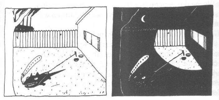
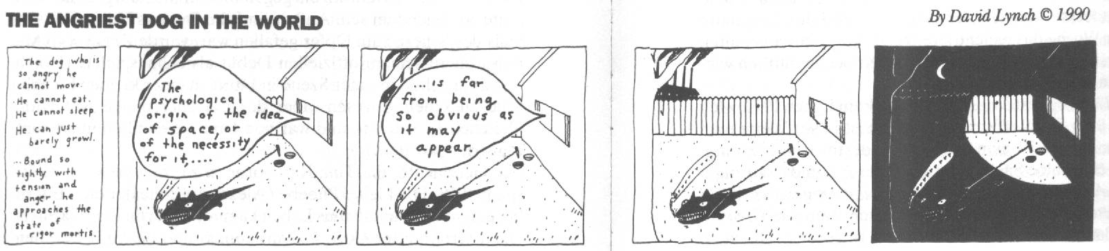
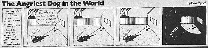
It was hiding in plain sight, and yet it was almost designed not to be noticed at all. For several years from the mid-1980s to the early 1990s, an experimental four-panel comic strip conceived and written by David Lynch ran in a handful of alt-weeklies under the title “The Angriest Dog in the World.” If you were the type of person who might have been flipping through the Los Angeles Reader or the New York Press or Creative Loafing or the Baltimore City Paper around 1987, you surely remember the peculiarly unfunny strip with the never-changing image of a tiny, spermatozoa-esque pooch straining at his lead in which the deadpan resolution was almost always a transitional nighttime image of the same godforsaken yard. 

It is said that Lynch came up with the idea for the strip during the long gestation period for Eraserhead in the early to mid-1970s, but it was only after the prominent releases of The Elephant Man and Dune that Lynch was able to convince anyone to run the strip. James Vowell, founding editor of the L.A. Reader, was the first publisher to bite. Vowell told SPIN in 1990 that Lynch drew the template for the strip a single time and sent it on, and after that it was the task of David Hwang, the alt-weekly’s art director, to receive the dialogue for each new installment from Lynch himself or Lynch’s assistant Debbie Trutnik, and draw the new dialogue on a piece of wax paper that was then superimposed over the strip’s template. (It’s noticeable that the handwriting in the captions changes over time, but I don’t know if that represents the input of different people or what.)

“The Angriest Dog in the World” had a memorable intro text, which was presented at the start of every installment:
 

The dog who is so angry he cannot move. He cannot eat. He cannot sleep. He can just barely growl. Bound so tightly with tension and anger, he approaches the state of rigor mortis.

 
The dog itself never did anything but growl, while whatever “action” there could be said to occur emanated from inside the house. Speech bubbles indicate the existence of human beings named “Bill,” “Sylvia,” “Pete,” who were apparently fond of trading street jokes creaky enough to make Henny Youngman himself die of embarrassment. A typical example runs:
 

Person A: Bill…. Monopoly jam?
Bill: What the hell is that?
Person A: They say it’s a game preserve.

 
Other times the strip veered into non sequitur, with pronouncements such as “It must be clear even to the non-mathematician that the things in this world just don’t add up to beans.” The introduction of fiery panels apparently ignited by an unseen hand on the rightward side of the strip did liven things up in a suitably apocalyptic register.


The evidence on the matter of the strip’s popularity was decidedly mixed. SPIN stated that in a 1989 survey, 20% of New York Press readers selected “The Angriest Dog in the World” as their least favorite feature, but when the Baltimore City Paper asked its readers what they thought a few years earlier, the outcome was 5 to 1 in favor of keeping it. In the mid-1980s an enterprising parodist named Jeff Murray aptly skewered Lynch as “The Laziest Cartoonist in the World.” 

In their volume on the director, Colin Odell and Michelle Le Blanc described “The Angriest Dog in the World” as “a masterpiece of minimalist cartoon writing,” nailing its appeal thus:
 

The simple, black and white, harsh style of the strip, with its nervous, edgy lines and picket fence suburbia turned into a Dadaist battlefield, would later reflect the look of his animated series Dumbland.

 
Oh right: if you haven’t heard about Dumbland, you really owe yourself a peek.

Lynch has always had a knack for writing against type, if you will: his “dramas” are consistently crammed with amusing and odd bits of business, and here, in what is ostensibly a vehicle for mirth, what you mainly get are stale punchlines and what must be apprehended as a considerable quotient of pain, no matter how ironically presented.

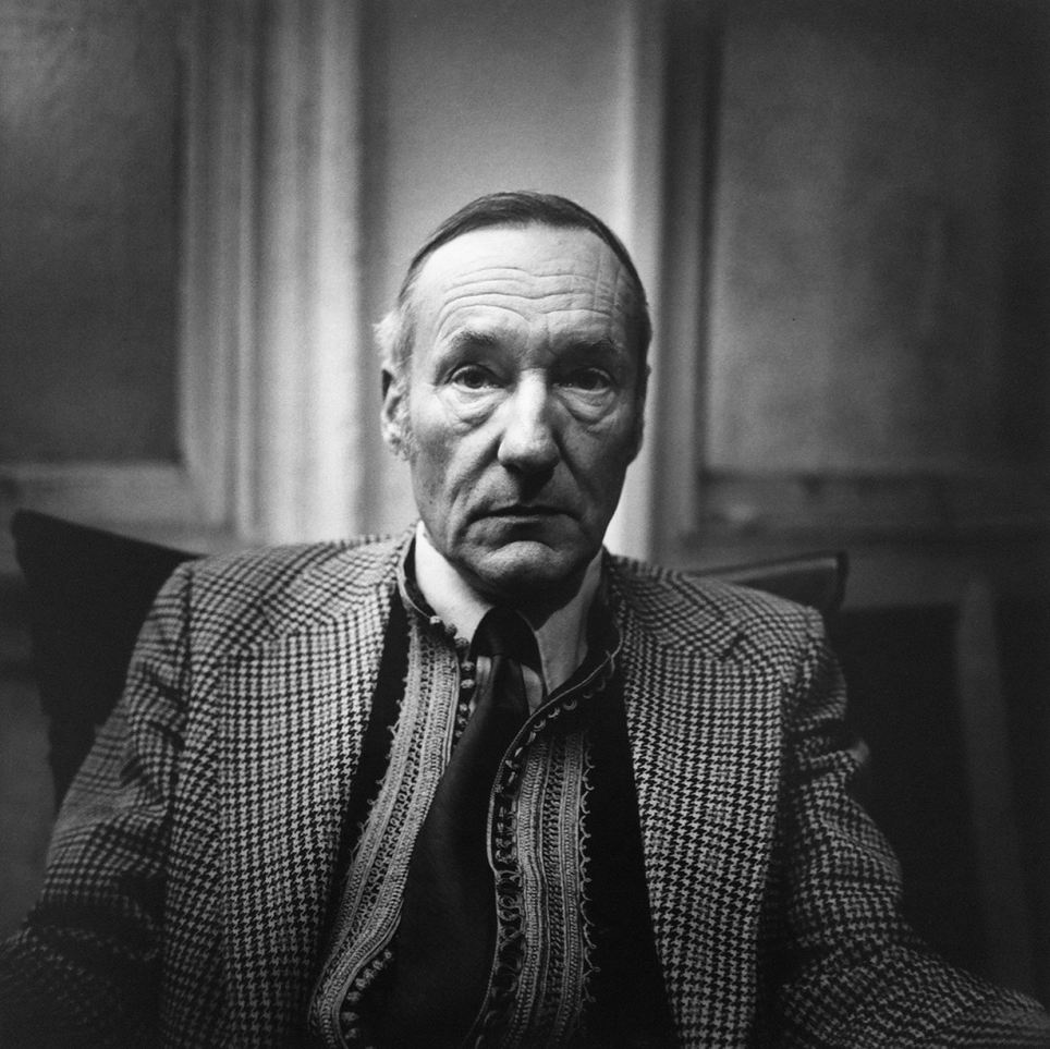
The meditating master of misdirection is notoriously hard to pin down on any subject, but David Breskin managed to get a straight answer out of the director in Inner Views, his charming book of interviews with famous directors:
 

Breskin: And what makes you the angriest dog in the world?
Lynch: Well, I had tremendous anger. And I think when I began meditating, one of the first things that left was a great chunk of that. I don’t know how it went away, it just evaporated.

Breskin: What was the anger like? Where did he come from?
Lynch: I don’t know where it came from. It was directed at those near and dear. So I made life kind of miserable for people around me, at certain times. It was really a bummer. Even though I knew I was doing it, there wasn’t much I could do about it when the thing came over me. So, anger––the memory of anger––is what does “The Angriest Dog.” Not the actual anger anymore. It’s sort of a bitter attitude toward life. I don’t know where my anger came from and I don’t know where it went, either.

 
The strips are difficult to find online, and those that are available are, for the most part, blurry and indistinct. To be honest, these self-consciously stupid strips are crying out to be collected in a book. Until that happens, we’ve presented a healthy collection below.

We’ll give the final word on the subject to Vowell, the strip’s very first patron, who once explained to Rob Medich of Premiere, “It’s just the same bad jokes. They’re really pretty dreadful. You can quote me. But they’re still fun. I think sometimes he tests to see what it would take for us to throw him out of the paper.”


More after the jump…

READ ON
Posted by Martin Schneider
|
05.16.2018
11:31 am
|
Short-lived, almost-forgotten satire mag ‘Americana’ took a shiv to FDR’s America
04.24.2018
10:21 am
Topics:
Tags:


We think of the era of below-the-belt satirical media with a left-wing edge as a thing that was more or less invented in the postwar era, particularly the 1960s and 1970s, as the rise of alternative newspapers ushered in a style of humorous, scurrilous, no-holds-barred sloganeering that was unafraid to transgress the usual borders of propriety. Before that, most of the good comps come from continental Europe, especially in the welter of strident and audacious movements that sprang into existence in the first decades of the 20th century, including surrealism, dada, and expressionism.

Not coincidentally, George Grosz, one of the leading lights of expressionism after World War I, was involved with a genuinely bracing and angry left-wing political magazine in the unforgiving terrain of the U.S.A. Its name was Americana, its editor-in-chief and founder was a colorful young man named Alexander King, and a host of publications such as The East Village Other, The Black Panther, The Berkeley Barb, and The Realist, whether they knew it or not, all owed Americana a great debt.

The imagery of Americana, unlike a lot of stuff that is more than eight decades old, still resonates. The images strike one as what might happen if the original editorial minds behind The New Yorker in the 1920s and 1930s were somehow given the task of publishing the International Times of the late 1960s and early 1970s, albeit with a modernist fibrousness to the art that The New Yorker mostly lacked. (Basically this means that Americana was, unusually, willing to be ugly if it achieved other aims.)
 

King as an older man in the 1950s, here with Jack Paar; photo taken during Paar’s stint as host of The Tonight Show
 
Publishing historians who track Americana cite it mainly for two things: its impressive roster of contributors and its exceedingly brief publication run. Americana existed only for 17 issues in the calendar years of 1932 and 1933, a moment when America was obviously in the throes of a catastrophic depression. While FDR tried to save capitalism from its own successes, Americana, consistently and with great vitriol, challenged the premise that capitalism was worth saving in the first place. To give an idea of what the folks of Americana thought of the likelihood of Roosevelt solving the problems of the working class, here is what Gilbert Seldes wrote in the issue following Roosevelt’s first election:
 

I will suggest to the editors of Americana that they reform. No more sadism. Only pretty pictures of sweet communists welcoming Trotsky back from exile; sweet capitalists washing the feet of the ten million unemployed, and sweet editors of liberal magazines smiling broadly at love triumphant.

 
In his book An Autobiography Grosz reminisced about editor King and Americana:
 

The only person who took me as I was was my friend Alexander King, who put out America’s first and only satirical magazine, Americana, and regularly published my things. He trimmed neither my wings nor my fingernails: “Scratch their eyes out, George,” he would say to me, “the harder, the better!”

 
Featuring names like William Steig and James Thurber, Americana did have a fair bit of cross-pollination with the aforementioned New Yorker. (King managed to run an interview with New Yorker grandee Alexander Woollcott in which the acerbic writer allowed that the New Yorker “is got out by a shiftless reporter with the help of two country bumpkins,” the latter two being non-East-Coast-ers Harold Ross and Thurber.)

In addition, Americana published contributions by E.E. Cummings and Nathanael West. Americana’s run coincided precisely with the West’s first great productive period, during which he wrote and published A Cool Million and Miss Lonelyhearts (The Day of the Locust arrived a few years later)—it’s not too much to say that Americana was an near-perfect periodical correlative for West’s corrosive fiction, and it’s not surprising that he found a warm welcome there. Americana was also an early venue for the work of Al Hirschfeld, who later became much more renowned for sticking the word “NINA” into the whiskers of Orson Welles and the locks of Bernadette Peters.
 

A remarkable editor’s note from Americana
 
Not surprisingly, King himself was from the Continent—he was born Alexander Koenig in Vienna in 1899. In his later years he became a talk-show personality and wrote several books which did very well. In its review of King’s 1960 book May This House Be Safe From Tigers, Time magazine summarized the author’s eventful life, with some affection, as follows:
 

an ex-illustrator, ex-cartoonist, ex-adman, ex-editor, ex-playwright, ex-dope addict. For a quarter-century he was an ex-painter, and by his own bizarre account qualifies as an ex-midwife. He is also an ex-husband to three wives and an ex-Viennese of sufficient age (60) to remember muttonchopped Emperor Franz Joseph. When doctors told him a few years ago that he might soon be an ex-patient (two strokes, serious kidney disease, peptic ulcer, high blood pressure), he sat down to tell gay stories of the life of all these earlier Kings.

 
It’s my impression, researching this topic, that there is just damn little out there about Americana, which is a real shame. However, the images of the publication have aged remarkably well in my estimation, still possessing the power to catch the eye and even to shock, whether it’s the casual yolking of the “modern messiahs” Stalin and Gandhi (!) or the unflinching presentation at the suffering of the destitute. Here is a representative sample of images from the magazine, but by all means there’s more here.


Much more after the jump…....
 

READ ON
Posted by Martin Schneider
|
04.24.2018
10:21 am
|
In their own write: Fonts made from the handwriting of David Bowie, Kurt Cobain, John Lennon & more
04.09.2018
10:15 am
Topics:
Tags:

04fontsbowiepic.jpg
 
For some, the first step towards a chosen career is imitation.

Peter Capaldi is a fan of the great horror actor (and big screen Doctor Who) Peter Cushing. Once, when Capaldi was a child, he was fortunate enough to have met Cushing who gave him a signed autographed photo. Capaldi was so enamored by the actor that he spent many hours practicing his signature to look just like his idol’s as it was his ambition to follow in the great man’s footsteps as a thespian. He managed to make Cushing’s signature his own and forty years later Capaldi became the twelfth Doctor Who.

Nicolas Damiens is a French graphic designer with an impressive back catalog of award-winning work for a range of companies. He has won a trophy cabinet full of awards including a gold medal for his project Tokyo No Ads. Most recently, Damiens designed a series of Songwriters Fonts based on original handwritten letters and notes from the likes of Serge Gainsbourg, John Lennon, David Bowie, Kurt Cobain and Leonard Cohen. These fonts are available to download for free for personal use so you won’t have to practice your cursive writing skills for penmanship like one of your favorite pop stars.
 
05fontsbowiewrit.jpg
 
06fontsbowiefont.jpg
 
More Songwriters Fonts, after the jump…
 

READ ON
Posted by Paul Gallagher
|
04.09.2018
10:15 am
|
What Netflix might have looked like in 1995
03.27.2018
10:38 am
Topics:
Tags:


Everything would look better if it were made in the ‘90s, right? No? Nostalgia for the heartwarming simplicity of early technology has, in recent years, had many of us reimagining what our lives would look like if certain present day inventions or creations had existed just a decade prior. You may recall the tongue-in-cheek parody commercial on “The Facebook” that came out a few years ago. Presented in late night television “friend-helping-friend” format, the ad explores the hypothetical, crude components of the social media platform pre-DSL, pre-selfies, even pre-Cambridge Analytica.


Retro-nerd YouTube channel Squirrel Monkey has captured the very essence of nineties-style “new technology” videos with its latest presentation on the online movie platform, Netflix. Founded just two years after the spoof is intended to take place, in 1995, the video is a how-to introduction to streaming movies through the website. Obviously, things would have been much different back then and this video does a pretty excellent job of capturing the nuances of the not-so-distant past. In a nutshell, in order to watch your favorite films online, you will need a fast computer (Windows ‘95 preferable), a reliable dial-up connection, and have to sign up to receive their Welcome Package, an homage to the free AOL CD-ROMS that littered the decade. But after everything is said and done, don’t expect to “Netflix and Chill” at ease. As you would probably predict, the quality of the stream would either be indistinguishably slow, or it would take nearly half the day to load!
 
Watch Squirrel Monkey’s ‘Streaming Netflix movies in 1995’ after these stills:


More after the jump…

READ ON
Posted by Bennett Kogon
|
03.27.2018
10:38 am
|
‘Arf!’: The video variety show made for dogs
03.22.2018
10:22 am
Topics:
Tags:


I wish I could take my dog everywhere with me. Recently, I ran into a man on the street protesting our local 7-Eleven. He claimed that the popular convenience store wasn’t “pet friendly” enough; that they wouldn’t allow his dog “Snowball” inside with him while he shopped. I don’t believe Snowball was fit to be a service dog or anything. It’s just nice to have the company every so often. And I’m sure our dogs would prefer the company, too.


I’m fairly certain that my dog Bella gets lonely when I’m not around. It really sucks to look her in the eyes before I leave the house. I mean, who knows what kind of crazy shit is going on inside her brain? There exist several remedies for pet separation anxiety and, in an age where we can have basically everything we want, there’s now a cable channel called DOGTV.
 
The concept is pretty self-explanatory. DOGTV is a 24/7 television network made exclusively for our canine friends. Designed by animal behavioral specialists, the station’s programming supports a dog’s natural everyday patterns with its original, ASPCA-approved content of three different categories: Relaxation, Stimulation, and Exposure. Each episodical segment is 3-6 minutes long and has been color-adjusted to appeal to a dog’s unique eyesight. Common everyday scenarios such as a visit to the park or a ride through town are accompanied by a soundtrack of healing frequencies, positive affirmations, and relaxing music. The programming is even considered educational. By use of gentle, low volume exposure, unfamiliar sounds are slowly introduced to the viewer, thereby “training” him or her to grow more comfortable. DOGTV has produced over 2,000 original programs to date, including The DOGTV Hour, which is intended to be enjoyed by pets with their owners. Honestly, I enjoy the dog programming much more than I do the human programming.
 

DOGTV ‘Stimulation’ Sample Episode

Much more after the jump…

READ ON
Posted by Bennett Kogon
|
03.22.2018
10:22 am
|
William S. Burroughs on the cut-up technique and meeting Samuel Beckett & Bob Dylan
03.22.2018
09:35 am
Topics:
Tags:


“It’s the stink of death, citizens!” (Photo by Peter Hujar)

This hour-long BBC Radio special opens with “Old Lady Sloan,” the Mortal Micronotz’ interpretation of a Burroughs lyric about a happy pedophage, a record the host, John Walters, borrowed from John Peel for the occasion. If the program starts out sounding like a clip-show tribute to Burroughs’ cultural influence, it’s more than that. Aside from a chat with future WSB biographer Barry Miles (identified only by his surname), a little music, and Burroughs’ performances of the now-classic routines “The Do-Rights” and “The Wild Fruits,” the broadcast is given over to Walters’ lengthy interview with the author, champion of apomorphine, and devotee of the Ancient Ones.

Burroughs tells Walters about his years in England, and meeting Samuel Beckett and Bob Dylan; he observes that certain American politicians boast of their ignorance and stupidity. His (camp, I think) misogyny has softened by ‘82. What really sets the interview apart, though, is Walters’ enthusiasm, his openness, his willingness to risk sounding uncool. Here he is grappling with the implications of the cut-up technique:

Walters: What always attracted me when I first heard about that—I suppose, a lot of students at the time—it seemed to introduce a random effect, a found work, do you know what I mean? I wonder if it was so random as all that.

Burroughs: Well, how random is random? Uh…

Walters: Well, let’s put it like this. I was in a pub in Charlotte Street, of all places, in Soho, and a mate of mine had read Nova Express—this was ‘64, ‘65—was talking about this, “You must buy this book,” and started to try and explain to me his interpretation of cut-up and fold-in techniques, which he probably got wrong. And I couldn’t remember the name of the book when I got outside, and then an Express Dairy van from the Express Dairies came by, and I thought, “Express, Nova Express!” And I thought, “That’s what he’s trying to tell us. Random events can have a hidden meaning. We can get messages.” But I don’t think that’s what you see in it, is it?

Burroughs: Oh, exactly. Exactly what I see in it. These juxtapositions between what you’re thinking, if you’re walking down the street, and what you see, that was exactly what I was introducing. You see, life is a cut-up. Every time you walk down the street or look out the window, your consciousness is cut by random factors, and then you begin to realize that they’re not so random, that this is saying something to you.

More after the jump…

READ ON
Posted by Oliver Hall
|
03.22.2018
09:35 am
|
The short-lived Mexican edition of Rolling Stone that’s been nearly lost to history
03.12.2018
12:02 pm
Topics:
Tags:


Piedra Rodante was the Mexican version of Rolling Stone that existed in late 1971 before shutting down as a result of intense pressure from the Luis Echeverría administration. The magazine was in Spanish, of course, and the content was a combination of original reporting on Mexican issues alongside translations of recent content from the U.S. version of Rolling Stone. It existed for only eight issues, and its demise arguably heralded the end of La Onda Chicano, a rock music movement that drew inspiration from La Onda (The Wave), the name for the countercultural stirrings in Mexico.

For reasons I cannot fathom, the existence of Piedra Rodante has been all but written out of the Rolling Stone narrative.

Details on Piedra Rodante are somewhat scarce. All eight issues are available as an image archive at the website for the Stony Brook University. Google suggests that the picture below is of the magazine’s editor, Manuel Aceves, but I don’t know and don’t have any easy way of knowing. (The page it came from lost its 3rd-party hosting privileges at some point.)
 

Is this Manuel Aceves, editor of Piedra Rodante?
 
Stony Brook University has an admirable summary of the magazine’s brief existence and the social stirrings to which it was linked. The key points of reference that are necessary to understand are the Tlatelolco massacre in late 1968 in Mexico City, in which the Gustavo Díaz Ordaz regime brutally suppressed the thousands of students protesting the Olympics to be held in Mexico City a little more than a week later, leading to at least 300 fatalities and 1,300 arrests. The Olympics had to go on.

On June 10, 1971—Corpus Christi—there was a similarly brutal crackdown when government-trained paramilitaries—known as the Halcones, or “Falcons”—attacked a protest march outside the Santo Tomás campus of the National Polytechnical Institute. After a first wave of paramilitary soldiers attacked the protesters with bamboo and kendo sticks, “los Halcones” then attacked the students with high-caliber rifles for several minutes. The death toll was roughly 120—the event became known as El Halconazo, or the “hawk strike.”

The magazine wasn’t up and running yet, however. During the magazine’s brief duration, on September 11–12, 1971, occurred one of the largest and most significant rock and roll gatherings in Mexican history, the Avándaro Rock Festival. Avándaro had an entirely domestic roster of bands and was specifically modeled after Woodstock, which had taken place two years earlier. The event drew some 200,000 people, if not many more, and pretty much wigged out the authorities, which enforced a crackdown directly afterward that led to the demise of the magazine.

Here is part of Stony Brook’s summary of Piedra Rodante’s brief lifespan:
 

Mexican middle-class youth yearned to be recognized participants in the global counterculture.  By around 1967, the cultural landscape of these youth reflected those yearnings, as expressed now not only through locally produced music but also through fashion, aesthetic choices, and a new youth argot.  Collectively, this incipient countercultural movement was labeled within the media as “La Onda” (The Wave).  Although intellectuals and more radical students generally regarded La Onda with a certain degree of disdain—judging it as “mere imitation” of a more authentic youth counterculture found abroad—in truth, the values and aesthetic choices linked to La Onda had seeped into all corners of youth cultural practice more broadly.  This became especially apparent during the massive student-led demonstrations in the summer-fall of 1968, which culminated in a violent crackdown by the government on October 2 (“Massacre at Tlatelolco”).  In the aftermath of the crackdown, La Onda was transformed by a generation of youth whose optimism had been shattered by the repression of a one-party state, into a vibrant vehicle for national protest.

In late 1970, Manuel Aceves, who was at the time working successfully in advertising, decided to give up his job and put together a magazine similar to Rolling Stone.  Imitating Rolling Stone’s own take on the New York Times motto “all the news that’s fit to print,” by using “all the news that fits,” Aceves chose “el periódico de la vida emocional” (the newspaper of emotional life), meant as a pun on “el periódico de la vida nacional” (the newspaper of national life), which was the motto of Excélsior, one of Mexico’s two major newspapers at the time.

Aceves liked testing the boundaries of what could be published in Mexico, and Piedra Rodante’s reporting on the counterculture, as well as events and protests related to the regime crackdown after the Tlatelolco episode, soon reached a point the government of President Luis Echeverría (1970-76) was not willing to accept.  After only eight issues, La Piedra, as it had become known, was abruptly shut down.  Still, the magazine did manage to devote a whole issue to the 1971 Avándaro music festival, Mexico’s equivalent to Woodstock, and by then had become a vibrant forum for young writers interested in the new musical and cultural milieu of La Onda, at home and abroad.

 
The rise of La Onda Chicana led to some extravagant expectations of a new branding of Mexico as a locus of exciting musical and artistic currents. Hand in hand with that was the commercialization of the music scene, a process of which the most prominent Anglo American participant was Polydor, by far.

Notable translated content from the Mother Ship included Allan R. McDougall’s interview with Stephen Stills, Jonathan Cott’s obituary of Igor Stravinsky, Jann Wenner’s interview with John Lennon, David Felton’s profile of Elton John, Ben Fong-Torres’ profile of the Jackson 5, and Fong-Torres’ obituary of Jim Morrison.

After the magazine was shut down, Aceves, the editor-in-chief, did not stay in the publishing or the counterculture, instead becoming an expert on the Swiss psychiatrist C.G. Jung. Aceves died in 2009.

In his book Refried Elvis: The Rise of the Mexican Counterculture, Eric Zolov explains:
 

Another casualty of the crackdown was the countercultural magazine Piedra Rodante. Combining often-daring articles on drugs, politics, and the counterculture in Mexico and abroad with translated material from its parent magazine in the United States, Piedra Rodante quickly proved too much for a regime that sought to recontain the rock movement; after eight issues, the magazine was forced to shut down. Claiming a distribution of 50,000, the magazine not only aimed at a national audience but reached Central and South America, Spain, and the “Chicano youth of North America”––indicated as including the borderlands, New York, and Chicago—as well. As editor Manuel Aceves recognized, the survival of such an effort in Mexico “requires an atmosphere of liberty, both in an objective sense and at the level of consciousness,” which he believed the apertura democratica under Echeverría would provide. “We sincerely hope we aren’t mistaken about this sexenio [six-year presidential term],” he wrote in an opening editorial. During the eight issues of its existence, Piedra Rodante consistently tested the boundaries of the political opening offered by the new regime. An advertisement in its last issue provocatively queried, “How much freedom of the press exists in Mexico?” To fill this gap, the magazine offered “Youth’s viewpoint about their own world versus that of adults. Without inhibition, shame, sweat, or reserve, the sole truth about drugs, politics, sex, rock, art ... a new type of journalism. Enlightened journalism. And enlightening ... The first long-haired news journal.” But its bold testing of political and cultural tolerance––one issue boasted “40 pages replete with drugs, sex, pornography, and strong emotions”––proved too much, especially in the context of an antipornography moralizing crusade spearheaded by conservatives. While called to the attention of the ineffectual Qualifying Commission of Magazines and Illustrated Publications (the government censorship bureau for printed matter) in a letter by a member of Congress, the magazine nonetheless met a quicker fate than what would have been the arduous process of bringing the publisher to court under the rules of the commission: facing threats of physical harm, the editor simply ceased publication.

 
Rolling Stone celebrated its 50th birthday last year, and there has been no small share of adulatory artifacts, including a big exhibition at the Rock and Roll Hall of Fame in Cleveland, Ohio, and a two-part documentary on HBO called Stories on the Edge. In neither case was there any mention of Piedra Rodante, at least as far as I can remember. (The HBO doc jumps more or less directly from the 1968 Democratic Convention in Chicago to the rise of Bruce Springsteen.) The subject also doesn’t seem to come up In Robert Draper’s 1990 tome Rolling Stone Magazine: The Uncensored History, and it also was apparently not mentioned Sticky Fingers: The Life and Times of Jann Wenner, Joe Hagan’s book on Wenner that came out last year (Amazon searches on “Piedra” in the book yield 0 hits).

What follows are a wealth of images from the magazine’s brief run.


More after the jump…

READ ON
Posted by Martin Schneider
|
03.12.2018
12:02 pm
|
Gorgeous covers of the Japanese magazine ‘Teen Look’ from the 1960s
03.05.2018
08:27 am
Topics:
Tags:


When the Japanese decide to do a thing right, they really do it right. The current case in point is the cover art that Satsuko Okamoto produced for the magazine Teen Look in the late 1960s. Her fresh and playful use of color and pattern and symmetry contribute to her notable and distinctive body of work, one that any young graphic designer would do well to imitate.

There is very little information in English out there about Teen Look or Okamoto, which is a shame. I was able to discover that the magazine started in the spring of 1968 because of a brief snippet of text on Google Books I found from a 1969 issue of New Scientist in which they were making fun of the poor English discovered in a Japanese trade magazine at the Frankfurt Book Fair. To be fair, the English is pretty bad. Here’s the text:
 

“In April, 1968 started the Teen Look, a weekly for girl students of junior and senior high schools, which met with favourable acceptance as the magazine presenting sound dialogue between the adolescent girls delicate in sentiment and the parent….”

 
Unfortunately, the excerpt ends there.

There are lots of Okamoto’s Teen Look covers on Pinterest, always with the same identifiers: Teen Look, Satsuko Okamoto, 60s cover…. In other words, I don’t have a lot of confidence that some of these covers don’t creep into the 1970s, but I don’t know Japanese.

I did figure out that the nice serif integers to the left of the price in yen (usually 80) signifies the date. You can see the numbers in certain runs progress from 2/11 to 2/18 to 2/25 and so on. Obviously if it was a weekly, the dates would be advancing by 7 days each time.

We’d be grateful for the detective work of any Japanese speakers in the audience—please contribute in comments. Even better, does anyone actually remember reading Teen Look?

Honestly, I’d trade the entire run of Tiger Beat for a single one of these covers.


Many more of these lovely covers after the jump…....
 

READ ON
Posted by Martin Schneider
|
03.05.2018
08:27 am
|
Golden-Showers, Wang-Holder, and Dick-Kuntz: Amusing wedding name combinations
02.28.2018
10:47 am
Topics:
Tags:

00unkundi.jpg
 
I guess this is not going to be too amusing for all the Dicks, Kuntzs, and Hookers out there but for the rest of us, well…

We all know how sticks and stones may hurt bones, but some names can be mildly amusing—especially if there is something childishly funny about them. You know the kind of thing, old favorites like “Mike Hunt” or “Mike Hock” or even “Amanda Gobble.” Now, these names are quite amusing on their own but what about those individuals whose surnames when placed together create an unfortunate double or even single entendre like this fine bunch of happy couples, to whom I wish all happiness. 

At first, I first thought some of these must be photoshopped but after checking up on a few of them via newspaper wedding banns it turns out they’re (let’s say mostly) legit. Authors often claim they spend hours searching for suitable and unusual names for characters—who knew they had to look no further than the social pages of the local paper?
 
01undrilcou.jpg
 
02ungolsho.jpg
 
05unlitga.jpg
 
06unstoda.jpg
 
More happy couples, after the jump…
 

READ ON
Posted by Paul Gallagher
|
02.28.2018
10:47 am
|
‘Monotony Maker’: International Times parodies Melody Maker, 1973
02.22.2018
10:31 am
Topics:
Tags:


Issue number 145 of the legendary London underground newspaper International Times was the first published in 1973, and it’s a wonder to behold.

For starters, on the cover is an interesting creation by an artist named George Snow, a self-referential image highlighting the means of production involved in ... creating a cover for IT. The image is craftily “pixelated” in a way that suggests (of all things) desktop publishing of the late 1980s, and a font card for 42-point Aachen is also featured as a design element.

The issue also included a two-page installment of “Fritz the Cat” by R. Crumb, and there’s an additional bit of Crumb art tucked elsewhere in the issue. There’s a wonderful advertisement for “Climax Books” (a Danish publisher of smut), and an incredible subscription offer—anyone willing to shell out £4.80 for a year’s worth of IT would also receive Hawkwind’s new album Doremi Fasol Latido.

The cover blandly promises a look at “How Melody Maker Hit Rock Bottom,” which is scant preparation for the savage four-page parody of the UK music rag to be discovered in the pages within. They call it “Monotony Maker”.....

It would take someone with a clear memory of the Melody Maker of the 1970s to unpack the myriad of now-forgotten references. On Twitter, Syd Barrett biographer Rob Chapman refers to the parody as “libellous,” which we’ll get to in a minute. The cover featured a fanciful tale of David Bowie becoming the first male rock star to give birth, while also reporting on a forthcoming Moscow production of the Who’s Tommy in which “guest soloists are believed to include everyone in the Soviet Union.”

In a tweet I can no longer find, Chapman also draws attention to the wicked wit involved in the otherwise innocuous-seeming cover headline “Beatles to Split?” which in 1973 addressed the deep-seated denial in the UK music press. On the parody’s second page there is a scurrilous gossip column called “The Raver” that is surely the item IT’s attorneys would have scrutinized most carefully, seeing as how it contains references to an Ian Anderson tax exile in Switzerland, cocaine shenanigans with Jimmy Page, and Marc Bolan’s likely stint in a looney bin.


The “Payolagraph” item affords an opportunity to engage in some takedowns of Ono/Lennon, Neil Young, and the people trying to wring the last quid out of Jimi Hendrix’s legacy.
 
Read the whole thing after the jump…....
 

READ ON
Posted by Martin Schneider
|
02.22.2018
10:31 am
|
Page 2 of 53  < 1 2 3 4 >  Last ›