


A Clockwork Orange alternate poster
Choosing the right art for a movie poster is harder than you might think. When it comes to iconic movie posters of the last 40 or so years, some of them are so incredibly effective that’s it takes an effort to recall that it took a specific person’s creative impulse to concoct the poster from scratch, and several other people, most likely, to have the good sense to approve it. In other words, it could have gone any number of other directions.
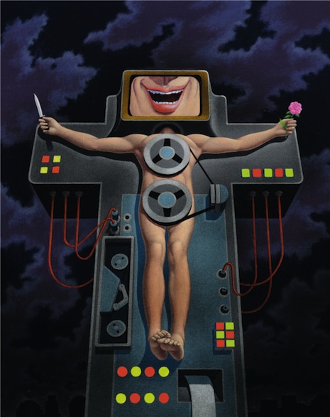
If I say to you, “Clockwork Orange movie poster,” you can probably summon up an image of the thing I’m talking about—without me showing it to you. How interesting to find out that one of the early alternatives (above) bore zero resemblance to the end result, with its unforgettable image of nasty Alex leering out from behind that A shape. Bill Gold, one of the acknowledged masters of the movie poster, was responsible for both the great Clockwork Orange poster we know and admire and the overly detailed, ridiculously 1970s, sci-fi-novel-ish version at the top of this page. Much the same sort of thing is true of Pulp Fiction and Mystic River and plenty of others.
Bill Gold was also responsible for the classic poster for the 1972 box office sensation The Exorcist. You might recall the spooky, ice-cold image of Max von Sydow’s reluctant, serious Father Merrin underneath a lamppost, approaching the MacNeils’ Georgetown dwelling in the dead of night. But it was almost not so! Below is a far more conventional take Gold cooked up for consideration.
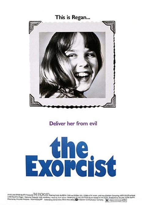
The Exorcist alternate poster
The British events website Daybees has a fascinating gallery of movie-posters-that-almost-were, featuring the work of just a bare handful of designers while still managing to cover an impressive range of classic movies, from Cool Hand Luke and Dog Day Afternoon to Batman and Ocean’s Eleven.
“Alternate 2” for Clint Eastwood’s Unforgiven is quite simply gorgeous, while “Alternate 2” for Mystic River looks like it took some underling about ten minutes. The alternate version of the poster for Tim Burton’s Batman isn’t horrible, but it’s very, very different from the Batman logo used in the final product.
In some ways, James Verdesoto and Vivek Mathur‘s Pulp Fiction offers the most interesting case. We seldom appreciate how bold and striking the Pulp Fiction poster is, but the alternate takes are almost painfully ‘90s and frankly show a lack of confidence in the movie—relying on blurry “slacker”-style imagery and the trendy lower-case lettering of the moment (remember sex lies and videotape?)—if you happened upon one of the alternate Pulp Fiction posters nowadays, you’d be forgiven for wondering if there wasn’t an Edward Burns retrospective happening or something.
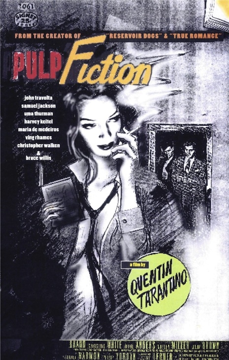
Pulp Fiction alternate poster
via Cinephilia and Beyond
Previously on Dangerous Minds:
‘Read More Movies’: Every word from ‘A Clockwork Orange’ printed on poster
‘Pulp Fiction’ reconstructed in chronological order
Turkish version of ‘The Exorcist’ in all of its glorious ineptitude