The UnCola: 7Up and the most psychedelic, LSD-friendly ad campaign of all time

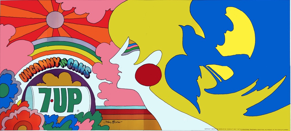
John Alcorn’s “Uncanny in Cans” billboard seems to reference “the girl with kaleidoscope eyes” from the Beatles’ “Lucy in the Sky with Diamonds“
7up has existed as a drink since 1929, but it wasn’t until 1936 that it was given the name 7Up. From the mid-1930s to the early 1950s, the advertising slogan for the drink was “You Like It, It Likes You.” In its incredible directness, simplicity, and dishonesty, it ranks as my favorite advertising slogan of all time.
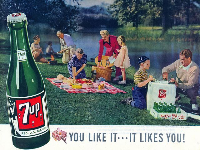
“You Like It, It Likes You.” Oh, does it now? 1947 advertisement for 7Up
In 1967 ad execs at J. Walter Thompson Company in Chicago pitched a radical repositioning of 7Up as a way of reviving dormant sales of the drink — the idea was to capture the new hippie market for 7Up. The new nickname for the drink was to be “The Uncola” and if you’re older than about 50, you’ll have no trouble remembering that name and possibly a memorable series of TV spots starring Geoffrey Holder.
The Uncola campaign stretched from 1969 to 1975, and it used a wide variety of hyper-colorful, psychedelic posters that reminded many people of Peter Max, even though the images used in the campaign were not done by him. (Max did submit images to J. Walter Thompson, but his designs were not used.)
The Uncola campaign was perhaps advertising’s most adventurous foray into truly psychedelic imagery, even to the point of appearing to endorse LSD use as an activity fit for 7Up-consuming adults.
7UP pursued the psychedelic imagery of the Uncola campaign primarily through billboards, but also were done up as posters for college dorms and what 7Up called “Fallpaper” (somewhat like wrapping paper) that could be used for any number of purposes. This spot seen here touting “Fallpaper” is a pitch-perfect example of the shaggy new vibe of the hippies making its way into TV commercials. (One can almost see the director telling the actor to shrug more.)
Dallas resident Bob Treat has become the world’s foremost collector of the massive 7Up billboards–he has managed to get his hands on 25 of the 53 known UnCola billboards known to exist. All of them are gorgeous examples of brazenly psychedelic advertising, and Treat has done a huge amount of work researching the images and the artists responsible for them. Recently Lisa Hix at Collectors Weekly interviewed Treat at length and wrote up a definitive account of the UnCola campaign; most of the information here derives in some way from that post.
One connection that Treat made that would never have occurred to me is that the much-touted “Un” in “UnCola” was a direct reference to the concept of “un-American” that had stuck to the hippie generation in the hyper-charged political atmosphere of the late 1960s. As Treat put it, “The phrase “Un-American” often came up in association with the counterculture’s antiwar protests so the suffix “Un” struck a chord with the youth.” To us in 2016, the negative aspects of being labeled un-American seem so clear as to make such a move seem perverse, but the ad campaign did rescue 7Up from oblivion.
The roster of artists involved in the campaign is impressive indeed. As already mentioned, Peter Max didn’t make the cut, but legendary illustrators Milton Glaser, Seymour Chwast, Skip Williamson, and Simms Taback, but the artist with the biggest imprint on the UnCola campaign was most likely a woman named Pat Dypold, whose work was consistently chosen by the client to become billboards.
It was Dypold who was responsible for perhaps the most intriguing billboard in the UnCola series, a 1969 billboard with the title “Turn Un,” a direct reference to the well-known pro-LSD slogan that had been coined by Timothy Leary in 1966. Treat only has half of the billboard in his possession, but was able to extrapolate the rest from an image from one of 7Up’s poster offers–an image that is probably just an inch or two wide.
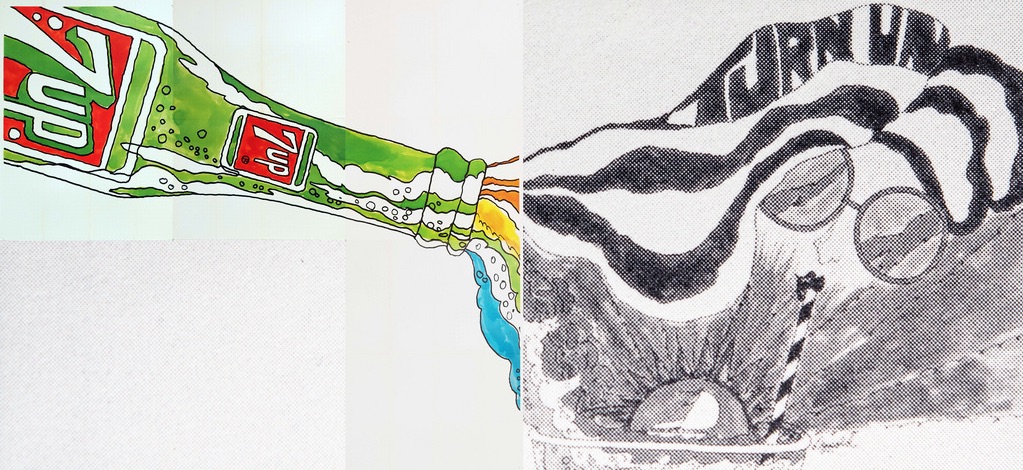
Pat Dypold’s “Turn Un” image billboard–the b/w portions are Bob Treat’s recreation based on a much smaller image
In Mad Men Don Draper approves the hiring of Kurt and Smitty based on a cute ditty about coffee said to represent youth values towards retail products, but it’s difficult to imagine Don approving a psychedelic ad that winkingly references actual LSD-25 (as it was known then).
Here are more great images from the campaign, as well as a TV commercial:
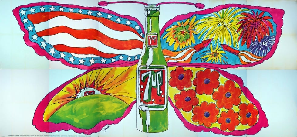
Pat Dypold’s 1969 “Butterfly & Bottle” billboard
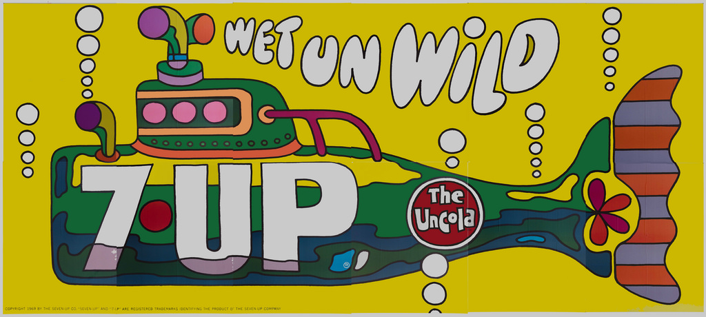
Ed George’s 1969 “Wet Un Wild” billboard could almost be mistaken for the Beatles’ “Yellow Submarine”
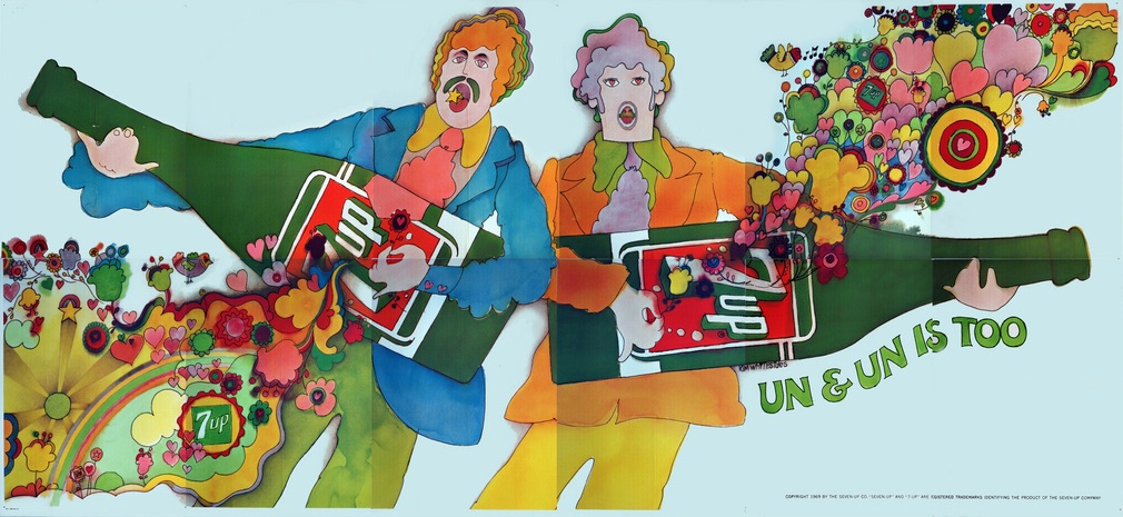
Kim Whitesides’ 1969 “Un & Un Is Too” billboard uses Lennon/McCartney stand-ins with psychedelic imagery emanating from their “bottle-guitars”
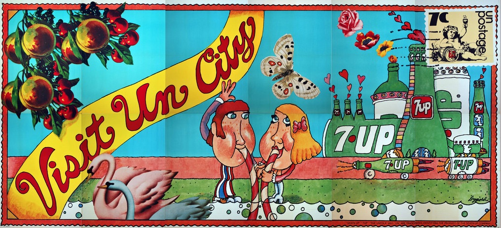
Pat Dypold’s 1971 “Visit Un City” billboard playfully incorporates a postage stamp

Milton Glaser’s 1971 “Like No Cola Can” billboard
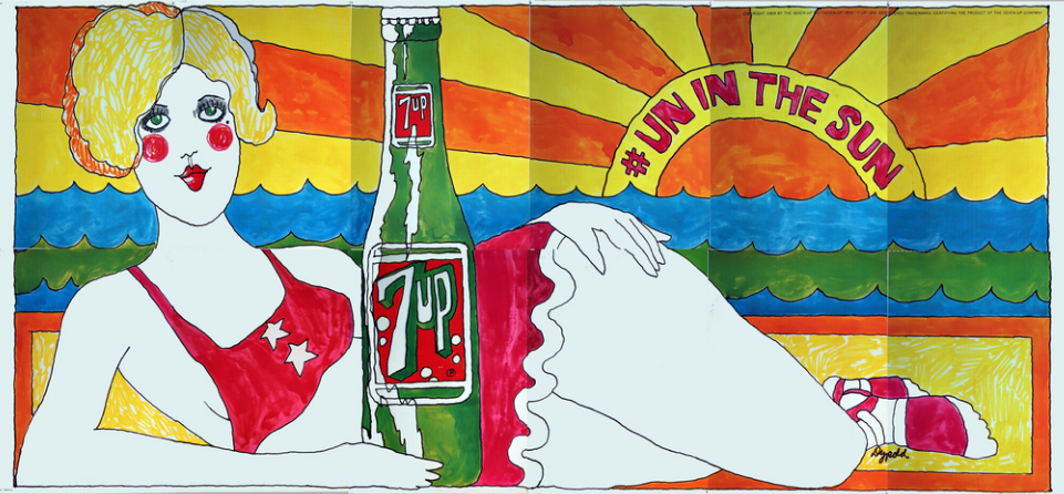
Pat Dypold’s 1969 “# Un in the Sun” billboard
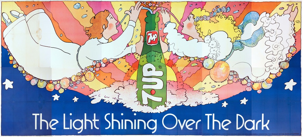
Pat Dypold’s 1971 “The Light Shining Over the Dark” billboard

Nancy Martell’s 1970 “Hear No Cola, See No Cola, Drink UnCola” poster

Pat Dypold’s 1969 “Lady Liberty” was the object of protests objecting to the implied endorsement of the Statue of Liberty for a commercial product
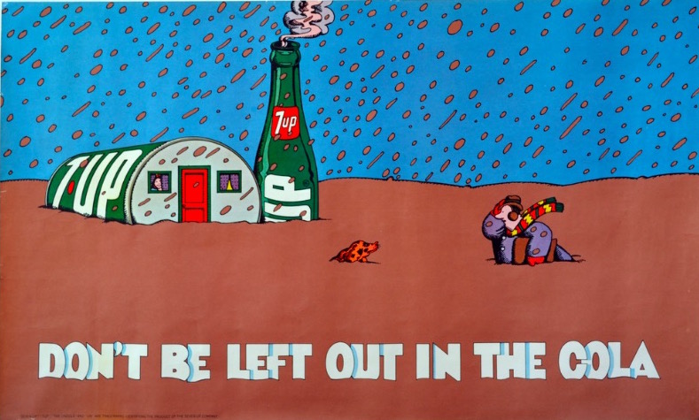
Milton Glaser’s 1971 “Don’t Be Left Out in the Cola” poster
Pat Dypold’s 1971 billboard was called “Matisse” for obvious reasons
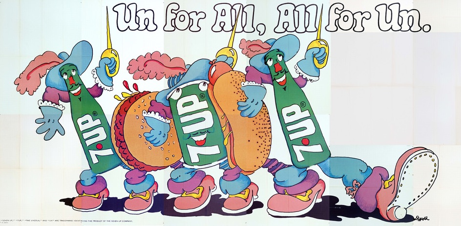
Pat Dypold’s 1972 “Un for All, All for Un” billboard adapts R. Crumb’s “Keep on Truckin’” image
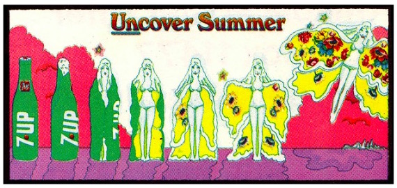
Pat Dypold’s 1971 “Uncover Summer” billboard poster
Here’s a brief medley of TV commercials from the pre-Geoffrey Holder heyday of the UnCola campaign:
Bob Treat’s Flickr set on the UnCola advertisements is amazing; check them out as well as Lisa Hix’s excellent Collectors Weekly writeup for more information.
via {feuilleton}