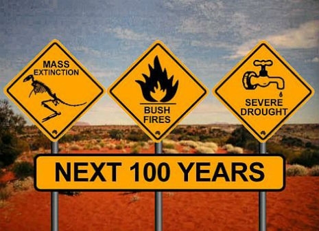
Nine of the 10 hottest years since they’ve been keeping records have occurred after the turn of this millennium.
Via Climate Central:
While temperatures soared for many this summer, this video takes the longer historical view. It comes to us from our friends at NASA and is an amazing 26-second animation depicting how temperatures around the globe have warmed since 1880. That year is what scientists call the beginning of the “modern record.”
You’ll note an acceleration of those temperatures in the late 1970s as greenhouse gas emissions from energy production increased worldwide and clean air laws reduced emissions of pollutants that had a cooling effect on the climate, and thus were masking some of the global warming signal.
The data come from NASA’s Goddard Institute for Space Studies in New York, which monitors global surface temperatures. As NASA notes, “in this animation, reds indicate temperatures higher than the average during a baseline period of 1951-1980, while blues indicate lower temperatures than the baseline average.”
Watch it, this will make you feel vertigo. Not for the squeamish, I suppose.
We’re doomed!