FOLLOW US ON:
GET THE NEWSLETTER
CONTACT US
Robyn Hitchcock and Graham Coxon cover Syd Barrett’s ‘Octopus’ for new Philip K. Dick TV series
10.12.2017
02:08 pm
Topics:
Tags:


Right now Channel 4 in the U.K. is running Philip K. Dick’s Electric Dreams—U.S. viewers will be able to see it once it gets on Amazon Prime next year. To my eye the series appears to be an almost slavish attempt to recapitulate the magic of Charlie Brooker’s dazzling Black Mirror, but really, any excuse to adapt ten early-period Philip K. Dick short stories with movie stars and high production values is A-OK with me.

The series was developed by Michael Dinner (Chicago Hope) and Ronald D. Moore (Battlestar Galactica) and features, in the various episodes, such familiar faces as Steve Buscemi, Bryan Cranston, Anna Paquin, Vera Farmiga, Terence Howard, and Greg Kinnear.

Episode list:
“The Hood Maker” (originally published in 1955)
“The Impossible Planet” (1953)
“The Commuter”  (1953)
“Crazy Diamond” (“Sales Pitch,” 1954)
“Real Life” (“The Exhibit Piece,” 1954)
“Human Is”  (1955)
“Kill All Others” (Published as “The Hanging Stranger,” 1953)
“Autofac” (1955)
“Safe And Sound” (Published as “Foster, You’re Dead!” in 1955)
“Father Thing” (Published as “The Father-Thing,” 1954)

In connection with the visionary themes of solipsism, madness, and unhinged reality, the series’ makers recruited Robyn Hitchcock and Graham Coxon of Blur, Kevin Armstrong, Johnny Daukes, and Jon Estes to collaborate on a cover of “Octopus,” by rock and roll’s most famous mental ward occupant, Syd Barrett. “Octopus” is the first song on the second side of Barrett’s first solo album, 1970’s The Madcap Laughs. One thing that sets “Octopus” apart is that this is the song in which the lyric “the madcap laughs” appears.

More after the jump…

READ ON
Posted by Martin Schneider
|
10.12.2017
02:08 pm
|
The original guide to identifying criminals from 1909
10.12.2017
09:46 am
Topics:
Tags:

013bertmeasur.jpg
 
About three years ago, defenders of civil liberties were understandably angsty over the news the F.B.I. had launched its Next Generation Identification system—a billion dollar operation intended to replace the old fingerprint system with “the world’s largest and most efficient electronic repository of biometric and criminal history information.” This meant investigators could identify perps from stored information like DNA, voice recognition, latent prints, personal history, and iris and face recognition technology culled from mugshots, surveillance camera footage, and even selfies taken from social media.

A lot of people were blaming the government, Big Brother, fascism, communism, and all the usual suspects for this monumental change to detective work and our privacy. But personally, I blame Alphonse Bertillon, coz he was the dude that started the whole thing off in the 19th-century.

Alphonse Bertillon (1853-1914) was a French detective. He believed everything had its place and that the world had an order. Bertillon had an unremarkable early career first as a soldier then as a lowly clerk with the Prefecture of Police in Paris. It was while working as a police copyist that Bertillon first recognized the random way in which cops investigated crimes. There was no proper system for identifying criminals and no code by which detectives could investigate crime scenes. Sure, there were crime scene photographs and artists sketches, but these were all rather ad hoc.

To solve these issues, Bertillon came up with the mugshot as a means of identifying criminals and codified a precise photographic process for documenting crime scenes in the 1880s—both of which are still in use today.

He also gave investigators a biometric system for identifying criminals. This involved measuring their height, the length of their arms and legs, the size of their heads, the shape of eyes, ears, nose, and mouth, and any other identifying characteristics like wrinkles, scars, birthmarks, etc. This system of breaking down criminals into identifiable component parts was known as Bertillonage. It included an early form of facial recognition, which gave cops a “cheat sheet” for getting their man.

Bertillon’s Tableau synoptic des traits physionomiques (Synoptic Table of Physiognomic Traits) helped the cops identify criminals and criminal types. It was rather like identikit pictures. It was used as a tool of capturing ne’er-do-wells right up to the turn of the last century when it was quickly superseded by fingerprints.
 
09bertfaces.jpg
 
01berteyes.jpg
 
See more of Bertillon’s ‘Synoptic Table of Physiognomic Traits,’ after the the jump…
 

READ ON
Posted by Paul Gallagher
|
10.12.2017
09:46 am
|
‘Slacking Towards Bethlehem,’ the incredible true story of the Church of the SubGenius
10.12.2017
08:35 am
Topics:
Tags:


The Church of the SubGenius’ annus mirabilis, 1998, may have come and gone (or it may be yet to come, as some of the faithful believe), but it’s never been easier to hear the word of “Bob.”

OSI 74 carries on the Church’s TV ministry. Evangelical radio programs such as Hour of Slack, Puzzling Evidence, and Ask Dr. Hal no longer splutter from our computer speakers in a pitiable dribble of RealAudio 1.0, but burst forth in full stereo at 64 Kbps, a mighty firehose of Slack. The classic SubGenius recruitment movie Arise!, which used to cost 20 whole dollars, is now just as free as an ISKCON book with Ganesha on the cover. And The Book of the SubGenius is still in print.


But a documentary in the works promises to do something new for the Church, namely, to situate its founding and founders in real, actual historical time. Slacking Towards Bethlehem: J.R. “Bob” Dobbs and the Church of the SubGenius will tell the story of Rev. Ivan Stang and Dr. Philo Drummond meeting in mid-Seventies Texas as young weirdos. The pair “quickly forged a friendship over a shared love of comic books, Captain Beefheart and UFO paperbacks,” in the words of the movie’s press release, before starting a religion that won converts in R. Crumb, Robert Anton Wilson, DEVO, Frank Zappa and Negativland. Directing is Austin filmmaker Sandy K. Boone, whose late husband, David Boone, directed the 1980 cult film Invasion of the Aluminum People, which might be “an allegorical testimony for the Church of the SubGenius.”


Slacking Towards Bethlehem is almost in the can, Boone says, with poster art by legendary comix artist and SubGenius saint Paul Mavrides (a/k/a Palmer Vreedeez [unless you believe he’s really Dr. Hal], LIES) to come, but first they have to fund post-production. The movie’s Kickstarter—not to be confused with the also recently launched crowdfunding campaign behind SubGenius Dr. K’taden Legume’s proposed “alien-contacting beacon”—offers tempting perks. At $11, salvation can be nearly anyone’s. There are clothes, books, and rare items from the Rev. Ivan Stang archive higher up the scale. Still more generous donations secure holy relics, suitable for framing, such as pieces of toast on which “Bob” has appeared to believers in their humble kitchenettes; for just a few dollars more, they will sell you the Breakfast with “Bob” toaster used to manufacture these miraculous apparitions. For the very deep-pocketed donor, or the crazed, impulsive superfan with a high FICO score, there is an associate producer credit on offer. Would it be too much to hope for a few Holy Seven-Bladed Windbreakers?
 
Keep reading after the jump…

READ ON
Posted by Oliver Hall
|
10.12.2017
08:35 am
|
Fish heads & the feminine form: The dazzling candy-colored art of Hannah Yata
10.12.2017
08:24 am
Topics:
Tags:


A painting by Hannah Yata.
 
I was flipping through the most recent issue of High Fructose magazine and came across the beyond enchanting artwork of Hannah Yata and was instantly drawn to her intriguing human/animal hybrids which she expertly drenches in vibrant colors. Much of her work includes images of elegant female forms with animal heads (or “masks” as Yata calls them), such as tropical-looking fish—or in one masterful mashup a woman emerging from the water with the head of a hairless Sphynx cat with a set of curved horns. Themes concerning the animal kingdom and the natural world predominate in Yata’s work and with good reason. Raised in a small rural country town in Atlanta, Georgia, Yata was surrounded by the gorgeous environment that runs deep through the lush Kudzu-covered landscape of that state and her love of animals and mother earth became ingrained in her.

When she enrolled in the University of Georgia, she studied several disciplines in addition to art including feminism and psychology. As I mentioned, Yata’s extensive use of the feminine form in her work speaks volumes about her core values, which the artist spoke about in depth in an interview with WOWxWOW back in 2014. As the topic of female objectification and rape culture is once again burning up our social media feeds, here’s Yata on the moment she realized she was a feminist and how she channeled the power of that revelation into her artwork:

“For me, it started in a class in college that studied the history of bodies in art, which basically focused on women. I was floored. I didn’t know I was a feminist before this class. The only things I’d heard about feminists was talk about some girls not shaving their armpits, hating on men, etc. I had never looked into it myself before. When the class began talking about how women are portrayed not only throughout the history of art but especially in the present day, I realized how much it had affected not only me but pretty much every female around me. Yes, I’ve had a lot of men argue that art and advertising does the same thing to men now, fetishizing and sexualizing them in very compromising ways, but the reality is that it isn’t as ridiculous and far-reaching as what women deal with, nor are the consequences as serious. You hear about women getting beaten up, raped, murdered and dismembered daily and I believe this problem is propagated by images and videos that see women as sexual objects and not human beings with agency.”

Her incorporation of animals are also symbolic for the same reasons Yata’s women convey a sense of struggle associated with just trying to exist, specifically, how our behavior and our insatiable consumption for all things as humans continue to decimate the animal kingdom, our natural surroundings, and even our bodies all so our lives can be somehow made “better” because of the abundance of triple bacon cheeseburgers and 72-ounce steaks. Right now Yata’s work is a part of a dual exhibition called “ORIGINS” along with her husband and fellow artist Jean Pierre Arboleda at the Parlor Art Gallery in Asbury Park, New Jersey. The show runs through October 30th. Much of Yata’s exquisite work that follows is NSFW.


More after the jump…

READ ON
Posted by Cherrybomb
|
10.12.2017
08:24 am
|
Deep Red: Blood-drenched movie posters & artwork used for the films of Dario Argento
10.12.2017
08:15 am
Topics:
Tags:


An Italian poster for Dario Argento’s 1975 film ‘Profondo Rosso’ aka ‘Deep Red.’
 
This October two versions of Dario Argento’s Suspiria have been making the rounds at independent movie theaters across the country following the discovery of an Italian-language 35MM cut in an abandoned theater in Italy. In addition to that Synapse films finally finished their 4K restoration of Suspira (which took nearly four years) and released it as a gorgeously packaged Blu-ray which is also screening in selected theaters through the end of 2017. So, in light of it being a very Argento October this year—to say nothing of his courageous daughter’s stand against Harvey Weinstein—let’s take a look at some of the artwork that has been used on movie posters, DVD releases, a few lobby cards, and even a vintage VHS tape for Argento’s goretastic films.

Some of the artwork and photography that follows is graphic especially when it comes to the covers created for various re-releases of Argento’s films put out by Arrow Video. But since we’re talking about a director who has been affectionately referred to as the “The Italian Hitchcock,” you should know to expect lots of blood, gore, and massive head trauma by way of sharp objects. YAY!
 

A Dutch VHS cover for ‘Suspiria.’
 

A Spanish lobby card for 1982’s ‘Tenebre.’
 

An Italian poster for ‘Tenebre.’
 
More after the jump…

READ ON
Posted by Cherrybomb
|
10.12.2017
08:15 am
|
‘Cocksuckers’ Ball’: The story behind the X-rated ‘50s doo wop song that was covered by Frank Zappa
10.12.2017
08:01 am
Topics:
Tags:

FZ and the Clovers
 
In the early 1950s, a highly successful doo wop group recorded a track so filthy that if Mike Pence heard it—if his wife would let him—he’d self-destruct. The song wasn’t released. Well, not officially, anyway. Years later, a certain mother (no, not Pence’s wife) performed a version of the obscure tune for amused audiences the world over.

The Clovers were one of the most popular doo wop acts of the 1950s. From 1951-1956, they scored nineteen R&B hits for Atlantic Records, including “Fool, Fool, Fool” and “One Mint Julep”. In 1957, the risqué “Down in the Alley” was released, but didn’t chart. Their final hit Leiber & Stoller’s “Love Potion No. 9,” came in 1959.

In his 2011 book, Filthy English: the How, Why, When and What of Everyday Swearing, author Peter Silverton wrote about an usual Clovers recording session:

In 1953, doo wop group the Clovers turned up for a session at their record label Atlantic’s central Manhattan studio. They told their label boss and producer, Ahmet Ertegun, that they wanted to record something of their own this time. This was something of a surprise to [Ertegun]. Like most R&B acts of the day, the Clovers sang songs that were given to them to sing. Still, they were one of Atlantic’s biggest acts. So, he decided to humor their request to record one of their own songs. They stepped up to the mikes. The engineer set the tape rolling.

Singing acapella, the group laid down a track that surely shocked Ertegun with its over-the-top raunchiness. The name of the song? “Rotten Cocksuckers’ Ball.”

 
The Clovers
 
What the Clovers recorded was a parody of the jazz standard “The Darktown Strutters’ Ball,” which written in 1917. Here’s a version sung by Ella Fitzgerald from 1936:


The term “Darktown” was a reference to a Chicago neighborhood. “Darktown” is outdated language and surely offensive to most in 2017, but there wasn’t any racist intent by the composer, Shelton Brooks, who was black. Read an interesting, in-depth analysis of the song here.

If you’re an American and at all wondering about the use of the term “cock” in “Rotten Cocksuckers’ Ball,” you’re not alone. In the north, “cock” is slang for penis, but in the south, for hundreds of years “cock” referred to female genitalia. That’s largely changed in the past couple of decades, but was still in vogue when the Clovers recorded the song. So, we can surmise how the members of the group—who hailed from Washington D.C., which is below the Mason-Dixon line—used the word.
 
The Clovers
 
As you may have guessed, the Clovers’ X-rated send-up wasn’t meant for public consumption, but it did eventually make it out into the world, obviously. It appears it was first bootlegged on record in the early 1970s. The version embedded here is taken from the compilation, Copulatin’ Blues, Volume 2.
 
45
 
Frank Zappa was a Clovers fan, and his love of doo wop, in general, is well documented, with the genre proving to be an influence throughout his career. You can hear it on such FZ records as Freak Out! (1966), the first Mothers of Invention full-length, and Cruising with Ruben & the Jets (1968), Frank’s homage to doo wop and early R&B. The Mothers 1970 album Burnt Weenie Sandwich opens with a cover of a doo wop song by the Four Deuces, “WPLJ.”

Zappa had a fondness for lyrics that the general public would consider “off color,” and for his 1984 world tour he worked up his own version of “Rotten Cocksuckers’ Ball.”

Continues after the jump…

READ ON
Posted by Bart Bealmear
|
10.12.2017
08:01 am
|
‘Michael’s Thing’: New York City’s once essential queer city guide (as seen on HBO’s ‘The Deuce’)
10.11.2017
12:58 pm
Topics:
Tags:


Early on in the most recent episode of HBO’s The Deuce, which is set in New York City in 1971, Vince Martino (one of the two twins played by James Franco in the show) is looking to get the Hi Hat, the new mobbed-up bar in the Times Square area that he runs, a little more publicity. So he asks the show’s most prominent gay character, a bartender who works for him named Paul Hendrickson (Chris Coy), whether he has seen to it that the establishment has been listed in all of the “bar guides.”

It’s already been established that Vince wants to extend a welcoming hand to the city’s burgeoning post-Stonewall homosexual community, so it’s not a huge surprise when he also adds, “The gay one, too? What’s it called, ‘Michael’s Stick’?” The bartender clarifies that the magazine is actually called Michael’s Thing and suggests taking out an ad, too—the rates aren’t bad for a half-page.

Michael’s Thing—what’s that? Well, it turns out that, just as The Deuce suggests, Michael’s Thing was an essential weekly guide to homosexual life in New York City that literally lasted decades but (in retrospect) seems like it went kind of unheralded. It’s very difficult to find more than a handful of covers online (this for a magazine that ran for well over a thousand issues), and similarly, there is also pretty much a black hole in terms of information about it on the Internet. Most of the images I was able to find are tiny, too. There’s just very little information out there about Michael’s Thing, and that seems a shame.

The most pertinent piece of information I’d like to know is—who was Michael, anyway?

A playwright named Doric Wilson (Now She Dances, The West Street Gang, Street Theater) who was artistically active in New York during the 1970s and 1980s comes to the rescue, with a blog post he wrote about Michael’s Thing in 2011. Sadly, it appears that he wrote his account less than a month before his death. In 1974, Wilson had been instrumental in founding TOSOS (The Other Side of Silence), which was a theater company dedicated to gay themes—according to Wikipedia, the first such entity; it’s still in existence.

It turns out that the “Michael” of Michael’s Thing was named Michael Giammetta. Here’s a chunk of Wilson’s tribute to the publication, without which, believe me, there’d be virtually nothing out there about it:
 

Michael Giammetta published Michael’s Thing between 1970-2000 as a guide to cultural and social happenings of the GLTB community. It was the one of the main and most reliable sources of information. It also was a handy guide to the most important institutions of the early days of liberation, the gay bar. The covers of Michael’s Thing may have featured pretty boys almost in their all together but inside the focus was theater, dance, cabaret. They were all there, all the early voices of what would become queer culture. Freeman Gunter was an excellent critic. There are careers in the arts still going full force that began thanks to his taking notice of them.

Mandate magazine was started as an “out” version of After Dark in the early 1970s. It featured some of the early stars of GLBT photography, John Michael Cox, Jr., Jürgen Vollmer, and first and foremost, Roy Blakey. Under the editorship of John Devere, it contained thoughtful reviews covering all of the arts, and essential articles on the emerging gay liberation movement. John Devere’s coverage of the protests surrounding the filming of Cruising is still a high-water mark of gay journalism.

 
Today it seems almost unexceptional that there would be a prominent gay weekly guide in New York City, but as Wilson reminds us, things weren’t so cut and dry in the 1970s: “It was an era when publications like New York magazine dismissed the culture coming from the queer community with a sneer and a snicker. The New York Times refused to even use the word ‘gay,’ and only mentioned our community if the article was derogatory.”

What’s clear is that Michael’s Thing was not just a city guide for queers—it was also a bona fide news outlet that catered to a specific demographic very well, with good reporting and top-notch arts coverage. It’s interesting how much the cover design changed over the years—I count five different treatments for the name of the magazine.
 

1972
 

May 1976
 
Much more after the jump…....
 

READ ON
Posted by Martin Schneider
|
10.11.2017
12:58 pm
|
Power, Beauty & the Feminine: The collage art of Deborah Stevenson
10.11.2017
10:37 am
Topics:
Tags:

01debscrosspollination.jpg
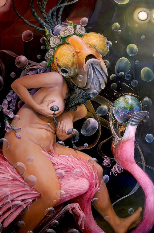
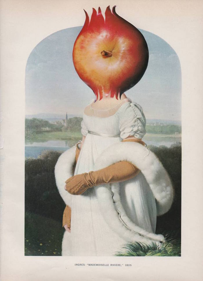
‘Cross Pollination.’
 
I could probably spend days looking at artist Deborah Stevenson‘s collage artworks. Well, maybe a slight exaggeration but let’s say hours or at least some considerable time, definitely, as each of Stevenson’s brilliant, complex pictures sets in motion a series of associations and ideas—whether intended or accidental—that connect towards a unifying narrative.

Take for example Cross Pollination which instantly startles with its reworking of Ingres’ portrait of Mademoiselle Caroline Rivière with Harold Edgerton’s photograph Bullet Through Apple.

Okay, so let’s go for basics. My first (obvious) thought was Adam and Eve and the eating of the apple and the start of institutionalized misogyny. Then I noticed the clothes worn by Rivière. Adam and Eve had supposedly been naked in the Garden of Eden. Being naked often signified the status of being a slave in ancient times. While being clothed is about power, freedom, and performance. Ingres’ portrait shows the teenage Rivière (she was about fourteen at the time) as a “ravishing beauty”—even Ingres’ words have multiple connotations—dressed in her finest clothes. She is presented as pure and virginal with the loop of a boa encircling her arms and body like a snake from the Garden of Eden.

Ingres has idealized this portrait and sexualized Rivière. The painting was not well-received when first exhibited as it was considered too Gothic and shockingly eroticised. Mademoiselle Rivière died within a year of the painting’s completion.

Then there is the violence of the exploding apple which is used to replace Rivière’s head. This could suggest the whole history of violence against women or the frustration of being a woman in such oppressive times. What it may also suggest is that in this collage, this photographic image captures one fleeting moment in time. Edgerton invented the electronic flash which enabled him to take his incredible photograph of a bullet passing through an apple. This image, this portrait, is similarly only one fleeting glimpse, one two dimensional aspect of something far more incredibly complex and subtle of which we only have but a small understanding.

Then there are the conversation pieces about identity, the male gaze, religion, and science, and the female body. And so it goes on… Of course, whether Stevenson’s intends all of this micro-reading I dunno, but you get the idea. You can, or at least I can riff on Stevenson’s work for hours. Whether that’s of any value to you, is for you to decide. What I do know is this is one of the things that makes Stevenson’s collage work so rich, so important, so beautiful, and so utterly compelling.

American artist Deborah Stevenson first came to prominence as a painter. Her work includes a series of Brooklyn skylines and another on structures and buildings. These works are beautiful, iconic and idiosyncratic. They mark the talents of an artist who can surprise the viewer by making them aware of the strangeness and beauty in the most unexpected of places.

About seven years ago, Stevenson started making collages. As a painter, she found the process of making collages accessed a different part of her consciousness. This was no longer representational work of urban landscapes but something that worked intuitively as she explained to Klassic Magaizne:

I don’t set out to do a specific image. My work table is crowded with stacks of images I have cut from a variety of print sources (I only use original material, never printing out or doing digital) and I shift them around until something strikes me. I may pick out one image as particularly striking, and then continue moving the images around until I see something that seems to ‘fit’ with the first one. It is an adventure with my muse, and most important to the process is my ability to pay attention and listen to the whispers the muse makes to me, then I see the piece. There are recurring themes in my work: the Feminine, current events, moods and internal states of being, and fashion mash ups. Finding pieces to put together is the easy part: it is the cutting and pasting that can be very labor-intensive and delicate.

Stevenson’s collages aren’t decorative work but intended to express “ideas that would be difficult to put into words, but come out very easily and clearly in imagery.” Her work is an “exploration of concepts of power, beauty, the Feminine, and mysterious archetypal conjunctions.”

The work arises in an ‘automatic’ way; I do not set out with an objective or goal in my mind when I sit down to make something. The images compose themselves spontaneously as I mix and move the masses of paper around on the table in front of me. I feel as though my eyes and hands facilitate the ‘arrival’ of the pictures that I make.

See more of Deborah Stevenson’s work here and here.
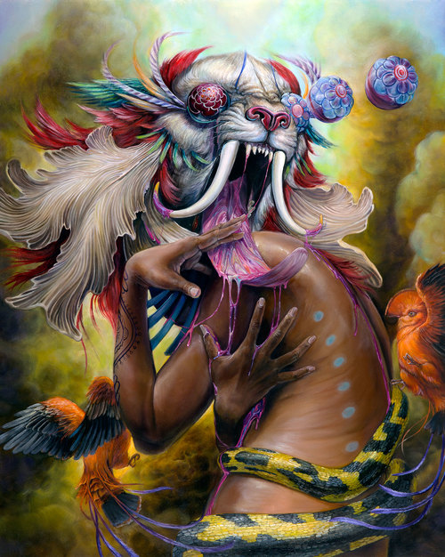
 
02debscoverup.jpg
‘Cover Up.’
 
03debsshoehorns.jpg
‘Show Horns.’
 
See more of Deborah Stevenson’s collages, after the jump…
 

READ ON
Posted by Paul Gallagher
|
10.11.2017
10:37 am
|
The socially deviant and provocative digital art of Waldemar Von Kozak
10.11.2017
10:02 am
Topics:
Tags:


A digital illustration by Waldemar von Kozak.
 
Waldemar von Kozak lives and works in Russia as a freelance artist. His art is reminiscent of work produced by Robert Maguire whose illustrations were published on the covers of over 600 pulp novels starting in 1950. Like Maguire, Kozak’s illustrations are boldly colorful and often feature bodaciously-endowed gorgeous women in various stages of undress.

After finishing his education at Tver Art College in Central Russia, Kozak received a degree in Graphic Design and ended up focusing his talents on digital illustration. Kozak’s work has been used to advertise everything from booze to projects for large corporations looking for a way to visually engage their clientele. Kozak once mused about his desire to put out a book containing his eye-popping, often confrontational illustrations, which I am happy to report he did last year. You get the fully customizable, digital-only publication for $25 bucks over at Kozak’s official website where he also has some of his choice prints for sale.

I’ve posted a salacious selection of Kozak’s NSFW work for you to check out below.


More after the jump…

READ ON
Posted by Cherrybomb
|
10.11.2017
10:02 am
|
Say hi to ‘Teenar’ the guitar made from an armless mannequin of a teenage girl
10.11.2017
09:56 am
Topics:
Tags:


A close look at “Teenar: The Girl Guitar” a creation by Lou Reimuller.
 
So before you shout “HELL NO” after seeing this image of “Teenar: The Girl Guitar” you should know that it is the creation of the rather talented luthier Lou Reimuller. Now that we have that out of the way, here are some technical specs on Teenar as I know you gearheads must be wondering if you can play ‘er. The short answer is yes as Teenar is a fully functional geetar with 21 frets on her neck and two single-coil pickups that have been embedded into her torso.

Reimuller caused quite a stir on the Internet when his creation made the rounds back in early 2000s—and if you’ve never seen it before it’s not something that I think you’ll easily forget even if you try. Images of the terrifying Teenar follow.
 

“Teenar” and her creator, Lou Reimuller (pictured in the bottom left corner).
 
HT: Amy Crehore

Posted by Cherrybomb
|
10.11.2017
09:56 am
|
Page 134 of 2346 ‹ First  < 132 133 134 135 136 >  Last ›