‘This is Where Its Fuckin At (At Least It Used to Be),’ artist Harland Miller’s take on what I wish was a real vintage Penguin book.
Before comedian Scott Rogowsky took to the New York Subway with his hilariously subversive “fake” book covers such as Ass Eating Made Simple, English novelist and artist Harland Miller was busy creating a series of dubious and inflammatory paintings based on the classic covers of vintage of Penguin Books in 2001. And like the books Rogowsky used to shock weary NY subway riders, I’d love to imagine stumbling across a vintage paperback with the title Health and Safety is Killing Bondage. Don’t laugh, it could happen.
Many of our Dangerous Minds readers are likely already acquainted with Miller’s contributions to the world of literature. His 2000 novel, Slow down Arthur, Stick to Thirty centered around a young child who sets off to explore the northern parts of England with a David Bowie impersonator. Even the cover of Miller’s debut is worth bragging about as it includes a small image of Bowie as Ziggy clad in ski gear embroidered on a sweater. The paintings Miller composed for his Penguin Book series are huge—perhaps over six feet in length. His nostalgic works are lovingly realistic thanks to his skilled painting technique by which he is able to create the tactile appearance of wear and tear on a book’s spine, or the distressing of color due to age, sun damage or mistreatment. Miller’s caustic sense of humor is on full display with these faux covers and of the many images I’ve included in this post below, I can guarantee there is something that everyone will identify with. Which helps to reinforce what a treasure Mr. Miller is.
Seemingly unstoppable, Miller has kept churning out more of his charmingly debaucherous book covers. The artist has sold many of his original paintings, and when he does they go for anywhere between $5,000 to more than $30,000. Some contain language and concepts that are slightly NSFW.
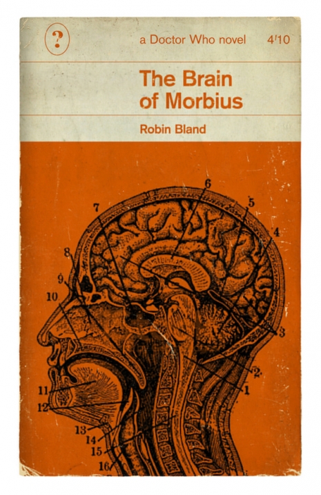
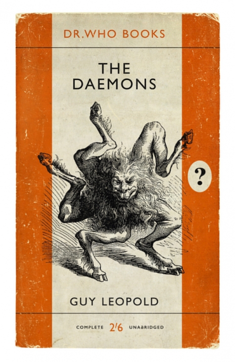
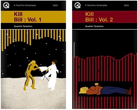
Well this is nice. The world’s longest-running science-fiction series Doctor Who reimagined as retro Penguin books from the 1960s-1980s.
I do like Penguin books. They are the acme of paperback fiction. And while I may have an apartment already crammed wall to wall and floor to ceiling with way too many books, I know I could just about find enough space for a few of these.
While there are literally dozens of real Doctor Who novelizations—some even published by Penguin—none are quite as stylish or as desirable as these beauties. Check out more Doctor Who book designs here.
More classic Penguin-style designs, after the jump…
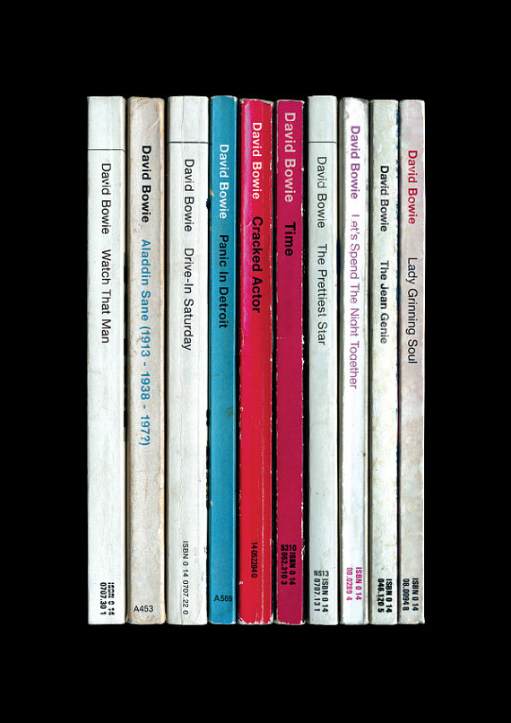
David Bowie, Aladdin Sane. Those red and blue spines seem artfully placed, hm?.......
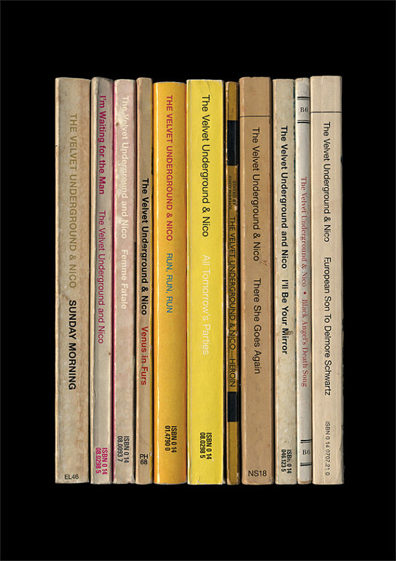
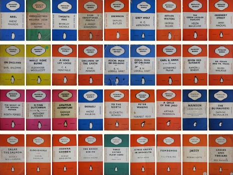
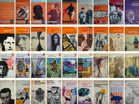
I’ve collected Penguin paperbacks for years; I’ve always been drawn to the groovy mid-century aesthetic of the covers from the pre-1980 era (actually pre-1970 for the really good stuff), with the stately and ineffably British typesetting and the promise of erudite treasures within.
So something in me totally lit up when I saw the StandardDesigns shop at Etsy. Clearly whoever is doing this store is a kindred spirit. You see, their main stock in trade is making posters where each of the songs of certain classic albums (there’s an emphasis on Bowie and British postpunk and Britpop, but not to worry, it’s not like VU and Springsteen and the Pixies and Tom Waits aren’t also in the mix) are represented by a single book from the midcentury Penguins. Once you do all of the songs of Doolittle or OK Computer or Substance, say, you’ve got a tidy little shelf of dog-eared paperbacks, each with a title in the often-teeny Penguin spine lettering.
Appreciating these posters is assisted by knowing some of the basics of the Penguin paperback world. One great thing about midcentury Penguins was the wonderful rules they set down in order to communicate things. For instance, the Pelican imprint specialized in nonfiction subjects and used blue as the indicating color, while murder mysteries almost always used green.
The early (and quite famous) phase of Penguin paperbacks were dominated by Jan Tschichold’s 1940s-era design with author and title information set in Gill Sans, flanked by huge orange stripes on the top and bottom. In 1962 Romek Marber came up with a standardized layout for Penguin titles that came to be known as the Marber Grid, which did a great deal to clarify what a Penguin cover was supposed to look like. Opinions may differ but most of my favorite covers use the Marber Grid.
The posters go in for a lot of little in-jokes or otherwise apt use of the Penguin spines. The “shelves” for Nebraska, Velvet Underground and Nico, Aladdin Sane, Velvet Underground and Nico, Unknown Pleasures and a couple others strongly mimic the album covers they’re recapitulating, while in most of the other cases there’s just a vague color resemblance. For Velvet Underground and Nico they’ve worked in the name “Andy Warhol” as the “editor” of the volume Heroin. The one for Led Zeppelin’s “Zoso” album doesn’t mention the band’s name anywhere—just like the real cover—and also uses exclusively titles from the Penguin Poets series from the late 1950s, while OK Computer, quite aptly, is made up entirely of those blue nonfiction Pelicans. My favorite detail actually comes from the poster for The Queen Is Dead, where “Bigmouth Strikes Again” is the only spine that’s one of those green mystery covers, which is somehow totally appropriate.
Each poster costs $26.54 but there are bundle deals if you want more than one. If you want to learn more about the history of Penguin design, I can’t recommend Phil Baines’ book Penguin By Design strongly enough, and Seven Hundred Penguins is also a fantastic treat.
My introduction to political theory and history came through Pelican Books—the non-fiction offshoot of Penguin Books. Pelicans were the high-end, academic books that brought bold, intellectual ideas to the mass public. The first Pelican imprint was George Bernard Shaw’s The Intelligent Woman’s Guide to Socialism and Capitalism, in which he the renowned author and playwright examined the theories of socialism and Marxism and the problems of capitalism. There then followed an impressive array of texts on art, architecture, psychology, economics and philosophy by writers as diverse as A. J. Ayer, E. P. Thomson and Jacob Bronowski. These paperbacks were mass-produced and sold at a price claimed to be lower than a packet of cigarettes. Allen Lane, who founded Penguin Books, believed there was “a vast reading public for intelligent books at a low price.” He staked his money and reputation on it. Thankfully he was right—the vast reading public did want to read intelligent books and Penguins and Pelicans sold in the thousands.
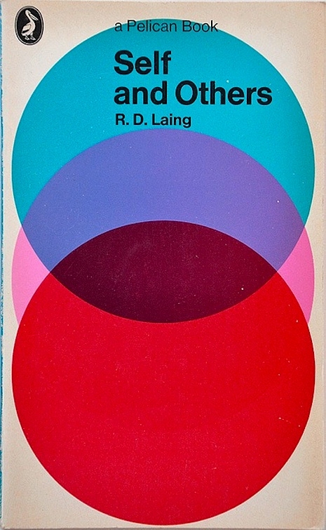
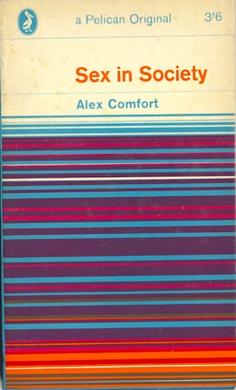
There was a color coding to Penguin books—orange for fiction, olive green for modern literature, black (originally white) for classics and blue for non-fiction. A reader’s taste in books was easily identified by the uniformly colored blocks filling their shelves. While Penguins had generally illustrative covers to a book’s story, Pelicans by the 1960s had a uniformity of design that made the brand instantly recognizable—ranging from abstracts inspired by Op Art to fashionably stylized photographs. The peak of popularity for Pelicans was in the 1960s and early 1970s, when there seemed to be a Pelican title for nearly every imaginable topic—many of which later became the source material for Richard Littler at Scarfolk Council.
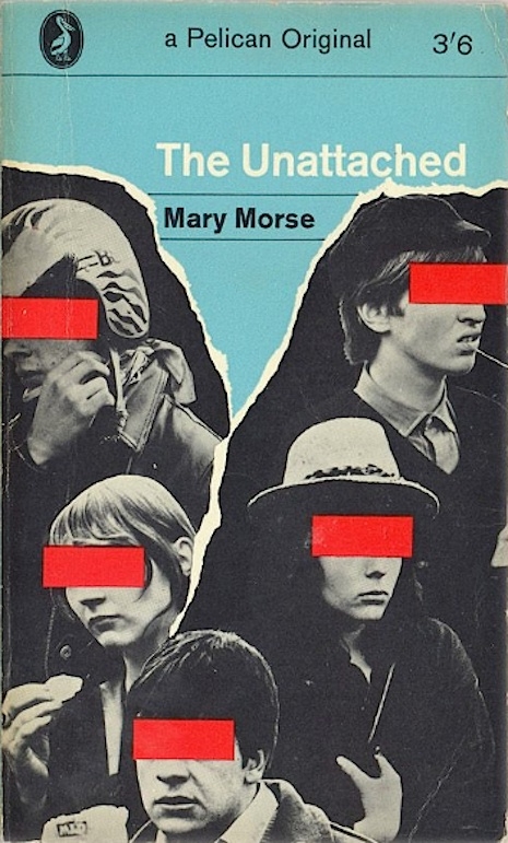
Penguin stopped publishing Pelican Books around the mid-1980s, though last year, the imprint was revitalized with a selection of new books and some texts available online. This small collection of vintage covers has been culled from various sites chosen mainly on the basis of being Pelicans I have read in my youth (Anarchism, Drugs, The Young Offender, Self and Others) or covers well-remembered because of their style and originality.
More vintage designs for classic Pelican Books, after the jump…
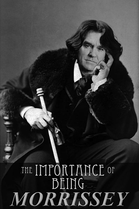
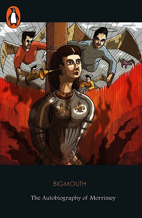
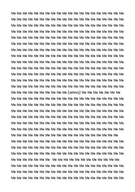
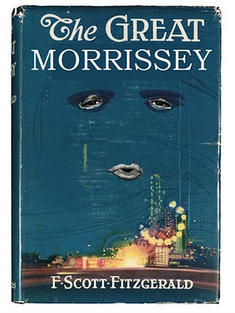
Big Mouth’s autobiography is published tomorrow by (can you believe it?) Penguin Classics. This even before a word of it has been read or considered worthy of inclusion amongst such writers as Aristotle, Virgil, Plutarch, Jane Austen, Christopher Marlowe, Charles Dickens, etc, etc. Admittedly Penguin Classics also include Philip K. Dick, Kurt Vonnegut, Carson McCullers and Ross McDonald—but at least these authors had already been published, and earned their place to be included in the list by being “read by generation after generation.” I wonder if Morrissey’s Autobiography will be read by anyone ten years from now, let alone a hundred?
The Guardian newspaper recently asked readers to send in their alternative designs for the cover to Morrissey’s Autobiography, here are a selection of their favorites. View more here.
My teenage ambition was to have a novel published by Penguin Books, the company responsible for publishing my favorite authors. My bedroom shelves were lined with orange and blue and green and silver-spined Penguin books—the only books whose quality is guaranteed by their cover.
I was, therefore, delighted to find A Penguin a week, where Karyn Reeves has blogs about her collection of Penguin books. Ms Reeves is collecting all of the Penguin books published before 1970, the year when the company’s founder Allen Lane died. So, far, Ms. Reeves has amassed 2,000 of the approximately 3,000 titles—“they look great in the book shelves en masse,” she says.
Karyn also reads and reviews one Penguin book a week (hence the title), and is currently reading “Penguin no. 1736:” At the Villa Rose by A.E.W. Mason. Once the book is read, a review is posted, and there are plenty of wonderful titles to browse through—from “Penguin no. 1:” Ariel by Andre Maurois, to “Penguin no. 2999:” Bullitt (Mute Witness) by Robert L. Pike.
However, there are quite a few titles still missing, and this is where you the reader might be able to help.
If you love reading, and you love books (particularly Penguin Books), then you’ll find plenty to enjoy at Ms. Reeves fabulous site.
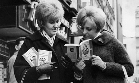
It is surprising to think that fifty years ago today, D. H. Lawrence’s novel Lady Chatterley’s Lover was published and sold legally in British bookshops for the very first time.
The initial print run of 200,000 sold out, and within a year a total of 2m copies were sold, outselling the Bible. As was reported by the BBC at the time:
London’s largest bookstore, W&G Foyle Ltd, said its 300 copies had gone in just 15 minutes and it had taken orders for 3,000 more copies. When the shop opened this morning there were 400 people - mostly men - waiting to buy the unexpurgated version of the book.
Hatchards in Piccadilly sold out in 40 minutes and also had hundreds of orders pending.
Selfridges sold 250 copies in minutes. A spokesman told the Times newspaper, “It’s bedlam here. We could have sold 10,000 copies if we had had them.”
Lady C, as it has become known, has also become a bestseller in the Midlands and the North where demand has been described as “terrific”.
Originally published in Italy in 1928, Lady Chatterley’s Lover had been banned in the UK on grounds of obscenity, though a limited, expurgated and heavily censored imported version had been available, where words, such as ‘penis’ were replaced by ‘liver’, and sections of sexually explicit “purple prose” removed.
All this was to change, when in 1959, the Obscene Publications Act stated that any book considered obscene by some but could be shown to have “redeeming social merit” might still published. This encouraged Penguin Books to prepare 200,000 unexpurgated copies of Lady C for release in 1960 (to coincide with the thirtieth anniversary of Lawrence’s death), in a bid to test the novel’s merit against the Act. This led to a now infamous trial in October 1960, where a host of established authors lined-up to give evidence in defense of the Lawrence’s novel, including T. S. Eliot, Doris Lessing, Aldous Huxley, Dame Rebecca West. Defense lawyer, Michael Rubinstein had cleverly contacted over 300 potential witnesses, ranging from writers, journalists, teachers, politicians, academics, TV celebrities and theologians. Many writers wrote letters in support to Rubinstein including:
E. M. Forster wrote:
‘Lady Chatterley’s Lover is a literary work of importance, written by a leading 20th-century novelist. It is surprising that such a work should be prosecuted here, and if it is condemned, our country will certainly make itself look ridiculous in America and elsewhere.
I do not think that it could be held obscene, but am in a difficulty here, for the reason that I have never been able to follow the legal definition of obscenity. The law tells me that obscenity may deprave and corrupt, but as far as I know, it offers no definition of depravity or corruption.
I am certain that it is neither erotic nor pornographic, nor, from what I knew of the author, would there have been any erotic or pornographic intention in his mind.’
Graham Greene, August 22 1960:
‘It seems to me to be absurd that this book should ever have been classed as obscene and I should say that its tendency as Lawrence intended is to treat the sexual side of a love affair in an adult fashion. I can’t Imagine that even a minor could draw any other conclusion from the book than that sexual activity was at least enjoyable.
I am myself dubious how far Lawrence was successful in his intention. I find some parts of the book rather absurd and for that reason I would prefer not to be called as a witness in case I was forced into any admission harmful to the Penguin case.
Yours faithfully
Graham Greene’
Aldous Huxley, October 9 1960:
‘Lady Chatterley’s Lover is an essentially wholesome book. Its treatment of sex is at once matter-of-fact and lyrical. There is no prurience in it and no trace of that sadistic perversion which is such an odious feature of many popular novels and short stories that, because their authors prudently avoid the use of certain four-letter words, are permitted to circulate freely.
That a beautiful and serious work of art should run the risk of being banned because its creator (for aesthetic and psychological reasons into which I need not enter) chose to make use of certain words that it is conventional to regard as shocking – this surely is the height of absurdity.
Aldous Huxley’
Evelyn Waugh, August 21 1960:
‘Your MBR/VS of 18th. I have not read Lady Chatterley’s Lover since it first came out. My memory of it is that it was dull, absurd in places and pretentious. I am sure that most of its readers would be attracted by its eroticism. Whether it can “corrupt” them, I can’t tell, but I am quite certain that no public or private “good” would be served by its publication. Lawrence had very meagre literary gifts.
Kindest regards,
E.W.’
Not everyone was happy about supporting the book, Doris Lessing wrote: “I don’t think this novel is one of Lawrence’s best, or a great work of art, I’m sorry, if there is to be a test case, that it will be fought over this particular book.” Likewise, Iris Murdoch tempered her support with “Lady Chatterley’s Lover certainly may strike one as an eminently silly book by a great man.”
Surprisingly, support came from unlikely sources, the Bishop of Woolwich supplied a written deposition, which stated:
‘Archbishop William Temple once said that Christians do not make jokes about sex for the same reason that they do not make jokes about Holy Communion – not because it is dirty, but because it is sacred.
‘Lawrence did not share the Christian valuation of sex, but he was always straining to portray it as something sacred, in a real sense as an act of Holy Communion. I believe that Christians in particular should read this book, if only because Lawrence believed passionately, and with much justification, that they have killed and denied the natural goodness of creation at this point.’
The trial lasted 6 days and marked the demise of one generation, and the arrival of another. This was most notable when the Prosecuting Counsel Mervyn Griffith-Jones asked:
“Would you approve of your young sons, young daughters – because girls can read as well as boys – reading this book? Is it a book that you would have lying around in your own house? Is it a book that you would even wish your wife or your servants to read?”
If there was a line that negatively affected the Prosecution’s case then this was it. For it revealed Griffith-Jones lived in an archaic and class-divided world where everyone apparently had servants; a world separate from that of wives and servants, and this the majority of Britons. It was the clearest picture of the two worlds that existed back then - the world of “class, rank and privilege, ranged against ordinary people.”
Griffith-Jones’ comment highlighted this divide, and re-enforced the notion Penguin was on the side of “the common man.” In his closing speech, defense lawyer, Gerald Gardiner said:
“I do not want to upset the prosecution by suggesting that there are a certain number of people nowadays who as a matter of fact don’t have servants. But of course that whole attitude is one which Penguin Books was formed to fight against, which they have always fought against…
“Isn’t everybody, whether earning £10 a week or £20 a week, equally interested in the society in which we live, in the problems of human relationships including sexual relationships? In view of the reference made to wives, aren’t women equally interested in human relations, including sexual relations?”
Penguin’s success was a victory for all publishers, and the release of the Lady Chatterley’s Lover, on November 10 1960, marked the start of the cultural and political change that defined the decade.


 Previously on Dangerous Minds